2
Styling and Laying Out the Objects
The second part of this tutorial goes beyond basic diagramming and object creation. With all of the objects now in place, it’s time to focus on the design aspect of the diagram.
Here, you’ll learn about many of OmniGraffle’s inspectors, the first of which is the Diagram Layout inspector. After establishing a base design for the diagram, you’ll employ a variety of inspectors to change fonts and type sizes, resize, scale, and style the objects, and tweak the width of the connecting lines in the diagram. You’ll also learn how to import a custom color scheme, create varying color shades based on that scheme, and even how to use seemingly innocuous shapes as “guides” for manually laying out the objects in the diagram.
Tip
Now might be a good time to brush up on the inspectors by reading through the Working with the Inspectors chapter of the OmniGraffle 6 for Mac User Manual, which you can get to by choosing Help ▸ OmniGraffle Help, or by reading the documentation online.
All right—enough dilly-dallying—let’s get to work!
Bringing Design to Olympus
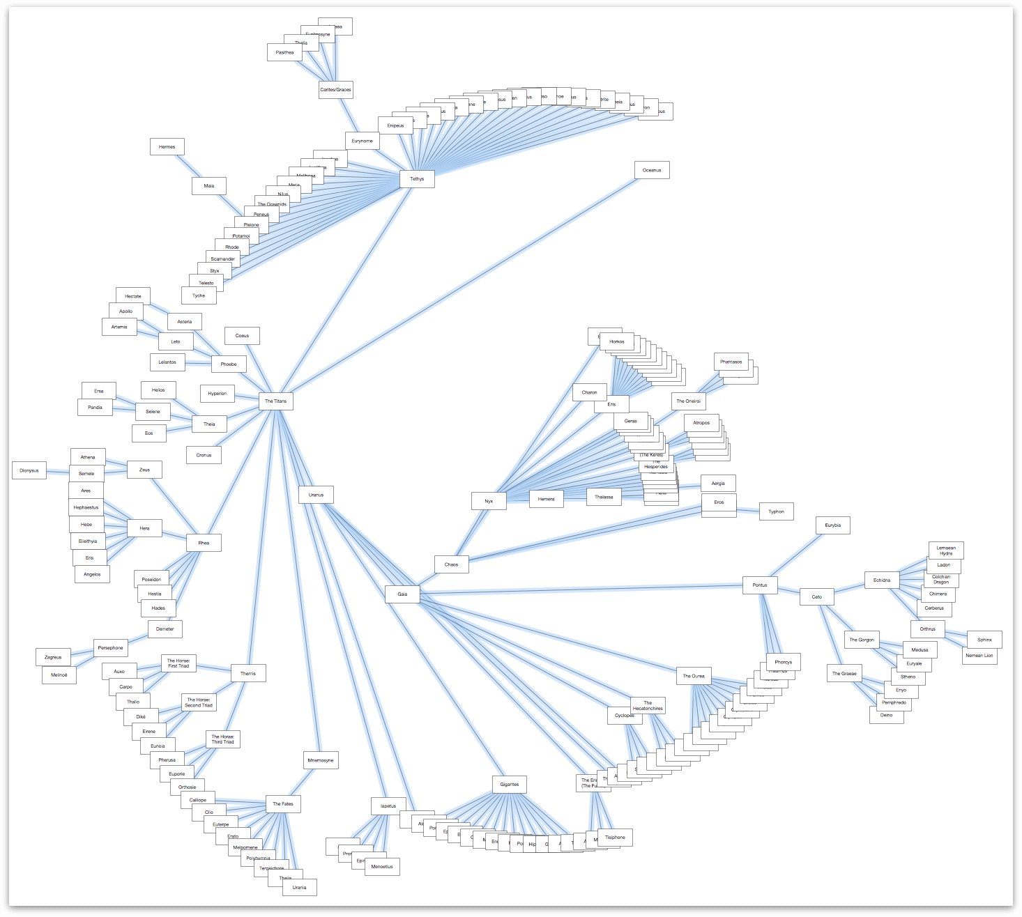
The first thing you’ll notice upon seeing the fully-fleshed out diagram is…it’s huge! You can’t see all of the objects on the canvas, and choosing View ▸ Zoom ▸ Fit in Window (Control-Command–0) makes the diagram impossible to read.
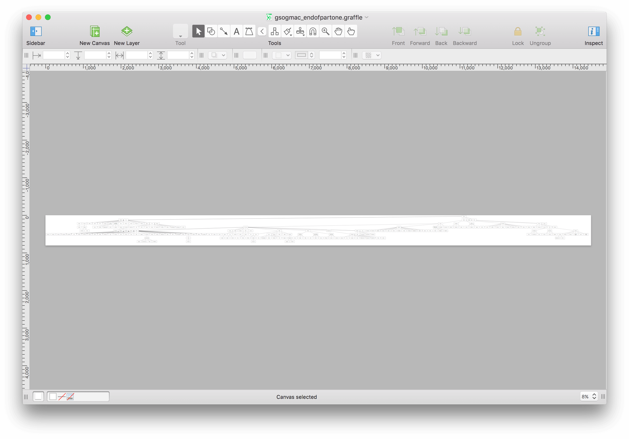
And zooming in doesn’t help all that much because you can only (and realistically) view and work on one small portion of the diagram at a time.
There are a few issues at play here:
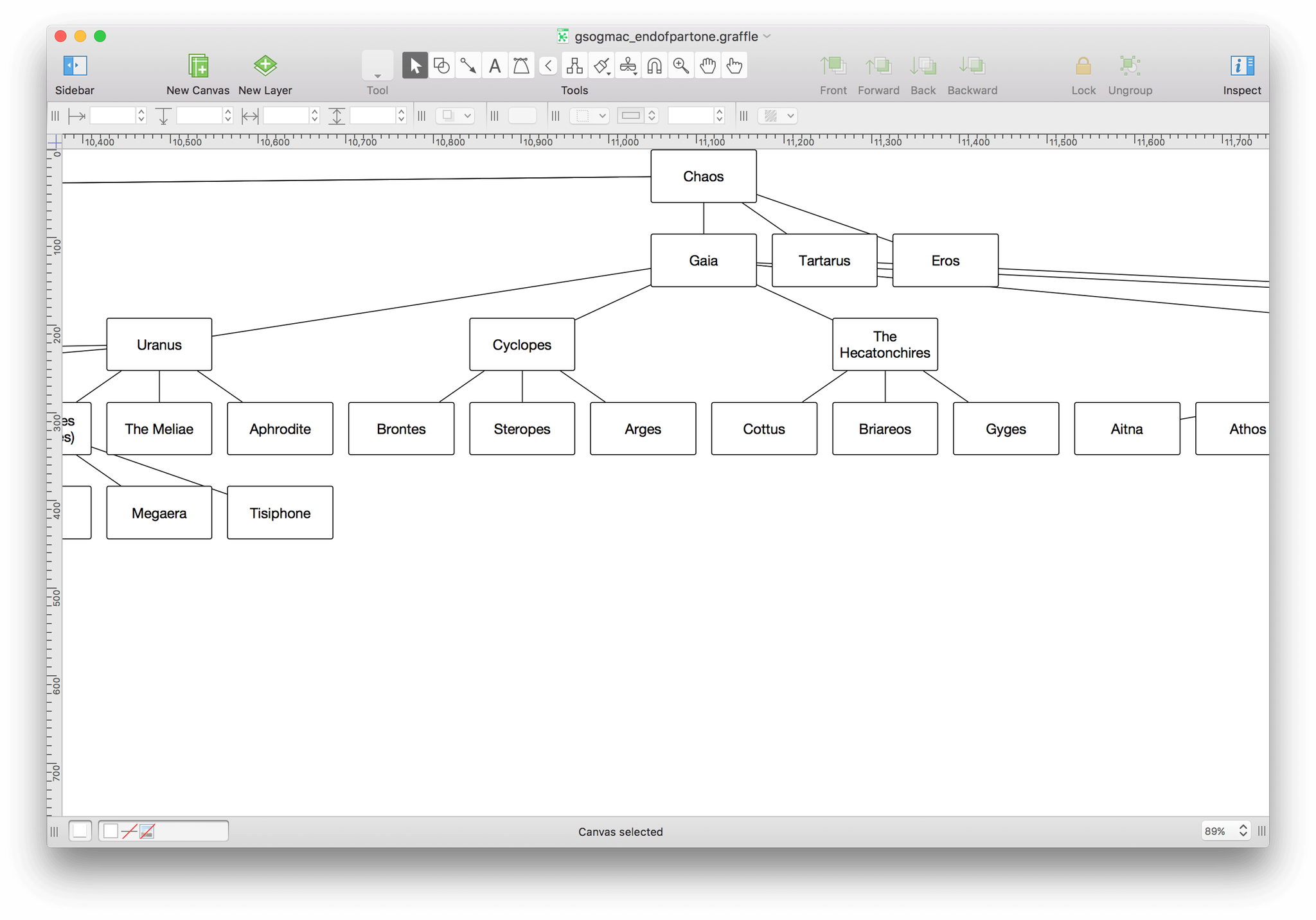
- With 220 objects (‼️) in the diagram, the Hierarchical layout just doesn’t work.
- Many objects in the diagram are too close together. This makes it difficult to determine the exact relationship of children and their parents or grandparents, let alone their siblings, nieces, and nephews.
- The template’s use of Straight lines makes it difficult to accurately determine the relationships because the connecting lines overlap one another.
- All of the objects are the same shape, size, and have the same fill color and font styling.
We can do better than the defaults, so let’s dig in and get to work on fixing these issues.
Using the Diagram Layout Inspector to Give Everyone Some Space
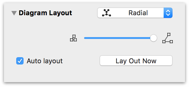
As you may have noticed when you turned on Auto layout in Part 1, the Diagram Layout inspector has a few more controls for laying out your diagram.
Tip
If you press Control-Command–0 (that’s a zero, not a capital Oh), OmniGraffle resizes the Canvas view so that the entire diagram fits in the window. This comes in handy for trying out the Layout Types in the popup menu, because OmniGraffle redraws and rescales the objects on the canvas for you. You can just select a Layout Type, adjust the object spreads, and then kick back and watch the drawing engine do its thing.
If you did not have Auto layout turned on in the Diagram Layout inspector, you would need to click Lay Out Now in the inspector to see the changes you’ve made.
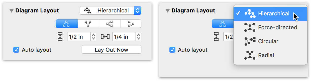
At the top of the inspector is the Layout Type popup menu which, when clicked (see the previous image at right), reveals four different ways for laying out your diagrams. Depending on which Layout Type you choose, other options become available within the Diagram Layout inspector, as follows:
Hierarchical — The hierarchical layout creates layers of equally-ranked objects, extending in one direction. Beneath that popup menu, you’ll see the following row of buttons:

These are the Diagram Origin buttons; they determine the direction in which your diagram flows:
- Top-down
- Bottom-up
- Left-to-right
- Right-to-left
And finally, you’ll find the Object Spacing controls beneath the Diagram Origin buttons:

Use the control on the left to determine how much vertical spacing to have between each level of objects; and use the control on the right to determine the horizontal spacing between objects on the same level.
Force-directed — The Force-directed layout grows in semi-random directions from the center, rather than in one particular direction from the edge.

Underneath the popup menu, you’ll find two sliders which control the line lengths (the top slider) and the relative distance between objects (the bottom slider). The Force-directed layout gives this diagram a sort of microprocessor look, where the objects form a square or rectangular pattern on the canvas depending on how much you’ve adjusted the spread between objects.

Circular — The Circular layout tries to arrange siblings in a circle around their parent.

The Circular layout has only one slider for defining the amount of spread among the objects in a particular branch of the hierarchy. As the next image shows, this creates little object “pods,” but those pods are so spread out that this isn’t much better than the Hierarchical layout.

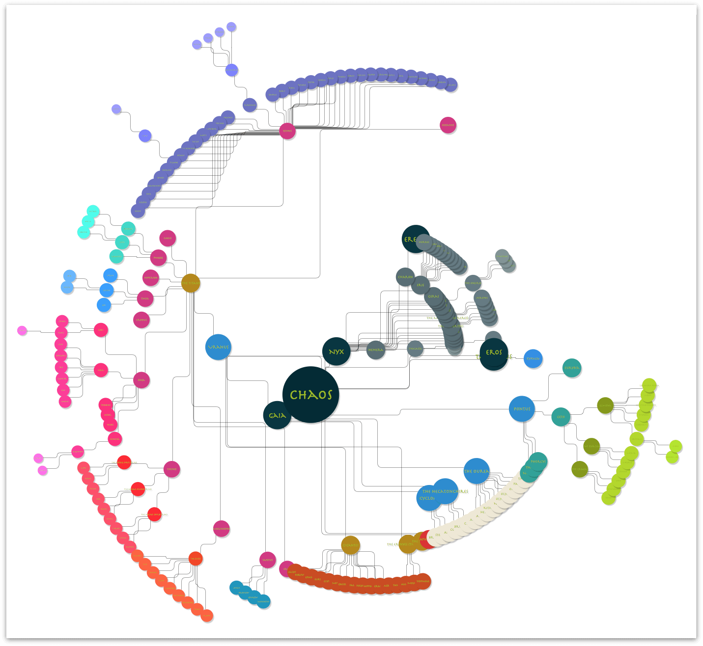
Radial — The Radial layout arranges siblings in a concentric circular pattern around their parent.

The Radial layout branches out in a circular pattern from a centerpoint, with sibling groups appearing in close proximity to one another.
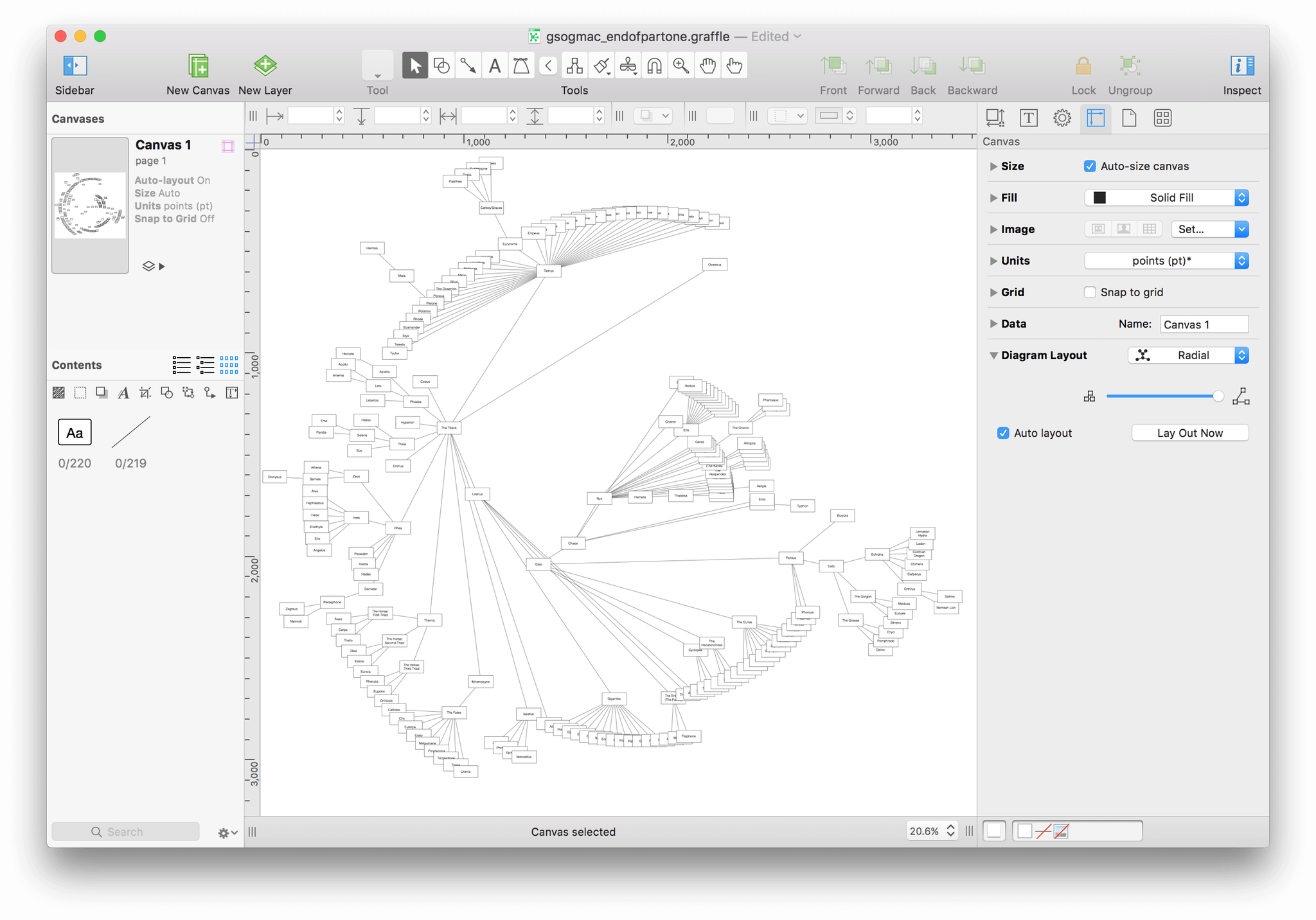
Design-wise, the Radial layout looks like it could result in something that’s really cool. And unlike the Force-directed or Circular layouts, it’s really easy to find the centerpoint from which everything is created—in this case, Chaos.
If you haven’t already done so, choose Radial in the popup menu, and then move the slider all the way over to the right. Before moving on to the next section, press Command-S to save your document.
Lines, Lines, Everywhere a Line
Even with the new Radial layout and a far-spread applied to the objects, related objects (parents, children, and siblings) are still fairly difficult to differentiate. Next up in our little bag of tricks is to change the line type using the Line and Stroke inspectors.
Using the Selection Matrix to Select the Lines
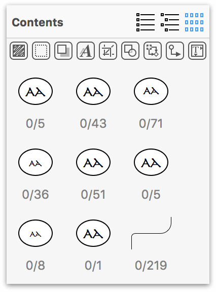
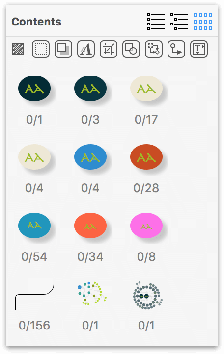
Back in Part 1, you used the Outline Editor to enter the names for the first batch of objects and define their relationship to one another. At the time, you were promised to be introduced to the buttons on either side, so here’s your first introduction: the Selection Matrix. Start by clicking ![]() in the Contents section of the sidebar.
in the Contents section of the sidebar.
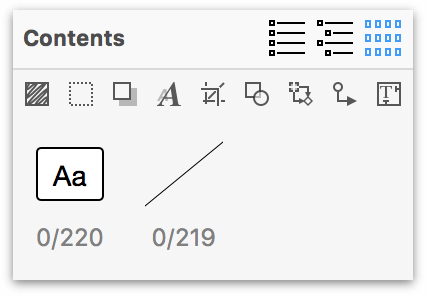
The Selection Matrix is pretty dang cool. It groups together like-objects on your canvas by style, and you can toggle them on and off based on the row of buttons just underneath the Contents bar. The Selection Matrix reveals that there are 220 unselected rectangular objects, and 219 unselected lines on the canvas.
Since you want to make a change to all of the lines in this diagram, click on the straight line (labeled 0/219). This selects all of the lines in the diagram, and changes the label in the Selection Matrix to 219/219.

And here’s how the diagram appears when all of the lines are selected:
Note
Do you see the Death Star in the diagram yet? We sure didn’t.
Using the Line Inspector to Make the Lines More Fluid
With all of the lines selected, now let’s switch to the Line inspector to give these blocky lines some motion. Okay, admittedly, the lines aren’t animated, but adding a curve to them—considering the circular formation of the diagram—seems appropriate.
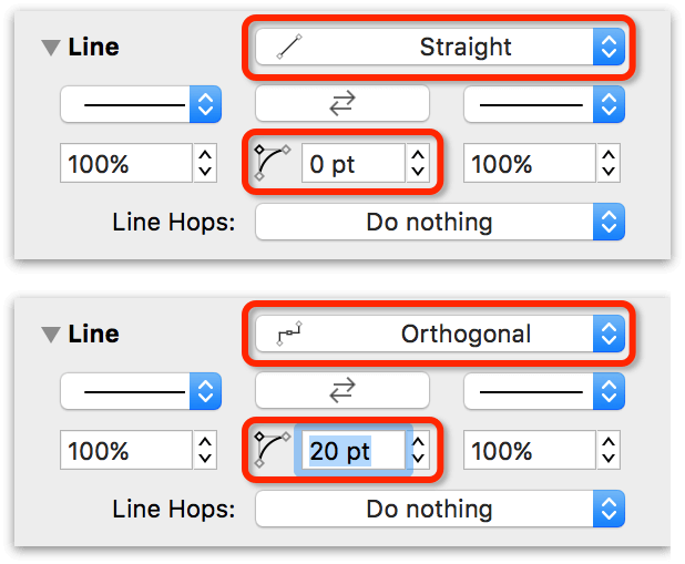
Open the Object inspectors (Inspectors ▸ Object, or Command–1), and locate the Line inspector. Your first order of business is to change the Line Type from Straight to Orthogonal. Next, add some curve to the lines. By default, Orthogonal lines have a 90-degree right angle. Using the center control, change the curvature of the line angles from 0 pt to 20pt:
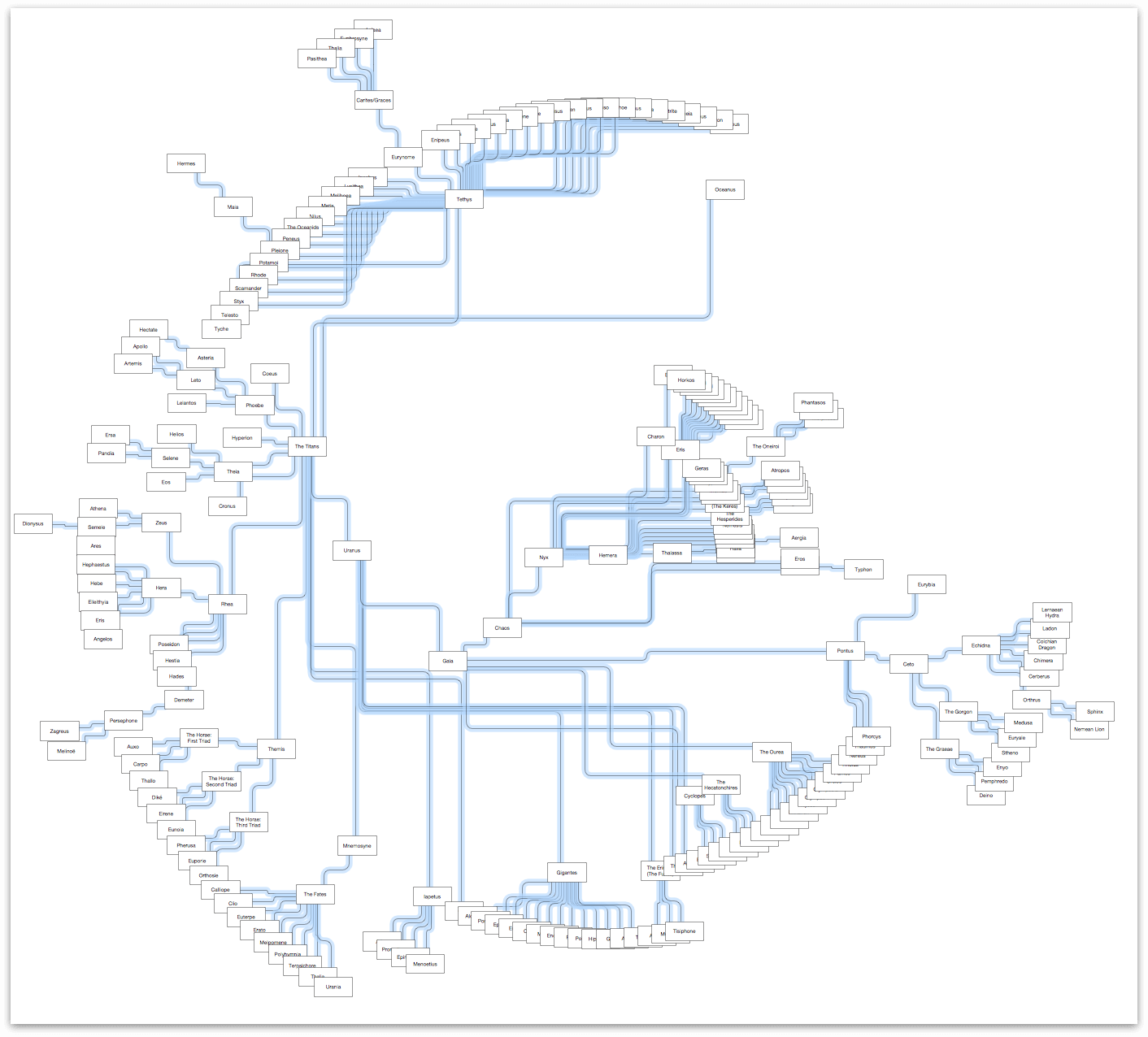
That one simple change makes a world of difference to how the diagram appears:
And while you’ve just made the lines a little easier to differentiate, the rectangular objects bearing everyone’s name could use some attention. Certain groupings of rectangles—such as the upper-left arc or near the center—are a little dense. It’s difficult, if not impossible, to make out the names in the objects. One way of resolving this problem is to change the object type, say from rectangles to circles, and then to change the dimensions of objects based on their place in the hierarchy.
For example, you could specify that the lines for Zeus’ children are a certain color, or that all of the lines for the Gorgon are a sickly green (because, hey, Medusa!). However, when you get more fine-grained like that, you’ll find that the Contents sidebar’s Outline Editor ![]() will greatly improve the way you work—and think—in OmniGraffle.
will greatly improve the way you work—and think—in OmniGraffle.
Let’s work on that next.
Bringing Style to the Masses
How you style your diagram (or other project in OmniGraffle) greatly depends on the goals you are trying to achieve. With a diagram such as this, there are a few stylistic elements that you can lean on, including:
- Shapes
- Typographical style
- Color palette
- Line widths
From an information graphic (or infographic) point of view, you can achieve a high degree of design with these elements. What you want to do is bring a level of design to your data and use it in such a way that not only makes sense visually, but so that it also implies purpose, importance, and structure to that data.
The sections that follow will discuss these elements and, while doing so, you will also implement the design.
Let’s get started!
Using Shapes, Typography, and Scale to Denote Hierarchy
In the book, Thinking with Type, author Ellen Lupton describes the use of scale (in the context of typography, of course) as:
“Scale is the size of design elements in comparison to other elements in a layout as well as to the physical context of the work. Scale is relative. …
Changes in scale help create visual contrast, movement, and depth as well as express hierarchies of importance.”
— Ellen Lupton, Thinking with Type, Second Edition
From a design standpoint, you can apply scale in a number of ways. For example, the shapes used can be scaled differently according to placement in the hierarchy. The same applies to the labels of those shapes (in this case, the names of the mythological characters). And finally, you could even set different widths, colors, or styles to the lines between the shaped objects to help denote relationships or importance.
These are the kind of things that make the difference between someone looking at your diagram and thinking “Meh!” or “That’s amazing!”.
Defining the Scale
The concept that we’re going to run with in this tutorial is one of a connected array of clustered orbs. The sizes of the orbs will vary based on their ranking in the hierarchy in the family tree. Since everything in the Greek mythological universe was created from Chaos, that object will be the largest object on the canvas.
The scale you will use for the objects is one that most designers can relate to: the progression of type sizes. Type is designed in a variety of default sizes, or points (pt). Fonts typically range in size from the practically unreadable (4 pt) to poster-sized (288 pt and above).
The following table lists the objects (by name of the character), along with the size of their circle and size of the text.
Warning
Don’t jump the gun and start assigning the circle and type sizes just yet. The following table is for later reference; there are a few “global” changes you can make before you implement the object and type scales to the diagram.
Just be patient.
| Level | Character | Circle Dimensions | Type Size |
|---|---|---|---|
1 |
Chaos | 288 × 288 | 72 pt |
2 |
Erebus, Nyx, Gaia, Tartarus, and Eros | 144 × 144 | 36 pt |
3 |
Uranus, Cyclopes, The Hecatonchires, The Ourea, and Pontus | 132 × 132 | 24 pt |
4 |
Under Nyx:
Under Uranus:
Under Pontus:
Under Tartarus: |
96 × 96 | 18 pt |
5 |
Under Nyx:
Under Uranus:
Under Pontus: |
84 × 84 | 14 pt |
6 |
Under Nyx:
Under Tethys:
Under Pontus: |
72 × 72 | 11 pt |
7 |
Under Tethys:
Under Pontus: |
64 × 64 | 9 pt |
8 |
Under Tethys: |
48 × 48 | 8 pt |
With the scale defined, you’d think the next logical thing to do is implement those sizes—but don’t move so fast! Before you proceed with making the changes specified in the previous table, there are a few “global” changes you can make to help streamline the process. These include:
- Using the Geometry inspector to change how objects scale
- Using the Shape inspector to change all of the shapes from rectangles to circles
- Using the Font inspector to specify a font and a base type size for the diagram
- Using the Text inspector to adjust how the text labels fit within the circle objects
After you have made the global changes in the sections that follow, you will then select and resize objects using a combination of the Outline Editor in the sidebar, and the Geometry inspector.
Setting How an Object Scales with the Geometry Inspector
To maintain the orb style of the diagram that you get with the Radial layout, your next big job will be changing all of the rectangular shapes to circles, and then scaling them differently to denote hierarchical “importance” within the family tree.
Using the Selection Matrix ![]() , select all of the shaped objects. Go to the Geometry inspector and take a close look at the dimensions of all of the rectangular objects. Right now, they are 120 × 60 pixels (px).
, select all of the shaped objects. Go to the Geometry inspector and take a close look at the dimensions of all of the rectangular objects. Right now, they are 120 × 60 pixels (px).
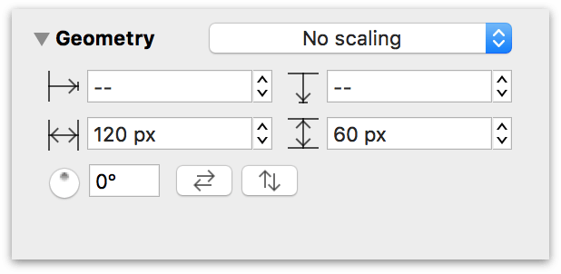
If you were to change the shapes from rectangles to circles right now, those circles would adopt the dimensions of the rectangles, resulting in elliptical shapes, which is not the desired effect. So let’s change a couple things.
Change the dimensions of the objects to 48 × 48 px; now all of the objects are squares. As noted in Table 4, this is the smallest-sized object on the canvas.
Click the popup menu at the top of the Geometry inspector; by default, this is set to No scaling. Change this to Maintain Aspect Ratio.

Now, whenever you change either the height or width of an object, the other the dimension changes to the same value. For example, changing the width to 48 px and pressing Tab (or Esc) automatically sets the height to 48 px; you only have to enter one value to change the size of an object whose scale is set to Maintain Aspect Ratio.
Changing Object Shapes with the Shape Inspector
With the aspect ratio properly set, the next phase of the design process involves changing all of the square shapes to circles. For this, you will use a combination of the Selection Matrix ![]() in the sidebar, and the Shape inspector.
in the sidebar, and the Shape inspector.
With the objects still selected in the Selection Matrix, switch to the Shape inspector.
Click the button at the top that’s labeled Rectangle:

That opens a Shape menu, from which you can select another shape to apply to the selected object (or objects).
Click the Circle object to change all of the squares to circles:

Now that all of the circles are set to the minimum size, the next thing you’ll do is scale the circles based on their hierarchical ranking and adjust the base font and object type sizes. That’s a lot of work, and it involves using three different inspectors. To aid in this process, you really need to be introduced to Workspaces.
Creating a Custom Workspace for the Inspectors You Need
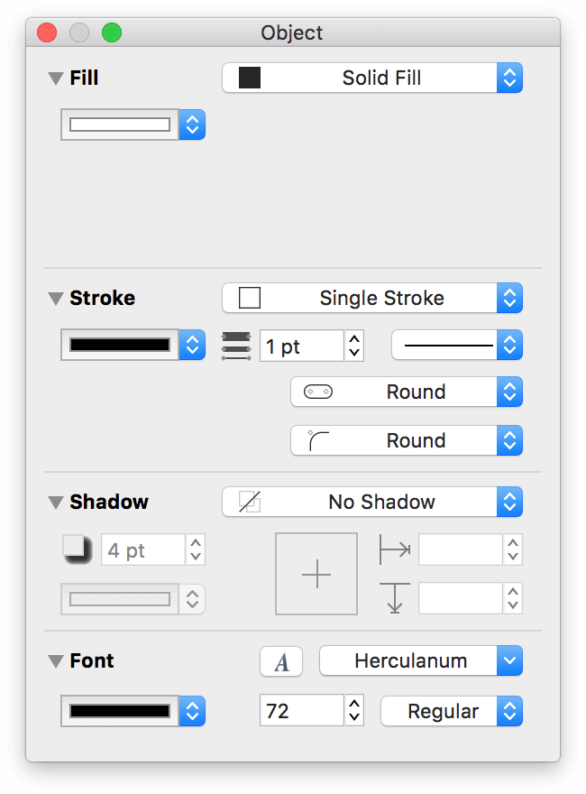
The inspectors, which are divided into four sets (or five, if you have OmniGraffle Pro), reside in a sidebar on the right side of OmniGraffle’s window. Switching between the sets is easy; you can use a keyboard shortcut or the Inspectors menu for that. And while that works just fine for simple tasks such as switching to the Canvas inspectors to assign a background color to a canvas, sometimes you need the inspectors to be grouped differently to make your workflow more efficient. That’s where Workspaces come in.
Workspaces allow you to drag inspectors out of the sidebar to create a “custom” inspector palette. In this case, you will need to use three different inspectors: the Geometry, Font, and Text inspectors. As you’ll notice, these reside in two different inspector sets: the Geometry inspector is part of the Object inspectors, and the Font and Text inspectors are in the Type inspectors. This is a perfect situation where you can leverage a relatively unknown feature of OmniGraffle, so let’s get to work.
To create a Workspace that includes the Geometry, Font, and Text inspectors, do the following:
- Choose Inspectors ▸ Object (Command–1); this switches to the Object inspectors in the right sidebar.
Click and hold on the title of the Geometry inspector, and then drag the inspector to the left. You’ll see that it detaches from the sidebar.

When you release the mouse button, the Geometry inspector is now in a floating window.
- Choose Inspectors ▸ Type (Command–2); this switches to the Type inspectors in the right sidebar.
- Click and hold on the title of the Font inspector; drag this inspector to the floating window that contains the Geometry inspector:

- Click and hold on the title of the Text inspector; drag this inspector to the floating window that contains the Geometry and Font inspectors:

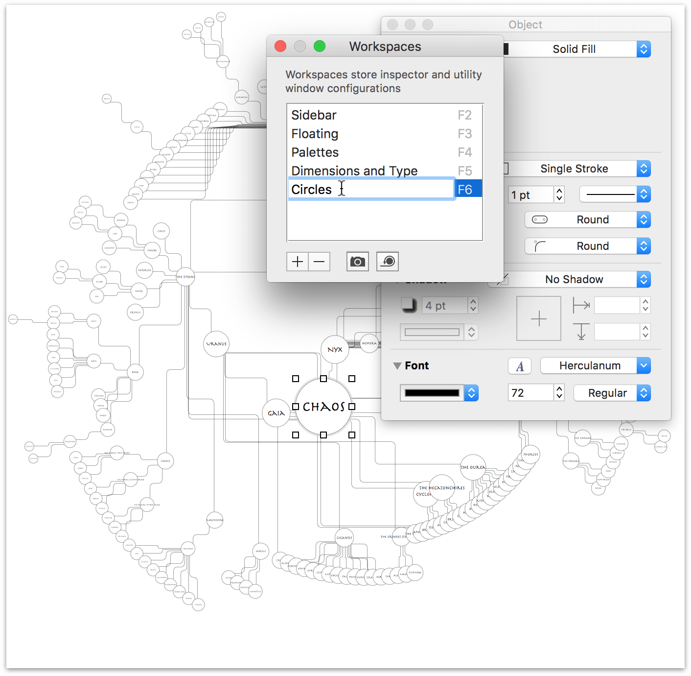
- Finally, choose Inspectors ▸ Edit Workspaces; this pops open the Workspaces window. Click + to add a new Workspace to the list, and enter a name, such as Dimensions and Type, and then press Return.

You’ll notice that the Dimensions and Type workspace also gains two very unique keyboard shortcuts in the Inspectors menu:
- Press Command–6 (or choose Inspectors ▸ Hide/Show “Object 2”) to hide and show the workspace window that contains the inspectors.
- Press F5 (or fn-F5 if you are using a laptop or external keyboard), which you see in the Workspaces window when you add and name the workspace, is a little more complicated:
- When the workspace window is open, you can “redock” the inspectors to their respective inspector panels in the sidebar by choosing Inspectors ▸ Sidebar or by pressing F2.
- After “redocking” the inspectors, pressing F5 pops those inspectors out into their own floating window again. Once the floating window is open, however, pressing F5 does nothing; the window remains open.
It’s important to know that using Command–6 to hide and show the workspace does not place the window’s inspectors back in the inspector sidebar. They remain detached and won’t be available in the inspector sidebar until you press F2 (or choose Inspectors ▸ Sidebar).
Press F5 to detach the Geometry, Font, and Text inspectors from the sidebar and place them into their workspace.
Now that you have created a custom workspace for the Geometry, Font, and Text inspectors, you can get back to working resizing the circles and setting their respective type styles.
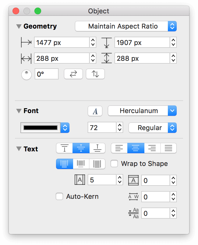
Resizing the Circle Objects and Setting Font Properties
The next step in the evolution of the diagram involves changing the size of two different things: the circles and the text labels within. While you could make these changes independent of each other, doing so would require repeating the process of selecting noncontiguous objects in the Outline Editor ![]() , which, admittedly, can be a pain in the butt when you have a diagram with over 200 objects.
, which, admittedly, can be a pain in the butt when you have a diagram with over 200 objects.
So, it’s time to do a little multitasking in OmniGraffle using Table 4 as your guide.
Select Chaos in the Outline Editor.
In the Workspace you created, use the Geometry inspector to change Chaos’ dimensions to 288 × 288.
Note
Because you previously set the scaling to Maintain Aspect Ratio, you only have to enter 288 in either the width or height field; pressing Tab afterward automatically updates the other field.
In the Font inspector, change the font to 72 pt Herculanum.
In the Text inspector, turn off Wrap to Shape.
When you have finished making those adjustments, this is how the floating Workspace window should appear:
Now repeat that process for the characters in Levels 2 through 8, using the dimensions and type size specified in Table 4.
Tip
To select multiple, non-contiguous objects in the Outline Editor, click to select the first object, and then hold down the Command key (⌘) and then continue to click the objects you need to select.
For groups of objects (for example, Eris’ children in Level 5 of Table 4), Command-click to select the first child, and then—while still holding down the Command key—Shift-click the last child to select that child and everyone in between.
As long as you keep the Command key held down, you can click and Shift-click to select objects with ease.
When you have finished adjusting the sizes and text labels, this is how your diagram should appear:
Even zoomed out so you can see the entire diagram, and you can easily see the differences in scale between the objects on the outer rim versus those closer to the center.
Also, note how the Selection Matrix has conveniently separated the circle objects based on their size:
This will come in handy for the next phase of the operation: assigning colored fills to the objects.
Choosing a Color Scheme to Highlight Relationships
Regardless of whether you’re designing a company org chart or putting together an infograffic, the one thing that you’ll want to consider is the color palette for that thing you’re designing. One of the more popular themes you can find when searching the Internet is the Solarized color scheme, by Ethan Schoonover.
The Solarized color scheme consists of 16 colors; 8 monochrome and 8 highlight colors that pair up quite nicely.

The colors in the Solarized color palette offers a great mix of colors, from which you can create lighter shades to use as Fill colors to the objects in the diagram.
This section walks you through the process of downloading the Solarized theme and install that on your Mac. Before adding the Solarized colors as swatches to the Colors window, you’ll create a backup of your current swatches, which you can later restore after you’ve finished this tutorial.
However, before you do all of that, it’s time to learn a little bit about the Colors window.
All You Wanted to Know About the Colors Window But Were Afraid to Ask
One of OS X’s standard widgets is the Colors window. Whether you’re using Pages or Keynote, or some other Mac app that lets you colorize things, the Colors window is there in some shape, form, or fashion. OmniGraffle is no exception.
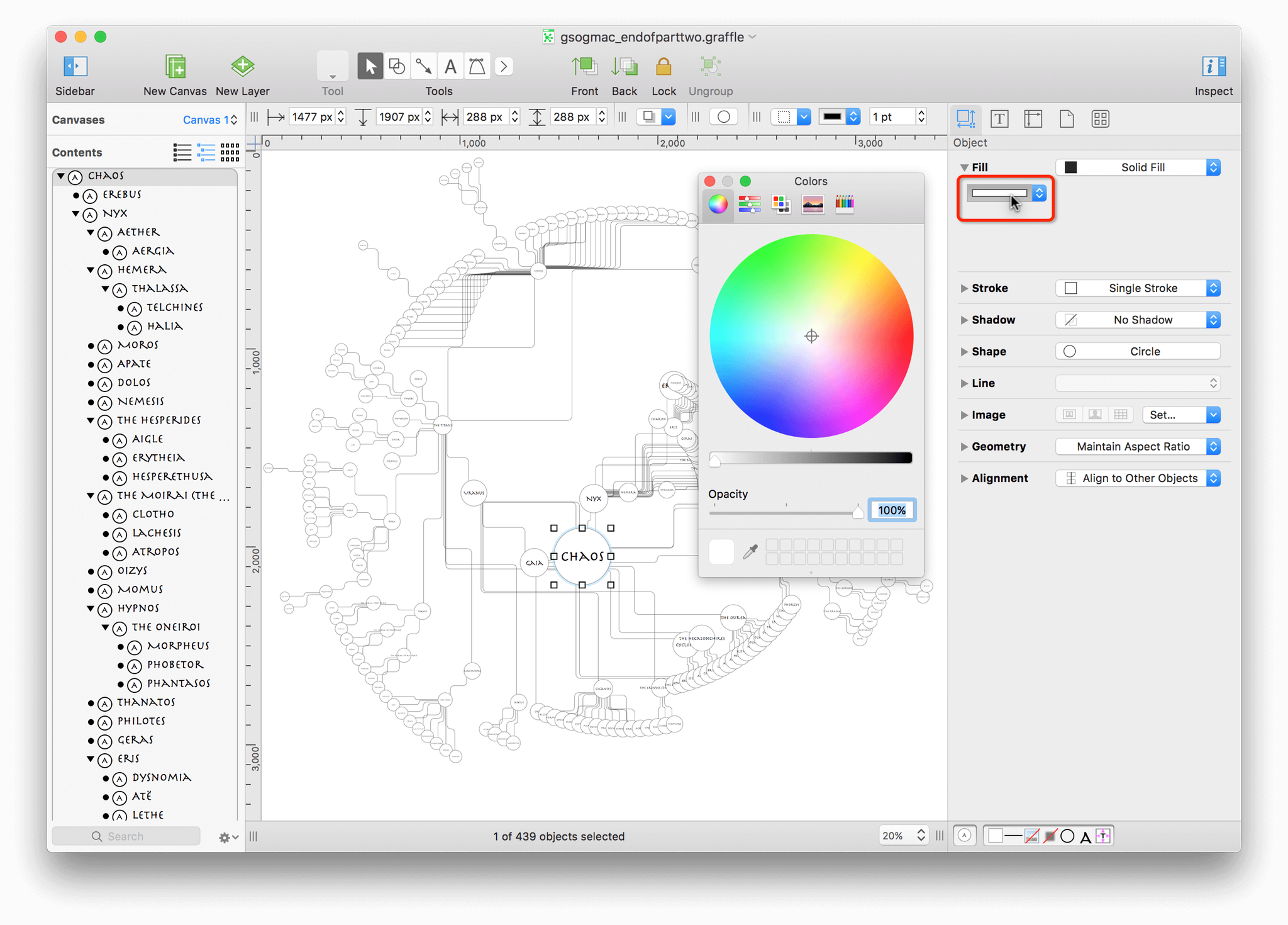
In OmniGraffle, you can access the Colors window, for example, by selecting any object on the canvas, opening the Fill inspector, and clicking on the Fill Color popup.
The Colors window has a bunch of different controls, so let’s take a closer look at those:
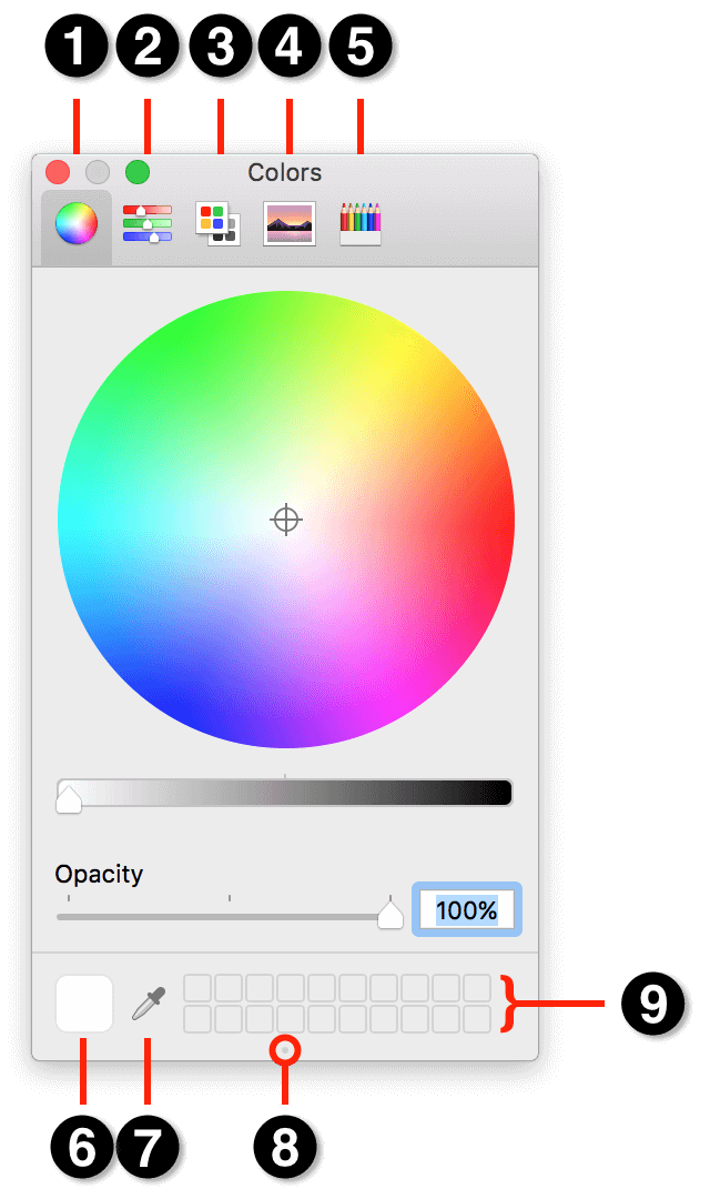
Along the top of the Colors window, you’ll se four different “tabs,” which give you different ways of selecting or mixing colors. Those five tabs include:
- Color Wheel: Click inside the color wheel to choose a color; hold down the mouse button as you move around within the wheel to find a color that you like.
- Color Sliders: The colors window provides access to a variety of color sliders so you can mix colors according to RGB, HSB, CMYK, and Gray Scale Sliders.
- Color Palettes: OS X packs in a few default Color Palettes which you can choose from, including Classic Crayons, Web Safe Colors, Crayons, Developer, and the bland Apple color palette (which is fine for simple colors, but don’t expect pizzaz from that).
- Image Palettes: The Image Palette lets you choose colors from a Spectrum. This is similar to the Color Wheel, where you can click and drag around within the Spectrum to discover colors.
- Pencils: Remember those colored Pencils you used to draw with as a kid (or probably still do as an adult)? Well, here you’ll find 48 colored Pencils to choose from.
At the bottom of the Colors window, you’ll find the following:
Color Swatch: When you mix or choose a color using one of the color selection methods. You can drag these swatches onto objects on the canvas to colorize them, or you can drag a swatch to the Color Well to save that color for later use.
Eyedropper: The often overlooked Eyedropper is one of the most powerful tools you’ll find in the Colors window. Click to select the Eyedropper and then move over anything on your Mac—your desktop, OmniGraffle’s interface, whatever.

After selecting the Eyedropper tool, a “bubble” appears around the mouse pointer with a tiny square in the center. Move the mouse around an object to find a color you like, and then click the mouse button to select that color.
Color Well Grabber: This innocuous little dot is often overlooked because, well, it is so small. However, if you move the mouse pointer over the Color Well Grabber, you’ll notice that the pointer changes to a grabby hand that, when you click and hold the mouse button, changes to a grabby fist. If you drag downward, you can expand the size of the color well at the bottom of the Colors window.

Color Well: Use the Color Well to store your favorite Color Swatches. When you find a color that you want to reuse, or just use for a particular project, click and drag the Color Swatch into the “buckets” in the Color Well.
Warning
Use caution when dragging Color Swatches into the Color Well, particularly if you have a bunch of colors that you really love. Dropping a Color Swatch onto another replaces that color, and this is one of the few places in OS X where Command-Z won’t save your bacon.
And this is the perfect segue into the next section; creating a backup of any Color Swatches you may have saved.
Create a Backup of Your Color Swatches
Whenever you drag a Color Swatch into the Color Well, that color’s value is stored in a preference file tucked away inside your Home folder. That file, NSColorPanelSwatches.plist, resides in the ~/Library/Colors folder, which is a little tricky to get to, but is one you’ll want to back up if you have previously saved Color Swatches in the Colors window.
Note
The reason why you’ll want to create a backup of the NSColorPanelSwatches.plist file is to give you a clean Color Well to work with. Initially, you’ll add the 16 color swatches that come with the Solarized color theme, but then you’ll need to create varying shades of those colors, which means you’ll need as much space as you can get in the Color Well.
To create a backup of your NSColorPanelSwatches.plist file, do the following:
In the Dock, click the Finder icon to open a new Finder window. If you already have a Finder window open, that window will be brought to the front.
Choose Go ▸ Go to Folder (Shift-Command-G), enter ~/Library/Colors in the sheet that appears, and then press OK:

For reference, ~/Library is where OS X stores various application and system preferences for your user account.
If the Colors folder is empty, you may proceed to the next section. However, if the Colors folder contains a file named NSColorPanelSwatches.plist, you can move this aside temporarily by changing the filename to NSColorPanelSwatches_backup.plist.
When OS X loads the Colors window, the system looks in ~/Library/Colors for the NSColorPanelSwatches.plist file and then loads those colors into the bottom of the Colors window.
Note
When you have finished this tutorial, you can repeat this process to create a backup of the NSColorPanelSwatches.plist file (perhaps, renaming it NSColorPanelSwatches_GraffleTutorial.plist) in case you ever want to revisit these colors. Then just rename NSColorPanelSwatches_backup.plist as NSColorPanelSwatches.plist and you’ll get your old batch of Color Swatches back.
Now that you’ve learned all about the Colors window, and, possibly, backed up your NSColorPanelSwatches.plist file, it’s time to get Solarized onto your Mac and into the Color window.
Download the Solarized Color Palette
Follow these steps to download the Solarized color palette to your Mac:
In Safari on your Mac, download the Solarized color scheme. Depending on your system settings, the solarized.zip file should be saved in your Mac’s Downloads folder.
Warning
If you are reading this on an iOS device—do not tap the link in the previous step. You need to install the Solarized color scheme on your Mac, so switch over to your Mac, and then click the link in iBooks or on Omni’s Support site, wherever you might be.Open a Finder window and press Option-Command-L to go to the Downloads folder:

Inside, you will discover that OS X has already unpacked the zip file; locate the solarized folder and look within. The Solarized package includes folders for a number of different applications; the folder you are most interested in, however, is named apple-colorpalette-solarized.
Switch back to OmniGraffle, and open the Colors window.
Click the Color Palettes tab in the Colors window:

Next to the popup menu at the top of the window, click the Gear menu, and then choose Open from the menu that appears:

In the selection window that appears, navigate to Downloads ▸ solarized ▸ apple-colorpalette-solarized.

Select the Solarized.clr file and then click Open; the Solarized color theme gets added as one of the available Color Palettes:

Click and drag each of the Solarized colors into the Color Well at the bottom of the window:

With the Solarized colors in place, you’re ready to start applying colors to the diagram.
Applying the Color Palette to the Diagram
Before you start coloring the diagram, however, create a new Workspace for the inspectors you’ll need for this task, which are: Fill, Stroke, and Shadow from the Object inspectors, and Font from the Type inspectors:
Choose Inspectors ▸ Edit Workspaces and name this workspace Circles.
Now you’re ready to give Chaos some style!
In the Outline Editor
 , click to select Chaos.
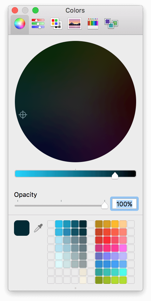
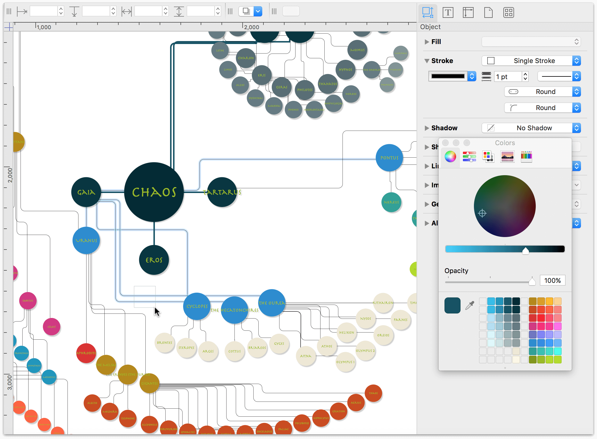
In the Fill inspector, click the Fill Color popup; this opens the Colors window:

In the Colors window; click the darkest color from the Solarized theme to set Chaos’ fill color:

In the Stroke inspector, set the Stroke Type to No Stroke.
In the Shadow inspector:
- Set the Shadow Casting Style to Shadow Immediately Below
- Set the Shadow Fuzziness to 5 pt
- Set the Horizontal offset and Vertical offset to 5 px

The black text on the dark circle doesn’t contrast well enough and makes the label difficult to read. So, click the Text color popup in the Font inspector and choose the Green color tile in the Colors window.

There, that’s better! But…that green is still a little too dark, so let’s lighten that up a little bit.
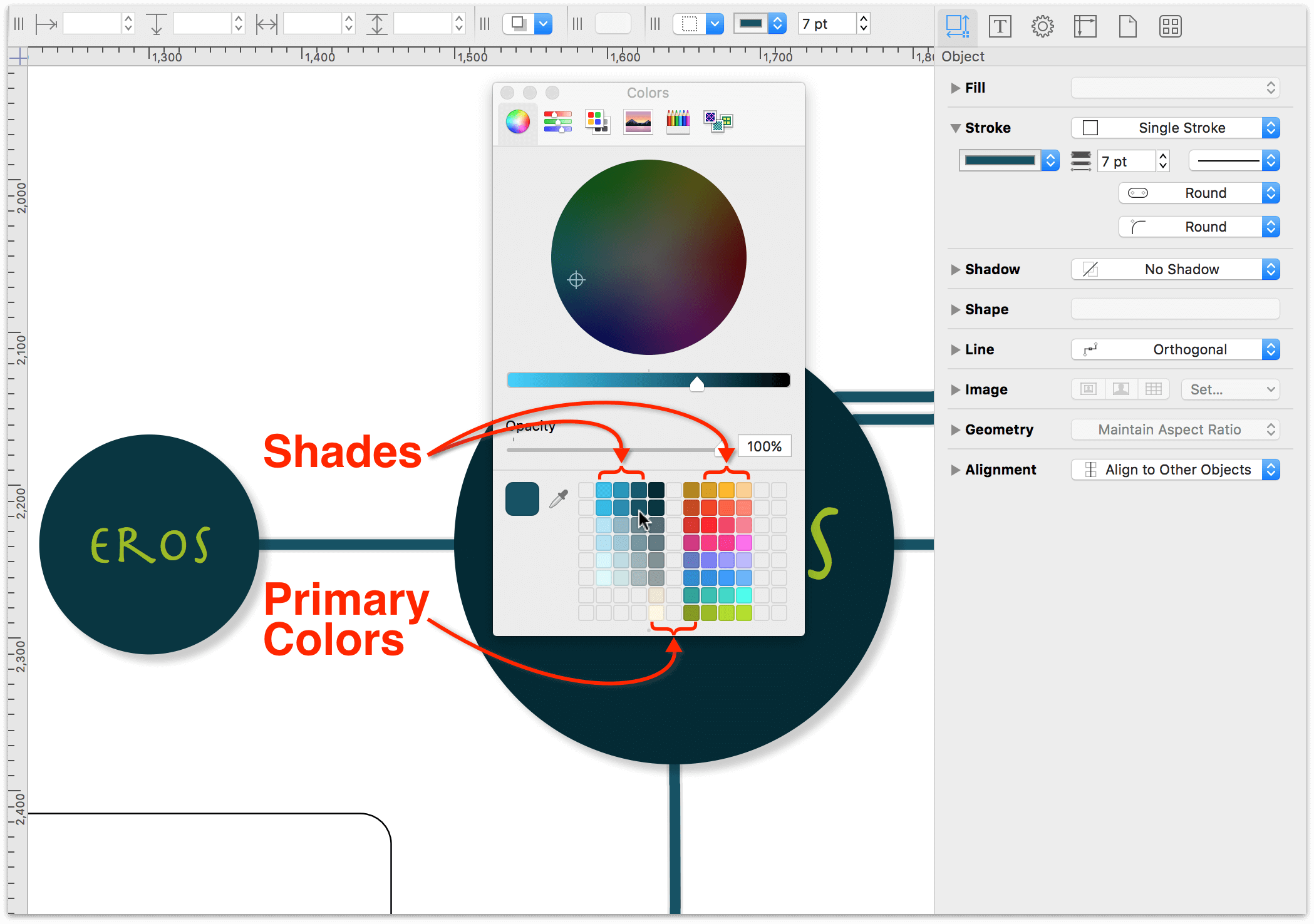
At the top of the Colors window, click the Color sliders, and then click the popup menu and select HSB Sliders. Click the Green color from the Solarized theme, increase the Brightness from 54% to 74%, and then drag the Color Swatch to the Color Well.

There; that’s a lot better! The lighter shade of green helps the text label stand out against the darkness of Chaos, er, the circle’s fill.
One last change to make while you have Chaos selected is to choose Arrange ▸ Bring to Front (Shift-Command-F). This brings Chaos to the front, placing all of the connecting lines in the background.

Using the Selection Matrix (Again) to Expedite Repetitive Style Choices
While working through the previous steps, you may have noticed that there are a couple that you could quickly apply to all of the objects in the diagram:
- Removing each circle’s stroke
- Adding the drop shadow to each circle
- Changing the font color to that lighter shade of green
Once again, here’s another moment where the Selection Matrix ![]() can really save the day.
can really save the day.
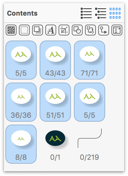
In the Selection Matrix, select all of the circle objects that currently have a white fill:

Use the Circles workspace that you created and apply the following style changes to the selected objects:
- In the Stroke inspector, set the Stroke Type to No Stroke.
- In the Shadow inspector:
- Set the Shadow Casting Style popup to Shadow Immediately Below.
- Set the Shadow fuzziness to 5 pt.
- Set the Horizontal offset and Vertical offset to 5 px each.
- In the Font inspector, set the Font color to the lighter green shade that you created for Chaos.
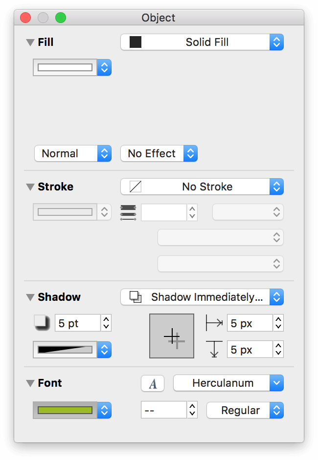
When you have finished making those changes, this is how the inspectors in the Circles workspace should appear:
And this is how the circle objects should appear in the Selection Matrix:
Next up: Coloring those circles!
Applying Fill Colors to the Remaining Circle Objects
The final phase of styling the circle objects involves your old friend, the Outline Editor, and a combination of the Fill inspector and the Colors window that pops open when you click the Fill Color popup. Use Table 5 as your guide and apply the fill colors.
| Characters to Select | Fill Color to Apply |
|---|---|
| Erebus, Nyx, Gaia, Tartarus, and Eos |  (Midnight) |
|
Under Nyx: |
 (Dark Gray) |
|
Under Nyx: |
 (Mid-Gray) |
|
Under Nyx: |
 (Blue Gray) |
| Reserved for use in Part 3 |  (Light Blue Gray) |
|
Under Cyclopes:
Under The Hecatonchires:
Under The Ourea: |
 (Sand) |
| Reserved for use in Part 3 |  (Cream) |
|
Under Uranus: |
 (Bronze) |
|
Under Gigantes:
Under The Erinyes: |
 (Ochre) |
Under Uranus: |
 (Brick) |
|
Under The Titans: |
 (Magenta) |
|
Under Tethys: |
 (Lavender) |
|
Under Gaia: |
 (Sea Blue) |
|
Under Pontus: |
 (Sea Foam) |
|
Under Ceto: |
 (Mossy Green) |
After applying these colors, you’ll notice that two (Light Blue Gray, and Cream) are reserved for use in Part 3. And, you’re going to need some additional shades of colors for the offspring of the Titans and Ceto. Using the same method for brightening the color of the text labels, use the HSB Sliders in the Colors window to create varying lighter shades for the Solarized color scheme.
As you create the varying shades, don’t forget to add them to the Color Well at the bottom of the Colors window. You might also want to take some time to rearrange the color tiles so the lighter shades are “offshoots” of the original Solarized colors.
Note
If you want to save yourself some time, you can download a copy of the NSColorPanelSwatches.plist file that contains all of the shades shown in the previous image. After downloading the file, save it in ~/Library/Colors on your Mac. You may need to quit and then start OmniGraffle again.
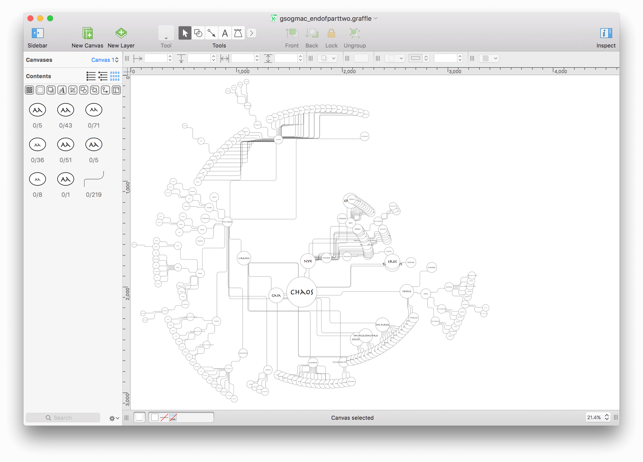
After applying the shades to the various siblings, your diagram of Greek Mythology should look similar to the following:
Next up: Giving all of the objects some space!
Giving Everyone Some Space
As you may have noticed, many of the objects in the diagram overlap or are fairly close to each other. What’s more, the objects in the diagram are spread out as far as the Diagram Layout inspector allows:
While Auto layout has served you well up to this point, it’s time to disable that and make some manual layout changes. To turn off Auto layout, do the following:
Choose Inspectors ▸ Canvas
Option-click on the disclosure triangle next to the Diagram Layout inspector; this collapses the other Canvas inspectors while opening the Diagram Layout inspector.
Turn off Auto layout by clicking its checkbox:

With your new-found freedom, it’s time to give some the objects a little more breathing room so the names are discernable and not hidden behind a brother or sister (or Aunt or Uncle).
Design Decisions, Revisited
The Radial layout has been the one constant design element in the diagram, so it would be great to keep with that theme. As you can imagine, though, adjusting the positioning of 219 objects is going to take a little bit of time.
And, to stick with the Radial layout, you’ll have to get even more creative with OmniGraffle. But hey, that’s what this tutorial is here for, right? To not just show you the basics of OmniGraffle, but to learn new ways of doing things while discovering little design tricks.
Creating Pseudo-Guides with Shapes and Layers
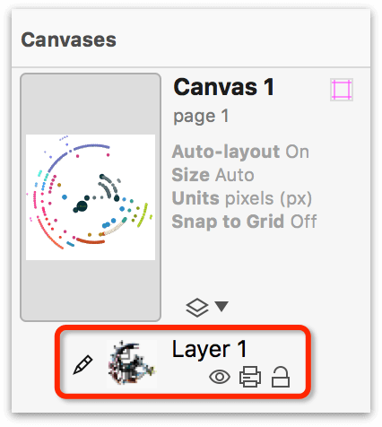
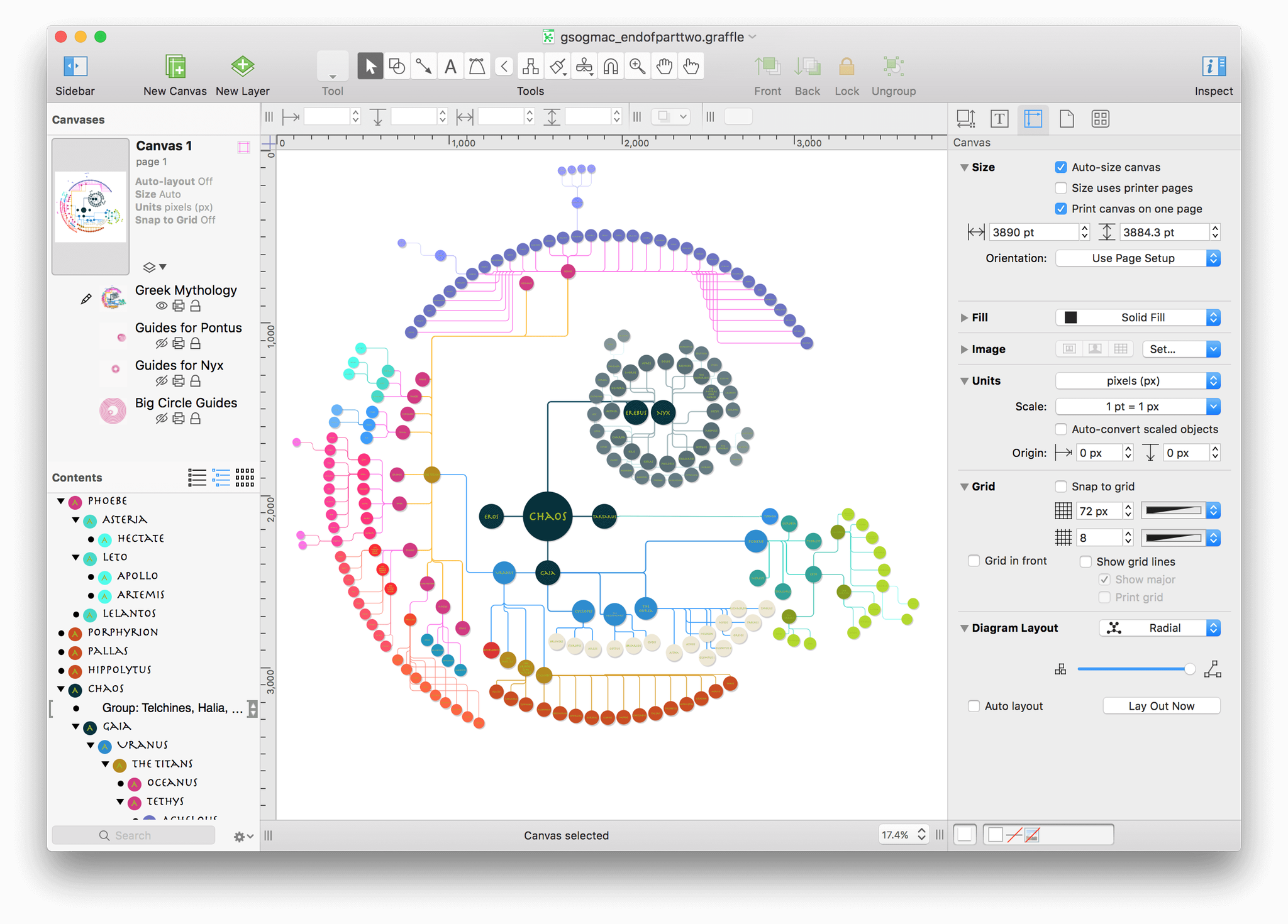
The whole time you’ve been working on this tutorial, you have been working on a single layer on the canvas. If you look in the Canvases section of the sidebar, next to the preview of the canvas, you will see the following:
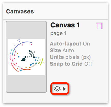
Just to the right of the canvas preview is the Layer List. Click the closed disclosure triangle (▾) to expose the Layer Controls:
To get familiar with the Layer Controls, do the following:
Click the layer name, Layer 1 to select the Layer Preview:

Notice that the Layer Preview gets a little box around it. When you have more than one layer on a canvas, this helps to let you know which is the active layer.
Click the layer name again to make the field editable. Change the name of the layer to Greek Mythology, pressing Return to accept the name.

Underneath the layer name are three additional buttons:
 : The button that looks like an eyeball denotes Layer Visibility. If the eyeball has a slash through it,
  , this means that the layer is still there, it’s just hidden from view.
 : This button indicates whether that layer is printable. If the Layer Print button has a slash through it (
 ), that layer won’t be printed, even if it is visible.
 : The button that looks like an open padlock indicates that the layer is editable; meaning, you can add objects to that layer, move things around, and so on. If the layer is locked, indicated by a closed padlock (
 ), you cannot interact with that layer.
You are going to use these buttons quite a bit in this section. In fact, you’re going to use them so much that you’ll become best friends with them. As proof, click the open padlock for the Greek Mythology layer to lock it in place.
Notice, too, that the little Pencil icon (![]() ) to the left of the Layer Preview is now slashed through (
) to the left of the Layer Preview is now slashed through (![]() ). This means that, while the layer is locked, you cannot draw on that layer. Perfect!
). This means that, while the layer is locked, you cannot draw on that layer. Perfect!
Adding Layers and Pseudo-Guides
With your new-found friends, and the diagram locked in place, it’s time to get back to work. Start by clicking the New Layer button (![]() ) in OmniGraffle’s toolbar. Name this layer Big Circle Guides and press Return.
) in OmniGraffle’s toolbar. Name this layer Big Circle Guides and press Return.
Now to add your first pseudo-guide to this layer:
In the toolbar, click the Shape tool
 .
.In the Shape inspector, click the Shape Selection button (this probably says Rectangle right now) to open the shape menu:
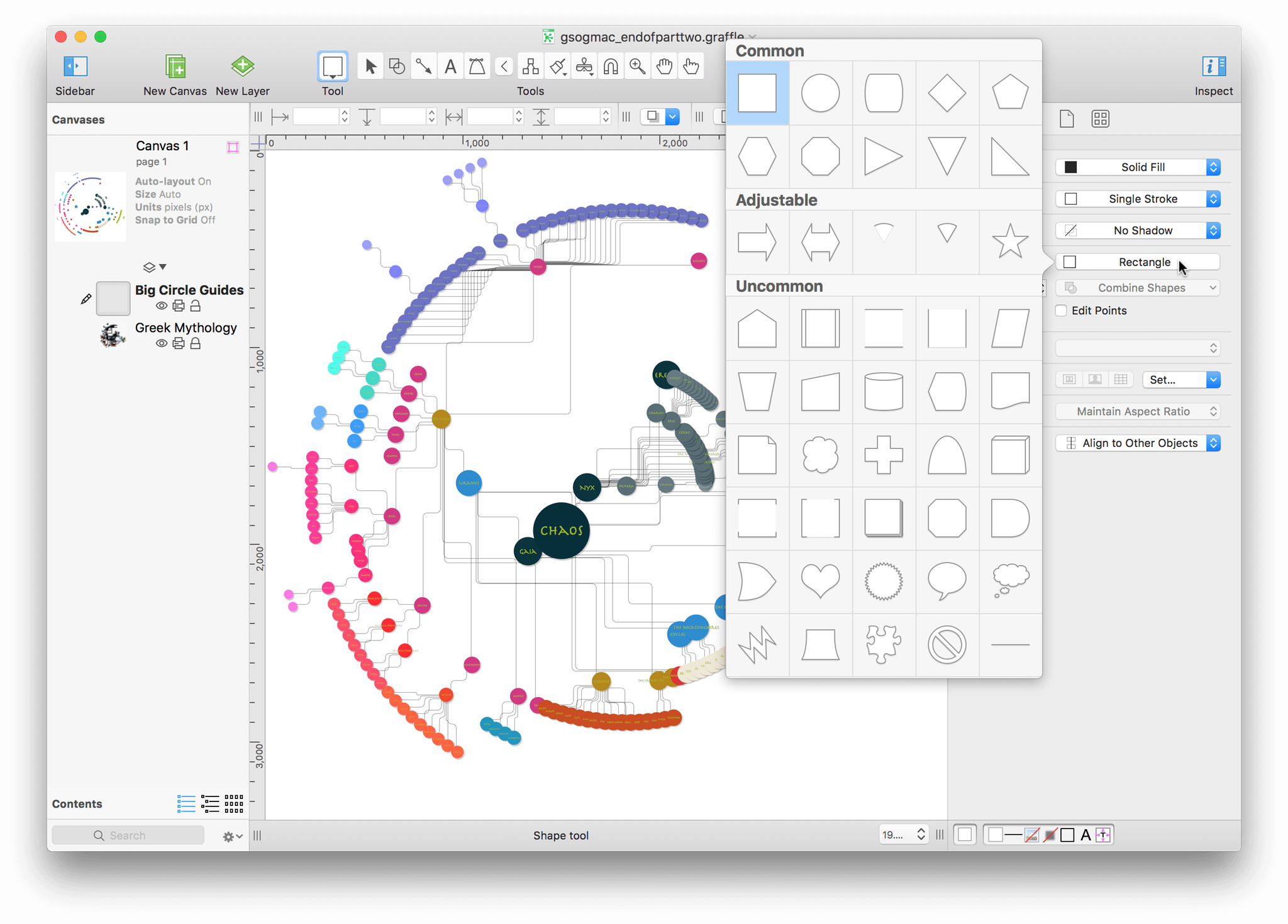
The Shape menu lets you choose from various predefined shapes to draw with. In the top row, double-click the Circle shape.
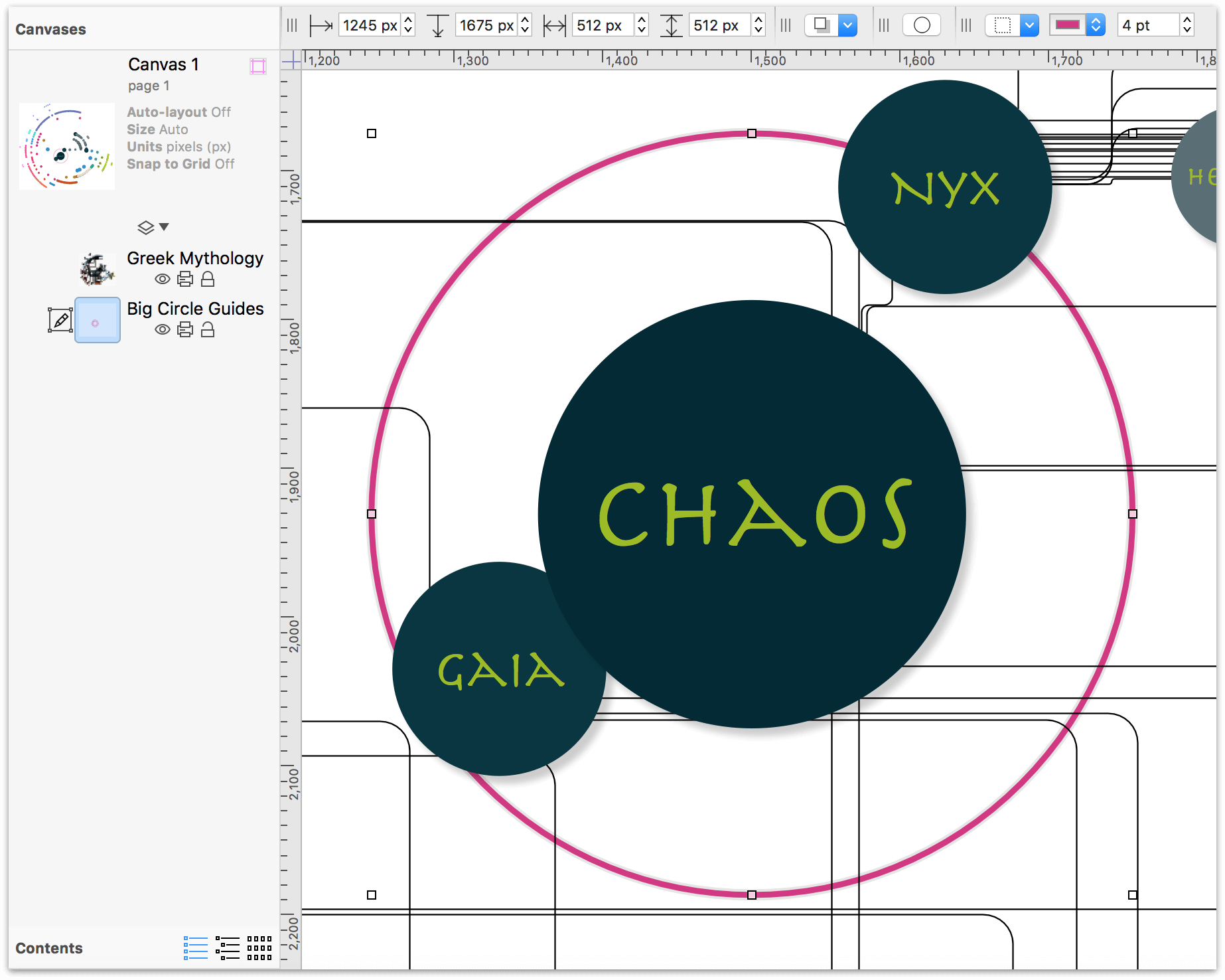
Click anywhere on the canvas (remember, you’re actually drawing on the Big Circle Guides layer), hold down the Shift key, and then drag to draw a circle that is 288 px × 288 px:
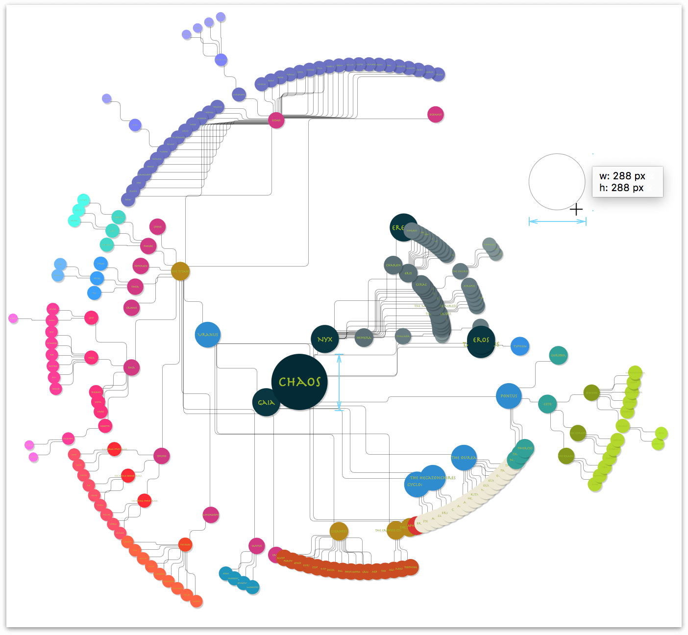
As you drag out the circle’s shape, you’ll see light blue guides along its side, along with other circles on the Greek Mythology layer beneath. As you can see in the previous image, this and Chaos’ circle share the same dimensions.
Click and drag the white circle so that it overlaps Chaos’ circle on the layer below. When you have the objects perfectly aligned, OmniGraffle places a set of light blue cross hairs inside the white circle, as shown here:

Tip
You may need to zoom in on the canvas to exactly align the circles. Use the Zoom tool ( ) in the toolbar to zoom in on a selection of the canvas.

Alternatively, you can use the keyboard shortcuts Shift-Command-> or Shift-Command-<, to zoom in or out, respectively.
With the white circle in place, it’s time to change some of its style properties. Using the inspectors, do the following:
- Set the Fill to No Fill
- Set the Stroke width to 4 pt
- Change the Stroke color from Black to the Magenta color from the Solarized color palette
When you have finished, this is how the circular pseudo-guide appears when overlaid on top of Chaos’ circle:

In the Geometry inspector, do the following:
- Click the popup menu at the top of the inspector and change this setting to Maintain Aspect Ratio. As you may recall from earlier, this makes it easier to resize objects, since you only have to enter either the height or width property.
- Change the size of the pseudo-guide from 288 px × 288 px to 512 px × 512 px.
After resizing the pseudo-guide, it’s slightly askew; realign it over Chaos:

Next, you want to reposition the Big Circle Guides layer so it is beneath the diagram’s layer. In the sidebar, click and drag the Big Circle Guides layer down so it lies beneath the diagram:

When you let go of the mouse button, this is how the layers should appear in the sidebar. Notice how the pseudo-guide is placed behind the diagram’s objects.
Finally, lock the Big Circle Guides layer, unlock the Greek Mythology layer, and then click to select the diagram’s layer.

With the first pseudo-guide in place, you can now start the process of adjusting the positioning of objects in the diagram:
- Position Gaia, Tartarus, and Eros so their edges align with the left, right, and bottom edges of the pseudo-guide, respectively.
- Move Nyx up and to the right, alongside her partner, Erebus.
Your diagram should appear as follows:
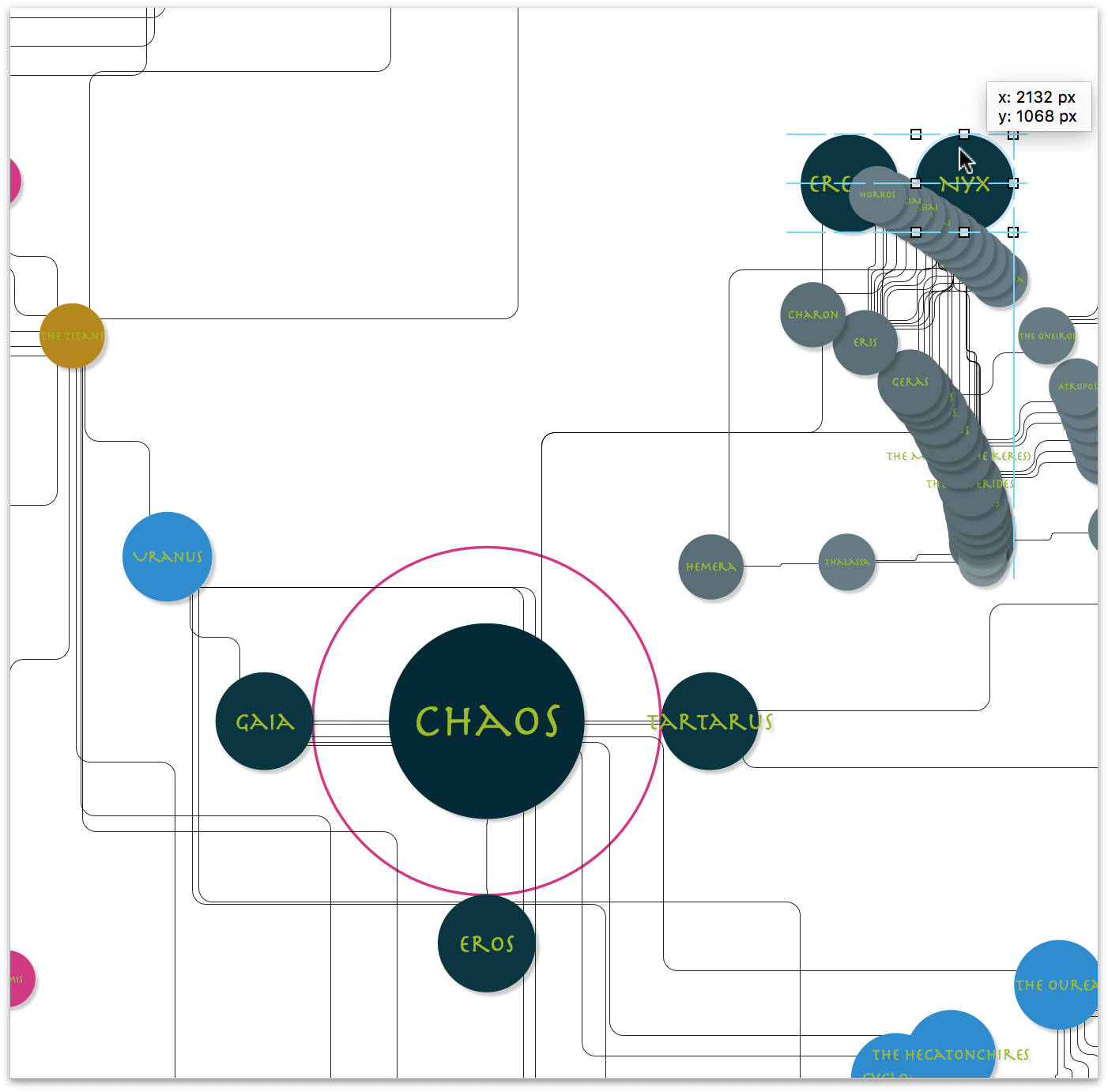
This keeps the primordial gods (Gaia, Tartarus, Eros, Erebus, and Nyx) in close proximity to each other. And since Erebus and Nyx pair up to create the more atmospheric Gods, placing them next to each other makes sense. Of course, that means you’ll need to reposition their children, grandchildren, and great-grandchildren, which means creating more guides, but you’ll get to that soon enough.
Adding More Pseudo-Guides to the Big Circle Guides Layer
Now that you have created one circle guide, it’s relatively easy for you to copy, paste, and resize that guide to facilitate laying out the objects on the outer rim.
Do the following:
In the sidebar, lock the diagram layer and unlock the Big Circle Guides layer.
Click to select the Big Circle Guides layer:

Click to select the pseudo-guide that’s around Chaos, press Command-C to copy that circle, and then press Command-V to paste it onto that layer:

Click and drag one of that object’s handles to create a much larger circle, and reposition it beneath one of the outer rims in the diagram:

Since all of the objects in the rings of the diagram are on a similar arc as the big pseudo-guide that you just created, it’s time for a little OmniGraffle Trickery™:
- Select the big pseudo-guide you just positioned
- Copy (Command-C) and Paste (Command-V) that circle. You’ll notice that the pasted copy is a little off-center from its predecessor.
- Click and position the circle so that it aligns on top of the previous guide:

- Now for the trickery part: Option-click and drag one of that circle’s resizing handles. The addition of the Option key forces the circle to resize based on its centerpoint and not anchored on the opposing handle. Keep dragging and align this circle underneath the next outer ring in the diagram.

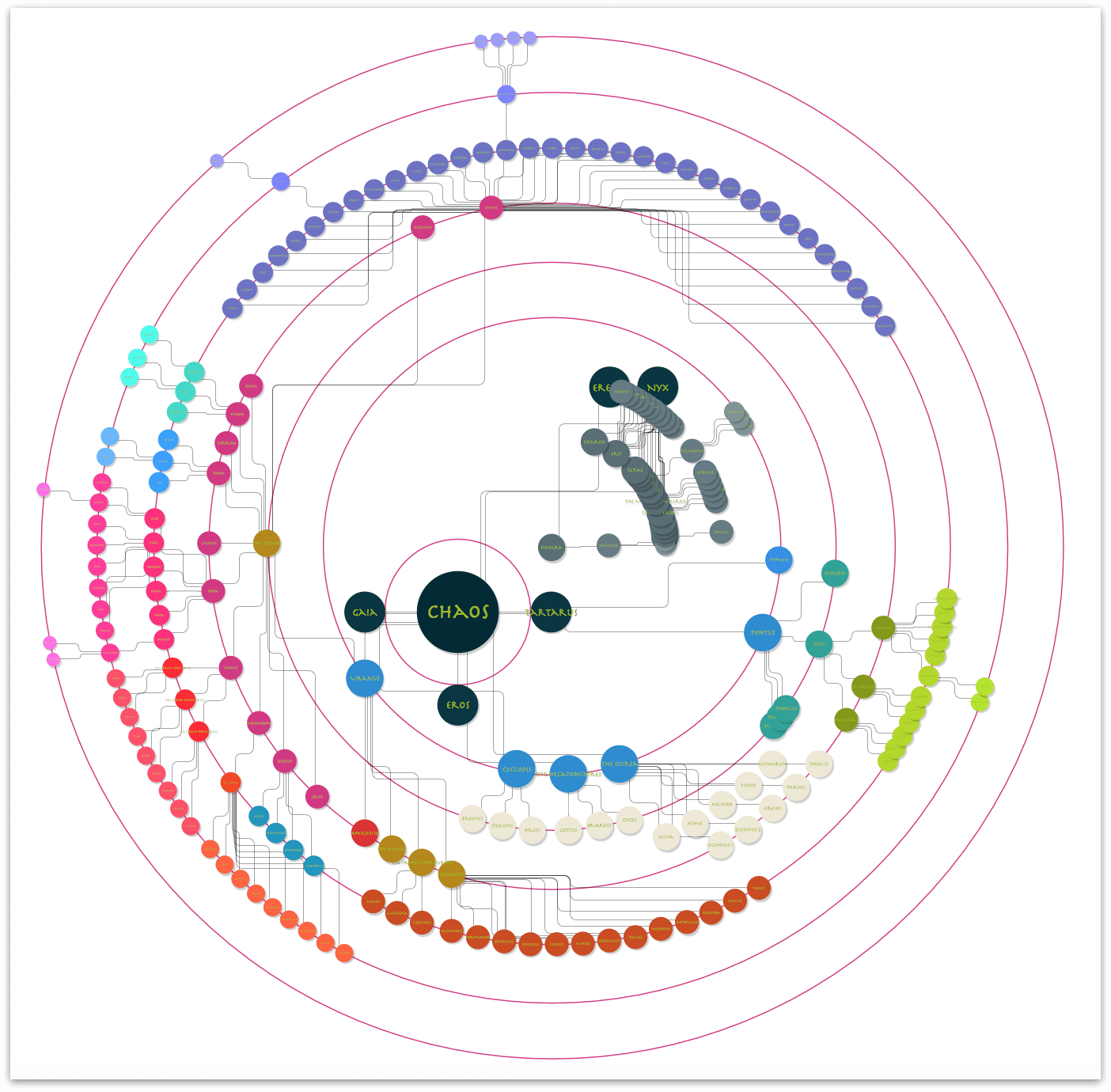
Now repeat the previous step, and create four more circles (one even bigger than the last, and three to fit the arcs of the inner rings of the diagram). Line up these pseudo-guides as follows:

Note
After you resize and place the largest diameter pseudo-guide, you may want to reposition the objects on both layers so things don’t extend off the top of the canvas.
To do this, unlock both layers, choose Edit ▸ Select All (Command-A)—this selects all objects on both canvases—and then click and drag the diagram and the pseudo-guides down until they fully fit on the canvas.
After repositioning everything, press Esc to deselect the objects.
With the pseudo-guides on the Big Circle Guides layer set in place, go ahead and lock that layer, and then unlock the diagram’s layer. And, finally, click the Layer Preview for the diagram’s layer to select that layer:

Now that the pseudo-guides are in place for the concentric rings of the diagram, you will need to manually align the objects along their respective arcs. The exceptions to this, however, are the children of Erebus and Nyx, and those of Pontus. For those, you’ll need to create two more sets of pseudo-guides, as covered in the following sections.
After you have relocated the objects along the arcs, your diagram should look similar to the following:
Tip
Be sure to occasionally save your OmniGraffle file. This helps preserve your progress, and helps protect you in case of an app or system crash.
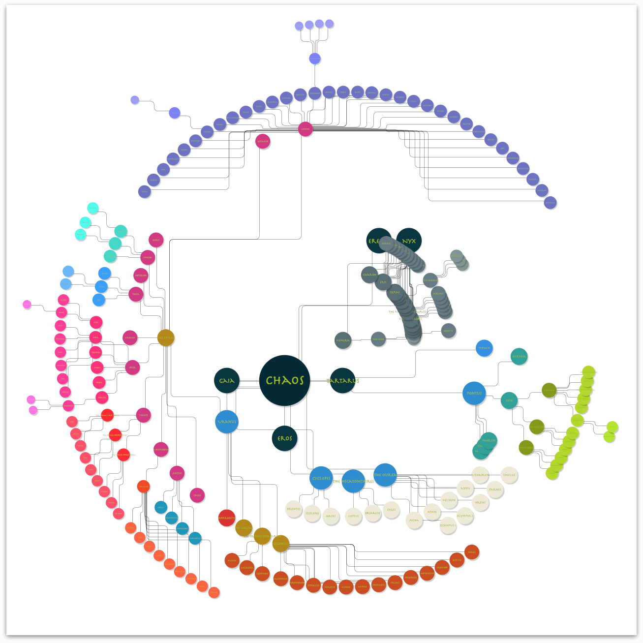
And here’s how the diagram appears when you turn off the visibility on the Big Circle Guides layer:
Creating the Pseudo-Guides for Nyx and Pontus
Hey, you’re almost at the end of the tutorial. The next task involves creating two more sets of pseudo-guides; this time for the children of Erebus and Nyx, and for the children of Pontus.
Let’s start with the pseudo-guides for Erebus and Nyx:
In the sidebar, unlock and then turn on the visibility for the Big Circle Guides layer.
Make sure that the Greek Mythology layer (the one containing the diagram) is locked.
Click
 in the Toolbar to add another layer to the project.
Change the title of this layer from Layer 2 to Guides for Nyx.
Move the Guides for Nyx layer beneath the diagram’s layer:

Select the Big Circle Guides layer by clicking its Layer Preview in the sidebar; this is now the active layer.
Select the pseudo-guide that surrounds Chaos, and press Command-C to copy this circle to the pasteboard.

Note
If you go to click on the circle around Chaos and one of the other pseudo-guides gets selected, choose Arrange ▸ Send to Back (Shift-Command-B) to move that pseudo-guide backward in the object stack on the layer. You may need to do this two or three times before you are able to finally select the circle that surrounds Chaos.Lock and then hide the Big Circle Guides layer.
Click the Layer Preview for the Guides for Nyx layer to make it active.
Press Command-V to paste the pseudo-guide that you copied from the Big Circle Guides layer onto the Guides for Nyx layer. When you paste the pseudo-guide, you’ll notice that it appears around Chaos. However, if you look in the sidebar, you will see that the pseudo-guide is indeed on the Guides for Nyx layer.

Move the pseudo-guide so that it is centered on Nyx in the diagram:

Notice that the pseudo-guide is a little close to Erebus. Let’s make that pseudo-guide a little larger, but still centered on Nyx.
Hold down the Option key, and then click and drag one of the pseudo-guide’s control handles to make the circle 600 × 600 px:

Following the methods from the previous section, create two additional pseudo-guides, one that is 800 × 800 px, and another that is 1000 × 1000 px—both centered on the circle that is centered on Nyx.

Lock the Guides for Nyx layer, and then unlock the Greek Mythology layer so you can reposition the children of Erebus and Nyx along the pseudo-guides.
When you have finished, your diagram should look similar to the following:

In the sidebar, click
 , and then scroll up to the top of the list.
Click to select Erebus, scroll down in the list until you find Charon (Charon should appear in the outline before Gaia). Hold down the Shift key, and then click Charon. This selects Erebus, Nyx, and all of their children.
Choose Arrange ▸ Group (Shift-Command-G). This arranges Erebus, Nyx, and their children into a group so you can later reposition these objects within the arcs of the diagram.

Lock the Greek Mythology layer, and then unlock the Guides for Nyx layer.

Next, Control-click" on the Guides for Nyx** layer and choose Duplicate Layer from the menu that appears. Rename this layer Guides for Pontus.

Lock and hide the Guides for Nyx layer to keep those in place; the next thing you’ll do is move and align the Guides for Pontus.

Click to select the Guides for Pontus layer, press Command-A to select all of the pseudo-guides on that layer, and then drag them downward and reposition them around Pontus, as follows:

You’ll notice that there are four levels of children under Pontus, but only three pseudo-guides so far. Click to select the smallest of the three circles, Copy and Paste it onto the layer.
Click and drag on one of the circle’s handles and resize it to 400 × 400 px, then align it with the other pseudo-guides on that layer.

Lock the Guides for Pontus layer, and then unlock the Greek Mythology layer; realign Pontus’s children along the pseudo-guides. And, since Typhon and Echidna are the proud parents of some of the more monstrous members in Greek Mythology, place Typhon on the same pseudo-guide next to Echidna.

As with the Erebus, Nyx, and their children, select Pontus, his offspring, and Typhon, and then choose Align ▸ Group (Shift-Command-G):

Unlock the Guides for Pontus layer, then click to the upper-right of the outer pseudo-guide, then drag inward until all four circles and the group you just created are selected:

Command-click and then drag on the upper-right handle of the selection downward to rotate the selection 30 degrees.

When you press the Command key and move the mouse over the handle, the pointer changes to a curved arrow to indicate that clicking and dragging that handle enables you to rotate the selection—which is exactly what you want to do! The only downside is that the labels on all of the objects are also rotated 30 degrees, so let’s fix that.
After rotating the objects on both layers, press Esc to deselect everything.
Click the Greek Mythology layer in the sidebar, and then click to select the group that contains Pontus’s children and Typhon.
Choose Align ▸ Ungroup (Shift-Command-U); this ungroups the objects that were grouped together, but leaves those objects selected.
While the objects are still selected, go to the Geometry inspector, and change the object rotation from 30 degrees to 0 degrees. Instead of rotating the objects as a group back to their former positions, the individual objects are rotated on their center points, which…wait for it…realigns the text labels in the circles!


Finally, choose Align ▸ Group (Shift-Command-G) to group those objects back together again. This makes it easier for you to reposition this group of objects later when you are putting the finishing touches on your diagram.
Now that you have all of the objects properly spaced so they don’t overlap each other, you can lock and hide all of the Guide layers since you won’t be using those again.
Choose View ▸ Zoom ▸ Fit in Window and gaze upon your masterpiece!

Note
For fun, go back in time and look at how that diagram appeared before you created all of the pseudo-guides and realigned all of the objects. That’s one heck of a difference!
Keep this little trick in mind whenever you are creating your next diagram. Don’t just limit yourself to the straight horizontal and vertical guides that you get with OmniGraffle. Use the shapes that come with OmniGraffle; you can even draw complex Bezier shapes on which you can align objects.
Using Variable Line Widths, Colors, and Styles to Convey Relationships
The lines in the diagram don’t just connect the objects to one another; they convey relationships. And sure, you could leave all of the connecting lines as single-point black, but with all of the interconnecting and overlapping lines in this diagram—and that awesome color palette you built out based on the Solarized color scheme—why stop now?
As mentioned earlier, there are eight levels of hierarchy in the diagram. This means there is a maximum of seven different line sets that reach from Chaos at the center, to the few great-great-great-grandchildren way out on the outer rim.
If you look at the Selection Matrix in the sidebar, you’ll see that most of the lines are in one massive group, while the two groups (Erebus and Nyx, and the Pontus family) contain their own lines:
And unlike object selection, you cannot lean on the Outline Editor to select the lines that you need. Instead, you will need to zoom in on the canvas and then use a combination of drag-selecting or Command-clicking lines in the diagram.
Using a combination of the Stroke inspector and drag-selecting (or Command-clicking) the connecting lines, apply the shades of the Solarized color scheme to the lines.
As you work your way out from the center point (Chaos), start by applying a 7 pt width to the lines from Chaos to Erebus, Nyx, Gaia, Tartarus, and Eros. For the Stroke color, apply the first step of a lesser shade based on the primary color used to style those objects; for example:
Continue styling the connecting lines using the Stroke inspector, until you end up with something like the following:
Viewing and Using Magnets to Define Where Lines Connect to Objects
To get the connecting lines to line up just right, you may need to select some of the circle objects and change the locations of their Magnets. An object’s Magnets determine where connecting lines connect. To view the locations of the objects in the diagram, choose View ▸ Magnets.
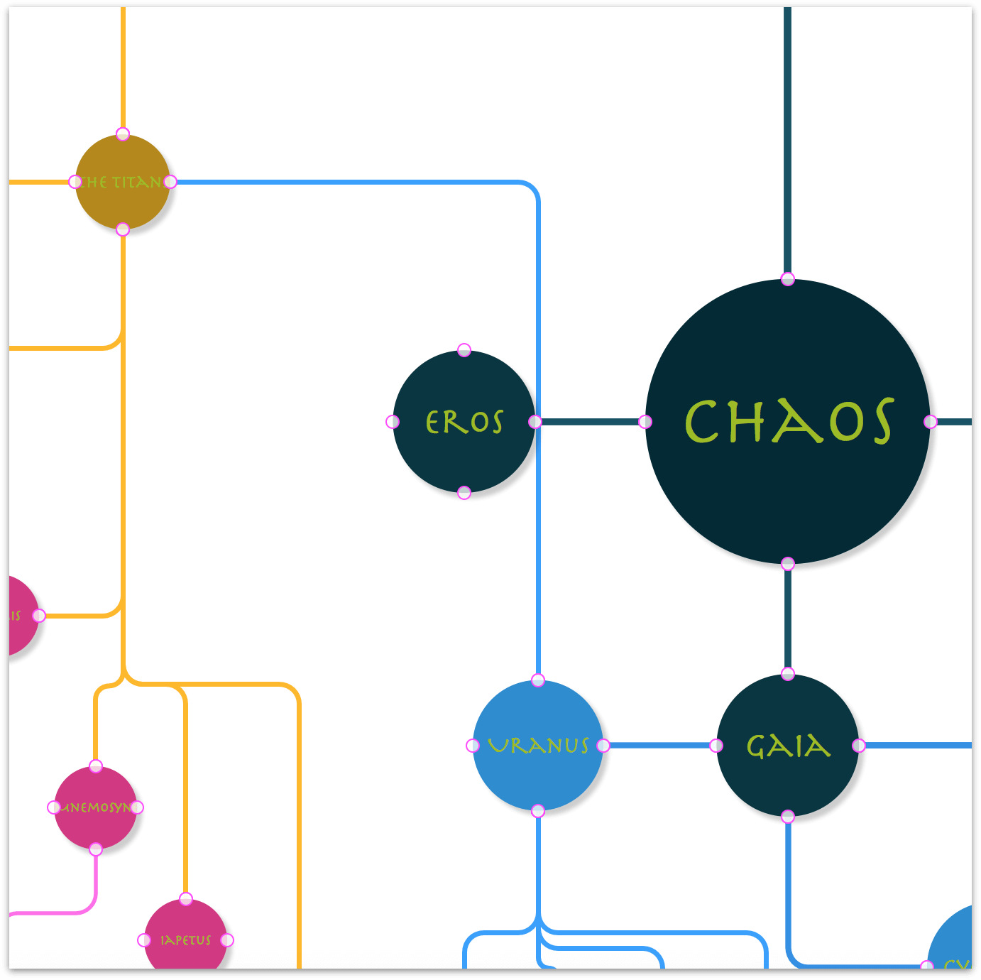
An object’s Magnets appear as bright pink circles along the object’s edge:
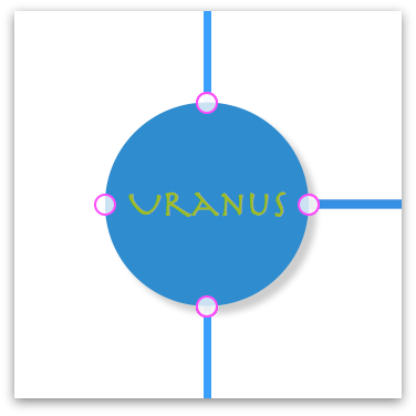
When you select a connecting line between two objects, you’ll see that one end of the line has a red diamond, and the other end of the connecting line has a green diamond. A red diamond indicates the starting point of the line, while the green diamond indicates the end of that line.
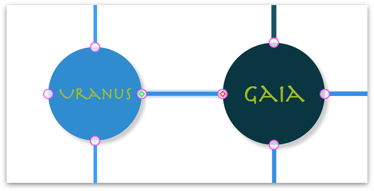
To move a connecting line from one Magnet to another, click the end of the line that you want to relocate, and then drag the line within the bounds of the object to the other Magnet.
When you have finished adjusting line positions, be sure to hide the Magnets again, by choosing View ▸ Magnets.
Wrapping Up Part 2
Congratulations! You’ve reached the end of the design and layout phase of the tutorial. Before proceeding, go ahead and lock the Greek Mythology layer that contains the diagram, and then save your OmniGraffle file.
This concludes Part 2 of the tutorial. Let’s recap the things you have learned to do so far:
- In Part 1, you…
- …used the Resource Browser and chose a template to create a new OmniGraffle document
- …made adjustments in the Units inspector
- …learned how to use the Outline Editor, including its various shortcuts to make entering hierarchical information go much faster
- …how to import an OmniOutliner document in OmniGraffle to create an entirely new diagram.
And if that wasn’t enough, in Part 2, you…
- …learned about the Diagram Layout inspector to discover new ways to layout your diagrams
- …discovered a handy keyboard shortcut for viewing the entire canvas (you do remember what this is, right?)
- …unlocked the magic within the Selection Matrix
- …used the Line inspector to adjust the curves of Orthogonal lines
- …learned a bit about the importance and use of Scale, not just for objects, but for type as well, to express hierarchies of importance
- …defined—and applied—a scale for the objects and type
- …discovered what it means to set the Maintain Aspect Ratio setting in the Geometry inspector, and how that speeds up object resizing
- …created not just one, but two, custom Workspaces for the inspectors you needed for styling the diagram
- …created a color palette based on the Solarized color scheme
- …expanded the base colors in the Solarized color scheme and applied varying shades to children, grandchildren, and great-grandchildren of the Titans
- …added Layers to the project and created a bunch of circular pseudo-guides to use for repositioning the objects
- …and, finally, you learned how to view and use an object’s Magnets.
That’s a heck of a lot of work. Rest assured, Part 3 just puts the finishing touches on the diagram, so your work here is mostly done.