Using the Inspectors
The Inspectors reside in a floating window which you can open by clicking the Inspect icon  at the right edge of the toolbar. Other ways you can open the Inspector are by choosing Window ▸ Show/Hide Inspectors, or by using the Shift-Command-I keyboard shortcut.
To switch between the Inspectors, just click on one of the icons in the Inspector’s toolbar along the top. If you’re not sure which button opens which inspector, hover over the button with your mouse, and the name of that inspector appears in italics at the top of the Inspector.
Inspector Behaviors
Before diving in to explore what’s possible with each inspector, it’s worth taking a quick look at a couple (possibly unknown) features that we’ve built in.
If you have the Inspector window open while you’re working in a multicolumn Outline, you’ll notice that the inspector automatically switches over to the Column inspector whenever you select a column heading. This makes it easy for you to set or change the column Type and its Summary behavior.
As you’re working in OmniOutliner, you’ll notice that whenever you are entering text in a row or column cell that the Style inspector is always available in the inspector window. However, if you want a particular inspector to show up as you’re moving along, you can double-click on the inspector icon in the Inspector window’s toolbar. This places a tiny green lock on the inspector so that it’s always available. To unlock the inspector, just double-click it again.
This comes in particularly handy when you want to examine the styles in your outline. Just place the lock on the Style Attributes inspector, and click around in your document to examine and tweak the styles as needed.
Style Inspector 
Use the Style inspector when you want to change the appearance of the rows in your document.
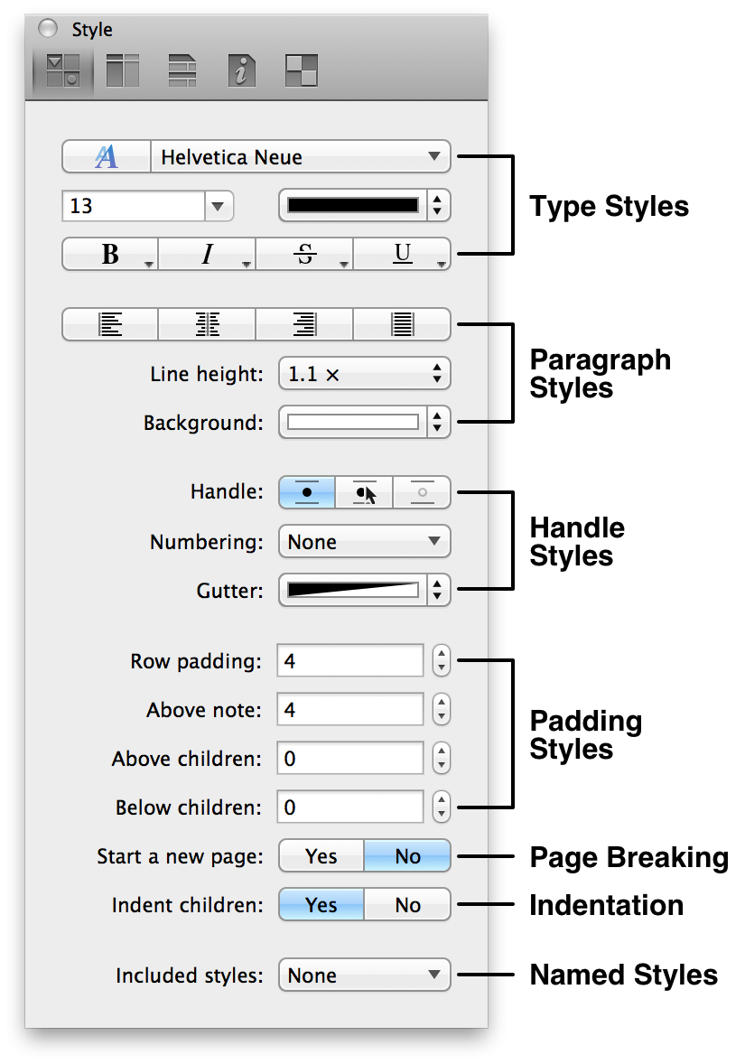
- Type Styles
- This section of the Styles inspector provides you with a variety of controls for changing the appearance of the text in your document:
- Typeface, Size, and Color
- Choose the font, size, and color for the selected text or row.
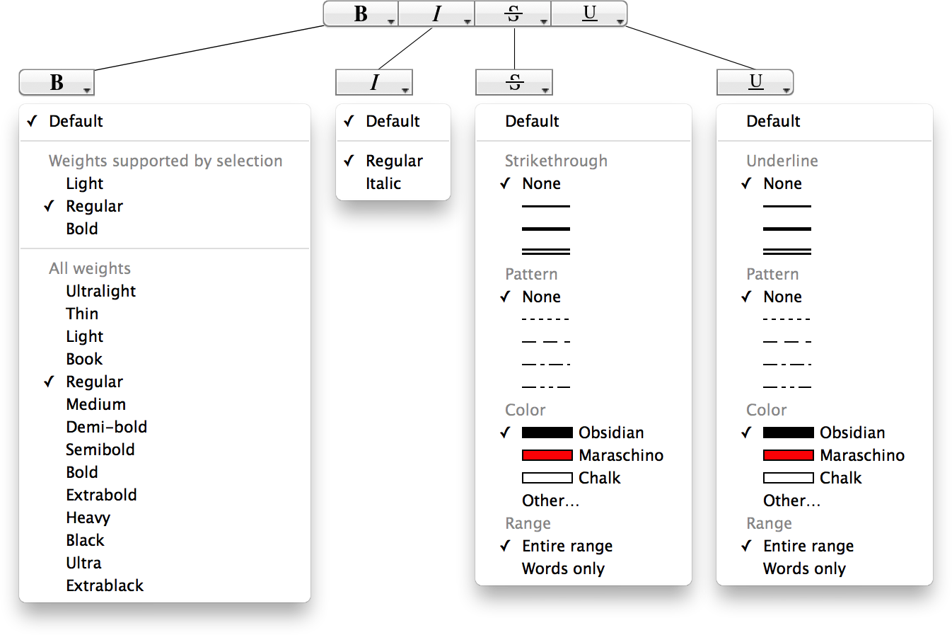
- Bold, Italic, Strikethrough, and Underline
- Click to apply the default Bold, Italic, Strikethrough, or Underline styles to the selected text or row. At the lower right of these buttons you’ll see a teeny-tiny triangle that’s pointing downward. This lets you know that there are additional options from which you can select. You can either click on the tiny arrows, or just click and hold to reveal the optional attributes menus:
- Paragraph Styles
- Choose the attributes for the rows within your document:
- Text Alignment
- The next row of buttons are used to left-, center-, right-align, or justified text.
- Line Height (Pro)
- Choose from a range of single to double spacing for your document. Line height adds spacing above the text within a row, where as Padding adds spacing between rows.
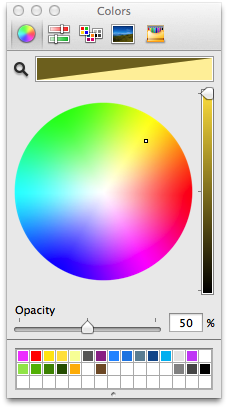
- Background
- Set the Background color for the selected row. Click the arrows on the right edge to choose from one of the presets we’ve offered, or click the color bar to open the Colors palette. Use the Colors palette to choose a custom color.
- Row Features
- Use these controls to set row features:
- Handle (Pro)
- Determines whether the row handle is always visible, only visible when you hover over the row, or never visible. Hiding the row handles makes it a little harder to drag and reorder your content; however, you can use the options in Organize ▸ Move to move rows up, down, left, or right.
- Numbering
- Choose a numbering style to use for the rows in your document. See Row Numbering for more information about numbering styles.
- Gutter
- Set a color to use for the gutter (the area where the row handle and status checkbox appear). Click the arrows on the right edge to choose from one of the presets we’ve offered, or choose Other to open the Colors palette.
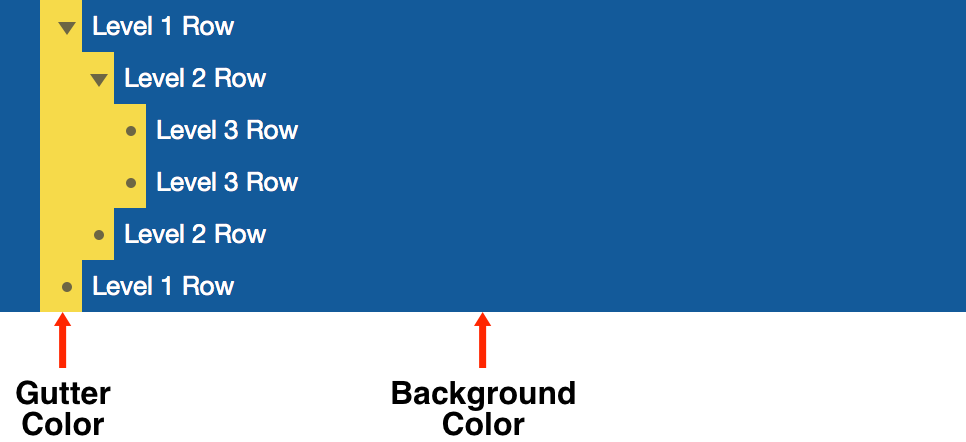
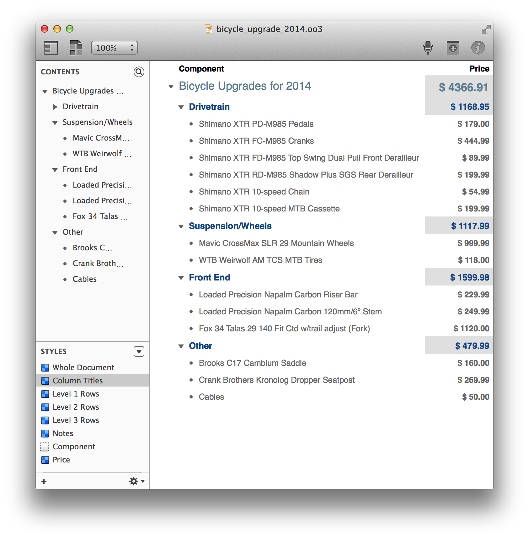
- The main purpose of a Gutter color is to help you see which level a row is on. As you can see in the previous image, the Gutter expands inward as child rows are added. If you set a Background color but do not set a Gutter color, the Gutter adopts the Background color automatically.
- Padding Styles (Pro)
- Padding, unlike Line Height, adds spacing inside of rows, notes, and their children:
- Row Padding (Pro)
- Set the amount of space (in pixels) above and below the text within the row.
- Above Note (Pro)
- Set the amount of space above an inline note.
- Above Children (Pro)
- Set the amount of space between a parent row and its children.
- Below Children (Pro)
- Set the amount of space below a parent row’s children.
- Page Breaking (Pro)
- Choose to insert a page break before a row:
- Start a New Page (Pro)
- Determines whether the currently selected row forces the start of a new page. When you select this option, a red dashed line appears above the row, as if you were going to cut the document with a pair of scissors. This is specifically for the purposes of printing or exporting to PDF.
- Indentation (Pro)
- Choose whether child rows are indented:
- Indent Children
- Choose whether to indent a row’s children. If you choose to not indent children, it might be hard to determine which is the parent and which is the child row. As such, you might want to style child rows differently, perhaps giving them a different background color or shade, reducing the font size, and so on.
- Named Styles
- Choose a Named style to apply:
- Included Styles
- This popup menu lets you select and apply one of the Named styles, listed in the lower portion of the Styles section of the Sidebar.
Column Inspector 
The Column inspector has two popup menus for setting column attributes:
- Type
- New columns always start out as Rich Text; however, you can change this to suit the needs of your document to one of the following:
- Checkbox
- Unlike the Status Checkboxes that live as an integral part of the main Topic column, Checkbox columns can be used for anything from giving you another checkbox to tick off, to monitoring the state of something, and even for ratings. You can add as many Checkbox columns as you’d like, and you can show or hide them as needed with the options in View ▸ Columns.
-
When used in combination with OmniOutliner’s sorting features (Organize ▸ Keep Sorted or Organize ▸ Sort Outline), checkboxes can be used to denote a Yes or No (binary) state for almost anything—feature comparisons, things that need to be reviewed, and so on.
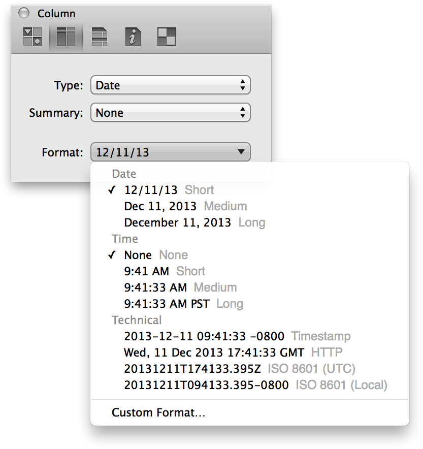
- Date
- Choose a date and optional time format to use in the column. The default date string is based on your locale, which is configured in System Preferences ▸ Language & Region. One of the many additions to OmniOutliner 4 is a new and improved date parsing logic that lets you type stuff like now, yesterday, 2d, september, thu, or –5w in a date column and have it know what you mean.
-
Use the Format menu to choose how dates and times are displayed in a date column. You can choose from a Short, Medium, or Long time string, or opt for something a bit more technical such as ISO 8601 (UTC) so you can show your friends just how nerdy you are.
-
-
Not satisfied with the options and formats we’ve provided? Choose Custom Format to create your own special date and time string to use for a Date-formatted column.
-
-
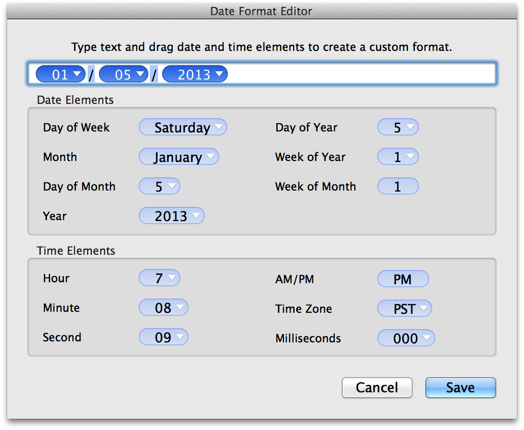
To use the Date Format Editor, just drag the items you’d like as part of the date/time string up to the field at the top of the dialog window. Items, such as Day of the Week or Month, have additional formats which you can choose by clicking the downward-pointing arrow. By default, the custom format uses slashes ( / ) for the delimiter, but you can enter another character (or different characters) or remove them entirely, if you’d like.
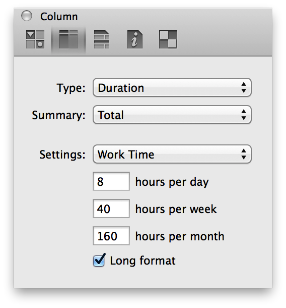
- Duration
- Use a Duration column for estimating or tracking the amount of time a task or project takes. For example, if you’re using OmniOutliner to make a list of all the things you want to do this weekend, you might add a Duration column so you can estimate how long it will take you to categorize your comic book collection and whether you should prioritize that over painting the garage.
-
-
Use the Settings popup menu to select from Work Time, Calendar Time, or to use a Custom time of your choosing. OmniOutliner formats the duration time based on the Setting you’ve chosen; for example, 12h in Calendar Time is equivalent to 1d 4h in Work Time (assuming an 8 hour workday). If you turn on Long format, OmniOutliner spells out the time durations; for example, 1d 4h gets expanded to 1 day 4 hours.
-
Use the hours per day, hours per week, and hours per month fields to adjust or fine-tune the Duration settings to suit your needs. For example, we prefer to have an 8-hour workday so we can have a great work-life balance, while the folks at a law firm or ad agency might enjoy working 80 hours per week.
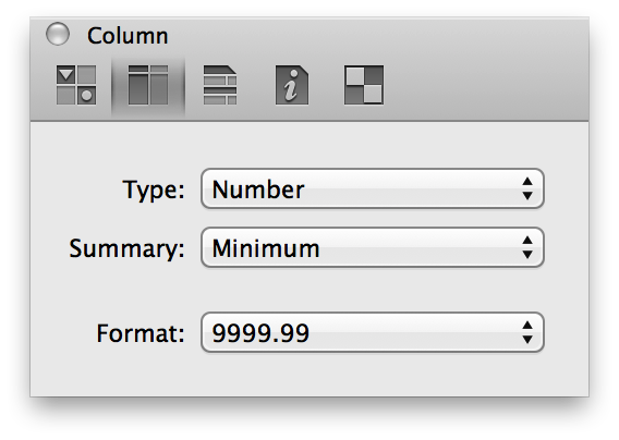
- Number
- Choose Number as as the column Type when you have a numbered value that you’d like to monitor.
-
-
Using the Format popup menu, you can choose from:
- 9999.99 — Numbers with a two-digit decimal.
- 10000 — Whole numbers; decimal numbers are rounded up or down to the nearest whole number. For example, 2.67 is rounded up to 3, while 3.14 is rounded down to 3.
- 10000% — A whole number percentage; a decimal number that gets entered is rounded up or down to the nearest whole number. For example, 2.67% is rounded up to 3%, while 3.14% is rounded down to 3%.
- 99.99% — Percentages with a two-digit decimal value, if needed. For example, 99% appears as that and not 99.00%, while 3.14159% is rounded to 3.14%.
- $9999.99 — Use this option for representing currency values based on the localized values you’ve set in System Preferences ▸ Language & Region ▸ Region. For example, if your Region is set to Asia ▸ Japan, the currency value would show up with the Yen symbol (¥).
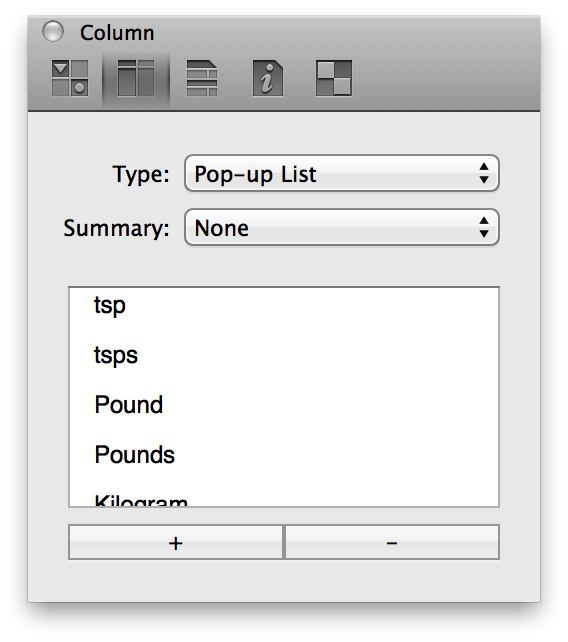
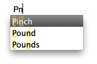
- Pop-up List
- Choose the Pop-up List type when you have a column of repeating “options” that you need to choose from. For example, if you have a template document for creating recipes, you might want to create a Measurements column with options such as ounce, ounces, gram, and grams (to name just a few). Now when you go to enter an amount, all you have to do is select the applicable option from the Pop-up List rather than having to enter the text over and over again.
-
-
Pop-up cells now use OmniFocus’s Smart Match technology. As you type characters, OmniOutliner tries to guess the item you want—and those characters don’t have to be at the beginning or contiguous either.
-
-
What’s more, if you enter a new term that isn’t already defined as part of the Pop-up List, you can enter Command-Return to add it to the list.
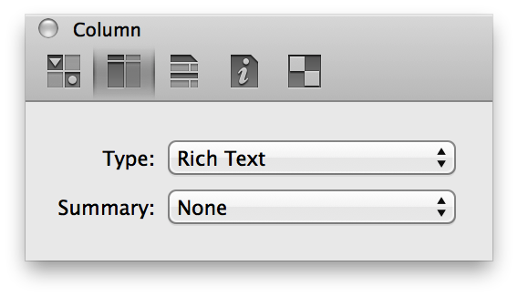
- Rich Text
- Choose Rich Text for regular text; this is the default column style for new columns.
-
- Summary
- The first and most important thing to know about Column Summaries is that they only appear on the parent row for a group. For example, if you have a two column document that lists pricing information for a bunch of parts that you need, and you choose Summary ▸ Total, you’ll probably wonder “Where’s the total at?”. But if you group those rows together by selecting the rows and choosing Reorganize ▸ Group (Option-Command-L), you’ll see all kinds of magic happen.
-
-
First, you’ll notice that all of the rows you selected were indented and placed under a new parent row. And in that parent row, the total appears in the column with all of the pricing information, but with a gray background to the cell. The gray background is a transparent layer of black, which slightly darkens any background color you’ve assigned to the row style.
-
The options in the Summary popup menu change depending on what you’ve selected in the Type popup menu:
- Checkbox
- Summary options include:
- None
- There is no summary; the summary cell displays a checkbox that acts completely independent of its children.
- State
- Displays an empty checkbox if no items have been checked off, a checkbox with a dash inside if some items have been checked, or a filled checkbox if all of the items have been checked.
- Hidden
- The summary cell is empty, regardless of the state of the other checkboxes in the column.
- Date
- Summary options include:
- None
- There is no summary.
- Minimum
- The summary cell displays the earliest date (or time) in the column from among the child rows.
- Maximum
- The summary cell displays the latest date (or time) in the column from among the child rows.
- Hidden
- The summary cell is empty.
- Duration
- Summary options include:
- None
- There is no summary.
- Total
- The summary cell displays the total of all cells in the column.
- Minimum
- The summary cell displays the lowest duration in the column.
- Maximum
- The summary cell displays the highest duration in the column.
- Average Leaves
- The summary cell displays the average duration for the child items under the parent row in that column.
- Hidden
- The summary cell is empty.
- Number
- Summary options include:
- None
- There is no summary.
- Total
- The summary cell displays the total of all cells in the column.
- Minimum
- The summary cell displays the lowest number in the column.
- Maximum
- The summary cell displays the highest number in the column.
- Average Leaves
- The summary cell displays the average number for the child items under the parent row in that column. This only averages descendant leaves, which means that all contained rows with no children—no matter how many levels away they are—are averaged.
- Hidden
- The summary cell is empty.
- Pop-up List
- Summary options include:
- Minimum
- If the Pop-up List contains numbers, the summary cell displays the lowest number used in that column. If the Pop-up List contains text, the summary cell displays uses the first entry in the Column inspector.
- Maximum
- If the Pop-up List contains numbers, the summary cell displays the highest number used in that column. If the Pop-up List contains text, the summary cell displays the last entry in the Column inspector.
- Hidden
- The summary cell is empty.
- Rich Text
- Summary options include:
- None
- There is no summary.
- Hidden
- The summary cell is empty.
Outline Inspector 
Use the Outline inspector when you want to adjust the styles that affect the outline as a whole, rather than styles that can be applied to a certain part of the outline.
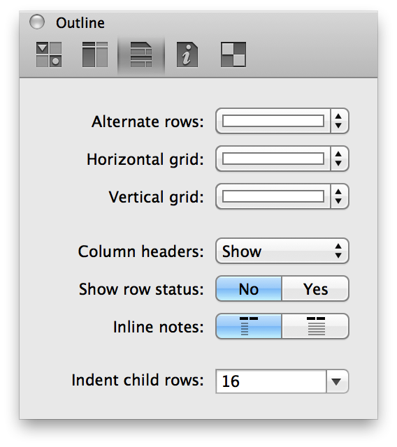
- Alternate rows
- Use the Alternate rows option to set a background color to alternating rows in your document. You can choose from one of the preset color options (Subtle Gray, Subtle Green, or Subtle Blue), or click the color bar next to it to choose a custom color or background pattern from the Colors palette.
- Horizontal grid
- Use the Horizontal grid option to add a thin line of color between the rows in your document. You can choose from one of the preset color options (Subtle Gray, Strong Gray, Subtle Green, Strong Green, Subtle Blue, Strong Blue, Subtle Red, Strong Red), or click the color bar next to it to choose a custom color or background pattern from the Colors palette.
- Vertical grid
- Use the Vertical grid option to add a thin line of color between the columns in your document. You can choose from one of the preset color options (Subtle Gray, Strong Gray, Subtle Green, Strong Green, Subtle Blue, Strong Blue, Subtle Red, Strong Red), or click the color bar next to it to choose a custom color or background pattern from the Colors palette.
- Column headers
- Choose whether to Show or Hide column headers. The Automatic option shows any text you’ve entered for a header, but hides the generic Topic header if you have only one column in your document. You can also do this by choosing View ▸ Column Headers ▸ Show/Automatic/Hide.
Using Grid Lines and Columns for Creative Templates
You can combine the Horizontal and Vertical grid to create documents that resemble a ruled sheet of paper. Just add another column and then change the font size for column headers, and you’ll get something like this:
Of course, that required a bit more tweaking (and not much, honestly), but you get the general idea, right? OmniOutliner makes it easy for you to customize documents and create templates that suit your every note-taking need.
- Show row status
- Choose this option if you want to display the Status Checkboxes along the left side of every row. These are different from the Checkbox option you can set on a column, in that Status Checkboxes are always located on the left edge of and follow the indentation level of your rows.
- Inline notes
- These buttons let you decide whether Inline Notes will wrap based on the first column of the document, or if they’ll span the width of all columns. Inline notes, which are styled using the Notes style, appear beneath the text you’ve entered in a row.
-
(Pro) If you have OmniOutliner Pro, you can opt to have Inline notes appear in a separate pane at the bottom of the Outline (View ▸ Notes ▸ Display in Pane).
- Indent child rows (Pro)
- This pop-up menu lets you choose how far child rows will be indented. You can choose from one of the options we’ve provided (either 0, 8, 16, or 24 pixels), or enter a value of your liking and press Return.
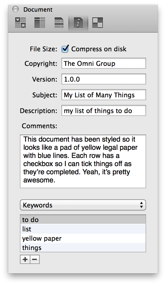
Document Inspector 
Use Document inspector to provide additional information (metadata) about the document you’re working on. The information you provide here stays with the document and makes it easier to find on your Mac using Spotlight.
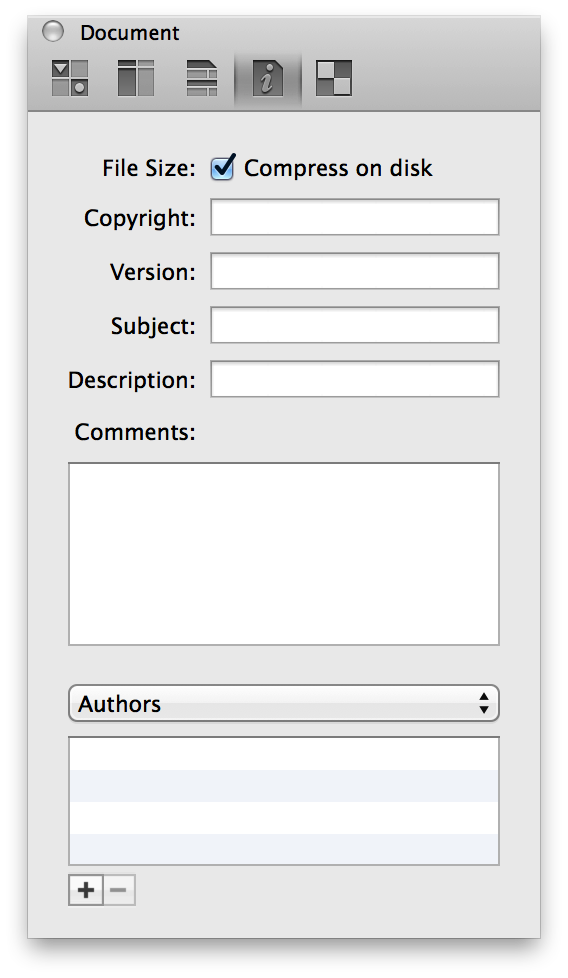
The first option in the Document inspector, Compress on disk, determines how your Outliner document is saved. This option is document-specific, which means that you can turn this on or off depending on your own needs.
If you check this box, OmniOutliner uses a simple Zip compression to squish your files down to the smallest size possible. Compressed files don’t just take up less space on your hard drive; they’re also easier to send to your friends and colleagues via email.
Leaving the Compress on disk option unchecked means your files won’t be compressed, and they’ll show up in the Finder as taking up a bit more space. You should consider leaving this unchecked if you are saving your OmniOutliner files in a version control or document management system, or so you can more easily run scripts (Python, Ruby, and so on) on the XML inside your document.
The metadata fields in the Document inspector include:
- Copyright
- Copyright statements typically declare who owns the legal rights to something. Since this is your thing, or your company’s thing, enter your name or your company’s name into this field.
- Version
- Version numbers are used to indicate a certain “state” of a project. For example, 0.1 might be a beta release while 1.0 might be an initial release. You can even go as far as adding a sub-version number, so you’ll end up with something along the lines of 4.0.1 when you correct a typo or something. The choice is yours, really.
- Subject
- Enter something similar to what you would enter as the subject line for an email; for example, Staff project assignments for OmniOutliner 5, or Fried Chicken Recipe.
- Description
- Describe the contents of your OmniOutliner file. For example, A list of bike parts, or Actors who’ve portrayed Batman.
- Comments
- Use the Comments field to enter more information about the file you’re working on. For example, you could provide additional detail about a project this file is associated with, or notes to yourself about other things that you’d like to add to the file.
Beneath the Comments field, you’ll notice a popup menu that’s set to Authors. This menu works in conjunction with the combo box below for creating metadata attribute and value pairs. What’s that? Too nerdy? Okay, let us explain…
Here’s how to create a metadata attribute and value pair using the popup menu and the combo box:
Select one of the options in the popup menu (Authors, Organizations, Languages, Keywords, or Projects, as further described next).
Click the Add button (the + sign) at the bottom of the Document inspector.
When you click Add, the focus changes to the box in the middle so you can enter information about the item you’ve selected in the popup menu.
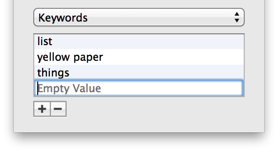
When you’ve finished entering some text, either press Tab or Return to save the metadata information to the file.
If you decide later that you want to remove an item, select it with the mouse and then click Remove (the − button, next to the Add button). To edit an existing item, double-click to highlight the text, and then enter your changes and press Tab or Return to save the changes.
Options in the popup menu include; all of these options can have multiple entries:
- Authors
- Enter the name of the person who created the document. This would be you, or perhaps you and a colleague, or you and the cat that won’t get off your lap while you’re working at 2 a.m. Of course, your friends at work might question why Sir Snugglepuss III is contributing to a secret project, but that’s for the lawyers to sort out.
- Organizations
- Enter the name of your company or the organization the document has been created for.
- Languages
- Enter the language, such as English or Japanese, or use one of the ISO 639 language codes, such as en or jp, to name a few.
- Keywords
- Ah, this is where you can have the most fun! Keywords increase the find-ability of your files more than anything else. This is because you can add tons of keywords to your file, and they can be as descriptive or outrageous as you’d like. The key (no pun indented) here is that the keywords are what help make each document unique when it comes to finding files with Spotlight.
- Projects
- If you’ve created an Outliner file for a specific project, enter the project name here.
Tip
If you are using other Omni apps, such as OmniGraffle or OmniPlan, you can enter similar metadata in the Document inspectors for those apps. So, let’s say that you’re tracking a project in OmniPlan, creating charts and diagrams in OmniGraffle, and managing your to-do list in OmniFocus, you could enter similar information for each project. That way, if you do a Spotlight search for a particular project, you could just enter that project name in the Spotlight search field and see all of your related documents in one place (even if they aren’t saved in the same place).
As noted earlier, the information you enter in these fields, and through the popup menu, are registered on your Mac as additional metadata for that particular OmniOutliner file. When you do a Spotlight search, by clicking the Spotlight menu in the menu bar (or with Command-Space), all of the information you’ve entered into the Document inspector helps to make your files easier to find.
Now, rather than opening a Finder window and trying to remember where you hid that super secret file, you can press Command-Space, enter one of the keywords or something else that helps you identify the file, and Spotlight brings it up in the list of possibilities.
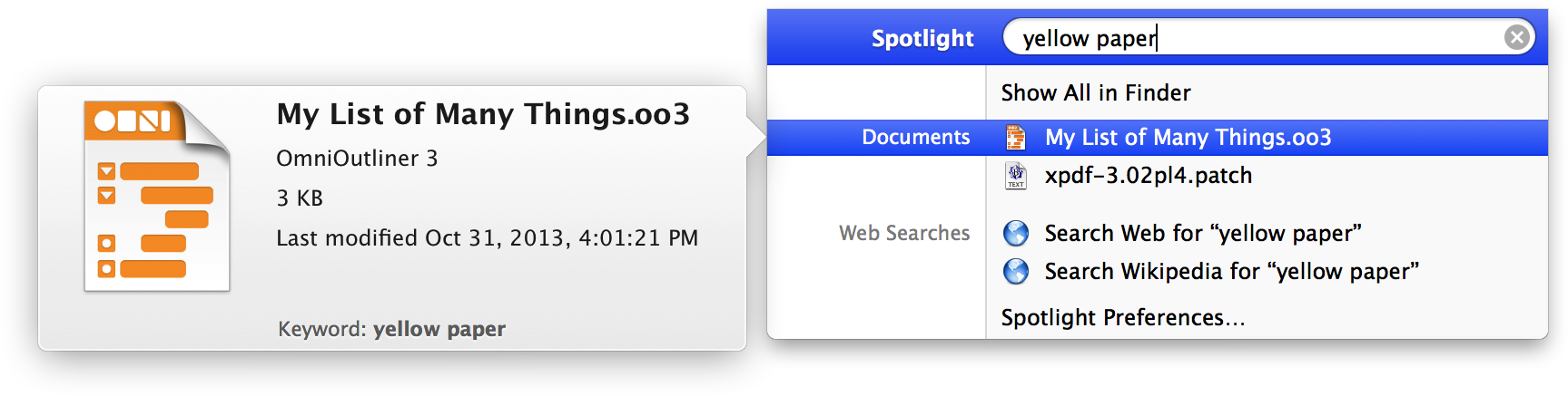
To open the file, highlight it with your mouse and press Return.
Tip
Actually, Spotlight works with every file on your Mac, not just the OmniOutliner files that you’ve assigned metadata to. Spotlight is a system-level service that catalogs all of the files on your Mac automatically to help you find the file (or files) you need quickly.
Style Attributes Inspector 
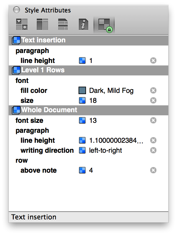
At a quick glance, the Style Attributes inspector is a little deceiving. What appears to be a mild-mannered window that shows you all of the styles in your document, is actually quite powerful.
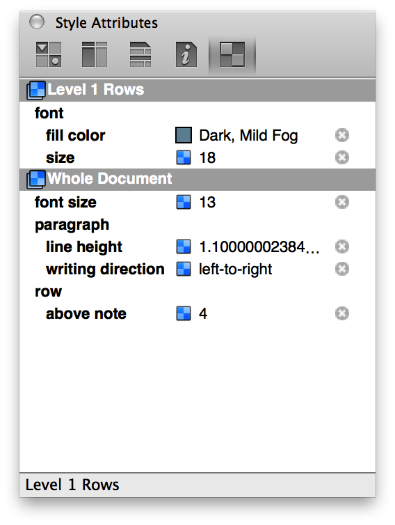
As you apply styles to the rows and columns in your OmniOutliner file, those styles start to show up here in the Style Attributes inspector. What you see in the Style Attributes inspector depends on where the cursor is currently placed in the document. The previous image shows that the cursor was on a Level 1 Row, and that the text in all Level 1 Rows are to be styled as 18pt text with a color of Dark, Mild Fog (a subtle grayish-blue, in case you were wondering).
But let’s say that you want the text in the Level 2 Rows to have that same grayish blue color. The easy way to apply that style is to click on the colored square in the middle of the inspector and then drag and drop that onto the Level 2 Row style in the Styles pane of the sidebar, and voila! The text for all Level 2 Rows now have that same grayish-blue color. This makes it easy for you to try out different styles. And remember, if you don’t like a change you’ve made, you can always press Command-Z to undo your last change and revert everything to normal.
What makes the Style Attributes inspector particularly useful, however, is that the order of the styles shown matches the priority of how the styles are applied to the selection. This allows you to see how the selected item’s style is calculated, so you can figure out why it looks the way it does. Additionally, you can click the little  button at right to clear any styles that are causing you trouble without having to find the control you used to set them.