Using the Inspectors
You use the Inspectors to change the style attributes for the objects on the Canvas, or set the properties of the Canvas itself. To access the Inspectors, tap  in the Document toolbar.
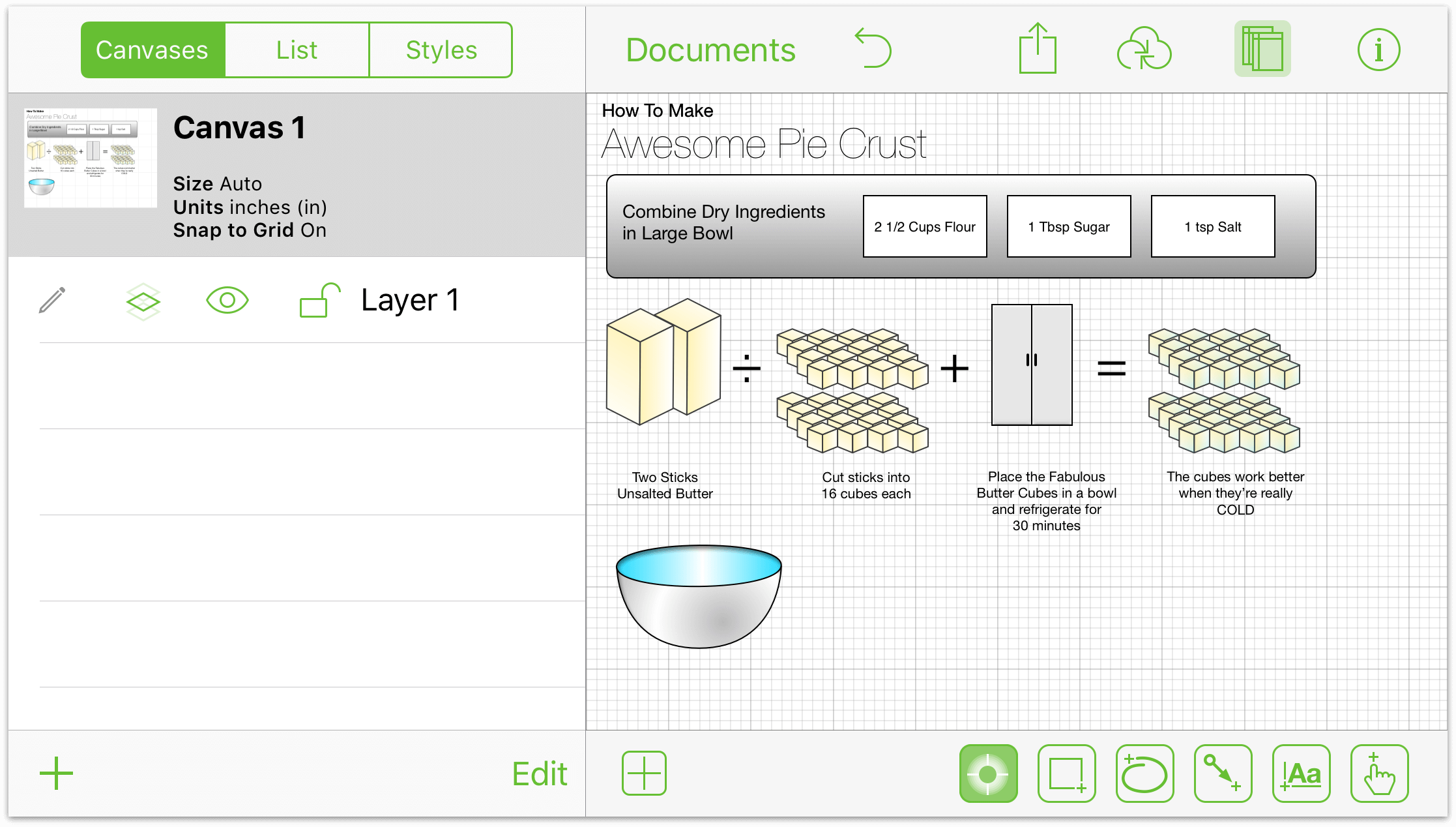
The Info window has two sections:
Selected Objects—This section displays the Inspectors that you can use on the selected object(s).
Canvas—This section displays the Inspectors that are specific to the Canvas alone. Each inspector contains two or more panes, for such things as adding a fill to an object or setting a background image for the illustration you’re working on.
Making Changes to the Canvas
A canvas is a space where you create and manipulate your shapes and other objects. You start off with just one canvas, but you can add as many as you like in the Contents sidebar.
The Canvas section has five different inspectors:
- Canvas Size
- Background
- Units & Scale
- Grid
- Diagram Layout
And if you have purchased the upgrade to OmniGraffle Pro, there is a sixth inspector—Notes. Each of these inspectors are covered in the sections that follow.
Adjusting the Canvas Size
The canvas attributes section has the following elements:
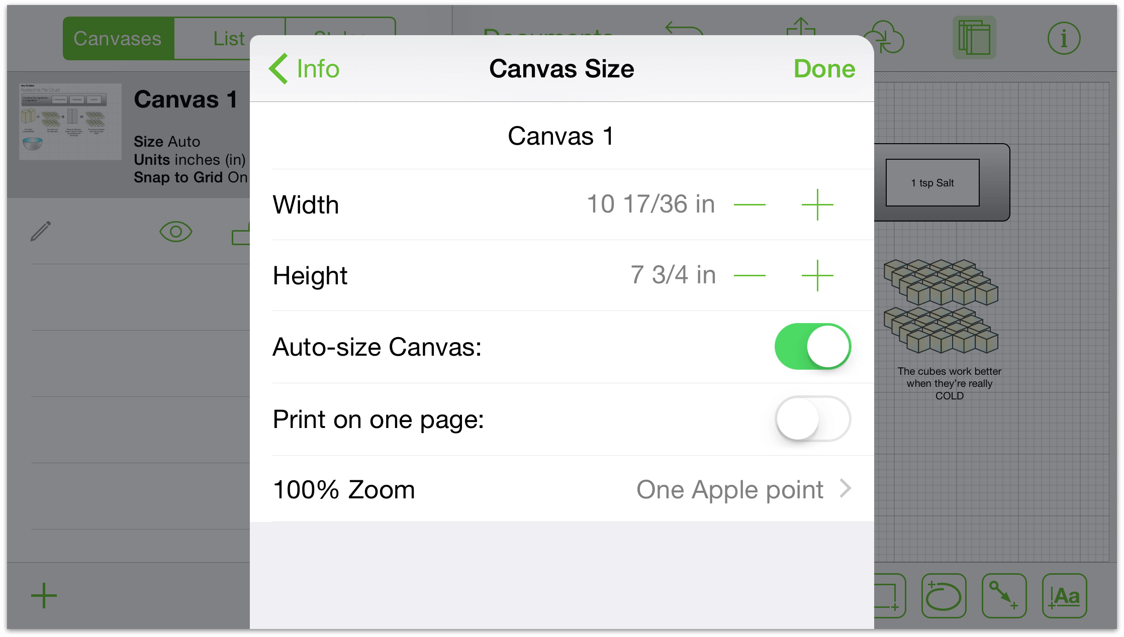
- Canvas Name
- Change the name of the canvas.
- Width
- Adjust the width of the canvas.
- Height
- Adjust the height of the canvas.
- Auto-size Canvas
- Enable and disable to automatically adjust the canvas size should your shapes go beyond the existing boundaries.
- Print on one page
- Fit the canvas to the page if its orientation or size differ from the default when printing.
- 100% Zoom
- Choose the display standard that suits your device and task. A canvas measured in screen pixels will render much larger on a non-Retina device; a canvas measured in Apple points will render at equal size across devices; and a canvas measured in PostScript points will match real-world measurements (WYSIWYG).
Coloring the Background of a Canvas
Use the Background inspector to set a background color for the Canvas:
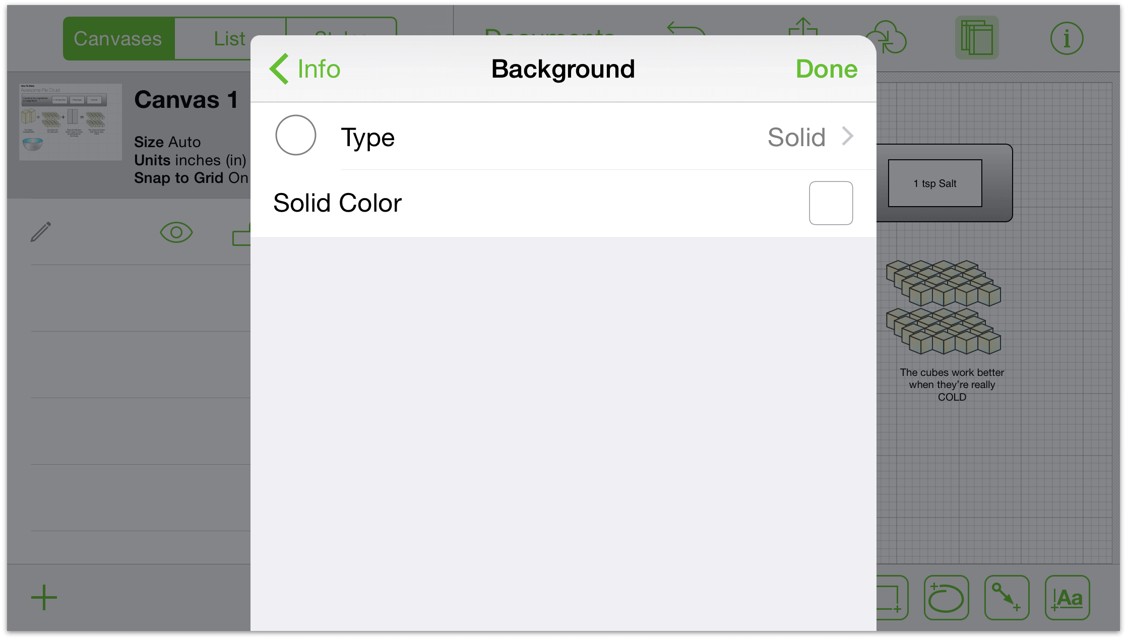
- Type
- Tap Type to change the style of the background color, choosing from Solid (the default for all included templates), Linear Gradient, Radial Gradient, Double Linear Gradient, Double Radial Gradient, Stipple, Squiggle, Plastic, and Marker. When you select one of the different types, the inspector changes slightly so you can fine-tune background to get the effect you’re after.
- Solid Color
- Tap Solid Color to choose a solid background color. You can use the defaults in the color palette, or use the HSB, RGB, and Gray slider controls to create custom colors.
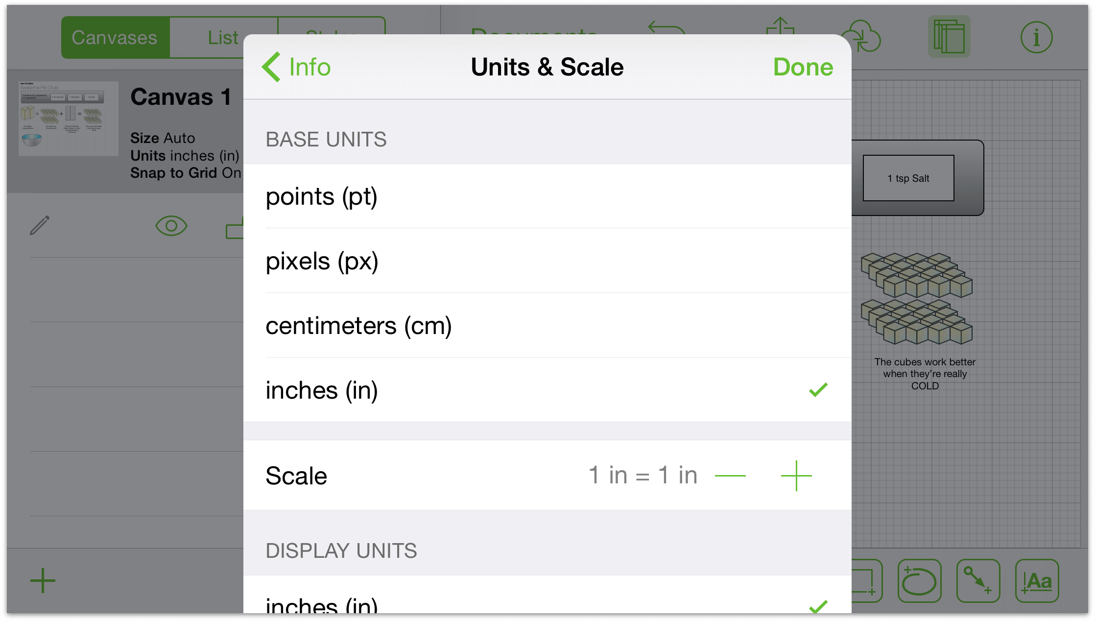
Setting the Unit Size and Scaling Options
Tap Units & Scale to choose the unit of measure you’d like to use to describe object dimensions, grid lines, the canvas size, and so on.
Defining Grid Properties
Grid options include:
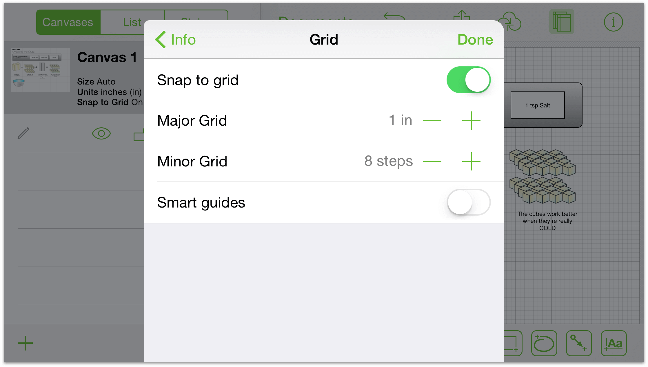
- Snap to grid
- Turn this on to show (and have shapes stick to) the gridlines; turn this off and the shapes move fluidly.
- Major Grid
- Tap the buttons to increase or decrease the grid size; tap the text to type a size.
- Minor Grid
- Increase or decrease the number of minor steps between major grid lines.
- Smart guides
- Enable or disable the blue guide lines that help you position and size your objects.
Note
You cannot enable Snap to grid and Smart guides at the same time; it’s a one-or-the-other option.
Laying Out Canvas Objects
Use the Diagram Layout inspector to change the flow of objects on the Canvas:
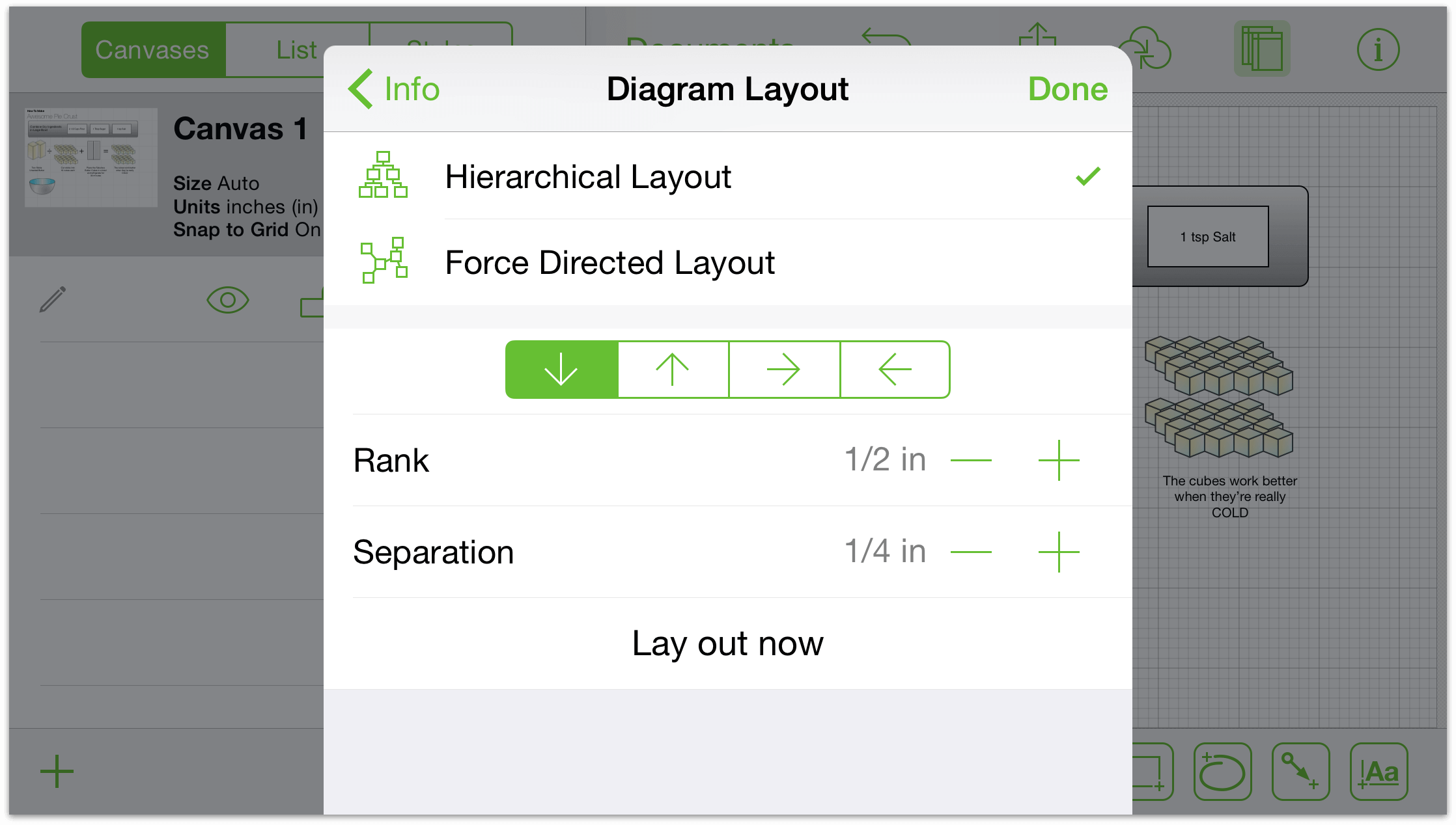
- Layout Type
- Choose either a Hierarchical or Force Directed layout.
- Layout Direction
- Use the arrows to change the direction of the layout.
- Rank and Separation
- Use these to specify the amount of spacing between objects.
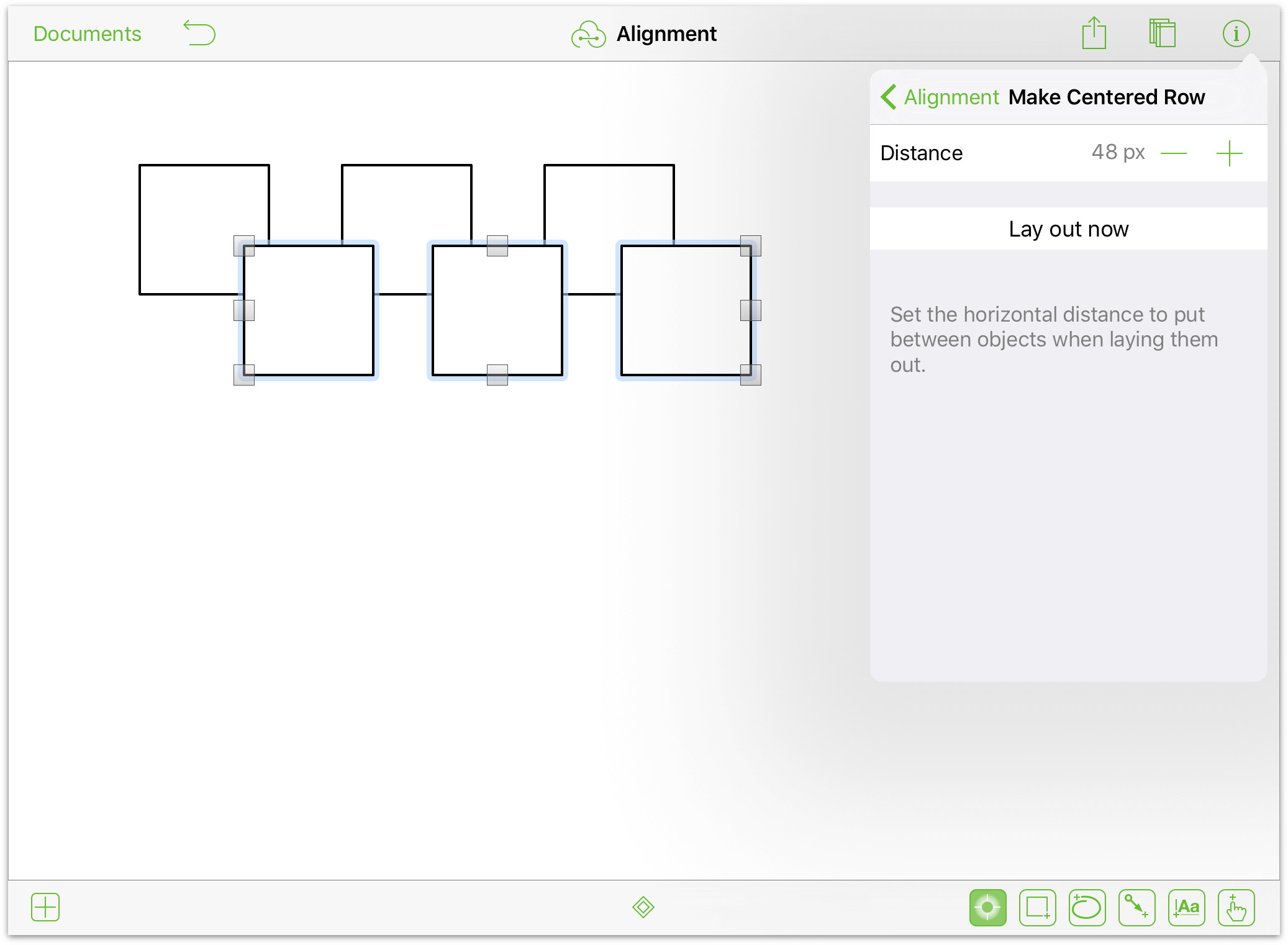
To apply these settings, tap Lay out now.
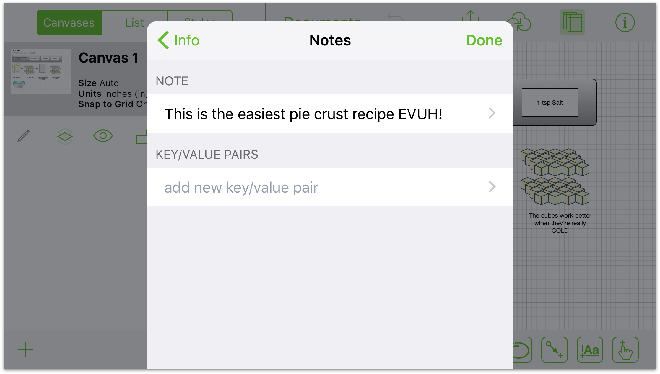
Adding More Detail to Your Canvases with Notes (Pro)
Use the Notes inspector to add a description about your diagram or illustration, and add key/value pairs of information about its content as well.
Making Changes to Selected Objects
Customize things to your heart’s content! Start by selecting an object on the Canvas and then use the Selected Objects section of the Info menu to make style and property changes. Only the inspectors applicable to your selection are available. For example:
When you select Shape and then tap
 , the available inspectors include: Fill, Stroke, Shadow, Text Position, Font, Geometry, Connections, and Notes.
When you select a Line and then tap
 , the available inspectors include: Stroke, Line, Shadow, Connections, and Notes (Pro).
These inspectors are briefly described as follows:
- Connections
- Adjust how the object reacts in relationship to other objects on the Canvas.
- Fill
- Choose a solid color or apply a nice gradient. Tap to view fill info.
- Font
- Customize the font family, typeface, and size of your text.
- Geometry
- Adjust properties of the object like its location and rotation.
- Image
- Place an image from your Photos library onto the Canvas or into an existing shape.
- Shape
- Pick a new shape for your object, including for those you may have created in freehand mode. Tap to view shape info.
- Shadow
- Add a shadow to your shape. The shadow can appear immediately below the shape or below everything on the layer.
- Stroke
- Customize the border around your object, or make it disappear. Tap to view stroke info.
- Text Position
- Adjust the layout of the text with respect to the shape.
- Notes (Pro)
- Add a description and key/value pair metadata to the selected object.
Each of these inspectors is described in the sections that follow.
Making Changes to a Fill
Fills are great way to add polish to a shape or canvas. Slide or tap a fill style in the carousel to choose a fill. This might be a solid color, a nice gradient, or nothing at all. Different fill styles reveal different options.
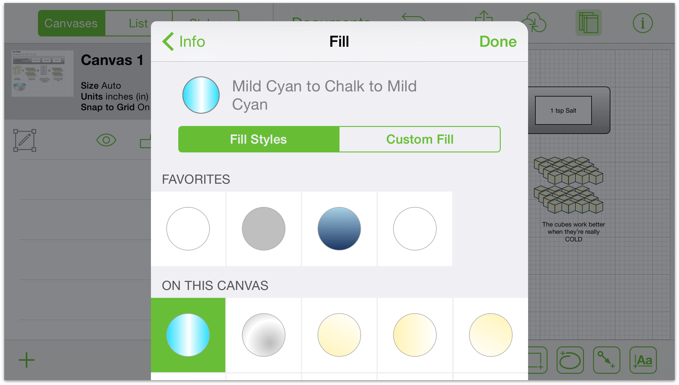
Choose no fill to leave the inside of your shape empty. (Canvases do not have this option because they cannot be see-through.) Any objects behind a shape will be visible.
Choose solid fill to apply a uniform color to the inside of your shape. Tap the color well to choose a color and see more color options.
Choose a linear blend to create a two-color gradient or a double linear blend for a three-color gradient. The colors will appear on the extremes of your shape and blend in the middle.
Choose a radial blend for a two-color, circular gradient or double radial blend for a three-color gradient.
Gradients have a few more options than a solid fill:
Tap the color wells to pick a color for each part of your gradient. To swap the colors, tap the swap button between the wells. (The swap button is not present in the double blends.)
Drag the slider to move the blend towards one side or the other.
Drag the blend rotation wheel to set an angle for the gradient. Tap the cell to type the degree of the angle.
Making Changes to a Stroke
The stroke is the line (or lines) drawn around your object. OmniGraffle has several different strokes for different folks; slide or tap a stroke style in the carousel to choose a stroke for your object.
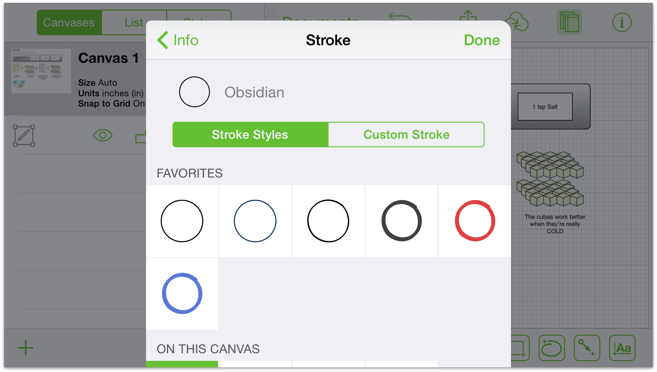
Choosing no stroke removes the border around your shape. (This is not an option for lines.)
A single stroke will add one line around your object and a double stroke will add two, with a color between them.
Different stroke types have slightly different options:
Tap the color well to explore the color options for each part of your gradient. For double strokes, the left color reflects the outer colors of the stroke and the right color sets the inner color.
Tap the buttons on either side of the thickness indicator to increase or decrease the stroke’s thickness. Or, just tap the cell to type a value.
Slide or tap the dash pattern at the bottom to add dashes to your stroke.
Making Changes to a Line
Lines quickly demonstrate relationships between shapes and other objects but they can also stand alone. Select the line and choose line info to make adjustments.
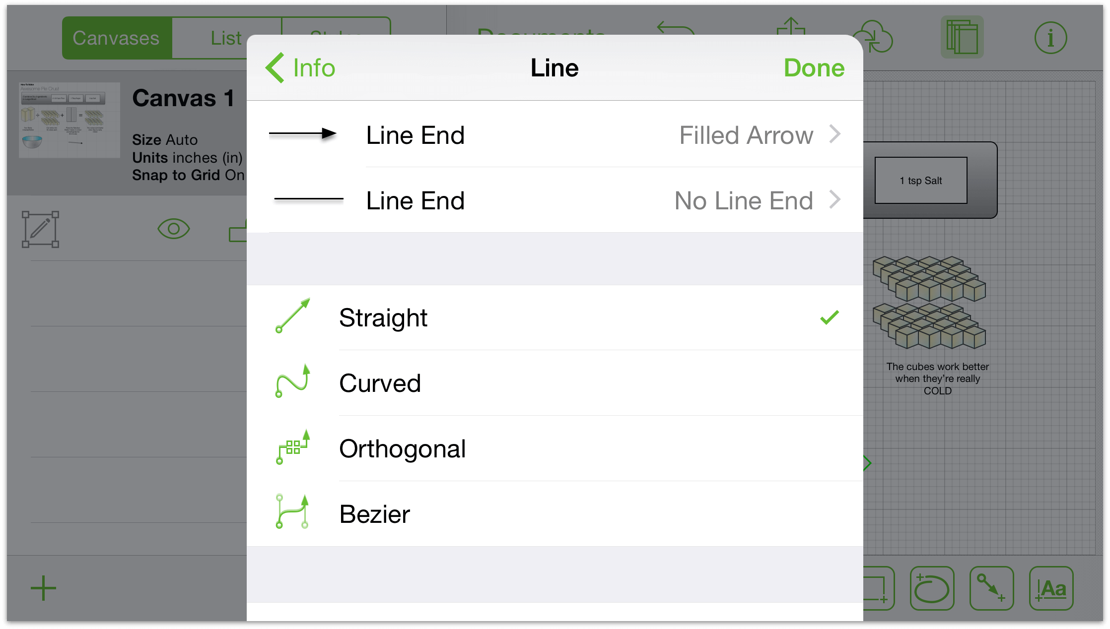
Tap the segmented control to specify your line as straight, curved, or orthogonal.
To choose an end type, slide or tap to choose from the carousel. The upper carousel changes the head arrow (the start point) and the lower carousel changes the tail arrow (the end point).
Change the corner radius to add rounding or rigidity to the bends of your line. Tap the buttons on either side or tap the cell in the center to define a radius by typing.
Making Changes to a Shape
Shapes are two-dimensional objects you can add to your canvas. Swipe to scroll and peruse the list. They are arranged according to commonality and adjustability.
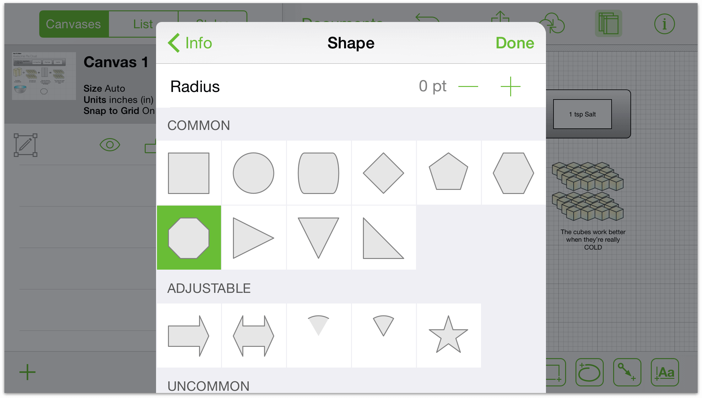
If you have a shape selected on the canvas, tap another in the list to change its shape.
Adjustable shapes have handles that can be dragged to add or subtract elements from the shape. For example, you can increase or decrease the number of points on the star.
Change the corner radius to add a nice rounding or rigidity to the corners of your shape. To change the corner radius incrementally, tap the buttons on the sides of the cell. Tap in the cell to type a value.
Making Changes to a Shadow
Shadows are a great way to add some depth and texture to your diagram.
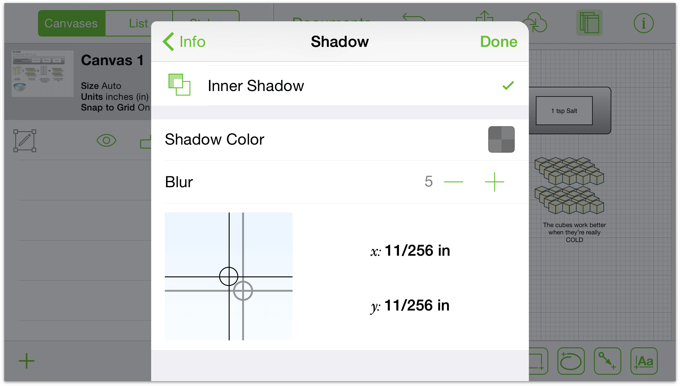
Tap the segmented control at the top to: remove the shadow from your object; add a shadow immediately beneath the object; or add a shadow below all objects on that layer.
If your object has a shadow, tap the color well to change the opacity and explore its color options.
Drag the blurriness slider to the left for a sharper shadow or to the right to add blurriness.
Drag the shadow position indicator to move the shadow or tap in the cells to type x and y offsets.
Making Changes to the Text Position
The text position section contains settings, for your text, as they relate to shapes and the objects around them.
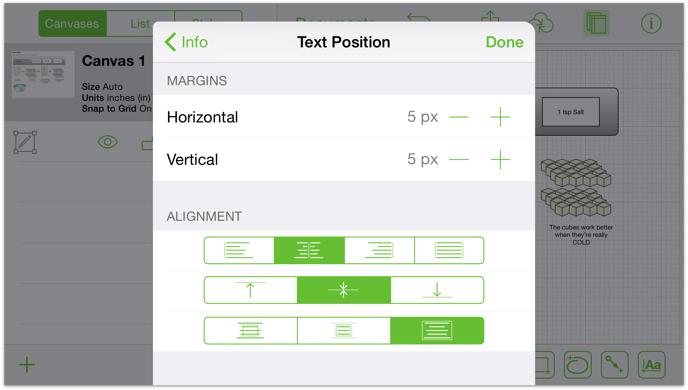
Tap the margin indicator buttons (to the left and right of the cells) to increase or decrease the width or height of the margins for your text object. Tap in a cell to type a value.
Tap the left, center, or right buttons (the upper group of segmented controls) to change the justification of the text.
Tap the top, center, or bottom buttons (the middle set of segmented controls) to change the vertical position of the text in the shape.
Tap the overflow, hide, or resize to fit buttons (the bottom set of segmented controls) to have the text: overflow the shape; be cut off when it does not fit the shape; or to resize the shape to fit the text.
Tap the wrap to shape button to constrain the width of the text to that of the shape.
Making Changes to the Font
The font info section is where you can specify the style of text for your label.
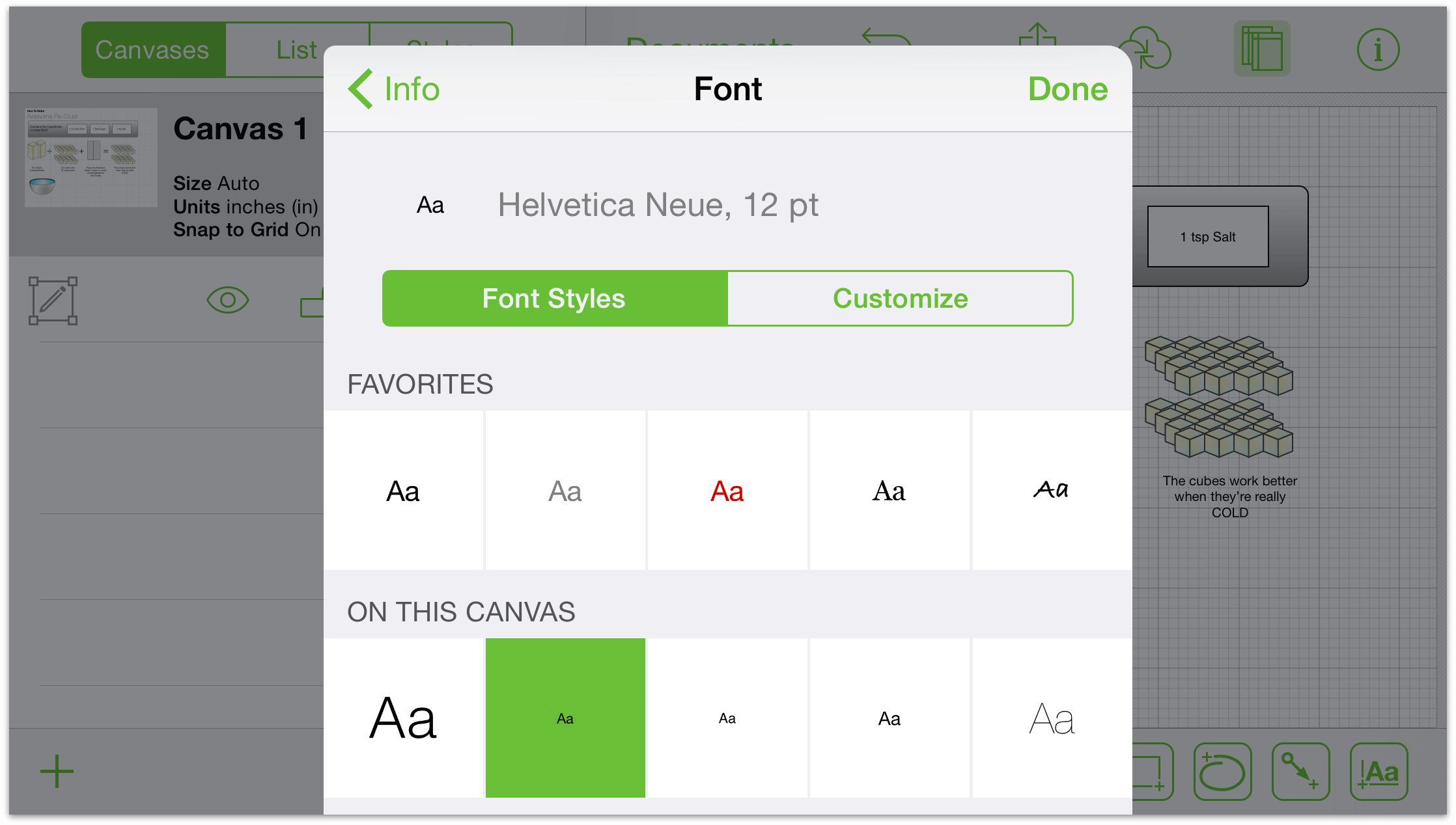
To view the list of fonts, tap the font family name. Choose a recommended font to ensure readability and commonality or, for fonts of all seasons, scroll to see the full list.
To choose a typeface, pick a font family, and tap the typeface option to view a list of typefaces (like bold or italic, for example).
To increase or decrease the size of your font, tap the buttons on the left and right of the font size or tap in the center to define a size by typing.
Making Changes to the Geometry
The Geometry section is where you can adjust object properties like position, size, and rotation.
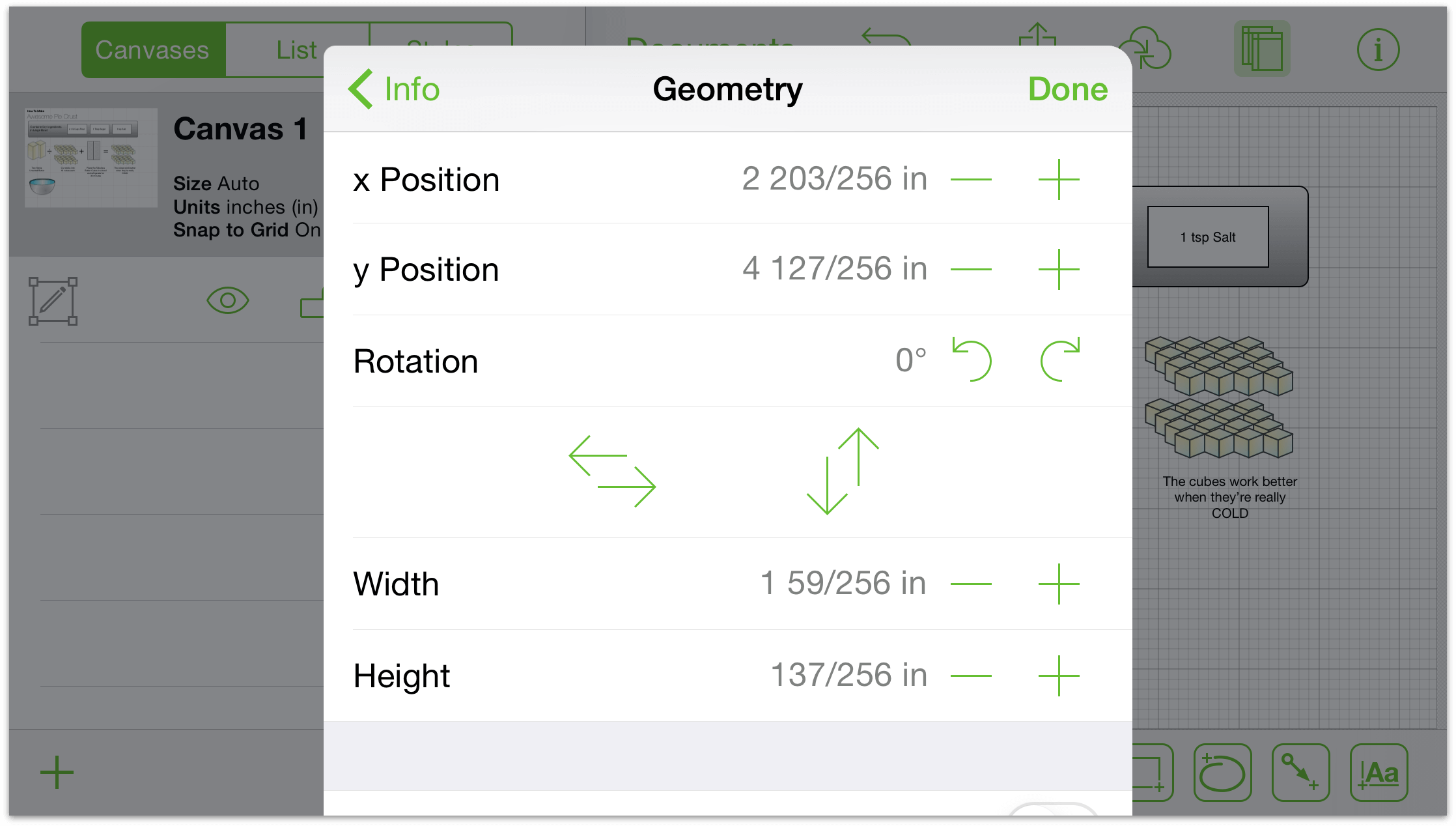
To change the horizontal position of your object, tap the buttons to the left and right of the horizontal position indicator. Tap the center to define a position by typing.
To change the vertical position of your object, tap the buttons to the left and right of the vertical position indicator. Tap the center to define a position by typing.
To change the rotation of your object, tap the rotate left and rotate right buttons. The buttons will rotate the object in increments of 15 degrees. Tap the center to define a degree of rotation by typing.
To flip an object, tap the vertical or horizontal flip buttons.
To change the width of the object, tap the buttons to the left and right of the width Indicator. Tap the center to define a width by typing.
To change the height of the object, tap the buttons to the left and right of the height Indicator. Tap the center to define a height by typing.
To maintain the ratio between the height and width while making adjustments, turn on maintain aspect ratio. To do so, tap the switch so it is blue and reads on. Tap again to turn off.
To maintain the ratio between the content of the object and the object itself, turn on maintain aspect ratio and then tap the scale content switch so it is blue and reads on. Tap again to turn off.
If more than one object is selected and the objects have different values, the inspector displays two dashes (–) in place of a value.
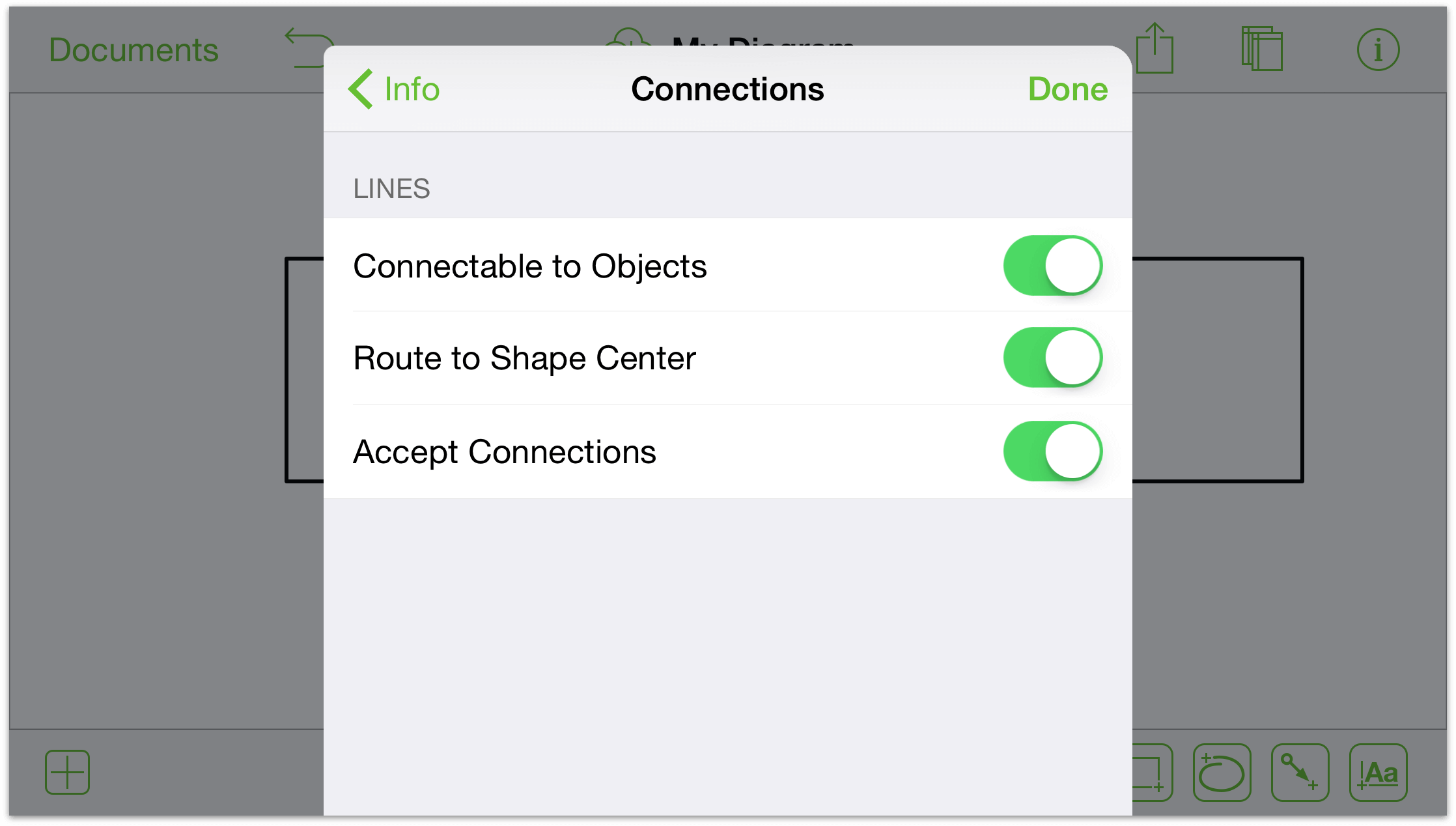
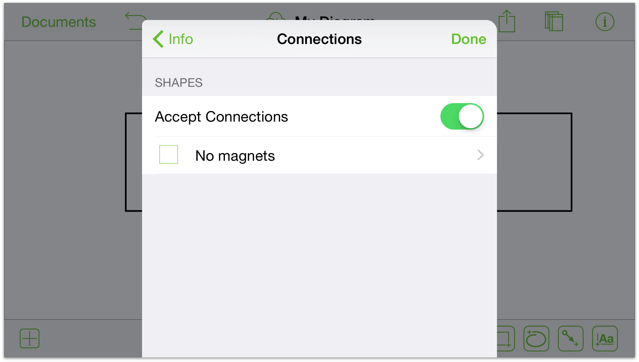
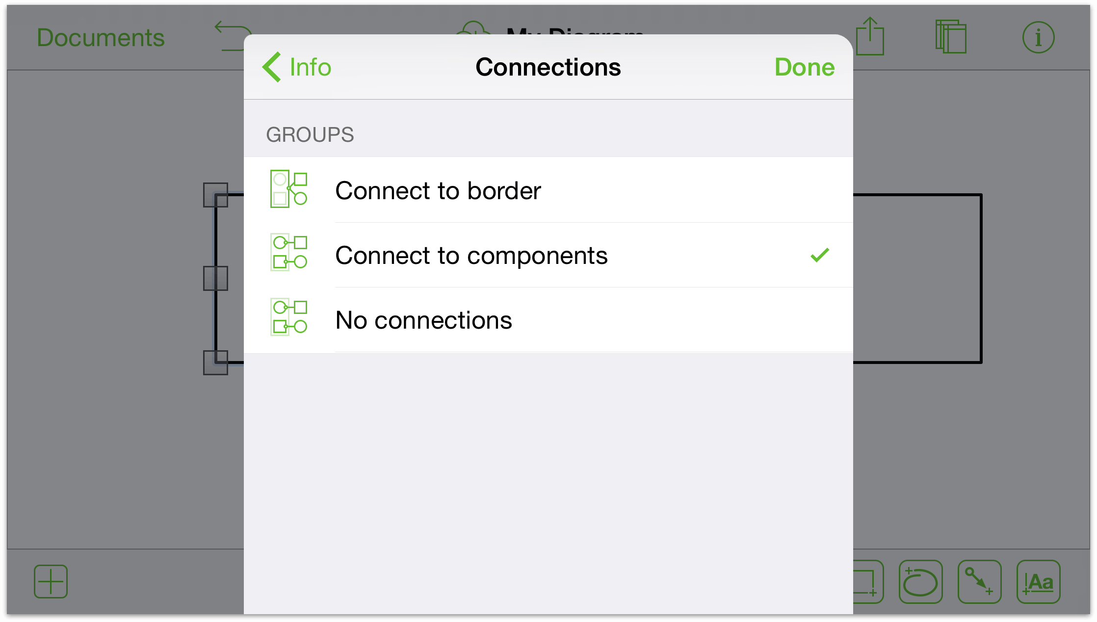
Making Changes to Connections
Connections are an attribute of shapes and lines that keep objects in touch. With a shape or a line selected, use connections info to make adjustments.
With a line selected: tap the Connectable to Objects, Route to Shape Center, and Accept Connections toggles to allow or disallow these connections.
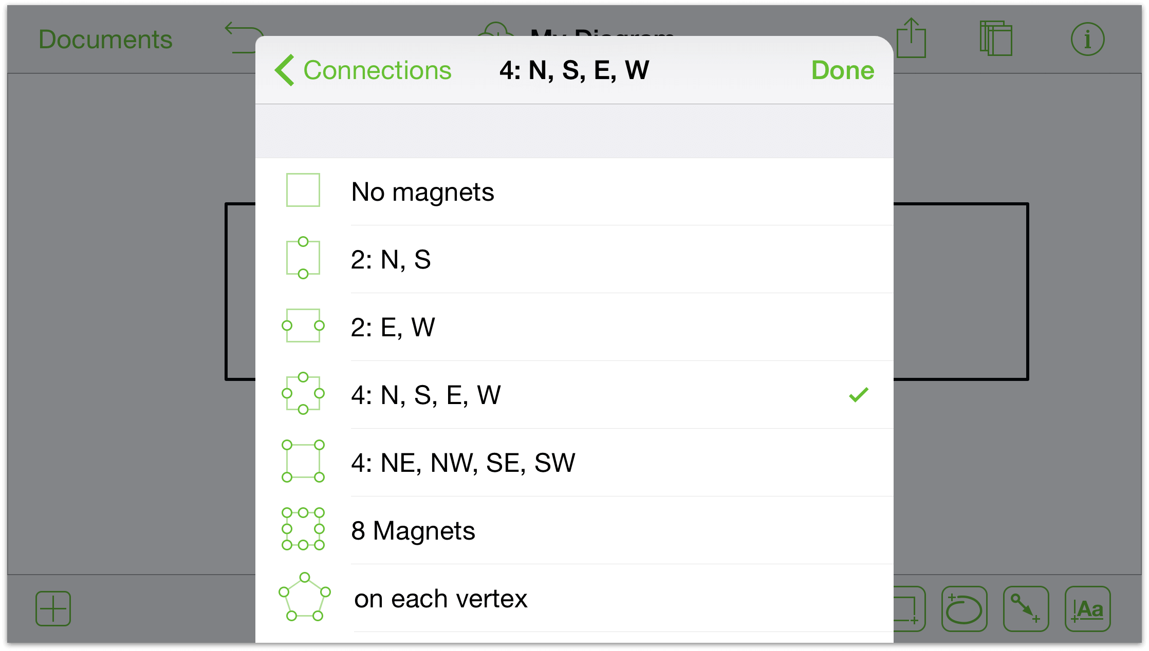
With a shape selected: use the Accept Connections toggle to turn connections on and off. All objects have magnets turned off by default. If you would like to apply magnets to an object, tap No magnets and the options for magnet placement becomes available. Tap one of the options to customize how the connections interact with the shape.
With a line, a shape, or a group selected: a combination of the two is presented. Use the groups section to specify whether you’d like to connect to the border or the components.
Positioning Objects Neatly with the Alignment Inspector
When you have two or more objects selected on the Canvas, the Alignment inspector becomes available in the inspector menu. Use this inspector to line up and uniformly space objects on the Canvas.
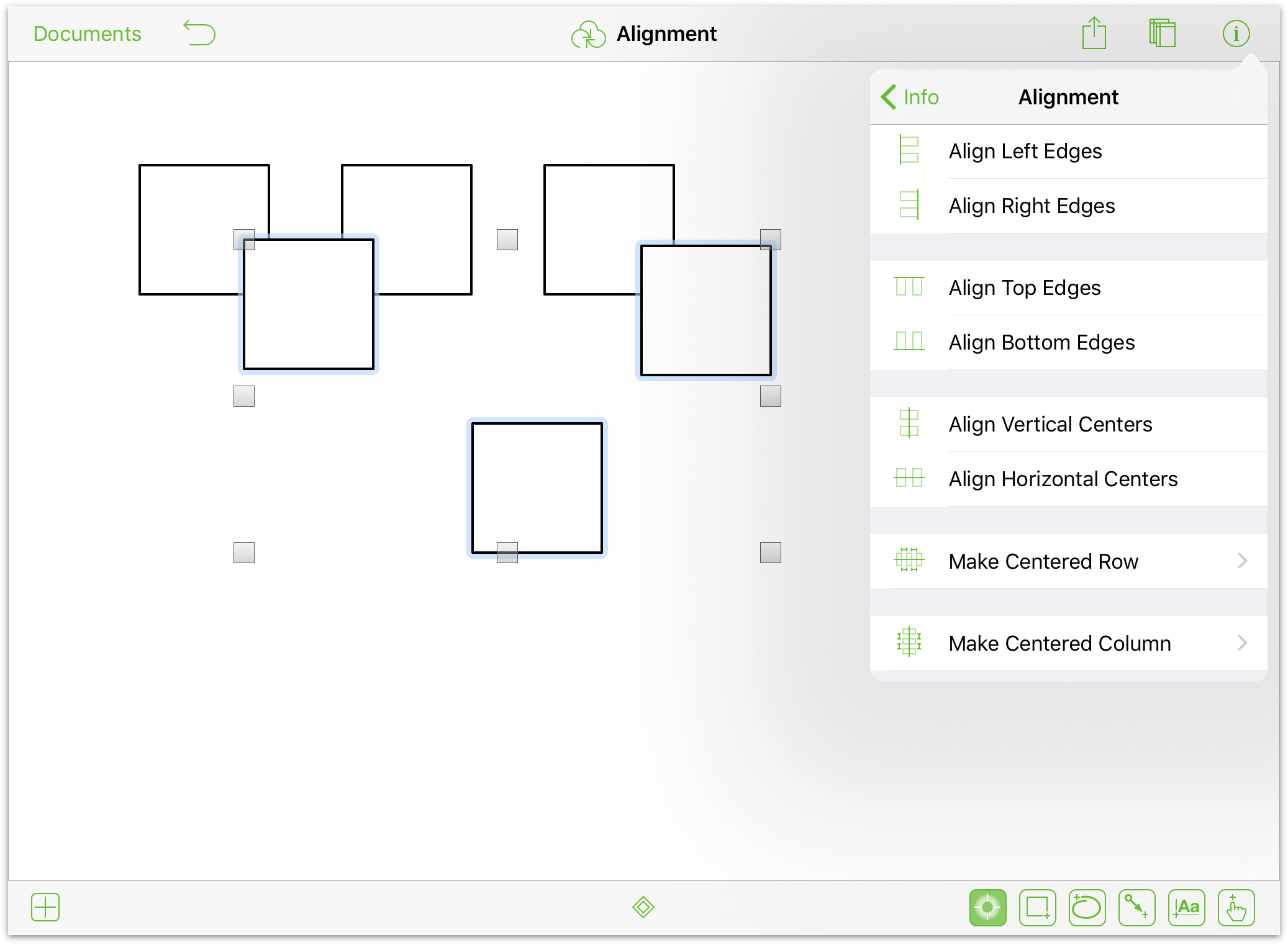
You can align objects based on their Left, Right, Top, or Bottom edges, as well as their vertical or horizontal centers. The final two options in the Alignment inspector, Make Centered Row and Make Centered Column, let you evenly space the selected objects in a row (horizontally) or a column (vertically), respectively. The two Make Centered options also give you the ability to specify the distance between the selected objects.
When aligning objects, OmniGraffle uses the position of the first object you select as the basis for how other objects align to that object. For example, if you have three squares and you want to vertically align them based on the top edge of the middle object, first touch and hold the middle square, and then tap to select the other two objects. With all three squares selected, open the Alignment inspector and tap Align Top Edges; the other two squares shift their positions so that all three squares are aligned based on the middle square’s top edge.
Working with Images
Images have a lot in common with shapes. You can add many of the same properties to them—like a stroke or a shadow, for example. In the image info section, you can make changes to how your image is displayed:
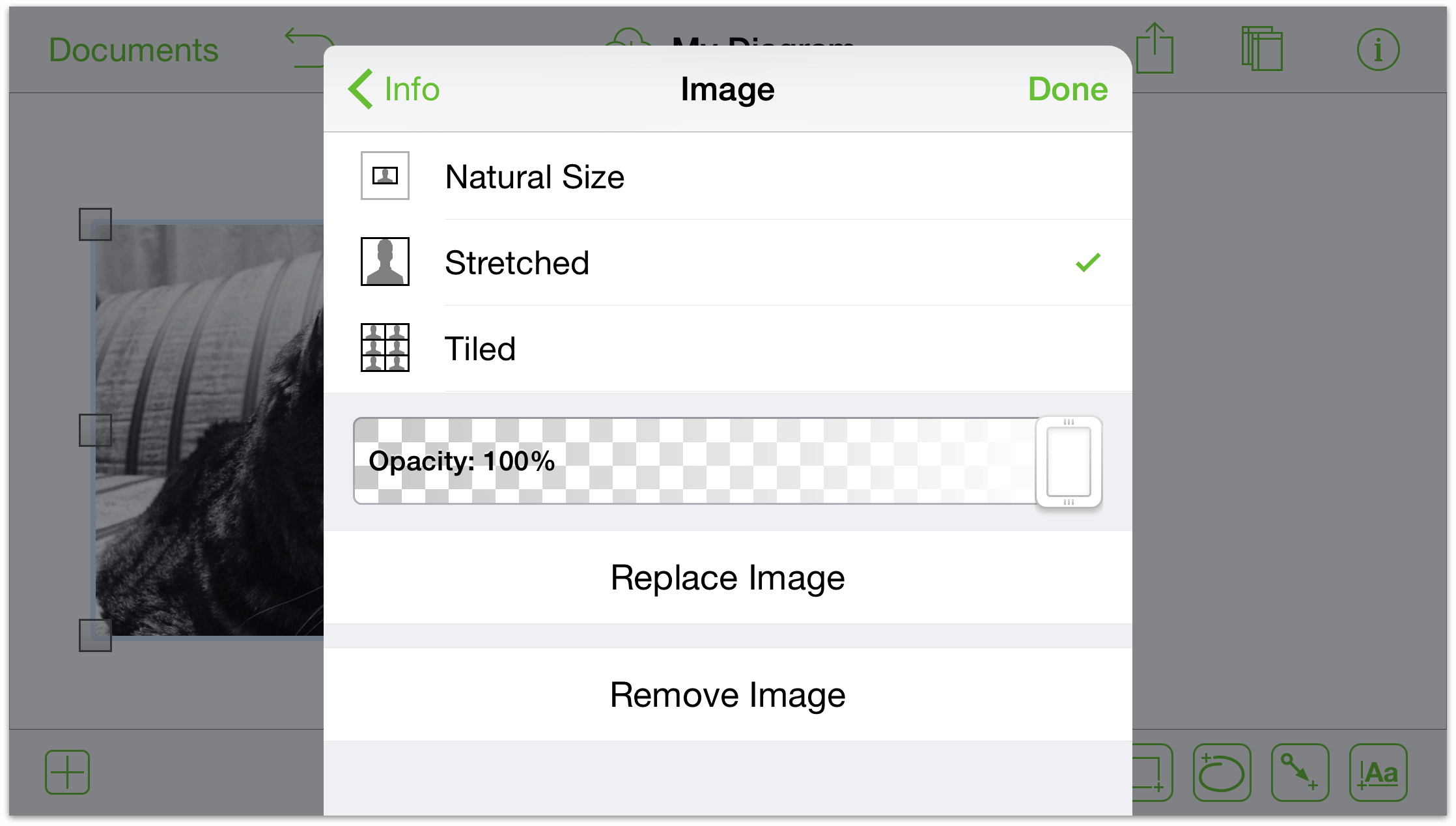
Use the segmented control at the top to specify the image layout. When changing the border size of the object that contains the image: choose its natural size; stretch the image to fill the shape; or tile the image within the shape.
If your image is not stretched, use the size control to increase or decrease the image’s size with the buttons to the left and right of the control, or use tap in the cell to type a value.
Use the opacity slider to create an image you can see through. By default, the image is fully opaque.
Tap the Replace Image or Remove Image buttons to swap or remove the image, respectively.
You can also adjust properties of the image directly on the canvas. Tap, then tap again to reveal a slider to change the image’s size. If your object’s layout is its natural size, you can tap the image, tap again, and then drag to move the image within the shape.
Working with Tables (Pro)
Tables are a great way to quickly enter and communicate information. To create a table:
Add a shape to your canvas (if you don’t have one already) and select it.
Touch and hold your selection, then release. Tap more in the context menu that appears; then, tap make table.
OmniGraffle automatically groups and arranges the shapes into a table. The table will have one column and as many rows as shapes in your original selection. For example, if you had three shapes selected, you will end up with one column and three rows.
To add more rows or columns:
Tap the table to select it.
Drag the handle on the right to add more columns. Use the handle on the bottom to add more rows. Any additional rows will match the last shape of the original table. So, if Row 1 was a circle and Row 2 was a square, any new rows will be squares.
If you prefer to use a menu, touch and hold your table, then release. Tap more in the context menu that appears; then, tap add column or add row.
To add labels: Select an individual shape in the table, and then double-tap to show the keyboard.
Exploring the Color Options
OmniGraffle has a plethora of color options for your perusal. Tap a color well (or the more colors button when available) to view palettes based on the work of some people whose choices in color have proved rather successful.
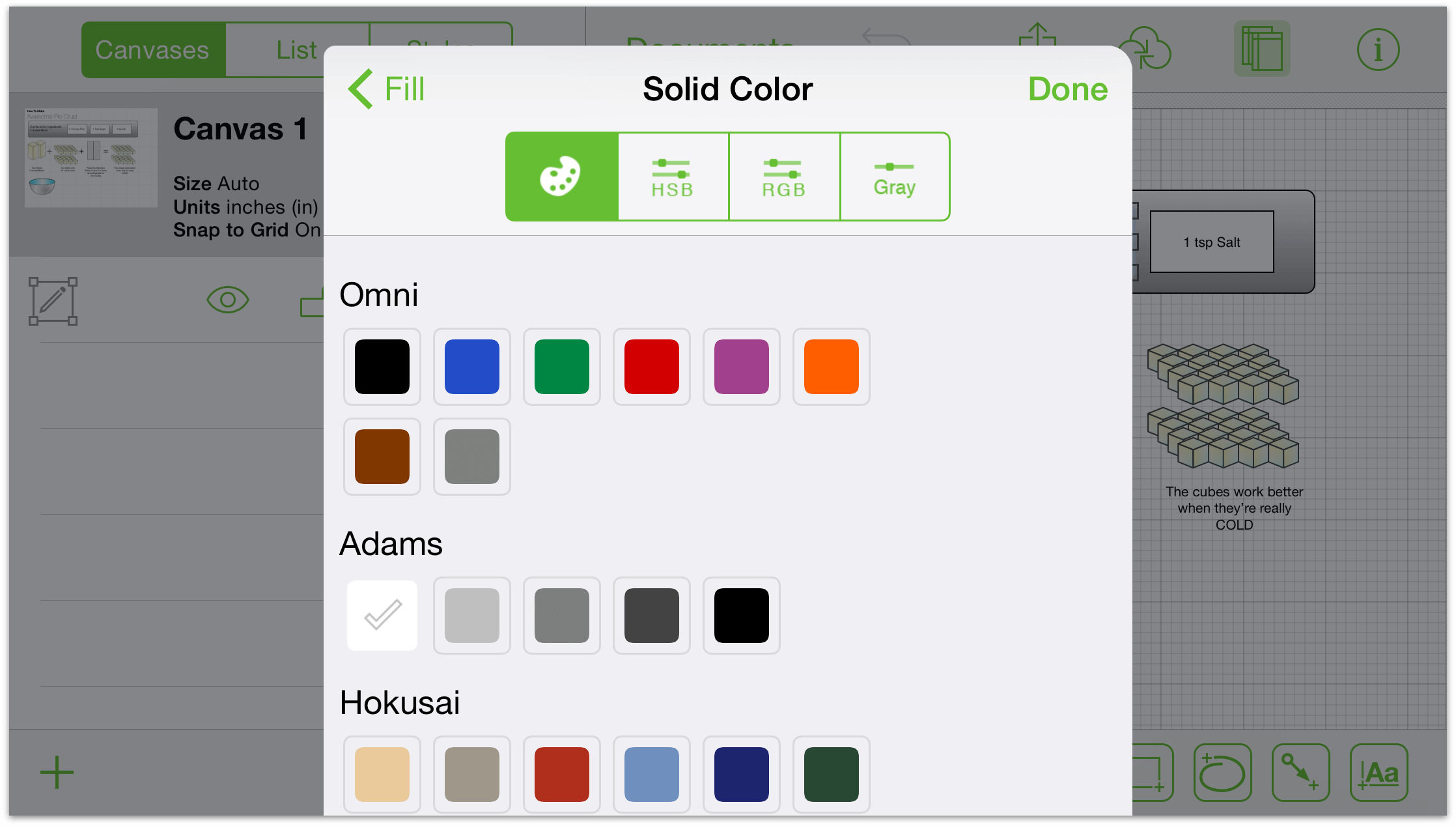
Tap the HSV, RGB, and grayscale buttons to refine:
- HSV
- Change the hue, saturation, value, and opacity of your selection.
- RGB
- Change the red, green, and blue values of a color, along with its opacity.
- Grayscale
- Change the white value of your selection and its opacity.