Contents
- Contents
- Terminology
- The Document Browser
- The Canvas
- The Tool Palette
- Document Toolbar
- Navigation Sidebar
- Inspectors
- Object Inspectors
- Style Inspector
- Properties Inspectors
- Canvas and Document Inspectors
- Settings
- Gestures
- Opening, Placing, and Exporting Files
- Blend and Filter Types
- Keyboard Shortcuts
- Data Variables
- Getting Help
Terminology
Every piece of software you use has a core set of terminology, and like those apps, OmniGraffle has a common nomenclature. To better help you understand the terms and terminology used when describing the interface or how to work in OmniGraffle, we’re providing this brief glossary.
- App Menu
- The App Menu contains information to help you get the most out of OmniGraffle and settings for customizing your OmniGraffle experience. Tap
 in the toolbar of the document browser to access it. See The App Menu for more details.
 - Artboard

- An artboard is a special type of layer whose objects define an export area, or act as a container, for objects on standard or shared layers higher up in the layer stack.
- Bézier
- A curve on a path whose curvature is determined by the extent and angles of control handles which extend from the vertex point. To convert a regular vertex into a Bézier curve, choose the Point Editor Tool and touch and hold the vertex point until its control handles appear.
- Bounding Box
- The rectangular area that defines the space an object occupies on the canvas is known as the bounding box. Bounding boxes have eight handles (one at each corner and centerpoint of the box), which you can click and drag to resize an object.
- Canvas
- The canvas is the big white area in the center of OmniGraffle’s interface where you draw and create things. An OmniGraffle document always contains at least one canvas and one layer.
- Contextual Menus
- Since iOS doesn't have a menu structure similar to macOS, OmniGraffle uses contextual menus to provide a method of interacting with the user interface. Where available, contextual menus appear when you touch and hold on an object and then release your finger.
- If a contextual menu has additional options, you will see an arrow on the right edge of the menu; tap
 to reveal the additional menu options. After scrolling the menu to the right, a
  appears on the left edge of the contextual menu so you can scroll back to the previous set of options.
 - In iOS 13 and later, contextual menus can also appear as vertical lists (such as those that appear for files in the document browser).
- Control Handles
- Red lines that extend from a vertex point; used to control the curvature of a Bézier curve.
- Data Variable
- A string that you can use to insert object and line labels based on other information in your document. Data variables look for like-named elements in a document’s XML source, and display its corresponding data related to the string provide. See Appendix F: Data Variables for a list of data variables available in OmniGraffle.
- Document
- When you create a new file in OmniGraffle, the basic type of file you can create is a document, which ends in a .graffle file extension. You can also create Stencil files (.gstencil) and Templates (.gtemplate).
- Document Browser
- The file browser that OmniGraffle uses to help you manage OmniGraffle diagrams, stencils, and templates. Starting with OmniGraffle 3.11, OmniGraffle uses the built in iOS file browser for document management, including access to your files in the cloud (with iCloud Drive or another storage service) and files synced with OmniPresence to Omni Sync Server or a WebDAV server.
- Drag & Drop
- Drag & Drop is a system-level function that’s integrated with OmniGraffle and other apps on iOS. You can drag into OmniGraffle from the Files app and other apps, reorder items in OmniGraffle’s Sidebar, as well as drag objects, layers, and canvases from an open OmniGraffle file to other apps on your device.
- Files
- The Files app offers a way to access files in local app directories, as well as those in the cloud. You can copy files to the local app directory, tap OmniGraffle files to open them in OmniGraffle, and also drag from OmniGraffle into the Files app.
- Group
- A group consists of two or more objects that are bound to each other. An object group, when selected, can be styled and moved on the canvas as a single unit; the styles you apply using the Object inspectors are assigned to each object in the group.
- Inspector
- You use an inspector to define the styles and properties of an object, define the canvas area and units of measurement, and set document properties for saving and printing your OmniGraffle documents. The individual inspectors are contained in four separate tabs of the Inspector Bar, located to the right of the canvas.
- Inspector Bar
-
The Inspector bar is located to the right of the canvas. Similar to the Sidebar, the Inspector has four tabs which contain specific categories of inspectors:
- Use the Object inspectors to style, size, and arrange the objects you create.
- Use the Style inspector to view the styles applied to a selected object, as well as apply styles from other objects on the canvas.
- Use the Properties inspectors to define how and where lines connect to other objects. If you have OmniGraffle Pro, you can also add Notes and key-value metadata for the objects you create, and assign actions to objects.
- Use the Canvas and Document inspectors to define the selected canvas. If your document has multiple canvases, you can set each canvas’s properties independently. Use the Document inspector to add document-wide metadata for the document.
- Keyboard Shortcut
- A set of keys you press to invoke a menu command, or a single character or number key that you press to select one of OmniGraffle’s tools. Keyboard shortcuts are available when a Bluetooth keyboard is paired with your device.
- Label
- Text that you add to an object, line, or the canvas with the Text Tool.
- Layer
- A layer contains the objects that you draw. There are three different types of layers in OmniGraffle:
-
- Standard Layer — this is the basic layer type, available in both OmniGraffle Standard and Pro.
-
- Shared Layer — shared layers are used to share objects with the canvases in your document. Shared layers are only available in OmniGraffle Pro.
-
- Artboard Layer — artboard layers contain a new object type in OmniGraffle Pro, the artboard.
-
- Shared Artboard Layer — an artboard layer that is shared with all other canvses in your document.
-
Canvases can contain multiple layers of any type.
- Layer Stack
- The order in which layers appear in the sidebar. When a canvas has multiple layers, those layers are stacked on top of each other. Layers can be repositioned in the stack by dragging them up or down in the sidebar.
- Line
- A line can be a standalone object on the canvas, or used to connect two or more shapes together. To create a line, use the Line tool. Use the Stroke inspector to change the line’s style properties, and the Line inspector to change the line type and apply line ends.
- Metadata
- Bits of information that you can enter into the Metadata, Canvas Metadata, or Document Data inspectors, some of which can be retrieved as labels for objects and connecting lines with data variables.
- Navigation Sidebar
- The sidebar to the left of the canvas, is used for managing everything in your document. You can organize and rename the canvases, layers, objects, and groups of objects here.
-
The navigation sidebar has two tabs which you can tap to switch between different things in your document:
- Use the Canvases tab to organize and rename the canvases, layers, objects, and groups of objects in your document.
- Use the Selection tab to select, style, and interact with objects based on their properties.
- Object/Shape
- The things you draw on the canvas are known as objects. An object can be a shape that you draw with the Shape or Freehand Drawing tools, a line that you draw with the Line tool, or a block of text or line label that you enter using the Text tool.
- If you have OmniGraffle Pro, you can also use the Artboard tool to add an artboard to your document, or to convert text to shapes.
- Omni Automation
- A method of scripting OmniGraffle with JavaScript.
- Origin
- The origin marks the vertical and horizontal intersection at the canvas coordinates
0,0. When Show Origin is turned on in the Grid & Guides, the origin point is marked by dark blue Canvas Origin guides. - Plug-In
- An Omni Automation Plug-In can contain a collection of scripts, libraries, and assets. For more information, see the Omni Automation website.
- Smart Guides
- Light blue guidelines that appear when aligning objects on the canvas.
- Stencil
- A stencil is a reusable shape that can be dragged to the canvas from the Stencils window. Stencils can be as simple as a square or triangle, or as complex as a multilayered and meticulously designed illustration. Each object or object group in an OmniGraffle stencil file becomes an individual stencil.
- Stenciltown
- A website for sharing and downloading stencils for use with OmniGraffle.
- Stroke
- A stroke is the line that borders an object. To remove or apply styles to an object’s stroke, or to a line created with the Line tool, use the Stroke inspector.
- Style Filter
- Use the Style Filter buttons along the bottom of the Selection sidebar to isolate like-styled objects based on their style properties. Like-styled objects are collected as Style Sets in the middle of the sidebar.
- Style Set
- After filtering objects based on their styles, objects are collected into Style Sets in the Selection sidebar.
- Table
- A table is a special kind of group that organizes rows and columns of objects.
- Template
- An OmniGraffle file type that contains the base settings—such as the canvas size and units of measurement, background colors, or objects—used when creating new OmniGraffle documents.
- Tool Palette
- Floating above the canvas you’ll find the Tool Palette, which contains the tools you use in OmniGraffle to select, create, draw, connect, and interact with objects.
- Toolbar
- The region along the top of the Document Browser and Canvas is the toolbar. The toolbar contains buttons for opening and closing the Sidebar (to the left of the canvas) and the Inspector sidebar (to the right of the canvas).
- Tooltip
- A brief explanation that appears over a tool or inspector item when selected. Tooltips can be turned on or off by tapping , and choosing Settings from the app menu.
The Document Browser
When you first launch OmniGraffle you arrive at the document browser, where you can open an existing file or create a new one from scratch.
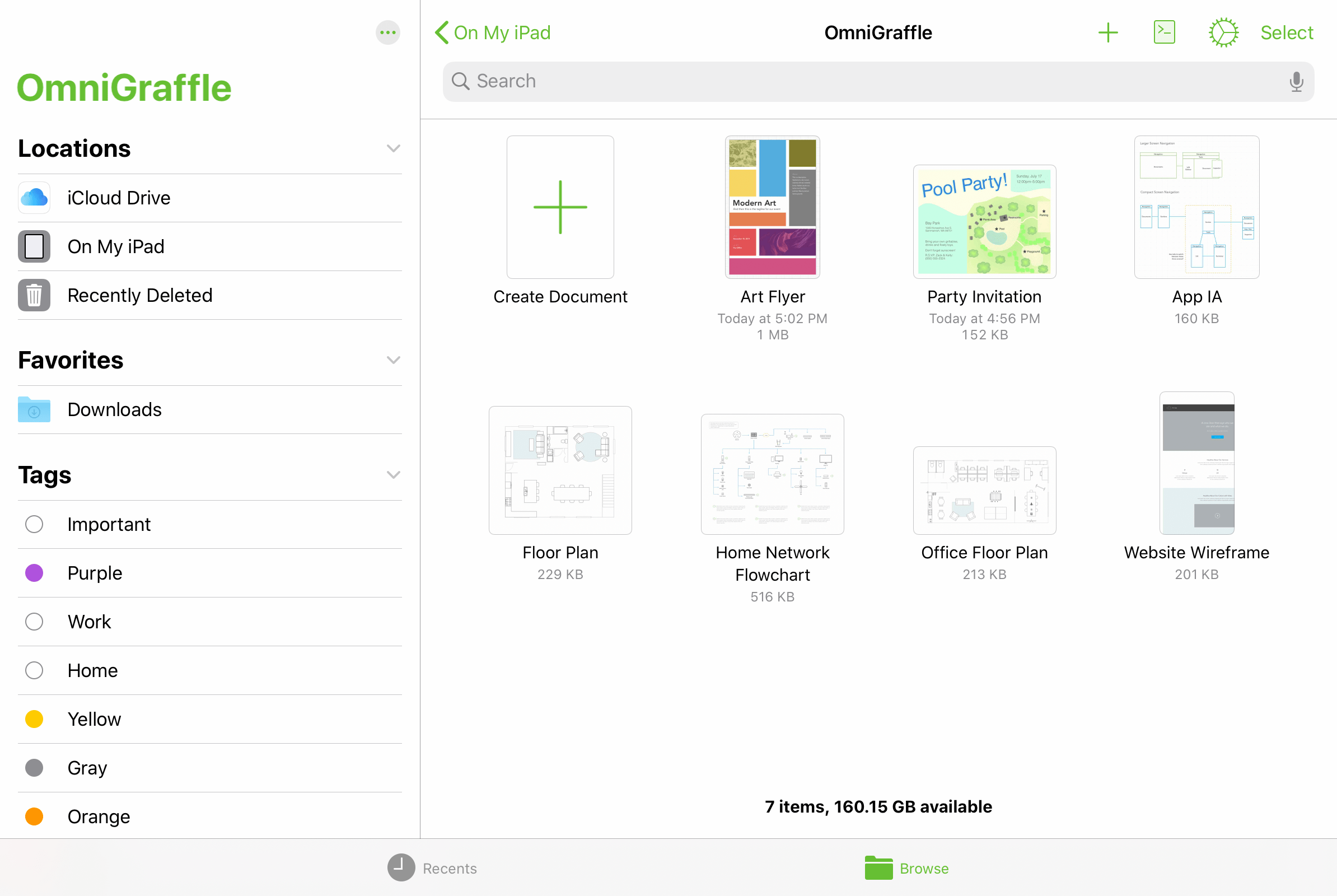
The document browser provides access to the same file storage locations as the iOS Files app, including the OmniGraffle folder on your device (where files are kept locally), your cloud storage locations (such as iCloud Drive), and any OmniPresence folders you have connected.
Recents View
Tap the clock icon  to switch to the Recents view of the document browser, which shows a collection of files that you have worked with recently. This list is drawn from every location available on your device, and includes files stored locally as well as those in the cloud.
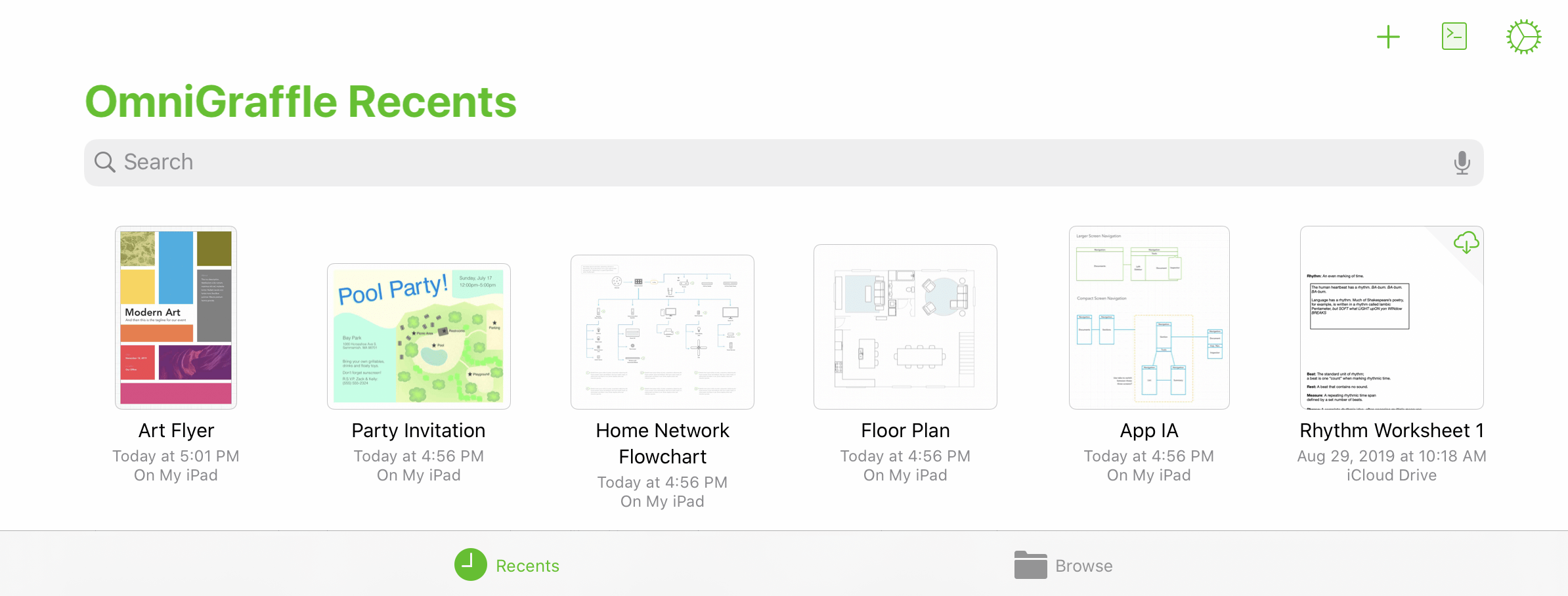
The Recents view is a flat list of files sorted by date from most recently accessed to oldest. If you don't see a file here that you expect, you can use the Search dialog to look through all the files available, or switch to the Browse view to look through the hierarchy of files on your device along with any connected cloud locations.
Browse View
Tap the folder icon  to switch to the Browse view of the document browser, which displays the hierarchy of locations and folders you have stored on your device, as well as any connected cloud service providers.
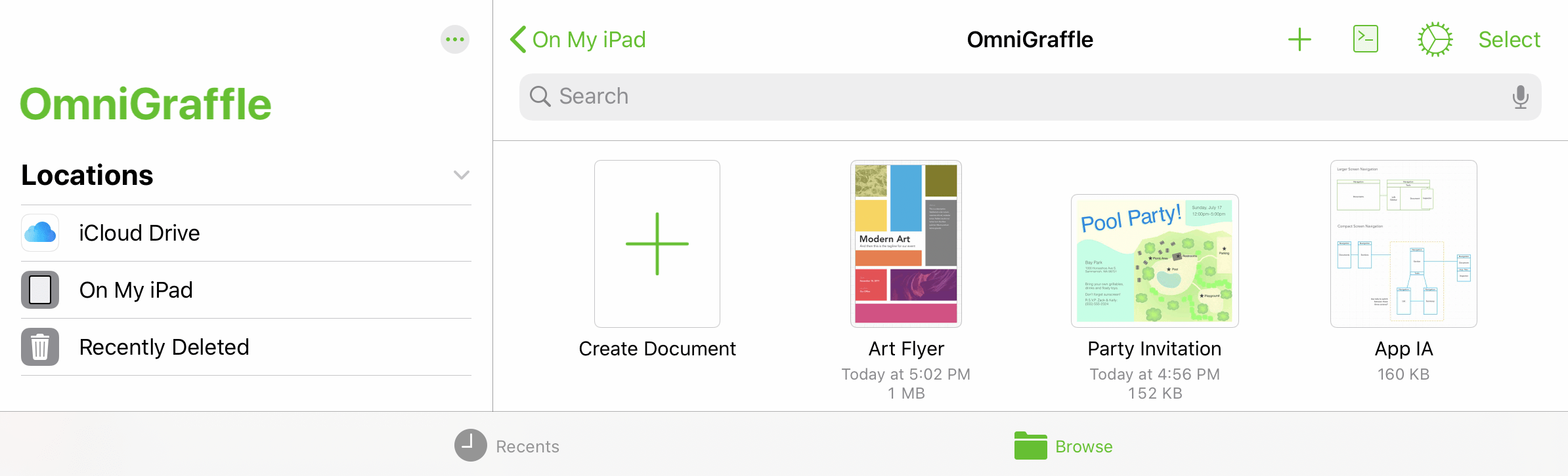
In wide device views, the Locations list offers high level navigation on the left side of the screen, with the contents of a selected location shown on the right; in compact views, Locations sits at the top of the navigation hierarchy with specific locations and their contents nested beneath.
The Locations List
When browsing your files, the Locations list displays the storage destinations that are available on your device. This always includes On My [device], which contains all of your files stored locally. If you have an Apple ID connected, iCloud Drive also appears as an available cloud storage location.
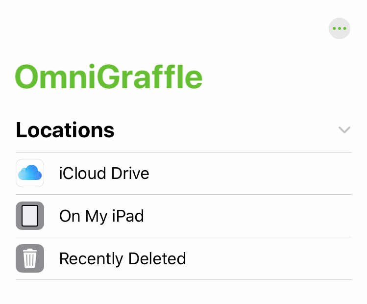
If you have any additional cloud storage providers installed on your device they will appear in this list as well.
Note that OmniPresence, the cloud sync solution operated by the Omni Group, does not appear in the list of service providers here because it doesn't run as a separate application. Instead, you can sync with a dedicated OmniPresence folder inside your On My [Device] > OmniGraffle folder, as described here.
Not all cloud storage providers work equally well with all file formats. We recommend using iCloud Drive or a connected OmniPresence folder to sync your OmniGraffle files; other providers may have trouble depending on the technologies they use.
The final item in the Locations list is Recently Deleted, where iOS temporarily stores files after you have deleted them in case you want them back.
Managing Deleted Files
If you delete an OmniGraffle file, that file is moved to the Recently Deleted folder in the Locations list.
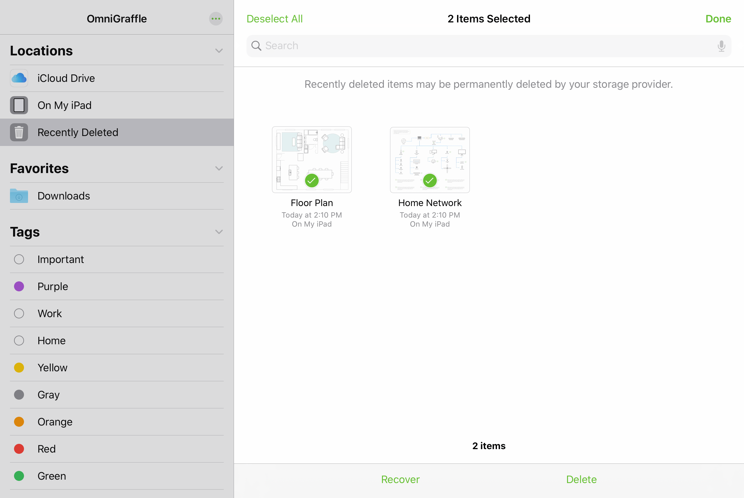
To manage files in the Recently Deleted folder, tap Select in the upper right and tap the thumbnails for each file you would like to manage. Options appear at the bottom of the screen to either Recover the files, returning them to their previous location, or Delete the selected files permanently.
Note that files stored with some cloud storage providers may be permanently deleted immediately instead of moving to Recently Deleted first. Because these recovery standards differ, it's a good idea to always take care when deleting files.
Beneath the list of available locations is a list of Tags. Tap a tag in the list to view all of the items with that tag applied; you can apply tags to individual files using their contextual menu (see File Details below).
Finally, the More button  at the top of the Locations list provides additional functions for modifying the contents of the list.
-
Connect to Server—Choose a server to connect to via SMB, adding it as a location in a separate Shared section of the Locations list.
-
Edit—Switch the list to Edit mode, where you can rearrange locations and tags, and choose which locations you want to be visible in the list. Note that changes made here apply to the Locations list everywhere it appears, including the Files app and other apps that use the iOS document browser.
Browsing a Location
Upon selecting a location in the Locations list, its contents appear in a pane to the right (this pane appears on top of the Locations list when in compact views).
A search field at the top of the pane offers options to search recently opened files, the entire current location, or just the current folder for filenames that match the search terms.

Drag down on the browsing pane to access more controls for the location, choose how files are sorted, and switch between thumbnail and list views.
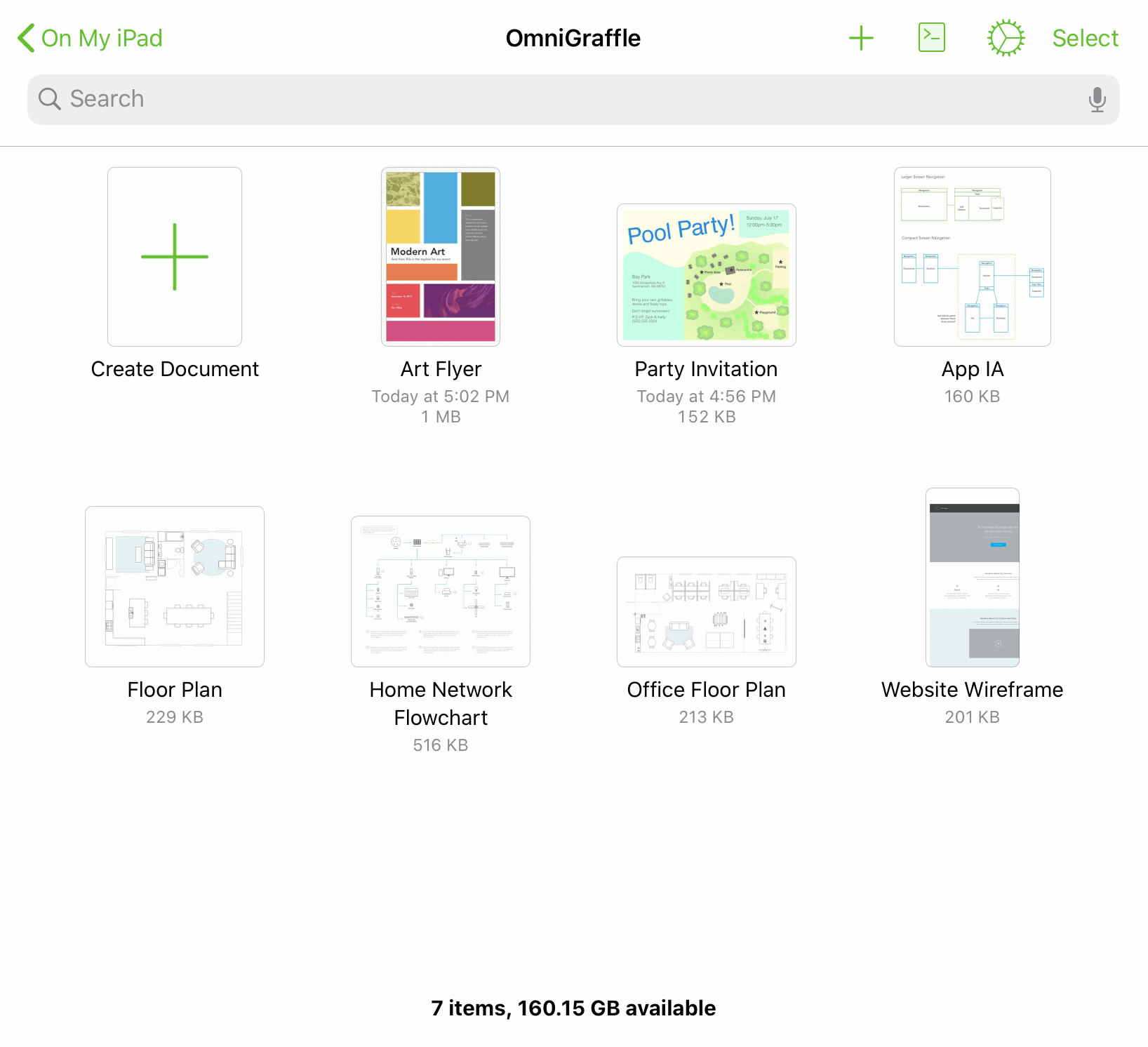
File Details
Each file is represented by a thumbnail image. Once modified, OmniGraffle generates a preview based on the contents of the file; otherwise, the file is represented by a generic document icon.
Along with the thumbnail, each file displays its name, the date it was last modified, and its location on your device.
-
Tap a document preview to open the associated file.
-
To change the name of a file or folder, tap the name and then enter a new title.
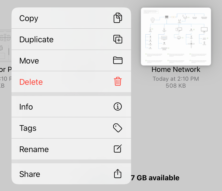
Contextual Menu
Tap and hold a file's thumbnail to open a contextual menu for the file, with the following commands:
-
Copy—Copies the selected file and makes it available on the clipboard for pasting.
-
Duplicate—Copies and instantly pastes a copy of the selected file at the current location.
-
Move—Opens a hierarchical view of your locations where you can choose a new destination for the file.
-
Delete—Deletes the selected file (it can still be recovered if necessary).
-
Info—Presents a popup with detailed information on the file, including a larger document preview, metadata related to the file's creation and modification, location on your device, and any tags you have assigned.
-
Tags—Presents the list of available tags along with the option to create a new one. Tap a tag in the list to assign it to or remove it from the file.
-
Rename—Opens the file rename dialog, just as if you had tapped its name in the document browser.
-
Share—Opens the iOS share sheet, where you can choose from among the standard array of iOS share destinations as well as additional OmniGraffle-specific share options, as described below.
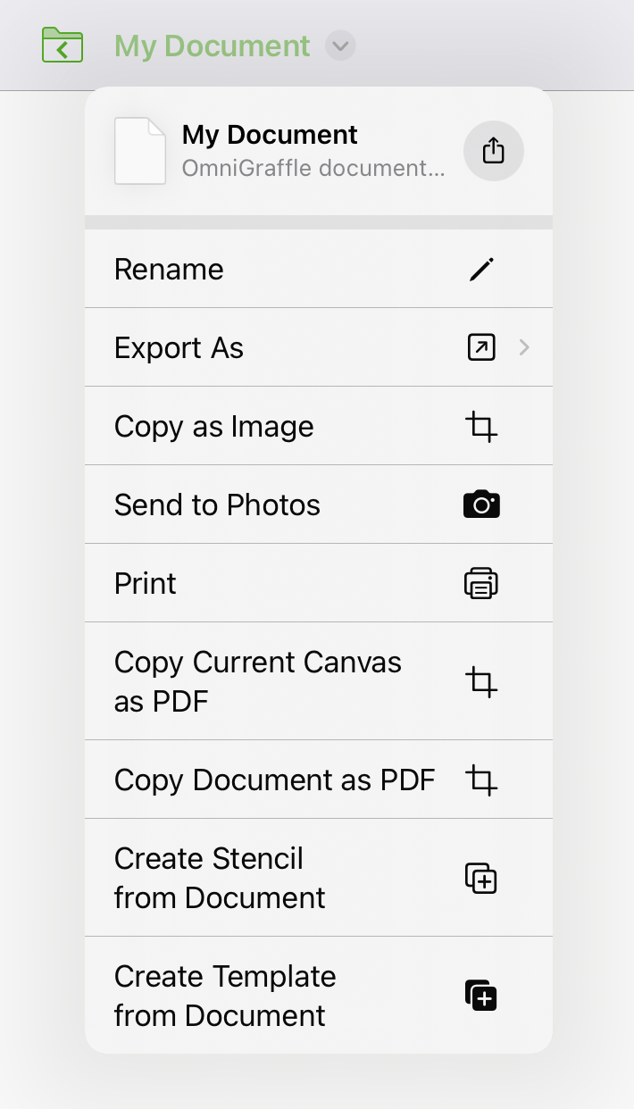
Sharing and Exporting
From a file's contextual menu, with a file selected, or from an open file's document toolbar, tap the Share button  and then choose one of the following actions to perform on the file.
Share As... 
Choose a format for sharing the file, and then choose a destination from the standard set of iOS share destinations.
When sharing an OmniGraffle file, you can choose an export format from among the following file types:
- Modern OmniGraffle (single file zipped)
- Legacy OmniGraffle (compatible with versions earlier than 3.14 for iOS and 7.16 for Mac)
- PNG
- OmniOutliner
If you have OmniGraffle Pro, you can also choose to share the selected file in Visio XML format.
Copy as Image 
Copies to the pasteboard the selected file as an image, which you can then paste onto the canvas of an OmniGraffle file, or into another app.
Send to Photos 
Sends a JPEG image of the selected file’s contents to the Photos app on your device.
Print 
Prints the selected file to an AirPrint printer of your choosing. The document prints based on the orientation set in Size Uses Printer Pages, in the Canvas Size inspector.
Copy Current Canvas as PDF
Copies to the pasteboard the currently selected canvas as a PDF, which you can then paste elsewhere.
Copy Document as PDF
Copies to the pasteboard the selected file as a PDF, which you can then paste elsewhere.
Create Stencil from Document 
Creates a stencil file from the selected document.
Create Template from Document 
Creates a template file from the selected document.
Copy 
Copies the selected file to the clipboard.
Learn more about OmniGraffle import and export in Opening, Placing, and Exporting Files.
OmniGraffle File Types
Several file types are associated with OmniGraffle diagrams, stencils, and templates. Files of these types can be opened, edited, and saved within OmniGraffle for iOS.
| Filetype | Document Icon |
|---|---|
| OmniGraffle Document (.graffle) |  |
| OmniGraffle Stencil (.gstencil) |  |
| OmniGraffle Template (.gtemplate) |  |
If you have OmniGraffle Pro, you can also use the Copy from... command to import Microsoft Visio XML files. Unlike native OmniGraffle files, these are not opened for editing in place; they must be copied into OmniGraffle as described in Opening Files.
The Location Toolbar
When viewing the contents of a location in the document browser, the toolbar along the top of the screen includes the following buttons:

Back 
On the far left of the toolbar is the Back button, followed by the name of the folder that contains the files being viewed. Tap to go backward in the folder hierarchy or return to the Locations list.
Folder Title 
At the center of the folder toolbar is the name of the current folder (such as On My iPad).
Add New 
Tap to create a new OmniGraffle document. After tapping Add New, the Template Chooser opens and displays a list of available templates for your document (starting with the custom templates you've created, if any).
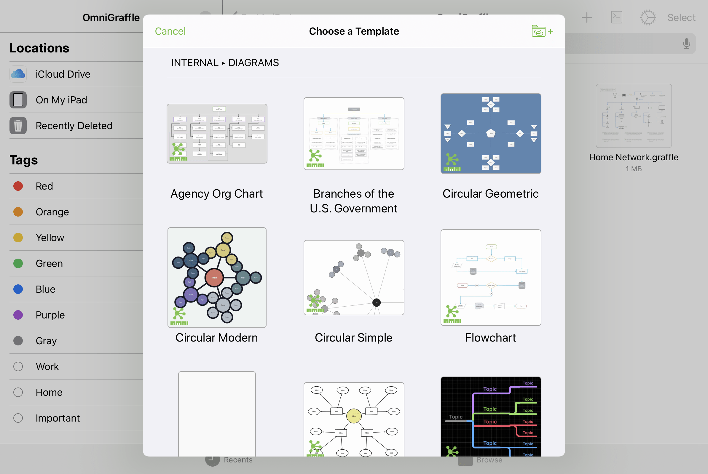
Choosing a template creates a new document pre-populated with the contents of that template, including sample text (if any) and all of the template's default structural and named styles.
To add templates from other locations on your device, tap  in the template chooser or use Configure Resource Locations in OmniGraffle Settings to connect the folders that contain them.
Automation Menu 
Tap to open a menu with controls related to Omni's JavaScript automation.
-
Automation Console—Opens the automation window to the console pane.
-
Automation API Reference—Opens the automation window to the API reference pane.
-
Configure Plug-Ins—Opens a pane that contains a list of automation Plug-Ins on your device, and controls for linking to a folder that contains Plug-Ins stored elsewhere (such as a cloud storage location).
If any Plug-Ins are installed, they appear in a list titled Actions beneath the Configure Plug-Ins menu item.
Omni Automation Plug-Ins require OmniGraffle Pro. For instructions on adding Omni Automation Plug-Ins to OmniGraffle, see this article on the Omni Automation website.
With OmniGraffle 3.17 and later, you can use shortcuts created with the Shortcuts app to run OmniGraffle's Omni Automation Plug-Ins and scripts. Learn more at the Omni Automation website.
OmniPresence Menu 
With an OmniPresence folder connected, the OmniPresence menu button appears in the toolbar. Tap it to open the OmniPresence menu, where you can download files to a connected OmniPresence folder or navigate directly to them by tapping files in the list.
See this support article for details on using OmniPresence with iOS 13 and later.
App Menu
Tap to open a menu with tools and settings related to OmniGraffle itself. See The App Menu below for details.
Select
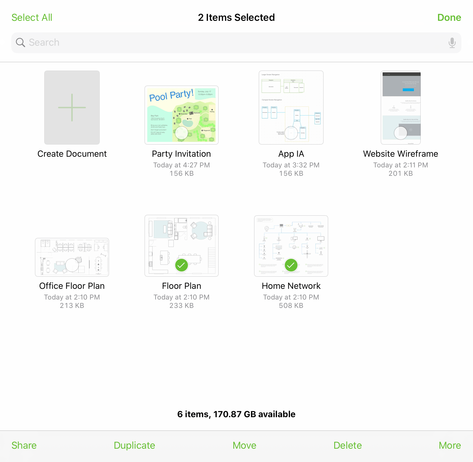
At the far right edge of a folder’s toolbar is the Select button. When tapped, Select makes it possible for you to tap to select documents within a folder. Once a document is selected, use the buttons in the bottom toolbar to share or duplicate the file, move it to another folder, delete it, or copy it.
The App Menu
When viewing the contents of a location in the document browser, tap  at the top of the screen to open the App Menu:
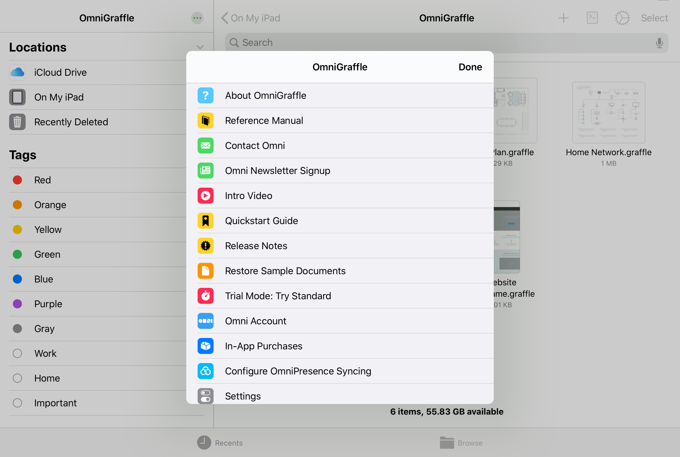
The App Menu has the following options:
About OmniGraffle 
Tap to see which version of OmniGraffle is installed on your device, and to find Omni’s contact information.
Reference Manual 
Tap to view the in-app reference manual.
Contact Omni 
Tap to send us an email.
Omni Newsletter Signup 
Tap to subscribe to Omni’s quarterly newsletter via email. When tapped, you are taken to the Omni website where you can enter your email address to subscribe.
Intro Video 
Tap to revisit the introductory experience and tutorial presented the first time you opened OmniGraffle.
Quickstart Guide 
Tap to open the quickstart guide, with instructions for creating your first OmniGraffle diagram and navigating some of the most common interface controls.
Release Notes 
Tap to see what’s new in the current release. The release notes are also available on Omni’s website.
Restore Sample Documents 
Tap to open a sheet that lists the sample documents originally included with OmniGraffle. Tap a document's filename to restore a copy of that diagram to the OmniGraffle folder on your device.
Trial Mode 
Trial Mode is only available prior to purchasing the upgrade to OmniGraffle Essentials or Pro. Tap to switch between Essentials and Pro to see which version is right for you.
Omni Account 
Tap to open the Omni Account sign in sheet. If you are an OmniGraffle subscriber, use this window to sign in to your Omni Account and unlock the full OmniGraffle feature set.
In-App Purchases 
Tap to purchase the upgrade from Trial Mode to either OmniGraffle Essentials or Pro. This is also where you can restore purchases, if you ever need to reinstall OmniGraffle on a device.
Configure OmniPresence Syncing 
Tap to connect an OmniPresence cloud synced folder to your device. Documents in this folder are automatically synced to the cloud whenever a change is made. You can sync with a free Omni Sync Server account, or an OmniPresence-capable WebDAV server of your choice.
See this support article for details on using OmniPresence with iOS 13 and later.
Settings 
Set preferences for working in OmniGraffle. See OmniGraffle Settings for more details.
The Canvas
The Canvas is the area on which you work. Using the tools provided in The Tool Palette, the Canvas is where you create the objects and shapes that make up your document.
Each Canvas has at least one layer, and each OmniGraffle document can have multiple canvases. Canvases and layers are managed in the Navigation Sidebar.
Canvas Modes
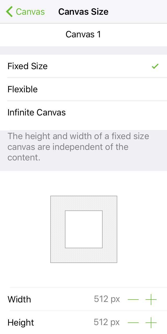
Use the Canvas Size inspector to specify your type of canvas; choose between:
- Fixed Size
- Flexible
- Infinite Canvas
Fixed Size
The canvas is a size of your specification, based on the values set in the Width and Height fields. Choose a Fixed Size canvas when you know the dimensions of the thing you are creating; for example, an app icon.
Flexible
A canvas that can be expanded in any direction: up, down, left, right, or any combination of the four. Choose a Flexible canvas when you want the canvas to expand or collapse to the size of objects on the canvas.
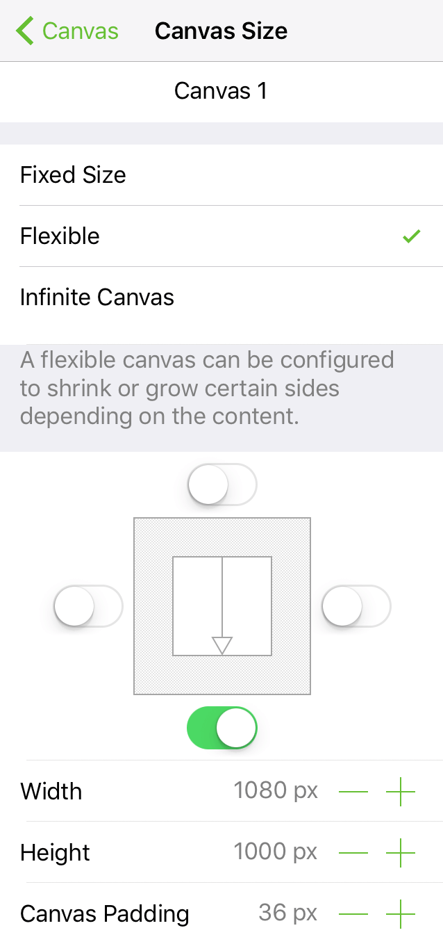
Use the Autosizing Switches to enable canvas expansion in that direction.
- Width: Tap
 or
or  to decrease or increase the width of the canvas, respectively. Changing the Width after the Autosizing Switches have been set turns off the left and right switches.
 - Height: Tap or to decrease or increase the height of the canvas, respectively. Changing the Height after the Autosizing Switches have been set turns off the top and bottom switches.
- Canvas Padding: Tap or to adjust the amount of padding to surround a canvas.
Canvas Padding is disabled when you turn on Size Uses Printer Pages; see Canvas Size inspector, later in this Manual.
Infinite Canvas
A canvas that infinitely extends in all directions. Choose an Infinite Canvas when you have a document that needs a lot of space.
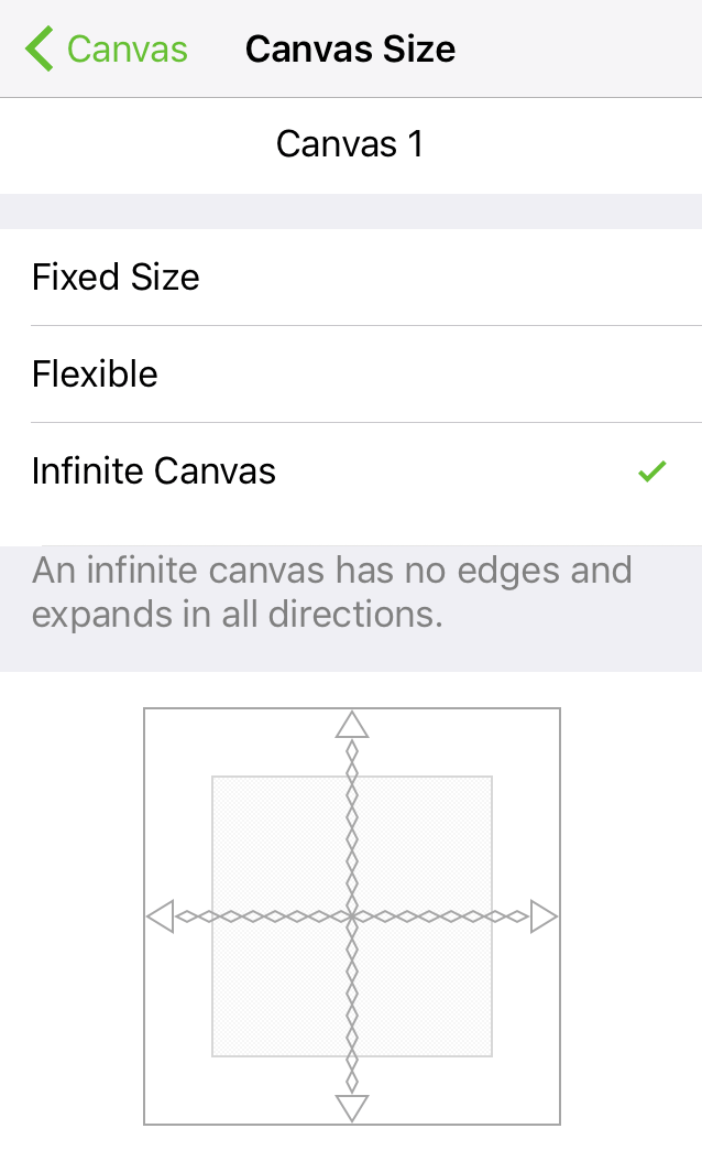
The Width and Height of an Infinite Canvas are not adjustable.
Contextual Menus and the Canvas
With nothing selected on the canvas, a single-tap on the canvas reveals its contextual menu:
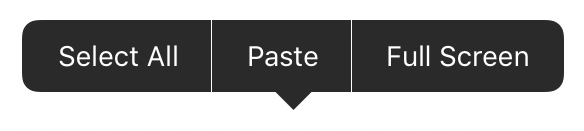
| Menu Item | Description |
|---|---|
| Select All | Selects everything on the canvas. |
| Paste | Available if something has been copied to the clipboard; pastes the contents of the clipboard at the tapped location. |
| Full Screen Exit Full Screen |
Enters or exits Full Screen. |
| Previous Canvas | Navigates to the previous canvas in the document. |
| Next Canvas | Navigates to the next canvas in the document. |
To reveal an object’s contextual menu, touch and hold the object until the menu appears.
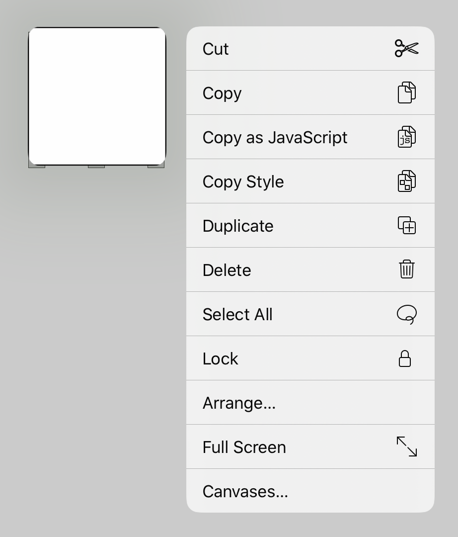
| Menu Item | Description |
|---|---|
| Cut | Removes the selected object(s) from the canvas and places them on the clipboard for pasting. |
| Copy | Copies the selected object(s) and makes it available on the clipboard for pasting. |
| Paste | Available if something has been copied to the clipboard; pastes the contents of the clipboard at the tapped location. |
| Copy As JavaScript |
Copies the properties of the selected object(s) and makes that information available for use in the Automation Console, accessible by tapping  in the toolbar. in the toolbar. |
| Copy Style | Copies the style of the selected object; the style properties are copied to the clipboard for pasting. |
| Paste Style | Available if the style properties of another object have been copied to the clipboard; pastes the style properties from the clipboard to the selected object(s). |
| Duplicate | Copies and instantly pastes a copy of the selected object on the canvas. |
| Delete | Deletes the selected object(s). |
| Select All | Selects everything on the canvas. |
| Lock/Unlock | Locks or unlocks the current selection. |
| Arrange... | Opens the Arrange... submenu, with commands for manipulating the position of the selection. |
| Group | When two or more objects are selected, creates a group from those objects. |
| Ungroup | If a group or table is selected, the selection is ungrouped. |
| Convert Text to Shape |
Converts the characters of a selected text block to shapes. |
| Full Screen Exit Full Screen |
Enters or exits Full Screen. |
The Arrange... submenu contains commands for manipulating the position of the selected object or objects.
| Menu Item | Description |
|---|---|
| Bring to Front | Brings the selected object(s) to the front of the object stack. |
| Bring Forward | Brings the selected object(s) one position forward in the object stack. |
| Send to Back | Sends the selected object(s) to the back of the object stack. |
| Send Backward | Sends the selected object(s) one position back in the object stack. |
| New Artboard Under Selection |
Places an artboard under the selected object(s). If no artboard layer exists, one is created. |
| Make Table |
Creates a table out of the selected object(s). |
The Tool Palette
Whether you’re creating a diagram or an interactive app prototype, the way you create things in OmniGraffle is with a unique set of tools. On iOS, OmniGraffle’s tools are conveniently located in a moveable, collapsible Tool Palette that floats above the canvas area.
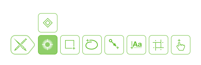
Tools in the Tool Palette
The tool you choose in the floating tool palette determines which inspectors are available in the Inspectors pane. For example, choosing the Shape Tool makes the Fill, Stroke, Shape, Shadow, Connections, Font, and Text Position inspectors available for use.
Tool Palette Handle 
Tap to open and close, or drag to another corner of the canvas area to relocate the floating tool palette.
Selection Tool 
Use the Selection tool to select objects on the canvas.
Point Editor Tool 
Use the Point Editor tool to move the vertex points that make up the path of an object, or touch and hold a point to convert it to a Bézier curve.
Add Point 
Use the Add Point tool to add a point to an object’s path. With the tool selected, tap anywhere along an object’s path to add a point.
Remove Point 
Use the Remove Point tool to remove a point from an object’s path. With the tool selected, tap to remove the undesired point.
Shape Tool 
Use the Shape tool to draw objects on the canvas. Use in combination with the Object inspectors to choose the shape type and stylize objects.
Freehand Drawing Tool 
Use the Freehand Drawing tool to draw on the canvas without the use of predefined shapes.
Shape Recognition 
Turn on Shape Recognition while using the Freehand Drawing tool to have the shapes you draw converted to objects.
Line Tool 
Use the Line tool to connect objects in a diagram, or to draw lines on the canvas.
Text Tool 
Use the Text tool to add text labels to objects and lines, or to add a block of text as a standalone object on the canvas.
Artboard Tool 
Use the Artboard tool to create an artboard for defining export regions of the canvas.
Action Tool 
Use the Action tool to perform an action assigned to an object on the canvas.
Show Action Badges 
Use to display Action Badges; accessible after tapping the Action Tool.
Hide Action Badges 
Use to hide Action Badges; accessible after tapping the Action Tool.
Choosing a Tool
Most tools have three different states: A tool is Unselected when it has a white background, Selected when it has a light green background, or Sticky with a darker green background.
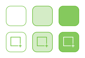
The exceptions are the Selection, Point Edit, Add Point, and Remove Point tools, which are either Unselected or Sticky.
Tap a tool once to Select; or double-tap a tool to make it Sticky. The difference between a Selected and Sticky tool is that:
-
A Selected tool may only be used once. After the selected tool has been used, the Selection tool
 becomes the active tool.
 -
A Sticky tool is persistently active; meaning you can repeatedly use that tool until you choose another tool in the palette.
Document Toolbar
The Document Toolbar is located above the canvas whenever you are working in an OmniGraffle document (diagram, stencil, or template). The Document Toolbar is unique, in the sense that it provides you with document-specific things that you can do; from opening and closing the Navigation Sidebar or Inspectors, exporting the current canvas, or adding a stencil—a pre-drawn object—to the canvas.

Document Toolbar
The Document Toolbar features the filename for the document that you are working on, along with a series of buttons to the left and right for working with the current document.
Hide/Show Sidebar 
Tap to hide or show the sidebar along the left side of the screen.
Documents 
Tap to close the current document and return to its folder in the Document Browser.
Document Title
The toolbar displays the name of the current document here. Tap to edit and change the file name.
On narrow devices the document title is hidden to leave room for more functional button controls. You can always change the title of your document by tapping its preview icon text in the document browser.
Only files stored in your On My [device] folder or a connected OmniPresence folder can be renamed within OmniGraffle. To rename other files (such as those stored in iCloud Drive), tap the filename in the document browser instead.
Starting with OmniGraffle 3.19 and iPadOS 16, the document title adds a menu that includes controls for sharing the document in various ways (in addition to renaming it), as described in Sharing and Exporting.
Sync with OmniPresence 
This icon appears to the left of the document filename if the file is synced via OmniPresence. The icon indicates whether a sync is in-progress; tapping the OmniPresence icon initiates a sync.
This icon doesn't appear in the toolbar in OmniGraffle 3.19 on iPadOS 16.
-
Sync Ready
In its most basic state, OmniPresence is online and ready to sync files.
-
Sync In-Progress

Whenever OmniPresence notices a change to the files in the sync folder, the icon appears to be lifting a barbell.
-
Sync Offline

If you lose your Internet connection (which is required for syncing), the icon turns light green to denote that you are offline.
-
Sync Error

If you see a light green sync icon with an exclamation mark, it means that OmniPresence failed to connect to the sync server. This could be the result of an invalid Account Name or Password, or something as simple as an intermittent Internet connection that drops while OmniPresence is trying to connect to the sync server.
If the icon remains in this state, here are some things you could try:
- Double-check your Account Name and Password.
- Check your network connection in Settings.app.
If that doesn’t help, contact our Support Humans for assistance.
Undo/Redo 
Tap to undo the previous change to your document. Touch and hold to reveal a pop-up menu with the option to Redo.
Sharing and Actions 
Tap to open a menu containing options for exporting or sharing the document you are working on. See Sharing and Exporting in the Document Browser chapter for details on the menu options.
Starting with OmniGraffle 3.19 and iPadOS 16, the Share button no longer appears in the toolbar and can instead be found in the Document Title menu.
Add Stencils and Images
Tap to open a menu for adding a stencil or an image from your Photos library to the canvas. See Using the Stencils and Images Menu for additional details.
Automation
Tap to open a menu with options to open the Automation Console or to view the Automation API Reference. This is an OmniGraffle Pro-only feature, used for scripting OmniGraffle with Omni Automation.
Inspectors 
Tap to open or close the inspector bar along the right side of the screen.
More 
If you see three dots in the toolbar, this implies there are more options/buttons available than there is space for in the toolbar. Tap to open the More menu, which presents the other available options.
Starting with OmniGraffle 3.19 and iPadOS 16, the toolbar adds a More menu with a new icon  and controls for customizing the document toolbar and accessing the OmniGraffle app menu.
Customizing the Toolbar
On an iPad with iPadOS 16 or later and OmniGraffle 3.19 or later, you can customize the document toolbar to include a variety of additional controls not present in the default toolbar arrangement.
To customize the contents of the document toolbar, open the More menu and choose Customize Toolbar.
The custom toolbar editor appears, where you can drag controls up to where you'd like them in the toolbar; you can also remove or rearrange existing controls by dragging them to different spots in the toolbar.
Tap Reset in the editor header to restore the toolbar to its default set of controls.
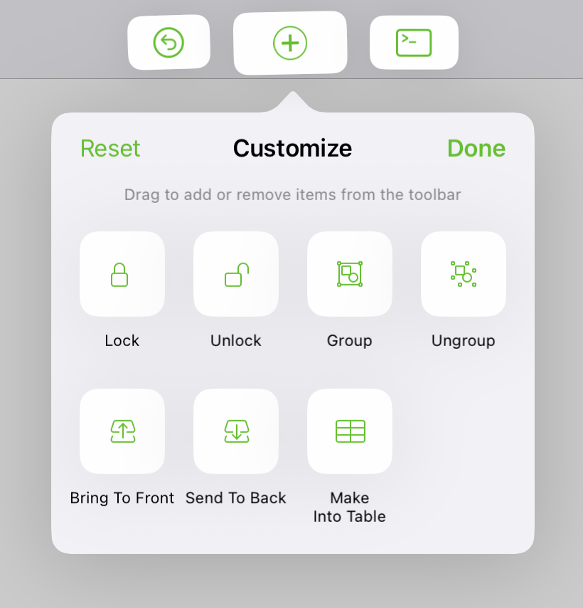
If there isn't enough room in the toolbar for all of the controls you add, any that don't fit are added as menu items in the More menu instead.
Note that changes you make to the document toolbar apply across all documents.
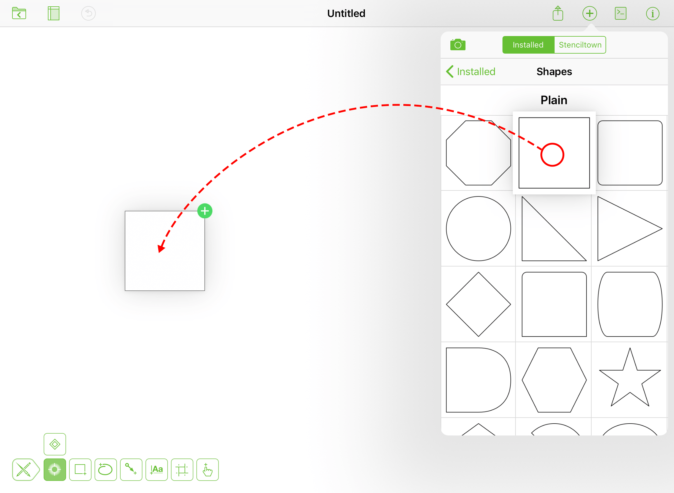
Using the Stencils and Images Menu
Tap  in a document’s toolbar to open the Stencils and Images menu.
Photo Library 
Tapping the camera icon in the menu provides you with the following options:
- Take Photo: Choose this option to use the camera on your device to take and place on the canvas a picture.
- Choose Existing: Choose this option to select and add to the canvas a photo in your photo library.
- Use Latest: Choose this option to place on the canvas the last picture you have taken using the camera on your device.
The first time you tap , you need to authorize OmniGraffle to access your photo library.
Installed 
A list of stencils installed on your iOS device which are available to add to the canvas. See Adding Stencils to the Canvas to see how it’s done.
-
To install stencils in the default OmniGraffle location, use the Files app to copy the .gstencil files into the OmniGraffle folder on your device (On My Device > OmniGraffle) or the OmniGraffle folder in iCloud Drive (iCloud Drive > OmniGraffle).
-
To add stencils from other locations on your device, use Configure Resource Locations in OmniGraffle Settings to connect the folders that contain them.
Stenciltown
View available stencils on Stenciltown, Omni’s free online stencil-sharing service. See Downloading and Using Stencils from Stenciltown to see how it’s done.
Search
Use the Search field to quickly find stencils Installed on your device, or available for download from Stenciltown.
Adding Stencils to the Canvas
To add a Stencil that’s installed on your device, tap in the toolbar, choose a stencil set, and then tap or drag a stencil to the canvas.
Downloading and Using Stencils from Stenciltown
To download stencils from Stenciltown, tap in the toolbar, choose Stenciltown in the menu, and then search for the stencil you are looking for and tap Download to add the stencil set to your device.
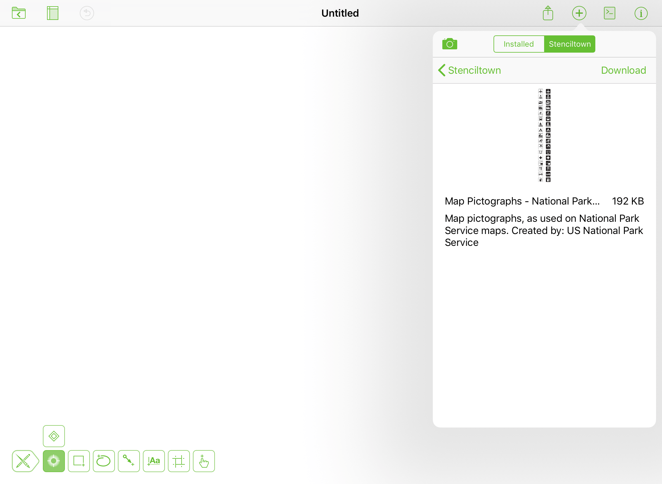
Searching on—and downloading from—Stenciltown requires an Internet connection.
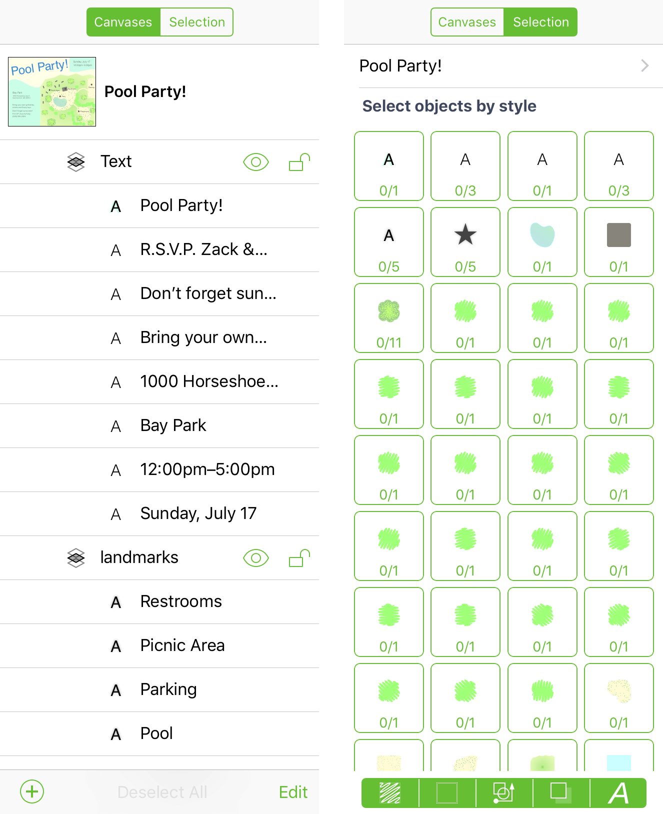
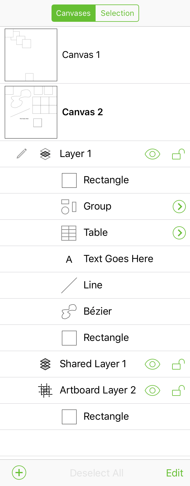
Navigation Sidebar
The Navigation Sidebar is split into two different views: Canvases, which lets you organize the objects, layers, and canvases in your document; and Selection, which lets you select text and objects in your document based on their unique style properties.
The Canvases Sidebar
Use the Canvases sidebar to manage and organize the components of your document. OmniGraffle documents can have multiple canvases with multiple layers, and with OmniGraffle Pro you can share layers—and the objects on them—with other canvases.
OmniGraffle documents have at least one canvas with one layer; you cannot have a canvas without a layer. To add a new canvas or layer to your document, tap at the bottom of the sidebar, and then choose New Canvas or New Layer.
If you have OmniGraffle Pro, you can also add a New Artboard Layer or New Shared Layer to the canvas.
Layer Types 
The most basic type of layer in OmniGraffle is the Standard Layer, as denoted by  , appearing to the left of the layer name in the sidebar.
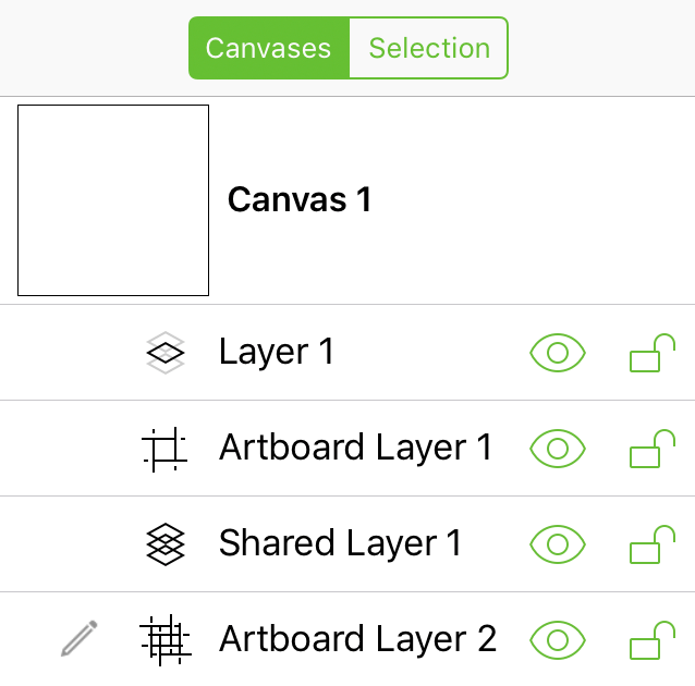
OmniGraffle Pro features these additional layer types:
Artboard Layer 
Used as a “container” to manage objects and define canvas areas for export. The objects on an Artboard Layer affect objects on the layers above.
Shared Layer 
Used to share objects between multiple canvases in a document.
Shared Artboard Layer 
An artboard layer that is shared with other canvases in the document. The objects on a Shared Artboard Layer affect objects on the layers above on all canvases.
Layer States
Layer states are defined by the following icons in the Sidebar:
| Icon | Description |
|---|---|
 |
This is the active layer. |
 |
An object is selected on this layer. |
 |
Denotes an object is selected on the current layer. |
 |
Denotes that the selected layer cannot be written to because it is locked. To unlock the layer, tap  . . |
 |
The layer is visible; tap to hide. |
| The layer is hidden; tap to make visible. | |
 |
The layer is unlocked and may be written to; tap to lock. |
|
The layer is locked and cannot be written to; tap to unlock. |
To reveal a layer’s contextual menu, touch and hold anywhere on the layer’s row in the navigation sidebar.
| Menu Item | Description |
|---|---|
| Cut | Removes the selected layer from the canvas and places it on the clipboard for pasting. |
| Copy | Copies the selected layer and makes it available on the clipboard for pasting. |
| Paste | Available if a layer has been copied to the clipboard; pastes the layer (and its contents) into the selected canvas. |
| Duplicate | Creates a duplicate of the selected layer, including any objects on that layer. |
| Delete | Removes the selected layer from the canvas. |
| Convert to Artboard Layer |
Converts the selected layer into an Artboard Layer; all objects on that layer become artboards. |
| Don’t Share With Other Canvases |
Available when the selected layer is a Shared Layer. Converts a Shared Layer into a Normal Layer (i.e., one that is not shared with other canvases). |
| Share With All Canvases |
Converts the selected layer into a Shared Layer; all objects on that layer are visible on other canvases in the document. |
Using Drag & Drop in the Sidebar
You can use drag and drop in the sidebar to rearrange objects on a layer, or even reorder layers and canvases within your document.
What’s more, you can drag objects, layers, and canvases out of OmniGraffle, enabling you to quickly export objects from the canvas and into other apps on iPad, including to the Files application. Regardless of what the receiving app accepts, an artboard will include the objects above it, and a layer includes the objects with a transparent background.
To use drag and drop in the sidebar:
- Touch and hold on the item you want to drag.
- Drag the item to where you want it to go.
- Remove your finger from the screen to drop the item in place.
Need to drag more than one item? OmniGraffle’s sidebar supports multiple drag and drop, and you can mix and match the items you drag. For example, you could tap to select a couple objects, a layer and its objects, and even another canvas with its layers and objects. Once you have selected the items you want to move in the sidebar or drag out of OmniGraffle, drag them to where you want them to go.
Edit Mode
Tapping Edit at the bottom of the sidebar enables Edit Mode, which allows you to move, delete, copy, or cut the objects, layers, and canvases in your document.
Tap to select items ( ) in the sidebar, and then use the options at the bottom of the sidebar to perform actions on your selection(s).
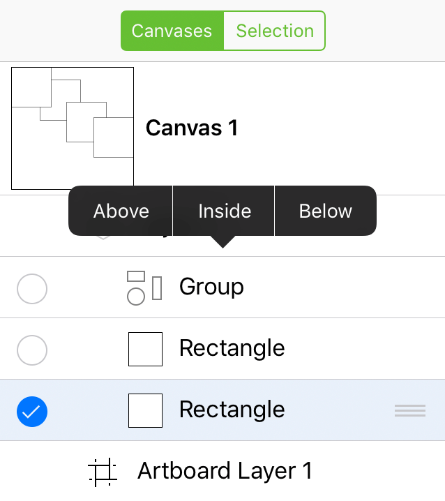
Move
Move the selected item(s) elsewhere in the document. When you tap Move, the bottom bar displays the text, Tap object destination. In the sidebar, tap an item to where you want to move the selection, and then choose Above, Below, or Inside if the move location is a Group or Table.
Delete
Deletes the selected item(s). You can tap Undo in the Document Toolbar to restore the item(s) to the document.
More...
Tapping More reveals a pop-up menu with options to Copy or Cut the selected item(s). The More menu gains the following options, depending on what is selected in the sidebar:
- If you have selected a canvas, a Duplicate option is available at the bottom of the pop-up menu.
- If you have selected two or more objects, a Group option is available at the bottom of the pop-up menu.
- If the item you have selected is a Group, an Ungroup option is available at the bottom of the pop-up menu.
Done
Tap Done when you are finished working in Edit Mode.
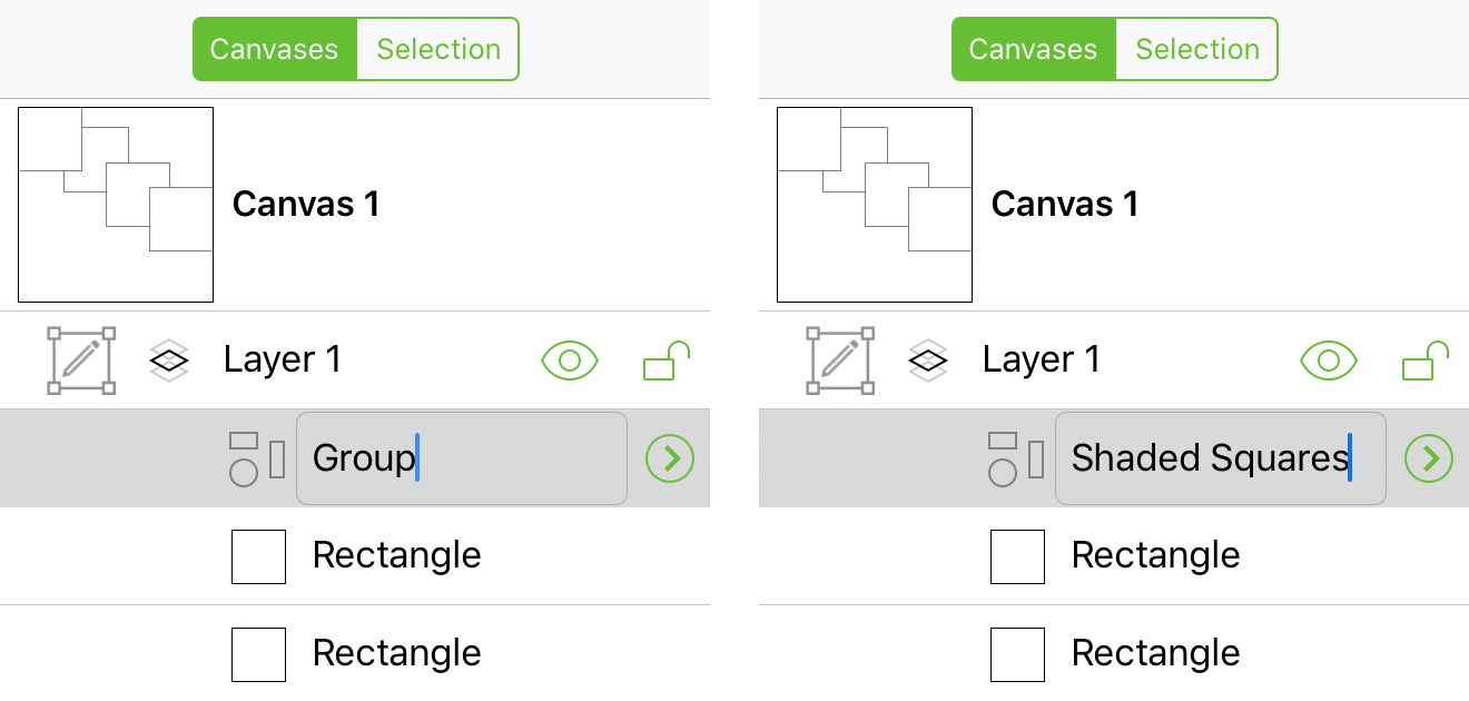
Renaming Canvases, Layers, and Objects
To rename canvases, layers, and objects in the Sidebar, tap the name twice to bring up the keyboard, enter a new name, and then tap Done.
Objects in the Sidebar
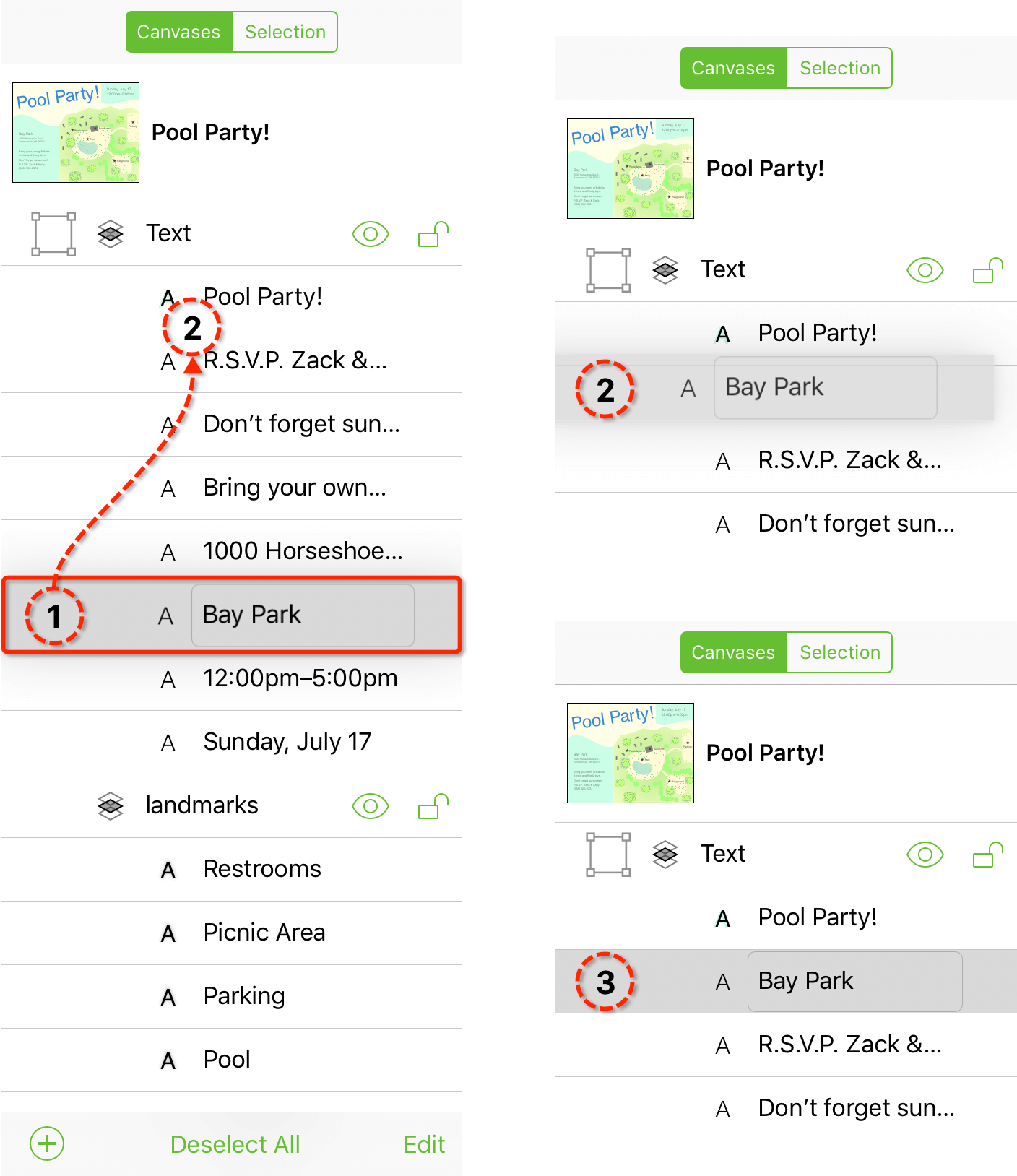
When you tap an object in the sidebar, the selection receives a gray highlight in the sidebar, and the object is selected on the canvas.
Tap Deselect All at the bottom of the sidebar to deselect any selected items in the sidebar. To view the objects that make up a table or group, tap  .
.
To reveal an object’s contextual menu from the sidebar, touch and hold on the object until the menu appears.
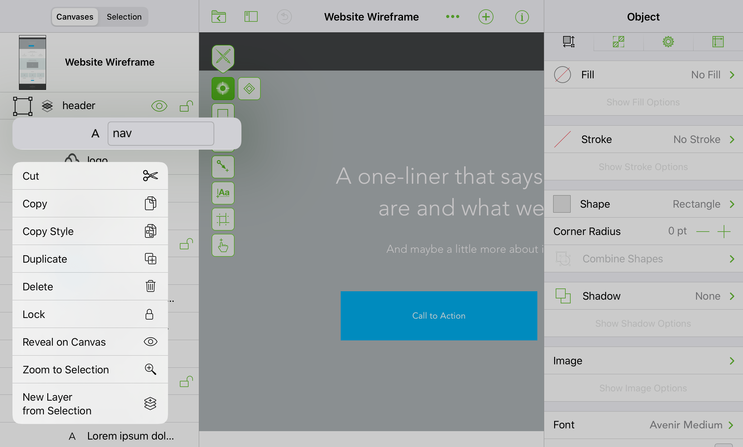
| Menu Item | Description |
|---|---|
| Cut | Removes the selected object(s) from the canvas and places them on the clipboard for pasting. |
| Copy | Copies the selected object(s) and makes it available on the clipboard for pasting. |
| Paste | Available if something has been copied to the clipboard; pastes the contents of the clipboard at the tapped location. |
| Duplicate | Creates a duplicate of the selected layer, including any objects on that layer. |
| Copy Style | Copies the style of the selected object; the style properties are copied to the clipboard for pasting. |
| Paste Style | Available if the style properties of another object have been copied to the clipboard; pastes the style properties from the clipboard to the selected object(s). |
| Delete | Deletes the selected object(s). |
| Group | When two or more objects are selected, creates a group from those objects. |
| Ungroup | If a group or table is selected, the selection is ungrouped. |
| Zoom to Selection | Zooms in on the selected object(s), filling the canvas view with that object(s). |
| Scroll to Selection | Scrolls the canvas so that the selected object is centered within the canvas view. |
| Lock/Unlock | Locks or unlocks the selected object. |
| Reveal on Canvas | Shows the selected object on the canvas. |
| New Layer from Selection | Creates a new layer with the selected object(s). |
The Selection Sidebar
Use the Selection sidebar to view objects by their type and style properties.
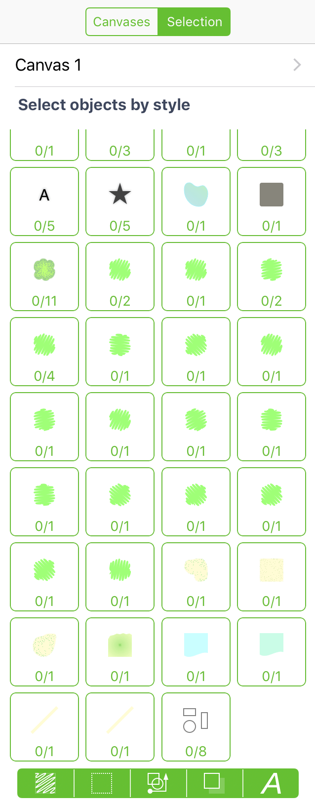
Objects in the document are filtered in the Selection sidebar by their styles, using the Style Filters along the bottom of the sidebar:

Use the Style Filters to choose which object styles are shown in the grid of Style Sets in the middle of the sidebar.
You can turn Style Filters on or off by tapping the filter buttons.
Fill Style 
Filters objects by their fill type and color.
Stroke Style 
Filters objects by their stroke type and color.
Shape and Line Styles 
Filters objects based on their shape type and line styles.
Shadow Style 
Filters objects based on their shadow properties.
Font Style 
Filters objects based on font and text alignment properties.
You can choose how objects are gathered in sets by selecting one or more Style Filters at the bottom of the sidebar. Objects with similar style properties are collected in a Style Set which, when tapped, selects those objects on the canvas.
Selecting a Style Set in the sidebar selects that set’s objects on the canvas, making it easy for you to collectively restyle those objects rather than one at a time.
Inspectors
Use the Object, Style, and Properties inspectors for working with objects on the canvas, and use the Canvas inspectors for configuring the canvas and setting document-specific metadata.
Inspector Basics
To access the inspectors, tap  in the toolbar. Depending on the orientation and available screen space (for example, when multitasking on iPad), the Inspectors Bar either slides in from the right or bottom edges of the screen. When there is enough room on the right side of the screen, the Inspectors Bar appears there; otherwise, the bar slides up from the bottom of the screen.
The inspectors reside within four tabs in the Inspectors pane: Object, Style, Properties, and Canvas/Document inspectors. Tap a tab to switch inspector sets.
Wherever you see paired with in an inspector, these are used as “steppers” to decrease or increase a number value, respectively. For example, while using the Stroke inspector, tapping makes the stroke thinner, while tapping makes the stroke thicker.
Many of the inspectors include a Show/Hide [Inspector] Options button. For example, tapping Show Stroke Options unveils a list of available stroke Patterns you can choose from.
Inspector Tabs
The inspectors are gathered in four tabs, and categorized by their purpose. To switch between tabs, tap the applicable tab at the top of the Inspectors Bar.
Object Inspectors 
Inspectors for defining the style properties of objects, shapes, and text. Object inspectors include:
Style Inspector 
Displays the styles of the selected item on the canvas, as well as the style properties of everything else on the canvas. Tap a different style in the On This Canvas section to apply that style to the current selection.
Properties Inspectors 
Inspectors for further defining the properties of an object. Properties inspectors include:
Canvas Inspectors 
Inspectors for defining the properties of the canvas and the OmniGraffle document itself. Canvas inspectors include:
Fill Types for Objects and Canvases
The Fill Type pop-up menu, found in the Fill and Canvas Background inspectors allow you to set a fill for a shape or apply a background color or pattern for the entire canvas.
The one difference between Object and Canvas Fill is that Object Fill also has a None option, whereas the Canvas must always have a fill.
None 
An object without any fill properties. This option is not available in the Canvas Fill inspector.
Solid 
Fills the object/canvas with a solid color. Tap the Color Swatch to select or mix a color.
Linear Gradient 
Fills the object/canvas with a linear gradient. Use the Color Swatches to change colors for the start and end phase of the gradient.
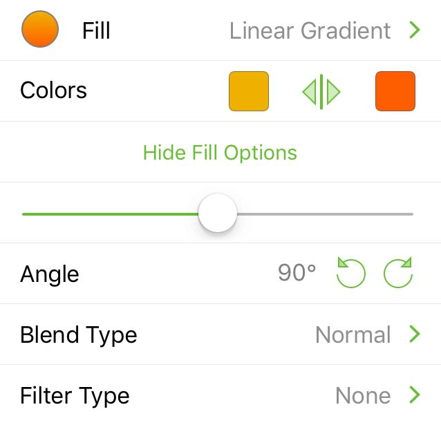
- Colors: Choose start and end colors. Tap
 to swap color positions.
 - Slider: Adjust where the midpoint of the gradient appears.
- Angle: Tap
 or
or  buttons to rotate in 15° increments. Optionally, double-tap and then enter a specific number for the angle of the gradient.
Radial Gradient 
Fills the object/canvas with a radial (i.e., circular) gradient. Use the Color Swatches to change colors for the inner and outer phase of the gradient.
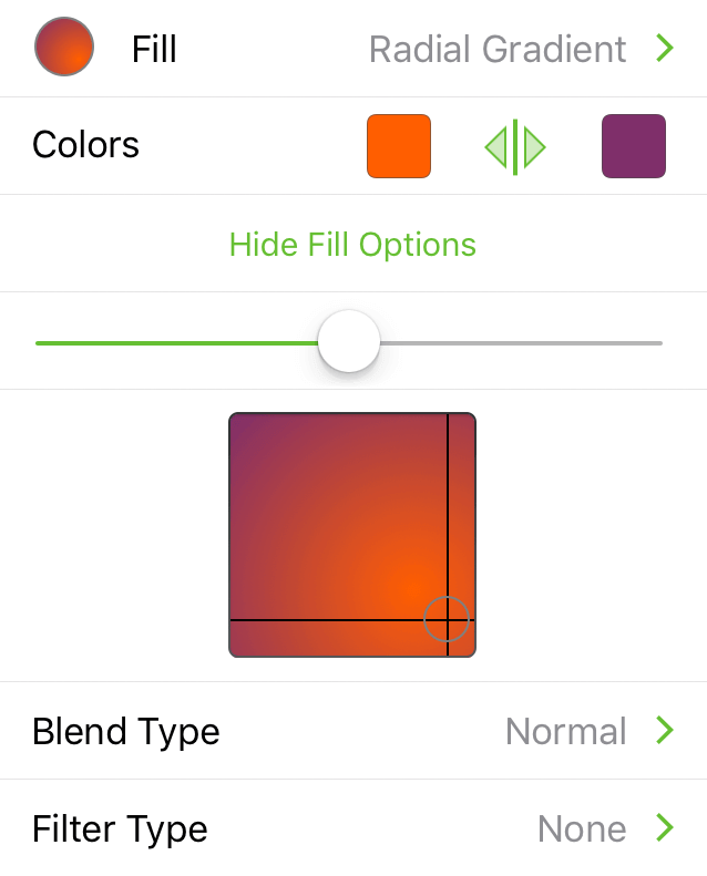
- Colors: Choose start and end colors; center and outside, respectively. Tap to swap color positions.
- Slider: Adjust where the midpoint of the gradient appears.
- Light Source Positioning: Touch and hold, and then drag the circle to reposition where the light source for the gradient is positioned.
Double Linear Gradient 
Fills the object/canvas with a three-colored linear gradient. Use the Color Swatches to change colors for the start, mid-, and end phase of the gradient.
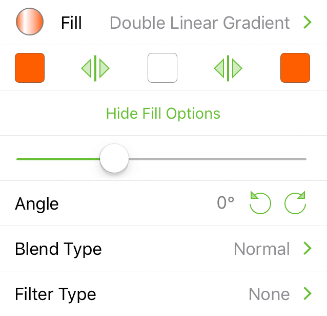
- Colors: Choose colors for the start, mid-, and end phase of the gradient. Tap to swap right/center or center/left colors.
- Slider: Adjust which is the dominant color in the gradient; drag to the right for the left-most color, or to the left for the right-most color, or leave centered for the middle color.
Double Radial Gradient 
Fills the object/canvas with a three-colored radial gradient. Use the Color Swatches to change colors for the inner, mid-, and outer phase of the gradient.
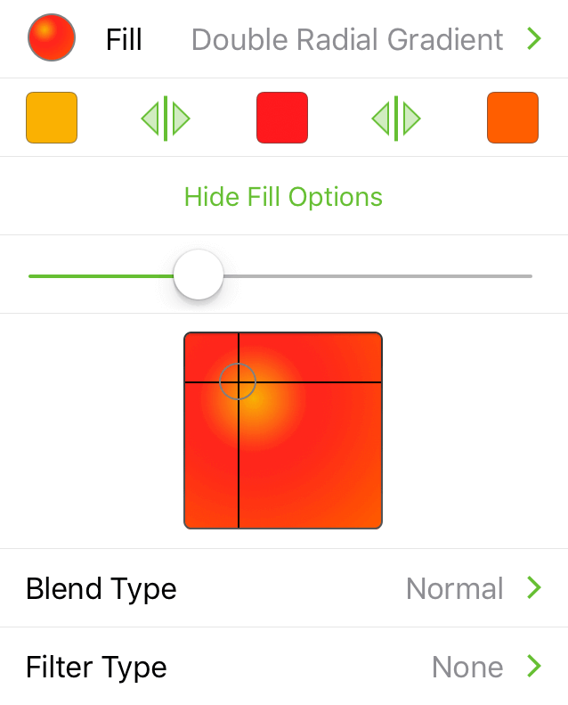
- Colors: Choose colors for the inner, mid-, and outer colors of the gradient. Tap to swap the inner/middle or middle/outer colors.
- Slider: Adjust which is the dominant color in the gradient; drag to the right for the left-most color, or to the left for the right-most color, or leave centered for the middle color.
- Light Source Positioning: Tap in the box to reposition where the inner color appears. Optionally, you can touch and hold within the square.
Stipple 
Fills the object/canvas with a black background and with white “stipple” dots around the outer edge. Use the Color Swatches to change the background and stipple colors.
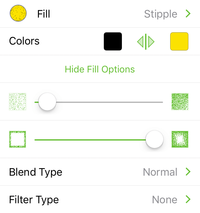
- Colors: Choose the color for the stipple dots (right) and the background (left). Tap to swap the stipple and background colors.
- Stipple Frequency Slider: Drag left for fewer stipple dots or to the right for more.
- Stipple Depth Slider: Drag to the left to keep the stipple dots closer to the edge of the object/canvas, or to the right to fill in more of the object/canvas area.
Squiggle 
Fills the object/canvas with a black background with a thick curvy line on top. Use the Color Swatches to change the background and squiggle colors.
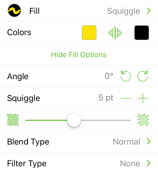
- Colors: Choose the color for the squiggle line (right) and the background (left). Tap to swap the squiggle and background colors.
- Angle: Tap or to rotate the squiggle line in 15° increments; optionally, double-tap the angle number to enter a specific value.
- Squiggle Size: Tap or to decrease or increase the width of the squiggle line, respectively.
- Squiggle Gap Slider: Drag to the left to have the squiggle lines appear closer together, or drag to the right to add more space between the lines (revealing more of the background color in the process).
Plastic 
Fills the object/canvas with a shiny, plastic-like fill that is slightly beveled. Use the Color Swatches to change the highlight and bevel colors.
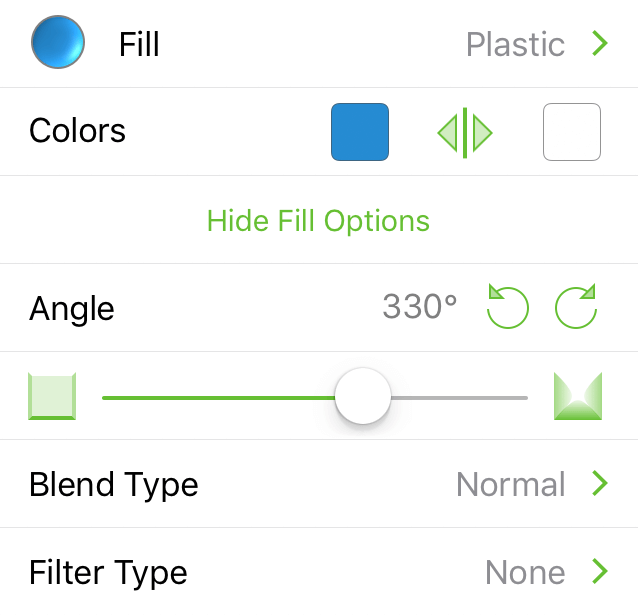
- Colors: Tap the left color swatch to set the background color; tap the right color swatch to set the highlight color. Tap to swap the selected colors.
- Angle: Tap or to rotate the position of the highlight color (the right color swatch); optionally, double-tap the angle number to enter a specific value.
- Bevel Height: Drag the slider to the left for a flatter beveled edge on the object/canvas; drag to the right for higher beveled edge.
Marker 
Fills the object/canvas with a black background and a set of thick lines on top. Use the Color Swatches to change the background and marker colors.
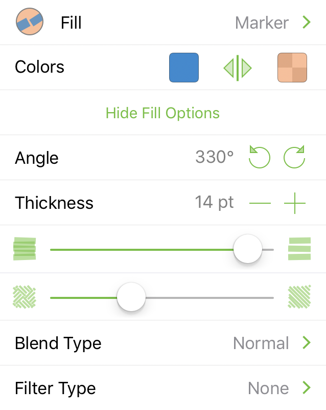
- Colors: Choose the color for the marker lines (right) and the background (left). Tap to swap the marker and background colors.
- Angle: Tap or to rotate the marker line in 15° increments; optionally, double-tap the angle number to enter a specific value.
- Thickness: Tap or to decrease or increase the width of the marker line, respectively.
- Marker Gap Slider: Drag to the left to decrease the gap between the marker lines; drag to the right to increase the gap between the marker lines.
- Marker Pattern Slider: Drag left to fill the object/canvas with increasingly smaller squares of marker lines, creating a herringbone pattern. Drag right to fill the object/canvas with increasingly larger squares of marker lines. When all the way to the right, the marker lines fill the entire object/canvas.
Choosing Colors
Throughout the inspectors, you will find Color Swatches which you can tap to change the default colors. Some inspectors, such as the Line inspector, only have one Color Swatch, while others, such as the Linear Gradient or Double Radial Gradient fill type in the Fill inspector, have two or three, respectively.
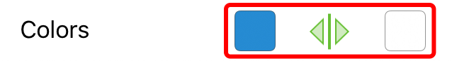
Tapping a Color Swatch— —takes you to a pane of preset Color Palettes, from which you can choose another color.
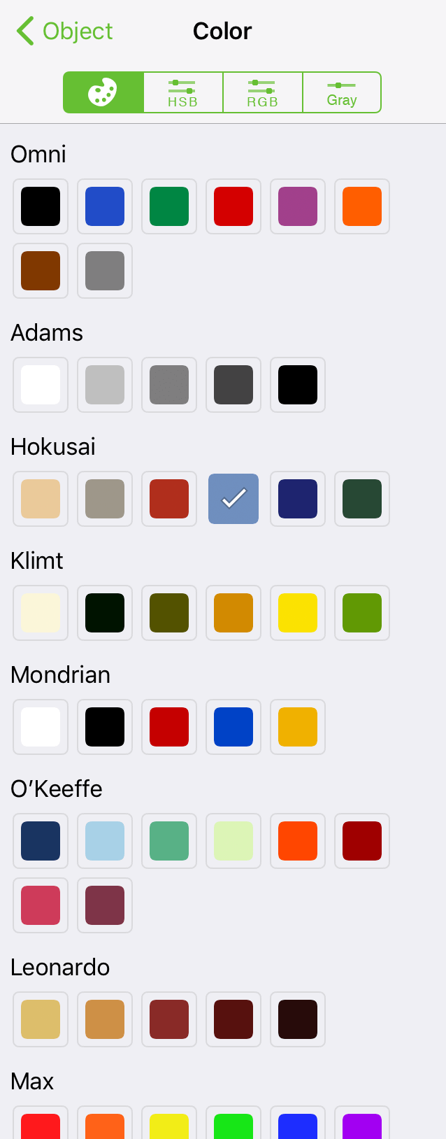
Tap to select another color, or tap the HSB, RGB, or Gray tabs to mix your own colors by adjusting the sliders in those tabs.
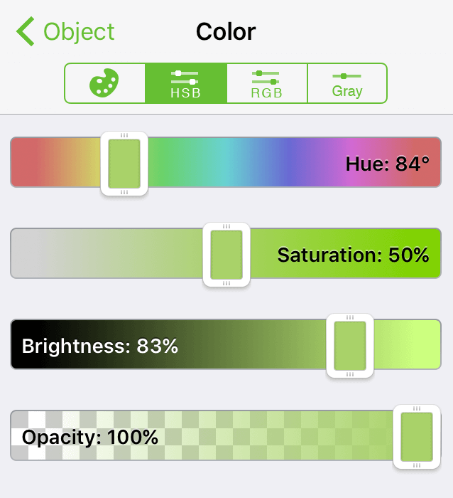
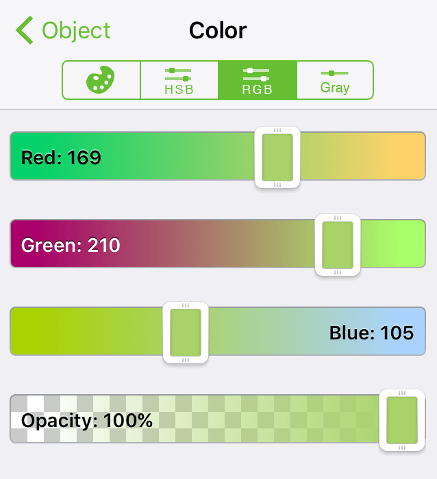
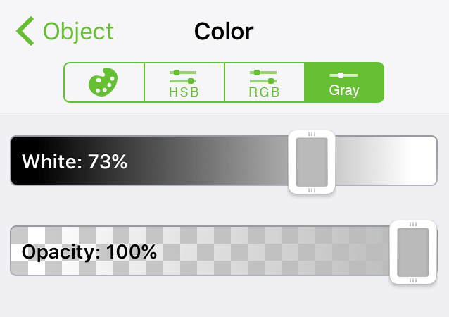
The HSB, RGB, and Gray tabs each feature an Opacity slider for setting a fill color’s opaqueness.
Object Inspectors
Use the Object inspectors to apply style properties to the objects—shapes, lines, images, and more—on the canvas.
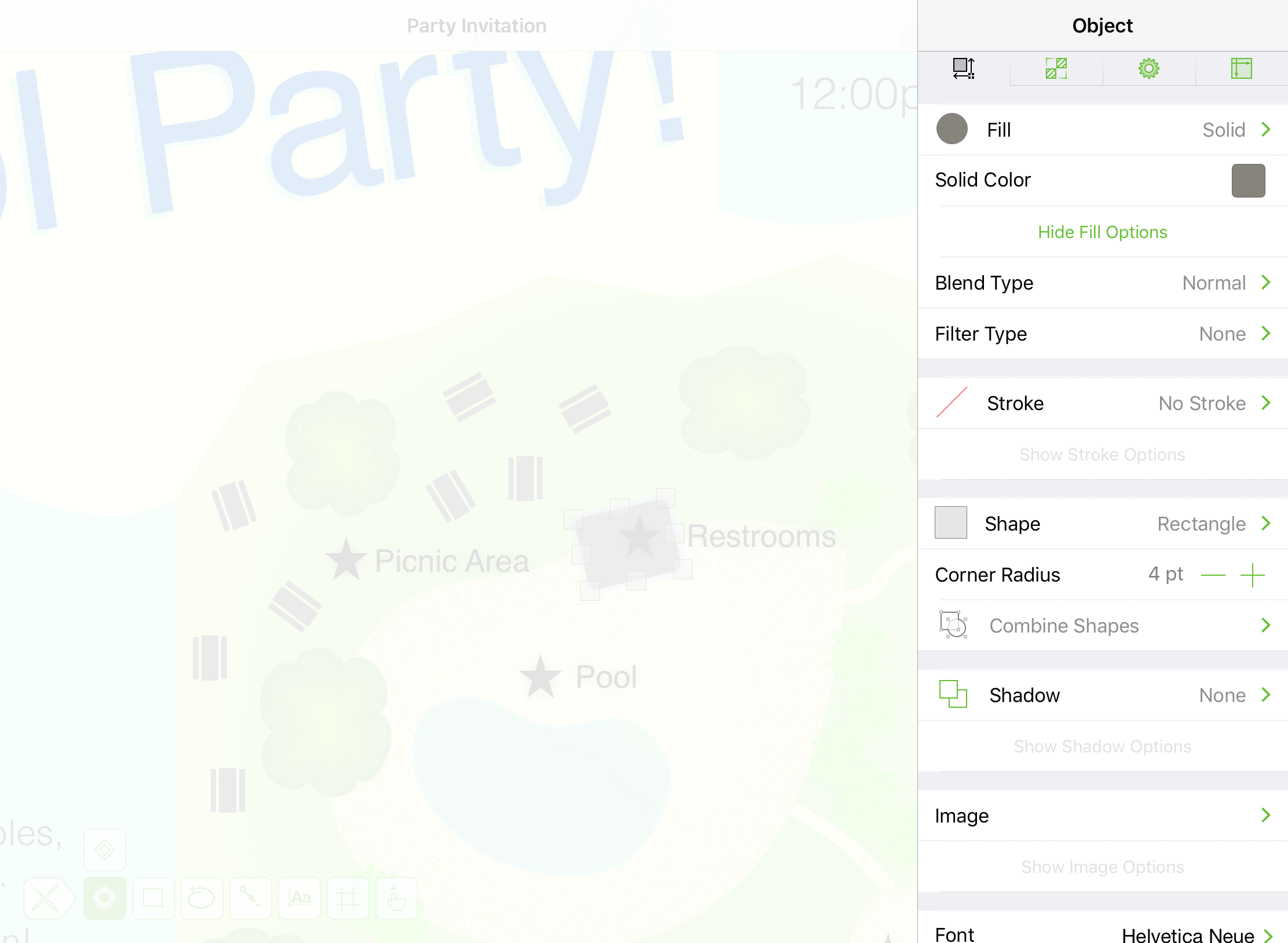
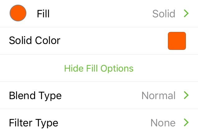
Fill
Available when the Shape or Freehand tool is selected, or when an object is selected with the Selection tool. Use to add fill properties to an object, including its Fill Type and Color properties.
Fill Type
Tap the top row in the Fill inspector to choose a Fill Type; the default is a Solid fill.
Blend Type
Apply a blend type to the selected object. Blends have a visual effect on objects or layers underneath.
Filter Type
Apply a filter type to the selected object. Filters have a visual effect on objects or layers underneath.
To learn more about the various Fill Types in OmniGraffle, see Fill Types for Objects and Canvases, earlier in this manual. See Choosing Colors for more detail on setting colors in OmniGraffle.
Stroke
Available when the Shape, Freehand, Line, or Artboard tool is selected, or when any object is selected with the Selection tool. Use to define the properties of an object’s stroke.
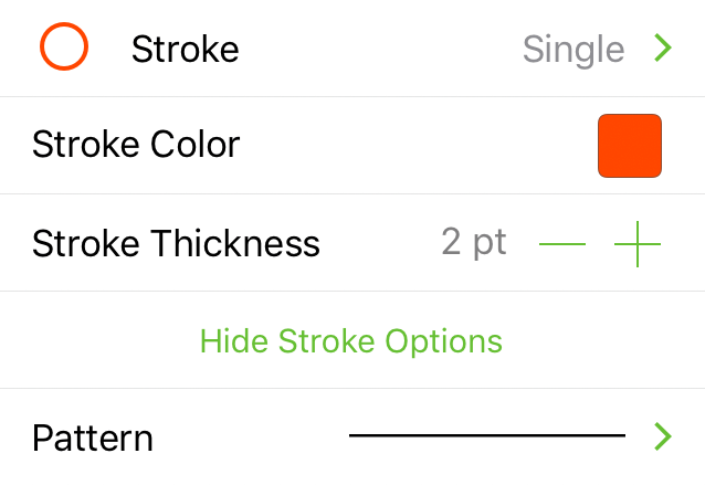
Stroke Type
Choose a style for the object’s stroke.
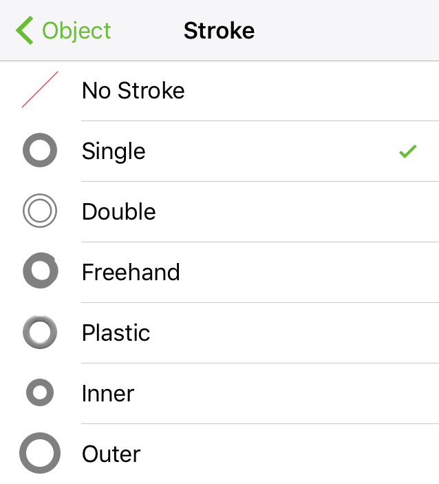
- No Stroke: The object has no visible stroke.
- Single: A single stroke.
- Double: A double stroke.
- Freehand: A stroke that appears to be drawn by hand.
-
Plastic: A raised stroke with a highlight color. Tap
or to rotate the angle of the plastic stroke’s highlight. Optionally, double-tap the number and enter a different value.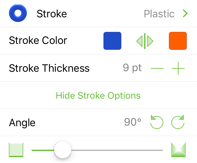
-
Inner: The stroke appears inside the bounds of the object.
- Outer: The stroke appears outside the bounds of the object.
Stroke Color
Tap the Color Swatch to select or mix a color for the stroke. See Choosing Colors for more detail on setting colors in OmniGraffle.
Stroke Thickness
Tap or to make the stroke thinner or thicker, respectively.
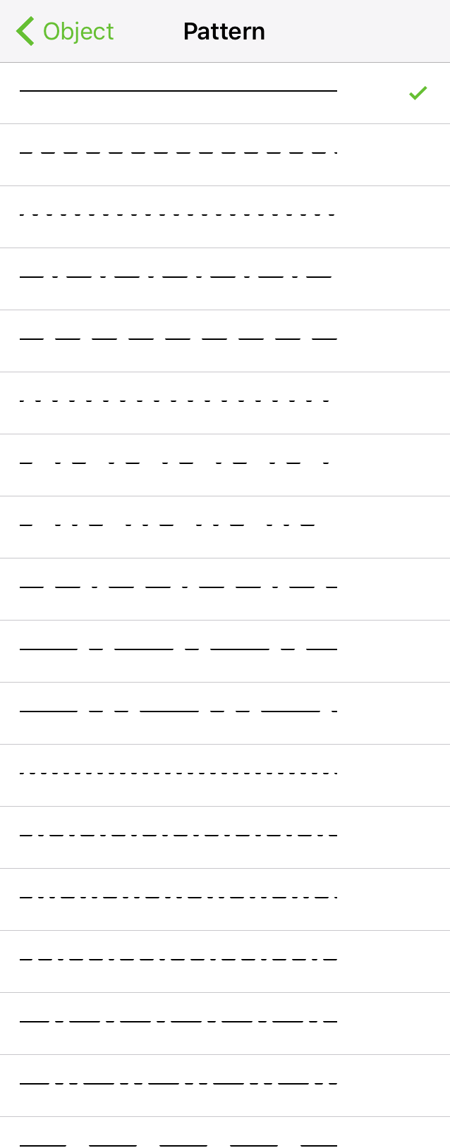
Stroke Pattern
Tap to open a side pane for choosing a pattern for the stroke.
Shape
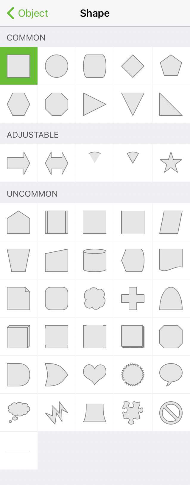
Available when the Shape or Artboard tool is selected. Use to choose a shape to place on the canvas.
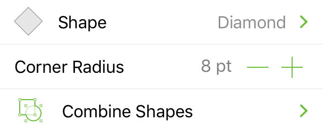
Shape Type
Tap the top row in the Shape inspector to set the Shape Type. This opens a side panel from which you can select one of the following shape types:
- Common: Basic geometric shapes.
- Adjustable: Shapes with adjustable points.
- Uncommon: Shapes for use in diagrams or as image masks.
Corner Radius
Tap or to decrease or increase, respectively, the curvature of an object’s corner points.
Combine Shapes 
Use shape combinations to create unique shapes from two or more shapes:
 Unite Shapes: Combines the selected shapes to create a new, single shape.
 Intersect Shapes: Creates a new shape based on the overlapping areas of the selected shapes.
 Subtract Shapes: When two or more objects overlap, the top-most shape is cut out of the bottom-most shape.
 Uncombine Shapes: Reverts any shape combination action, restoring the shapes to their original state.
Shadow
Available when the Shape, Freehand, or Line tool is selected, or when an object is selected with the Selection tool. Use to add a drop shadow to an object.
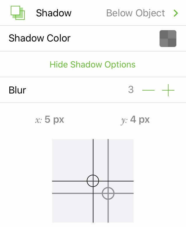
No Shadow 
The selected object has no shadow.
Shadow Below Object 
Places a shadow beneath the selected object.
Shadow Below Layer 
Places a shadow beneath the selected object. If other objects are positioned underneath and on the same layer, the shadow appears beneath objects lower on the stack.
Inner Shadow 
Places a shadow inside the selected object.
Shadow Color
Tap the color swatch to alter the default shadow color. See Choosing Colors for more detail on setting colors in OmniGraffle.
Blur
Tap or to make the shadow less or more fuzzy, respectively.
Shadow Offset
Tap or tap and drag your finger with in the Shadow Offset box to adjust the position of the shadow in relation to the object. Optionally, double-tap on the x or y values and enter another number to adjust the shadow offset.
Image
Available when an object is selected with the Selection tool. Use to place an image inside an object on the canvas. The first time you choose the Image inspector, you are asked to grant OmniGraffle permission to your photo library.
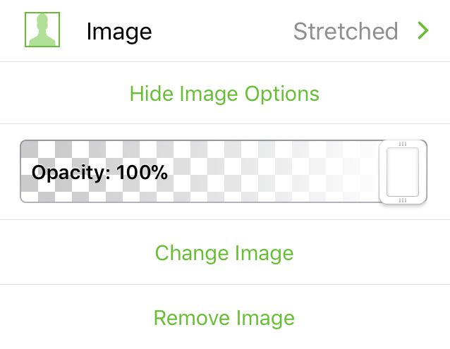
Photos
Tap the Image inspector with an object selected on the canvas to open the Photos side pane. Choose an image to place within the selected object.
Image Fill Style
Choose one of the following:
 Natural Size: Fill the shape with a full-sized image; use the Size controls to make the image smaller or larger.
 Stretched: Stretch to fit the image within the bounds of the selected shape.
 Tiled: Tiles the image within the selected shape; use the Size controls to make the tiles smaller or larger.
Opacity Slider
Slide left or right to make the image more or less opaque, respectively.
Size
The Size options are available when Natural Size or Tiled is selected as the image fill type. Tap or to scale the image’s size within the object; double-tap the number and enter a specific percentage value.
Change Image
Tap to replace the image in the selected object with a different image from your Photos library.
Remove Image
Removes the image from within the object.
Image Mask Mode
With an object containing an image selected, tap the image on the canvas to enter image mask mode. Handles appear on the corners and edges of the image for resizing its visible area. Note that this does not resize the image itself; to change an image's size, use the regular shape handles instead.
Font
Available when the Shape, Text, or Artboard tool is selected, or when a shape or text object is selected with the Selection tool. Use to define the font properties of a shape’s text.
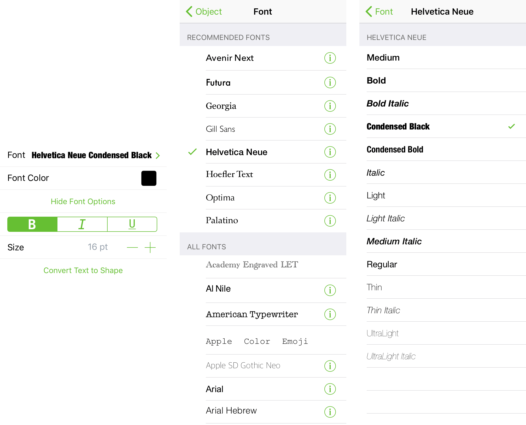
Font Family
Choose from Recommended Fonts or All Fonts; tap for additional style attributes.
Font Color
Tap to select a color. See Choosing Colors for more detail on setting colors in OmniGraffle.
Bold, Italic, Underline
Tap B to embolden the text; tap I to italicize the text; or tap U to underline the text.
Size
Tap or to make the text smaller or larger, respectively. Optionally, double-tap the point size to enter a specific value.
Convert Text to Shape
Converts the selected text object to shapes.
Text Position
Available when the Shape, Text, or Artboard tool is selected, or when a shape or text object is selected with the Selection tool. Use to define text alignment, positioning, overflow, and wrapping properties.
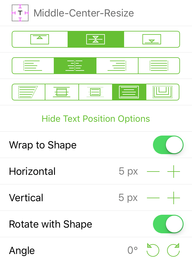
Text Position Indicator 
The indicator changes according to the selections you make in the Text Position inspector.
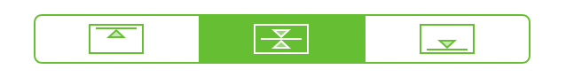
Vertical Alignment
Choose how text aligns vertically; align to the Top, Middle, and Bottom of the object, respectively.
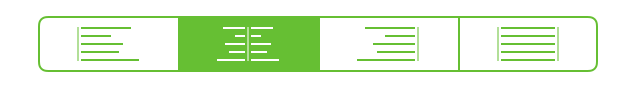
Horizontal Alignment
Choose how text aligns horizontally; align to the Left, Center, Right, or Justified within the object, respectively.
Text Overflow
Choose how text flows within a shape; fill the shape with the text, allow the text to overflow the shape, crop text within the bounds of the shape, resize the shape to fit the text, or wrap the text around the border of the shape, respectively.
Wrap to Shape
When turned Off, text does not wrap; when turned On, text wraps to the width of the shape.
Horizontal
Tap or to decrease or increase, respectively, the amount of padding on the left and right sides of the text.
Vertical
Tap or to decrease or increase, respectively, the amount of padding on the top and bottom of the text.
Rotate with Shape
When turned Off, text does not rotate when the shape's rotation angle is changed; when turned On, the text rotates along with the shape.
Angle
Tap or to rotate the text in 15° increments. Optionally, double-tap on the degree of rotation and enter a specific value.
Geometry
Available when an object is selected with the Selection tool. Use to position and size, rotate, or define the scaling properties of a selected object.
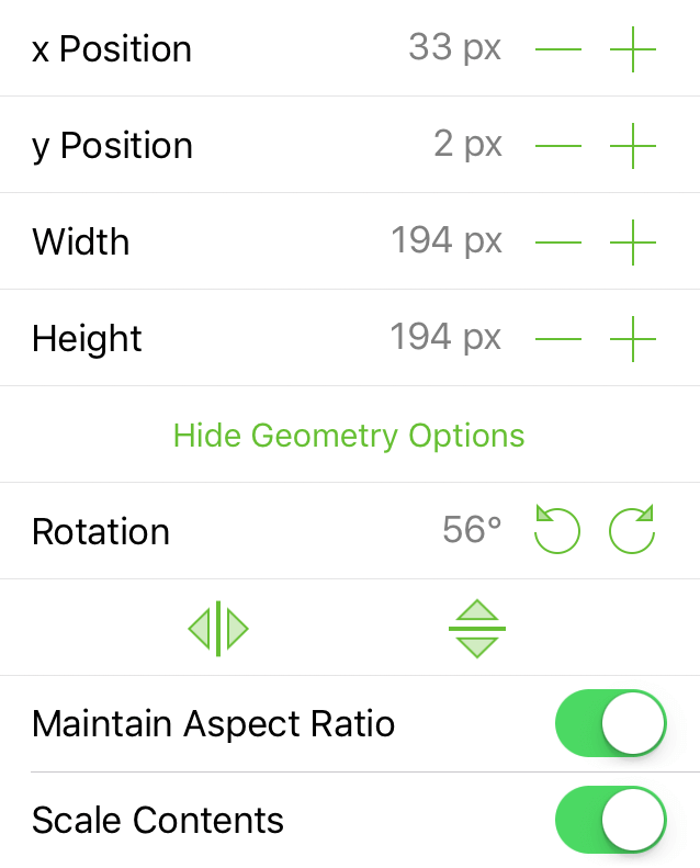
x Position
Tap or to move the object left or right on the canvas, respectively. Optionally, double-tap the x Position value and enter a different value.
y Position
Tap or to move the object up or down on the canvas, respectively. Optionally, double-tap the y Position value and enter a different value.
Width
Tap or to adjust the width of the selected object. Optionally, double-tap the width value and enter a specific value.
Height
Tap or to adjust the height of the selected object. Optionally, double-tap the height value and enter a specific value.
Rotation
Tap or to rotate the selected object in 15° increments. Optionally, double-tap on the degree of rotation and enter a specific value.
Flip Horizontally 
Tap to flip the object horizontally.
Flip Vertically 
Tap to flip the object vertically.
Maintain Aspect Ratio
When turned on, objects maintain their basic shape, but scale when resized.
Scale Contents
When turned on, an object’s contents (text, image, and fill patterns), along with the object’s stroke, scale when the object is resized.
Line
Available when the Line tool is selected, or when a line is selected with the Selection tool. Use to connect objects in a diagram with lines, or to draw lines on the canvas.
Line Type
The Line Type determines the properties of a line’s vertex points; choose from:
 Straight: A straight line whose vertex points have no curvature.
 Curved: A line whose vertex points are curved; Bézier control handles for adjusting the curve are not available when using the Point Editor Tool.
 Orthogonal: A line whose vertex points result in right angles. To adjust the angle of the line, touch and drag the handle; to reset the handle's position, touch and hold on the line to reveal the line’s contextual menu and choose Reset Handle.
 Bézier: A line whose vertex points are curved; Bézier control handles for adjusting the curve are available when using the Point Editor Tool.
Line Ends
Optionally, choose to add an ornament for the end point or start points of the line.
Radius
Designate, in points, the curvature for points on the line.
Label Position
Available when a line label is selected. Choose the label’s relative position with the line; options include:
- Horizontal
- Vertical
- Parallel
- Perpendicular
- Independent
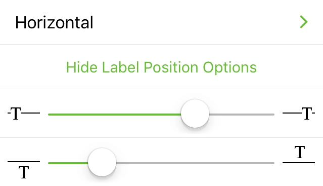
Use the top slider to position the label toward the left or right edge of the line, and the bottom slider to position the label below or above the line.
Alignment
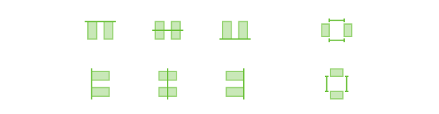
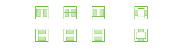
Available when one or more objects are selected with the Selection tool. Use to align objects with each other. You can also align objects to the canvas if the Canvas Size inspector is set to either Fixed Size or Flexible.
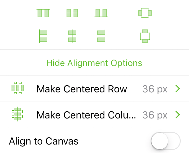
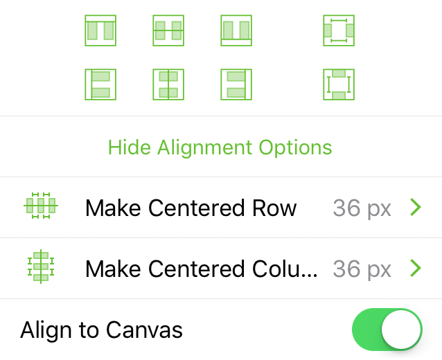
Align Objects with Other Objects
Select two or more objects and then tap one of the alignment buttons to align objects with each other.
When aligning objects, the alignment is based on the object with an edge that is furthest in the desired direction. For example, when you select three objects and tap  Align Top Edges, the top edge of the highest object is chosen as the baseline for the others to match.
This alignment behavior can be changed in OmniGraffle Settings, which offers the option to instead use the first-selected object as the anchor for alignment.
Align Objects to the Canvas
When turned on, the grid of buttons changes to reveal how objects would align in relation to the canvas. Select one or more objects and then tap one of the alignment buttons to align an object in relation to the canvas.
Make Centered Row
Centers the selected objects as a row on the canvas. Objects are spaced apart according to the value shown at right. To change the distance between objects, tap the number, and then tap or to close or widen the gap between objects. Optionally, you can double-tap the number and enter a specific value. After changing the value, tap Lay Out Now.
Make Centered Column
Centers the selected objects as a column on the canvas. Objects are spaced apart according to the value shown at right. To change the distance between objects, tap the number, and then tap or to close or widen the gap between objects. Optionally, you can double-tap the number and enter a specific value. After changing the value, tap Lay Out Now.
Objects cannot be aligned to an Infinite Canvas.
Style Inspector
Use the Style inspector to examine the style of a selected object, or to apply styles of other objects on the canvas.
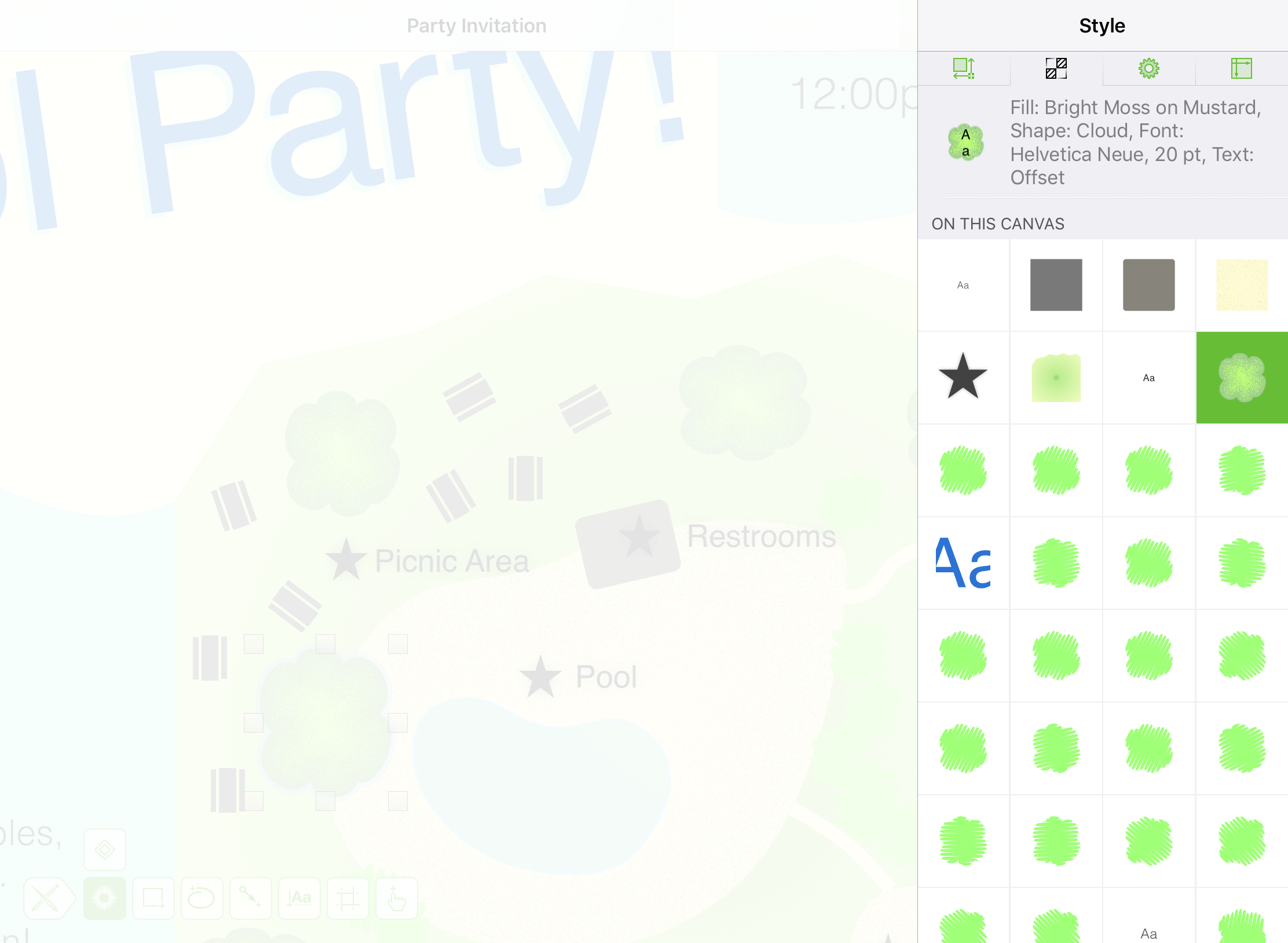
Style Inspector
When you select an object on the canvas, that object’s style properties appear next to a facsimile of the object at the top of the inspector.
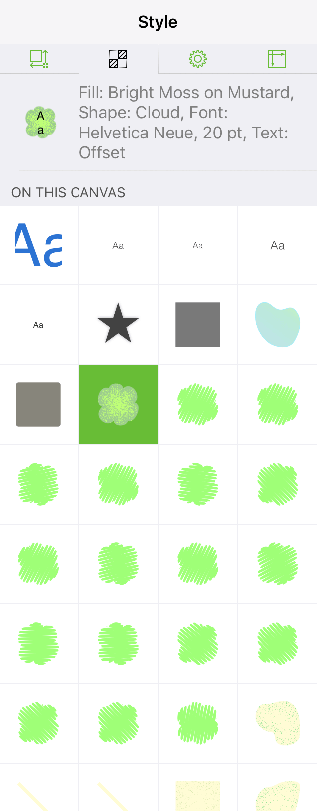
The On This Canvas section beneath displays a grid of the objects—shapes, text, lines, and images—on the same canvas. To apply the styles associated with another object, simply tap another object in the grid and its style is applied to the object you have selected.
Properties Inspectors
Use the Properties inspectors to set additional attributes to shapes and lines in your document, including defining where and how shapes and lines connect to each other, setting metadata for document, and including object Actions (a feature of OmniGraffle Pro).
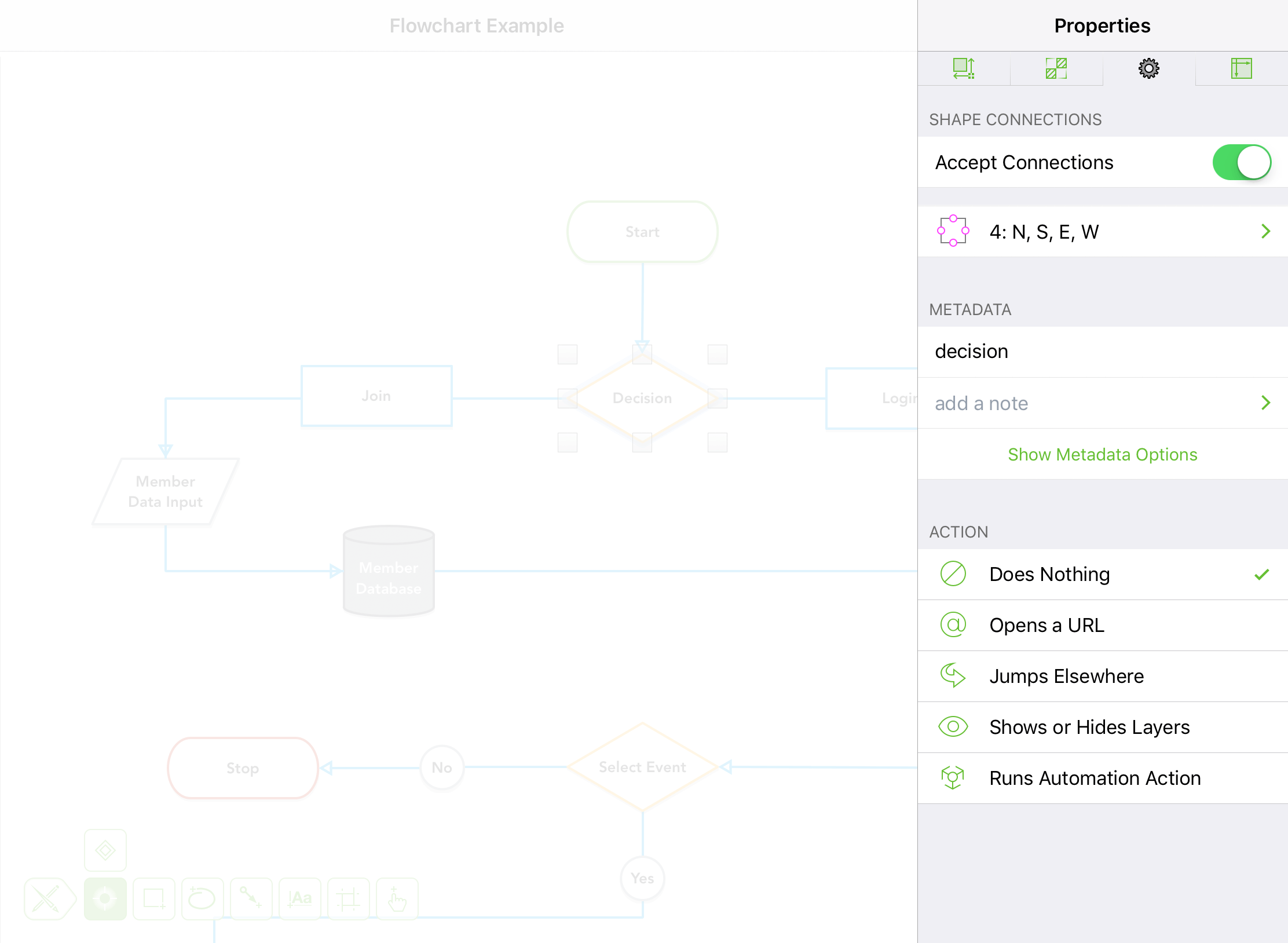
Shape Connections 
Available when a shape is selected; use to define whether a shape accepts connections from lines and with other objects, as well as where those connections are made.
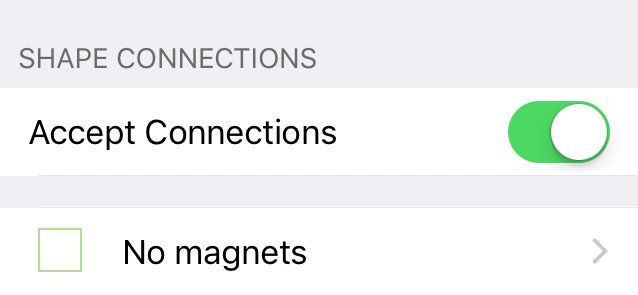
Accept Connections
By default, all objects accept connections from lines or other objects. The default connection location is the object’s centerpoint. Turn off to disable connections to an object.
Magnet Locations
Magets allow you to change the connection location from an object’s centerpoint to another location on the object’s outer edge. Tap the No Magnets row to open a side menu from which you can define where connections are made on an object. Magnet locations may be placed as follows:
 No Magnets: Connections may only be made to the object’s centerpoint.
 2: NS: Magnets are placed at the center-top and -bottom.
 2: EW: Magnets are placed at the center-left and -right.
 4: NSEW: Magnets are placed at the center-top, -bottom, -left, and -right (i.e., cardinal points).
 4: NE, NW, SE, SW: Magnets are placed at the upper-left and -right, and lower-left and -right (i.e., ordinal points).
 8 Magnets: Magnets are placed at the cardinal and ordinal points.
 One on each vertex: Each vertex point on the object’s path may be used as a magnet.
 1 Magnet per side: Each side of the object receives one magnet.
 2 Magnets per side: Each side of the object receives two magnets.
 3 Magnets per side: Each side of the object receives three magnets.
 4 Magnets per side: Each side of the object receives four magnets.
 5 Magnets per side: Each side of the object receives five magnets.
If an object has the  icon next to it in the menu, this means the object has had magnets placed on it using the Magnet tool in OmniGraffle for Mac.
Line Connections
Available when a line is selected; use to specify how and where the line connects to other objects, and whether the line itself can accept connections from other lines.
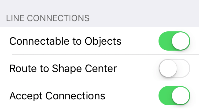
Use the following switches to toggle the settings for the selected line(s):
- Connectable to Objects: When turned on, the line can connect to objects on the canvas; when turned off, the line will not connect to other objects.
- Route to Shape Center: When turned on, the line ignores an object’s magnets and will only connect to a shape’s centerpoint; when turned off, the line will either connect to an object’s centerpoint or to the nearest available magnet.
- Accept Connections: When turned on, the line can accept connections from other lines; when turned off, the line will not accept connections from other lines.
Metadata
Available when an object is selected with the Selection tool. Use to add object-specific metadata, including a name, note, and key-value pairs.
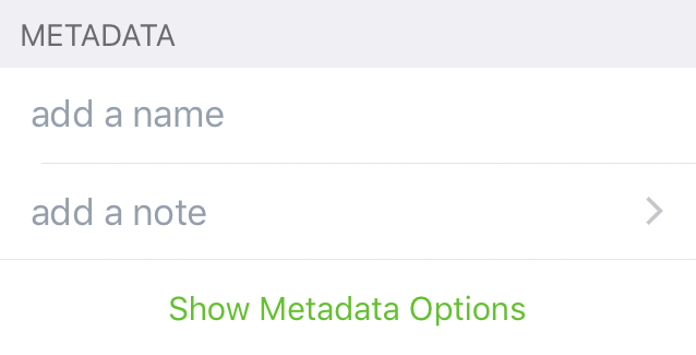
Add a Name
Assign a Name to the selected object. Access the object’s Name with the <%GraphicName%> data variable.
Add a Note
Assign a Note to the selected object.
Add New Key/Value Pair
Assign key-value paired data to the selected object. Access the data in the key-value pair with the <%UserData [key]%> data variable to display the [value] as a text label or object in your document.
Action
Assign an Action to the selected object.
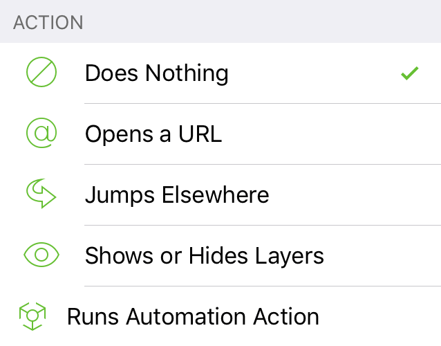
Does Nothing
The default state for any object on the canvas.
Opens a URL
Enter a web link (for example, https://omnigroup.com); opens the link in Safari on iOS when tapped with the Action Tool.
Jumps Elsewhere
When selected, choose from one of the following options:
- Switch to Previous Canvas: Tapping the object with the Action tool goes to the previous canvas.
- Switch to Next Canvas: Tapping the object with the Action tool goes to the next canvas.
- Switch to a Specific Canvas: If your document has more than one canvas, you can choose which canvas gets jumped to when the object is tapped with the Action tool.
Shows or Hides Layers
Use to set the visibility of layers on the current canvas. Select a layer, and then choose from:
- None: Does nothing with that layer’s visibility state.
- Show: Sets the visibility state of the chosen layer to visible.
- Hide: Sets the visibility state of the chosen layer to hidden.
- Toggle: Swaps the visibility state of the chosen layer. If the layer is set to visible, it is hidden, and vice versa.
Runs Automation Action
When selected, choose from a list of Automation Actions, displayed underneath. The Automation Action is performed when tapped with the Action Tool.
Canvas and Document Inspectors
Use the Canvas inspectors to define your canvas, set the units of measurement, enable grids and guides, control the flow of your diagram, and to set canvas- and document-specific metadata.
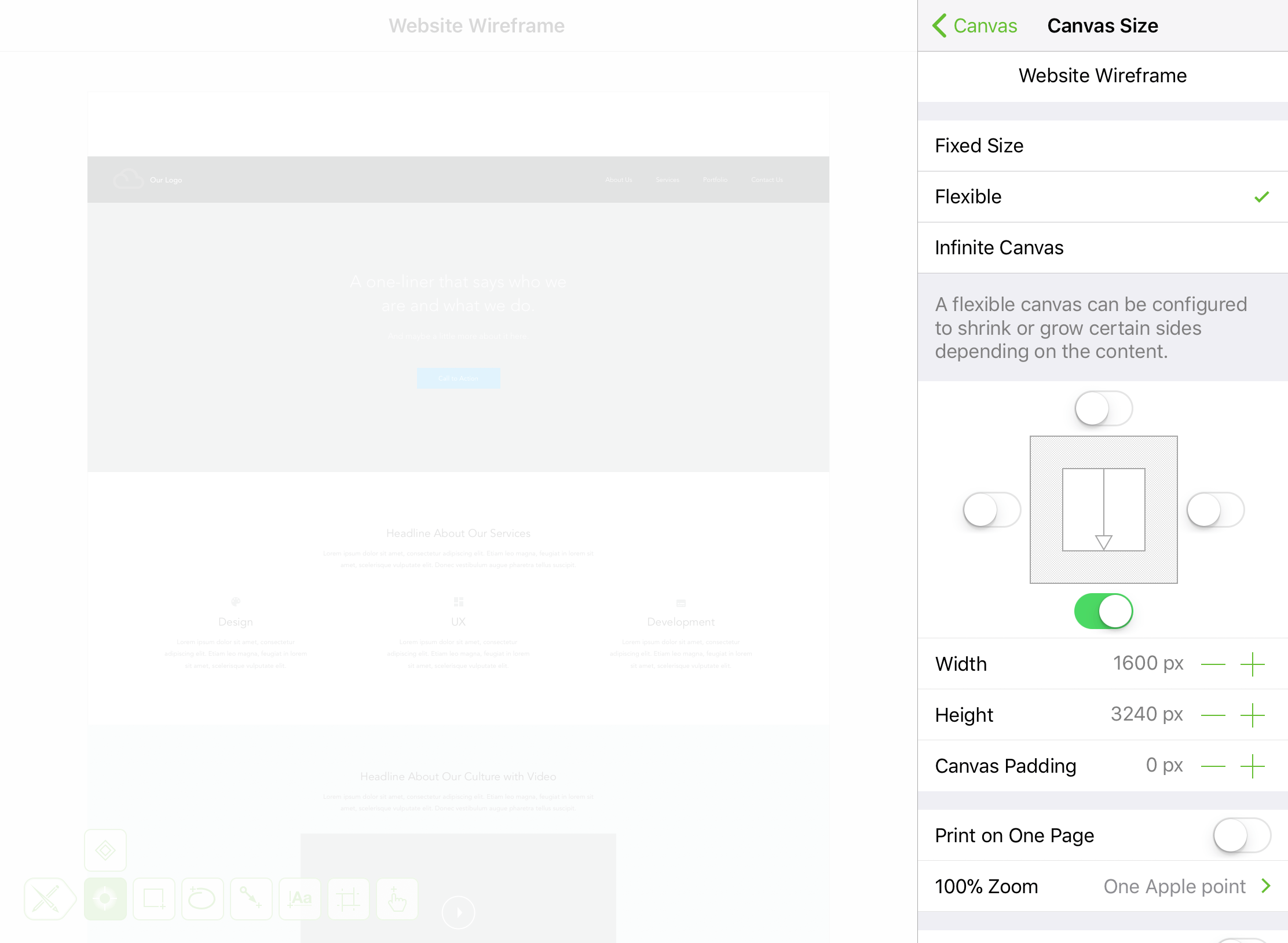
Canvas Size 
Choose the Canvas Mode for your document, and set its properties.
- Fixed Size: A canvas with its width and height set to a specific size; for example, 1024 × 768 pixels.
- Flexible: A canvas which expands in a specified direction (up, down, left, or right) to suit your needs.
- Infinite Canvas: A canvas that extends infinitely in all directions.
See Canvas Modes, earlier in this manual, for additional detail.
Additional options found in the Canvas Size inspector include:
Print on One Page
Switch On or Off to force your document to print on a single page.
100% Zoom
If you have OmniGraffle Pro, you can also specify how things look onscreen when viewing your document at 100% Zoom:
-
One Apple point (the default) relates to resolution-independent distance on the display. For example, on a standard-resolution display, 1 point equals 1 pixel; on a Retina display, 1 point equals 2 pixels. At 100% zoom, objects viewed at One Apple point only appear smaller onscreen; however, they retain their actual size (which you can verify by looking at the object’s dimensions in the Geometry inspector).
-
One PostScript point displays the contents of your document at real-world size. At 100% zoom, you can hold a ruler up to your display and the size of the object you are measuring onscreen will match the dimensions you see in the Geometry inspector.
-
One pixel matches the pixel density of your display. For example, at 100% zoom, objects viewed at One pixel only appear smaller onscreen; however, they retain their actual size (which you can verify by looking at the object’s dimensions in the Geometry inspector).
The 100% Zoom options make it possible for you to work on large-scale documents at a smaller scale onscreen.
Size Uses Printer Pages
Switch On or Off. When turned on, the canvas size is displayed in pages not the Base Units of measurement (i.e., pixels, points, centimeters, or inches). When turned on, choose how your document will print:
- Portrait Orientation
- Landscape Orientation
- Use Document Default
Canvas Padding is disabled when you turn on Size Uses Printer Pages.
Scroll Margin
Tap or to adjust how much of the canvas area is added as a scrolling margin around the canvas. When set to 100%, your entire canvas can scroll out of view.
Canvas Fill 
Use to add fill properties to the canvas, including its Fill Type and Color properties.
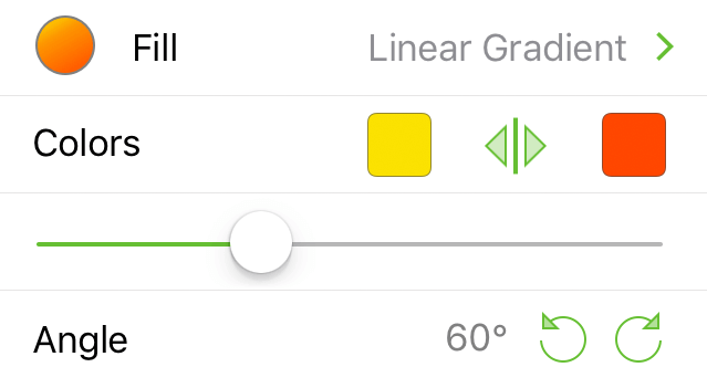
Fill Type
Choose a Fill Type for the canvas.
Fill Color
Choose a color for the canvas.
To learn more about the various Fill Types in OmniGraffle, see Fill Types for Objects and Canvases, earlier in this manual. See Choosing Colors for more detail on setting colors in OmniGraffle.
Units & Scale 
Set a unit of measurement for your document:
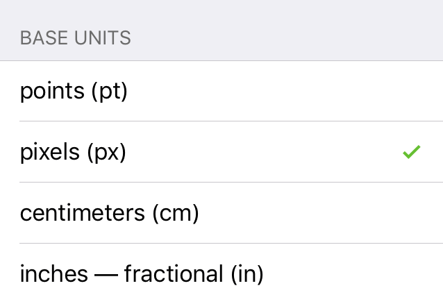
Base Units
Set the base unit of measurement; choose between points (pt), pixels (px), centimeters (cm), or inches—fractional (in). Base Units are used by the Canvas Size inspector to display the dimensions of Fixed and Flexible canvases, and are used for scaling purposes.
Scale
Available when centimeters (cm) or inches—fractional (in) is chosen as the Base Units.
Scale is shown as two numbers; for example, 1 in = 1 in. The first value uses the unit of measurement chosen as the Base Units (either cm or in) and relates to the actual size of objects on the canvas. The second value relates to how those objects scale in size, and use the units of measurement chosen under Display Units for how those measurements appear when scaled.
Use the and to decrease or increase the Base and Display Unit values. Optionally, double-tap on the number and enter a different value.
Display Units
Available when centimeters (cm) or inches—fractional (in) is chosen as the Base Units.
Choose a unit of measurement for how the units are displayed in the Geometry, Alignment, Grid & Guides, and Diagram Layout inspectors.
Grid & Guides 
Define the grid used for aligning objects on the canvas.
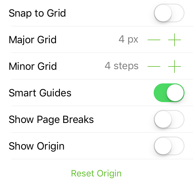
Snap to Grid
Switch on to have objects and guides snap to the Major and Minor grid lines.
Major Grid
Tap or , or double-tap the number and enter another value, to change the amount of space between steps in the Major Grid.
Minor Grid
Tap or , or double-tap the number and enter another value, to change the number of Minor Grid steps between each Major Grid.
Smart Guides
Smart Guides are the blue lines you see onscreen when positioning objects on the canvas. Switch off to disable Smart Guides.
Show Origin
When switched on, the dark blue Canvas Origin guides are visible. The origin marks the vertical and horizontal intersection at the canvas coordinates 0,0.
Reset Origin
Tap to realign the Canvas Origin to the upper-left corner of the canvas.
Snap to Grid and Smart Guides cannot be enabled at the same time. Use Snap to Grid when you want precise, pixel-perfect alignment based on canvas positioning. Use Smart Guides when you want to align objects in relation to each other.
Diagram Layout 
Choose a layout style for a diagram. With OmniGraffle for iOS, you can choose either Hierarchical or Force-Directed Layout for a diagram style.
Hierarchical Layout
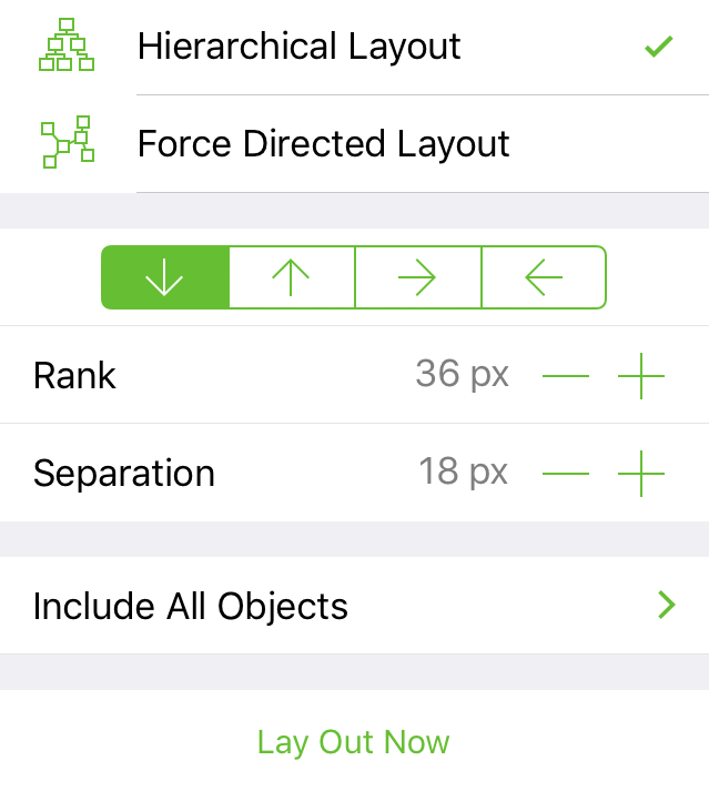
Diagram Flow Direction
Tap one of the arrow buttons to redirect the flow of Hierarchical diagrams:

- Down Arrow — Diagram flows from top to bottom.
- Up Arrow — Diagram flows from bottom to top.
- Right Arrow — Diagram flows from left to right.
- Left Arrow — Diagram flows from right to left.
Rank
Tap or to decrease or increase the amount of space between objects at different levels of the diagram. Optionally, double-tap the number and enter a different value instead of using the stepper controls.
Separation
Tap or to decrease or increase the amount of space between objects on the same level of the diagram. Optionally, double-tap the number and enter a different value instead of using the stepper controls.
Include All Objects or Connected Objects
Choose whether to include All Objects in the diagram layout, or only Connected Objects. In the latter case, objects without connections between them will remain in place when the layout is applied.
Lay Out Now
Tap to lay out the diagram after making changes to other elements in this inspector.
Force-Directed Layout
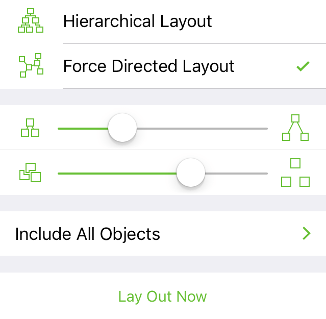
Line Length Slider 

Drag the slider left or right to shorten or lengthen the connection lines between objects, respectively.
Object Separation Slider 

Drag the slider left or right to decrease or increase the amount of space between objects, respectively.
Include All Objects or Connected Objects
Choose whether to include All Objects in the diagram layout, or only Connected Objects. In the latter case, objects without connections between them will remain in place when the layout is applied.
Lay Out Now
Tap to lay out the diagram after making changes to other elements in this inspector.
Canvas Metadata 
Assign metadata for each canvas in your document.
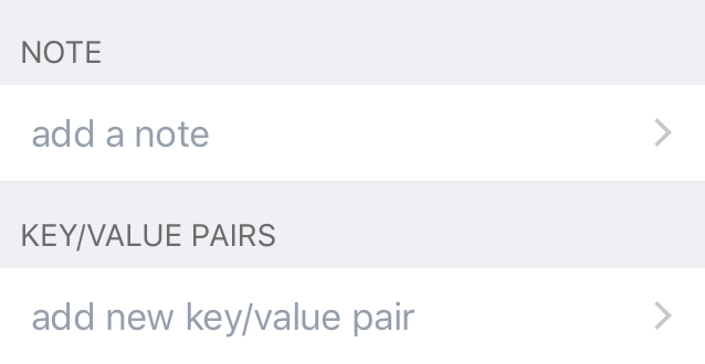
Note
Tap add a note to open a side pane to add some notes about the current canvas.
Key/Value Pairs
Tap add new key/value pair to open a side pane to add a key-value pair to further define the current canvas.
Canvas metadata cannot be accessed with Data Variables.
Document Data 
Assign document-level metadata for your document; use in combination with Data Variables to inject text labels for objects, lines, and text objects.
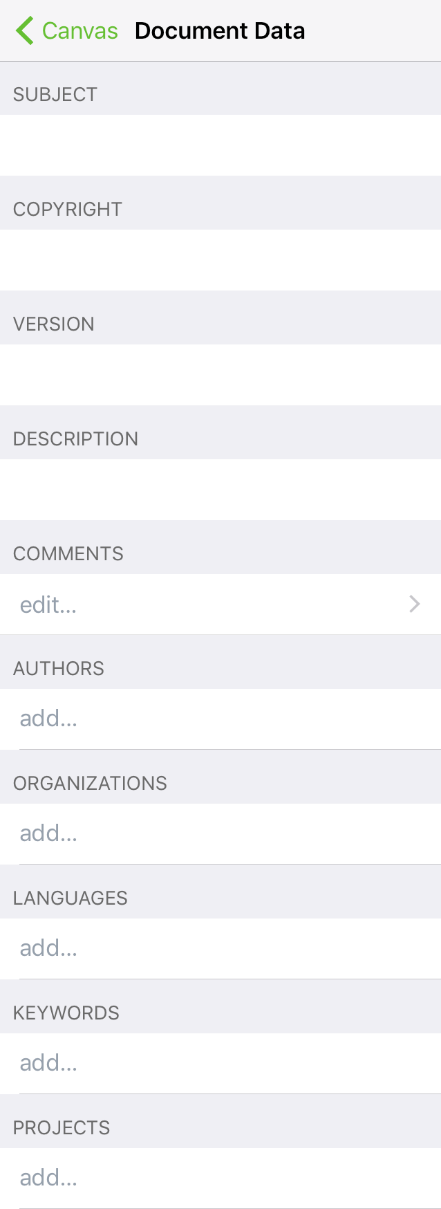
Subject
Assign a Subject to the document; use with the <%Subject%> data variable.
Copyright
Assign copyright information to the document; use with the <%Copyright%> data variable.
Version
Assign a version number to the document; use with the <%Version%> data variable.
Description
Add a description to the document; use with the <%Description%> data variable.
Comments
Add comments to the document; use with the <%Comments%> data variable.
Authors
Assign one or more authors to the document; use with the <%Authors%> data variable.
Organizations
Set an organization name to the document; use with the <%Organizations%> data variable.
Languages
Specify the language(s) used in the document; use with the <%Languages%> data variable.
Keywords
Assign keywords to the document; use with the <%Keywords%> data variable.
Projects
Assign a project name to the document; use with the <%Projects%> data variable.
Appendix A
Settings
Settings
From the Locations Screen or the Document Browser, tap the app menu (), and then choose Settings to set the following options for working with OmniGraffle:
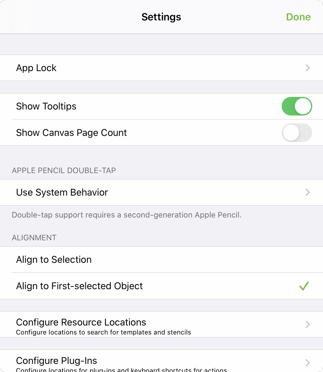
App Lock
If you use OmniGraffle on a device that you occasionally share (with your children, coworkers, or clients, for example), there may be times when you would prefer that your OmniGraffle documents remain out of reach. The App Lock feature prevents accidental taps and casual glances by adding a password-locked privacy screen that must be dismissed before any of your documents or settings can be accessed.
App Lock does not encrypt your data, and does not prevent someone with access to your device from connecting it to iTunes and copying your files, or deleting OmniGraffle from your device outright.
App Lock is intended as a privacy feature to prevent accidental exposure or corruption of data when others are using your device. It is not mant to thwart serious attempts to access or compromise your data.
Device-level security measures are recommended for those with additional security needs.
Show Tooltips
With Tooltips enabled, OmniGraffle presents a brief pop-up of explanatory text to describe the interface element or tool you have selected.
Show Canvas Page Count
When enabled, OmniGraffle displays the number of printable pages on a per-canvas basis, in the app’s Sidebar.
Apple Pencil Double-Tap
With an Apple Pencil (2nd generation) paired with your iPad, use this submenu to choose the behavior when you double-tap the side of the Pencil.
-
Use System Behavior—Invoke the default behavior set in iOS Settings. Some behaviors are not supported by OmniGraffle; when this is the case, it will be noted here.
-
Switch to Previous Tool—Return to the previously selected tool.
-
Toggle Navigation Sidebar—Show or hide the navigation sidebar.
-
Toggle Inspector—Show or hide the inspector.
-
Toggle Full Screen—Switch to Full Screen mode, or return to normal mode.
-
Toggle Stencil Browser—Show or hide the stencil browser.
-
Off—Turn off Double-Tap in OmniGraffle.
Alignment
When aligning multiple objects to one another, choose whether to:
-
Align to Selection—Use the object farthest in the chosen alignment direction as the anchor for alignment.
-
Align to First-selected Object—Use the first-selected object as the anchor for alignment.
Configure Resource Locations
Open a sheet with a list of connected locations that the app will check for template and stencil files. Tap Add Location to open a file browser and navigate to the desired folder, then tap Done to link it.
Not all cloud storage providers are capable of acting as linked resource folders for OmniGraffle. Providers that aren't compatible have their names greyed out in the browser list.
Configure Plug-Ins
Open a sheet with a list of the Omni Automation Plug-Ins available in connected folders on your device. To add Plug-Ins to this list, choose Add Linked Folder at the bottom of the list and navigate to the folder on your device that contains them.
For more information about this feature, see the Omni Automation website.
Send Anonymous Data
Help us help you; turning on the Send Anonymous Data option provides Omni with anonymous information about the platforms on which OmniGraffle is being used.
Appendix B
Gestures
The following gestures can be used while working in OmniGraffle.
| Gesture | Action | Description |
|---|---|---|
 |
Select an object or interact with the user interface | Tap with a single finger. |
|
Enter image mask mode | Tap an image with a single finger. |
 |
Touch and hold | Touch and hold an object with a single finger; commonly used in combination with other gestures. |
 |
Select a value in an inspector, or the text in a text label | Double-tap with a single finger. |
 |
Zoom object or canvas to fit screen | Double-tap an object, or on the canvas, with two fingers. |
 |
Pinch to zoom in on the canvas | Move two fingers together. |
 |
Pinch to zoom out on the canvas | Move two fingers apart. |
 |
Drag to select | Touch the canvas and then drag your finger to select objects on the canvas. |
 |
Scroll | Swipe in any direction to scroll; swipe up or down in the Sidebar or Inspector Bar, or in any direction on the canvas. |
 |
Rotate an object | Touch an object with two fingers and then rotate. |
 |
Move an object on the canvas | Touch and hold to select the object, and then slide your finger to move the object. |
 |
Select multiple, non-contiguous objects, on the canvas | Touch and hold on the first object, and then quickly (before the contextual menu appears) tap the other objects you would like to select. |
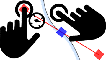 |
Switch between manipulating both control handles on a Bézier curve simultaneously, or each individually | With the Point Editor Tool selected, touch and hold a vertex to reveal its control handles (or touch and hold a handle if already revealed), then tap anywhwere on the canvas to switch between modes. |
In addition to the gestures listed above, OmniGraffle 3.11 and later support the iOS built-in gestures for Copy, Paste, Undo, and Redo.
Appendix C
Opening, Placing, and Exporting Files
This appendix provides you with a quick overview of the file and image types supported by OmniGraffle, and the methods for getting content into or out of OmniGraffle.
Opening Files
You may open the following native OmniGraffle files by tapping their icons in the Document Browser or in the Files app on iOS 11:
- OmniGraffle Document (.graffle)
- OmniGraffle Stencil (.gstencil)
- OmniGraffle Template (.gtemplate)
OmniGraffle also supports opening OmniOutliner files (.oo3 and .ooutline), and if you have OmniGraffle Pro you can also open Microsoft Visio XML files by doing the following:
- In the Files app, locate the OmniOutliner or Visio file and touch and hold on the icon momentarily; when you release your finger, a contextual menu appears.
- In the contextual menu, tap Share; a sheet slides into view.
- In the sheet, look for the row of app icons, and tap Copy to OmniGraffle.
OmniGraffle copies and opens a new file, saving it to the On My [device] folder on your device. The original source file remains where it was. To access OmniGraffle’s On My [device] folder in the Files app, choose On My [device] ▸ OmniGraffle.
The following Microsoft Visio file formats are supported for opening with OmniGraffle Pro:
- Drawing files (.vsd, .vdx, and .vsdx)
- Templates (.vst, .vstx, and .vtx)
- Stencils (.vss, .vssx, and .vsx)
Placing Files with Drag and Drop
OmniGraffle supports drag and drop on iOS 11 in both directions. You can drag images into or out of OmniGraffle to the another app when multitasking on iPad.
Dragging into OmniGraffle
You can drag the following file types onto a canvas:
| File Type | Standard | Pro |
|---|---|---|
| PDF (.pdf) | ||
| SVG (.svg) | ||
| PNG (.png) | ||
| JPEG (.jpg, .jpeg) | ||
| GIF (.gif) |
For example, you can drag image files into OmniGraffle from the Photos app, or from any webpage. Images can be placed inside objects or directly onto the canvas.
Dragging from OmniGraffle
Conversely, you can also drag objects, layers, and canvases from OmniGraffle’s sidebar—or directly from the canvas itself—to other apps. This enables you to quickly export objects from the canvas or place them in other apps on iPad.
For example, you can drag items from the sidebar or canvas to:
- ...Files, where you can move it into another app’s local folder or save it to iCloud Drive.
- ...Photos, adds an image file to your photo library.
- ...Mail, adds an image file of the item you dragged as an attachment.
- ...Notes, adds an image to the Note.
By default, when you drag out of OmniGraffle to another app, a vector-based PDF file is exported to or placed in that app. The exception, however, is if you drag out of OmniGraffle to an image-editing app such as Photos. In that case, the objects you drag out from OmniGraffle are rasterized and saved as a PNG image.
Regardless of what the receiving app accepts, an artboard includes the objects above it, and a layer includes its objects with a transparent background.
Exportable File Types
The following image and file types can be exported from OmniGraffle via the Share menu  in the document browser or document toolbar. OmniGraffle stencils and templates are also created directly from the Share menu.
| File Type | Standard | Pro |
|---|---|---|
| Modern OmniGraffle (.graffle) | ||
| Legacy OmniGraffle (.graffle) | ||
| PDF (.pdf) | ||
| PNG (.png) | ||
| OmniOutliner (.oo3) | ||
| Microsoft Visio XML (.vdx) |
The Modern OmniGraffle file type is used by OmniGraffle 3.14 for iOS and 7.16 for Mac and later, while the Legacy OmniGraffle file type is compatible with earlier versions.
Appendix D
Blend and Filter Types
If you have OmniGraffle Pro, tapping Show Fill Options at the bottom of the Fill inspector reveals Blend Types and Filter Types that you can apply to a shape.
Blends and Filters rely on a base shape or image object in the background (either on the same or a different layer), with the Blend or Filter applied to an object in the foreground.
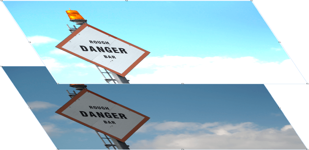
You can combine a blend and filter on the same object, or you can place them on different objects and rearrange them in the object stack to create different visual effects.
To create the Sample Images shown in the Blend Type and Filter Type tables, an image is used in the background, with a shape layered on top that contains the Blend or Filter type. The Blend Types, in particular, work by evaluating the colors of both the background and foreground objects and then blending those colors for the composition.
You may need to try different color fills for the object that contains the Blend Type—or even multiple objects with Blend fills—to get the desired effect.
Blend Type
Apply a blend type to the selected object. Blends have a visual effect on objects or layers underneath.
| Blend Type | Description | Sample Image |
|---|---|---|
| Normal | The selected object has no blend applied. |  |
| Multiply | Multiplies the color inputs of the background and foreground objects, resulting in a darker value. |  |
| Screen | Multiplies the inverse color values of the background and foreground objects, resulting in a lighter shade. | 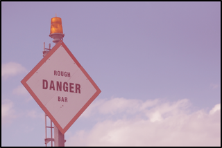 |
| Overlay | Multiplies or screens the colors, preserving the highlights and shadows of the background object. |  |
| Darken | The color values of the background and foreground objects are compared, resulting in the darker of the two color values being used. | 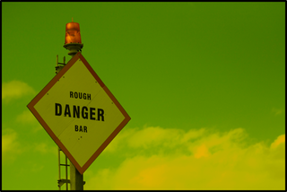 |
| Lighten | The color values of the background and foreground objects are compared, resulting in the lighter of the two color values being used. |  |
| Dodge | Brightens the background object, ignoring black color values of the foreground object; the resulting image looks somewhat washed, depending on the input color values. |  |
| Burn | Darkens the background object based on the color values of the foreground object, ignoring any white color values of the blend. | 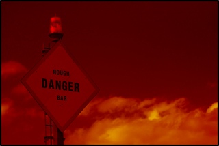 |
| Soft Light | Darkens or lightens the colors, based in the color values of the background object. | 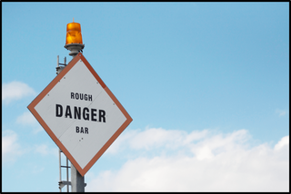 |
| Hard Light | Multiplies or screens colors, depending on the color values of the background object. |  |
| Difference | Compares and subtracts the darker color values of the background and foreground objects. If the foreground object is is white, the background object is inverted; there is no change if the foreground object is black. |  |
| Exclusion | Similar to Difference, but produces a lower contrast. |  |
| Hue | Uses the saturation and luminance values of the background object, and blends those with the hue value of the foreground object. |  |
| Saturation | Uses the hue and luminance values of the background object, and blends those with the saturation value of the foreground object. |  |
| Color | Uses the luminance value of the background object, and blends that with the hue and saturation values of the foreground object. |  |
| Luminosity | Uses the hue and saturation values of the background object, and blends those with the luminance of the foreground object. |  |
| XOR | XOR is primarily used in image processing—not composition—by comparing pixels to the background object with those of the foreground object with the XOR blend applied. If the pixels are the same, the XOR object’s fill is changed to black; otherwise, it gains a white fill. | |
| Plus Darker | Similar to Burn; darkens the background object while increasing the contrast. |  |
| Plus Lighter | Similar to Dodge; brightens the background object while increasing contrast. |  |
Filter Type
Apply a filter type to the selected object. Use the Opacity slider in either the HSB, RGB, or Gray color panel to change the Filter shape’s opacity to zero (0) to see the effect of the filter.
| Filter Type | Description | Sample Image |
|---|---|---|
| None | No filter is applied to the background object. |  |
| Blur | Applies a fuzzy blur to the background object; tap or to decrease or increase the Blur, respectively. |
 |
| Pixelate | Pixelates the background object; tap or to decrease or increase the size of the Pixelation, respectively. |
 |
| Magnify | Magnifies the background object; tap or to decrease or increase the Magnification, respectively. |
 |
Appendix E
Keyboard Shortcuts
The following keyboard shortcuts can be used with OmniGraffle, and require a hardware keyboard.
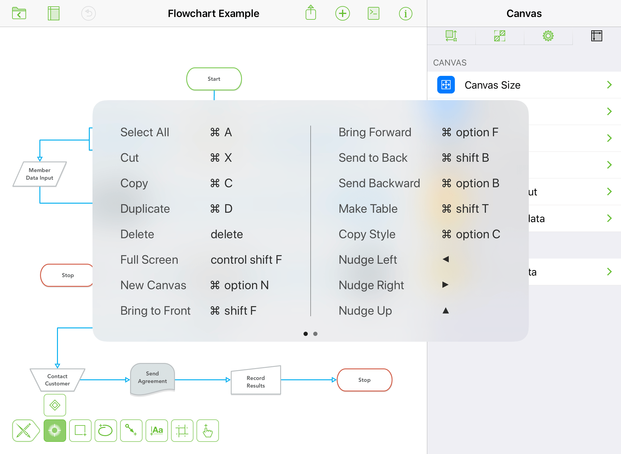
| Action | Shortcut |
|---|---|
| Standard Keyboard Shortcuts | |
| Select All | Command-A |
| Cut | Command-X |
| Copy | Command-C |
| Paste | Command-V |
| Duplicate | Command-D |
| Delete | Delete |
| Full Screen | Control-Shift-F |
| Undo | Command-Z |
| Redo | Shift-Command-Z |
| New Canvas | Option-Command-N |
| Previous Canvas | Command-[ |
| Next Canvas | Command-] |
| Close (Window) | Command-W |
| Shortcuts for Switching Tools | |
| Select Shape Tool | s |
| Select Selection Tool | v |
| Select Line Tool | c |
| Select Text Tool | t |
| Select Freehand Tool | e |
| Select Point Tool | f |
| Select Action Tool | b |
| Select Artboard Tool |
a |
| Shortcuts for use with an Object Selected | |
| Bring to Front | Shift-Command-F |
| Bring Forward | Option-Command-F |
| Send to Back | Shift-Command-B |
| Send Backward | Option-Command-B |
| Lock | Command-L |
| Unlock | Option-Command-L |
| Group | Shift-Command-G |
| Ungroup | Shift-Command-U |
| Make Table | Shift-Command-T |
| Copy Style | Option-Command-C |
| Paste Style | Option-Command-V |
| Shortcut for Nudging Selected Objects | |
| Nudge Left | Left Arrow |
| Nudge Right | Right Arrow |
| Nudge Up | Up Arrow |
| Nudge Down | Down Arrow |
| Shift Nudge Left | Shift-Left Arrow |
| Shift Nudge Right | Shift-Right Arrow |
| Shift Nudge Up | Shift-Up Arrow |
| Shift Nudge Down | Shift-Down Arrow |
| Shortcut for Text Editing | |
| End Text Editing | Command-Return |
Appendix F
Data Variables
In OmniGraffle, a data variable is a string that you can use to insert object and line labels based on other information in your document. These variables look for like-named elements in an OmniGraffle document’s XML source, and displays its corresponding data related to the string provided. For example, you can use the <%Layer%> data variable as a text object on the canvas to display the name of that layer.
Use of the <%UserData%> variable gives OmniGraffle Pro users access to document-level details and metadata entered into the Canvas Metadata inspector.
Universal Data Variables
OmniGraffle Standard and Pro both have access to a core set of data variables, listed in the following table.
| Variable | Description |
|---|---|
| Canvas and Layer Variables | |
<%Canvas%> |
Displays the canvas name. |
<%CanvasNumber%> |
Displays a number related to the canvas’s position in the Sidebar. |
<%TotalCanvases%> |
Displays the total number of canvases in the document. |
<%Layer%> |
Displays the name of the layer. |
| Document-specific Variables | |
<%Document%> |
Displays the filename of the OmniGraffle document. |
<%Creator%> |
Displays the user name of the person who created the document. |
<%Modifier%> |
Displays the user name of the person who last modified the document. |
<%#%> |
Displays the current page number, based on the object’s position on the canvas as it relates to how the page is printed. |
<%TotalPages%> |
Displays the total number of pages to be printed from the document. |
| Date Variables | |
<%Date%> |
Displays today’s date. |
<%CreationDate%> |
Displays the date the document was created. |
<%ModificationDate%> |
Displays the date that the document was last modified. |
| Date Strings for use with Date Variables | |
y |
Two-digit year, based on the decade; for example, 16 for “2016”. |
Y |
Four-digit year; for example, 2016. |
m |
Month, represented as two digits ranging from 01-12; for example, 10 for October. |
d |
Day, represented as two digits ranging from 01-31 (as appropriate); for example, 05 is the fifth day of the month. |
c |
Current date and time; for example, Tue Jul 11 10:00:00 PDT 2017. |
H |
Hours, represented as two-digits ranging from 00-23; for example, 11 is 11 a.m., whereas 23 is 11 p.m.. |
M |
Minutes, represented as two digits ranging from 00-59. |
S |
Seconds, represented as two digits ranging from 00-59. |
z |
Zulu time difference; for example, an output of -0700 represents that the current time is seven hours behind Zulu time. |
| Object-specific Variables | |
<%X%> |
Displays the object’s horizontal distance from the origin. |
<%Y%> |
Displays the objects vertical distance from the origin. |
<%Width%> |
Displays the object’s width. |
<%Height%> |
Displays the object’s height. |
<%Length%> |
Displays a line object’s length. |
<%GraphicName%> |
Displays the name of the object. |
| Document Data Inspector Variables | |
<%Subject%> |
Displays the Subject of the field of the Document Data inspector. |
<%Copyright%> |
Displays information entered in the Copyright field of the Document Data inspector. |
<%Version%> |
Displays information entered in the Version field of the Document Data inspector. |
<%Description%> |
Displays information entered in the Description field of the Document Data inspector. |
<%Comments%> |
Displays information entered in the Comments field of the Document Data inspector. |
<%Authors%> |
Displays the author, or authors, listed in the Authors field of the Document Data inspector. |
<%Organizations%> |
Displays information entered in the Organizations field of the Document Data inspector. |
<%Languages%> |
Displays the language, or languages, entered in the Languages field of the Document Data inspector. |
<%Keywords%> |
Displays the keyword, or keywords, entered in the Keywords field of the Document Data inspector. |
<%Projects%> |
Displays the document, or documents, entered in the Projects field of the Document Data inspector. |
Date Strings Used by the Date Variables
As noted in the previous table, OmniGraffle has three date-specific variables that make it easy for you to track the status of work on your documents.
-
Current Date (
<%Date%>) — inserts the current date. This particularly handy when you want to “stamp” a document you’re exporting or printing with today’s date. -
Document Creation Date (
<%CreationDate%>) — inserts the date that the document was originally created, according to the document XML. -
Document Modification Date (
<%ModificationDate%>) — inserts the date that the document was last saved, according to the document XML.
The date variables are particularly useful when combined with the <%Creator%> and <%Modifier%> variables, when you need to see who last updated a document file.
If you are using one of the date variables, you can customize the format of the date using the variables. For example, to get a date such as 2017-10-05 08:37:30 -0700Z, you could use the following variable string:
<%date %Y-%m-%d %H:%M:%S %zZ %>
The logic we have used in creating the date variables is based on Cocoa’s date formatting tokens.
Appendix G
Getting Help
When you’re in need of help—whether you’re trying to figure out how layers work, or if you’re having some other issue with OmniGraffle—it’s good to know that the Support Humans at the Omni Group are always available to lend you a hand.
Release Notes
For a detailed, comprehensive summary of the latest changes to OmniGraffle, tap while in the Document Browser and choose Release Notes. This is a good first place to check if something is behaving in a way you didn’t expect.
Finding Help Online
The OmniGraffle Support Site provides a wealth of information, including this Reference Manual, as well as How-Tos and Support articles, which go into finer detail on working with OmniGraffle.
Similarly, the OmniGraffle product page is always a good place to find the latest information about features and updates to OmniGraffle.
Videos
In addition to the online help, we also provide a series of online videos for OmniGraffle. These videos range in topics from available features in the latest version of OmniGraffle to how-to tutorial videos to help you level up in your OmniGraffle skills.
Email Support
If you’re stuck, if you have a good idea for the next version of OmniGraffle, or if you just want to let us know how we’re doing, go ahead and send us an email. In the Document Browser toolbar, tap and choose Contact Omni to queue up an email message addressed to us, or just send us an email with your thoughts. We take support pretty seriously, so you can expect a prompt response actually typed by human hands.
Phone Support
We understand that sometimes you just can’t wait for an email response when you’re knee-deep in a document and you’re stuck or something isn’t working quite right. We get that. When this happens, you can call our Support Humans at 800-315-OMNI or 206-523-4152. Our Support Humans are available Monday-Friday, from 10 a.m. to 5 p.m. Pacific Time (-0700 GMT).
Online Forums
Omni maintains online forums for all of our products, which are available to everyone. Come share your questions and ideas with other users, share OmniGraffle files to show off how you’re using OmniGraffle for a particular document, and seek help from the OmniGraffle community.