Using Dashboards (Pro)
When you are managing multiple projects at the same time, it is essential to ensure that the projects are on track and that any shared resources are correctly assigned. To help facilitate management of and participation in multiple projects, you can use Dashboards in OmniPlan Pro.
An OmniPlan Dashboard file (.opld) is a window that displays summaries of multiple projects simultaneously. When saved, the Dashboard file preserves the projects you have added to it, enabling you to quickly review your projects side by side.
To create a new Dashboard, choose File > New Dashboard (Shift-Command-N) and then drag OmniPlan project files onto it.
You can save that dashboard for future reference in its own .opld file format, and create as many other unique combinations of projects as you want with additional dashboard files. Any updates you make to a project that is shared in a dashboard are immediately reflected there, but projects themselves can’t be directly edited from the dashboard interface.
Creating a New Dashboard
To create a new Dashboard, follow these steps:
- Choose File > New Dashboard (Shift-Command-N).
- Click
 to add a project to the Dashboard. This opens a sheet from which you can locate and choose OmniPlan projects to add to the Dashboard. Alternately, you can also drag OmniPlan project files into the window from the Finder.
Reviewing Projects in the Dashboard
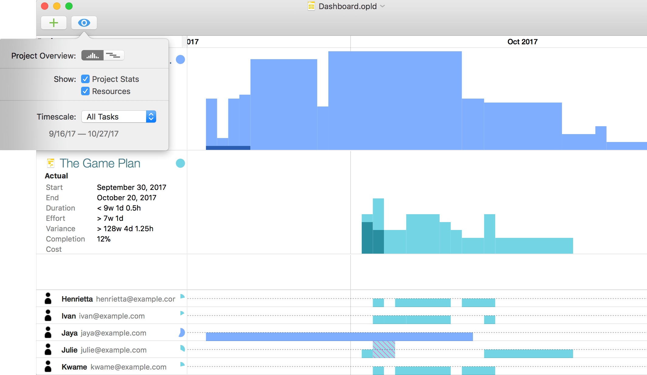
As you add projects to the Dashboard, you’ll see them laid out as rows with summary graphics of the projects’ Gantt charts in two-tone color schemes that reflect the work completed and the work yet to be done (these colors represent their respective projects throughout the Dashboard).
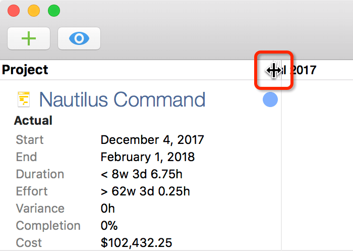
The Project column in the Dashboard provides you with a quick overview of your project’s Summary information (similar to what you see in the Project inspector). This first column can be resized by dragging the header separator left or right:
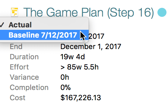
By default, the projects you add to the Dashboard show the Actual timeline for the project. However, if you click Actual, you can view a list of the baselines currently set for the project, and select a baseline schedule to view in the Dashboard instead.
In addition to rows representing your projects, you’ll see an additional, automatically generated row—a graph of Idle Time to indicate when the projects’ resources are available for other tasks. White bars of idle time represent unused time in the past, while dark gray bars represent available time in the future.
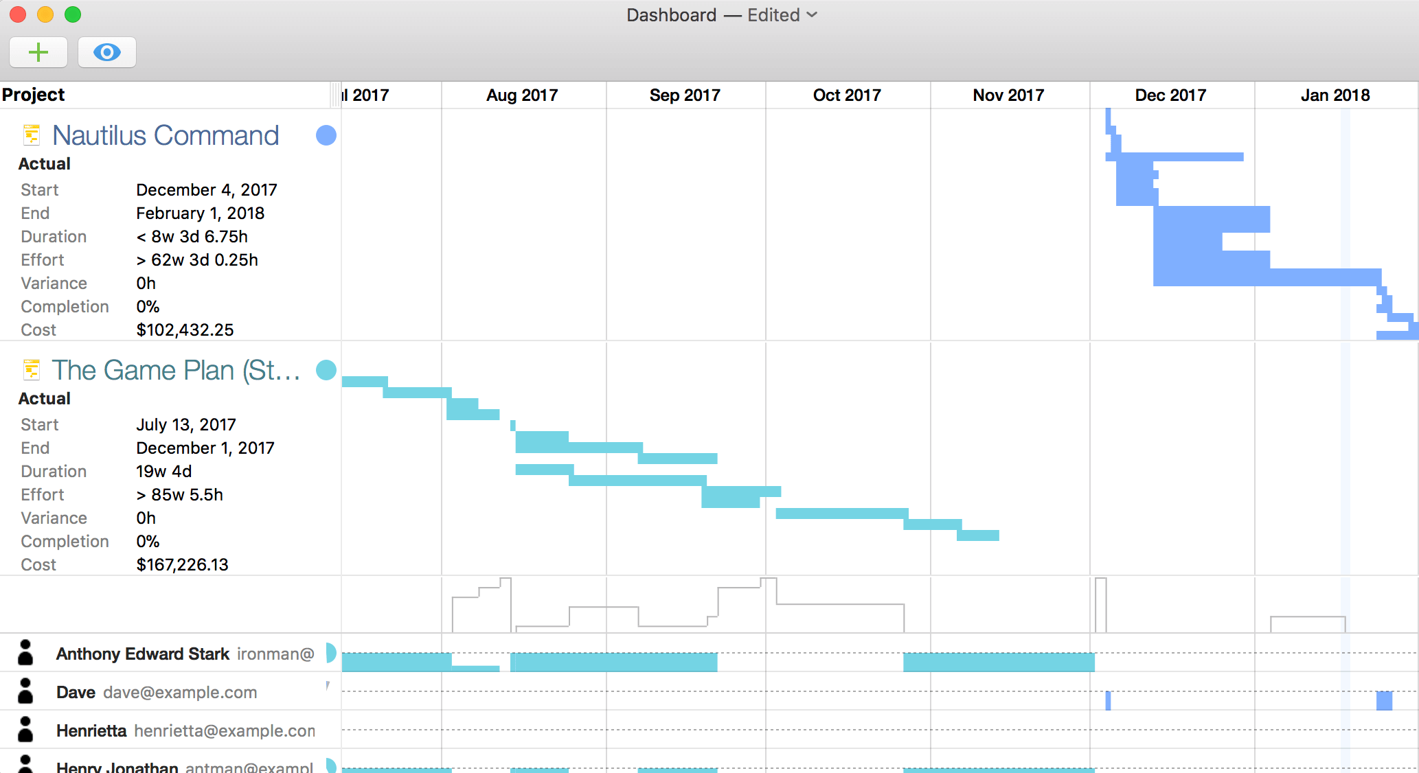
Along the bottom of the Dashboard window, you’ll find a list of any resources to which an email address is assigned. Next to each person, you’ll see diagram-style bars that illustrate when each person is busy or available, along with pie chart reference graphs noting the split of their effort between the projects in the Dashboard and their Idle Time.
Click  to open the Dashboard window’s View menu, which offers the following options:
- Project Overview—Choose between the Gantt comparison view or a bar chart view for displaying the chronology of projects with task bar heights based on the amount of effort required for completion.
- Show Project Stats—Shows or hides details about the project(s) on the Dashboard, including start and end dates, duration, variance, completion, and cost.
- Show Resources—Shows or hides the list of project resources along the bottom of the Dashboard window.
- Timescale—Choose a timeframe for the Dashboard to display from among a list of preset time spans. These include All Tasks (the Dashboard automatically scales to fit every task across all of its projects), Today through the End of all projects, This Month, This Quarter, or This Year. Alternatively, choose Custom to pick any date range you like.
You can open a project directly from the Dashboard by clicking its document icon. Edits made to project files included in the Dashboard are reflected there right away, so you can immediately see the effect your changes have on the project in question—and potentially on others, if you are sharing resources between projects.
Sharing Resources Between Projects
The power of dashboards is realized to its fullest when you are also taking advantage of the publication and subscription of resource loads of the projects included in your dashboard.
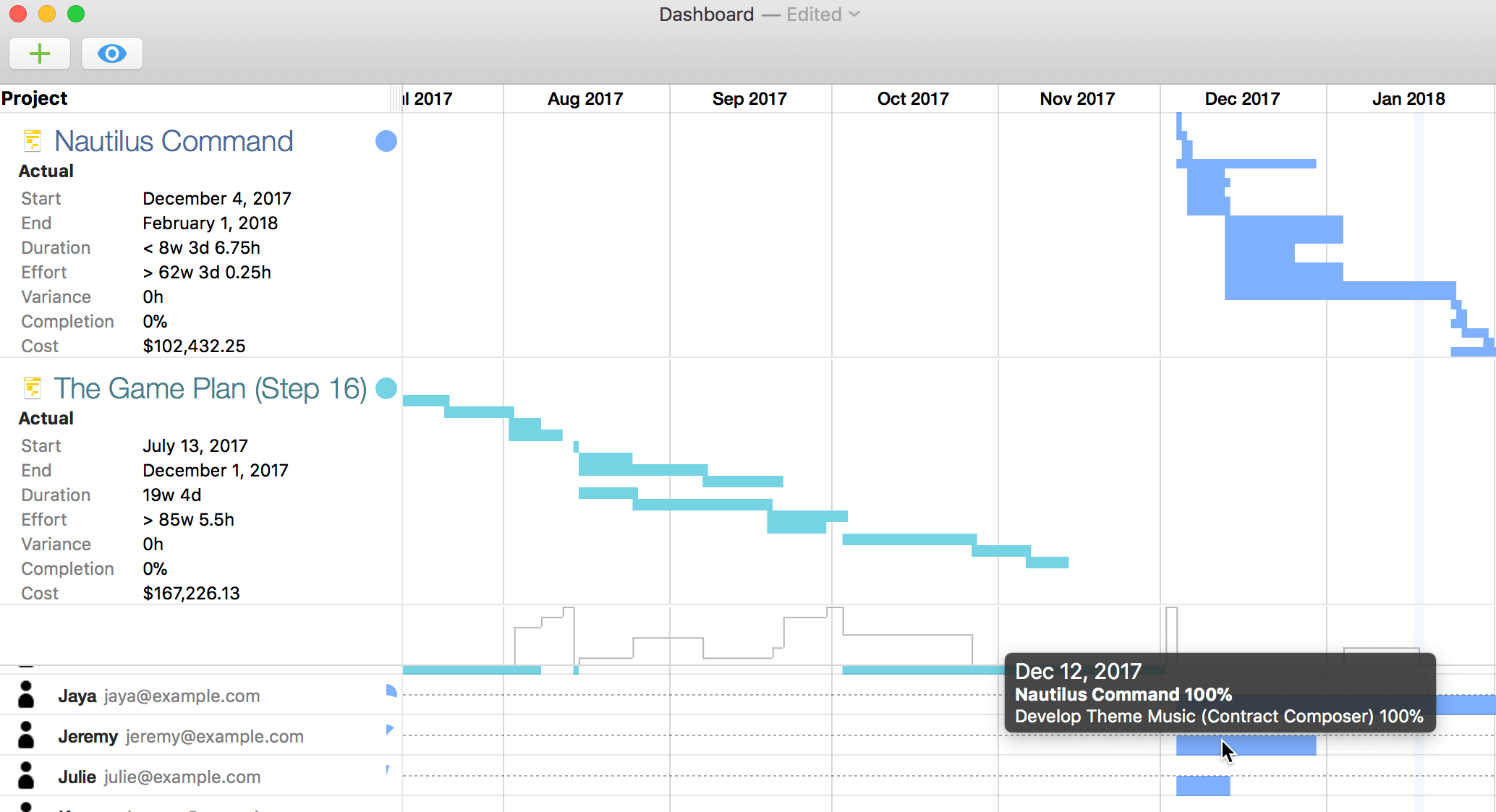
When balancing resource loads across projects in a shared server repository, the dashboard recognizes that resources are being shared and provides a window on the intersection between resources and the projects they’re working on (sometimes simultaneously at 100% effort, as in the example above). You can identify where resources are overloaded (or are standing idle), and make the changes necessary to ensure your projects are running in tandem at peak efficiency.
Printing Dashboards
When you have a dashboard set up the way you like it and you want to share it with others, you can print it straight from the File menu (Command-P).
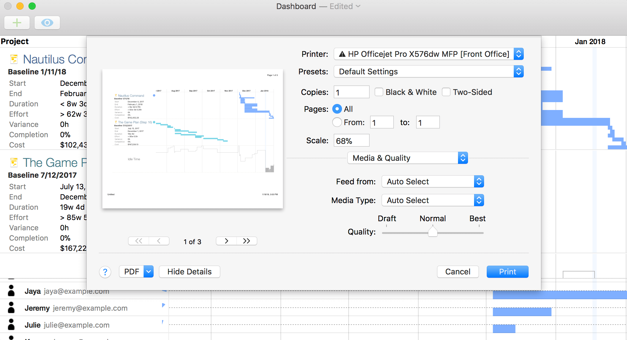
Print-time options for dashboards are pretty straightforward; as with all standard documents in macOS, you can choose to save the dashboard as a PDF rather than send it to a printer. The standard page setup controls are available as well.
The most important thing to note about printing dashboards is that what you see is what you get—the content of the print preview changes based on the dimensions and content of the dashboard’s window at the time of printing.
A dashboard’s printed page width is dictated by the bounds of the window, and will never exceed one page; excess pages are generated vertically only. If you find that the printed version of your dashboard extends vertically more than you would like, consider turning off display of project stats and resources in the dashboard’s view menu.