The Outline
The outline is where you view, add, and manipulate tasks in OmniFocus. The items you see in the outline depend on the perspective you are viewing: you can narrow your concentration on just a few things you’d like to accomplish in the near term using Forecast, tackle things contextually with Tags, or get a broad overview of the work ahead across a number of Projects.
In wide views, the Outline is the center pane and backdrop of all your activity in OmniFocus.
In compact views, the outline sits at a level beneath Home and the sidebar; you’ll tap through the hierarchy in a chosen perspective to reach it.
The Anatomy of a Row
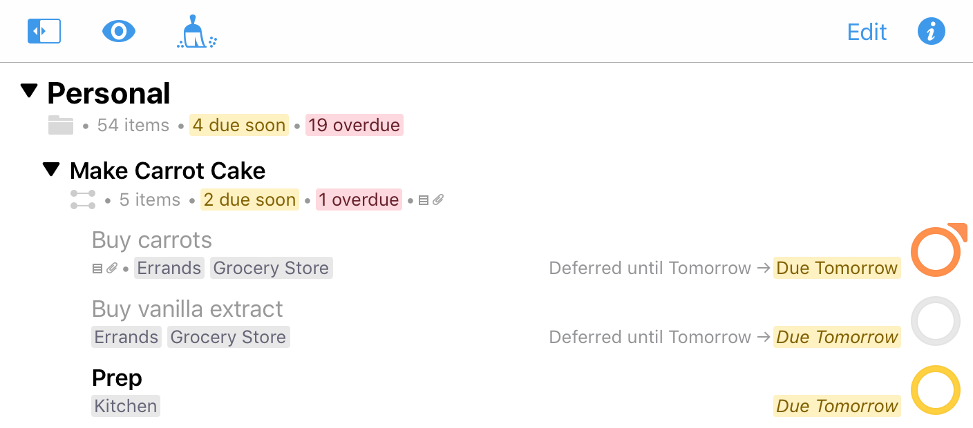
A row in the OmniFocus outline represents an item—a to-do that you captured with OmniFocus—or a piece of your organizational framework like a project, folder, or tag.
Rows display all sorts of information about an item, like the project it belongs to, any relevant tags, due dates, and completion status in the form of the status circle.
The figure below is a breakdown of an item in the Inbox that’s packed with additional information about the task at hand.
-
Project—If the item has a project assigned, its location in the project hierarchy appears here. Since this is an Inbox item (and Inbox items with projects are usually cleaned up), this item is listed with No Project. This row does not appear on items in the Projects perspective or custom perspectives that display project hierarchy, and can be hidden in
 View Options to increase the number of items on screen at once.
 -
Title—The item’s title. Black title text generally indicates that an item is actionable; items that are completed, blocked, on hold, or parents of groups have grey title text instead (unless they are due soon or overdue).
-
Notes and Attachments—These icons indicate whether the item includes notes
 or attachments
  .
. -
Tags—Any tags assigned to the item appear here. An item can have as many tags as you want; if there are more tags than horizontal space in the row, additional tags are indicated by an ellipsis.
-
Dates—If the item has due or defer dates assigned, they will appear here when relevant (once a defer date has passed it is no longer displayed). The defer date may be hidden if there isn’t enough room in the row.
-
Status Circle—A visual representation of the completion status of the item, along with other important attributes. Tap an active item’s status circle to mark it complete.
Project, Folder, and Tag Rows
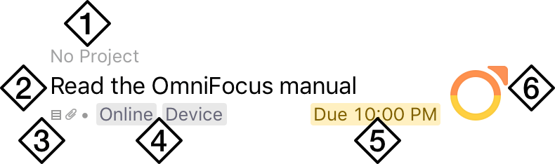
In addition to the common attributes of Inbox items, rows for projects, folders, and tags can have a variety of other useful information.
Note that hierarchy (projects nested within folders and tags within other tags) appears by default in the outline on wide devices; on compact, tap Show Projects Contents or Show Tags Contents to browse the full perspective hierarchy. Otherwise, each level of hierarchy is represented sequentially as you navigate through it.
-
Disclosure Triangle—Tap to collapse or expand the folder, project, or tag to hide or reveal its contents.
-
Row Type Icon—Projects,
 folders, and
  tags have icons next to them to help remind you of your current perspective and the row’s relation to those around it. Projects are further broken down by type:
  Sequential,
  Parallel, and
  Single Actions.
 -
Row Status—Projects and tags with a status other than Active display it here. In addition to Active (no icon), Projects can be On Hold
 , Completed
  , or Dropped
  , while tags can be Active, On Hold, or Dropped.
 -
Item Count—The total number of items in the project, folder, or tag.
-
Notes and Attachments—Indicates whether there are notes or attachments associated with the project itself (as opposed to the items within it). Notes and attachments can’t be assigned to folders or tags.
-
Due Summary—When there is enough room in the row, this line shows a breakdown of the due states (due soon and overdue) of items in the project, folder, or tag.
Status Circle
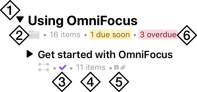
An item’s status circle is the target for checking it off when it is done. Tap the circle  , and the item is complete
  . (What happens next depends on your Clean Up setting.)
Status circles also convey important information about an item: items can be due soon  (amber), overdue
  (red), or flagged
  (orange). Repeating items are also distinguished by the ellipsis
  in their center.
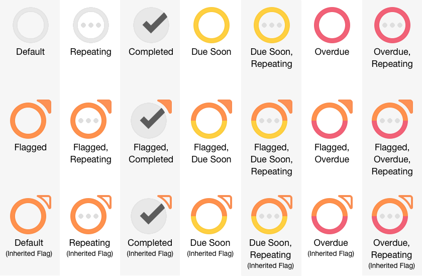
If you have an item with more than one status, the circle will take on multiple colors simultaneously to communicate each relevant attribute. Likewise, an item that is nested inside a flagged project or group will inherit the flagged property; when a flag is inherited, its icon is hollow rather than filled.
Outline Tools
The outline toolbar and bottom bar contain a variety of tools for determining what gets displayed in the outline, editing multiple items at once, adding new items to the outline, reverting unwanted changes, and managing projects in the Review perspective.
View Options
Tap View Options to customize which items appear in the current perspective’s outline view based on their completion status, project order, and other perspective-specific features.
Edit 
Tap Edit to enter Edit mode, where you can adjust the properties of multiple items at once.
Back 
In compact views, tap Back to return to the previous level in your OmniFocus directory. (The button’s label changes to Home when at the top level of another perspective, or to the perspective’s name when a level below that.)
Instead of tapping Back repeatedly, you can tap and hold it to return Home in an instant.
Inspector 
In wide views, tap Inspector to open and close the inspector on the right side of OmniFocus. In compact views, the Inspector button appears in the toolbar while in Edit mode. (Both views can use the inspector to batch edit items while in Edit mode.)
Clean Up 
In wide views, tap Clean Up to tidy any items in the outline that may belong elsewhere after a change of project, tag, or status. In compact views, drag down on the outline to prompt a clean up.
Use Clean Up Settings to determine when items are removed from the outline automatically.
Sidebar 
In wide views, tap Sidebar to open and close the sidebar on the left side of OmniFocus. In compact views, tap Back to return to the sidebar and Home.
New Inbox Item 
Tap New Inbox Item to quickly add items to the Inbox, or tap and hold the button’s icon to drag it anywhere in the outline. As you drag the button over the outline, rows around it separate to provide a blank space to drop it. Drop the button to create a new item at that spot in the outline hierarchy, pre-filled with any relevant attributes based on the perspective you’re in.
The editor that appears when you tap New Inbox Item is functionally identical to the inspector for Inbox items, and contains the same attributes and controls.
Create New...
The Create New buttons are available when viewing a relevant perspective in the outline. Tap to add an item of the chosen type (Project  , Folder
  , or Tag
  ) at the top level of on-screen hierarchy. (If you’re looking at the contents of a folder and tap Create New Folder, for instance, the folder will be created inside the current folder.)
Add Here 
The Add Here button is available when viewing the contents of a single project, tag, or other flat list (such as the Flagged perspective or a date in Forecast). Tap it to add an action item at the current location.
Add Here only appears when viewing the contents of a flat list in the outline. If the view includes anything else—a folder, a nested tag—it isn’t specific enough to know what “here” means, so the button won’t appear.
Undo 
Undo is available wherever you are in the outline. Tap it to revert the most recent change to your database. After a change has been undone, this button changes to Undo/Redo  and provides the option to restore the undone change.
Review Buttons
These buttons are available in the bottom bar of the Review perspective, and have specific uses pertaining to the review process.
 Previous—Return to the previous project in the list for review.
 Next—Advance to the next project in the list for review.
 Mark Reviewed—Mark the current project as reviewed, and advance to the next project in the list. The project’s next review date is updated to the present plus its review interval.
Contextual Menus
Contextual menus appear when you tap and hold a row in the outline, and contain commands contextually relevant to your selection.
Tap and hold is the same gesture required to lift an item for drag and drop. Instead of moving the item elsewhere in the outline, release it after it lifts and the contextual menu will appear.
On Actions
Contextual menus on actions and Inbox items offer the following commands:
- Cut
- Copy
- Paste
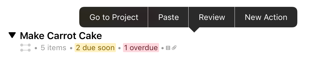
On Projects
Contextual menus on projects offer the following commands:
- Go to Project
- Paste
- Review
- New Action
On Folders
Contextual menus on folders offer the following commands:
- Go to Folder
- New Folder
- New Project
On Tags
Contextual menus on tags offer the following commands:
- Go to Tag
- Paste
- New Tag
- New Action
On Disclosure Triangles
Contextual menus on disclosure triangles (regardless of item type) offer the following commands:
- Expand All
- Collapse All
Search
Navigate to the top of the outline and drag down to reveal the Search bar. Tap Search and enter keywords to find matching items from among three different possible scopes on your database.
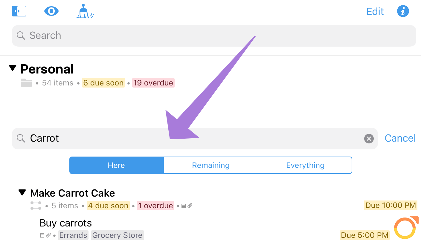
-
Here—The search is limited to the content currently visible in the outline. For many perspectives this includes the entire content of the perspective, but for those with hierarchy it may not—if you’re viewing the contents of a specific project or folder, items in projects outside that scope will not be shown in the results.
-
Remaining—The search includes everything in your database with an implicit status of Remaining: all items except those marked Completed or Dropped.
-
Everything—The search includes every item in your database, regardless of status or location.
Search looks for text matching the keywords in item titles, notes, and tags, and displays results as a list of items in the outline.
Edit Mode
Tap Edit in the outline toolbar to enter Edit mode. In Edit mode, you can select, inspect, and edit as many items simultaneously as you would like. (Tap rows in the outline to select them.)
Any attributes shared by the selected items are displayed in the inspector. When attributes differ, the inspector indicates this as well (items selected across projects display as Mixed, a collection of flagged and unflagged items displays Some Items Flagged, and so on).
Editing an attribute of the selection applies the edit to all items in the selection, overwriting any existing information (in the case of Some Items Flagged, for example, tapping to flag the selection applies a flag directly to all items in the selection).
Any property shared by items in the selection can be edited using the inspector, or tap Delete  to delete the selection from your database entirely.
In addition to the inspector’s editing controls, tap More in the outline’s bottom bar for several other batch editing tools (in the widest outline view these appear in the bottom bar side by side).
-
Flag—Add Flagged status to the items in the selection.
-
Tag—Add a tag to the items in the selection. A sheet appears with a list of existing tags and the option to create a new one from text in the Search dialog.
-
Remove Tag—Remove a tag from items in the selection. A sheet appears with a list of tags shared by one or more of the selected items.
-
Group—Create a group consisting of the selected items and a new parent item. The group appears in the hierarchy on a peer row of the first item in the selection, directly above it.
-
Cut—Cut the items from the database and copy them to the pasteboard. Leave Edit mode and tap and hold a row to open the contextual menu and paste the copied items beneath it.
-
Copy—Copy the items to the pasteboard. Leave Edit mode and tap and hold a row to open the contextual menu and paste the copied items beneath it.
-
Delete—Delete the items from the database entirely.
When you are finished editing, tap Done in the toolbar to leave Edit mode.
Drag and Drop
Items in the outline can be repositioned within the outline hierarchy, dragged to other projects or tags in the sidebar, and dragged from OmniFocus to other applications (where they are added in plain text Taskpaper format).
To select an item for drag and drop, tap and hold its row in the outline until the item “lifts off the page” and transforms into a mobile selection under your finger.
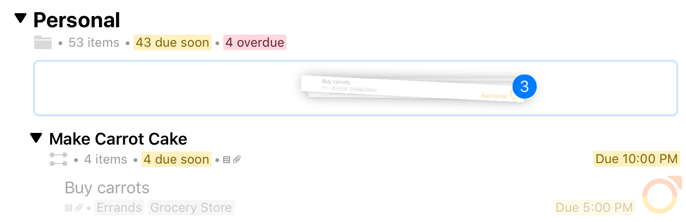
Once lifted, you can add additional items to the selection by tapping their rows. Additional items animate to join the selection, and the badge count increments to indicate the total number of items being dragged. When you drag a project or tag, the selection includes all of the items inside it.
If you would like to add items to the selection that are off screen, swipe to scroll the outline with a second finger while holding the selection with the first.