Built-In Perspectives
Perspectives are views on the work that you capture in OmniFocus, each with its own purpose to help you organize and get stuff done. OmniFocus includes seven built-in perspectives, and this chapter describes their purpose and features in detail.
Access OmniFocus’s built-in perspectives by tapping them in the Home view.
Forecast 
Forecast helps you keep an eye on the progress of your projects, check upcoming due dates, and schedule OmniFocus to-dos alongside important events in your calendar.
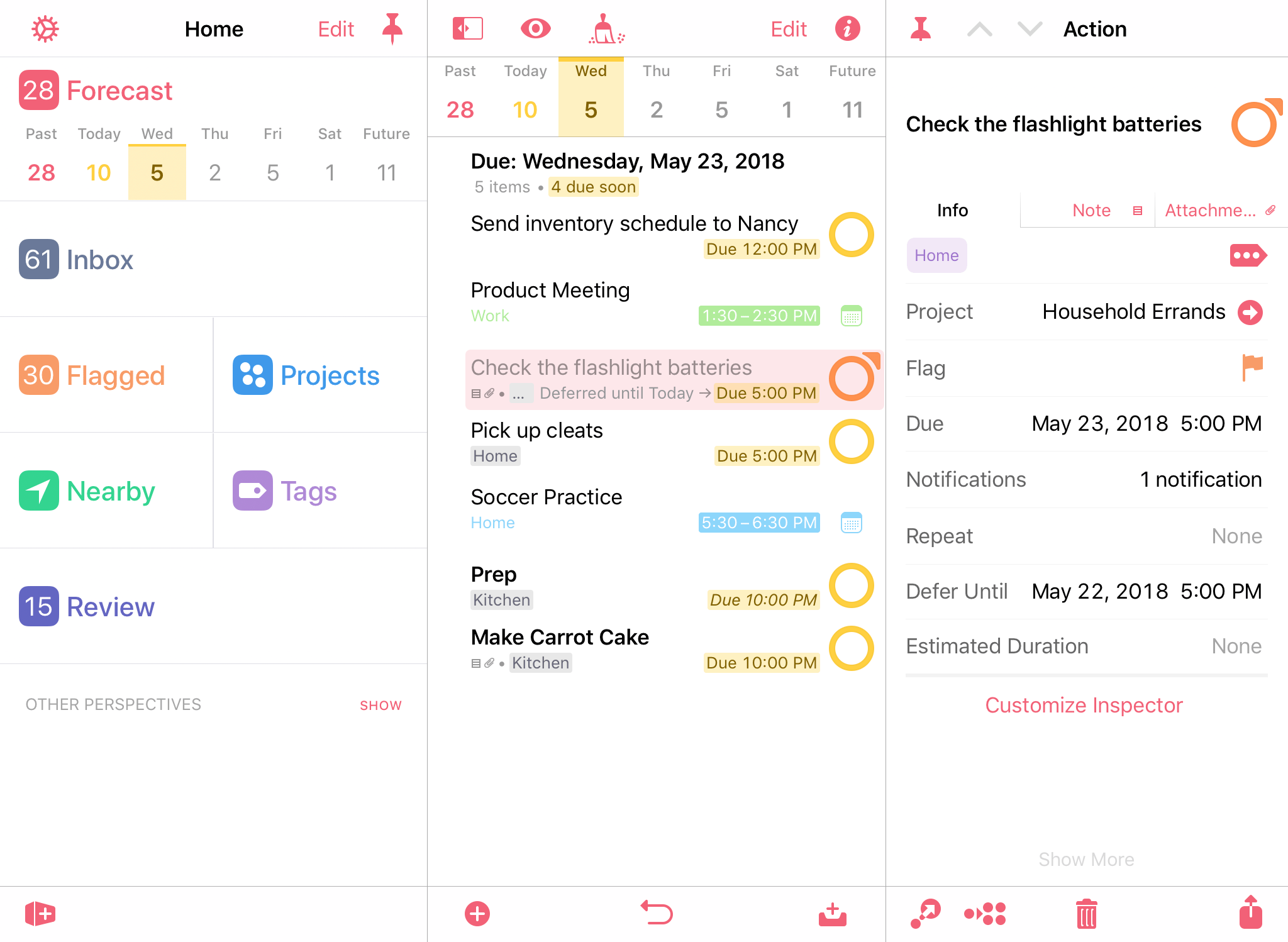
The Forecast tile in the Home view shows a range of dates spanning today, the next four days, the past, and the future, letting you know at a glance what’s on your plate.
Each date doubles as a button that shows the number of actions associated with that date. For due items, the count is color-coded according to the most urgent item: amber indicates that an item is due soon, and red indicates an item is due or past due.
To create a new action that is due on a particular day, tap the appropriate date button, followed by Add Here  .
.
Forecast Outline
The Forecast outline displays a chronological list of items due each day, interleaved with events from any calendars you’ve chosen to display in OmniFocus.
Calendar events in the outline are for display purposes and can’t be interacted with from inside OmniFocus. Tap the calendar icon next to an event to open it in iOS Calendar.
A row of dates at the top of the outline mirrors that in the Home perspective tile. Tap a day to view that day’s due items and calendar events.
If you have designated a Forecast tag  in view options, items with that tag appear in a separate section of the outline when browsing items due Today.
Forecast View Options 
-
All Days Show: Calendar Events—With this setting turned on, events from calendars you’ve chosen to display in Forecast will appear alongside OmniFocus items on the dates when they occur. With this turned off, calendar events do not appear in the outline.
-
All Days Show: Deferred Items—With this setting turned on, deferred items scheduled to begin on a given day will appear in a separate Deferred section on the dates when they become available. With this turned off, deferred items do not appear in the outline until they are due.
-
Calendars—When All Days Show: Calendar Events is turned on, use this submenu to pick the calendars that you would like to appear in OmniFocus. Events from the selected calendars appear interspersed chronologically with your OmniFocus items in the Forecast outline.
Calendars works with the iOS Calendar app to find calendars you own or have subscribed to across services and devices, including iCloud, Google Calendar, and more. Use Accounts & Passwords settings in the iOS Settings app to connect to your shared calendars.
-
 Today Includes: Tag—With OmniFocus Pro, choose a tag here to have its items appear in the Today view of Forecast in their own section of the outline. Once set, this Forecast tag can be applied to items from anywhere in the outline: swipe an item row from left to right and tap the Tag button to do so.
 -
Show Project Paths—With this setting turned on, rows in the outline include their project information above the item title as described in The Anatomy of a Row. Turn this off to reduce the amount of space taken by each row in the outline.
Inbox 
The Inbox is the catch-all perspective for depositing everything that you’d like to do. To add an item to the Inbox, tap Add Inbox Item  in the toolbar. (You can use this button wherever it appears to add Inbox items from all over OmniFocus.)
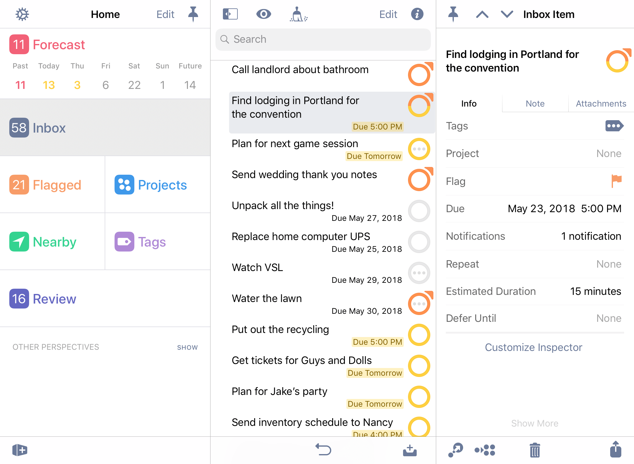
Many workflows use the Inbox as an initial point of entry, a transient receptacle for ideas big and small. Once you’ve processed an Inbox item (added a project or tag, converted it to a project, or assigned it some other fate), it will likely disappear off to its new location (this depends on your Clean Up settings).
Inbox Outline
The Inbox contains a list of individual items. If you convert an Inbox item to a project it will immediately disappear (you’ll have the option to see it in its new location in Projects).
Inbox View Options 
-
In The Inbox, Show:—Choose the setting for items that you would like to be visible in the outline (Available is the default). Each option describes the requirements for items that it includes or excludes; see the Glossary for further details on each status.
-
Show Project Paths—With this setting turned on, rows in the outline include their project information above the item title as described in The Anatomy of a Row. Turn this off to reduce the amount of space taken by each row in the outline.
Item Status
The states described here apply both to items in the inbox and actions within projects. Items can have additional states described by their status circles; the ones here are common to all and appear in the inspector.
-
Active
 —The default status for a newly added item, indicating an item that is currently planned for work.
 -
Completed
 —The status for an item that has been successfully completed. Tap the item's status circle, press Space with a connected keyboard, or use the inspector to mark an item complete.
When completing an item group, items within the group inherit the completed status and are represented with an inherited completion status circle
 in the outline.
 -
Dropped
 —The status for an item no longer planned for work. Use the inspector or press Option-Space with a connected keyboard to mark an item dropped.
When dropping an item group, items within the group inherit the dropped status and are represented with an inherited dropped status circle
 in the outline.
Flagged 
The Flagged perspective contains a collection of all items you have assigned the Flagged status.
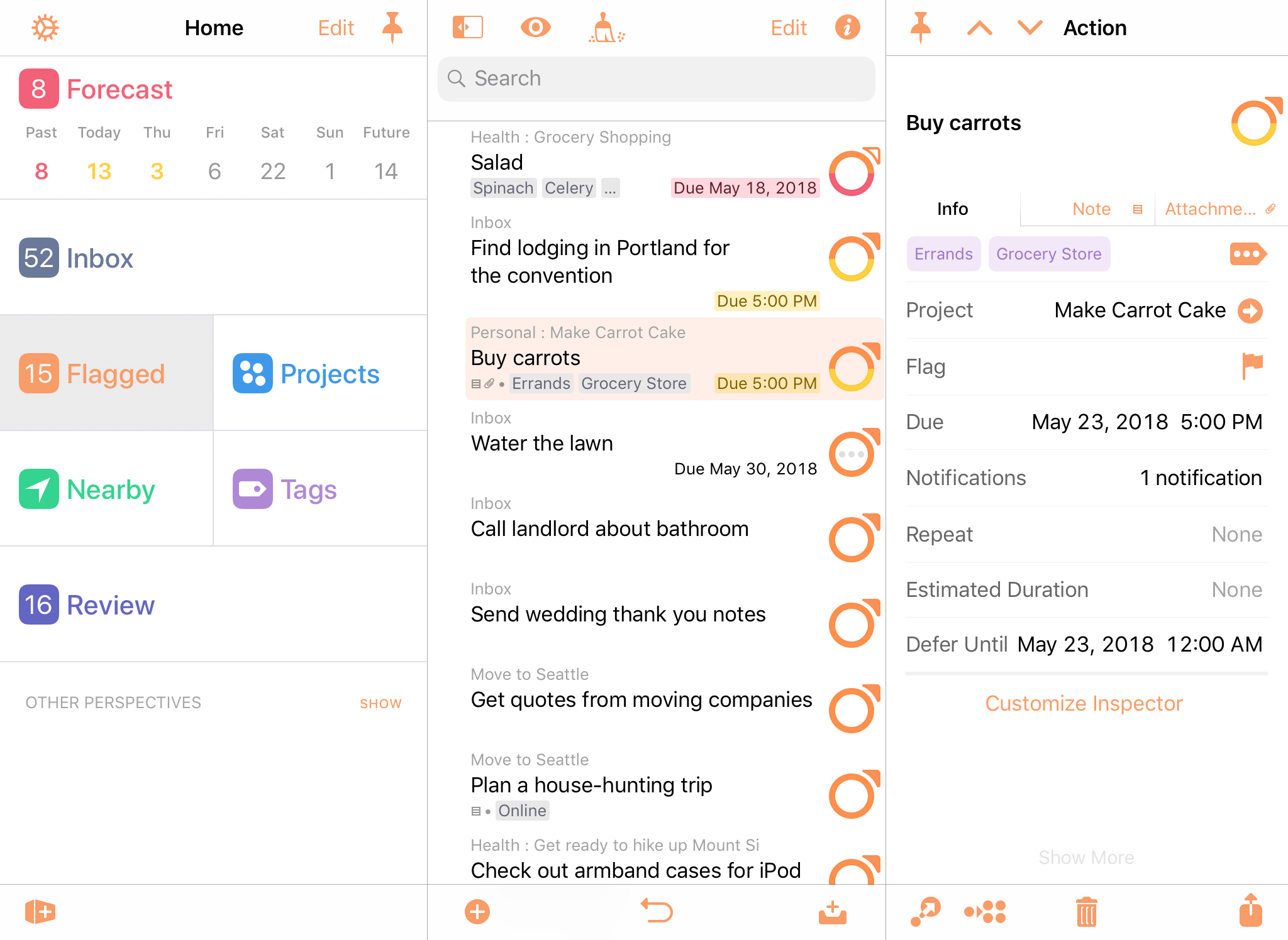
To flag an item, open it for editing and tap the flag icon. Another quick way to flag (or unflag) an item is to swipe it from left to right, revealing the Flag button.
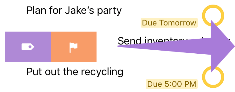
 If you've set a Forecast tag with OmniFocus Pro, the Flag button appears alongside the Forecast tag button when you swipe an item row.
When you flag an item, its status circle changes color to orange  to help catch your eye and let you know that something important is going on. If you flag a project or an action group all of the actions within it inherit that flag, and the sense of urgency it imparts. Flags on items that are inherited rather than directly applied are noted with a hollow flag icon attached to their status circles.
Flagged Outline
Items in the Flagged outline are sorted first by due date (from oldest to most recent), then by project (for items with the same due date). Sorting isn’t affected by whether a flag is inherited or directly applied, and the only items that appear in Flagged are those that are directly actionable (flagged projects don’t appear).
Flagged View Options 
-
In Flagged, Show:—Choose the setting for items that you would like to be visible in the outline (Available is the default). Each option describes the requirements for items that it includes or excludes; see the Glossary for further details on each status.
-
Show Project Paths—With this setting turned on, rows in the outline include their project information above the item title as described in The Anatomy of a Row. Turn this off to reduce the amount of space taken by each row in the outline.
Projects 
A project is a task made up of multiple items. Projects are typically more complex than individual action items, and can include several related actions. The Projects perspective displays all of your projects in a list, which can be grouped into folders to create hierarchy.
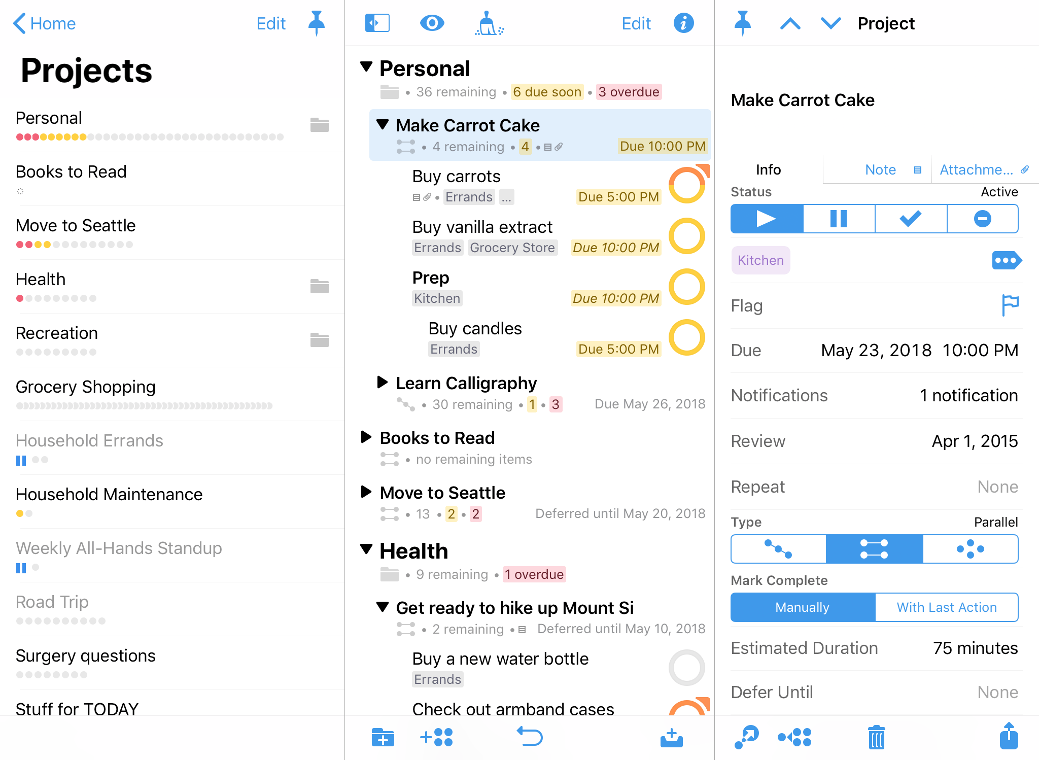
Project Type
Projects are distinguished by their type, which varies based on how actions inside the project must be completed. Project type also affects how actions within the project show up according to the perspective’s view options.
-
Sequential
 —Sequential projects have actions that need to be completed in a predetermined order; the first item must be finished before you can move on to the next. In a sequential project, there is only ever one action available at a time. (this is also, by definition, the project’s first available action).
 -
Parallel
 —Parallel projects consist of actions that can be completed in any order. In a parallel project, all incomplete actions are available, and the first available is just the first one in the list.
 -
Single Actions
 —A single action list isn’t a project in the traditional sense; it’s a list of loosely-related items that aren’t interdependent (a shopping list is an example of this). In a single action list, all actions are considered both available and first available.
The difference between parallel and sequential projects is most visible when Projects view options are set to show only Available actions. (Actions beyond the first available action in a sequential project are blocked, and therefore hidden.)
Project Status
When planning and subsequently reviewing a project, it can be useful to give it a status to indicate whether work is progressing or plans have changed.
-
Active
 —The default status for a new or ongoing project. It can be useful to review active projects regularly to determine what progress you’ve made, and whether they are still things you want to do.
 -
On Hold
 —If you’re not sure whether you want to continue a project, you can change the project’s status from Active to On Hold. If you’ve chosen to show only Available items in view options, the project and its actions are removed from the project list in the sidebar and outline.
Projects placed on hold are still available for review and reconsideration if you decide to prioritize them again in the future.
-
Completed
 —Eventually you’ll reach the successful end of a project. Select the project and then choose Completed in the Status section of the inspector (this automatically marks any unfinished actions in the project complete). If you’d like to revisit a completed project, change your view options to All or search for the project with the Everything filter.
 -
Dropped
 —If you’ve decided not to work on a project any further, you can Drop it completely. It disappears from the Projects list, and its actions are likewise hidden. You could delete the project instead, but then you wouldn’t have any record of it; keeping it around in a dropped state means you can go back and check on actions you’ve completed regardless of whether they’re from still-relevant projects, and so on.
To find a dropped project in your database, choose All in view options or search for it with the Everything filter.
Dropped and completed items accumulate in your database over time. If you find that things are becoming unwieldy, Database settings can help lighten the load.
OmniFocus for Mac can also archive these items according to time parameters that you control.
Projects Outline
The Projects outline displays your projects in a layout based on your view width. On wide views, the outline shows the full hierarchy of projects and folders. Tap a project in the sidebar to view it alone; tap it again to return to the full outline. Drag and drop to rearrange projects in the list.
On compact views, the Projects perspective shows each level of hierarchy in an individual pane, starting with the sidebar and diving deeper into folders and the projects within them. However, you can also view the full hierarchy by scrolling to the bottom of Projects and tapping Show Projects Contents.
Projects View Options 
- In Projects, Show:—Choose the setting for items that you would like to be visible in the outline (Remaining is the default). Each option describes the requirements for items that it includes or excludes; see the Glossary and the Project Type and Project Status sections for further details.
Nearby 
When you’re out and about, the Nearby perspective shows you items you’ve assigned to tags that are location aware. Depending on how you’ve set up your tags, you can see actions to complete somewhere nearby that matches a business search (for example), or at a specific address associated with someone on your iOS Contacts list.
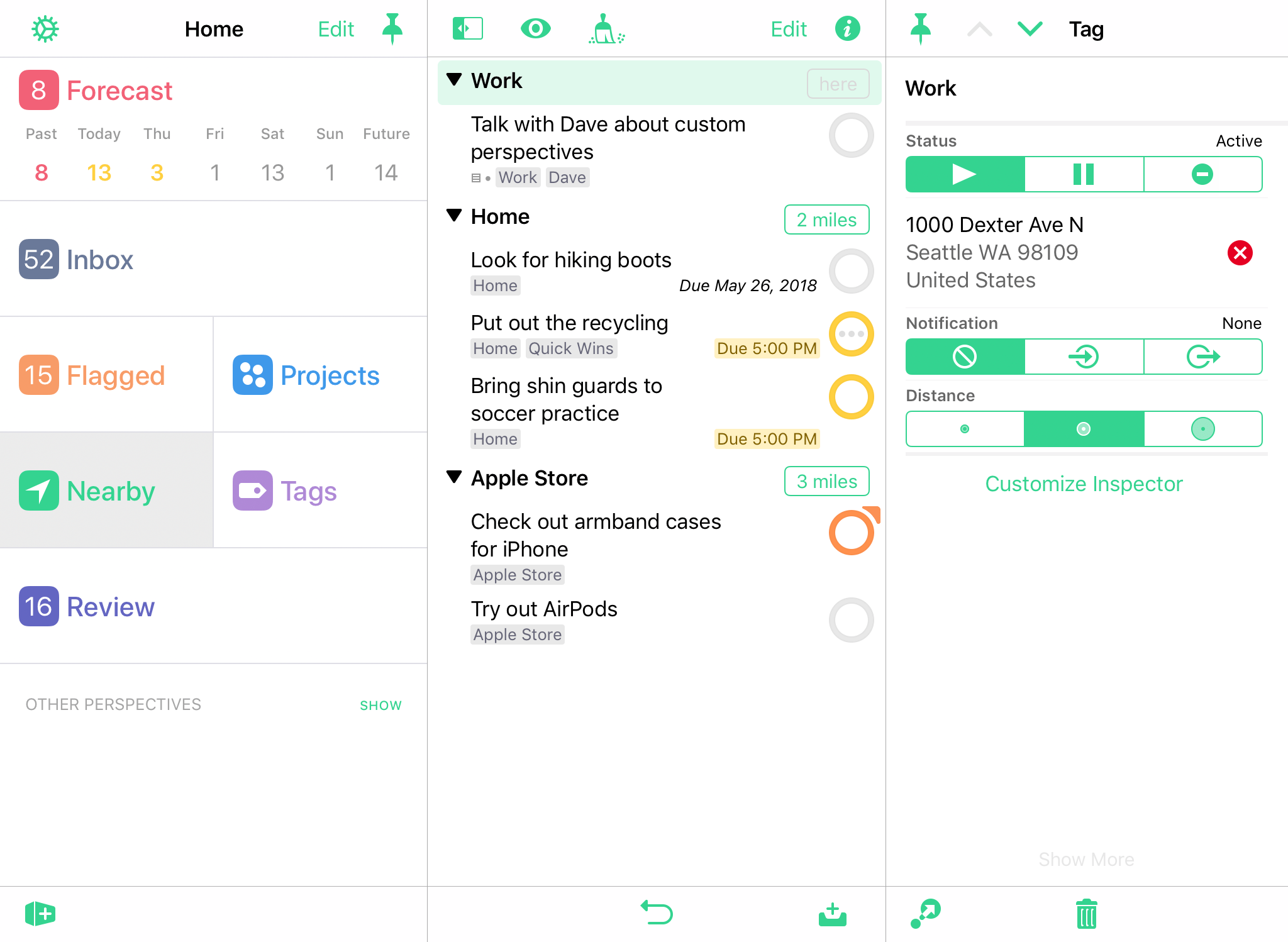
The first time you use Nearby, if you didn’t agree to let OmniFocus access your location when you launched the app for the first time, you’ll be asked again. Location access is required for the Nearby feature to work.
Like other location services on your device, an active internet connection is required for Nearby to work. Also, turning on Wi-Fi in the Settings app improves the quality and accuracy of location services (regardless of whether your device is connected to an active hotspot).
Nearby Outline
The Nearby outline displays displays all items that are:
-
Available;
-
With a location-aware tag assigned;
-
Within a reasonable distance of your current location.
Items are displayed in order, grouped by tag, from closest to furthest away. If an item isn’t available (perhaps because it’s deep within a sequential project, or has another tag that is on hold), it won’t appear; likewise, tags will not appear in the Nearby outline unless they have a location assigned using the inspector.
Tags 
In OmniFocus, a tag represents an association that a task has to the world around it. A tag could be a person, place, or thing most relevant to completion of a project, or it could represent a mindset most applicable to execution of an action item.
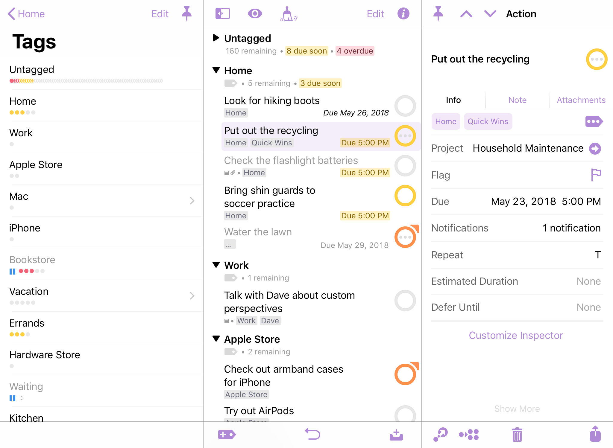
An item can have as many tags as you find useful, and there is no specific purpose assigned to them; use tags to assign priority, group items by energy level or required equipment, or don’t use them at all.
When a tag represents a specific place, you can assign a location to it. If you’ve allowed OmniFocus access to your device’s location data, items with that tag will appear in the Nearby perspective when you’re close to that spot, and you can receive notifications for those items based on your proximity to the tagged location.
Tag Status
Like projects, tags have a status that indicates whether they are currently relevant to your work. View options that depend on status apply similarly between projects and tags; however, the implications of tag status vary.
-
Active
 —The default status for a tag. When a tag is active, it exists and is relevant to you in some way.
 -
On Hold
 —When a tag is temporarily irrelevant or unavailable for some reason (a required tool is loaned out, a colleague is on sabbatical, or the public library is closed for remodeling), you can change the tag’s status from Active to On Hold. The tag remains in the sidebar, but when viewing Available items its actions are removed from the outline.
 -
Dropped
 —If a tag becomes permanently irrelevant or unavailable, you can drop it completely. It disappears from the Tags list, and its actions are likewise hidden. You could delete the tag instead, but then you wouldn’t have any record of it; keeping it around in a dropped state means you can go back and check on actions you’ve completed regardless of whether they’re from still-relevant tags, and so on.
To find a dropped tag in your database, choose All in view options or search for it with the Everything filter.
The Completed status doesn’t exist for tags, because tags aren’t actionable for completion themselves: they are things or conditions that exist in the world.
Tags Outline
The Tags outline displays your tags in a layout based on your view width. On wide views, the outline shows the full tags list (nested tags are listed in a flat view, with child tags listed after the parent). Tap a tag in the sidebar to view it alone; tap it again to return to the full outline. Drag and drop to rearrange tags in the list.
On compact views, the Tags perspective shows each level of hierarchy in an individual pane, starting with the sidebar and diving deeper into nested tag levels. However, you can also view the full tag list by scrolling to the bottom of Tags and tapping Show Tags Contents.
If an item has multiple tags, it appears in the list under each tag assigned to it.
Tags View Options 
-
In Tags, Show:—Choose the setting for items that you would like to be visible in the outline (Available is the default). Each option describes the requirements for items that it includes or excludes; see the Glossary for further details on each status.
-
Show Project Paths—With this setting turned on, rows in the outline include their project information above the item title as described in The Anatomy of a Row. Turn this off to reduce the amount of space taken by each row in the outline.
Tag Sorting
By default, items inside a tag are sorted in the order they appear in their respective projects (project order), or in the order they appear in the Inbox if no project is assigned (inbox order).
You can use drag and drop to rearrange items within a tag. The tag saves its new custom order once you make a change, and the previous default rules no longer apply: any items subsequently added to the tag appear at the end of the list, and can be reordered manually from there.
Review 
The Review perspective contains a flat list of projects that are due for review.
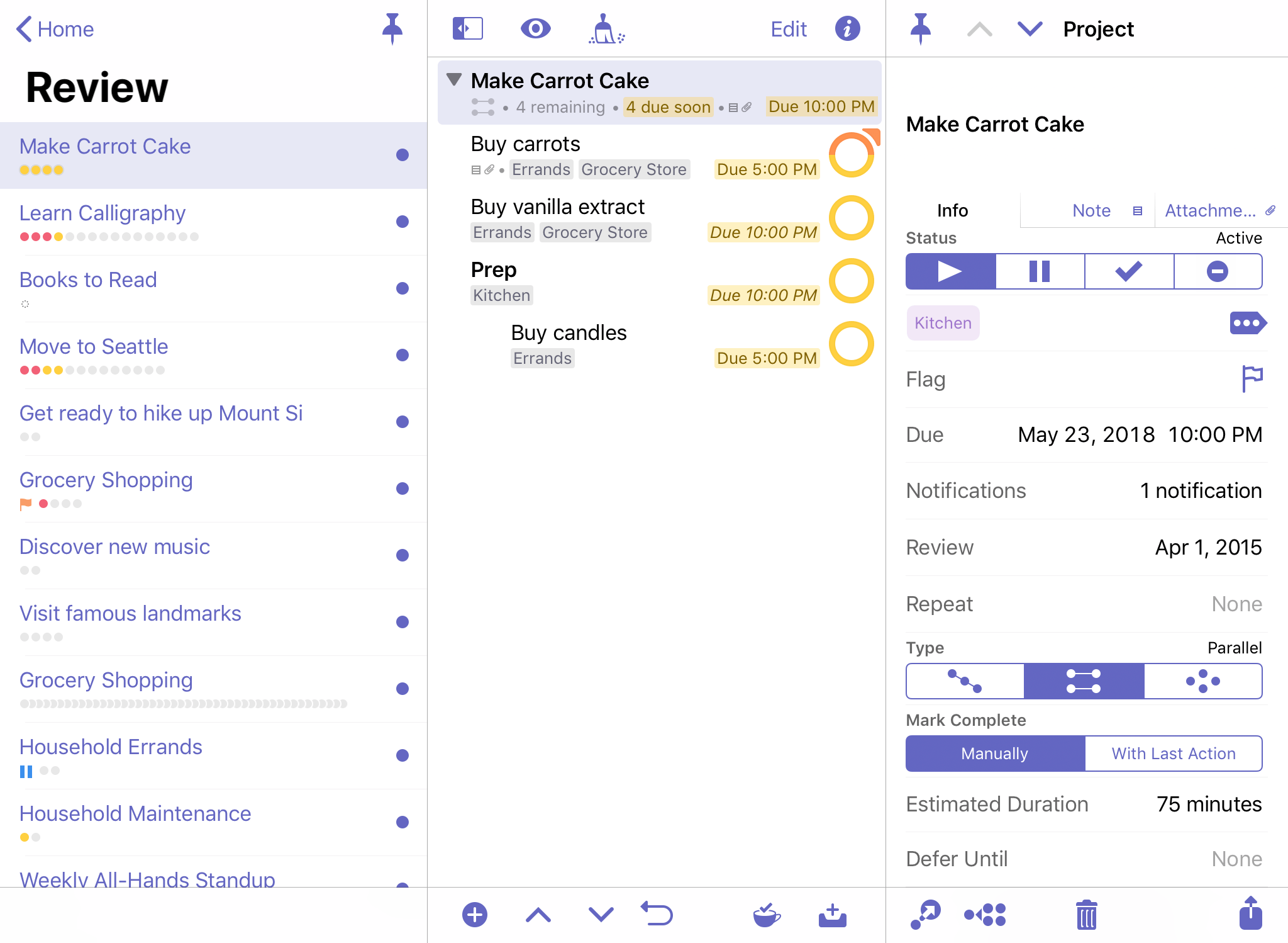
Reviewing helps make sure your projects are accurately portrayed in OmniFocus, leaving them in good shape and ready for action. If you have projects that need items added, projects that aren’t relevant anymore, or projects you don’t mean to do any time soon, following a regular review process can help you keep them from falling through the cracks.
Each project has an interval for how often you intend to review it and a date when the next review is planned. You can change the next review date for a project, as well as its review interval, using the inspector.
To review your remaining projects:
-
Open the Review perspective from Home. Your remaining unreviewed projects are listed in in the sidebar in the same order they appear in the Projects perspective.
-
For each project, check whether it is in the proper state (Active, On Hold, Completed, or Dropped). Do you need to revise its actions, or add new ones? Should you put the project on hold, drop it, or mark it Completed? Or is everything moving along just fine?
-
Once you’re satisfied with the state of the project, make sure it’s selected and tap Mark Reviewed
 in the lower right. The project’s next review date moves forward and you can go on to review another project.
If you would like to look a project over again before its next scheduled review, swipe it from right to left in the sidebar and tap More to reveal quick commands associated with the project. Tap Review, and the project opens in the Review perspective ready for perusal.
Review Outline
When you enter the Review perspective the sidebar displays a flat list of your review-ready projects (folders are not included). The first one may already be open in the outline for your inspection; if not, tap a project in the list to get started.
In Review, the outline only shows a single project at a time to facilitate inspection of its contents. Use the arrow buttons in the bottom bar to navigate between projects, or tap Mark Reviewed when you’re ready to move on to the next one.
Review View Options 
- In Review, Show:—Choose the setting for items that you would like to be visible in the outline (Remaining is the default). Each option describes the requirements for items that it includes or excludes; see the Glossary for further details on each status.
Completed and Changed
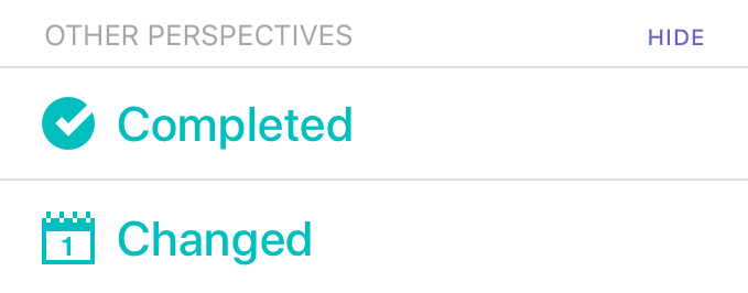
The final two built-in perspectives—Completed and Changed—are listed in the Home view when you toggle to show Other Perspectives. These are a great way to find items in your database that may have been filed away by mistake or otherwise disappeared under mysterious circumstances.
Completed and Changed are designed to track movement of items in your database, but have no other specific purpose for helping to get stuff done.