A Quick Tutorial
Now that you understand the basics of working with OmniGraffle, it’s time for a quick tutorial. The purpose of this tutorial is two-fold. Our first goal is to introduce you to everything that OmniGraffle can do, but the ultimate goal of this tutorial is to help you master OmniGraffle as soon as possible.
You’ll learn how to do all kinds of cool things, such as using Outline mode to quickly create and connect objects, and how to make effective use of the various inspectors. You’ll also learn how to use style chits to quickly replicate every style you’ve applied to an object to other objects, and how to create Bézier curves with text that conforms to the shape of the line. And best of all, we’ll walk you through all of these steps so you can master OmniGraffle in no time.
So hang on tight, grab your favorite beverage, put on some tunes in iTunes, and let’s get to work!
Tutorial 0: Let’s Get Started!
OmniGraffle excels at clarifying complex relationships, and nothing says “complex relationships” like a Shakespeare romantic comedy. Let’s try to make some sense of Much Ado About Nothing, and learn a bit about OmniGraffle in the process. Of course, this play is just a handy example; if there’s another story you’re more familiar with, you can go ahead and use it instead. The Tale of Genji, Steppenwolf, the cross-section between Sons of Anarchy the movie Pacific Rim and other movies produced and directed by Guillermo del Toro…whatever works best for you.
To get started, create a fresh document by selecting File ▸ Resource Browser (Shift-Command-N). In the Resource Browser’s sidebar under Templates, choose Imperial Units. In the list of Templates, choose the Auto-Resizing template, and then click New Diagram.
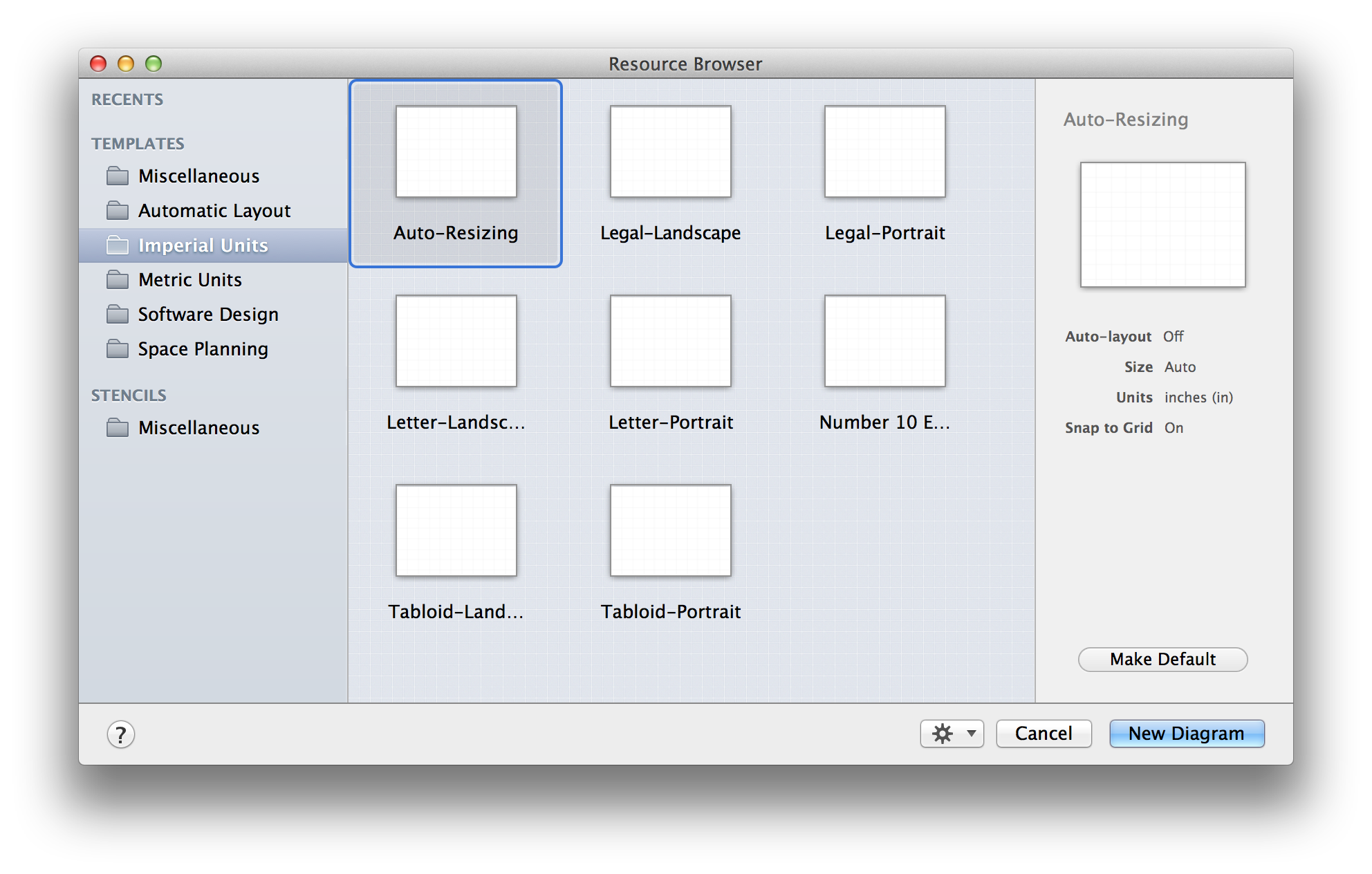
Your OmniGraffle window should look like this:
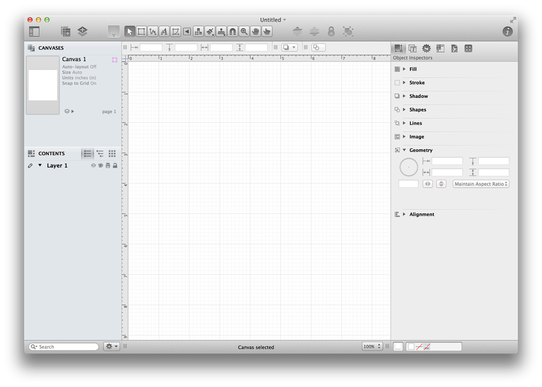
You’ll notice that the Canvas has grid lines showing. These can be helpful for when you need to lay out objects, such as if you’re laying out the furniture for your office or apartment. You won’t need these grid lines for this tutorial, so your next task is to turn them off. Follow these steps:
- Open the Canvas inspector by choosing View ▸ Show Inspector ▸ Canvas (Command-4).
- Locate the Grid pane and open it by clicking the disclosure triangle on the left, if necessary.
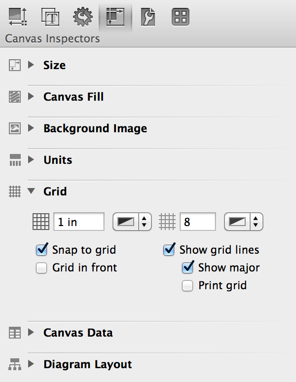
- Uncheck Snap to grid and Show grid lines; the grid lines are no longer visible.
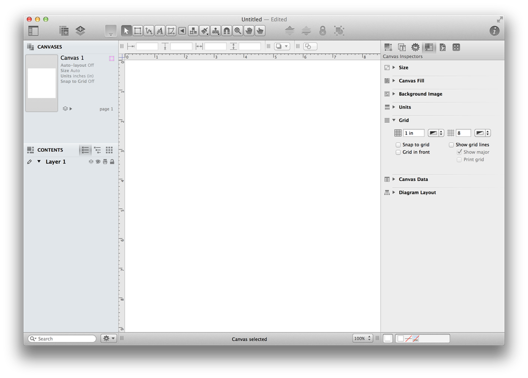
This gives you a blank slate to work on, so let’s get started!
Tutorial 1: Creating Objects with the Outline View
The Drawing Basics section taught you how to create shapes and connect objects with lines. You can also use the Outline view (in the Contents sidebar on the left) to create objects on the canvas. If you’ve ever used OmniOutliner, this should be quite familiar to you; if not, you can pick this up in no time.
Keyboard Shortcuts for Viewing Contents
OmniGraffle has a hundred or so built-in keyboard shortcuts to help streamline how you work. You can toggle between the different views of the Contents sidebar with Option-Command–2 for List view, Option-Command–3 for Outline view, and Option-Command–4 for Selection view.
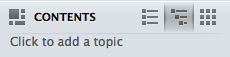
Use the keyboard shortcut, Option-Command–3, to switch to the Outline view. In the Contents section, click on where it says “Click to add a topic” to create your first object.
A Topic item appears in the outline, and an object labeled Topic appears on the canvas simultaneously.
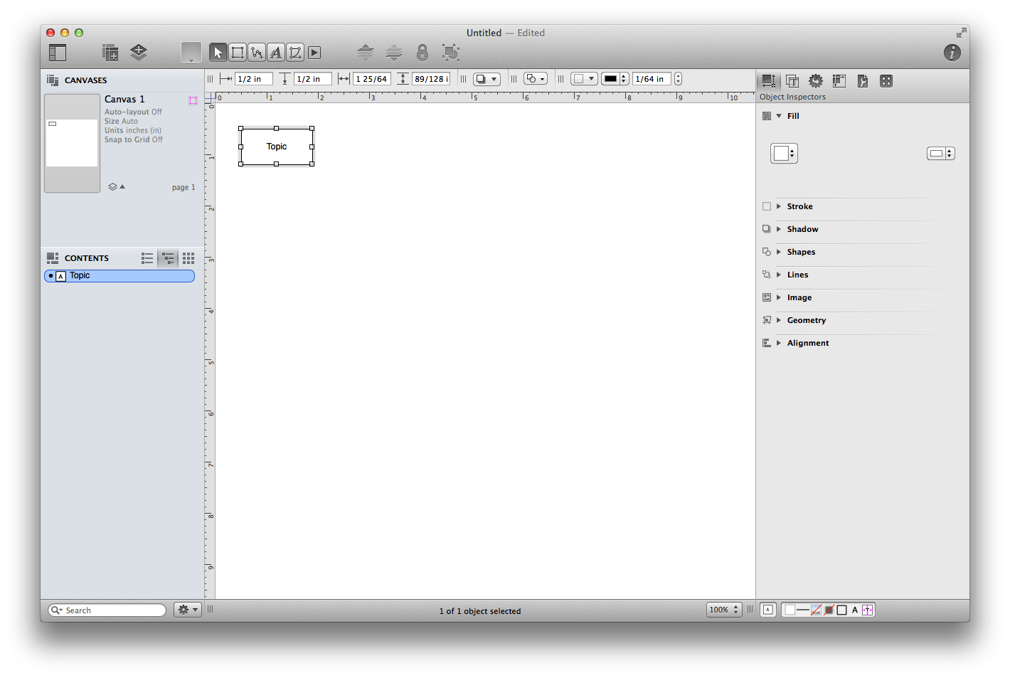
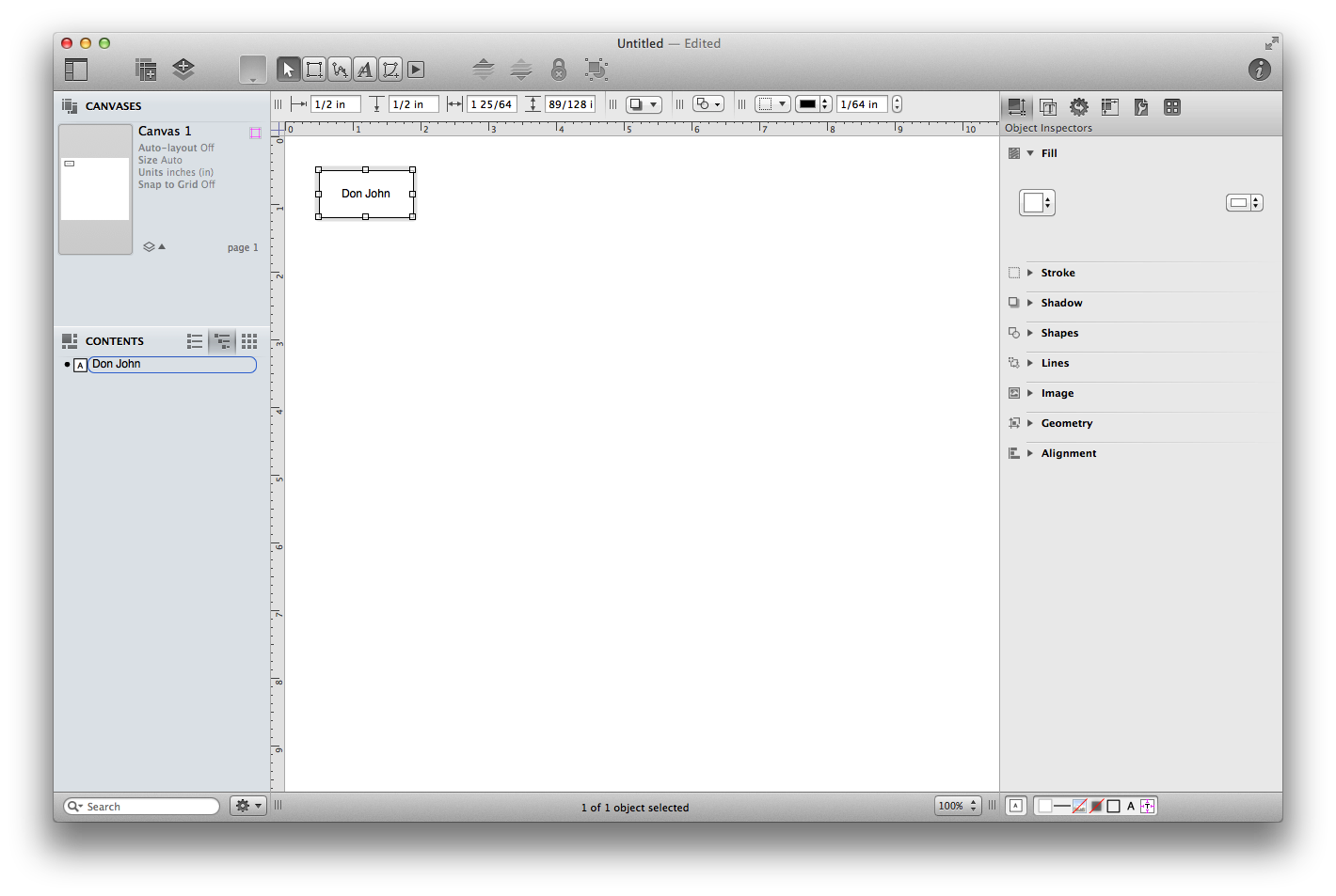
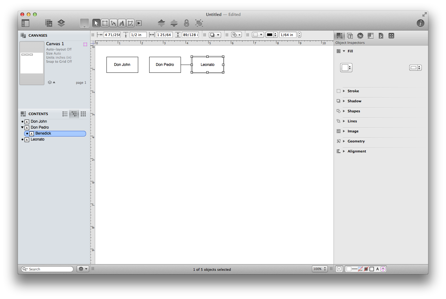
The item’s text is already highlighted, so you can just start typing to rename it. This item represents our first character, so enter “Don John”.
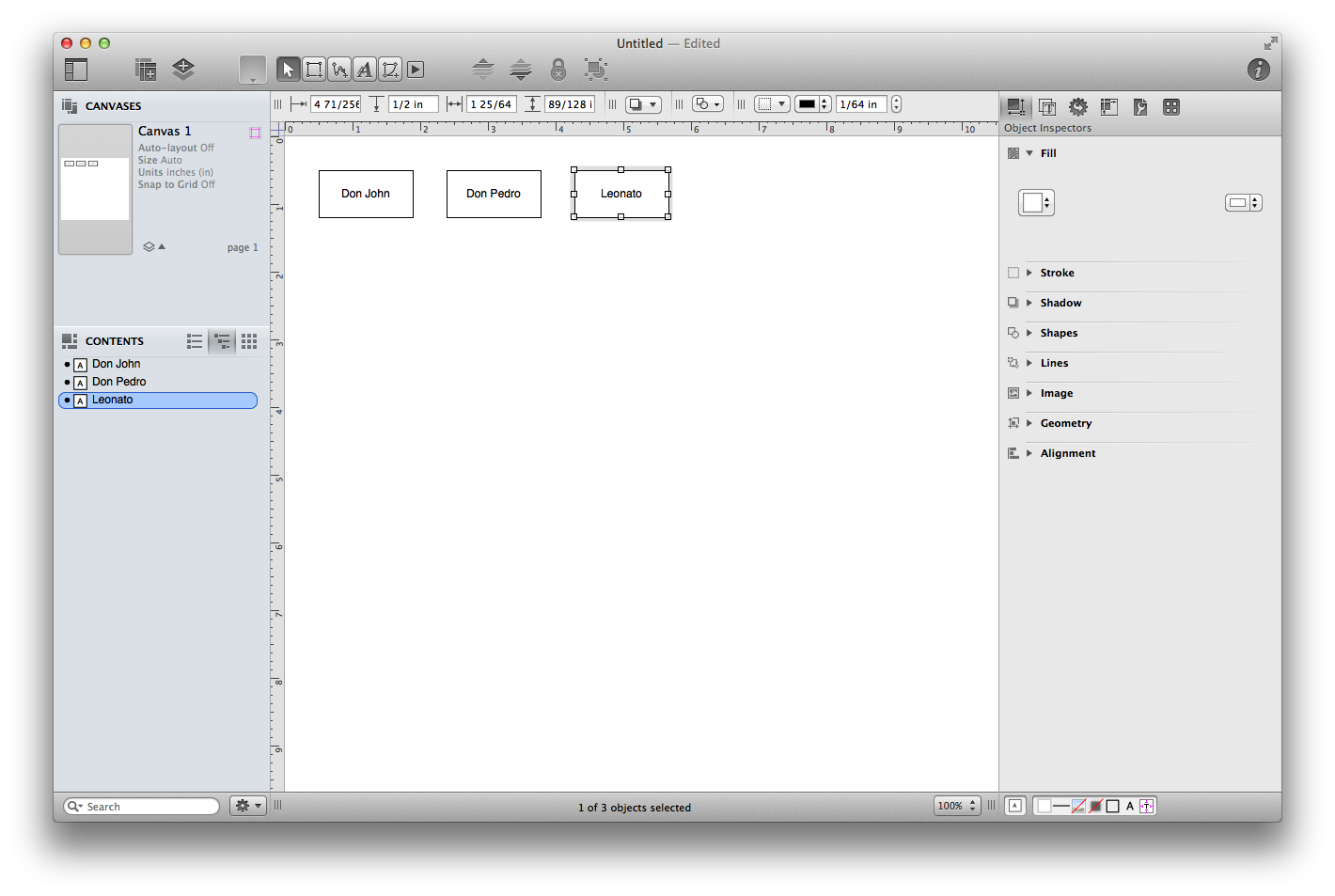
Press Return to finish with this item and move on to the next one. A new item appears below the first one in the Outline view, and a new shape appears on the canvas; name this one “Don Pedro”.
Press Return once more to create a third item, and name it “Leonato”. Now you have three items in your outline and three shapes on your canvas.
Tutorial 2: Outline Hierarchy
It’s nice that you can create shapes quickly from the keyboard like this, but the real magic is in adding depth to the outline. All of the characters you’ve created so far exist on the same level, but now let’s add some more characters one level below them.
The next two characters are soldiers who fought under Don Pedro’s command, so we’ll add them below him in the diagram. Click the Don Pedro item in the outline to select it, then press Return to create a new item below it. Name the new item “Benedick” and press the Tab key. Benedick is now indented beneath Don Pedro in the outline view. However…
…you’ll notice that rather than inserting an object labeled “Benedick” between Don Pedro and Leonato, that it doesn’t appear. Well, it is there, it’s just behind the Leonato object. Select “Leonato” and drag it down and to the right a little bit so you see Benedick.
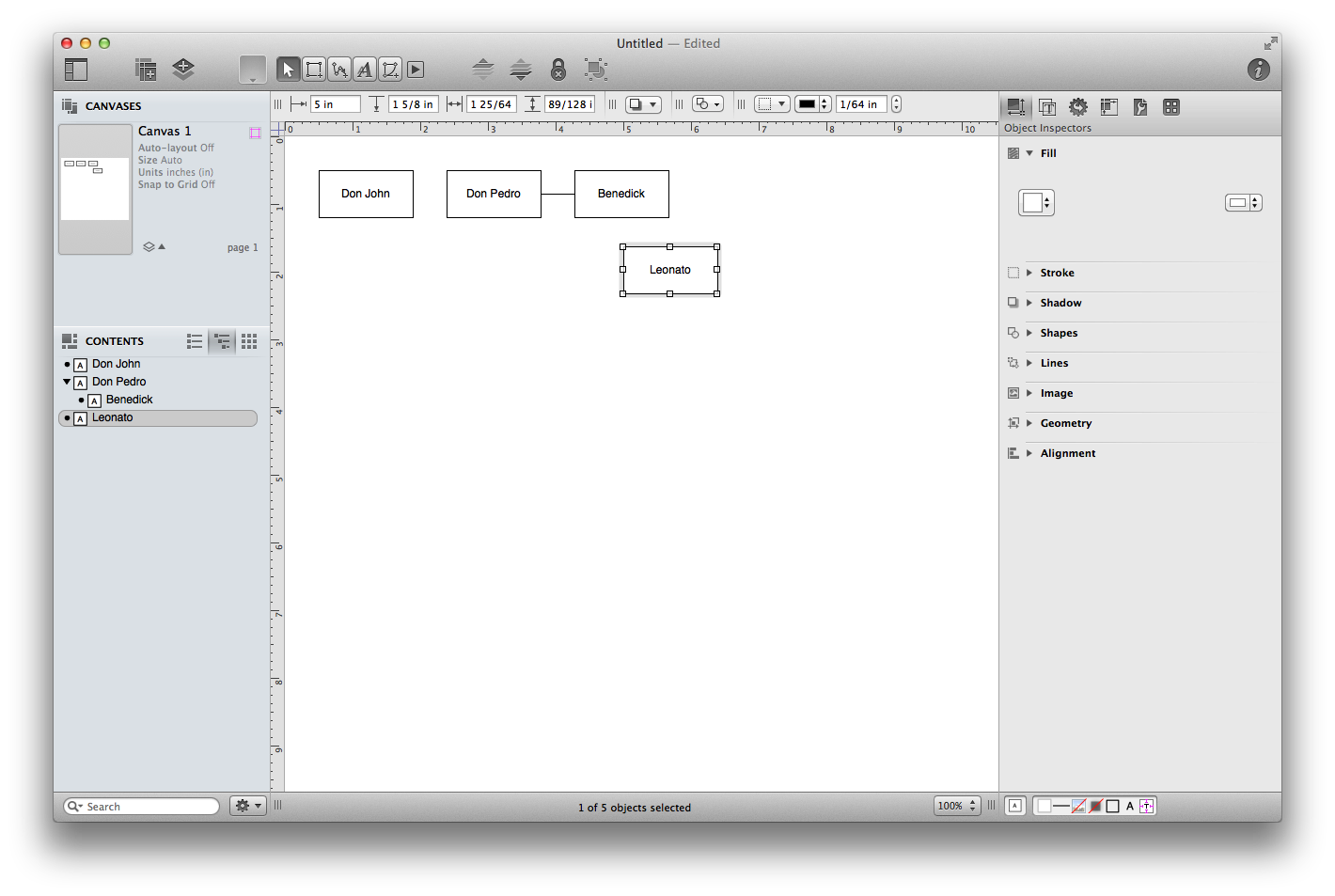
With Benedick still selected, press Return to create another item at the same level and name it “Claudio”. Now you have two characters who belong to Don Pedro.
Now use the same technique to add Beatrice and Hero underneath Leonato (they’re his niece and daughter).
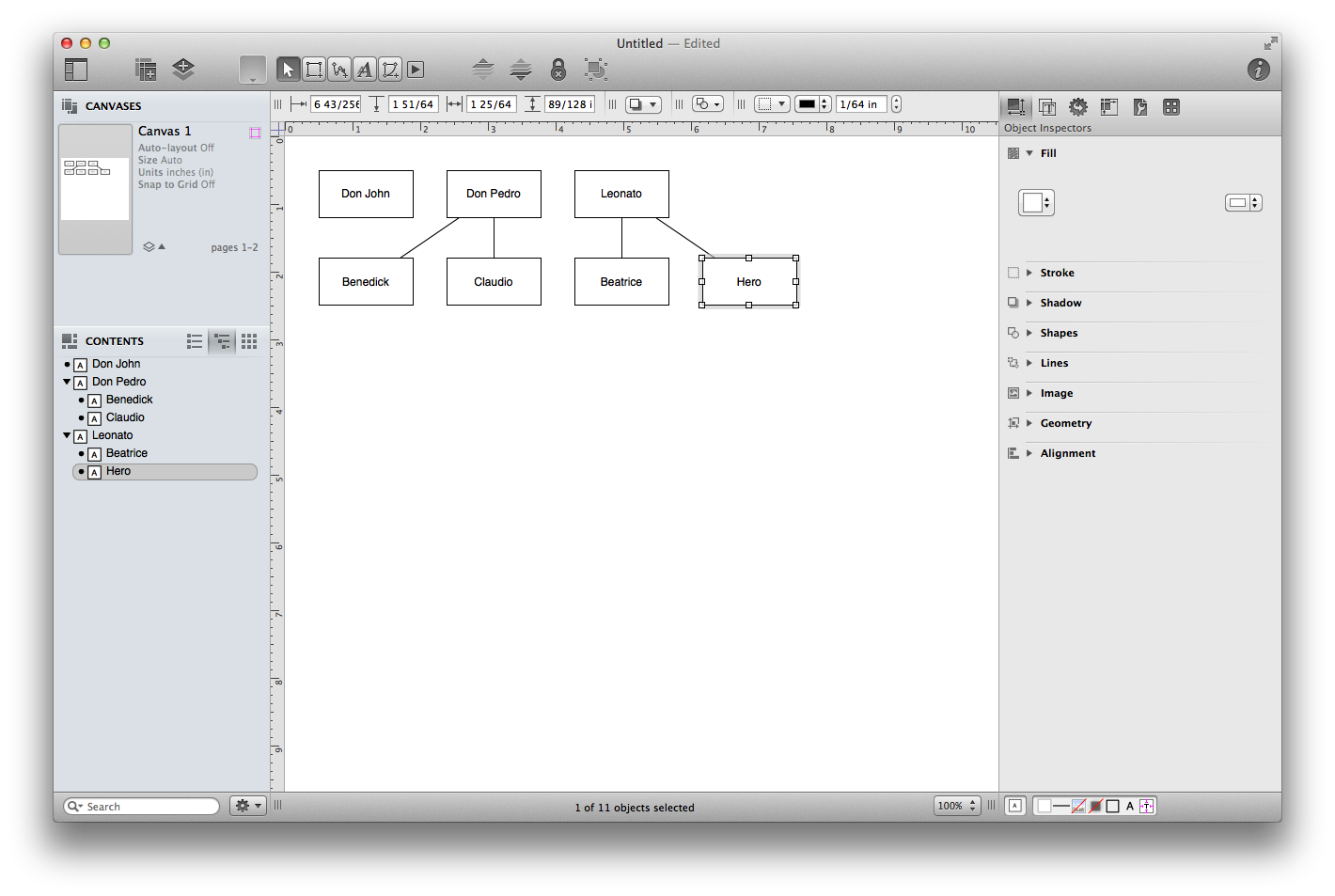
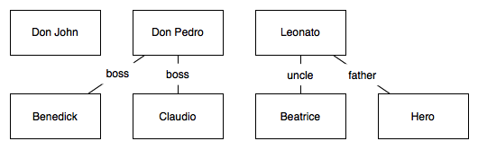
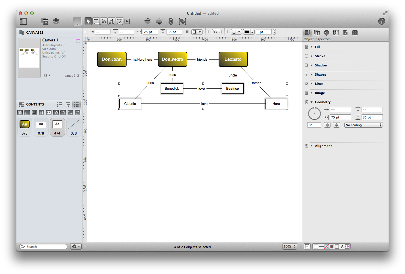
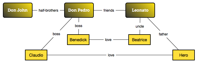
Adjust the diagram by dragging the Benedick, Claudio, Beatrice, and Hero objects so they appear beneath the three main characters, moving Leonato back up to the top line in the process. Your diagram should appear as follows:
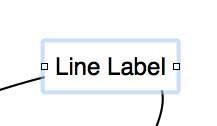
Tutorial 3: Line Labels
To clarify the relationships we have so far, let’s use the Text tool ( ) to add labels to the connection lines. To get started, click anywhere on the Canvas; just not on one of your objects.
- Select the Text tool; it’s the one with a letter A on it. Then click it again so that it’ll stay active instead of reverting back to the selection tool after you use it.
- Place the mouse pointer over the line between Don Pedro and Claudio so that the line glows and then click it to make a label appear. Type “boss” into the label’s text to show that Claudio works for Don Pedro.
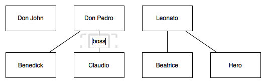
- Add labels to the three remaining lines in the same way, indicating that Don Pedro is also Benedick’s “boss”, and that Leonato is Hero’s “father” and Beatrice’s “uncle”.
Tutorial 4: Making More Connections
By now, you’ve already got a fine diagram, but sometimes you want to diagram relationships that are not strictly tree-like. Let’s manually add some more connections.
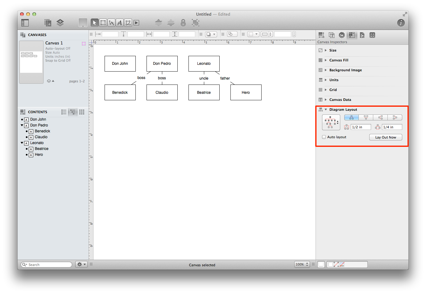
Before you start connecting things together manually, it’s a good idea to turn off the automatic layout feature. Choose View ▸ Show Inspector ▸ Canvas (Command–4), and then scroll down in the inspectors sidebar to the Diagram Layout section and make sure that Auto layout is unchecked.
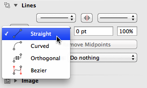
So far, the lines we’ve drawn to connect the objects have been straight, so to be consistent, let’s make straight lines the default. To do this, first select the Line tool, and then open the Object inspector (View ▸ Show Inspector ▸ Object, or Command–1). Scroll down in the inspector sidebar to the Lines section, and set the Line type to Straight.
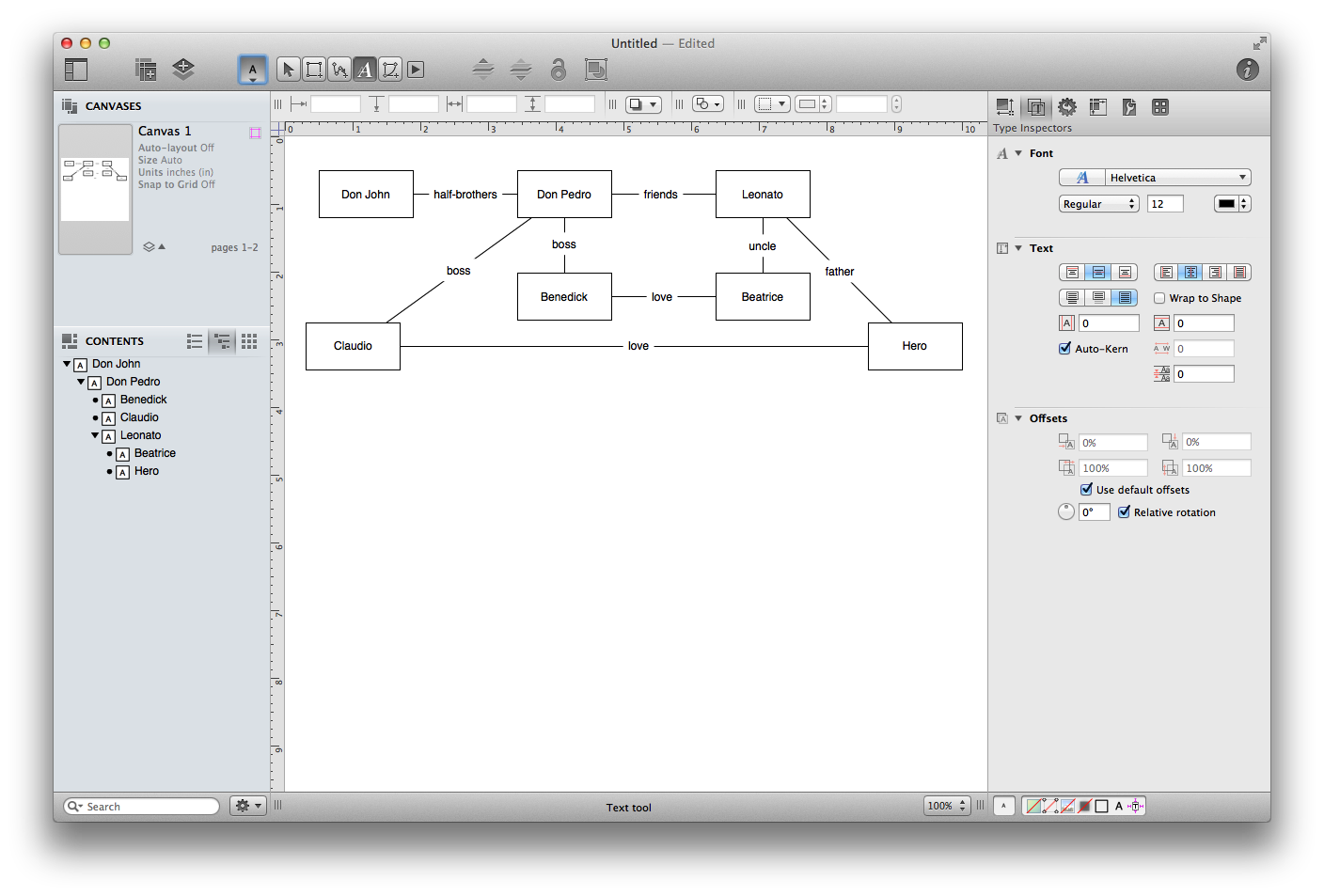
To connect two shapes, just activate the Line tool, click on one shape and then click on another to create a line between them. Make connections and label them with the Text tool to signify the following relationships:
- Don John and Don Pedro are half-brothers
- Don Pedro and Leonato are friends
- Benedick and Beatrice are (eventually) in love
- Claudio and Hero are in love
As you do this, feel free to use the Selection tool to move shapes into more comfortable locations.
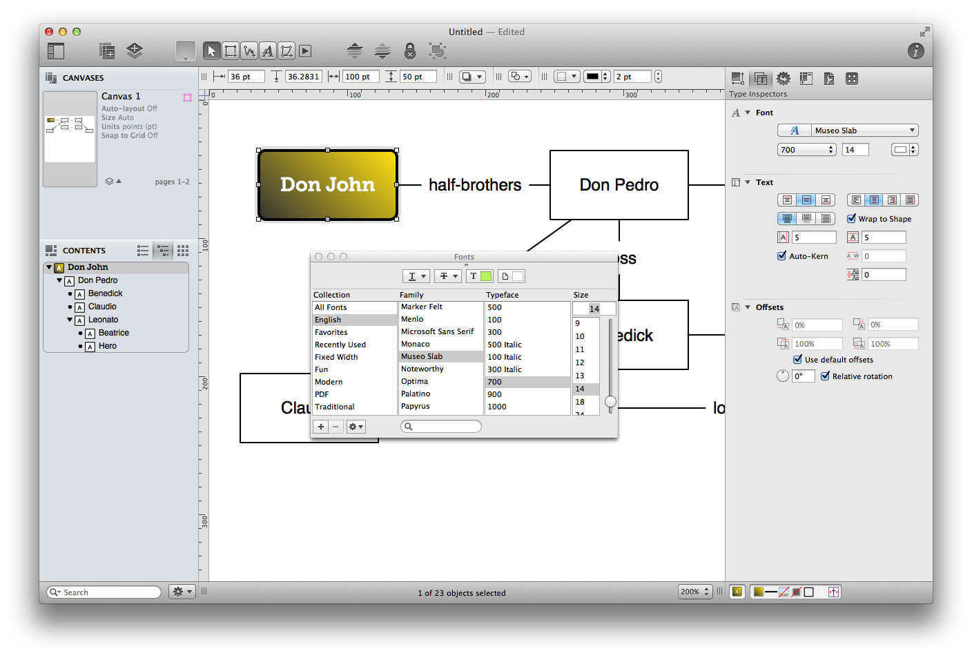
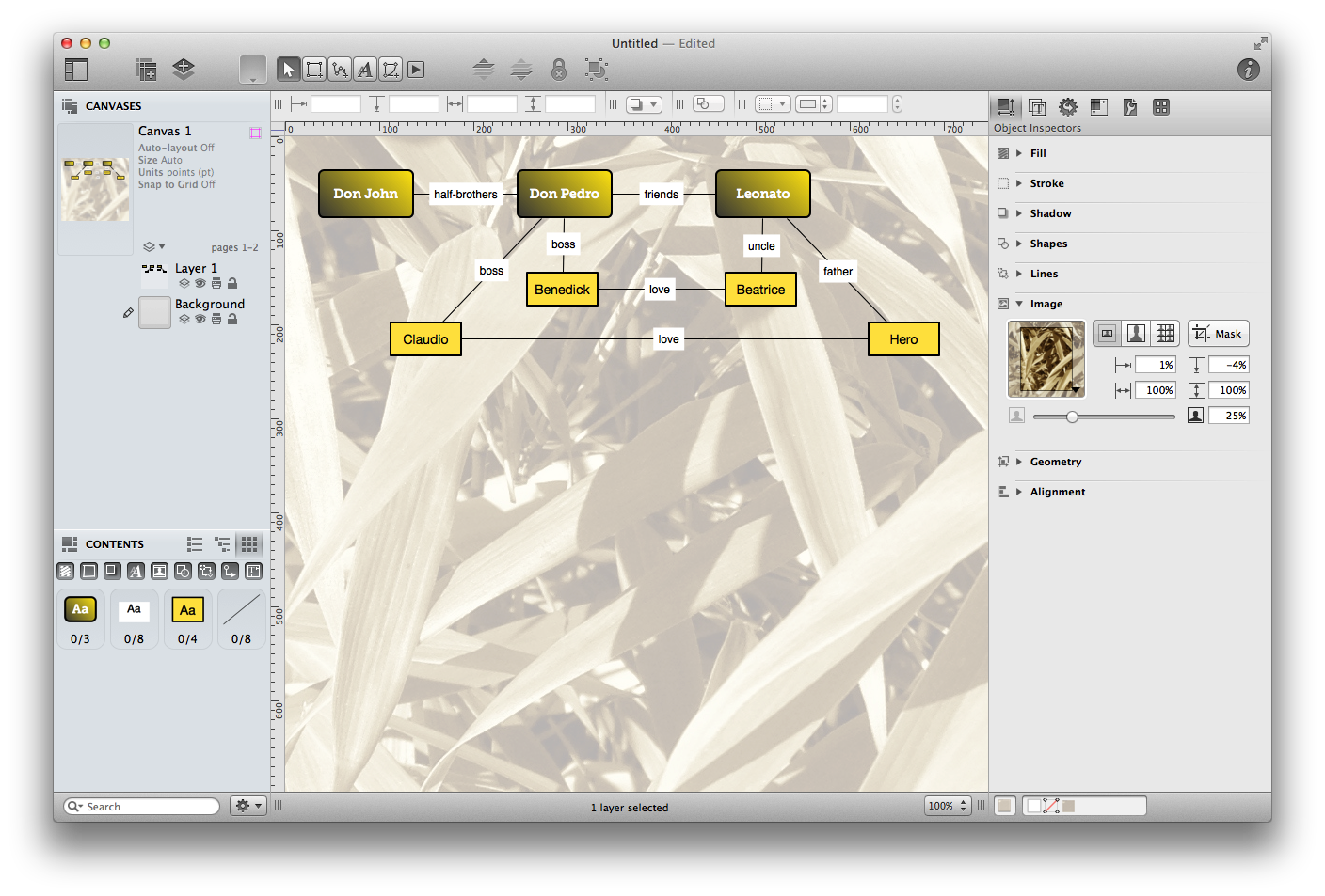
Tutorial 5: Styling Objects
Look at your work so far—no literary minutia can escape your organizational prowess! Okay, so, the diagram makes sense, but it’s not particularly attractive. Let’s pretty up those objects with some style attributes.
In Tutorial 4, we introduced you to the Diagram Layout inspector, but now we’re going to start using the inspectors in earnest. They’re convenient and full of controls that you can use to modify any object on the canvas, or the canvas itself.
There are eight Object Inspectors (Fill, Stroke, Shadow, Shapes, Lines, Image, Geometry, and Alignment), each one of which controls a certain aspect of the selected objects’ appearance. The first inspector we’ll use is the Fill inspector; if you don’t see it on your screen, choose View ▸ Show Inspector ▸ Object (Command–1).
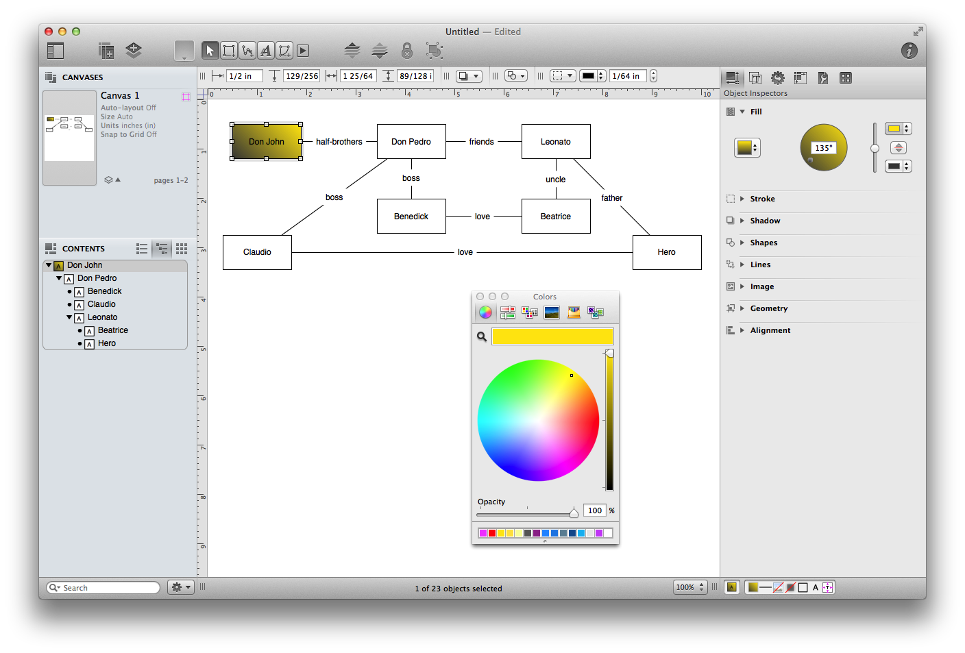
Select Don John’s object on the canvas and then choose the Fill object inspector. You’ll notice that the object has a plain white fill color; let’s change that.
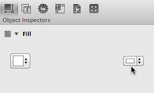
Click the Fill Color control on the right side of the Fill inspector (not on the little arrows). This pops open the Colors panel, which you can use to choose a new fill color. If you’d like, you can even choose a blend style using the Fill Type control on the left of the inspector.
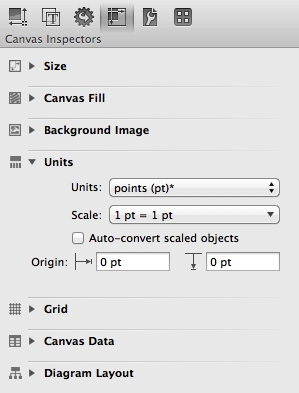
Before moving on to the next step, let’s first change the unit of measurement used from Inches to Points. Choose View ▸ Show Inspector ▸ Canvas (Command–4), and then scroll down in the inspectors sidebar to the Units section; change the Units popup from Inches to Points.
The reason why you want to switch from Inches to Points is mostly pragmatic; it’s easier to think in terms of strokes or lines for this exercise in points than it is inches. If you were designing a map, however, you might opt to change the unit of measurement to miles or kilometers and then set an appropriate scale as well.
- Now we’re going to use the Stroke and Shapes inspectors to change the line drawn around the outside of the object. Switch back to the Object inspector (Command–1).
- In the Stroke inspector, change the thickness of the stroke to 2 pt.
- In the Shapes inspector, change the radius to 5 pt.
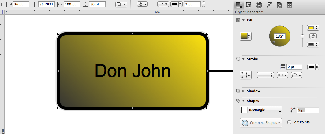
This makes for a nice, heavy, rounded stroke around the object. You can zoom in so you can see the progress you’ve made!
Switch to the Text inspector (View ▸ Show Inspector ▸ Text, or Command–2), and in the Font section, choose a nice font, then click the color well next to the Font button and choose a color to contrast the fill. Now you should have one quite charming shape object.
Tutorial 6: Style Proliferation
Now you can apply the same styles to your other shapes without having to repeat every step for each one.
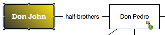
With Don John still selected, look at the bottom of the main window for the style tray. It contains all of the style attributes for the currently selected object, each one represented by a little square “style chit”. Try dragging the “All Styles” chit (the isolated one on the far left of the style tray) and dropping it onto the Don Pedro shape in the diagram.
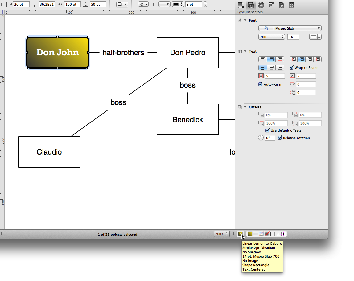
Whoa! That’s pretty easy. Do the same thing to Leonato so that all of the elder generation characters have a consistent appearance.
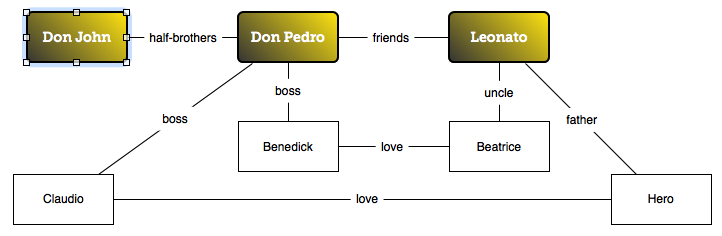
Tutorial 7: More Selecting and Styling
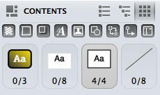
Let’s style the remaining objects. A quick way to select lots of shapes at once is with the Contents inspector, located in the left sidebar.
The Contents inspector lists all of the different kinds of objects on the canvas—lines, labels, rectangles—based on their styles. At the moment, it should show that you have one out of three colored rectangles selected. There should also be an item representing the four plain white rectangles with black strokes; click it to select all four objects at once, and it changes to show that you have selected all four of those objects.
You can use the Objects inspectors (View ▸ Show Inspector ▸ Object, or Command–1) to change various aspects of an object that are not strictly related to its visual style. Let’s use the Geometry object inspector to change the size of the four selected objects. In the width and height fields, enter some new values to make these shapes somewhat larger than the others.
Use the Style inspectors to simultaneously style all four shapes in in a way that differentiates them from the others. Here we’ve chosen a different color, a slightly thicker stroke, and a larger font.
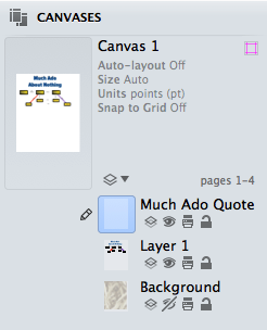
Tutorial 8: Layers
Layers contain different sets of objects on the same canvas. We’ll place a background image on a new layer to keep it separate from the character diagram.
- In the toolbar, click New Layer to add another one to the canvas. A new layer is born. You can name it if you like; something like “Background” should suffice.
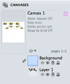
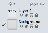
- The order of layers is important; stuff on higher layers appears in front of stuff on lower layers. We want the background to appear behind our relationships diagram, so drag the new layer and drop it below the other one in the list.
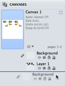
- Let’s concentrate on the background layer. The layer you’re working with right now has a pencil icon to the left of its preview in the drawer. If the background layer doesn’t have the pencil icon, click just to the left of the layer preview to put it there.
- For your background, rather than using the Background Image canvas inspector (Command–4), which would place a background image on the entire canvas, you’ll want to drag an image onto the layer. A new shape containing the image is created on the Background layer.
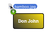
- Use the controls in the Image object inspector (Command–1) to change the size and scaling or the opacity of the image to suit your liking.
Now you have an attractive, informative diagram. You know how to use the outline view to create objects, how to label and connect them, and how to add styles. You know how to propagate styles around to many objects. You know how to use multiple layers. At this point, you’re pretty much unstoppable!
Tutorial 9: Styling Lines and Labels
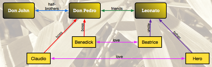
So far, we’ve focused on styling the object blocks and giving the diagram a nice background. But if you look at the previous image, you can see that there’s still some work to do, particularly with the lines and labels.
Here we want the lines to help people visualize the relationships between the characters, and do to more than just show a simple connection. So let’s address the lines first, and then you’ll see how to remove the fill from a label.
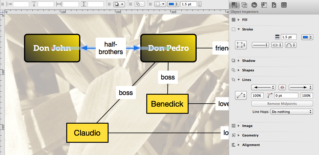
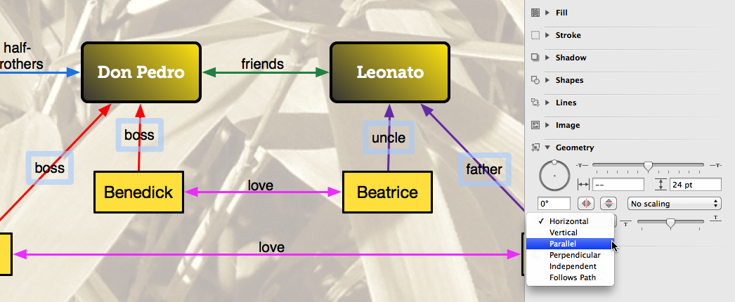
Choose View ▸ Show Inspector ▸ Object (Command–1) to open the Object Inspector on the right, and then open the Stroke and Lines object inspectors.
Select the line between Don John and Don Pedro.
In the Stroke inspector, set the stroke width to 1.5 pt, and change the line’s color to a nice shade of blue.
With the line still selected, go to the Lines inspector and give the line arrows at both the left and right sides. Your diagram and inspectors should look something like this:
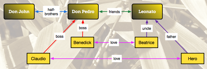
Use a similar approach for the other lines, as follows:
- Create a double-arrowed green line between Don Pedro and Leonato
- Create single-arrowed red lines that point up from Claudio and Benedick to Don Pedro
- Create single-arrowed purple lines that point up from Beatrice and Hero to Leonato
- Create double-arrowed pink lines between Benedick and Beatrice, and between Claudio and Hero
When you’ve finished, your diagram should look something like the following:
Now let’s deal with the labels on the lines. As you can see, they have a white background that obscures the lines and blots out the background image. Let’s fix that!
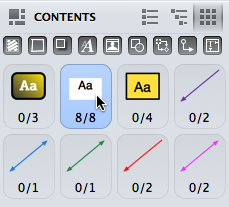
To help speed this process up, let’s go back to our old friend, the Contents sidebar. Choose View ▸ Show Contents ▸ Selection Matrix (Option-Command–4). The Selection Matrix, if you recall from Tutorial # 7, lets you quickly select similar items in your diagram. In this case, we want to select all eight of the text labels, which you can do by clicking on the label chit.
Choose View ▸ Show Inspector ▸ Objects (Command–1) and set the Fill for the labels to No Fill. This removes the white box behind the labels so the lines and the background image show through.
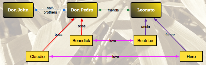
The only problem is that—with some of the labels—the text interferes with the lines. Let’s fix that.
Let’s start with the “love” labels. Select both of those by Command-clicking them, and then use the Geometry object inspector to change their positioning related to the line.
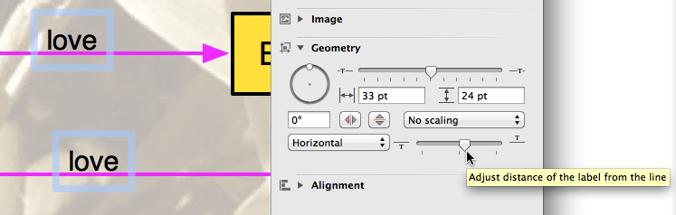
Select the “half-brothers” label and tap the Up Arrow key on your keyboard to nudge the label above the line.
Select the “friends” label and nudge that above the line using the Up Arrow key on your keyboard.
Use Command-click to select the two “boss”, “uncle”, and “father” labels.
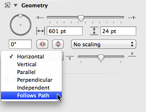
In the Geometry object inspector, change their orientation relative to the line from Horizontal to Parallel.
Finally, select each of those four labels individually to move them off the lines. Your diagram should look similar to the following:
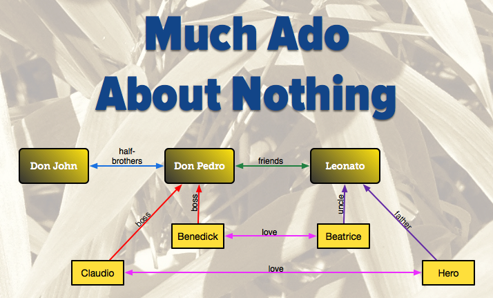
Tutorial 10: Adding a Title
Now it’s time for you to take a little bit of a breather. You’ve been going at this pretty hard now, so we’ll make this one simple. All you need to do is add a title to the diagram. For this, you’ll use the Text tool to place the title, Much Ado About Nothing along the top, and then style it however you’d like.
Use this as an opportunity to get acquainted with some of the other object inspectors that you might not have used so far. At the least, you’ll use the Type inspectors (Command–2) to change the Font, its size and style. You can also use the the Object inspectors (Command–1) to change the type’s appearance.
Tutorial 11: Adding Text to a Curve
Congratulations! You’ve made it to the end of the tutorial, and you’ve done a fine job so far. You’ve learned how to use the Outline Editor (Option-Command–3) to quickly add new blocks to the diagram, and how to use the Selection Matrix (Option-Command–4) to quickly edit and apply styles to multiple blocks and lines simultaneously. We also showed you how to add a background image to a new layer and how to style and adjust the positioning of labels using the Object inspectors.
But now, now we’re going to show you something really cool: Adding text to a curved line. This is a new feature for OmniGraffle 6, and is something that many of you have asked for, so here goes…
Create a new layer by either clicking the New Layer button in the toolbar, or with Edit ▸ Layers ▸ New Layer).
Name the layer “Much Ado Quote”, and press Return to accept the name for the new layer. This new layer should be the active layer (as noted by the pencil on the left).
Next up, turn off Background layer by clicking its Eye icon to hide its visibility. This makes it easier for you to use the Line tool to draw your line.
In the toolbar, double-click the Line tool so that it remains active; the mouse pointer changes to a set of crosshairs.
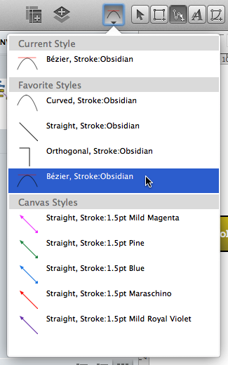
Click the Style Well and select the Bézier, Stroke:Obsidian style.
Click somewhere beneath the diagram and create a curved line. The easiest way to do this is to click at a starting point of your choice, and then somewhere in the middle of where you want the line, click and drag; this creates a curve at the midpoint of your line. To end the line, double-click in another location on the canvas. Command-double–clicking terminates the line.
If you haven’t worked with Bézier curves before, you can use the curve’s handles to change the shape of the curve. Drag the handles toward the center for a sharper curve, or further out to widen the arc. You can also drag the midpoint of the curve around to adjust the line’s positioning. To add another point to the curve, just click and drag anywhere on the line to add another Bézier point.
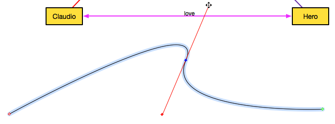
Next, add a label to the line you’ve just drawn. In the toolbar, select the Text tool and then click anywhere on the line.
Now, choose your favorite quote from Much Ado About Nothing and type that in as the label. For example, we’ll use this line from Beatrice: “Alas poor heart, if you spite it for my sake, I will spite it for yours, for I will never love that which my friend hates.”
Next, use the Geometry object inspector to make it so the text follows the path of the line.
Depending on the length of the quote you use, you may notice that some of the text doesn’t appear. You’ll see a light blue bounding box that clips off a portion of the text. If you see this, try dragging the handles on the box so that all of your text appears on the line.
You may need to play around with the top slider in the Geometry object inspector for adjusting the position of the label along the line. Moving this slider to the left moves the text toward the beginning of the line; moving the slider to the right moves the text toward the end.
Once all of your text is viewable along the path, go back to the Type inspector (Command–2) and change the Font from Helvetica to Zapfino. Reduce the type size and readjust the text box, if necessary, so that the entire quote shows up along the path.
Switch to the Object inspector and under Stroke, set the stroke’s width to 0 pt, and change the stroke style to No Stroke. This gives you an “invisible” path that you can add text to.
In the Fill inspector, set the label’s fill to No Fill. This clears out the white background, similar to the changes you made to the other labels earlier.
In the Canvases sidebar, go back to the Background layer and click on the Eye icon again to make the background layer visible.
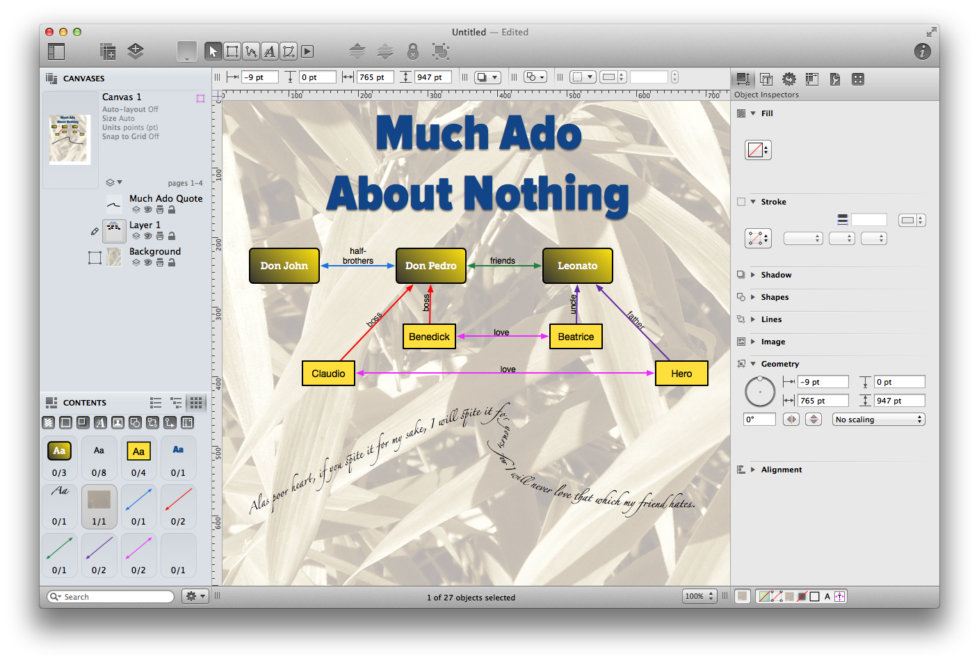
In the end, your project should look similar to the following:
Take some time now to experiment with OmniGraffle a little more. The more you use OmniGraffle, the more comfortable you’ll become with all of its abilities. Don’t worry about “messing” anything up; just remember that you can always hit Command-Z to undo any recent changes you’ve made.