Working with Templates and Styles
In the previous chapter, Creating a New OmniOutliner Document, you learned how to create a new OmniOutliner document. In the process, you saw how to add and organize the content, and how to add additional columns and change the column headings.
This chapter takes you to the next level—no pun intended—of learning in OmniOutliner by showing you how to create your own template. The chapter wraps up by showing you how to apply the styles from one template to your outline of favorite movies that you created in the previous chapter.
There’s a lot of ground to cover, so let’s get started!
Working in OmniOutliner
The best way to lay the foundation for a new template is to start with an outline that has minimal content. So, to get started, you’ll create a new document, enter some text, learn how to move rows around, and organize rows into groups. While this might sound pretty basic, it’s important to learn the fundamentals of working in OmniOutliner.
Follow these steps:
- From the Locations screen, tap to select the Local Documents folder.
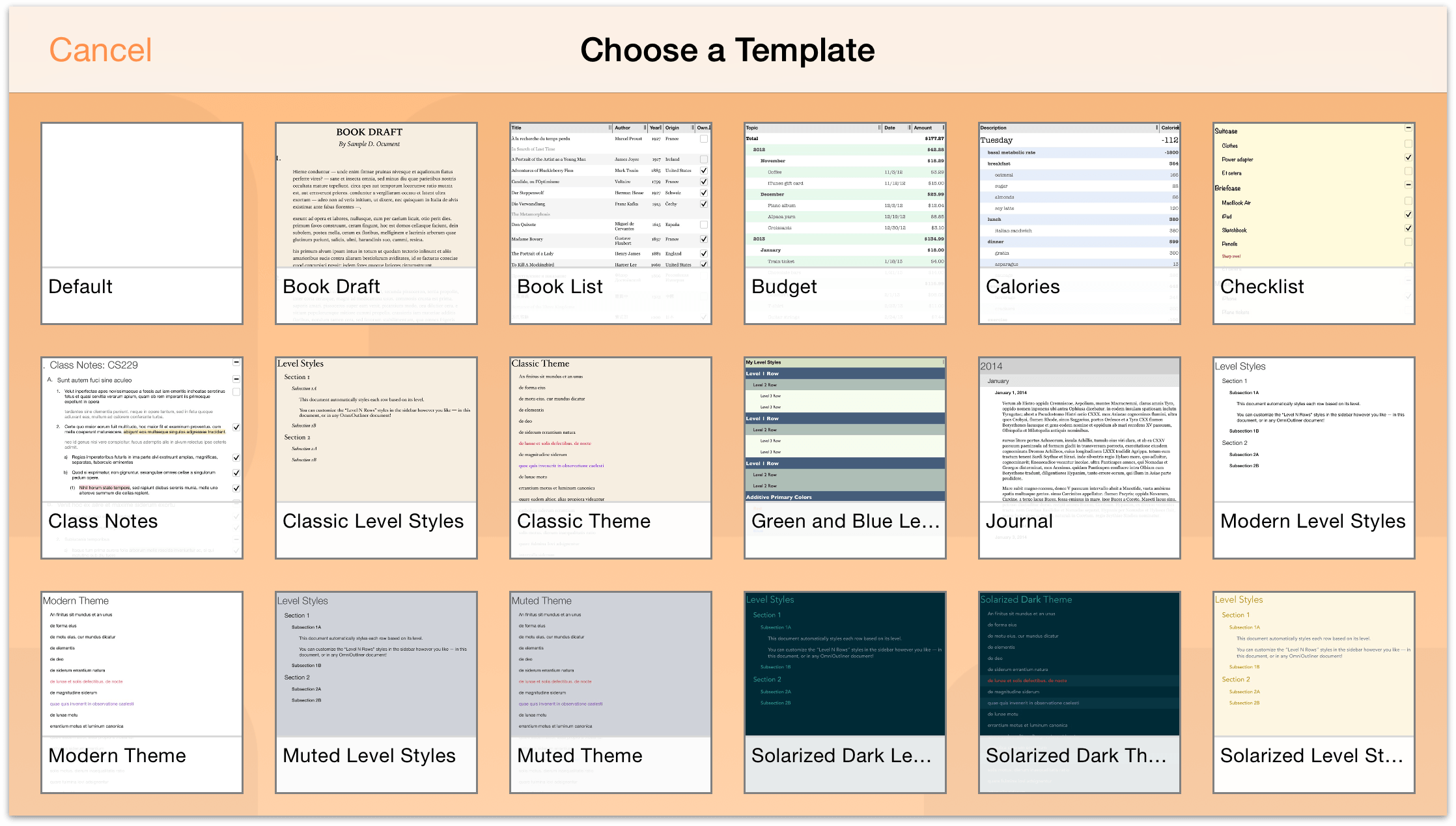
When asked to Choose a Template, tap to select the Default template.
The reason why we’re starting out with the Default template is because it is pretty sparse. It has a plain white background, and the only styles it contains are basic font styling. It’s the perfect starting point for creating a template of your own.
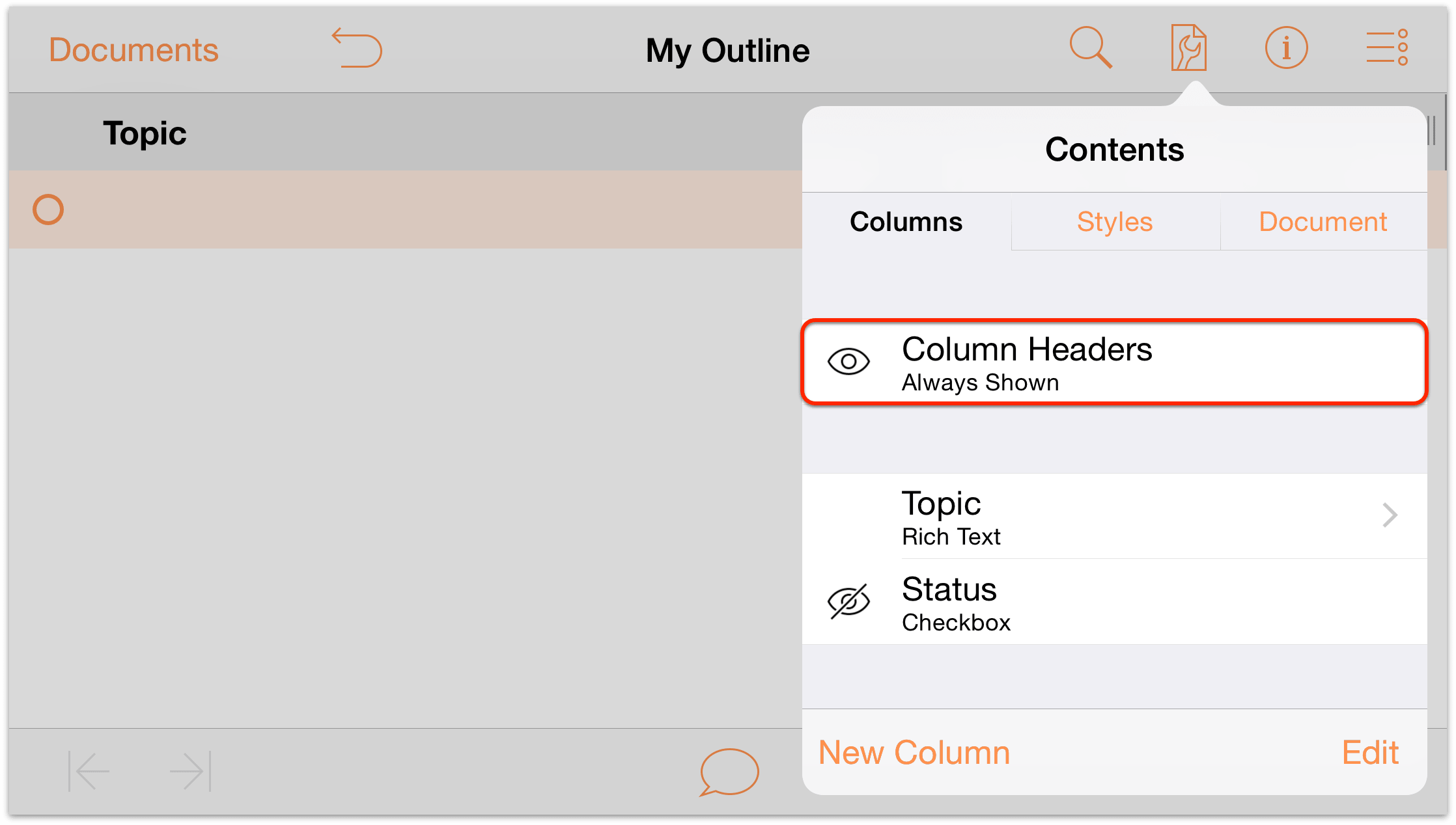
- Tap
 to open the Contents menu.
 - To the left of Column Headers, tap
 (the eye icon) twice to always show the column headings.
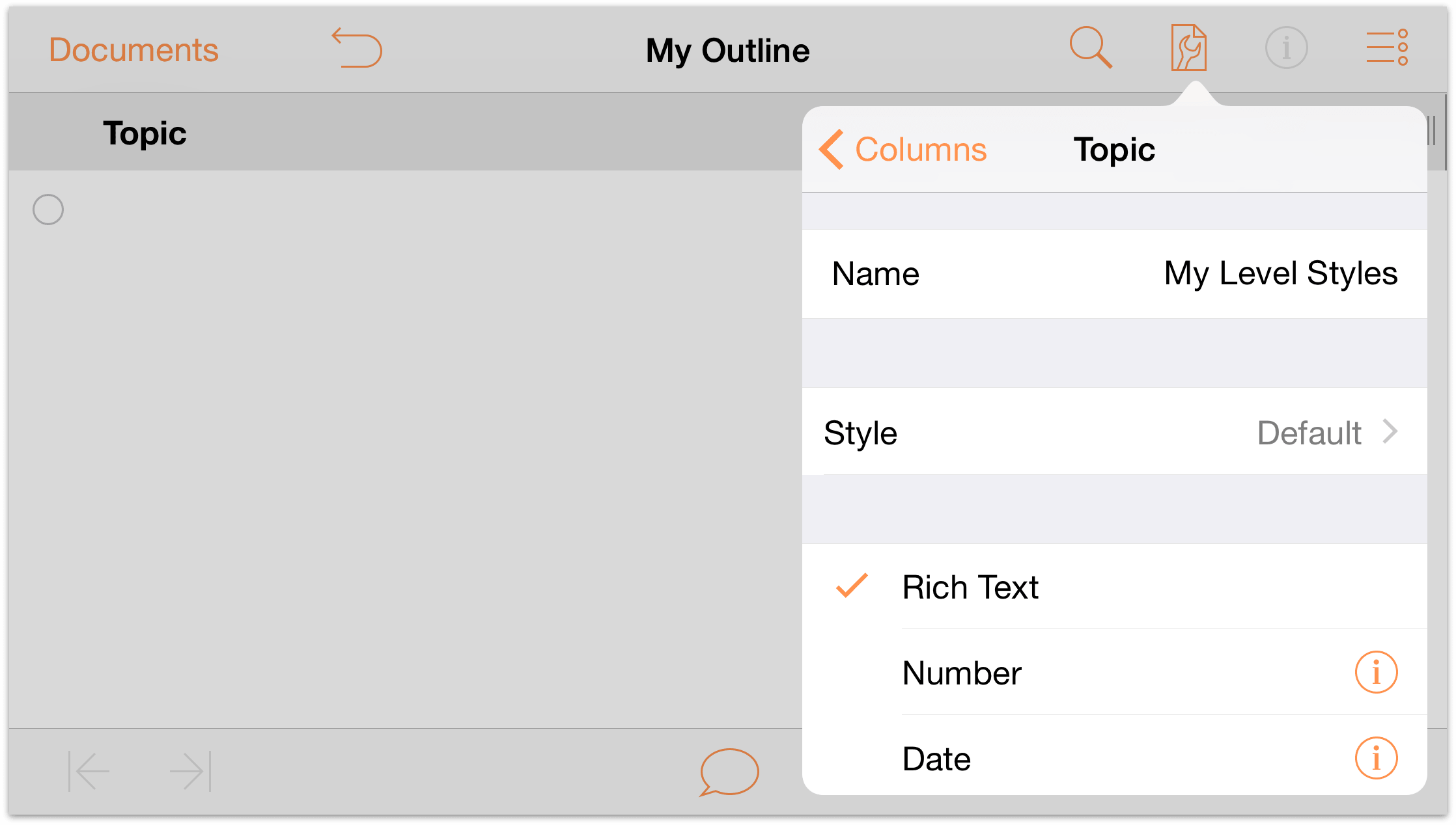
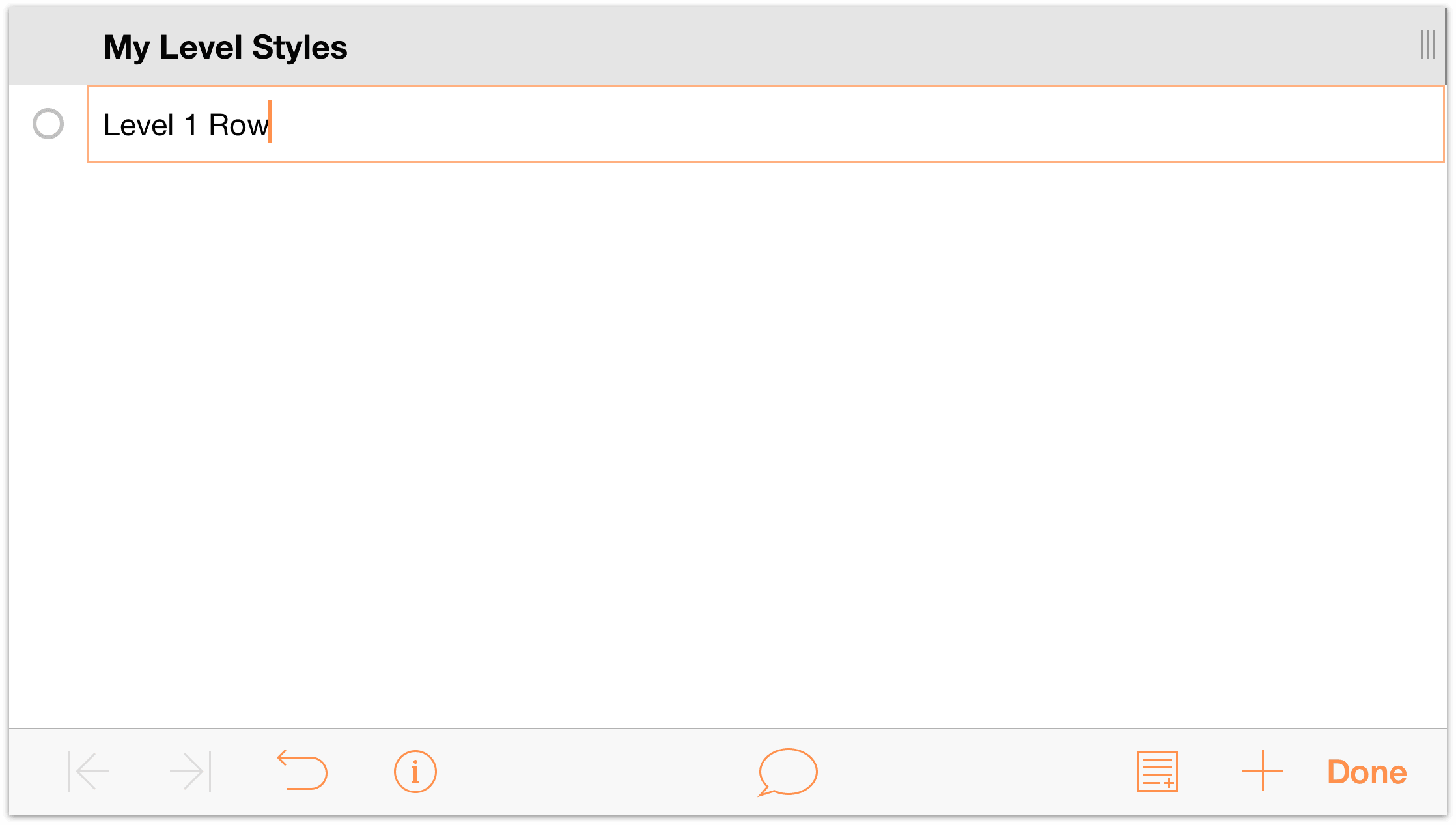
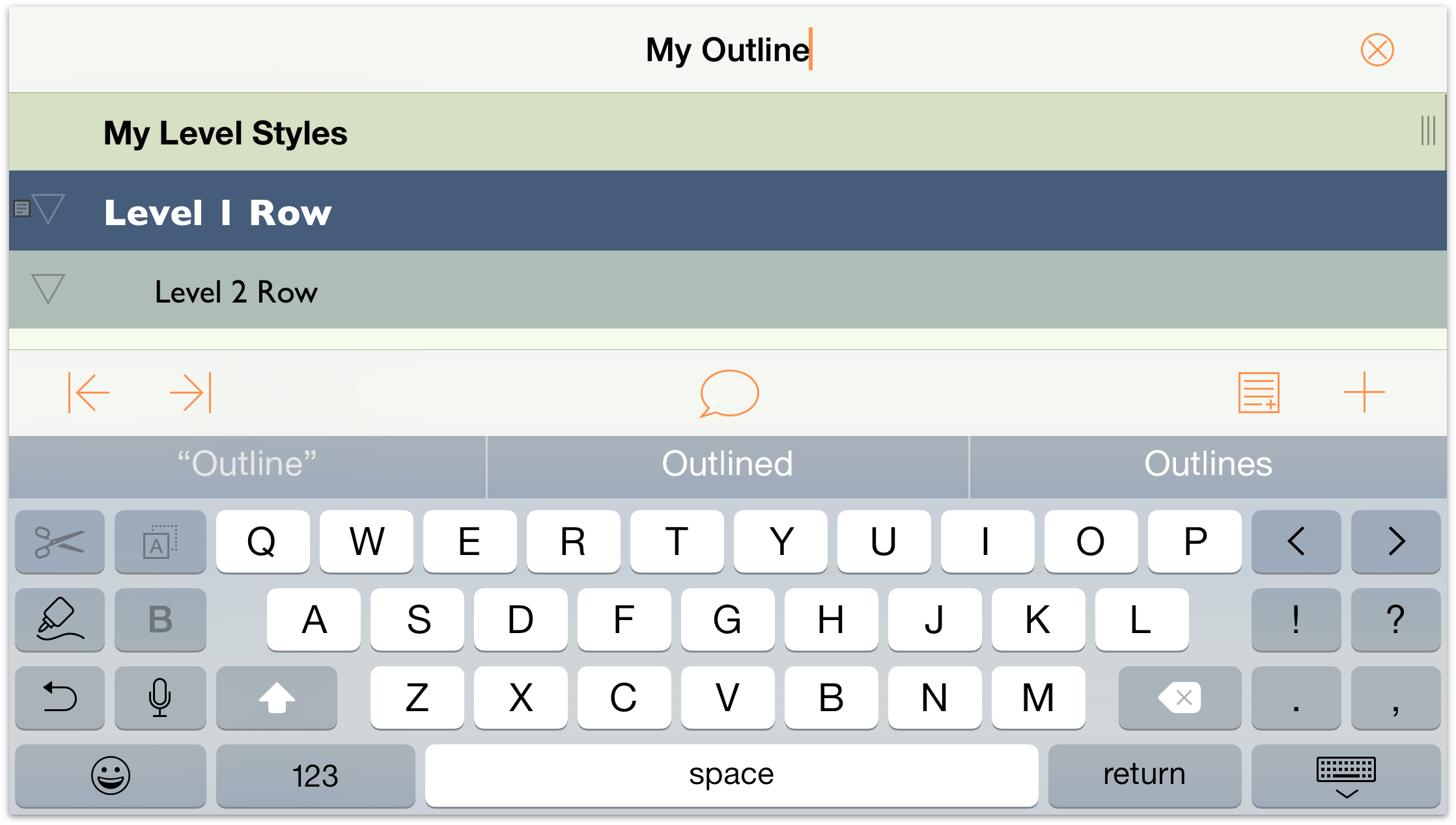
- Tap the Topic column heading once, and then tap Edit in the contextual menu that appears. This opens the Contents menu to the Columns pane so you can edit the column heading. Change the name from Topic to My Level Styles.
- Tap on the outline area to dismiss the Contents menu. When you do, you’ll see that the new column heading has been applied.
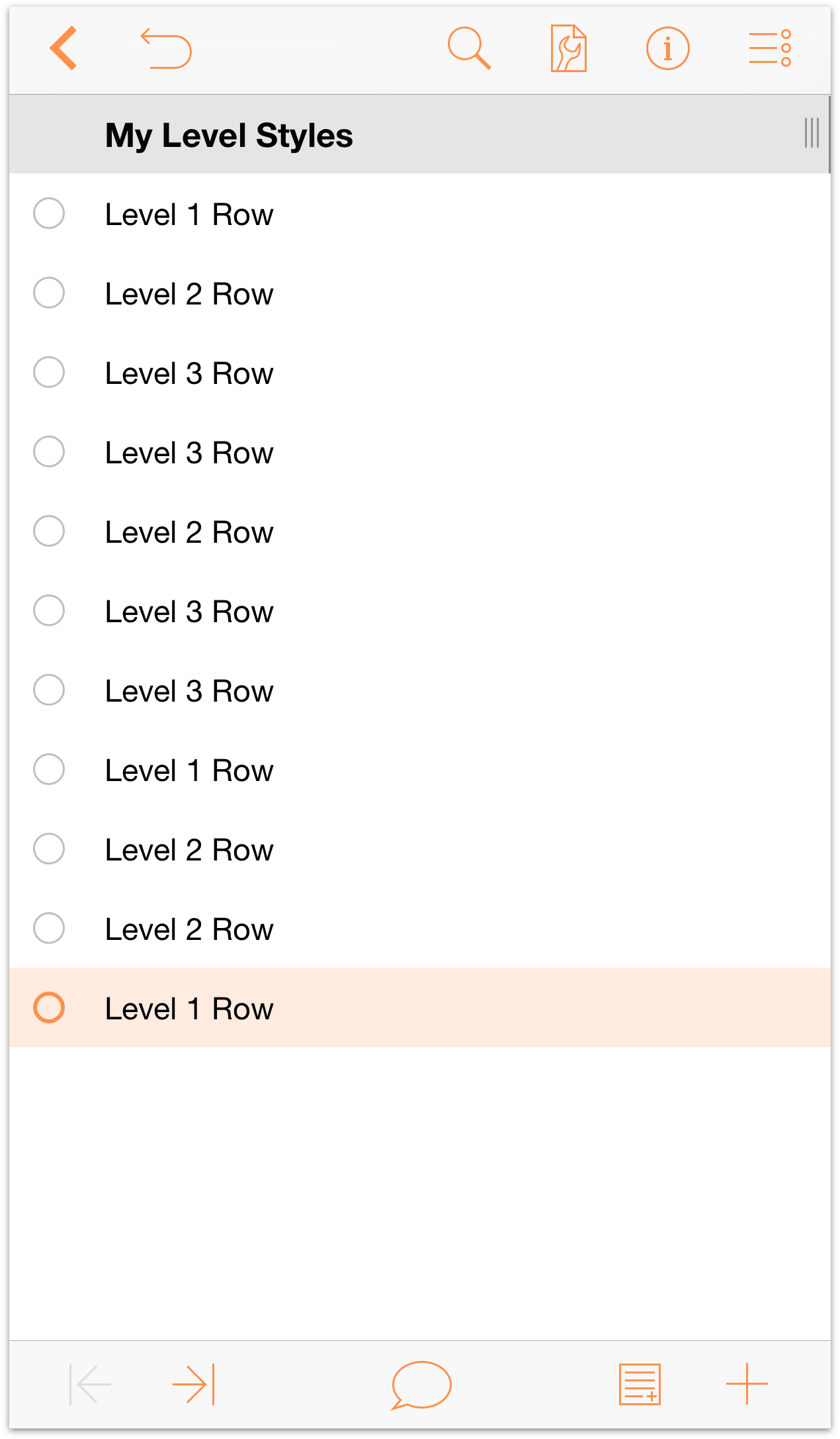
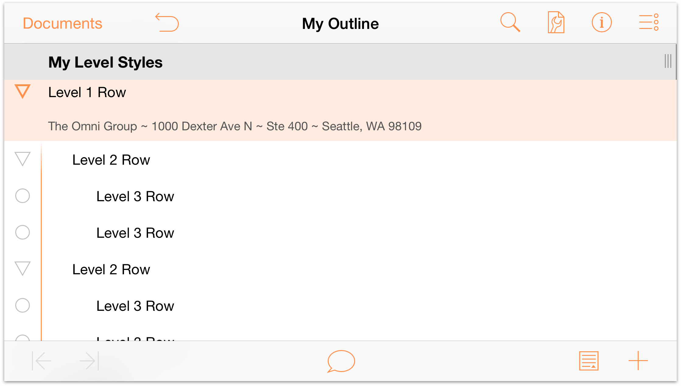
To enter text on the rows of your outline, double-tap on the row beneath the My Level Styles heading and enter Level 1 Row. Pressing Return at the end of the first line moves you down to the next row.
As you’ll notice, the rows get row handles (the open circles along the left edge of the row) by default. Now add more rows by entering the following on the next and subsequent rows:
- Enter Level 2 Row and press Return
- Enter Level 3 Row and press Return
- Enter Level 3 Row and press Return
- Enter Level 2 Row and press Return
- Enter Level 3 Row and press Return
- Enter Level 3 Row and press Return
- Enter Level 1 Row and press Return
- Enter Level 2 Row and press Return
- Enter Level 2 Row and press Return
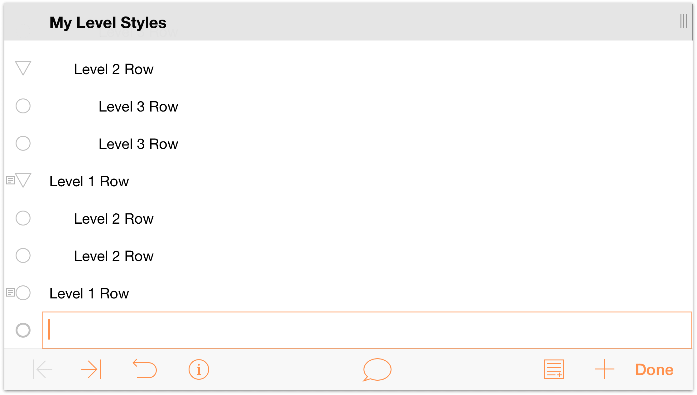
- Enter Level 1 Row
Your document should look like the following:
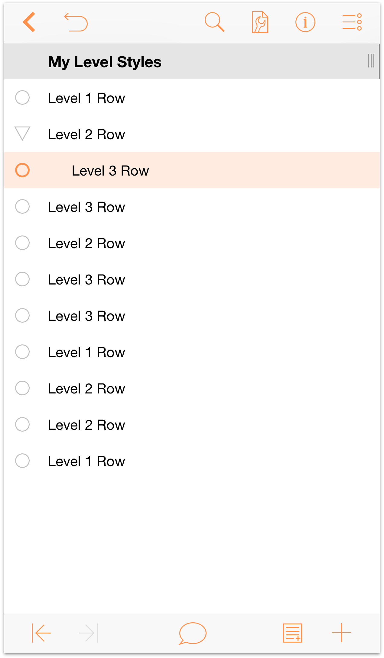
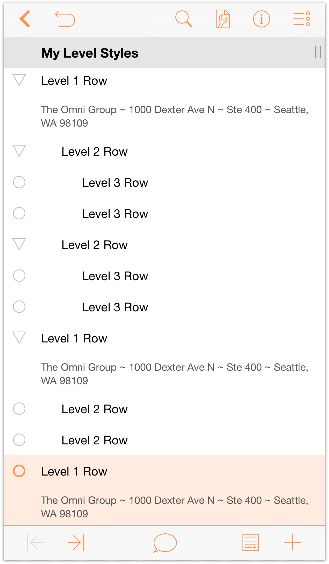
Now let’s add some depth to the outline by indenting the rows. Tap a row handle to select a row.
- Tap to select the first Level 3 Row.
In the toolbar at the bottom of the screen, tap
 (the Indent button) to indent that row one level. Your outline should appear as follows:
Repeat that process for all other Level 3 Rows. When finished, your outline should appear as follows:
Notice how the row immediately preceding the Level 3 Rows have gained a disclosure triangle as their row handle. When pointing downward, a row is Expanded. When pointing to the right, the row is Collapsed.
Now, repeat the indentation process with all of the Level 2 Rows:
- Tap to select each Level 2 Row.
- Tap
 to indent that row one level.
Your document should look like this:
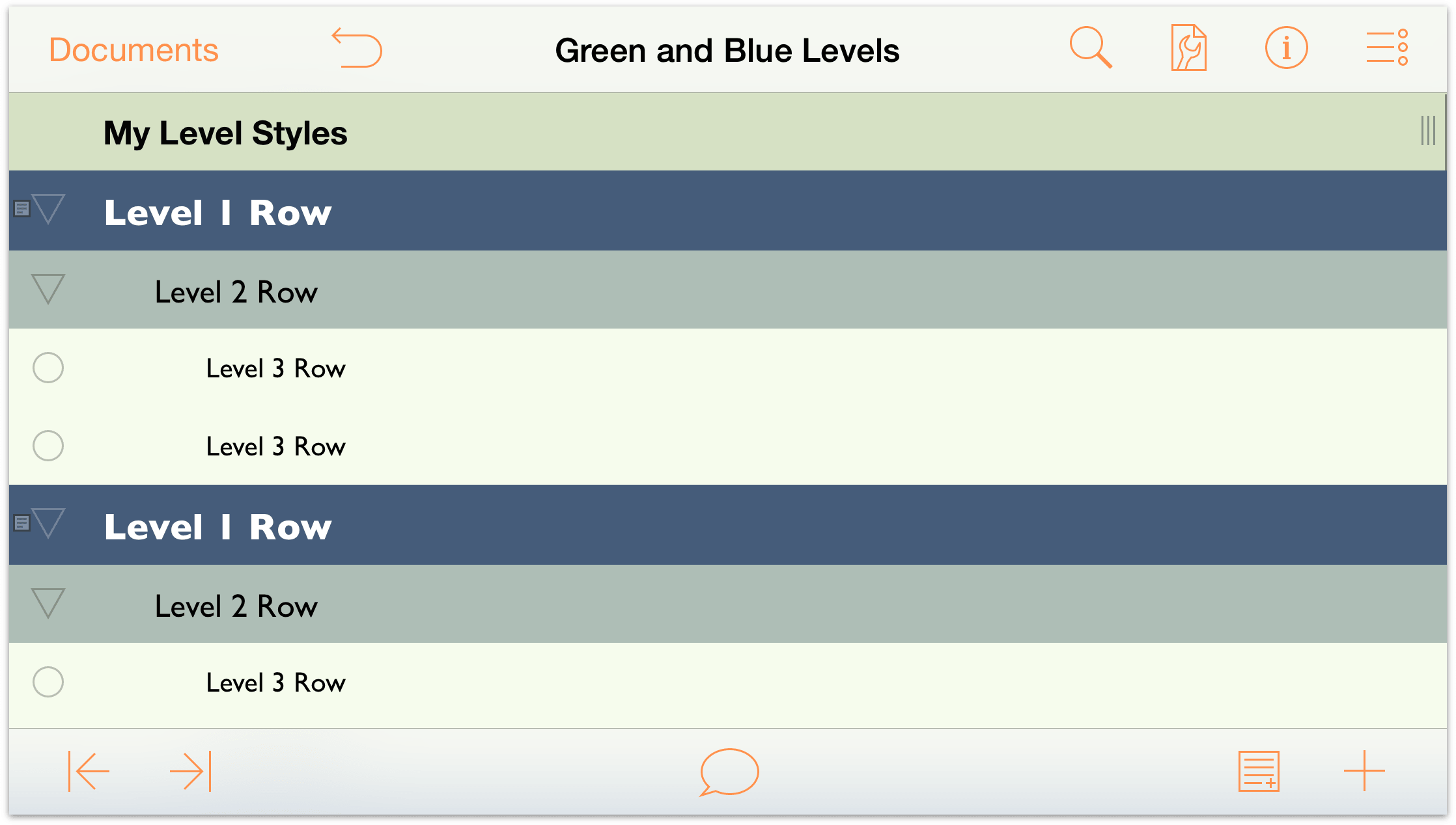
As you can see, the Level 2 Rows are children of the Level 1 Rows, and the Level 3 Rows are children of the Level 2 Rows, making them grandchildren of the Level 1 Rows. Indentation adds hierarchical depth to your outlines, making it easy for you to organize lists of information quickly.
If you look at the opposite side of the toolbar at the bottom of the screen, you’ll notice a couple more buttons; let’s examine these:
- Notes
 — With a row selected, tap this button to add a Note.
 Insert Row
 — When you quickly tap this button, OmniOutliner inserts beneath the current row a new row at that same level. However, if you press and hold this button, four additional buttons fly out.
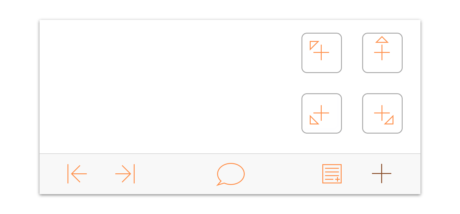
These additional buttons are as follows:
- Insert Parent
 — Inserts a new row at the next-highest level from the selected row.
 - Insert Above
 — Inserts a new row above and at the same level as the selected row.
 - Insert Child
 — Inserts a new row beneath and at one level lower than the selected row.
 - Insert Aunt
 — Inserts a new row beneath and one level higher than the selected row.
- Insert Parent
Before moving on to the next section, one final bit of text entry you should do is to add some text to the Notes for the Level 1 Rows. Tap to select the first Level 1 Row, and then tap  to add a Note.
It doesn’t really matter what you enter as the Note—it could be your address, or the name of your favorite Rush album—just as long as you have some text in place that you can style later in this tutorial. Copy and paste this text as a Note to the other Level 1 Rows. When you’ve finished, your document should look something like the following:
 When there are Notes in your outline, OmniOutliner places a tiny Note icon to the left of the row handle. You may also notice that the Add Note button in the bottom toolbar has changed slightly.
Now the Add Note button is only available when you have selected a row that does not have a Note. Instead, the Hide Note button ( ) is available when a Note is visible, or the Show Note button (
 ) is available when Notes are hidden. If you press and hold the button, two additional buttons “fly out” from the Notes button. These allow you to Hide and Show all Notes in your outline, respectively.
This now gives you enough content to use as placeholder text for the document you’ll eventually turn into a template.
Organizing Your Content
OmniOutliner helps you create detailed lists, and to go with that, it includes some powerful features for helping you organize the content in your outline. Here we’ll show you how to move whole sections around using the Move tool and how to create Groups to add depth to your content.
There are a few ways you can reorganize the content in your outline. The most frequent—and often misused—way is with Cut and Paste. In many cases, you don’t want to Cut the content from your document, you just want to move it to another location in the outline, and for that, there’s the Editing toolbar.
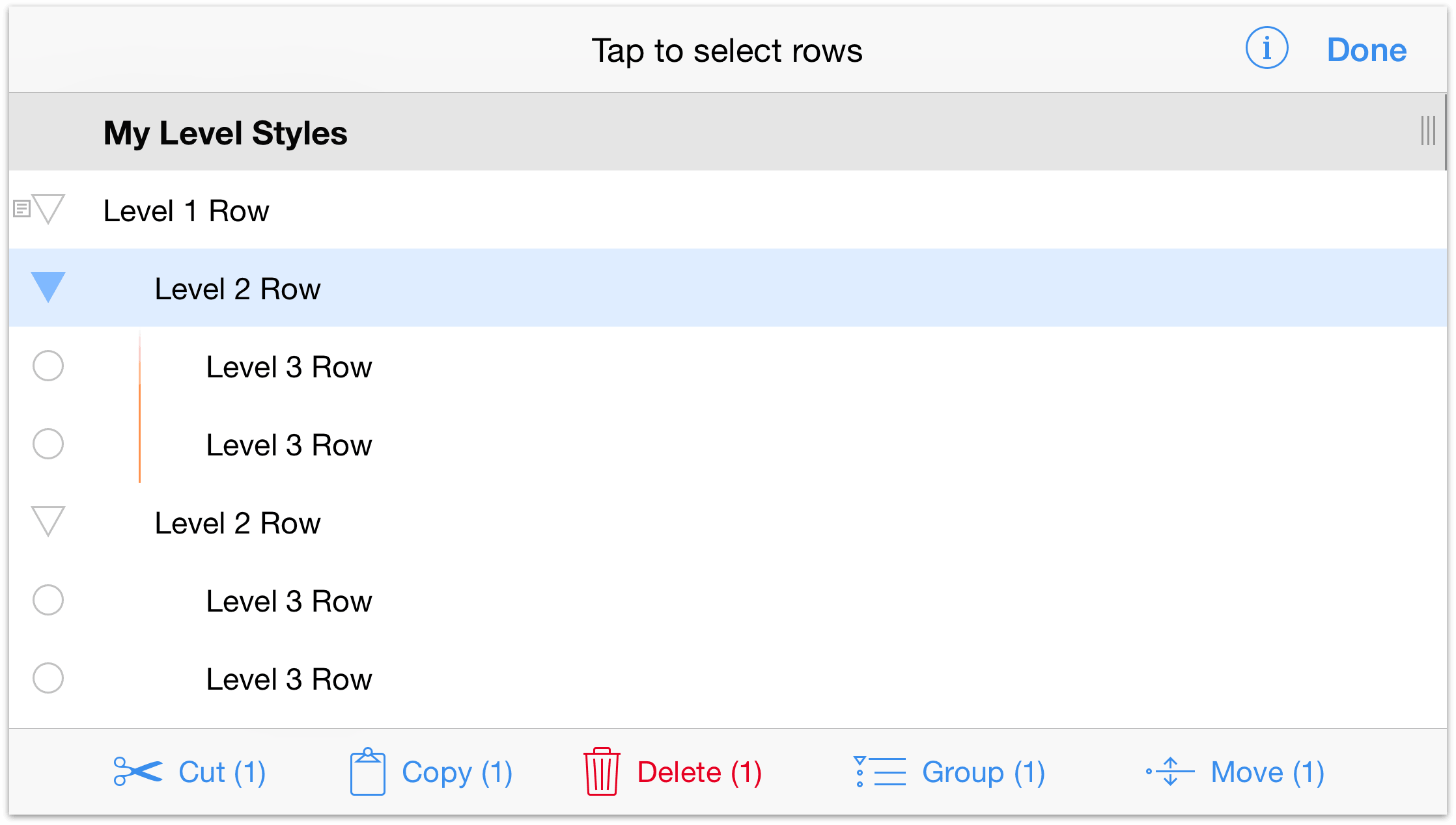
To access the Editing toolbar, tap  and then select the row (or rows) on which you’d like to work. Rows you select are highlighted in blue; to deselect a row, just tap it again.
The Editing Tools include:
- Cut — Removes the selected row(s) from the outline and moves to the clipboard so you can paste them in another location.
- Copy — Copies the selected row(s) and places the content on the clipboard so you can paste the content to another row.
- Delete — Deletes the selected row(s). Delete is very different from Cut, in that the content is permanently gone, whereas Cut places the content on the clipboard so you can use it again. If you delete something by accident, tap Undo.
- Group — Takes the selected rows (you must select two or more rows to make a Group), indents them one level and adds a parent row above in which you can enter some sort of descriptive text for the group.
Move — The row(s) you select can be moved to another location in your outline. Tap on the row where you would like to move the selected row, and choose to move it Above, Below, or Inside that row.
Above and Below places the row you’re moving at the same level as the row you have selected. Inside moves the line to that location, but makes it a child to the selected row.
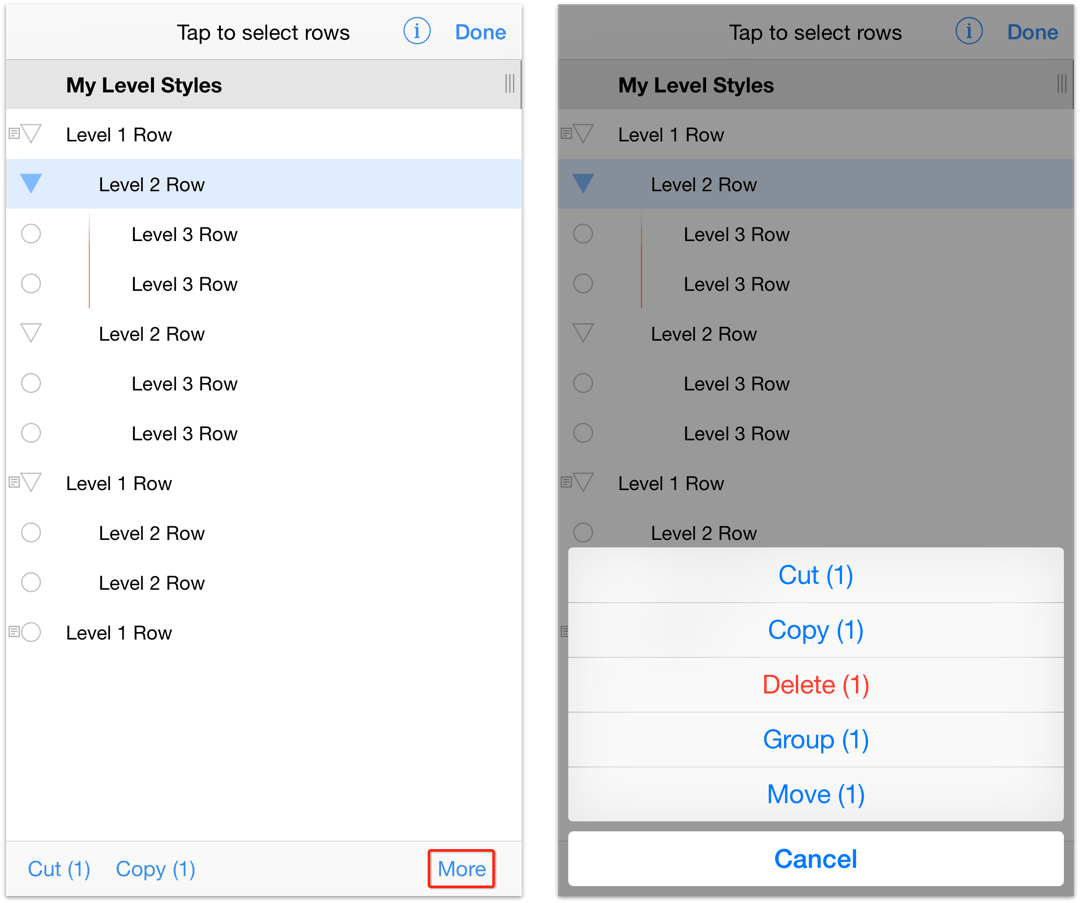
Where’d the Editing Tools Go in Portrait Mode?
If you are using OmniOutliner on an iPhone or iPod touch in portrait mode, you’ notice that the Editing toolbar looks significantly different than it does when your device is rotated to landscape mode.
Notice that your only options are Cut, Copy, and something called More. If you tap More, you can access all of the other Editing tools.
Creating a Group
Sometimes when you’re working on an OmniOutliner document, you’ll find a bunch of rows that you’d like to group together. These rows can follow one another or be non-contiguous, but all you know is that they belong together. For this, you’ll want to group the rows together using Group tool.
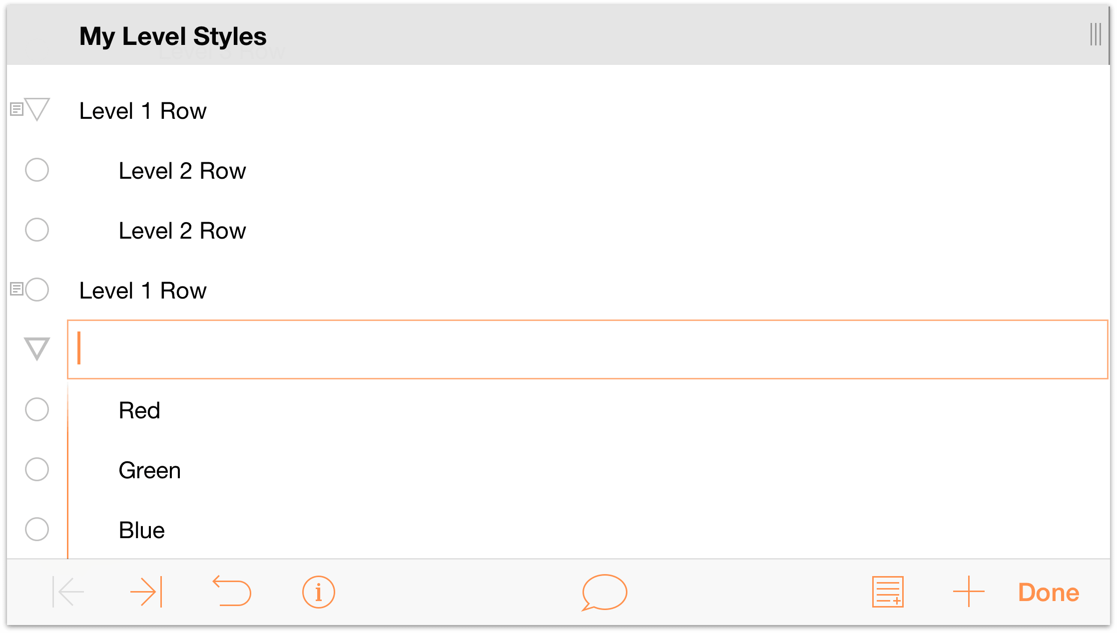
To show you how this works, go ahead and tap to select the last row in the document (Level 1 Row), and then tap  . This adds a new row directly beneath the Level 1 row.
Enter the following:
- Red and press Return.
- Green and press Return.
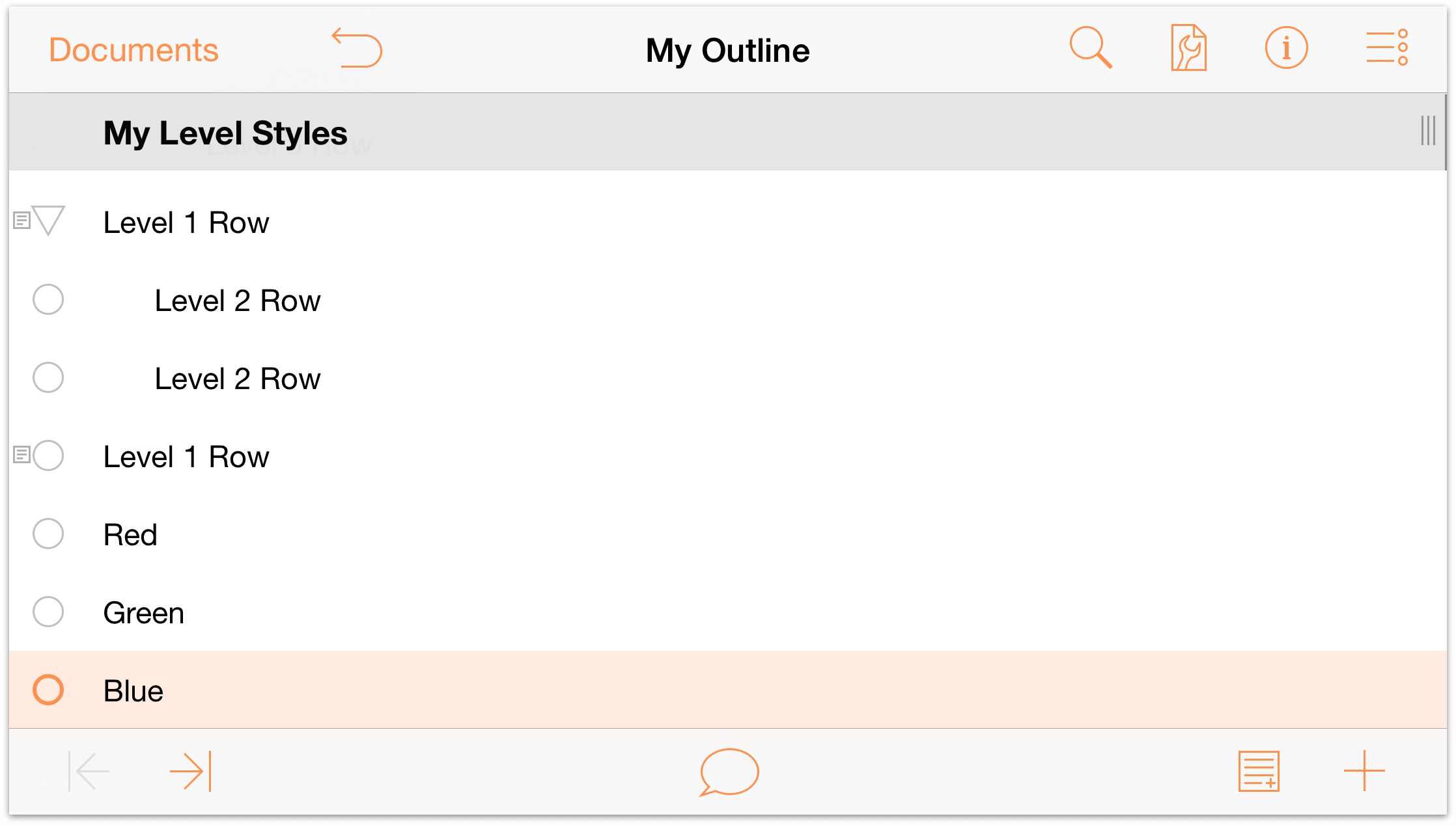
- Blue, and then tap Done.
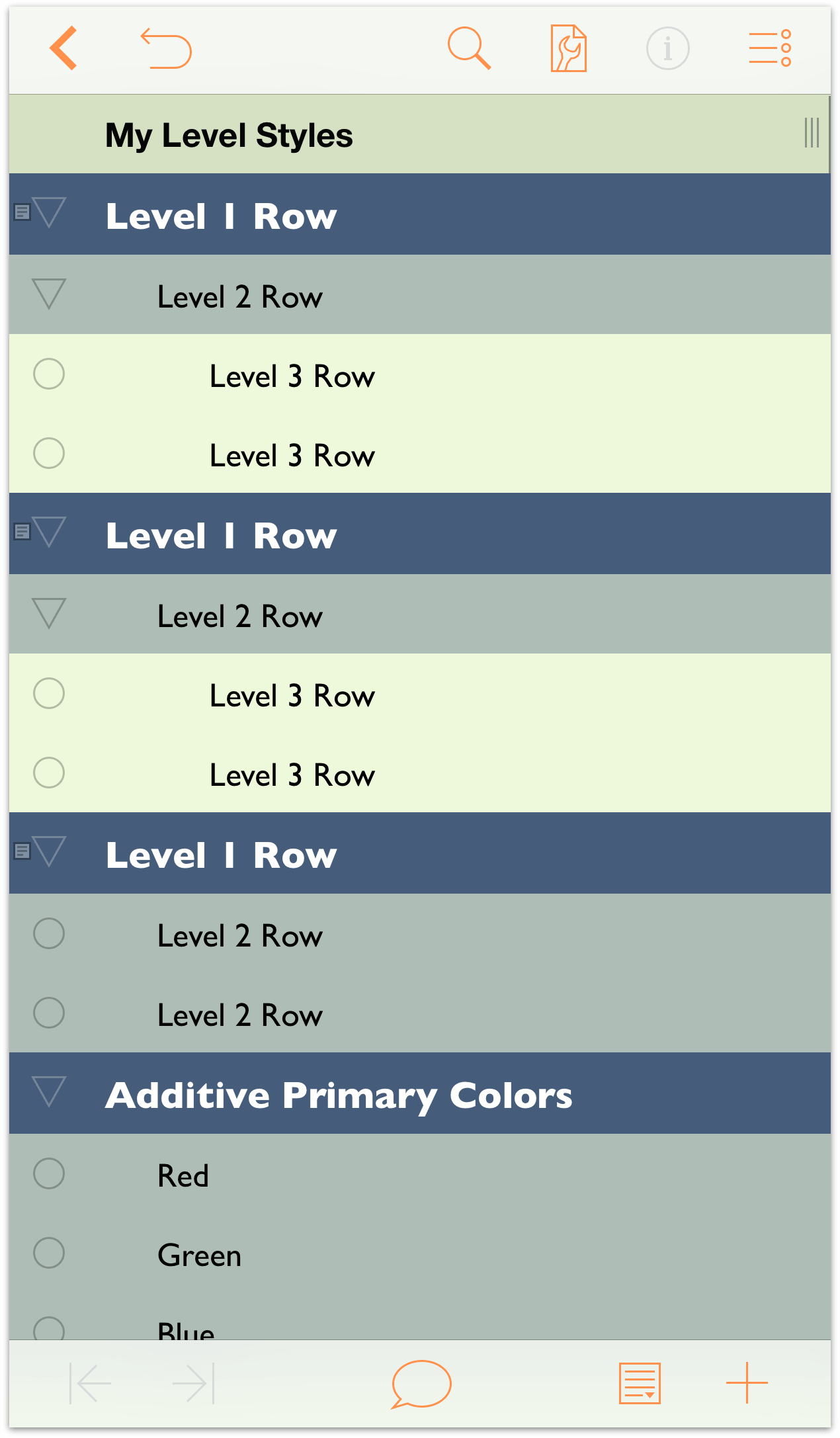
Your document should look like this:
To create a group from these rows, do the following:
- In the navigation bar, tap
 .
. - Tap the row handles to select the Red, Green, and Blue rows.
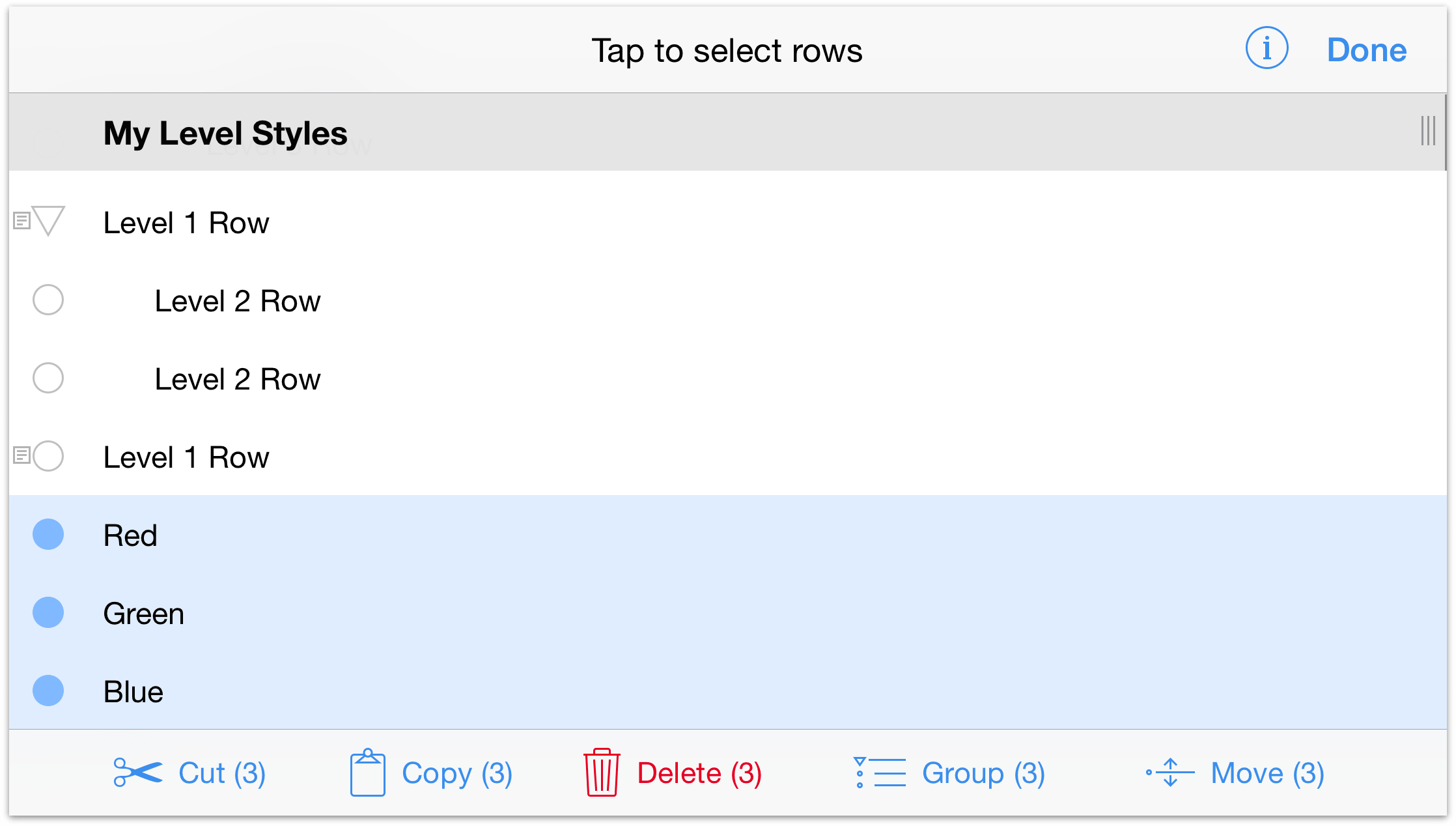
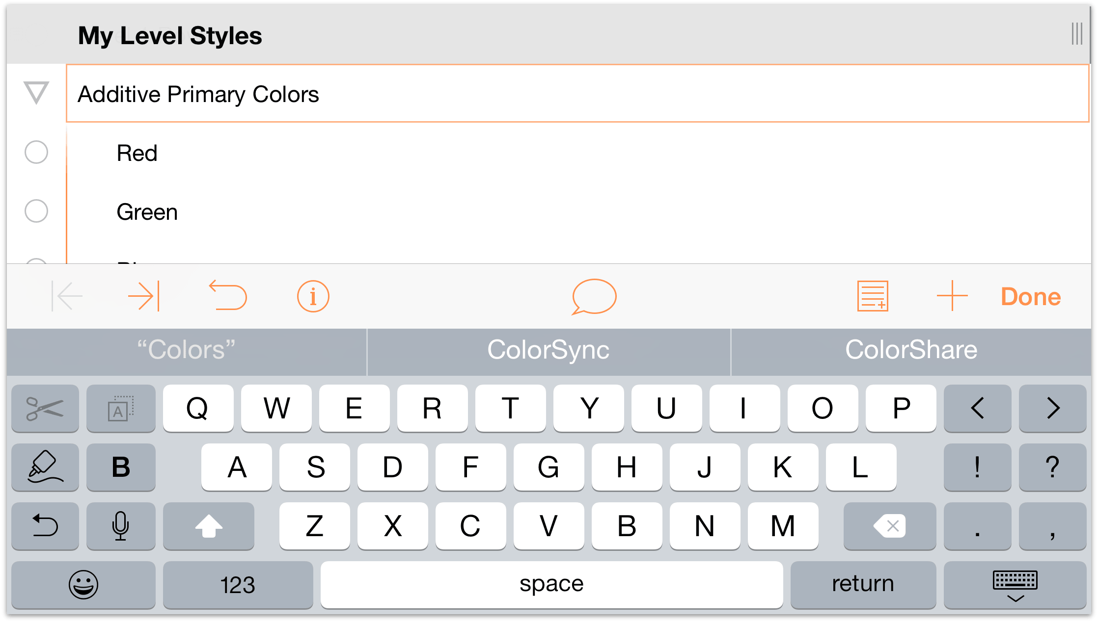
- Tap Group. When you tap the Group button, the Red, Green, and Blue rows are indented as children beneath an empty Level 1 Row.
- In that new row, enter Additive Primary Colors, and then tap Done.
Note
OmniOutliner for iOS does not have an Ungroup option as part of the Editing tools. If you need to ungroup some rows, use the Editing tools to select and move the rows Below the parent row. Then, if needed, delete the old parent row.
Moving Rows within Your Outline
As you start to organize your list of information, you’ll undoubtedly find the need to move things around. After all, that’s why you’re making lists anyway, right? To track and organize all of the fine details.
OmniOutliner offers two options for moving rows around within your outline.
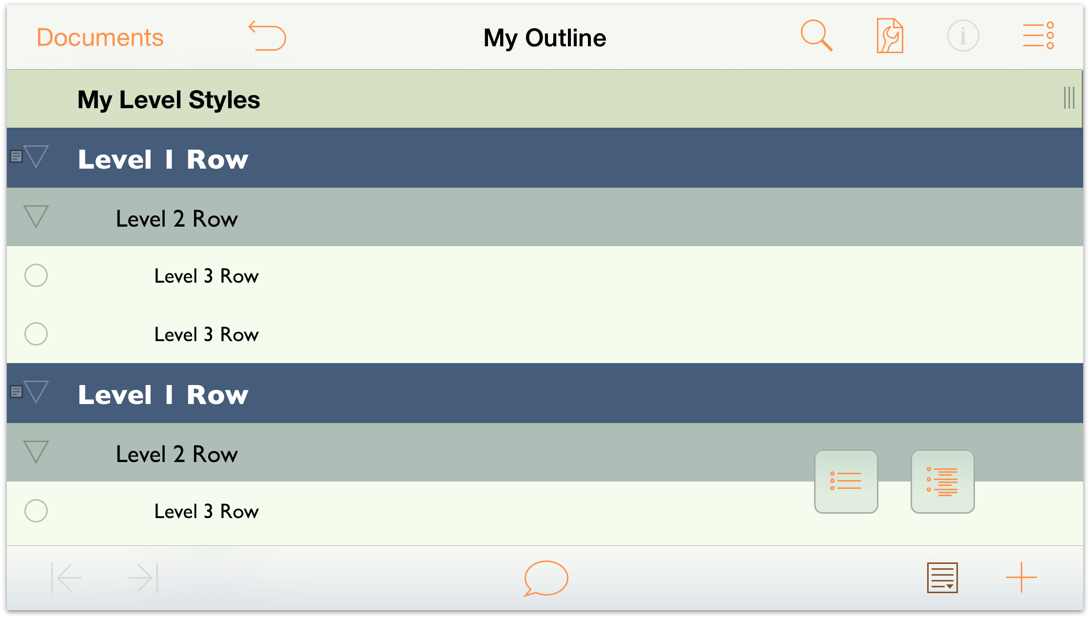
- You can press and hold on a row and then drag it to where you’d like it in the outline.
- Or you can use the Editing tools to select and move the rows. This is particularly useful if you have multiple rows (contiguous or non-contiguous) that you need to move.
- Start by tapping
 to access the Editing tools.
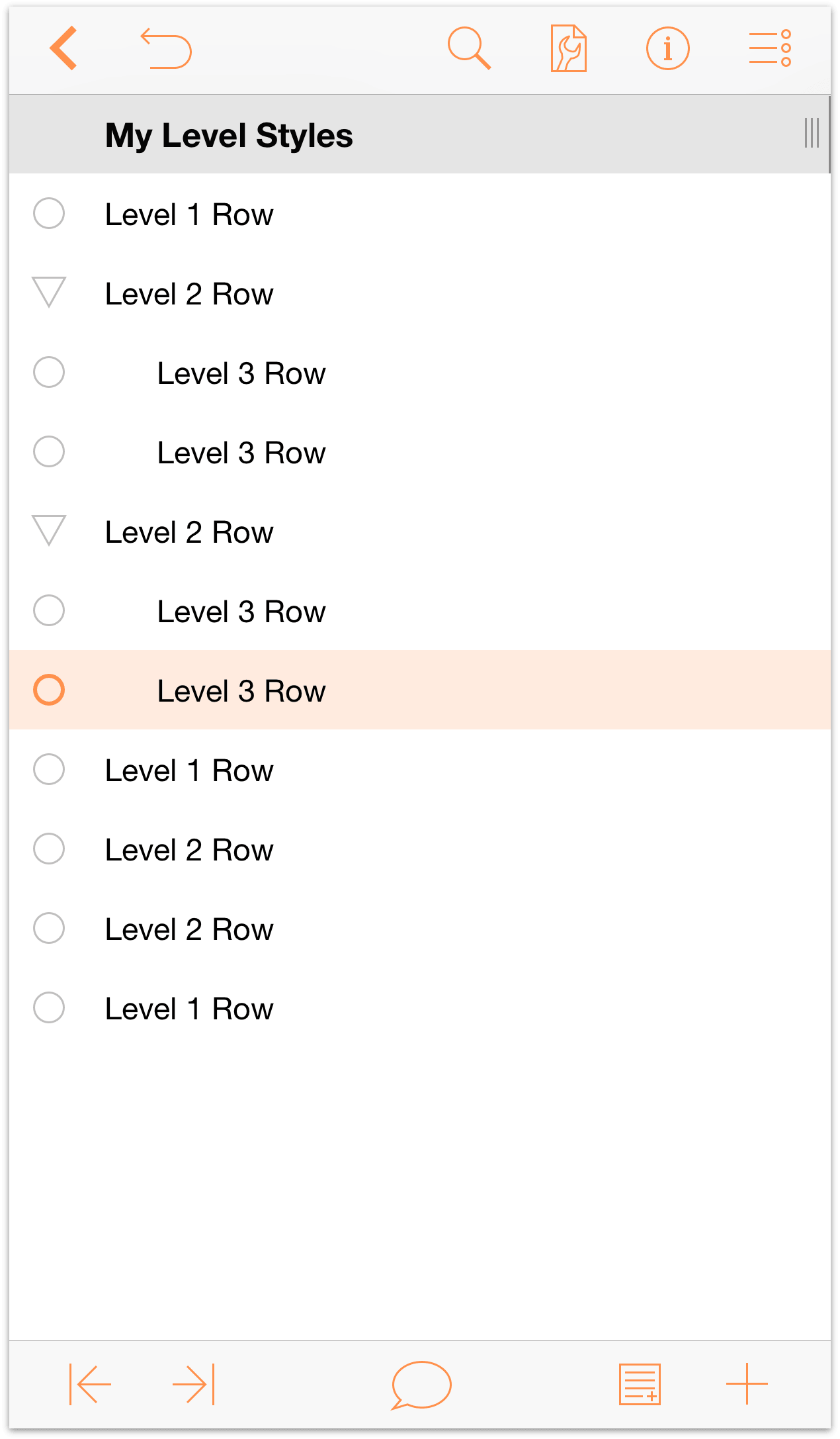
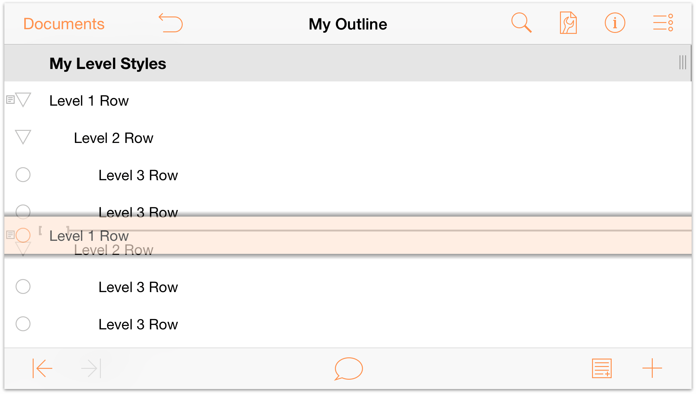
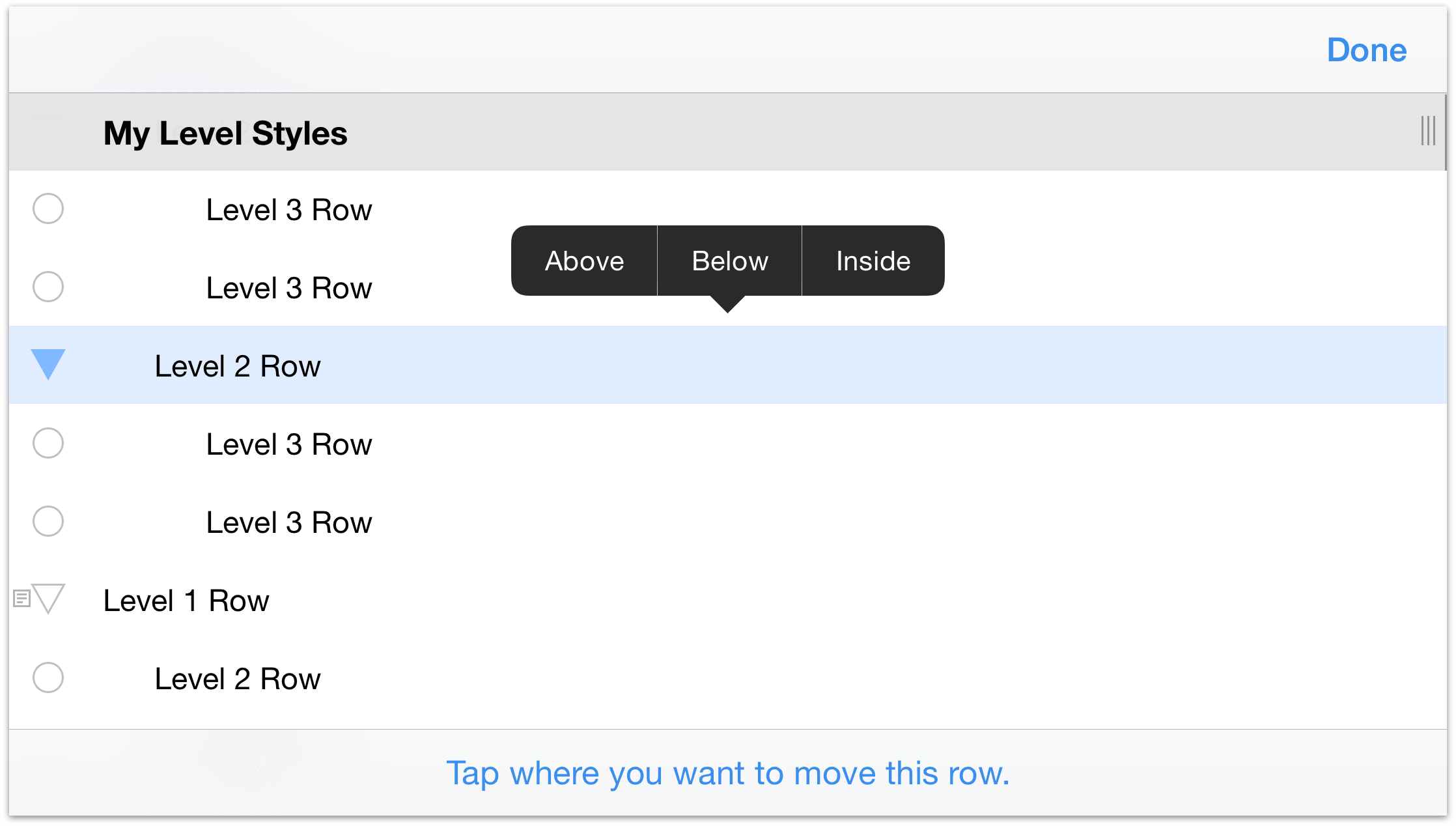
 - Tap to select very last Level 1 Row in the outline (the one above Additive Primary Colors), and then tap Move in the Editing toolbar.
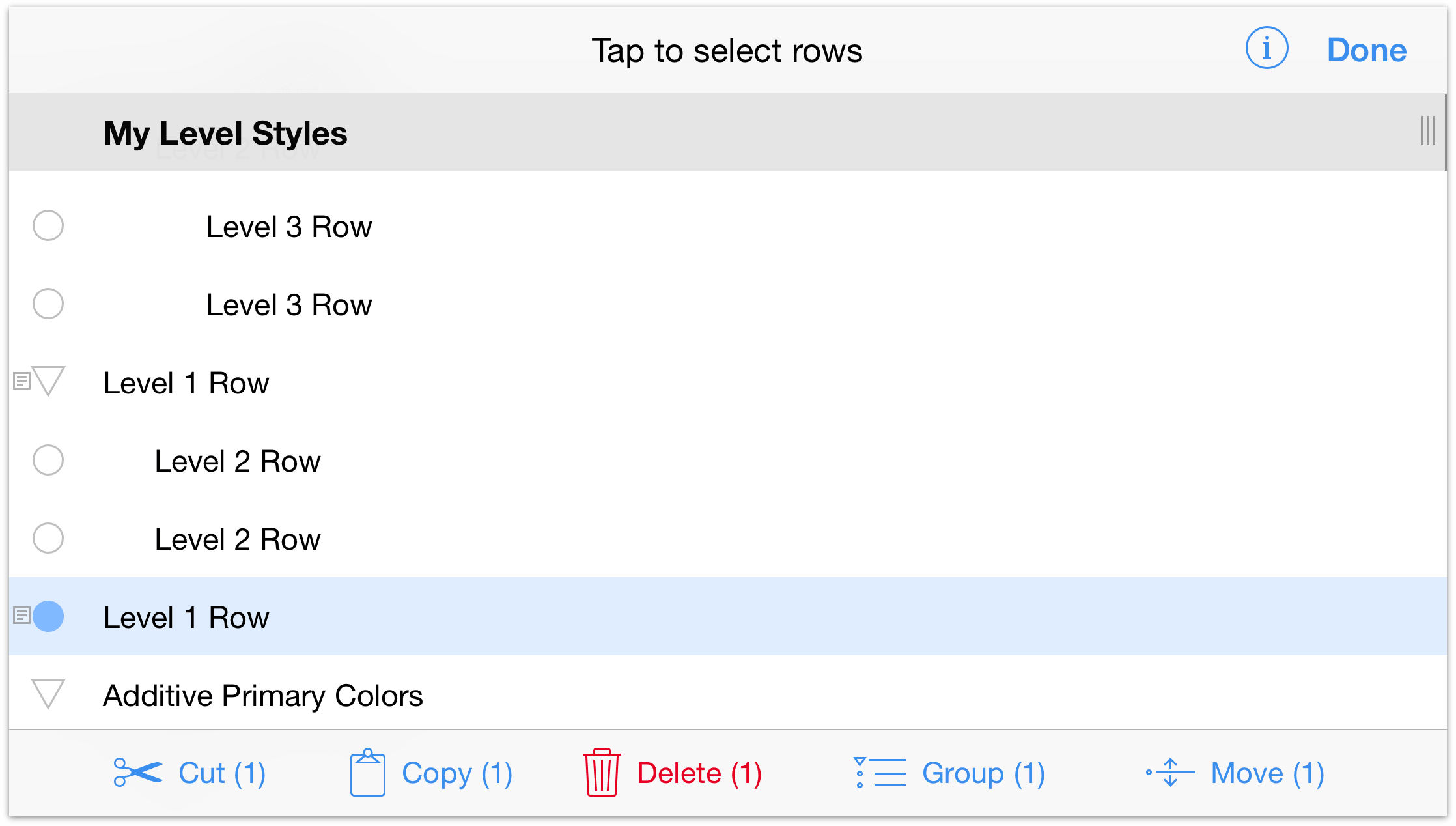
As the note at the bottom of the screen says, “Tap where you want to move this row.”. Scroll up in the outline and then tap to select the second Level 2 Row.
The row you tap highlights in blue, and a context menu appears above the row with options to insert the row you’re moving Above, Below, or Inside the row you have chosen.
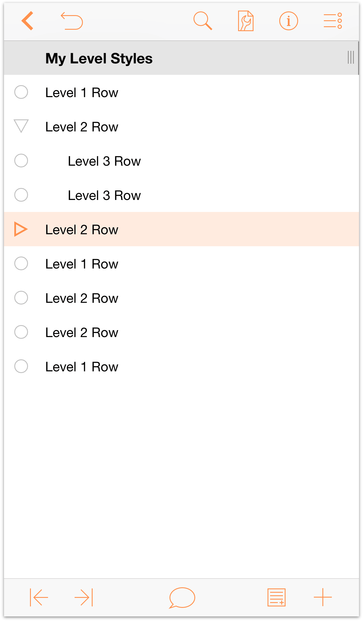
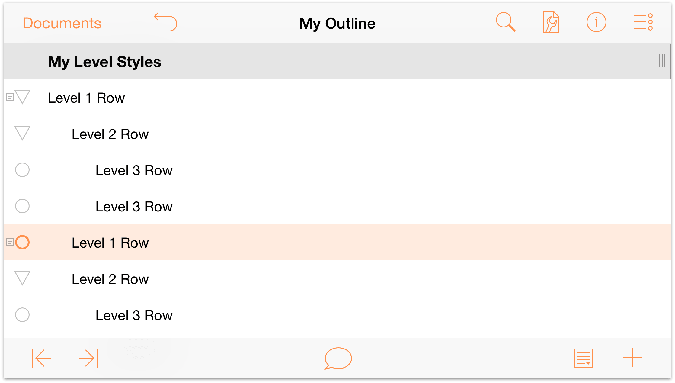
Tap Above, which inserts the Level 1 Row above the Level 2 Row.
- Start by tapping
After inserting the Level 1 Row, you’ll notice that it and the Level 2 Row are on the same level.
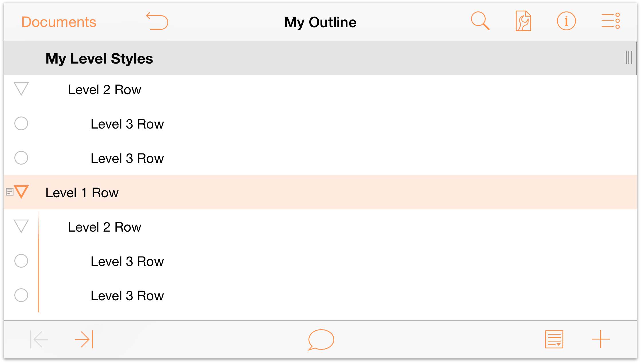
To make this outline more uniform, let’s turn the Level 2 Row (and its children) child rows of the Level 1 Row. Tap to select the Level 1 Row, and then tap  . This moves the Level 1 Row out one level and, in the process, turns the Level 2 Row and the two Level 3 Rows its children.
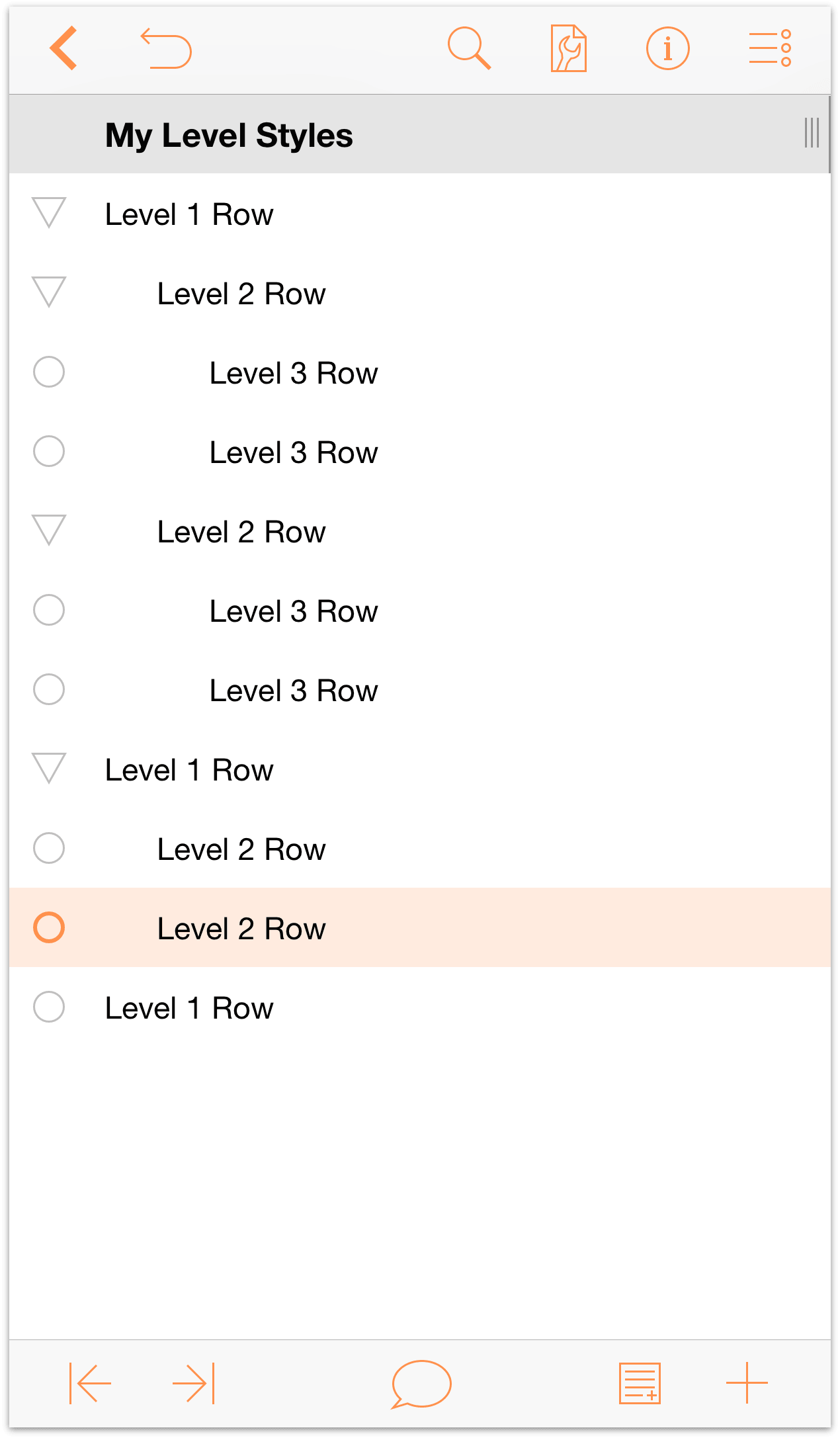
As you can see, both the Level 1 Row and Level 2 Row have a disclosure triangle as their row handle. Tap the disclosure triangles to familiarize yourself with how these work.
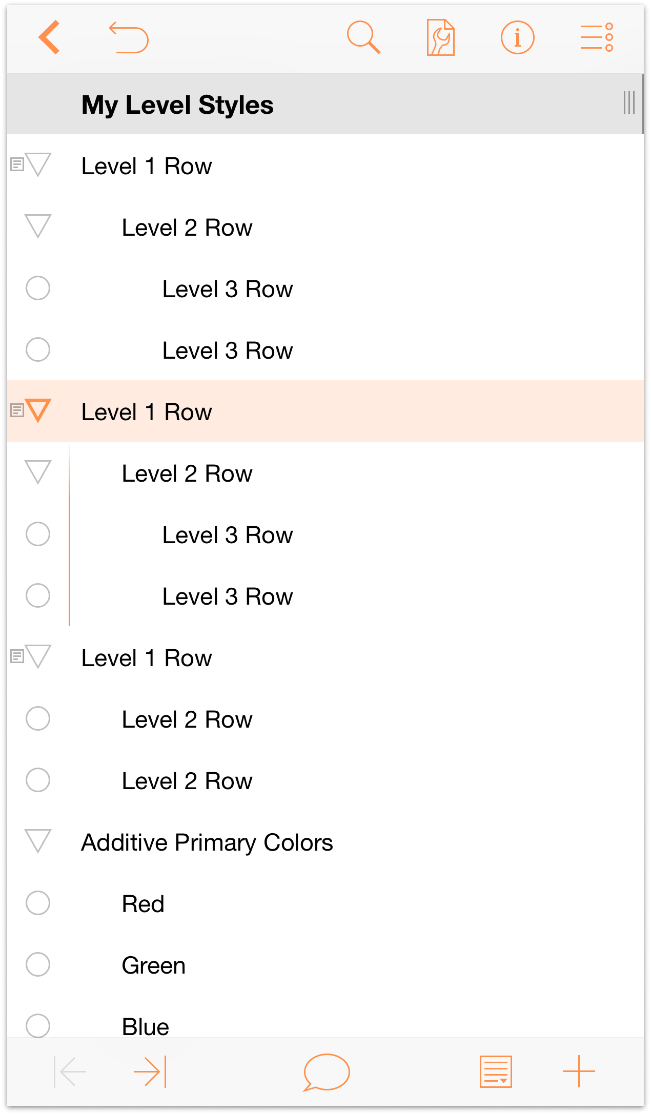
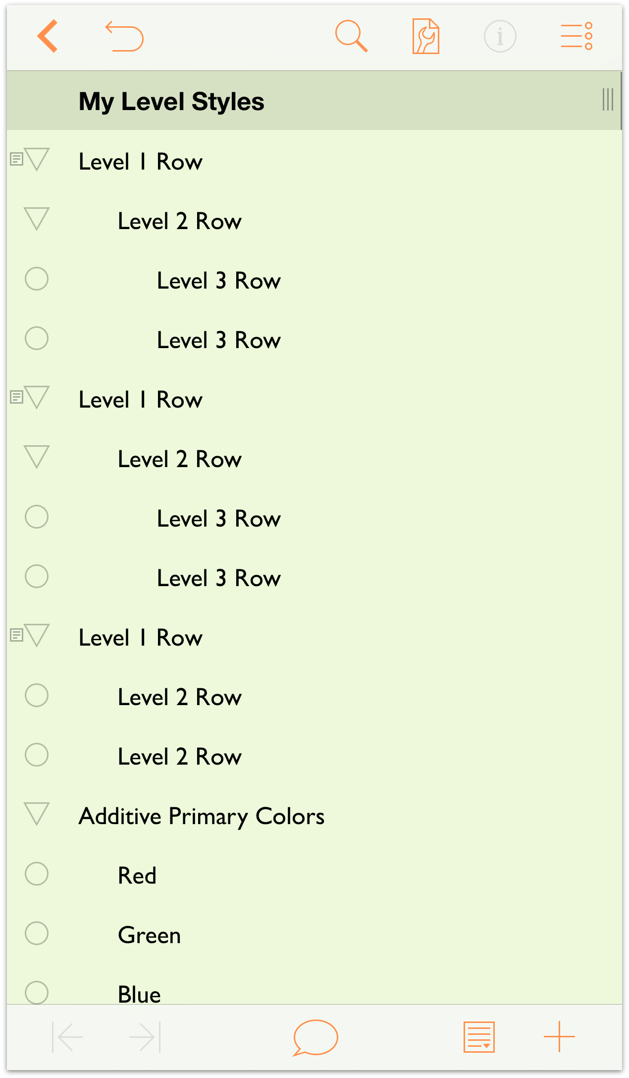
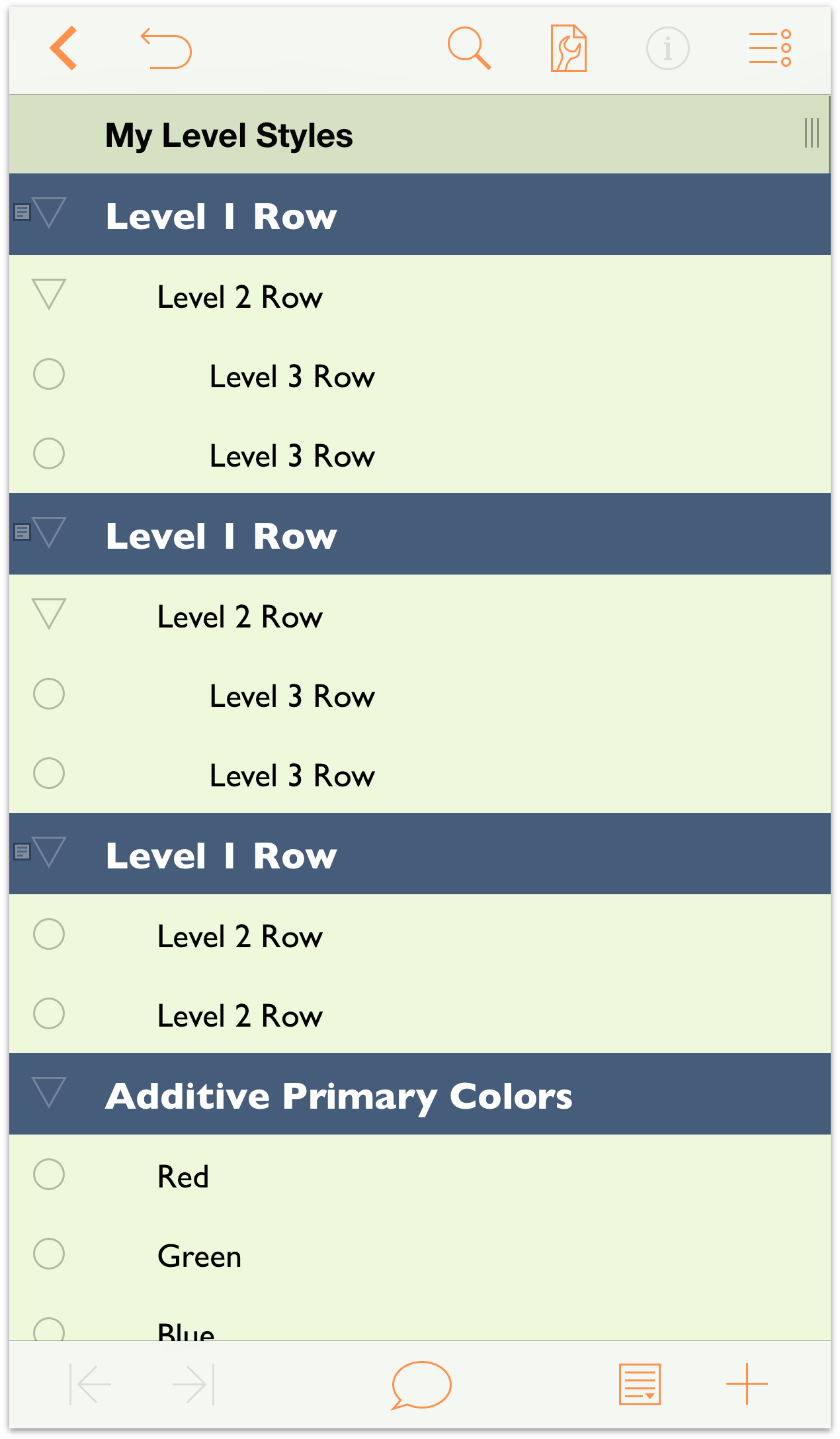
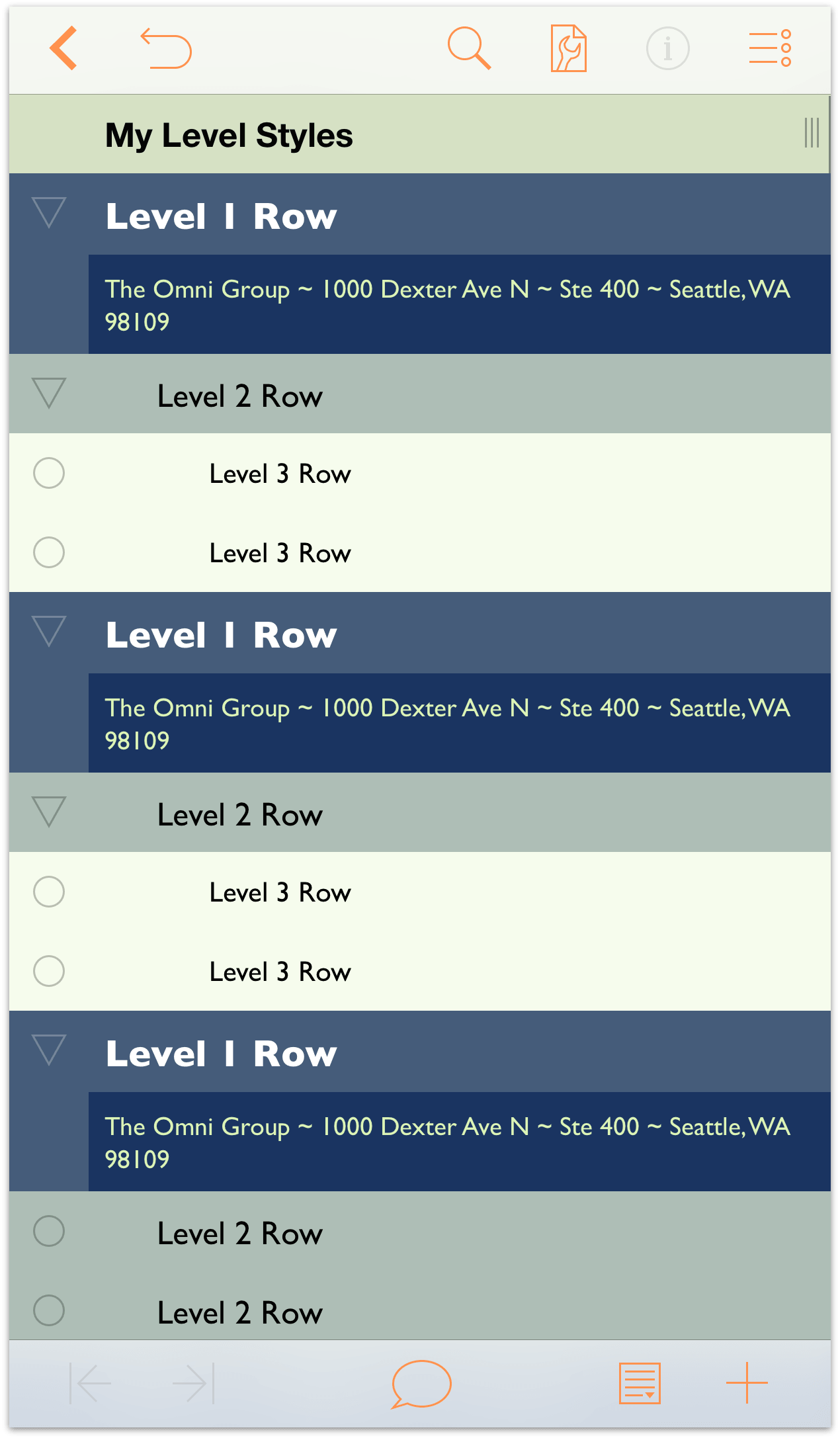
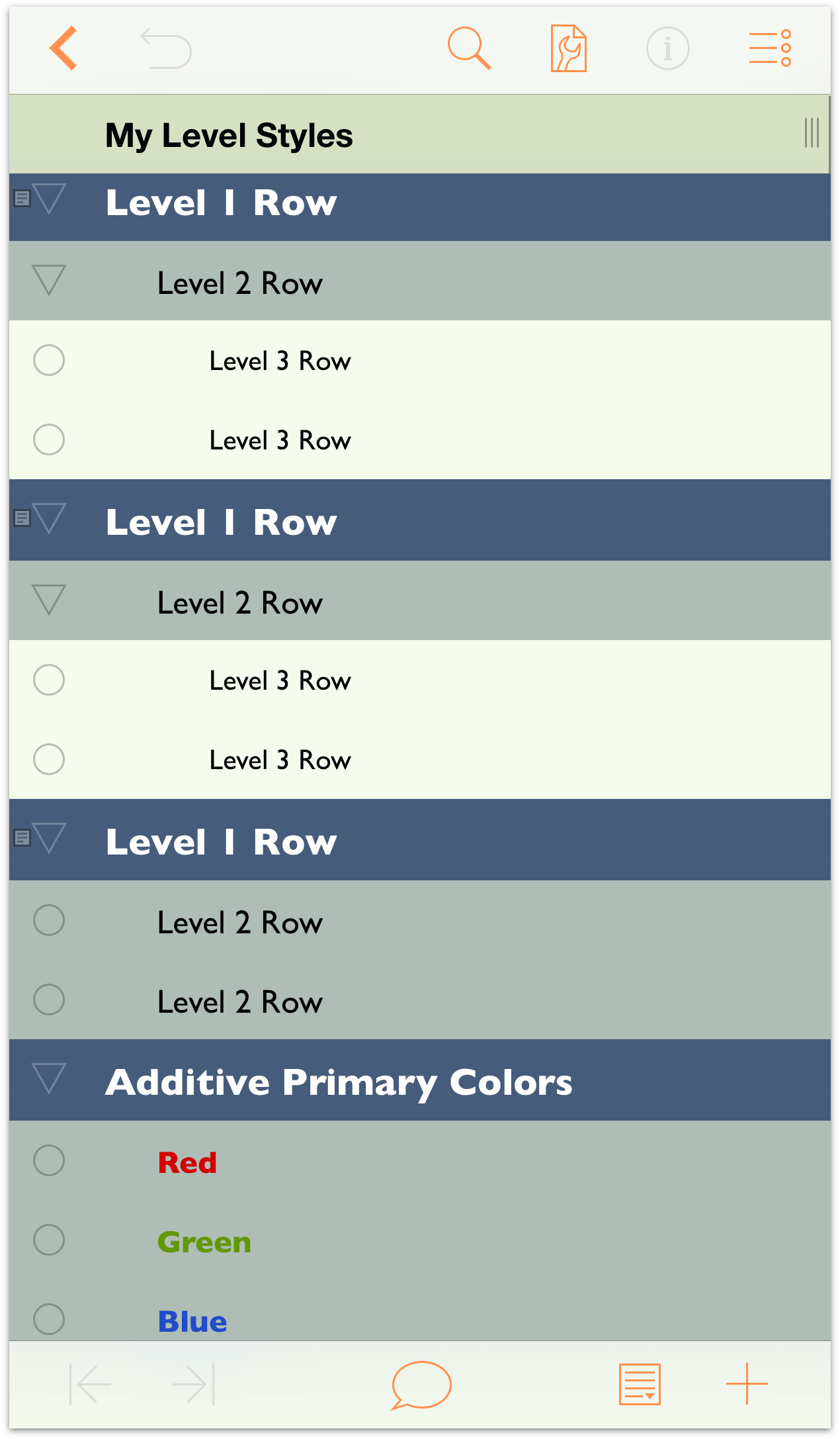
Now that you’re familiar with how to group and move rows around, along with how to indent and outdent rows, it’s time to move on to the fun stuff—styling your outline! Your outline should look similar to the following image. Each Level 1 Row has at least one Level 2 Row nested underneath, and most (but not all) of the Level 2 Rows have Level 3 Rows as children. Toward the bottom of the outline, there’s also the list of Additive Primary Colors, to which you’ll assign a styles to color the text.
Note
If you’re looking for a place to take a break, this might be a good time to do that. The remainder of this tutorial takes you through the process of styling the document before saving a version of it as a template which you can reuse later on. We won’t lie, it gets pretty intense, and you’ll want to pay close attention to the things you’re doing. So go ahead, take a walk around the office, grab a coffee, or go pet your cat, and then come back and be prepared for some fun.
Styling Your Outline
One of the many things that makes OmniOutliner such a fantastic outlining tool is the ability to style everything in your document. You can apply different fonts, increase or decrease the type size, set a background color for the Whole Document and individual row levels, and more.
It’s time to take things to the next level by showing you how to create styles for your content. There’s a lot that’s involved here, but before this goes too far, it’s important to understand OmniOutliner’s style layering model.
Understanding OmniOutliner’s Style Model
OmniOutliner’s styles stack upon one another. The base layer of styles for your document is the Whole Document style. This is the foundation of your document, and the various Level styles you set can adopt, amend, and even override the Whole Document styles.
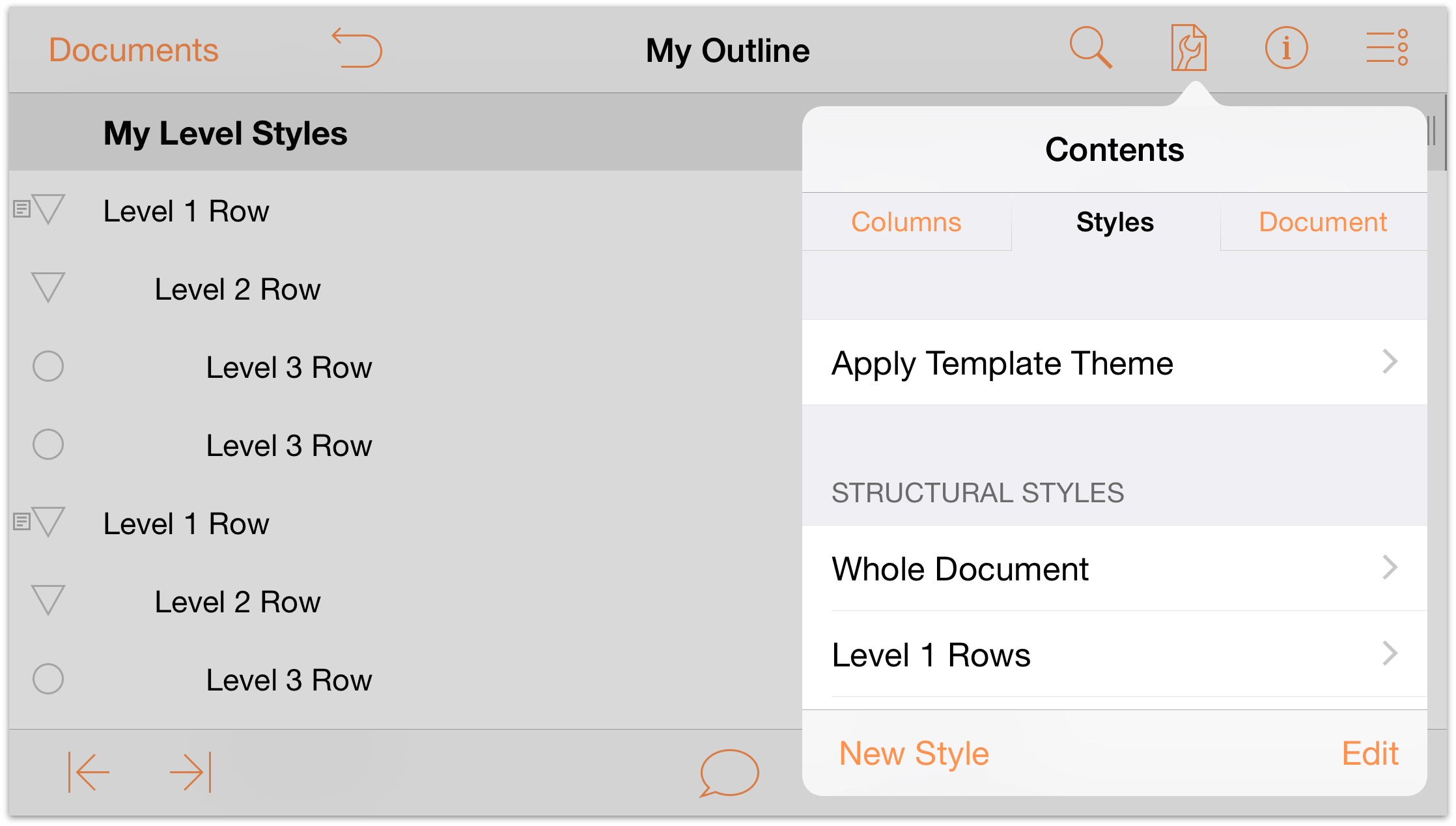
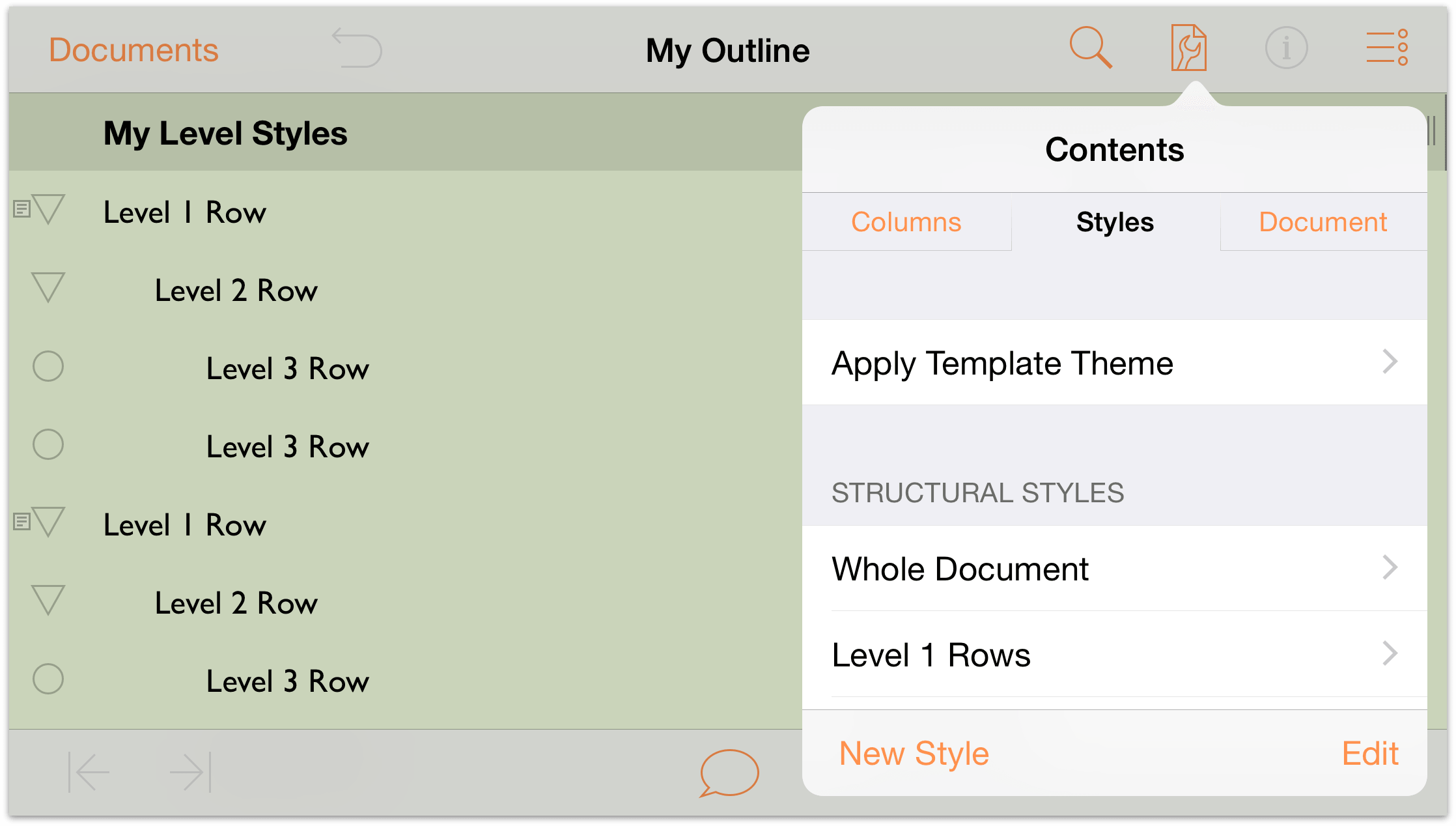
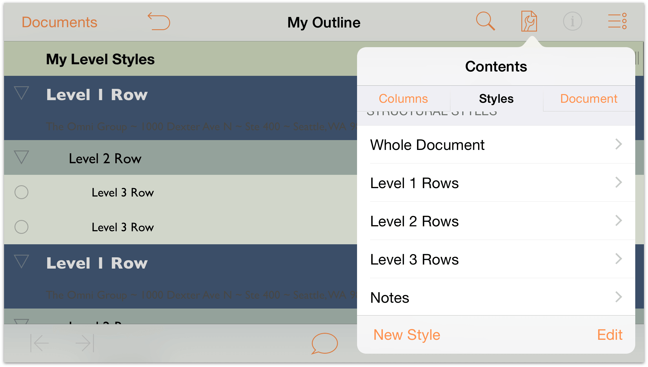
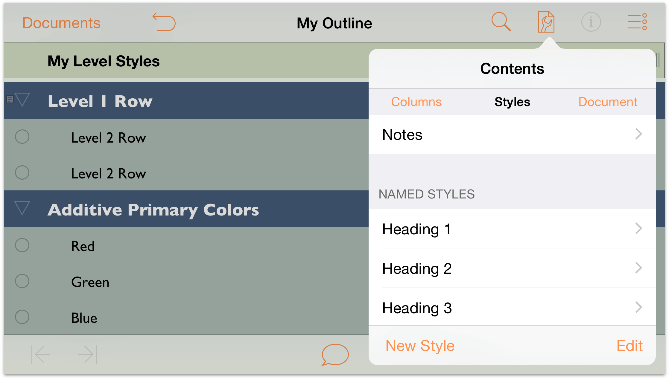
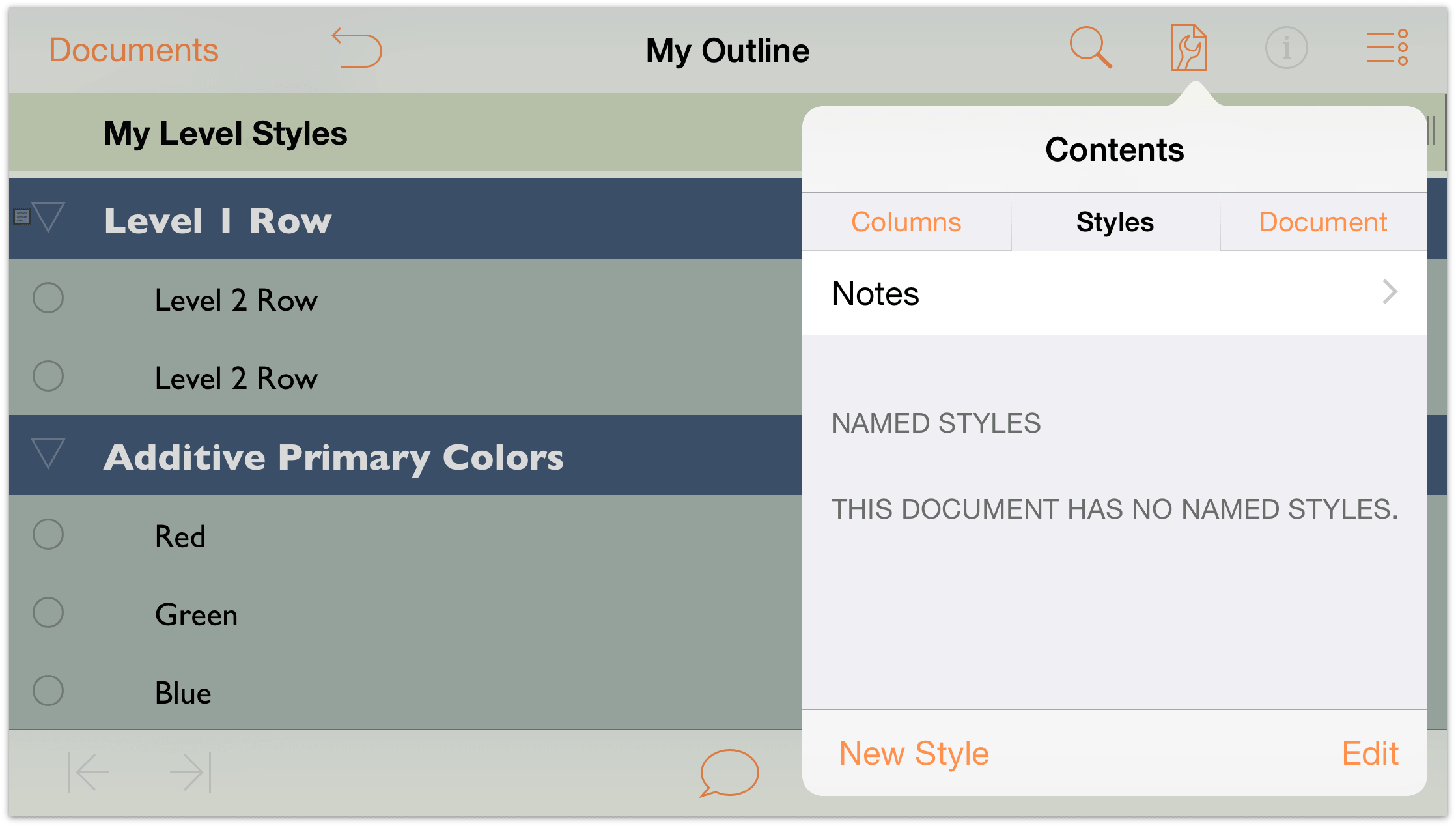
On iOS, you access the Styles pane via the Contents menu, which opens when you tap  .
.
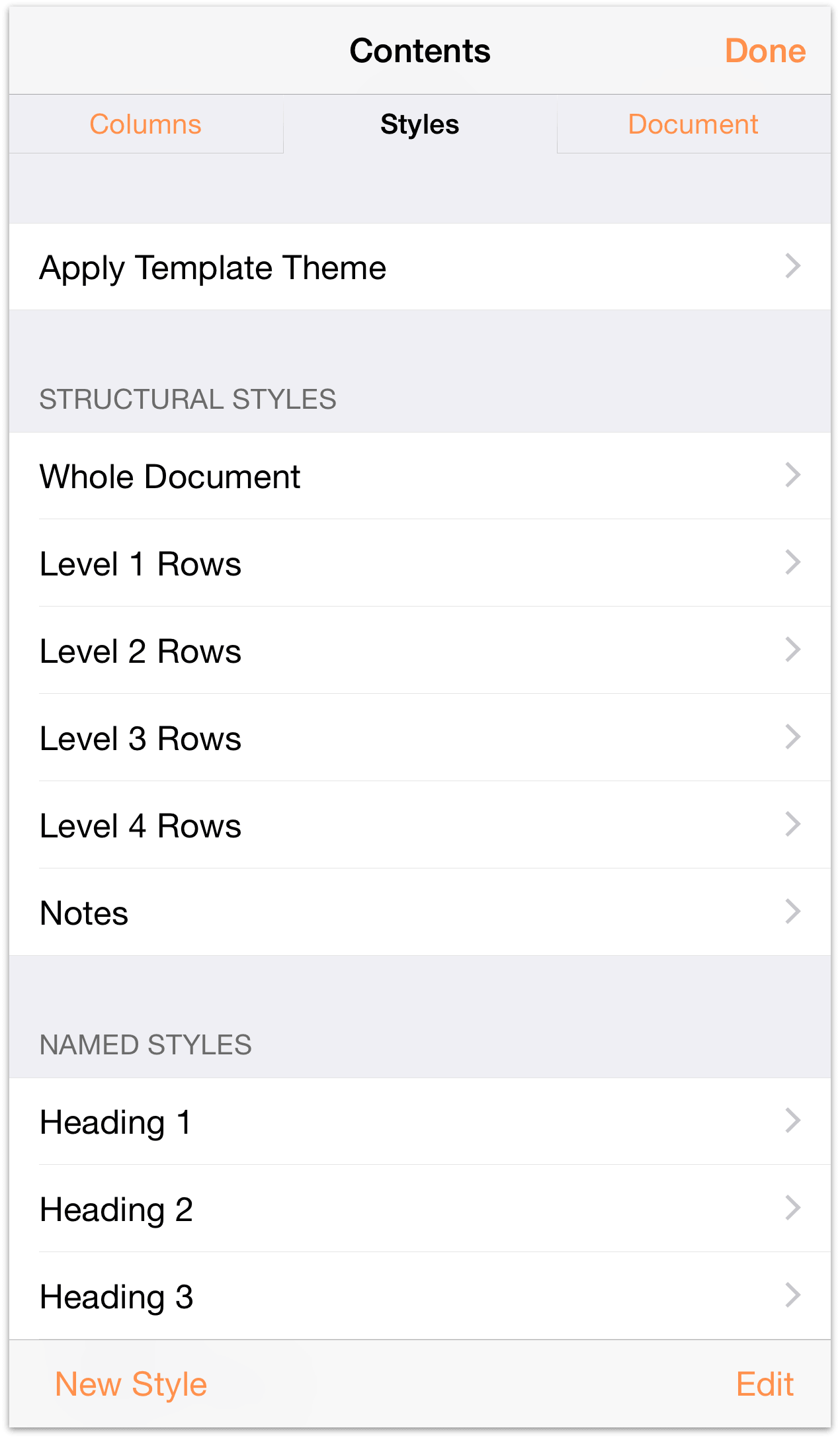
OmniOutliner has two types of styles:
Structural Styles reside in the top portion of the Styles pane, and consist of the Whole Document style, styles for the various numbered Level Rows (Level 1 Row, Level 2 Row, and so on), as well as styles for Column Titles, Notes, and the main Topic column.
Named Styles are found in the lower portion of the Styles pane, and can be applied to anything in your outline. When applied, a Named Style amends the existing Level Style with its own properties. For example, you could apply a Heading named style on top of a Level 1 Row style to make the text bigger or change the font. All of the templates come with some pre-defined Named styles, which you can use, delete, or edit to suit the needs of your outline.
The styles you set for the various Level Rows, headings, and text all stack on top of the styles you designate for the Whole Document. This is very much like the web’s Cascading Style Sheets (CSS), if you’ve ever used that for web design.
Using the Contents Menu on iOS
On iPad (in any device orientation) and iPhone 6 Plus when in landscape orientation, the Contents menu appears as a popup whenever you tap  .
.
However, on other iOS devices—and when holding the iPhone 6 Plus in portrait orientation—the Contents menu appears on a screen of its own, sliding in and out from the bottom of the screen.
If you use an iPhone 6 Plus, you may find it easier to work with the Contents screen in portrait mode rather than in the popup menu. Chances are you will still need to scroll through the styles list, but it’s nice to see that list in a less-constrained environment.
Setting the Whole Document Styles
Now it’s time to get to work on building out the styles for what will evolve into a new template you can use in OmniOutliner. Before you get started, take some time to think about how you would like your template to look:
- What colors should it have?
- What fonts and font styles are needed?
- Does it need status checkboxes?
- What about columns and layout?
- Are row handles necessary?
All of these—and more—can factor into how you design and create the template. As noted earlier, however, the Whole Document styles set the foundation for the rest of your template, so that’s where we’ll start.
- Tap
 , and then tap Styles to view the Styles pane.
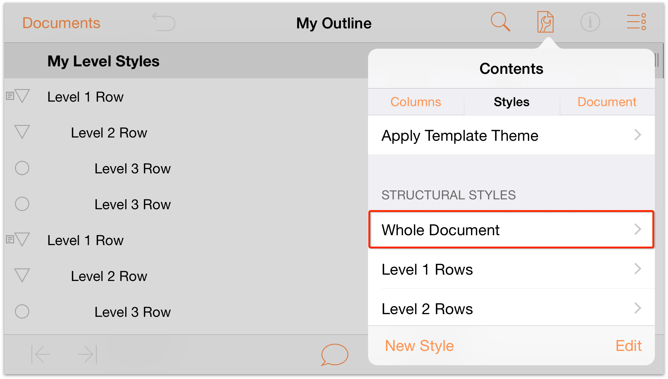
- Under Structural Styles, tap Whole Document to view the Whole Document styles.
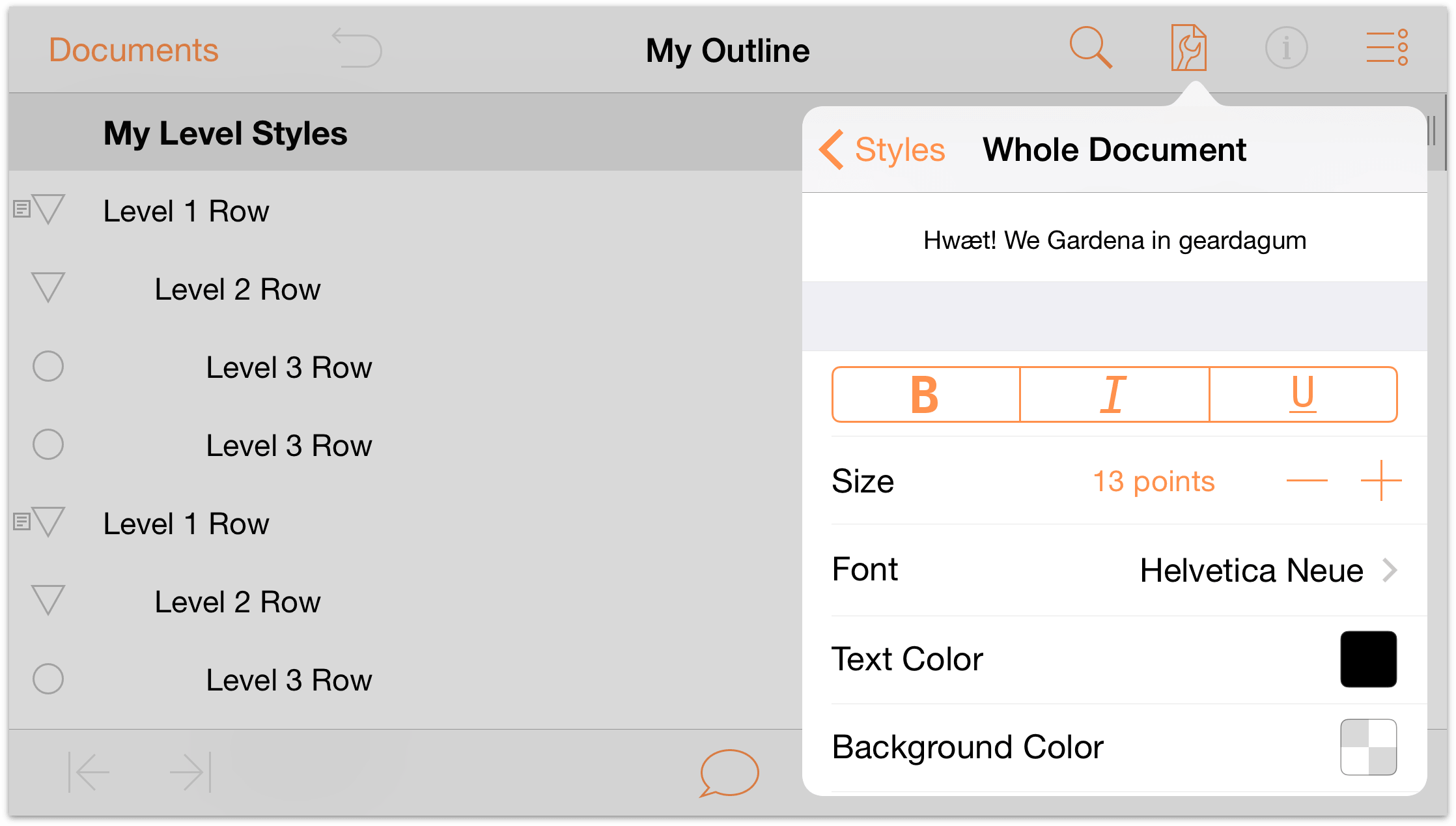
To set a base font for the document, tap Font, and choose Gill Sans; notice how all of the text in the outline changes to the new font selection.
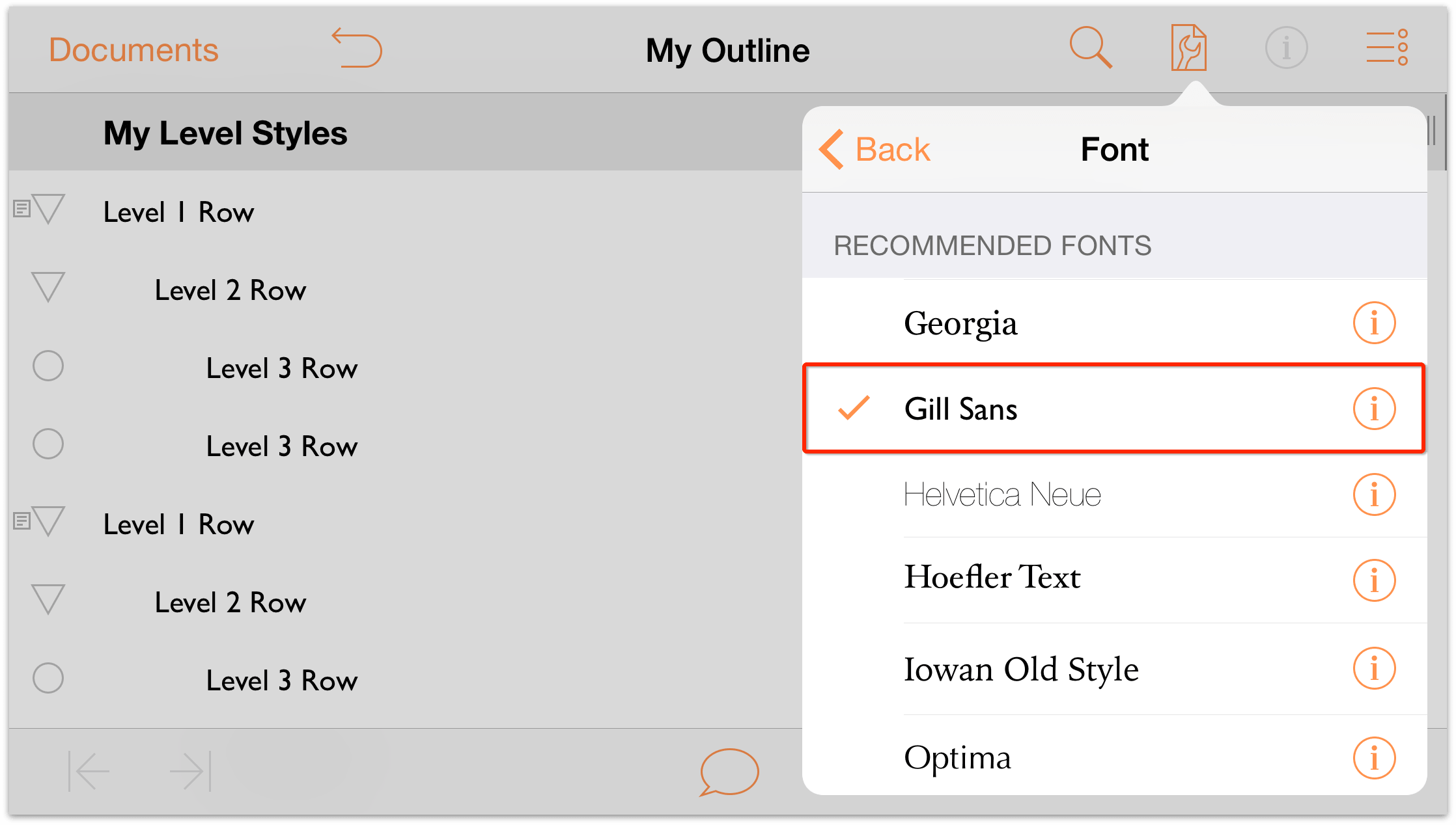
- Tap Back to return to the Whole Document styles view.
- In the Size selector, tap
 once to increase the base font size to 14 points.
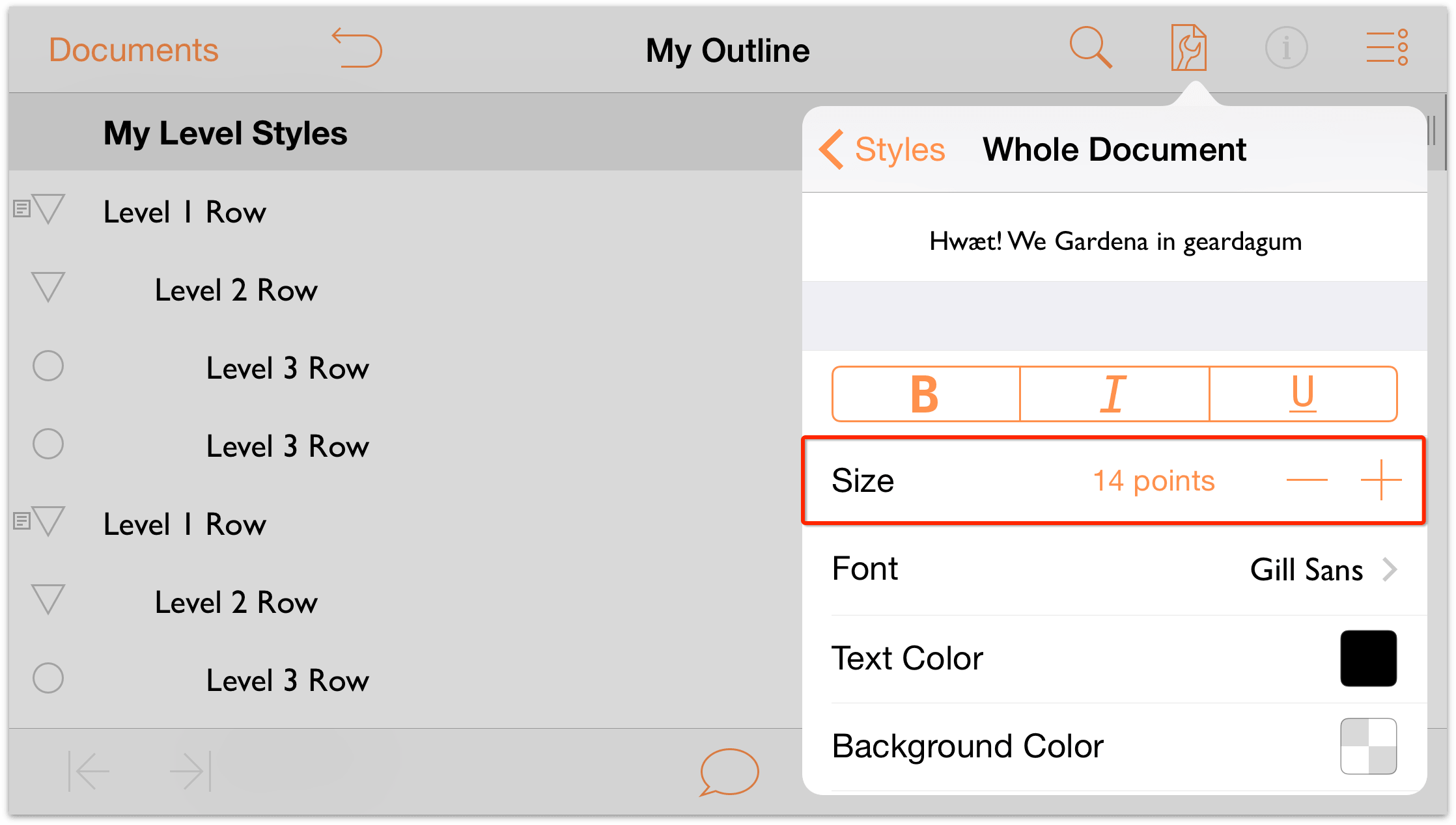
Now let’s set a background color for the Whole Document. Scroll down in the menu until you see Background Color. Tap
 to open the color pickers.
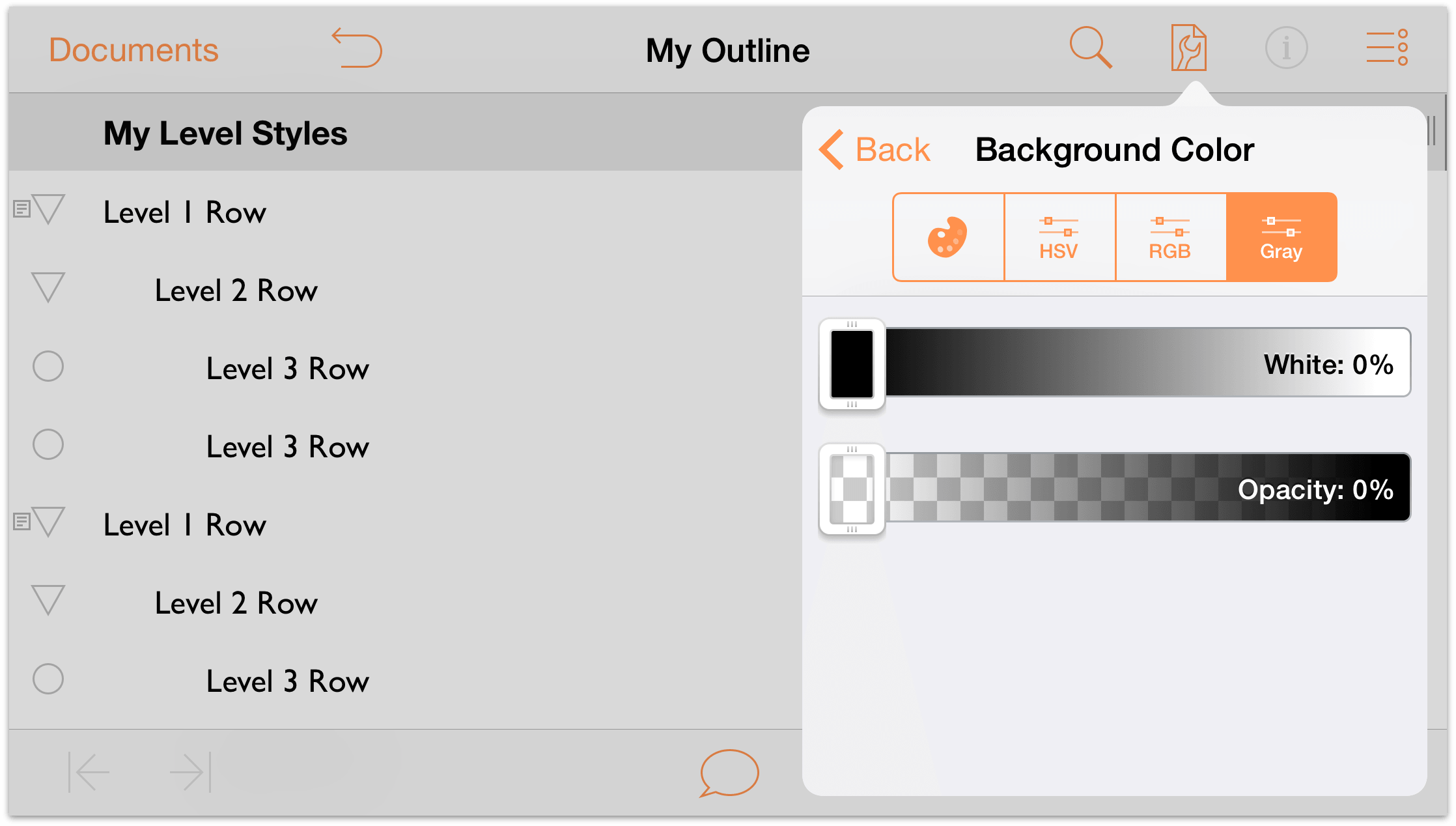
Along the top of the Background Color pane you’ll see the following row of buttons:

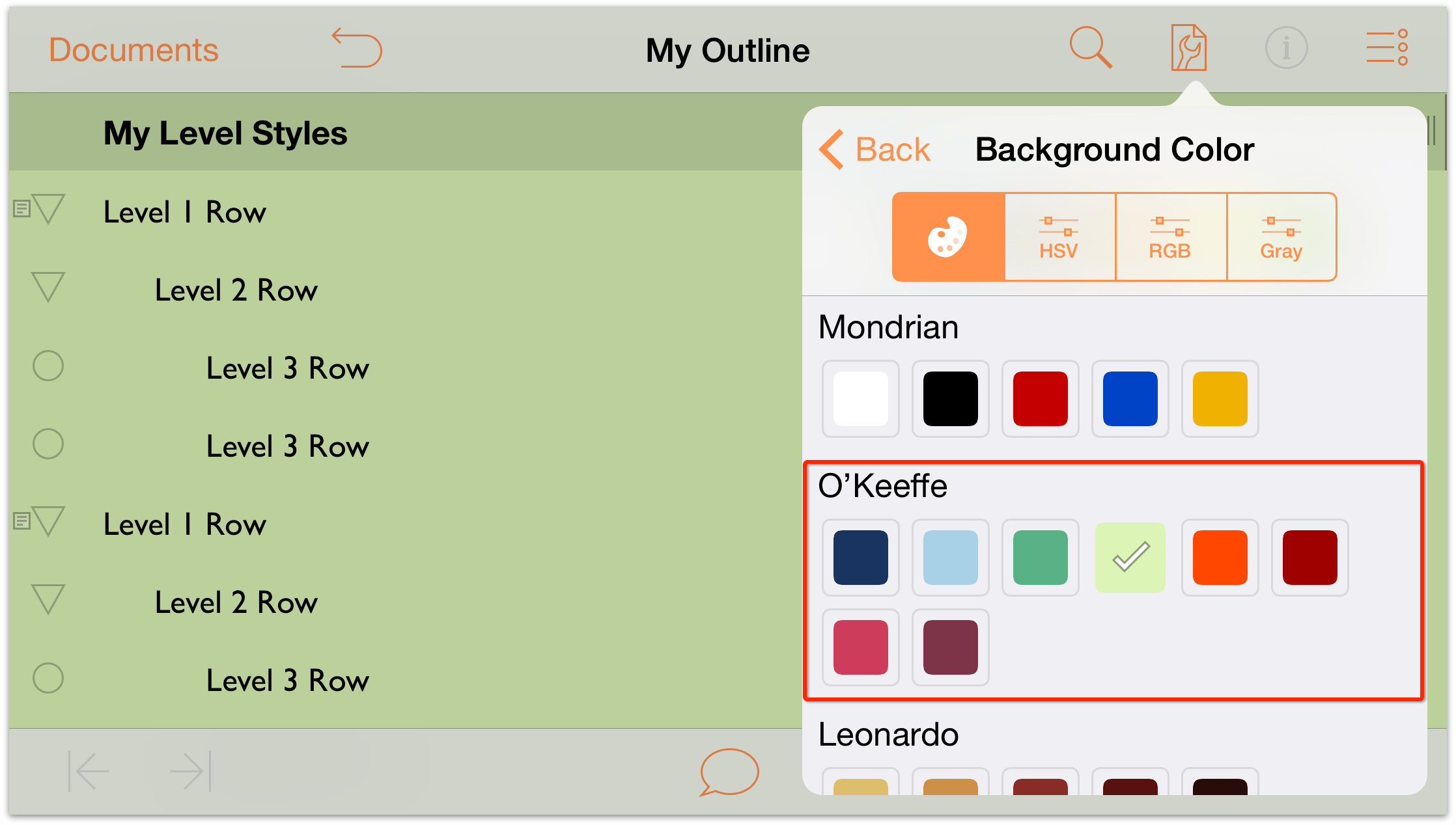
Tap the first button to view the available Color Palettes. The Color Palettes are based on the prominent colors used by some artists whose names you might recognize. For this tutorial, we’ll use the O’Keeffe palette; however, if you see another that’s more appealing, feel free to use that.
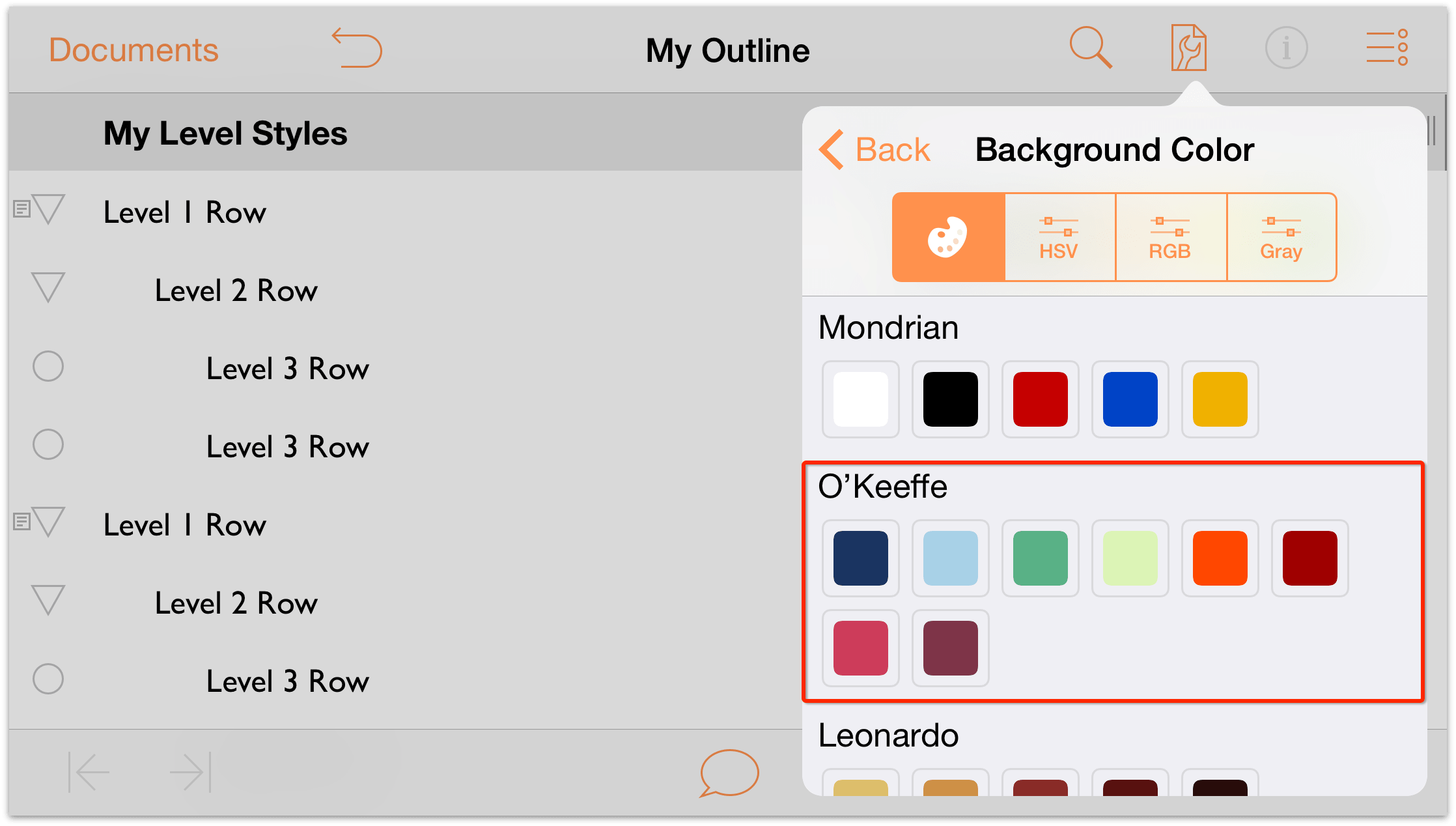
Tap the fourth tile in the top row to apply a light green color as the Background color.
Notice how the green background color also spreads beneath the Column Header row, which looks a shade darker. This is because the Column Header row sits on a higher layer above the background. And judging from its appearance, it looks like the Column Header row has its own background color, but with some opacity to let the background color pop through.
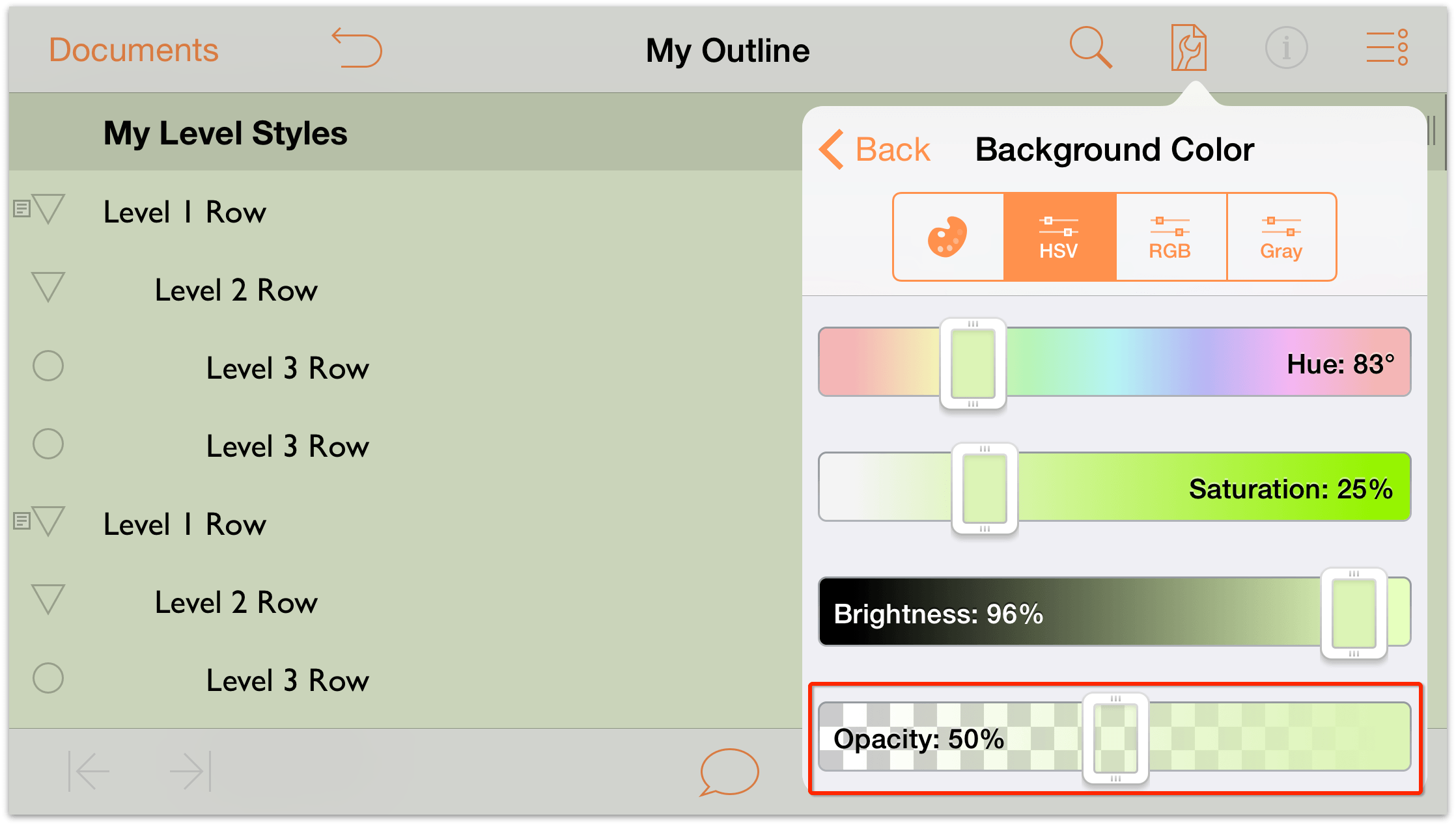
And speaking of opacity, that green background color is a little darker than we’d like, so let’s change that. Tap the HSV button in the color controls. You’re presented with four different sliders which you can use to adjust the Hue, Saturation, Brightness, and Opacity.
Tap and drag the Opacity slider to the left and set the background color’s opacity to 50%.
- At the top of the menu, tap Back to return to the Whole Document styles.
Scroll down in the menu, and tap the Align Left button.
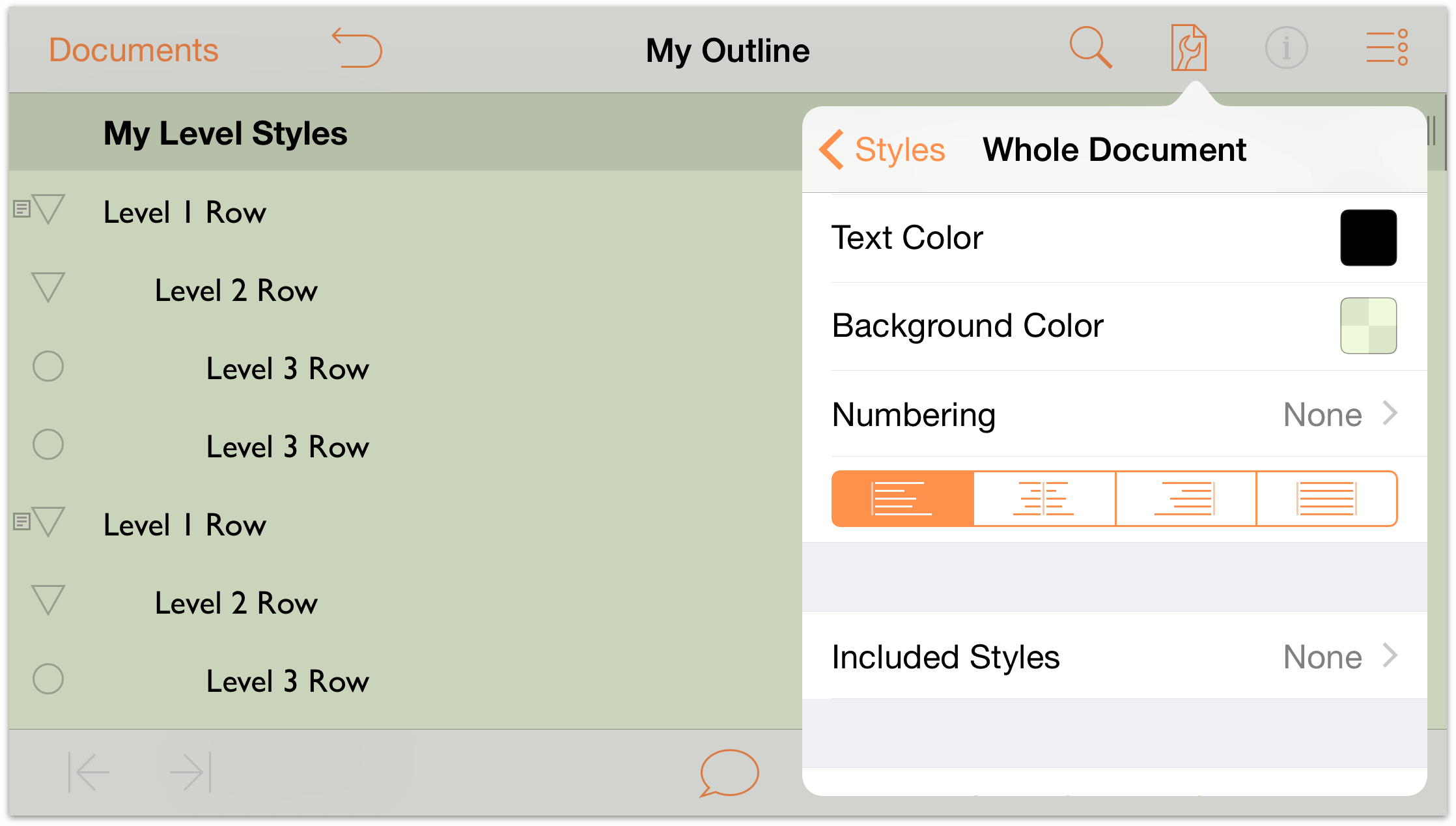
The outline now has a light green background, and its default font type and size is 14 point Gill Sans.
Setting the Row Level Styles
Now it’s time to turn our attention to the row levels. With the Whole Document styles set, we’ll use the same font (Gill Sans), but set different sizes for each row style. We’ll also add a background color to a couple of the rows so you can see how to layer colors on top of the background color specified in the Whole Document style.
Let’s get started!
Tap
 , and then tap to choose the Styles pane.
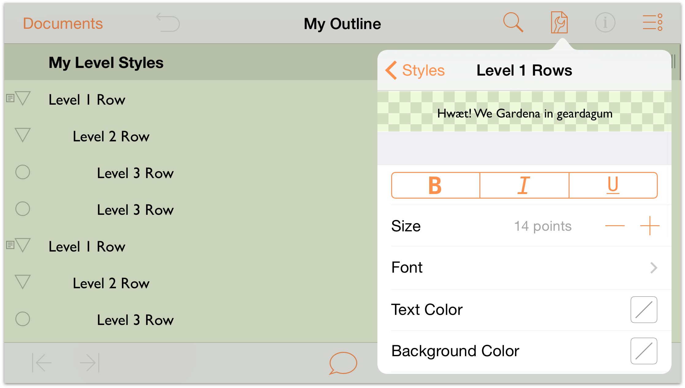
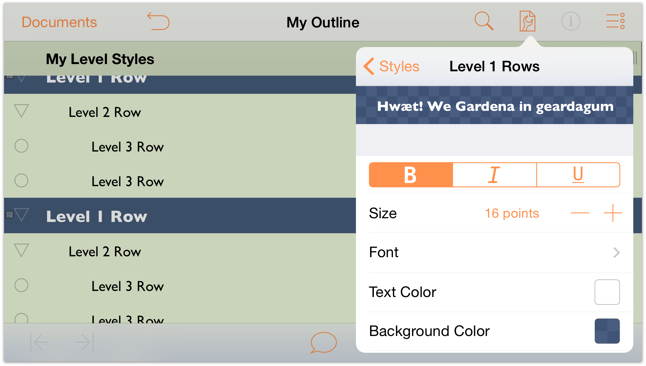
Under Structured Styles, tap to choose the Level 1 Rows styles.
Note
At the top of the Styles pane, you’ll see a bar that spans the width of the pane. This is a preview of the styles. As you change the style settings for the Level 1 Row, keep an eye on this preview so you can see how the rows will eventually look.-
In the Style pane, do the following:
- In the row of buttons, tap B to make all Level 1 Row text bold.
- Size: Increase the type size to 16 points.
Text Color: Change the color to White.
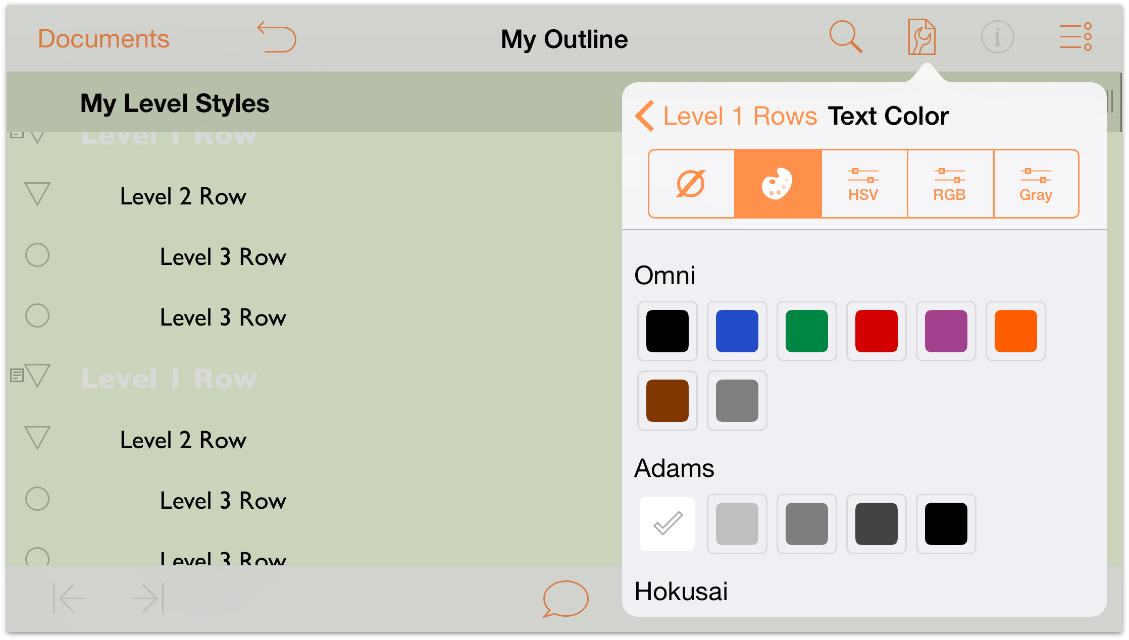
Background Color: Change the background color of the Level 1 Rows to the dark blue color under the O’Keeffe palette.
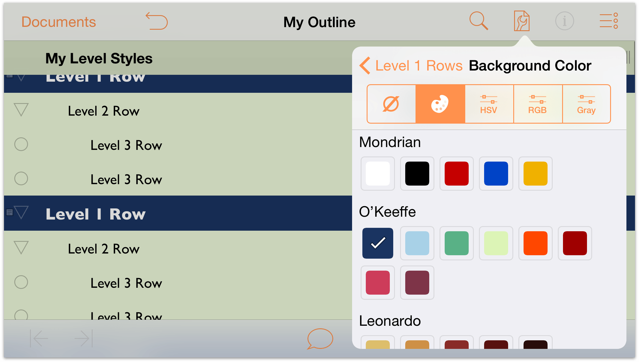
While in the Color pane, tap to choose the HSV color controls and set the background color’s Opacity to 80%.
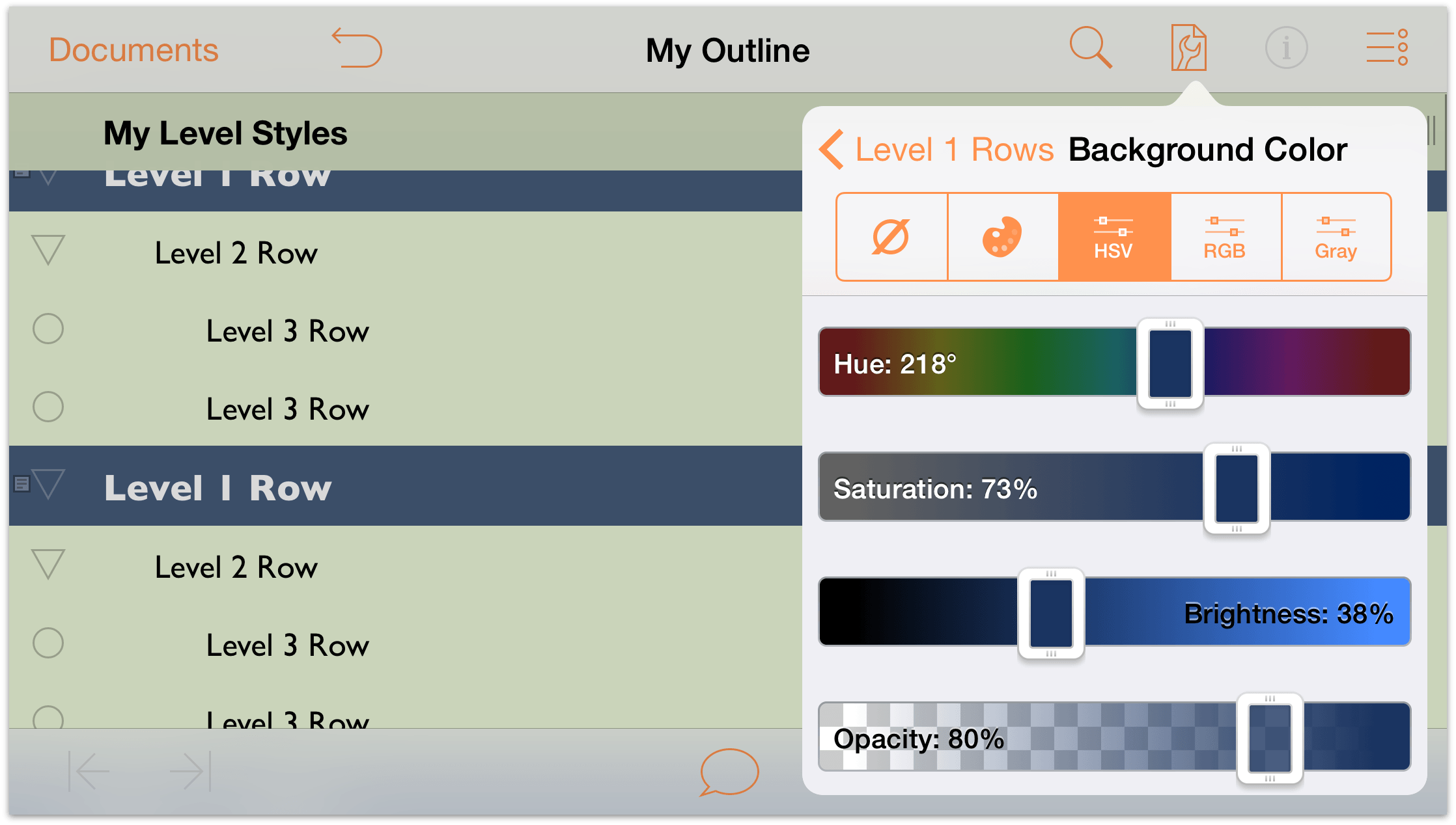
At the top of the Contents pane, tap Level 1 Rows to return to the Level 1 Rows style pane and review your changes.
Your document should look similar to the following:
-
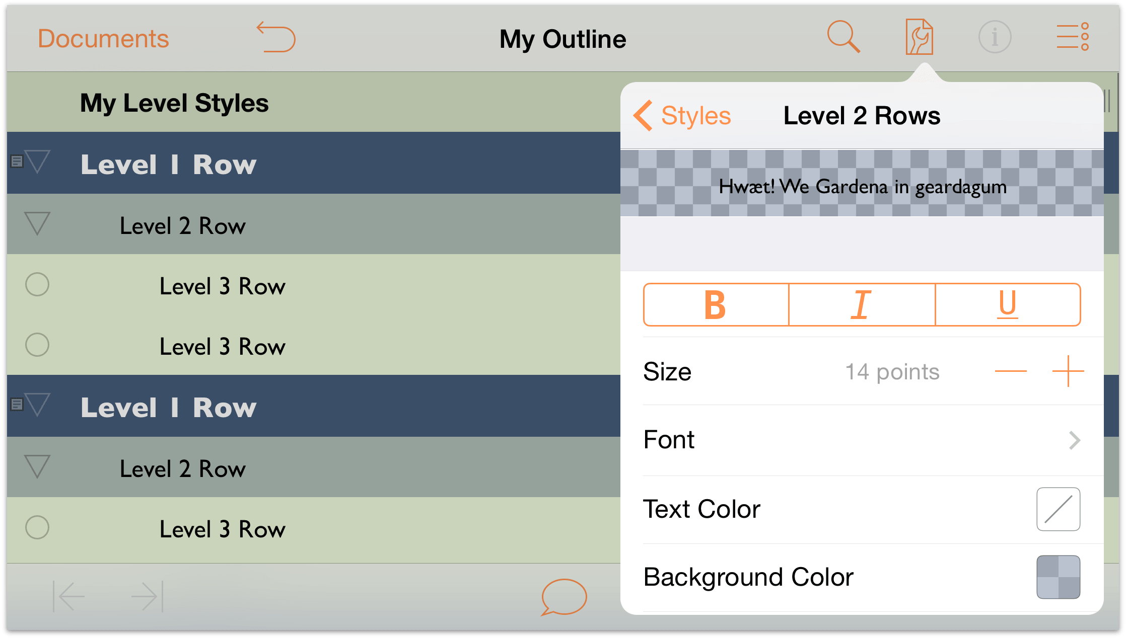
At the top of the menu, tap Styles to return to the listing of styles. Under Structural Styles, tap to choose Level 2 Rows.
In the Level 2 Rows styles pane, make the following changes:
- Background Color: Change the background color to the same dark blue color found in the O’Keeffe palette, and change its opacity in the HSV controls to 30%.
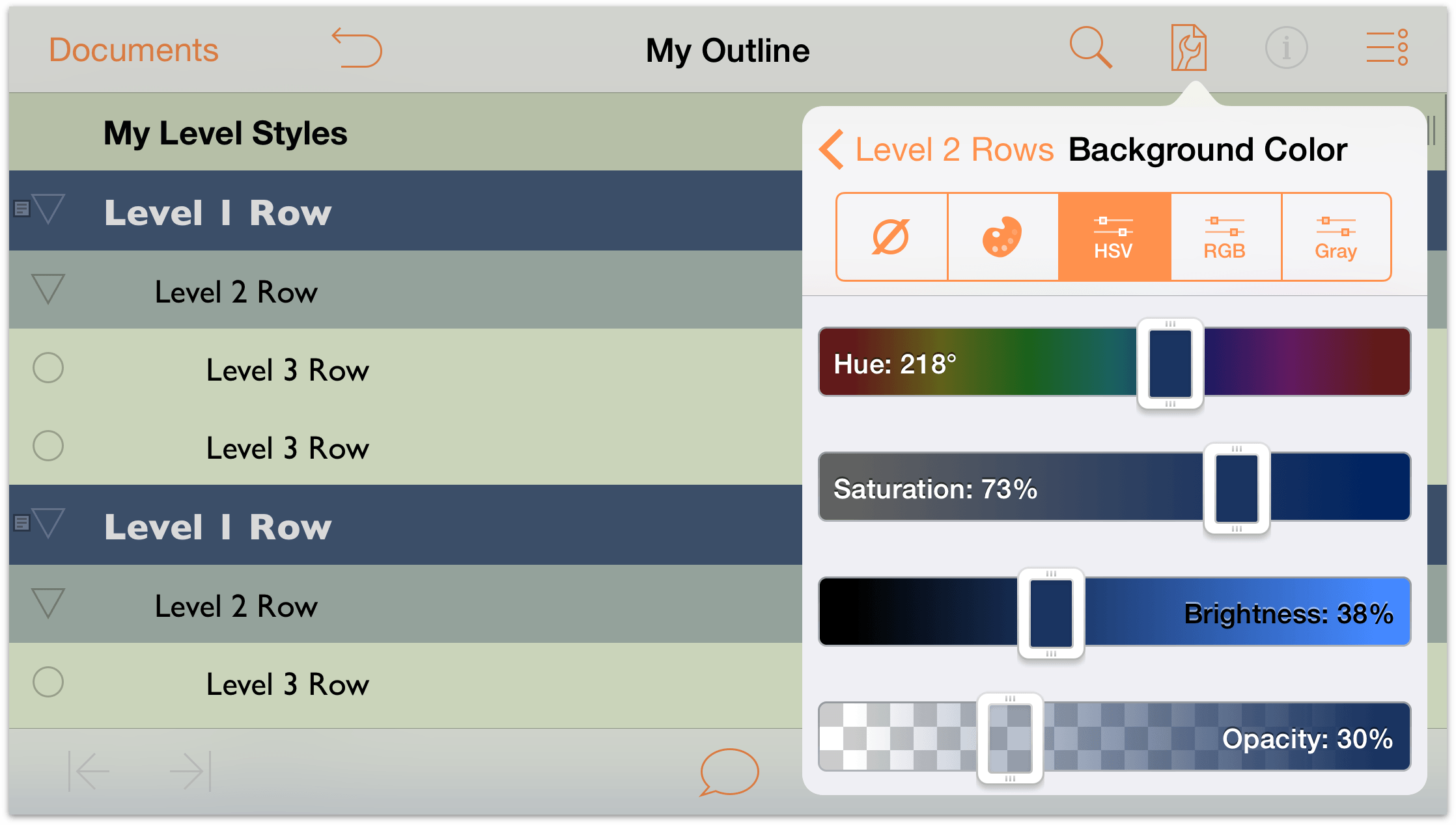
The Level 2 Rows style pane should be similar to the following:

And your outline should look similar to the following:
Notice how giving the Level 2 Rows’ background color a 30% opacity makes the color look bluish-green. By setting the opacity at a lower percentage, the background color you set for the Whole Document style starts to bleed through.
Tip
Use color opacity—available in the HSV, RGB, and Gray color panes—to blend row colors with the Whole Document’s background color. You can get really creative with just two colors and differing levels of opacity.- Background Color: Change the background color to the same dark blue color found in the O’Keeffe palette, and change its opacity in the HSV controls to 30%.
- At the top of the menu, tap Styles to return to the listing of styles. Under Structural Styles, tap to choose Level 3 Rows.
In the Level 3 Rows style pane, make the following changes:
- Size: Change the type size to 12 points.
- Background Color: Under the Adams color palette, choose the White color swatch. Then, tap HSV and change the Opacity to 50%. This gives the Level 3 Rows a light-whitish-green background color.

The Level 3 Rows style pane should be similiar to the following:
And your outline should look similar to the following:

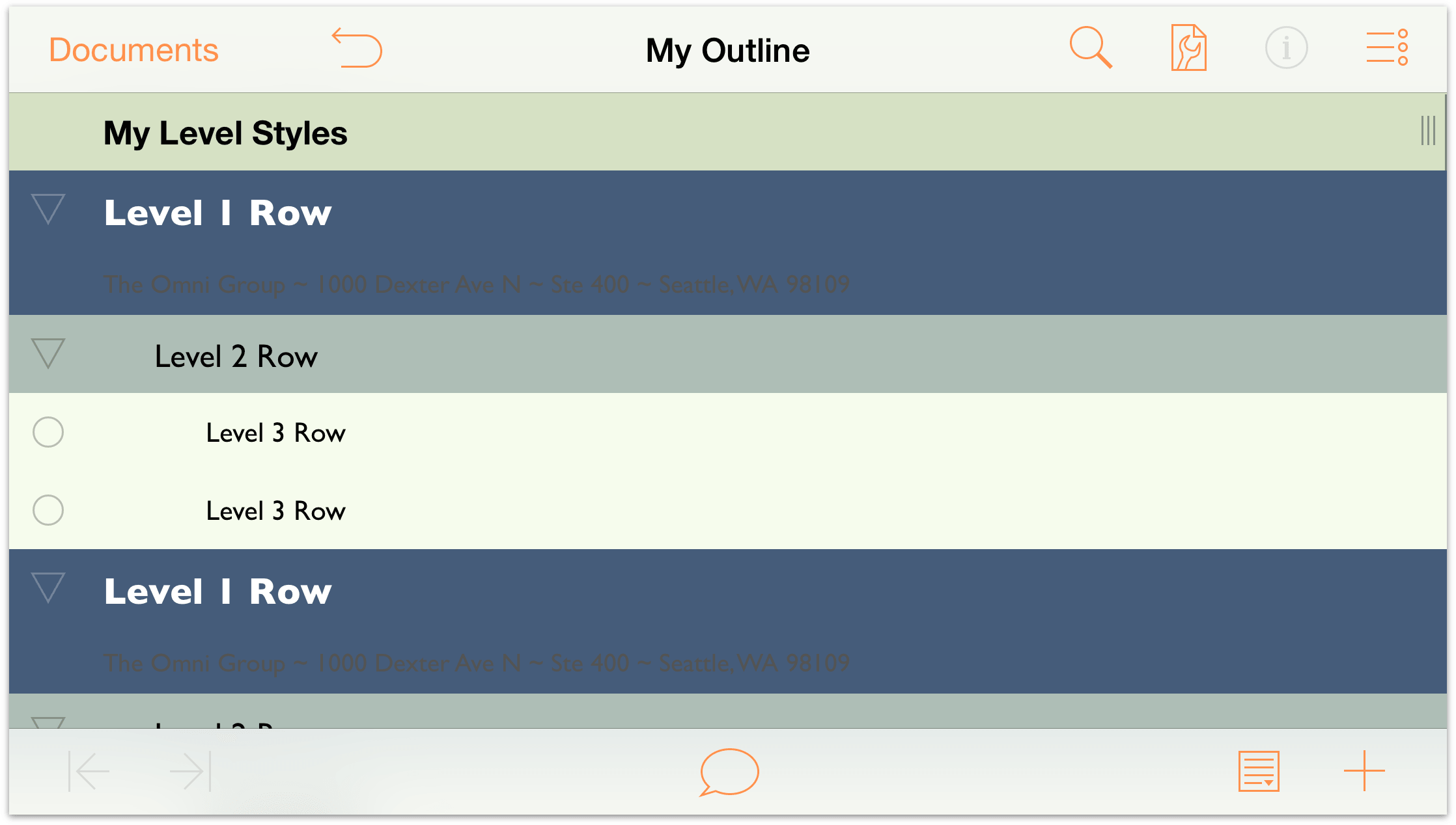
Now let’s take a look at the Notes you added to the Level 1 Rows earlier in the chapter. Start by tapping  in the toolbar at the bottom of the screen. When you do, two additional buttons fly out. The button on the left hides all Notes, and the one on the right reveals all Notes; tap the right button to expand all Notes.
Ew, that doesn’t look good at all! The color of the Note text is black, and against that dark blue background, they are totally unreadable. We’ll need to fix that.
Let’s get back to work!
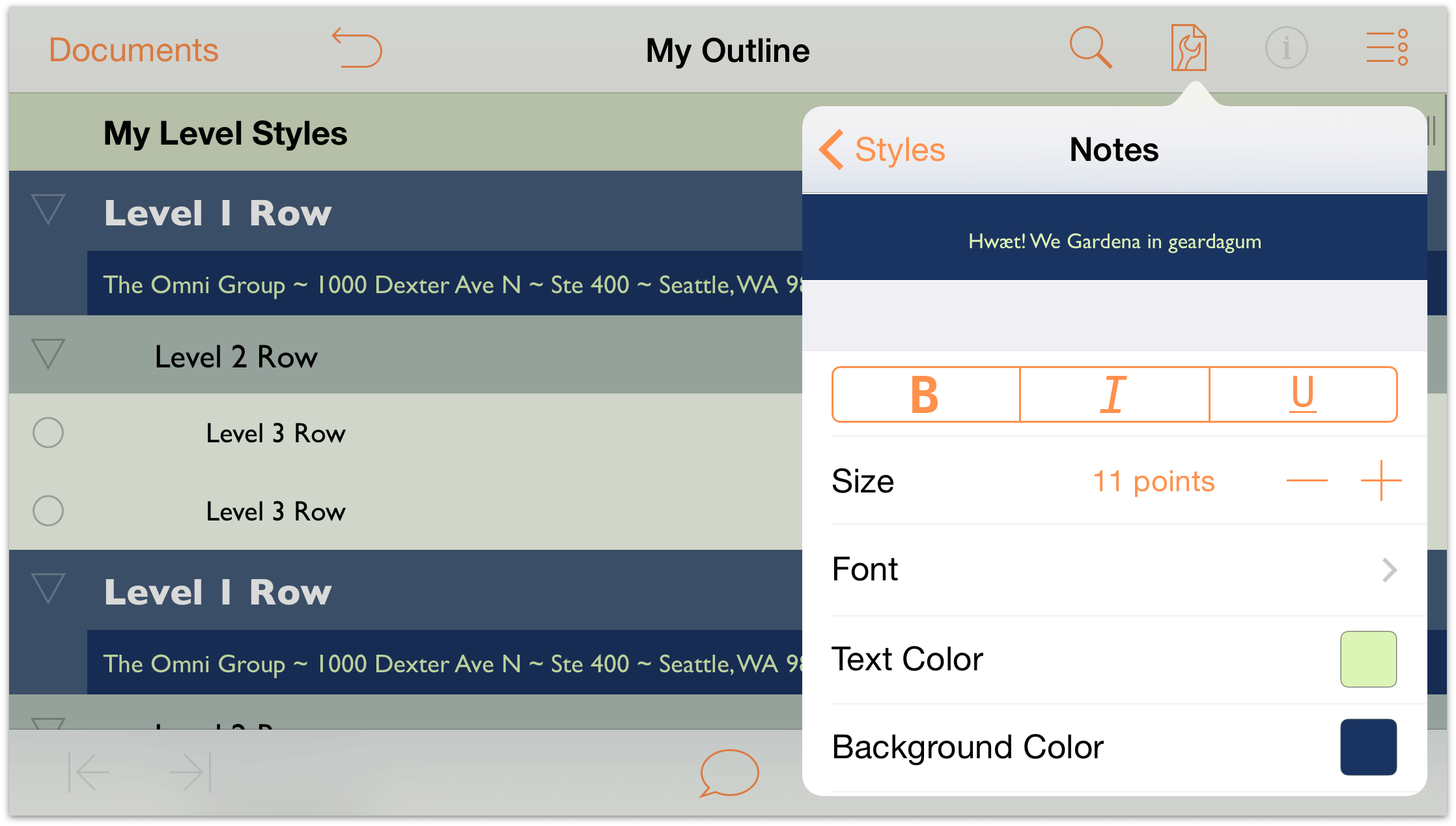
At the top of the menu, tap Styles to return to the listing of styles. Under Structural Styles, tap to choose Notes.
In the Notes style pane, make the following changes:
Text Color: Change the text color to the same light green color from the O’Keeffe palette that you used for the Whole Document’s background color, but don’t change its opacity.
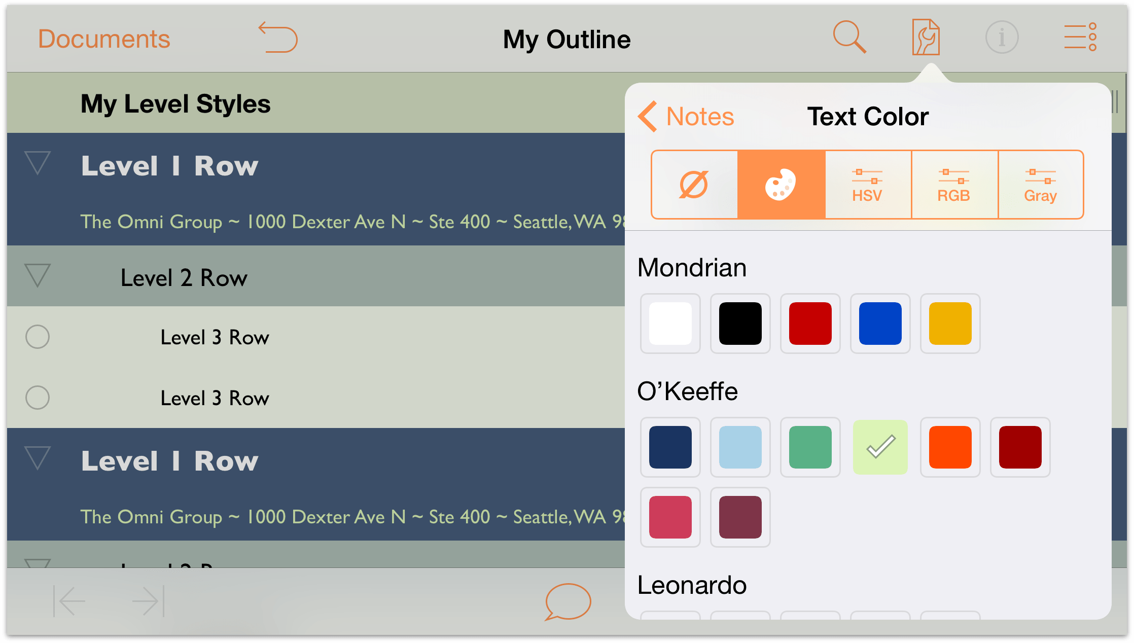
Ah, that looks better already!
Background Color: Change the Background Color to the same dark blue color from the O’Keeffe palette that you used as the background color for the Level 1 Rows. As before, don’t adjust the color’s opacity; you want this to be darker so the Notes really stand out against everything else in the outline when revealed.
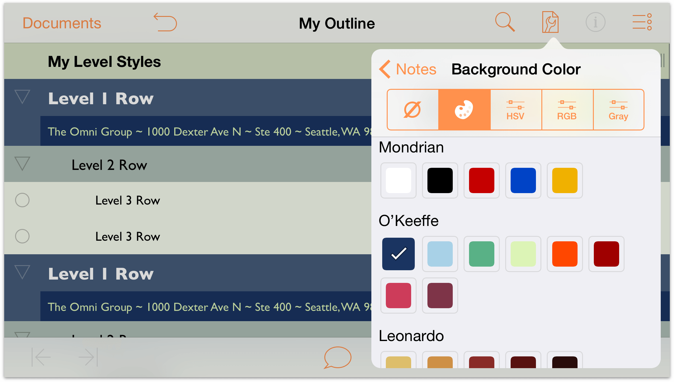
The Notes style pane should be similar to the following:
And your outline with the Notes revealed should look similar to the following:
Much better!
Creating New Named Styles
Finally, let’s create some new Named Styles that we can use on the Red, Green, and Blue text under the Additive Primary Colors row.
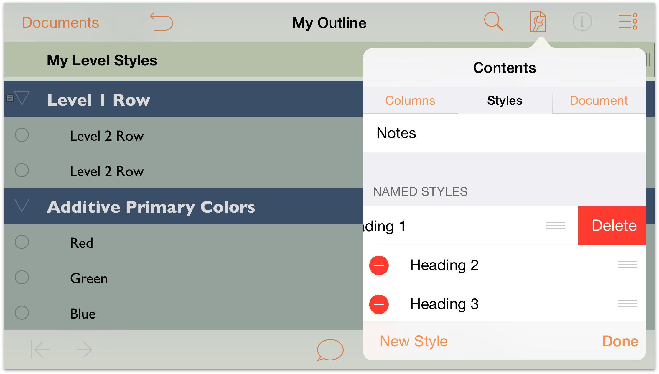
Start by deleting the Named Styles that already exist in the template; follow these steps:
Tap
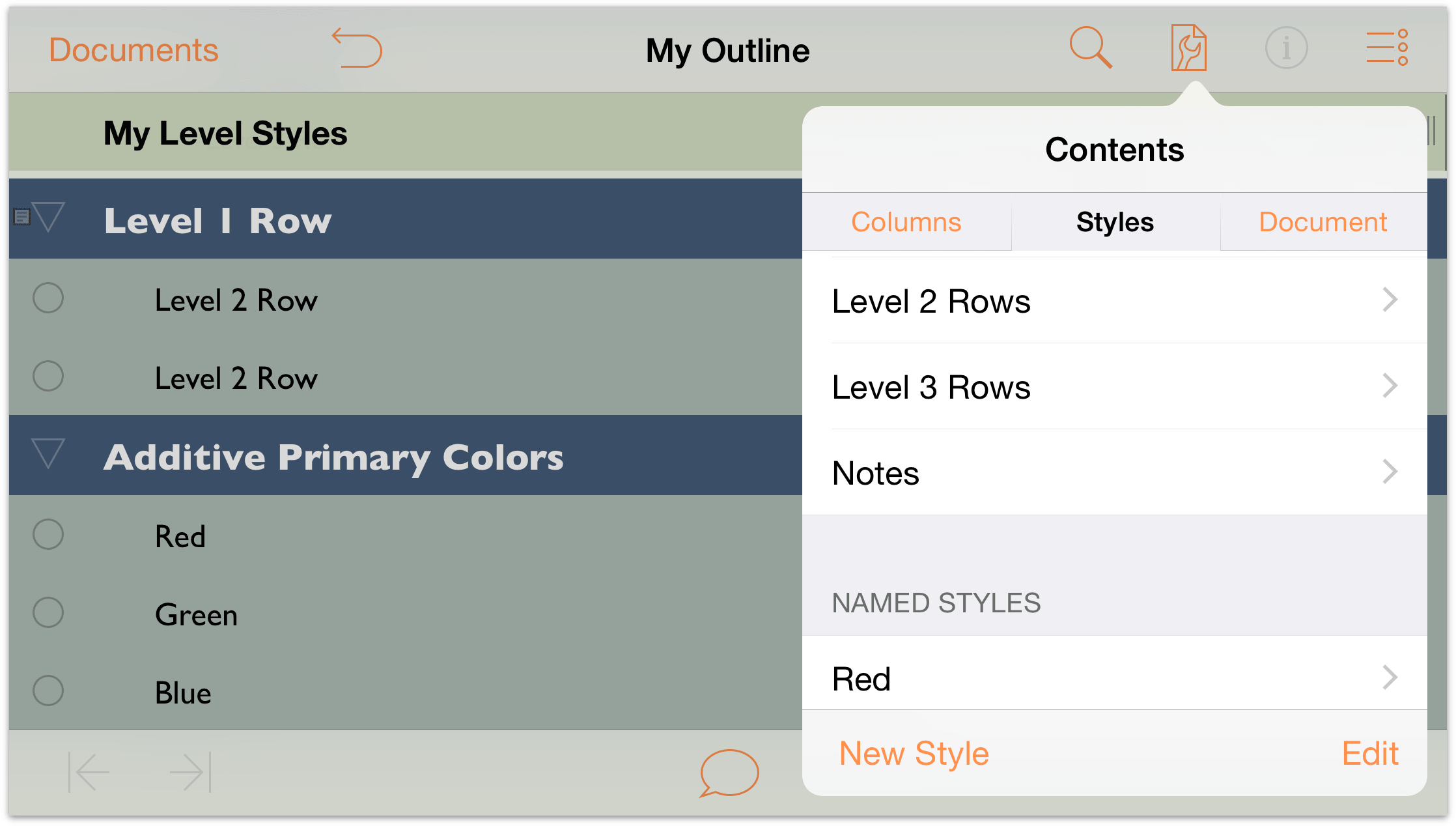
 and then tap Styles to see the list of styles. Scroll through the list until you find the section of Named Styles.
At the bottom of the Contents menu, tap Edit.
The Named Styles gain a red circle with a minus sign along the left edge. Tap this button twice to reveal the Delete button on the right edge.
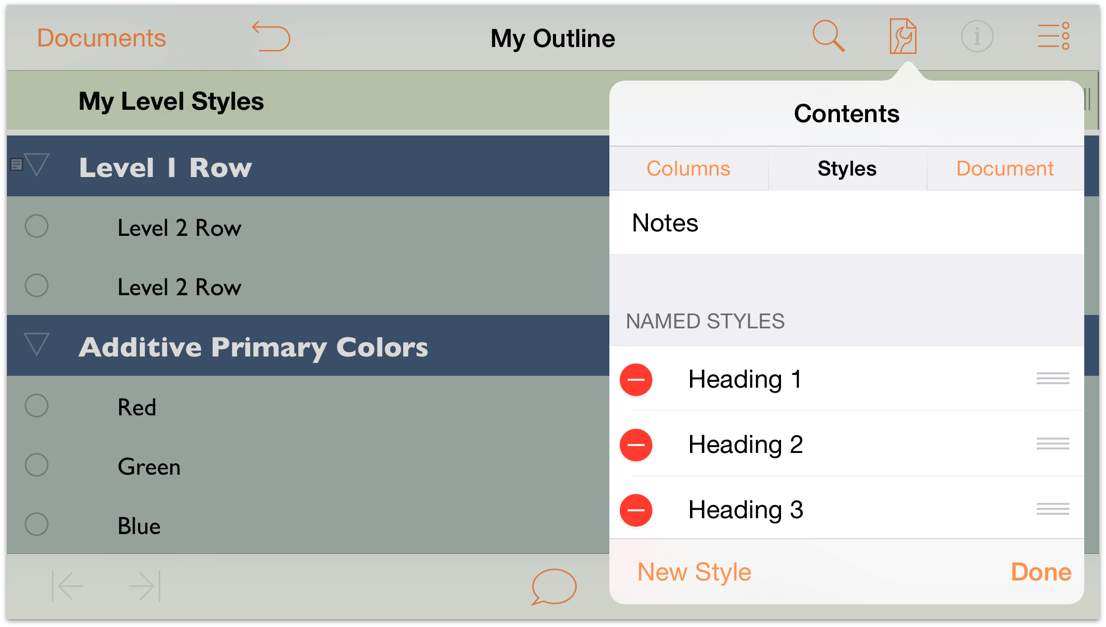
Tap Delete, and then repeat the process for all of the Named Styles.
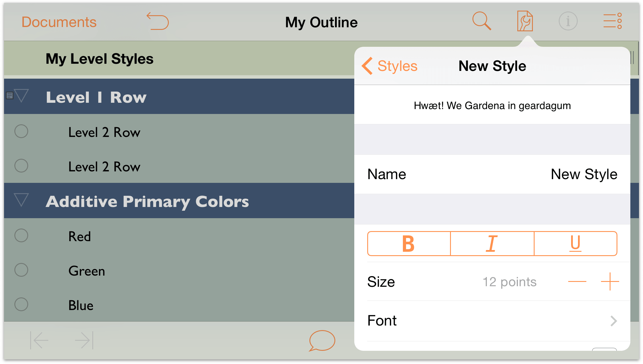
When you have finished, your outline should have no Named Styles in its repertoire. A clean slate, so to say. Time to replenish your Named Styles by creating three new ones. Start by tapping New Style at the bottom of the Styles pane.
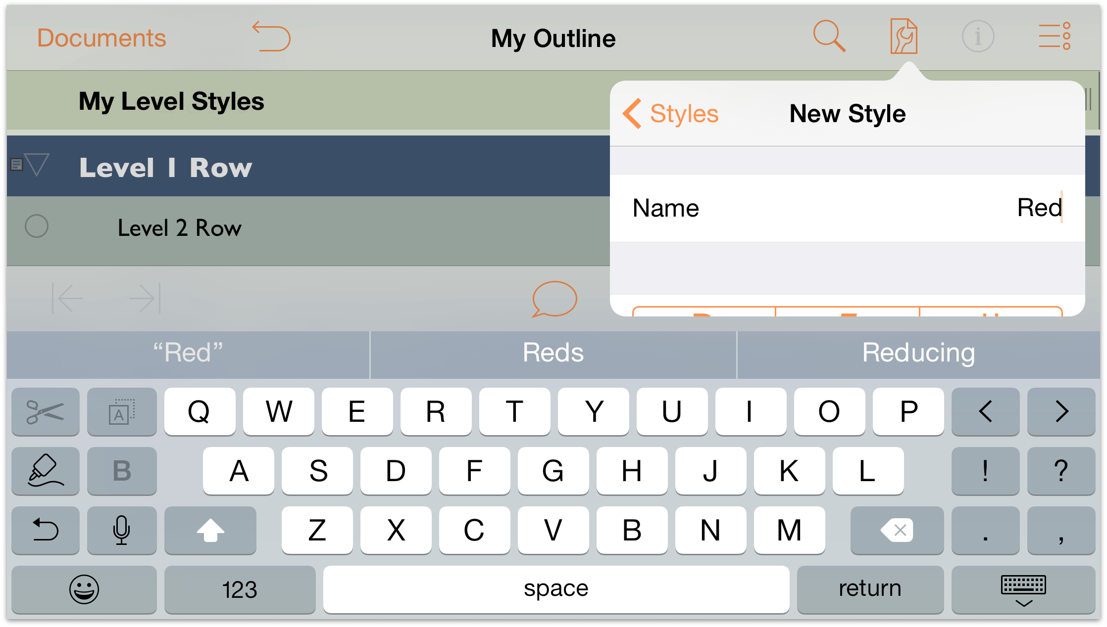
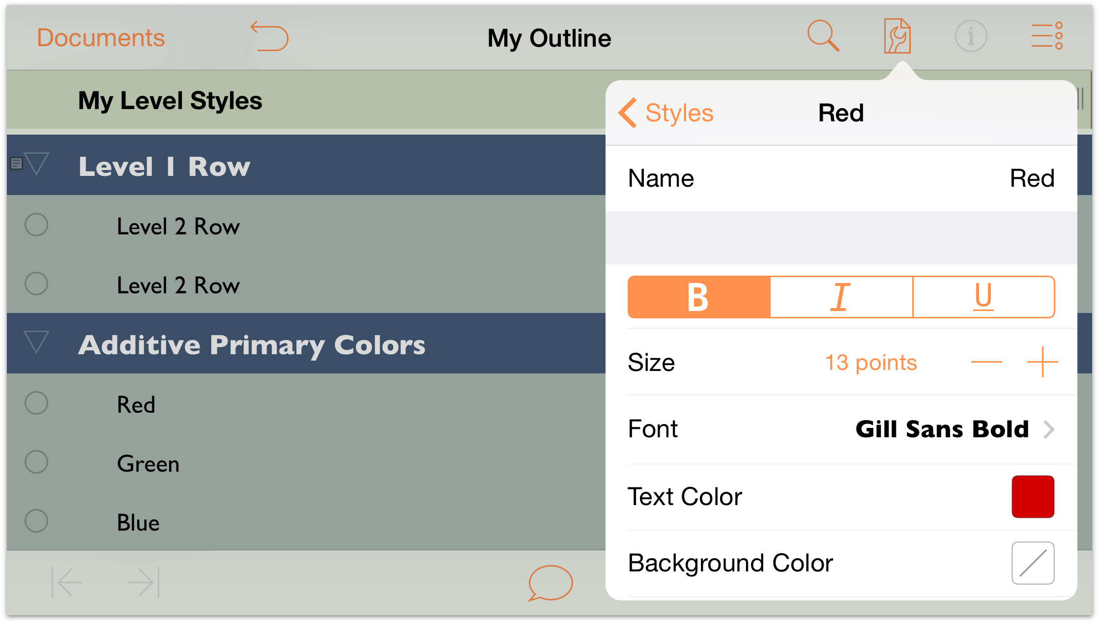
In the Name field, tap to select New Style, and enter Red as the name of this new Named Style.
Tap Styles at the top of the menu to return to your list of available styles.
Tap to select the Red Named Style so you can change its settings.
-
Make the following changes to the Red style:
- Change the font to 13 point Gill Sans Bold.
- Change the Text Color to red, either using the preset color palettes or blend your own using the HSV or RGB controls.
When you have finished, the Red styles pane should look similar to the following:
-
Now repeat Steps 4 through 7 and add two more Named Styles: Green and Blue. Your list of Named Styles should appear as follows:
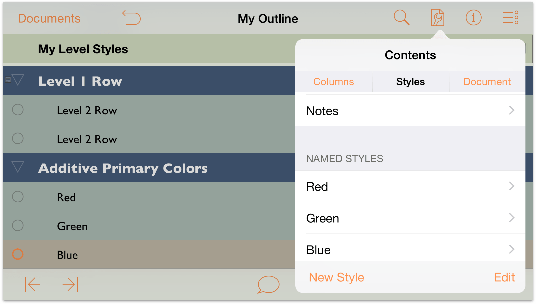
To apply a Named Style, first tap to select the row that you want to style, and then tap
 to open the Info menu.
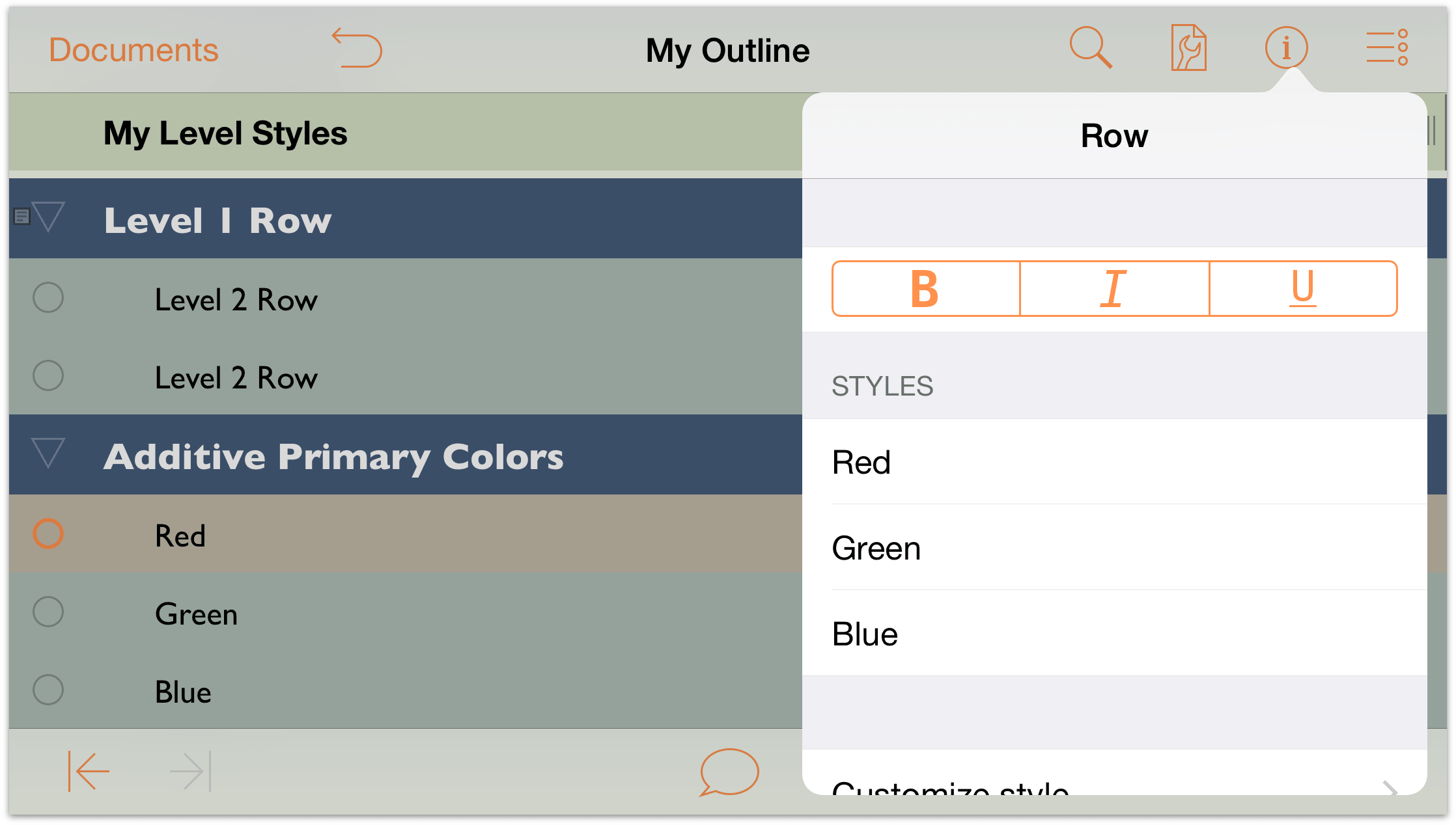
In the list of Styles, tap the Red Named Style to apply its properties to the selected row.

Repeat Steps 9 and 10 to apply the Green and Blue Named Styles to their respective rows. When you have finished, your outline should look similar to the following:
Creating and Using a Template
Up to now, you’ve done a lot of work on this one OmniOutliner document, and it’d be a shame to have to redo all of that design work again. When you find a design that you really really like, you can save the OmniOutliner file as a template and then later create new documents with that template, or apply its styles as a “theme” to an existing document.
Before you create the template, the first thing you should probably do is change the name of the file from My Outline (OmniOutliner’s default filename for new outlines) to something more appropriate, such as Green and Blue Levels.
To change the name of the outline you have been working on:
- Tap the filename at the center of the navigation bar at the top of the screen.
- Delete the name My Outline and enter Green and Blue Levels as the new filename.
Here’s what you need to do to create the template:
- In the navigation bar, tap Documents to save and close the outline you have been working on. This returns you to the Local Documents folder.
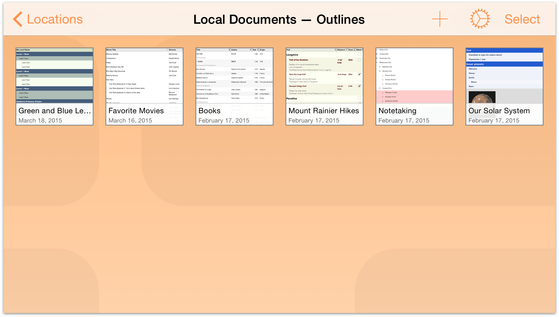
- In the navigation bar, tap Select.
- Tap to highlight the Green and Blue Levels file.
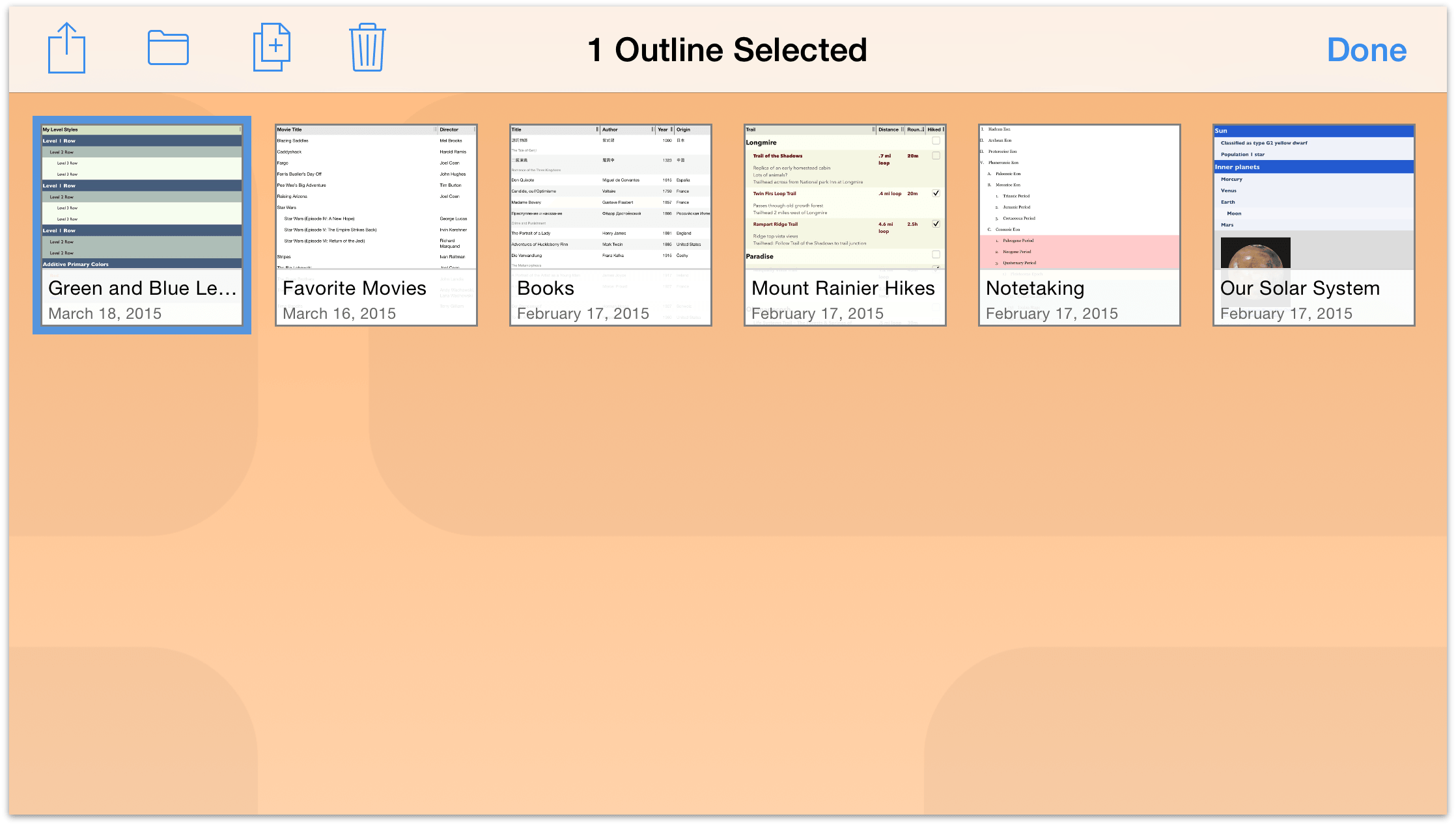
- In the navigation bar, tap
 , and then tap to choose Create Template from Outline in the menu that appears.
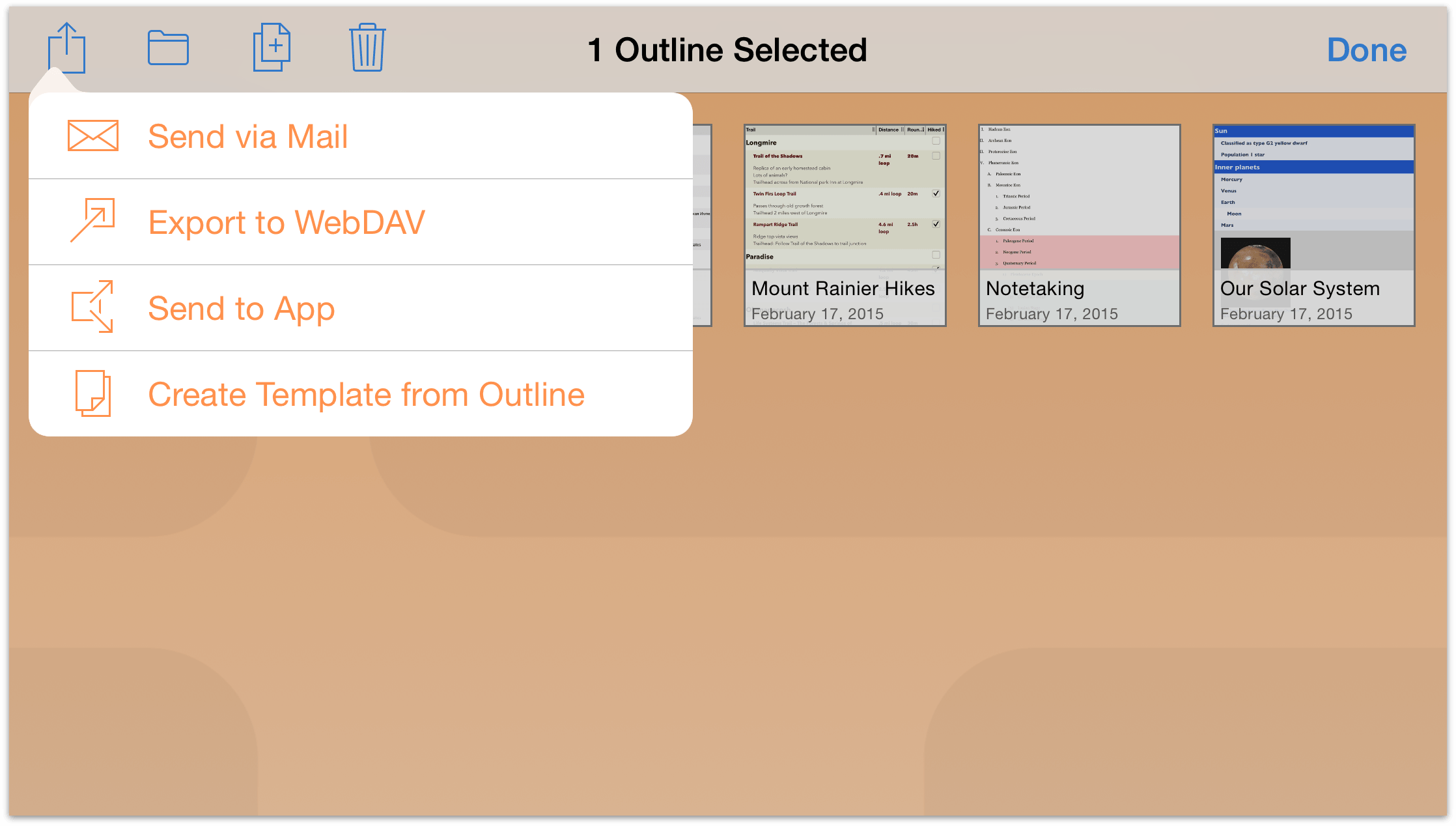
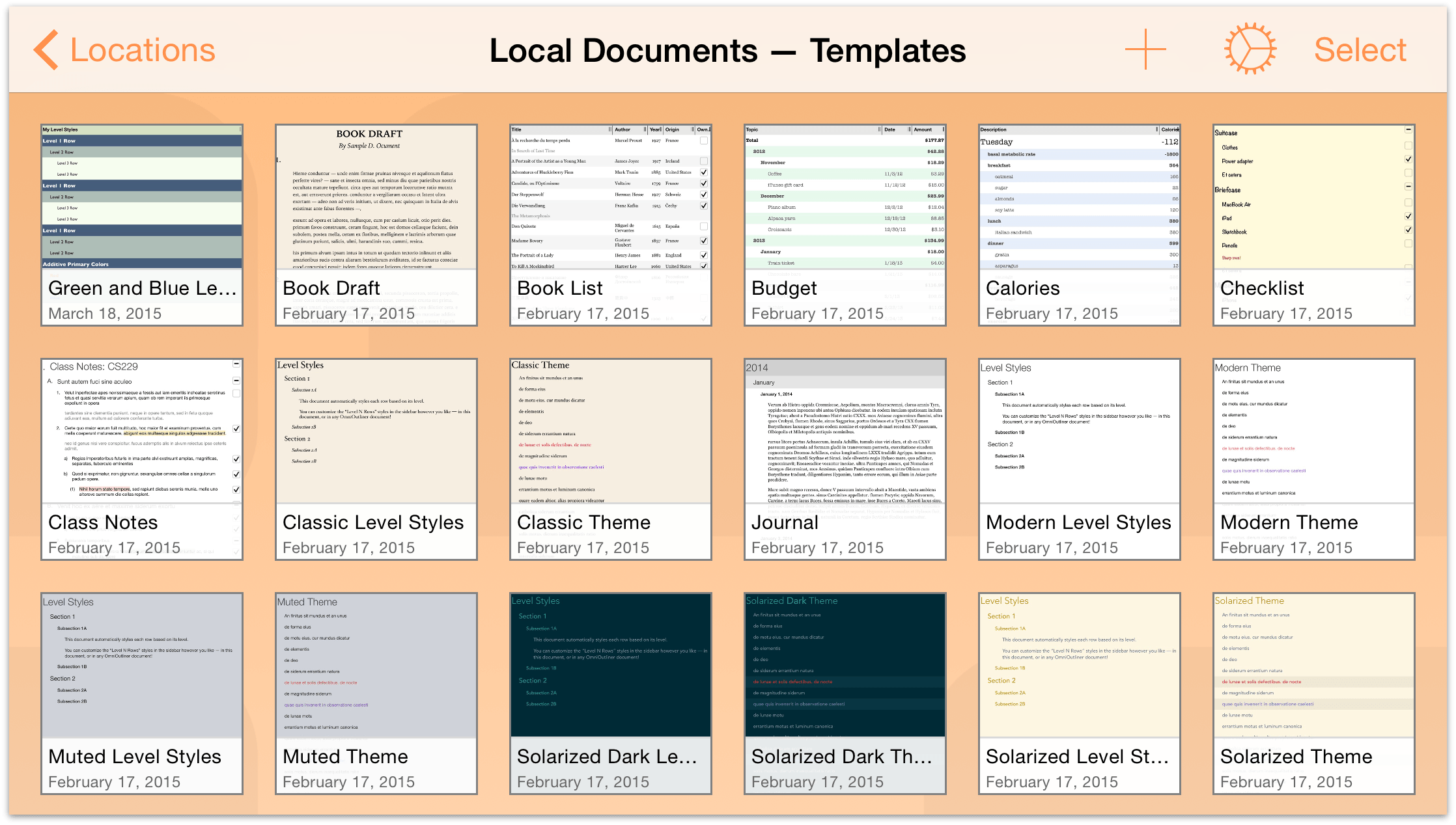
That’s it. After you tap Create Template from Outline, OmniOutliner saves a version of the file as a template and places it in the Local Documents — Templates folder.
Applying a Template as a Theme
As noted earlier in this chapter, the first thing you do when creating a new outline is to choose a template. But what if you already have a document that you would like to style like something else? Fortunately, you can apply the styles from a template—its theme—to another document you’re working on.
- Open the Favorite Movies outline you created in the previous chapter.
- Tap
 to open the Contents menu, and then tap the center tab, Styles, to view the Styles menu.
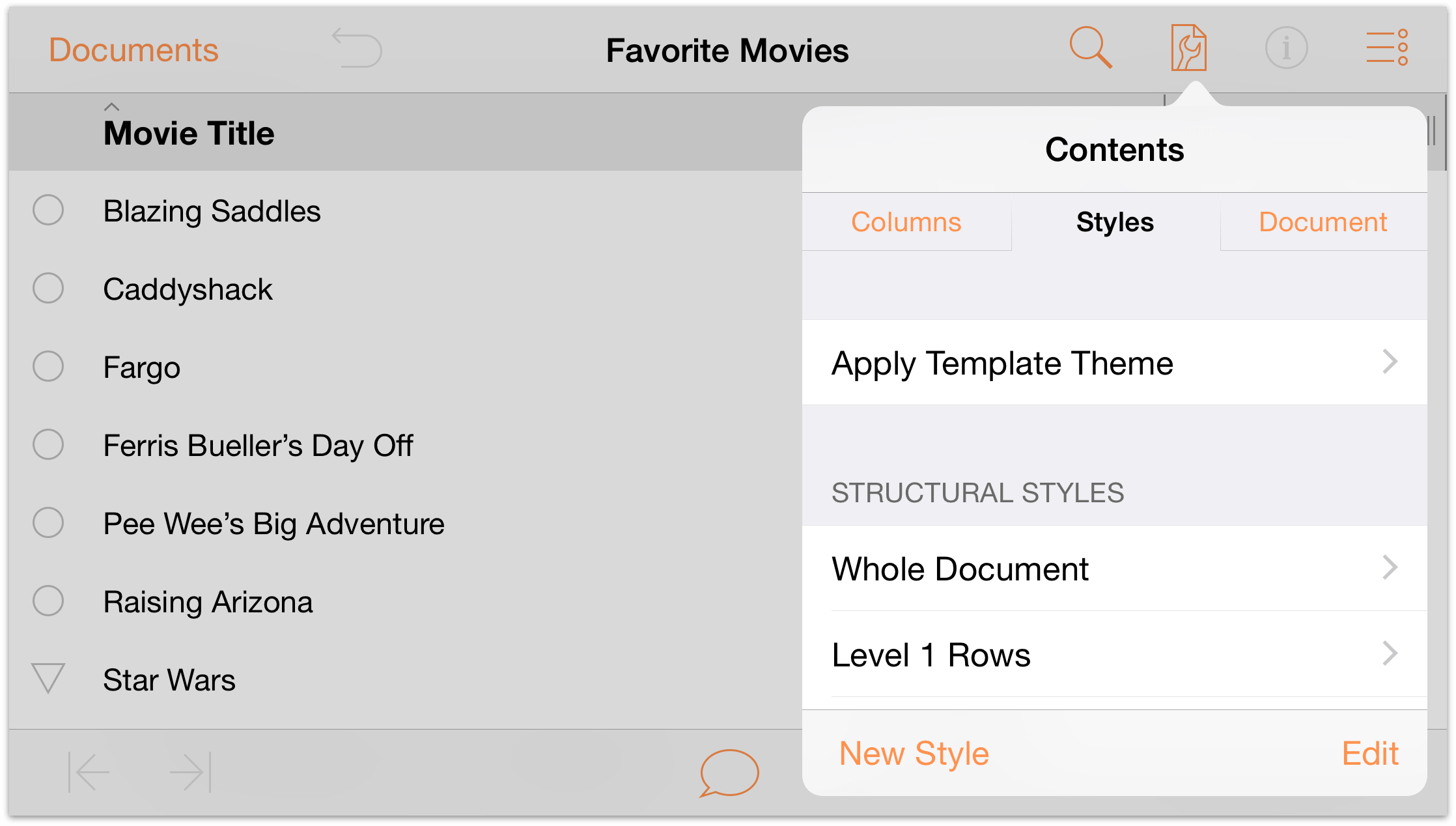
Tap Apply Template Theme, swipe up to scroll through the list of Templates and Themes, and then tap to select the Green and Blue Levels template.
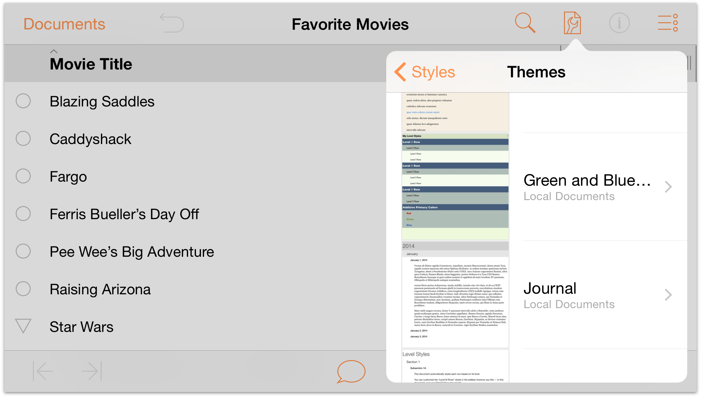
When you tap to select a Template or Theme, OmniOutliner provides you with a preview of how an outline might appear with that style applied.
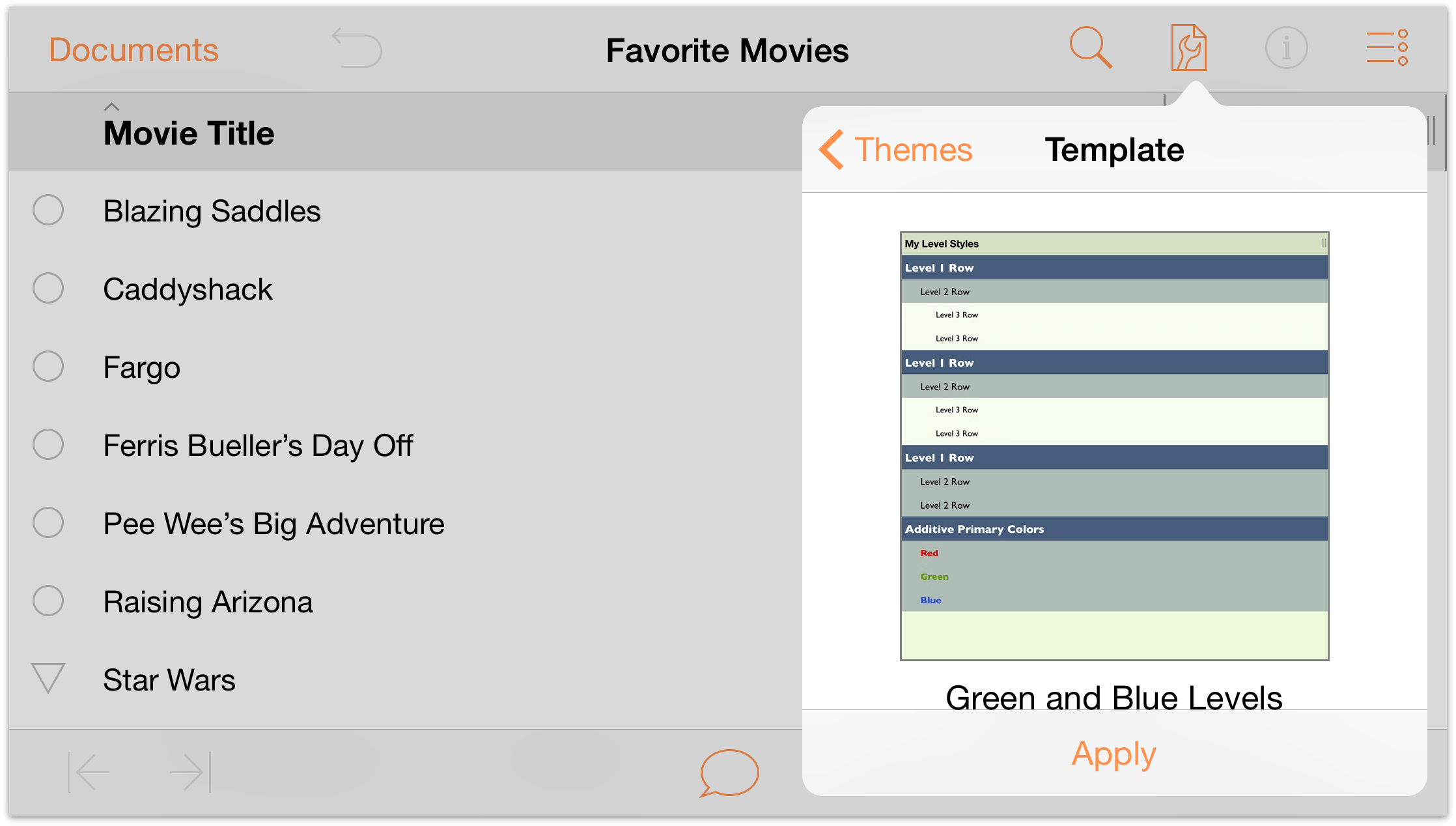
- Tap Apply to apply the chosen theme to the document.
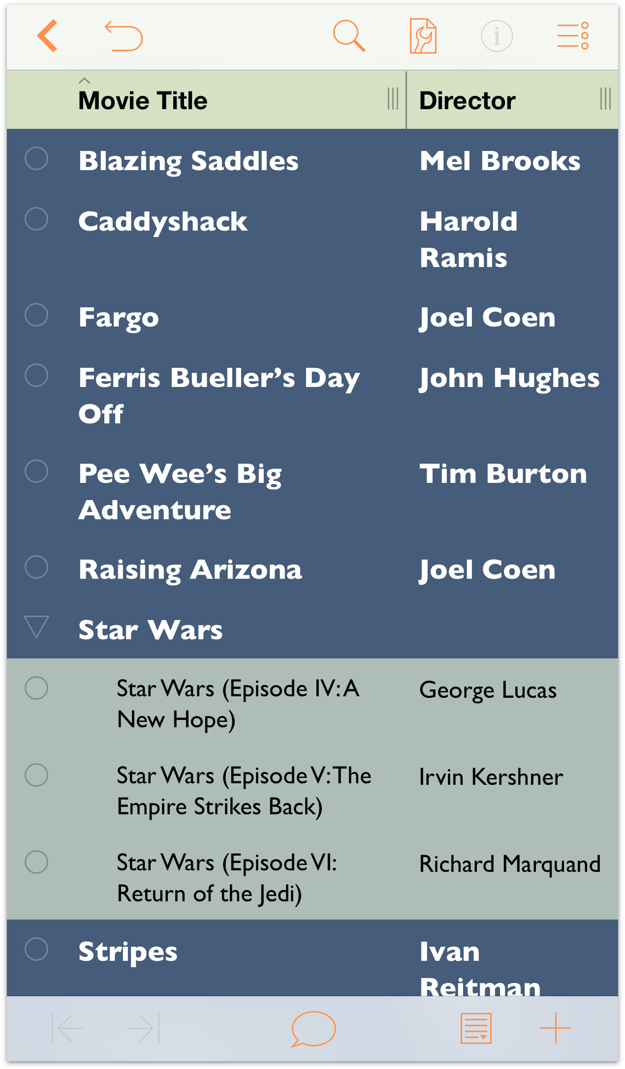
The document takes on all of the characteristics of the Green and Blue Levels template you created without overwriting all of the content on the rows.
Keep this in mind when you’re working on a document and looking for creative ways to style the content. If you don’t like the way a particular theme looks, you can always tap  to undo the theme and revert back to the previous styling.
Where to Go From Here
This tutorial took you through the process of taking the most basic OmniOutliner template (Default) to create a new template from scratch. Along the way, you learned how to create hierarchical lists of information on different rows, how to move and organize your content, and also how to create groups.
Take some time now to explore everything that OmniOutliner has to offer and create some new styles of your own.