Working With the Inspectors
Along the right side of the window, you’ll find the Inspectors sidebar. You use the Inspectors to change the style attributes for the objects on the canvas, set the properties of the canvas itself, and to include document-specific metadata and define how the OmniGraffle file is saved.
If you don’t see the Inspector sidebar, click  in the toolbar or choose Inspectors ▸ Hide/Show Inspectors (Shift-Command-I).
The Inspectors sidebar has four tabs along its top, used for categorizing the individual inspector panes based on their purpose:
- Object — used for styling the objects on the canvas
- Properties — used for defining the properties of the objects on the canvas
- Canvas — used for defining the canvas itself, including units of measure and the alignment grid
- Document — used for setting how the OmniGraffle project is saved, setting printer margins, and for adding document metadata
To make it easy for you to access the inspectors you need, we have conveniently mapped the Inspector tabs to the following shortcuts:
- Use Command–1 to view the Object inspectors.
- Use Command–2 to view the Properties inspectors.
- Use Command–3 to view the Canvas inspectors.
- Use Command–4 to view the Document inspectors.
Each tab contains a series of inspector panes, for such things as adding a fill to an object or setting a background image for the project you’re working on.
To open an inspector pane, hover over the title with the mouse, and then click on the disclosure triangle to open and use the inspector. To open one particular inspector (for example the Fill inspector) and close any other open inspectors, Option-click on the disclosure triangle. To open or close all of the inspectors, Shift-click on one of the disclosure triangles.
You can configure OmniGraffle’s preferences so that only the inspectors you need for working with the selected object are displayed in the sidebar. Choose OmniGraffle ▸ Preferences ▸ General ▸ Inspectors and turn on Hide inspectors that don’t apply.
Using the Inspectors
By default, OmniGraffle’s inspectors reside in a sidebar just to the right of the Canvas. However, you can also open the inspectors as a floating window, or as four floating palettes, one for each tab. The different ways of viewing the Inspectors are known as Workspaces, because they help define how you work in OmniGraffle.
You can quickly switch between Workspaces from the Window menu, or by using a keyboard shortcut:
- Sidebar: F2
- Floating Inspector Window: F3
- Palettes: F4
If you are using a MacBook Pro, MacBook Air, or an Apple Wireless Keyboard with your Mac, you also need to press the fn key—located at the lower-left corner of your keyboard—along with the applicable function key. If you have an Apple Keyboard with Numeric Keypad, the fn key is located below the F13 key.
The top section of the Window menu indicates the currently selected inspector tab (the one with the checkmark next to it).
Locking an Inspector Tab in Place
 If you find that you’re using a particular inspector tab quite a bit—such as the inspectors in the Object tab while applying various styles and fills—you can lock the tab in the open position. To lock an inspector tab, double-click the icon for the inspector tab; the tab then receives a green lock icon (shown above, at right).
To unlock the inspector, double-click the tab again or click on another tab; for example, from a locked Object inspector tab to the Canvas inspector tab.
Interacting with the Inspectors
In all of the inspectors, you can click in a text field that contains a number, and then press the up or down arrow keys to increment or decrement the number.
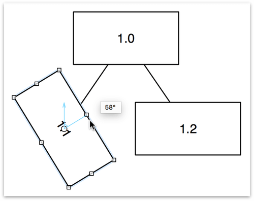
When it comes to rotating objects, you have a couple options. First select the object and then go to the Geometry inspector. Click and spin the rotation dial and watch the object revolve around its center point. After clicking the rotation dial, keep the mouse button held down while moving the pointer away from the control to gain more rotational precision.
If you have enabled the use of Multi-Touch gestures (OmniGraffle ▸ Preferences ▸ Multi-Touch), you can use a two-fingered spin gesture to rotate an object on the canvas.
The use of Multi-Touch gestures requires a touch-enabled trackpad. Most Apple laptops support Multi-Touch, as does Apple’s Magic Trackpad.
Select and touch an object with two fingers, and then rotate the fingers (or pivot one around the other) to rotate the object. While rotating the object, you’ll notice that a blue angle indicator appears within the object, and a tiny popover appears showing you the degree of the angle.
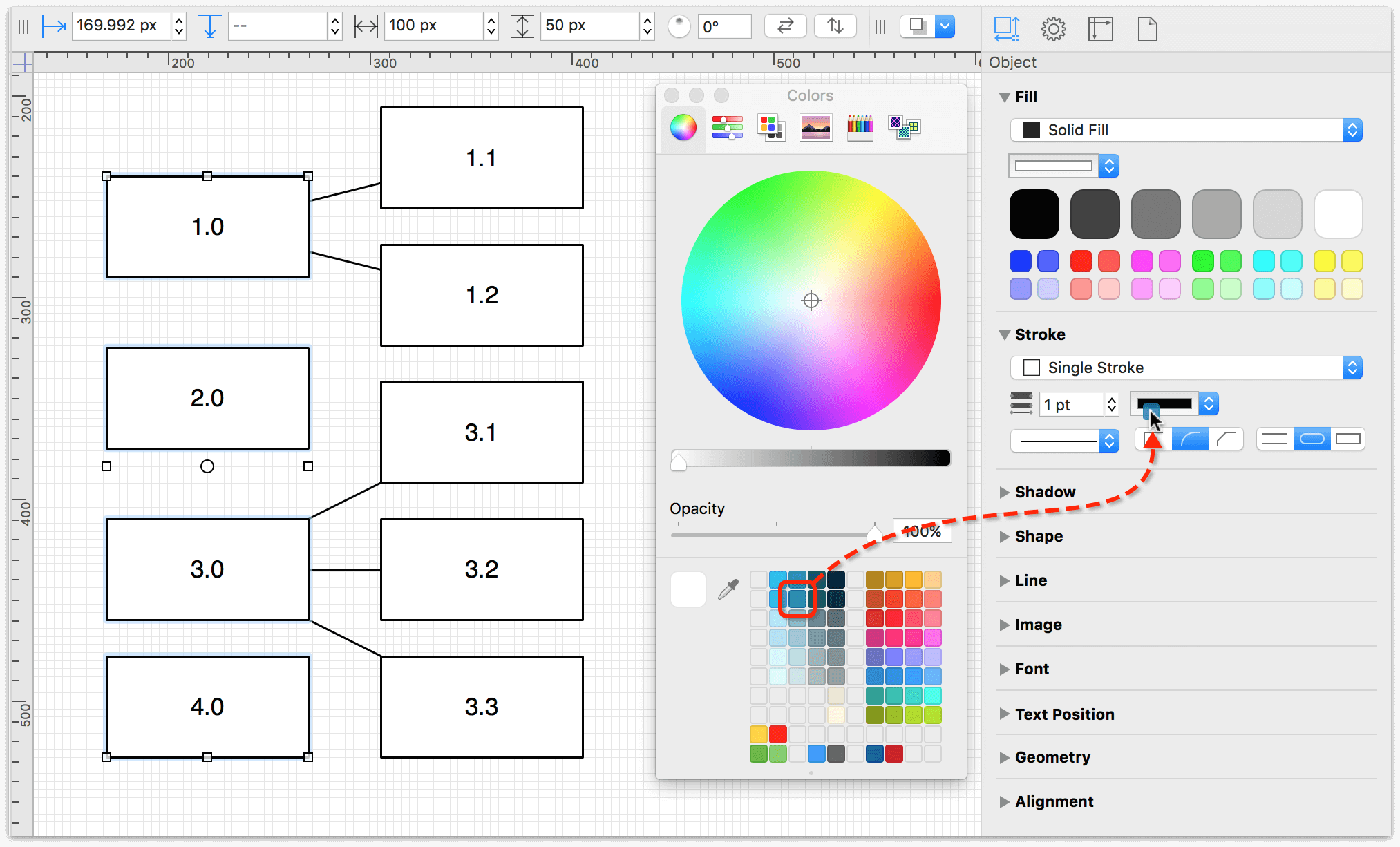
Any color swatch in the Colors window can be dragged to an object on the canvas or to an inspector’s color control. When you drag a color swatch to an object, you can drop the color on the object’s fill, stroke, or text (label) color.
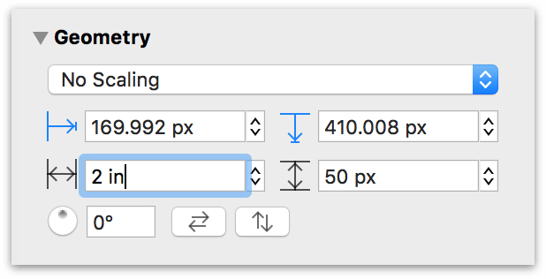
In places where you can enter measurements, such as in the Geometry inspector, values are shown in the current ruler units, or, if there is no unit scale, in the Units inspector. You can, however, enter values in any unit type that is available in the ruler, such as miles or kilometers. As soon as you finish entering the value, OmniGraffle converts it to the correct units automatically.
You can also perform simple arithmetic in the input fields; for example, add (+), subtract (−), multiply (*), or divide (/).
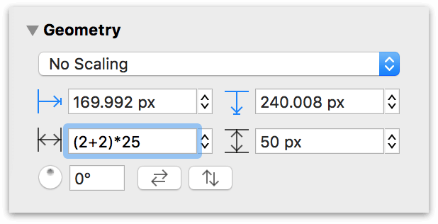
If you don’t specify a unit type in your math (for example, (2+2)*25), OmniGraffle uses the Unit Type specified in the Units inspector. You can, however, enter a different Unit Type as part of the arithmetic (for example, (2in+2cm)*25) and OmniGraffle will convert the Unit Type you have specified as part of the math to the Unit Type specified in the Units inspector.
You can also enter unit values that are different from the Ruler Units specified in the Units inspector. For example, if you have your project set up to use inches for the Ruler Units, and you enter 2.54 cm in a field, OmniGraffle would convert that to 1 in.
The Object Inspectors
Use the Object inspectors to view and change details about the objects on the Canvas. You can quickly access the Object inspectors by pressing Command-1, or by selecting any object on the canvas.
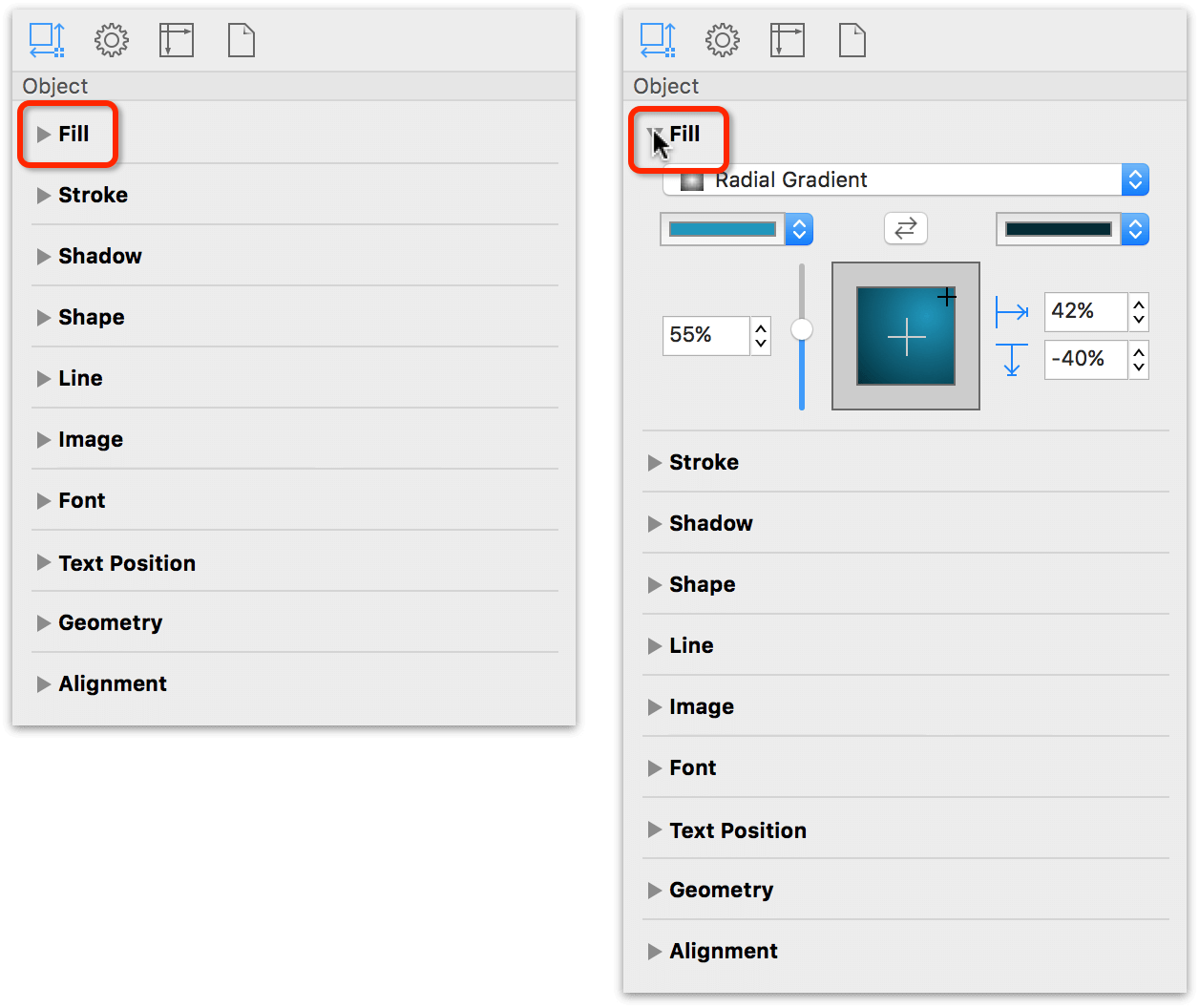
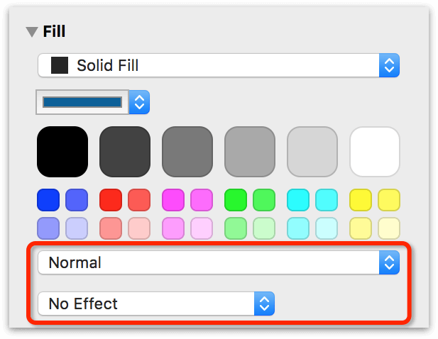
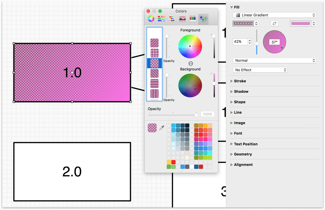
Coloring Shapes with the Fill Inspector
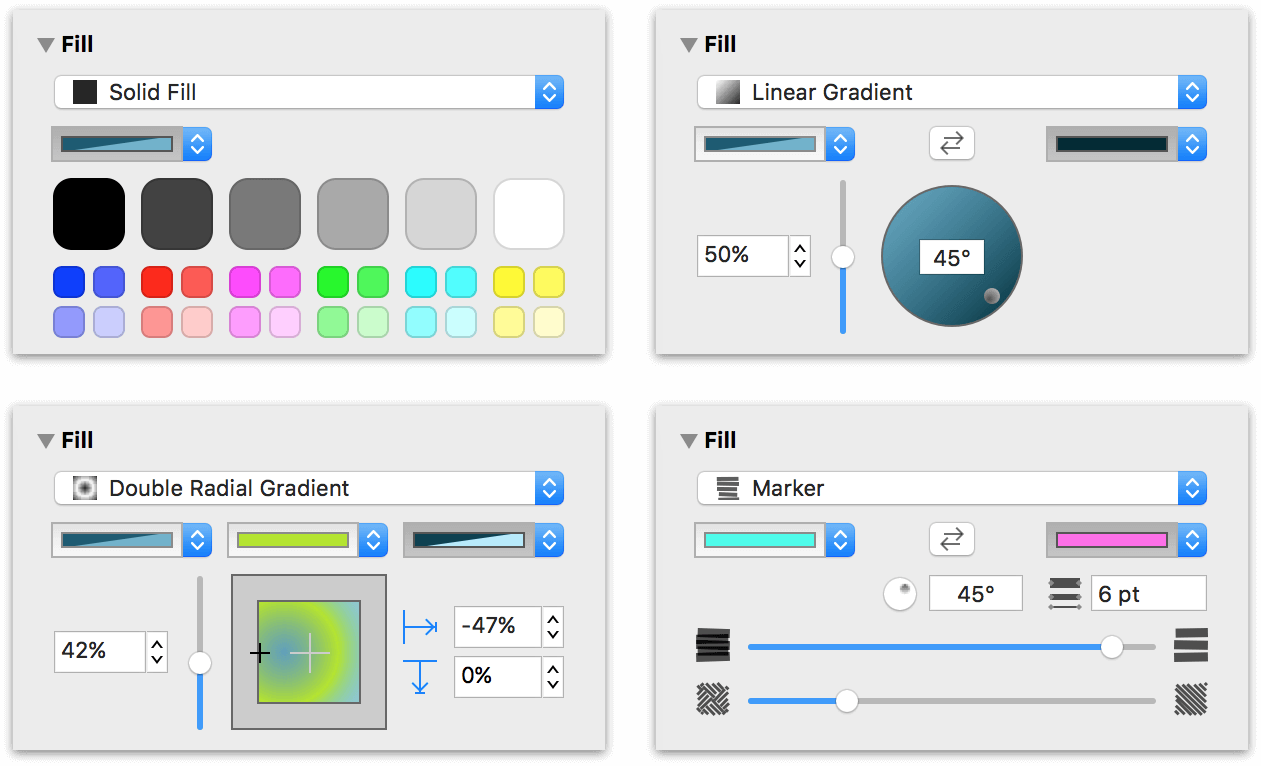
Use the Fill inspector to choose a color, gradient, or pattern to fill the inside of the selected shapes. Depending on the type of fill you’ve selected in the Fill Type popup menu, the Fill inspector adapts to provide the controls you need to adjust the fill’s settings.
The Fill inspector has the following controls:
-
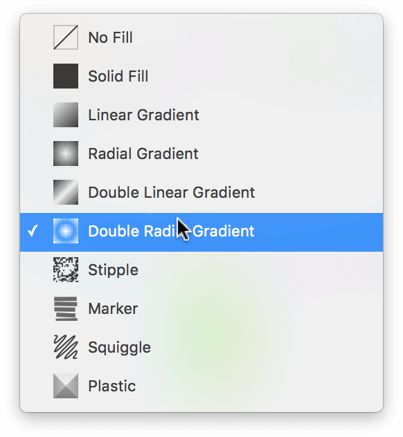
Fill Type: Use the pop-up menu at the top of the inspector to choose from the nine fill types, including: Solid, Linear Gradient, Radial Gradient, Double Linear Gradient, Double Radial Gradient, Stipple, Marker, Squiggle, and Plastic. The No Fill option is also available as an option for objects where transparency is desired.
With the Fill Type set to Solid, you’ll also see a series of default color swatches that you can choose from. The larger swatches along the top range from black to white with varying shades of gray in between, with smaller color swatches underneath.
-
Fill Color: Located underneath the Fill Type pop-up menu is the Fill Color pop-up. Clicking the arrows lets you choose from one of 12 preset colors, or you can click on the color well to the left of the arrows to open the Colors palette to blend your own color.
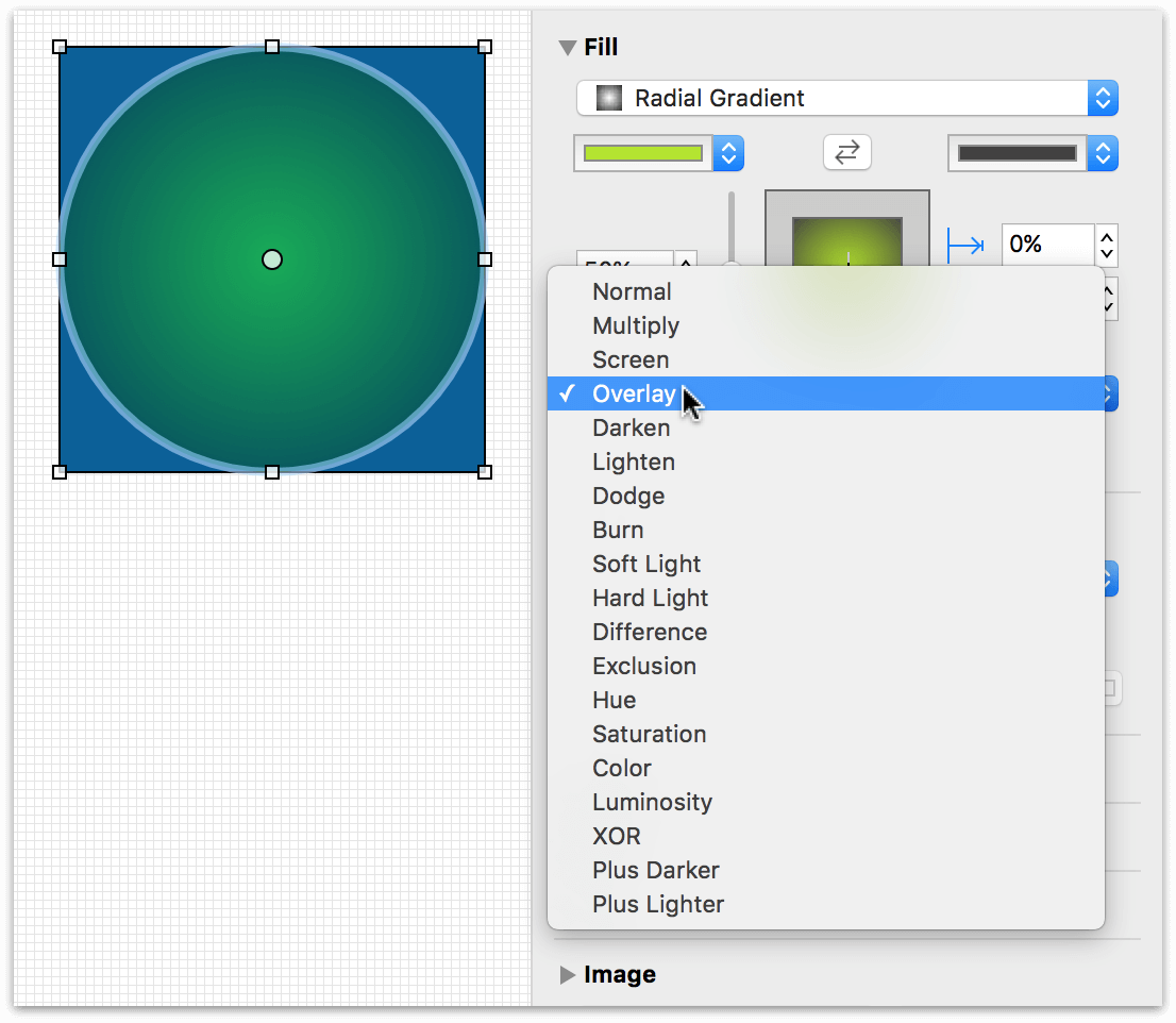
If you have OmniGraffle Pro, the Fill inspector has two additional popup menus along the bottom: Fill Blend Type and Distortion Effect.
-
Blending Mode: The Blending Mode pop-up lets you choose how to blend the currently selected object’s fill with objects on the same canvas. By default, this is set to No Effect.
-
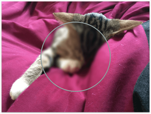
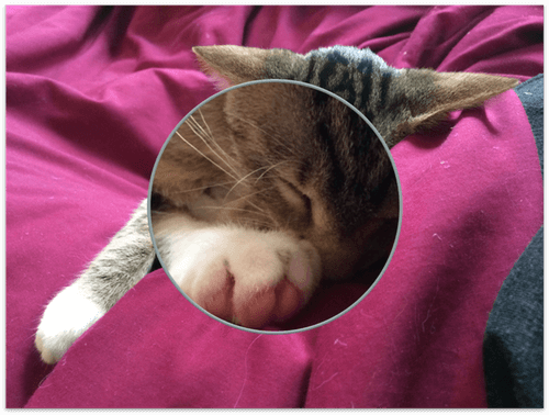
Distortion Effect Type: The Fill inspector includes three Distortion Effect Types: Blur, Pixelate, and Magnify. For example, you could apply the Magnify effect to an object that sits atop an image so you can use it like a magnifying glass.

You can also add a pattern fill to the objects in your projects. When you click on the color portion of a Fill Color pop-up menu, that opens the Colors window. Click the tab on the right, the Pattern Palette, to choose from a pattern to fill the objects.
Some additional notes about the Fill inspector:
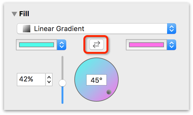
- The gradient rotation control becomes active when you choose one of the Linear Gradient fills; enter a number of degrees in the field or drag the circular control to set the angle of the gradient. The blend position control becomes active when you choose a radial gradient; drag its crosshair to move the gradient’s center.
-
If you have chosen Linear Gradient or Radial Gradient, you can click the swap button between the color wells to exchange the two colors.
-
Drag the Gradient Midpoint slider next to the color wells to adjust the gradient.
- If you choose one of the Gradient fills, two or three color wells become available. Click them to choose the colors to blend together.
You can also edit the fill color of a canvas itself using the Canvas Fill inspector.
Defining Line and Path Behaviors with the Stroke Inspector
Use the Stroke inspector to change the appearance of the selected connection lines or of the line drawn around the edge of the selected shapes.
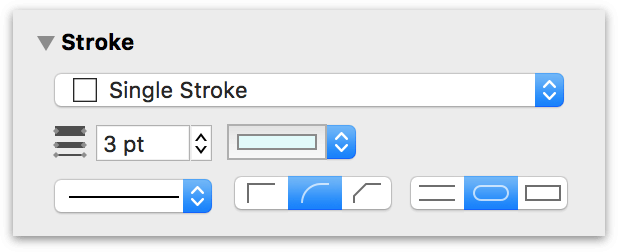
- Use the dropdown menu to choose one of the following stroke types: No Stroke, Single Stroke, Double Stroke, Freehand Stroke, Plastic Stroke, Inner Stroke, or Outer Stroke.
- Click the color well to choose a color for the stroke.
- Enter a number in the Thickness field or use the keyboard arrows to choose how thick the stroke should be.
-
With any Stroke Type except Plastic Stroke selected, you’ll find three sets of controls for further defining the stroke:
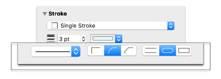
- Use the pop-up menu on the left to select a Stroke Pattern, ranging from solid, to dashed, to dotted, and everything in between. There are 25 stroke patterns to choose from.
- The center set of controls determines how the stroke appears at its corners: Miter creates a sharp corner, Round creates a soft corner, and Bevel creates a cut-off corner.
- The controls on the right determine how the stroke appears at its ends: The Butt option ends the line by cutting across its endpoint at an angle perpendicular to the line itself, while the Round and Square options let the line extend past its endpoint based on the stroke width.
-
With the Plastic Stroke type selected, the Stroke inspector takes on a different set of controls:
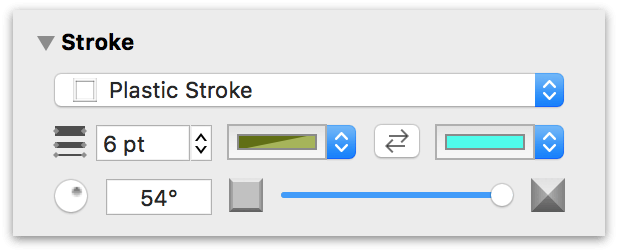
The middle row of controls lets you set a color for the Plastic Stroke’s Stroke and Highlight colors. Use the Highlight angle wheel on the left to change the "lighting" angle for the highlight. Use the slider on the right to make the Plastic Stroke flatter or to give it more height.
Casting Shadows with the Shadow Inspector
Use the Shadow inspector to drop a shadow behind the selected objects.
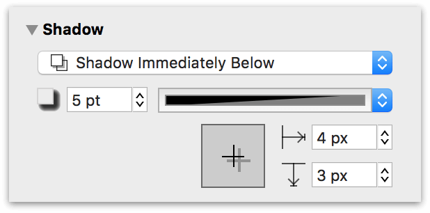
- Use the pop-up menu to choose whether the selected object has a shadow, and whether the shadow appears in front of or behind objects on the same layer, or if the object takes on an inner shadow. If you choose to let shadows appear in front of objects on the same layer, the ordering of objects matters; you can reorder objects with the Bring and Send commands in the Arrange menu.
- Enter a number in the blur field or use the keyboard arrows to choose how precise or blurry the shadow should be.
- Click the color well to choose a color for the shadow; partially transparent black tends to work best.
- Drag the crosshair in the offset control or enter numbers in the offset fields to set how far away from the object the shadow should fall.
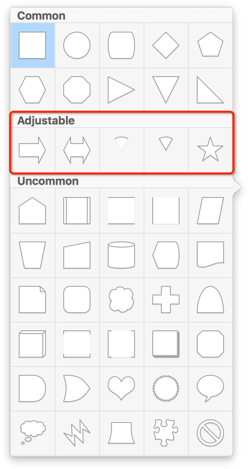
Choosing a Shape with the Shape Inspector
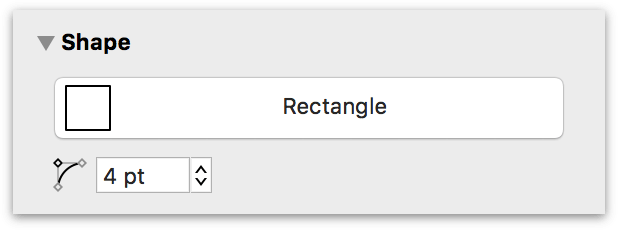
With a shape object selected, use this inspector to transform it in various ways.
-
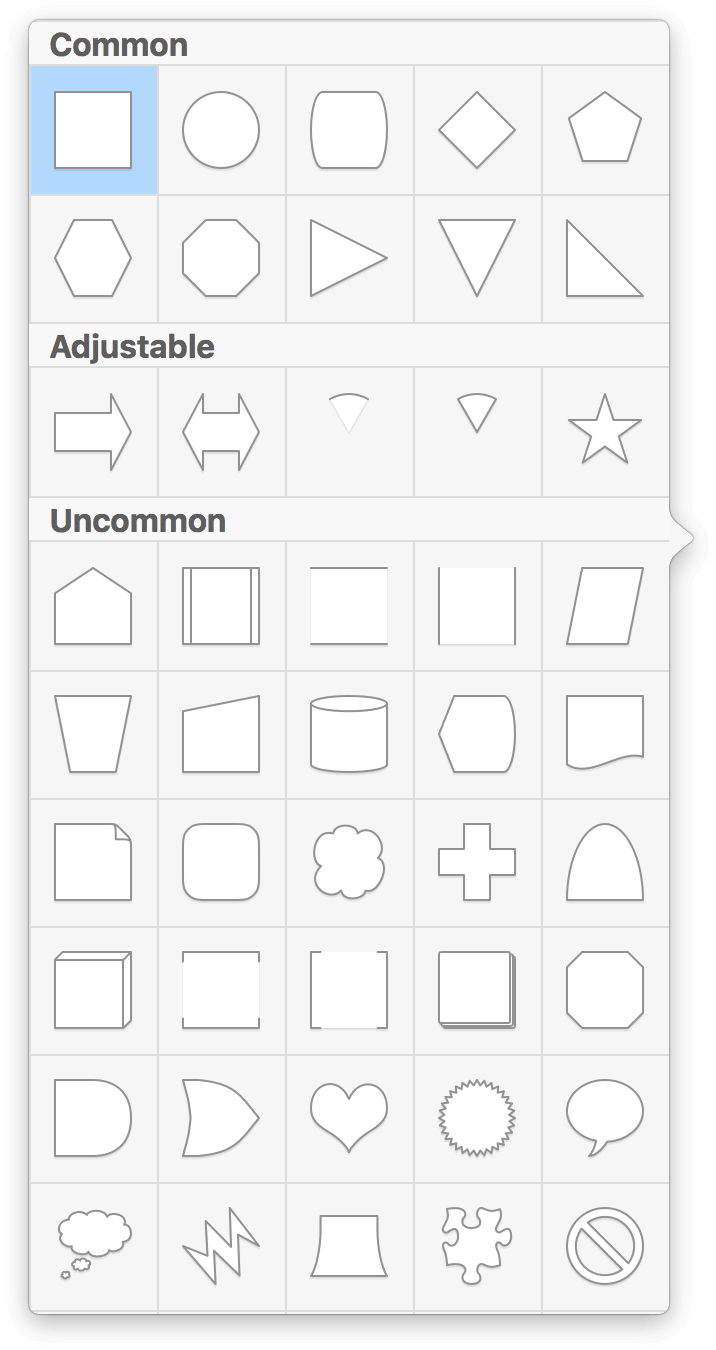
To change the shape (for example, from a rectangle to a circle), click the menu at the top of the inspector to reveal the Shape Popover. It includes all of OmniGraffle’s built-in shapes plus any custom shapes you’ve created.
-
Use the Corner Radius field to set how round the corners of the shape should be; enter 0 for perfectly pointy corners.
-
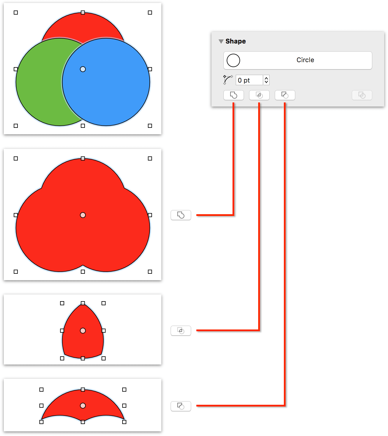
With multiple shapes selected, use the shape combination buttons for crafting custom shapes. Available actions include Combine Shapes, Intersect Shapes, Subtract Shapes, and Uncombine Shapes.
Using Adjustable Shapes
Underneath the Common Shapes found in the Shape Popover, you’ll see a row of five Adjustable shapes that you can choose from:
- Adjustable Arrow
- Adjustable Double Arrow
- Adjustable Arc
- Adjustable Wedge
- Adjustable Star
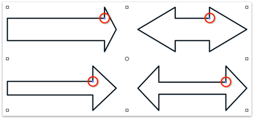
As their name implies, adjustable shapes can be morphed to take on different appearances. The thing that makes an Adjustable Shape adjustable are the Blue Adjustment Handles.
Depending on the shape, an Adjustable Shape has either one or two Blue Adjustment Handles. The Adjustable Arrow and Double Adjustable Arrow have a single Adjustment Handle, which you can use to resize the shape of the arrowhead.
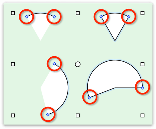
The Adjustable Arc and Adjustable Wedge shapes have two Adjustment Handles, which you can grab and drag to change the degrees in the arc. If you hold down the Shift key while adjusting the an Arc or Wedge, the shape increases or decreases in size in 15-degree increments.
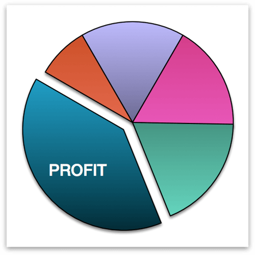
The Adjustable Arcs and Wedges can be Filled with any color or pattern, and arranged to create exploding pie charts.
Adjustable Stars have two adjustment handles, which you can use to make the points more or less pointier, and to decrease or increase the number of points on a star.
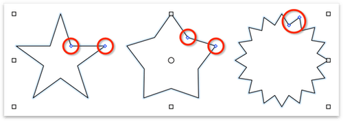
Adjustable Shapes can really speed up your time to creation, so look for ways to use them for diagrams, charts, wireframes, or website mockups.
Defining Line Attributes and Behaviors with the Line Inspector
Use this inspector to configure the properties of lines used to connect objects.
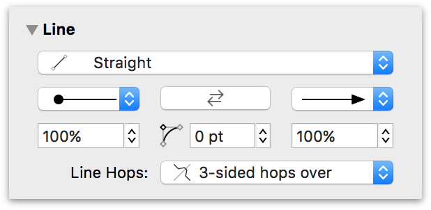
- Use the pop-up menu at the top to set how the line travels from its source to its destination:
- Straight for a line that takes the shortest possible path between points.
- Curved for a line that turns smoothly to pass through each point.
- Orthogonal for a line that always travels horizontally or vertically.
- Bézier for a line with control points you can adjust with the selection tool.
- In the middle of the Line inspector, you’ll find two pop-up menus on the right and left—used to set the appearance of the tail and head of the line. Click the reverse button to swap the line’s source and destination points.
- Use the fields below the tail and head menus to change the line ending sizes. If you’ve set the line type to Orthogonal, you can use the curve radius field in the middle to add some curvature to the line’s corners.
-
The Line Hops menu determines what the line should do when it crosses (or is crossed by) another line.
To better understand how Line Hops work, it’s important to understand how the things you draw or place on a layer stack in relation to each other.
Everything you draw or place on the same layer of a canvas—including lines—shares the same stacking order. The first thing drawn is at the bottom of that layer’s object stack; all subsequent objects and lines drawn on that layer appear further up in the object stack.
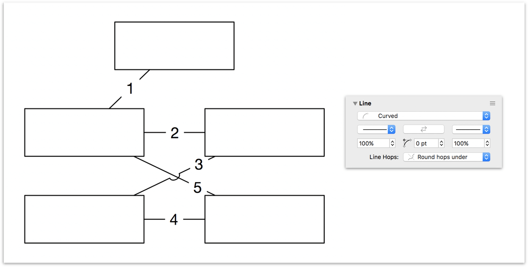
Consider the following:
Use the Line tool to connect the objects, using the numbers on the lines shown here as the order in which to draw the lines:
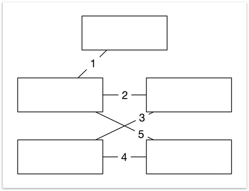
As you can see, Lines 3 and 5 cross each other. Following the principles of object stacking, Line 3 appears under Line 5. If you select Lines 3 and 5 and choose Round hops over in the Line Hops pop-up menu, Line 5 hops over Line 3 because it is lower in the stack.
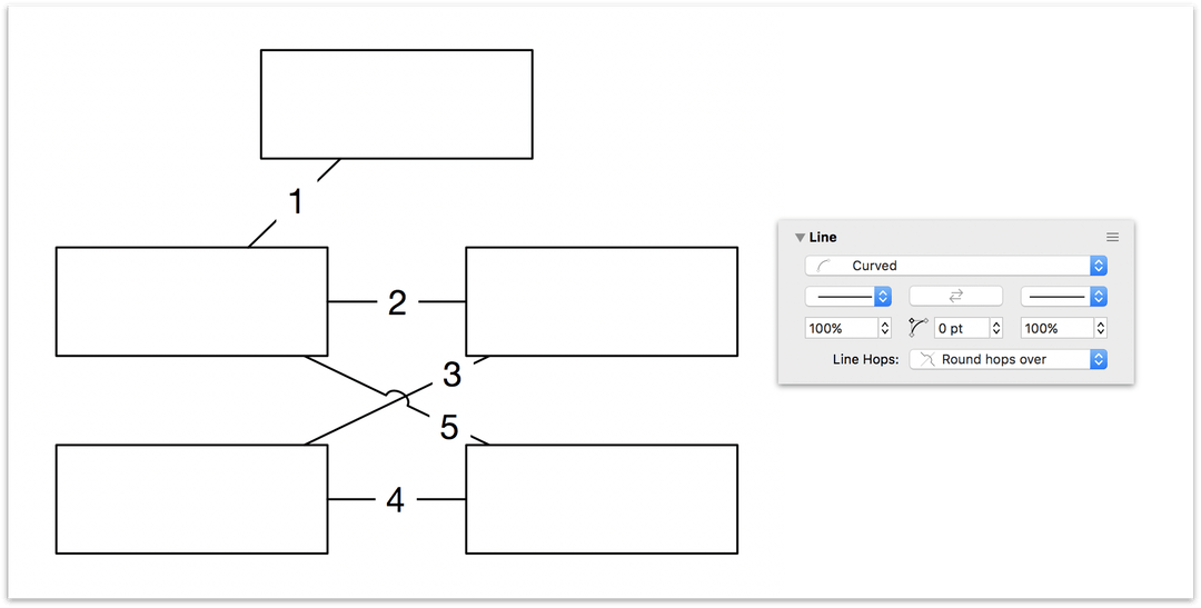
Conversely, if you choose Round hops under in the Line Hops pop-up menu, Line 3 loops underneath Line 5 because it is higher in the stack.
If you would like a line to appear higher or lower in the object stack, select the line in question, choose the Arrange menu, and then choose one of the following menu options:
- Bring to Front (Shift-Command-F)
- Bring Forward (Option-Command-F)
- Send to Back (Shift-Command-B)
- Send Backward (Option-Command-B)
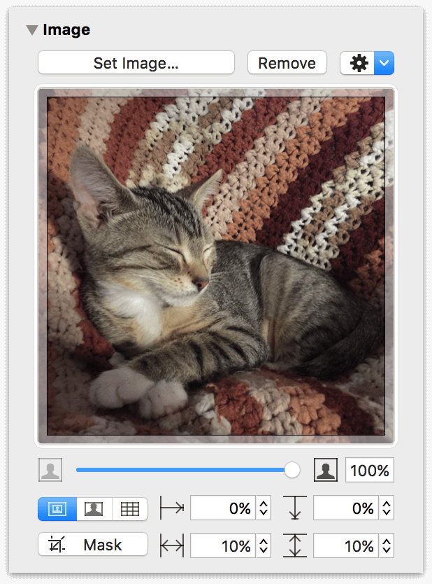
Placing Graphics Inside a Shape with the Image Inspector
You can use this inspector to place and position an image inside a shape, or to work with an image you have dragged directly to the canvas.
-
Click Set Image to choose and place an image in the selected shape. When you browse for an image file, clicking Option in the lower-left of the selection sheet provides you with options to Include image in document or Link to image file.
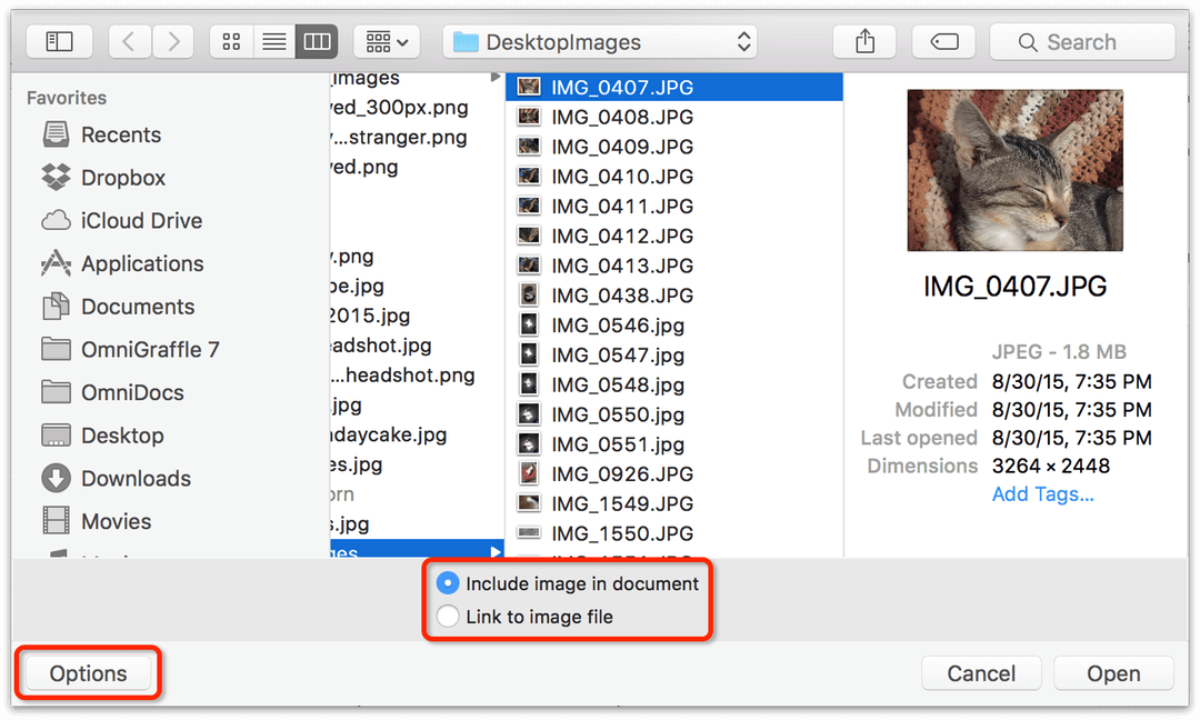
If you choose the Link to image file option, OmniGraffle places an alias of the image in the shape and relies on having access to that image file locally.
If you delete the linked image file from your Mac, or try to open the OmniGraffle file on another Mac, OmniGraffle displays an alert to let you know that it can’t find the image. The alert displays the name of the image file and the linked location on your filesystem, so you can try to relocate or re-link the image.
If an object’s image comes from an alias, some extra commands become available in the Gear menu
 :
:- Reveal in Finder open a Finder window and takes you to where the image file is located.
- Embed in Document places a copy of the image file in the OmniGraffle file, allowing you to safely send the file to another OmniGraffle user.
- Edit LinkBack Item gives you the ability to edit a LinkBack item’s resource.
-
Once an image is set, a Remove button becomes available so you can remove the image and try another.
Beneath the image well, you’ll find the following controls for working with the image:
-
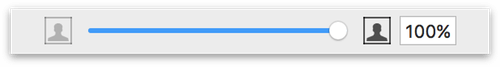
Use the slider to change the image’s opacity:
-
The following row of buttons lets you choose how the image is placed within the shape. You can choose to use the image’s natural size (left), to stretch the image to fit within the shape’s dimensions (center), or to tile the image within the shape (right).

-
The positioning offsets are enabled if you are displaying the image at its natural aspect ratio, as set by the first of the three buttons to the left. You can enter a positive or negative percentage, or drag the image around in the image well to indicate the area you want.
-
The zoom controls are available unless you are stretching the image to fit the shape. You can enter a zoom percentage, or just drag the slider, to make the image larger or smaller.
-
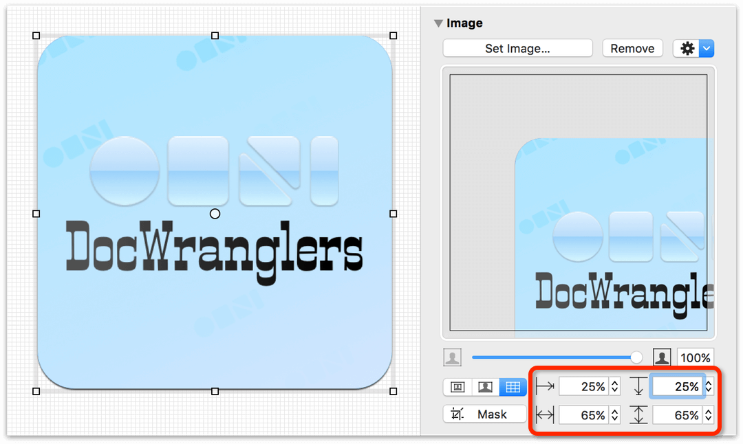
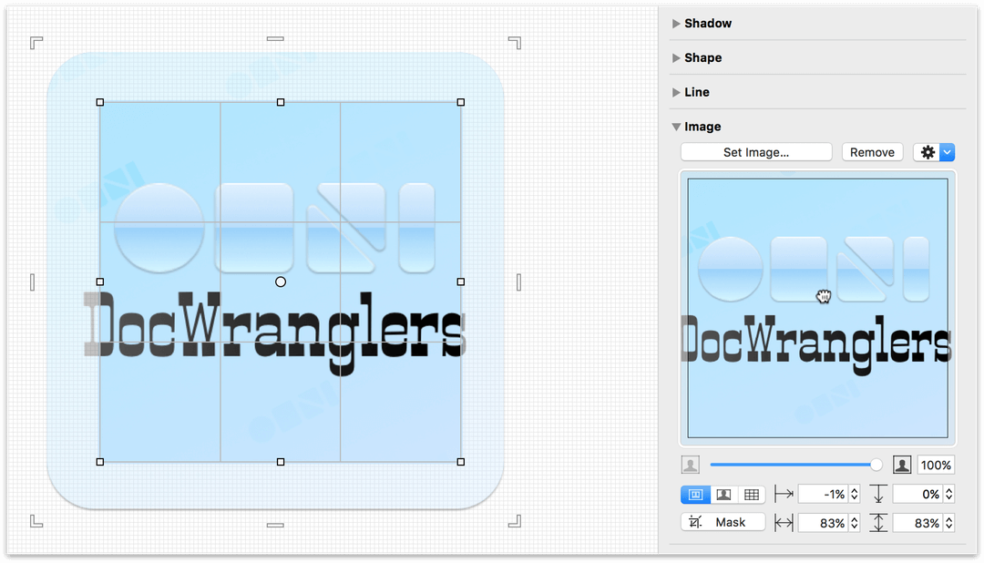
When you press the Mask button, a Masking Shape with an inner grid is placed on top of the image, and opaque corner brackets with lines in between are placed outside the masking area for resizing the image itself:
By default, the Masking Shape is a rectangle that’s placed on top of the image. You can change the shape by choosing another from the Shape Popover in the Shape inspector (see Choosing a Shape with the Shape Inspector).
-
To resize the Masking Shape, click-and-drag on the shape’s bounding box handles.
-
To resize the image, click-and-drag on the opaque image handles that are outside of the image itself.
-
To reposition the image within the Masking Shape, you can either click and drag the image on the canvas, or use the image well to move the image around within the shape’s area.
-
When resizing the Masking Shape or the image itself, use the Shift key to proportionally resize the item, or use Option-Shift to proportionally resize the item based on its centerpoint.
-
You can enter values in the Offset fields (horizontally and/or vertically), or to adjust the Scale values for the image’s width and height.
When you’ve finished making adjustments to the image mask, click the Mask button again to hide the masking handles.
-
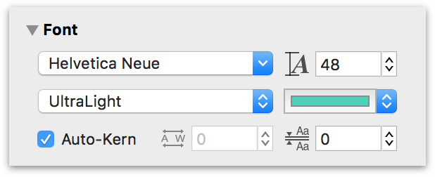
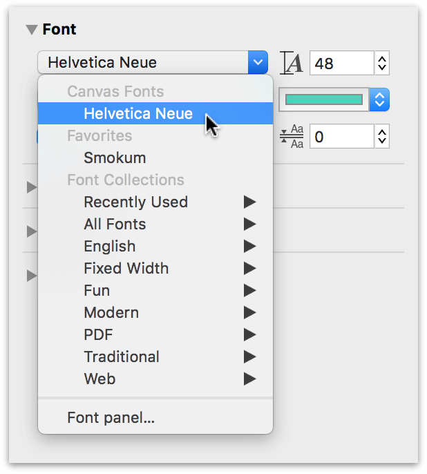
Choosing a Font, Size, and Color with the Font Inspector
Use this inspector to modify the font properties of the selected objects, including style, size, and color.
-
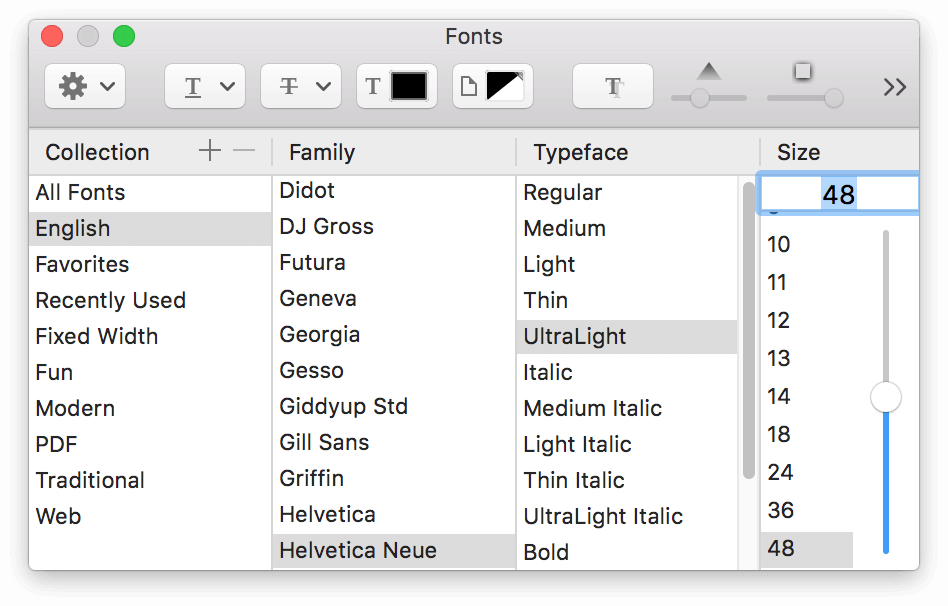
Click the Font Family menu to choose a font, or to open macOS’s Fonts Panel.
-
Enter a number to set the point size of the text.
- Choose a Typeface, if there is one available for the font family you’ve chosen.
- Click the color well to choose a font color.
At the bottom of the Font inspector, you will find controls for adjusting the Kerning (the space between individual characters) and Leading (the space between lines of text). Auto-kern is turned on by default, but you can uncheck that box if you so desire.
Styling Text with the Text Position Inspector
Use this inspector to control the positioning and appearance of the selected shape’s text. If you have OmniGraffle Pro, the Text Position inspector also includes offset positioning controls.
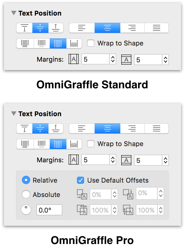
The controls in the Text Position inspector are as follows:
- Vertical Text Alignment — The first three buttons are used for setting the vertical alignment of the text; choose to align to the top, middle, or bottom of the shape.
- Horizontal Text Alignment — With the horizontal alignment buttons, you can align left, center, align right, or justify the text.
-
Text Positioning — There are four buttons for controlling how the text relates to the shape; you can choose:
- To let the text overflow outside of the shape
- To clip off the text that doesn’t fit inside the shape
- To resize the shape to make the text fit
- To make the text follow the shape’s path
If you choose to have the shape resize, the object will only be manually resizable in the horizontal direction; it will resize vertically according to its text.
-
Select the Wrap to Shape checkbox to limit the text’s width to the width of the shape.
Offsetting Text in the Text Position Inspector (PRO)
OmniGraffle Pro includes these additional text offset and positioning controls:
-
By default, the Use default offsets option is turned on. If you uncheck this option, you can adjust the text’s position using the four input fields:
- Text Offset from Left — This adjusts the text’s position from the left edge of the object.
- Text Offset from Top — This adjusts the text’s position from the top edge of the object.
- Width — This adjusts the text box’s width.
- Height — This adjusts the text box’s height.
-
Use the text’s rotation value to determine how the text appears when you rotate the object:
- Relative is turned on by default, which means that the text within an object will maintain its relative position when an object is rotated.
- Absolute permits the text to be rotated independent of its bounding object.
You can either enter a rotation value in the field or drag the circular control to rotate the text.
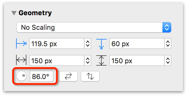
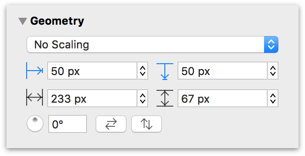
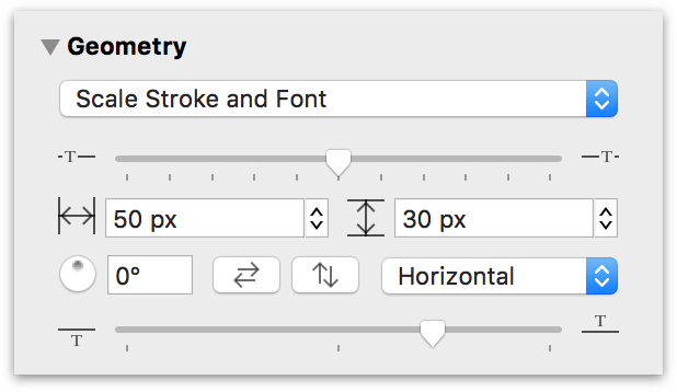
Changing Object Position and Size with the Geometry Inspector
This inspector deals with an object’s position and orientation.
-
At the top of the inspector, you’ll find a pop-up menu with the following options:
- No Scaling — by default, the objects you draw on the canvas are not scaled to any size or proportion.
- Maintain Aspect Ratio — the objects you draw or resize are scaled proportionally. In addition, there are three additional aspect-related options:
- Scale Stroke — scales the object’s stroke proportionally.
- Scale Font — proportionally scales any text inside an object, while also scaling the text object.
- Scale Stroke and Font — scales the objects stroke and text proportionally.
-
Underneath the scaling pop-up menu are two fields which display the X and Y (horizontal and vertical) coordinates for the selected objects; the value represents the distance between the canvas’s origin and the upper-left corner of the object:
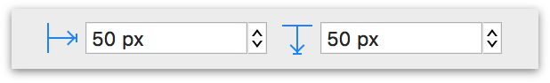
If you click on the blue arrow buttons next to the fields, you can measure the distance from the canvas origin to the top- or left-center of the object...
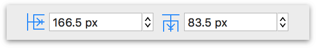
...or to the bottom-right corner of the selected object:
If you have multiple objects selected, two hyphens (‐‐) appear in the fields that have different values. Enter a new X or Y value to move an object on the canvas.
-
The next two fields contain the Width and Height values for the selected objects. If you have multiple objects selected, two hyphens (‐‐) appear in the fields that have different values.
To change the dimensions of an object, enter a new Width or Height in the fields. Entering a number value and pressing Tab or Return changes the Width or Height based on the Ruler Units set in the Units inspector. However, you can enter a value for any unit of measurement, even percentages. OmniGraffle takes the value you have entered, and converts that into the unit of measurement you have specified in the Units inspector. For example, if Ruler Units is set to pixels (px) and you enter 2 cm into the Width field, OmniGraffle changes the width of the object to 56.6929 px.
-
To rotate the object, enter a degree value in the rotation field, or drag the circular control.
- Click the flip buttons to reverse the object horizontally or vertically.
If you have selected a line label, two additional controls become active:
- Label Horizontal Position — Use the slider at the top of the inspector to adjust the label’s position along the line, moving it to the left or right.
- Label Orientation Menu — Use the pop-up menu to set how the label’s text appears in relation to the line. Options include: Horizontal, Vertical, Parallel, Perpendicular, Independent, and Follows Path.
- Label Vertical Position — Use the slider at the bottom of the inspector to position the label above or below the line, or somewhere in between.
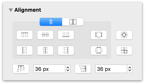
Positioning Objects Neatly with the Alignment Inspector
Use this inspector to uniformly align objects, either in relation to themselves, or to the canvas. At the top of the inspector, choose between Align to Shape or Align to Canvas.
Align to Shape
If you choose Align to Shape, the align and spread buttons consider the shape’s position in relation to other selected shapes. This makes it so you can precisely align and set horizontal and vertical spacing between objects.
How other objects align is based on the position of the first object selected. For example, if you have three objects on the canvas and you want the objects to align based on the position of the center object, Command-click the center object first, and then Command-click to select the other two objects:
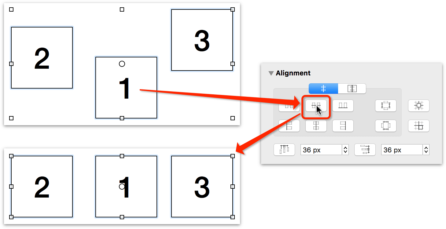
There are eight buttons for controlling how the selected objects will align to each other, as follows:
 aligns objects along their top edges
 aligns objects based on their horizontal center
 aligns objects based on their bottom edges
 aligns objects based on their left edges
 aligns objects based on their vertical center
 aligns objects based on their right edges
Off to the right are two additional positioning controls:
 spreads the selected objects evenly based on the positions of the top and bottom objects
 spreads the selected objects evenly based on the positions of the left and right objects
Align to Canvas
If you choose Align to Canvas, the align and spread buttons consider the canvas edges as “objects” when arranging the selected objects. This makes it so that you can align objects to a canvas edge, or space objects evenly between the canvas edges.
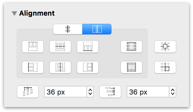
 aligns objects to the top edge of the canvas
 aligns objects to the horizontal center of the canvas
 aligns objects to the bottom edge of the canvas
 aligns objects to the left edge of the canvas
 aligns objects to the vertical center of the canvas
 aligns objects to the right edge of the canvas
Off to the right are two additional positioning controls:
 spreads the selected objects evenly between the top and bottom edges of the canvas
 spreads the selected objects evenly between the left and right edges of the canvas
Aligning to the Grid
If you are working on a grid layout or creating pixel art, you may opt to use either of the two buttons on the right side of the Alignment inspector:
 aligns the selected objects to the grid’s center.
 aligns the selected objects to the grid’s edge.
Controlling How Objects Space Apart
At the bottom of the Alignment inspector are two controls for setting the spacing between objects:
 sets the spacing between objects horizontally
 sets the spacing between objects vertically
Enter a value in the field and then click either the horizontal or vertical spacing button. These buttons are only useful if you have at least two objects selected.
The Properties Inspectors
Use the Properties inspectors to manage how objects connect to one another, and in OmniGraffle Pro, set actions and add notes and key-value pair relationships to objects.
Changing the Way Objects Connect with the Connections Inspector
Use this inspector to control how lines and objects connect to one another.
Connections To and From Lines
Use the Lines tab of the Connections inspector to define the relationship of the lines you draw with the Line tool.
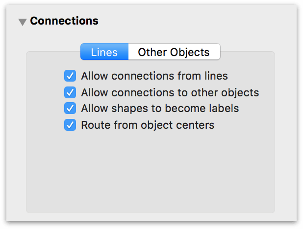
- Allow connections from lines permits lines to connect to each other.
- Allow connections to other objects defines whether the selected line(s) connect to other objects.
- Allow shapes to become labels lets you set a shape as the background to a line label.
- Route from object centers defines whether connecting lines between objects route to/from the object’s center point or based on Magnet positions.
For example, if you are using the Line tool to draw in OmniGraffle, you may want to turn off Allow connections from lines. If that option is turned on, the lines you draw will try to connect to one another, which can be problematic when freehand sketching with lines.
Connections with Other Objects
Use the Other Objects tab to define how shapes accept connections from other objects on the canvas.
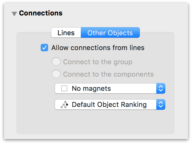
- Turn off Allow connections from lines to make it impossible for connection lines to use the selected objects as sources or destinations.
- If you have a group or a table selected, you can choose whether connection lines should be allowed to connect to objects in the group or only to the group as a whole.
-
The Magnet Positions pop-up menu contains a bunch of magnet presets that you can choose and assign to the selected shape. Magnets are points on a shape that attract connection lines. You can choose to have No magnets (the default), magnets placed according to cardinal directions (North, South, East, and West), magnets on each vertex (corner), or a certain number of magnets on each side of the shape.
If you select some number of magnets per side, then hold Shift while opening the pop-up menu and selecting another number, the two numbers are added together; you can get up to 10 magnets per side in this way.
Of course, you can always use the Magnet tool to add magnets to a shape. See Adding and Adjusting Connections with the Magnet Tool for more information about the Magnet tool.
-
If you have a line selected, the Lines checkboxes become available. Deselect the Allow connections to other objects checkbox to make it impossible for the line to have an object as its source or destination. Deselect the Allow shapes to become labels checkbox to make it impossible to drag a shape onto the line and make it a line label; existing labels stay attached.
-
Use the Rank pop-up menu to assign a hierarchical rank to the selected objects:
- Default Object Ranking lets OmniGraffle decide the rank based on connections.
- Minimum Rank places the objects at the top of the hierarchy.
- Maximum Rank places the objects at the bottom of the hierarchy.
- Same rank ensures that the objects end up on the same level.
These assignments don’t change the directions of connection lines, so you can always select all of your objects and choose Default Object Ranking to return them to normal.
Making Objects Interactive with the Action Inspector (PRO)
The Action inspector determines what should happen when someone clicks the selected object with the Action Browse Tool  in the toolbar. The default action is Does Nothing. You can click the object all you want, and nothing happens.
-
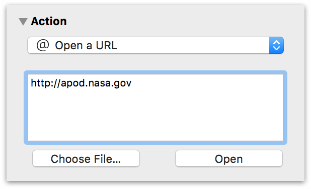
Open a URL — Specify a URL or filepath to open. Links (URLs) to web sites are opened in your default web browser, while files are opened in the appropriate app.
-
Open a File — Choose a file to open; when the Action is clicked, the file will open in its default app.
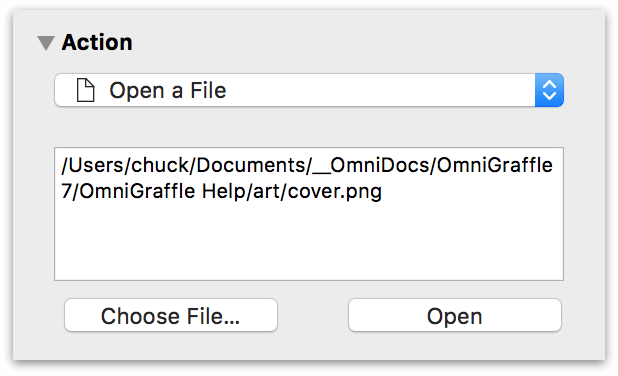
Note that file paths are relative: they start from the folder containing the document you’re working on, not from the root of your hard drive. Click Open button to try opening the file or URL that you’ve specified. When the object is clicked, the file or URL is opened in the appropriate app.
-
Run AppleScript — Runs an AppleScript that you enter into the space provided.
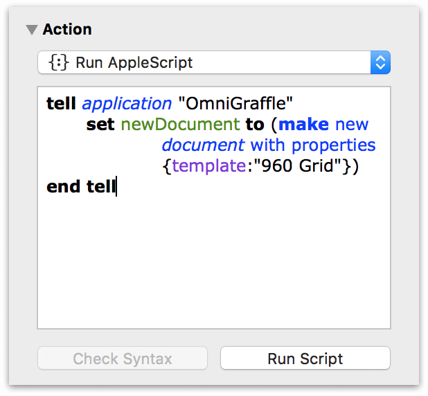
If you choose Runs a Script, you get a text field for entering an AppleScript. The script that you enter is run such that
selfrefers to the clicked object. Click Check Syntax to make sure that the AppleScript is correct, and then click Run Script to try it out. In Presentation Mode (Option-Command-P), the script runs when an actionable object is clicked. -
Jump to — Jump to another location in the current OmniGraffle file. You can specify a specific canvas name, and choose the location type from the pop-up menu that appears above the preview.
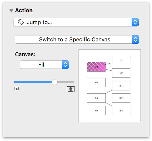
Locations you can choose from include:
- Highlight an Object
- Center on a Point
- Zoom to Display a Rectangle
- Switch to the Previous Canvas
- Switch to the Next Canvas
- Switch to a Specific Canvas
Some of these options offer a canvas preview, in which you can click or drag to indicate which object to highlight, which point to center on, or where to zoom. If you select Switch to a Specific Canvas, use the Canvas pop-up menu to choose from one of the canvases in your project.
-
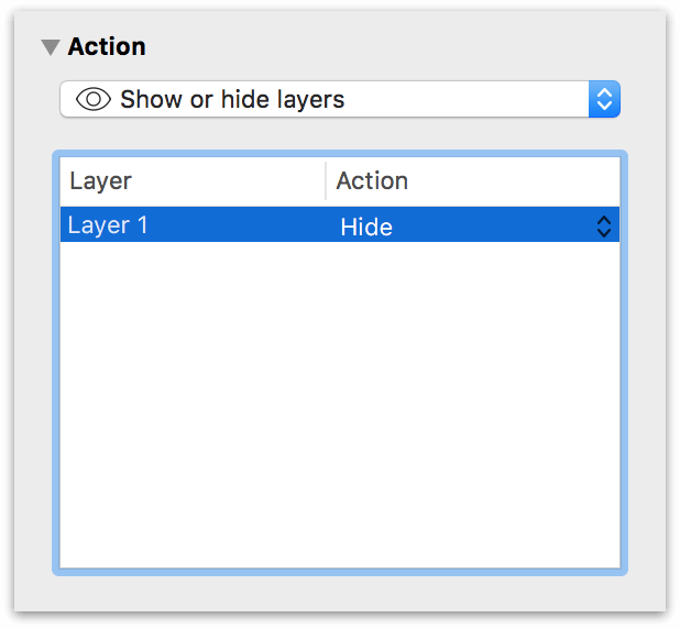
Show or Hide Layers — You can indicate whether to Show, Hide, or Toggle the visibility of any layer of the current canvas.
Adding Data to Objects with the Note Inspector (PRO)
The Note inspector contains a field for entering text to associate with the selected object, and a table of custom data.
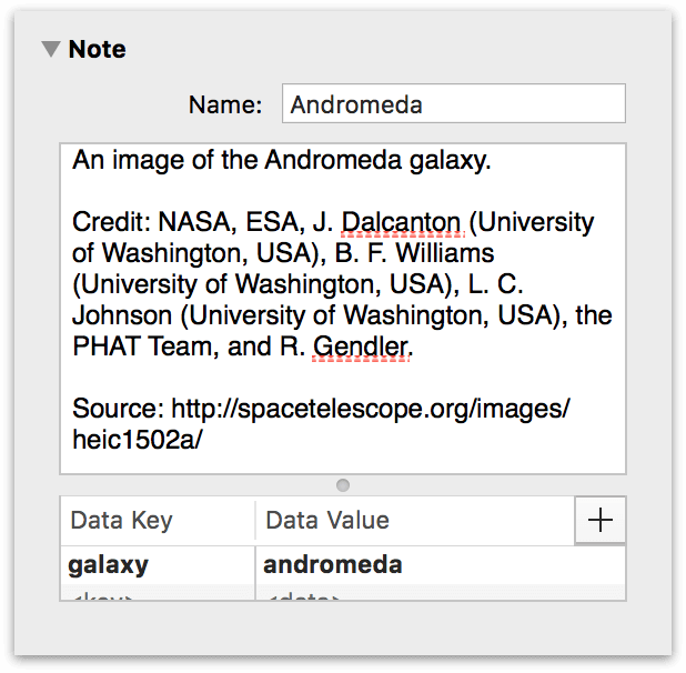
The Note can be formatted as Rich Text, which means you can use all of the different font styles and colors that you can use elsewhere in OmniGraffle. When you place the mouse pointer over an object on the canvas with a Note, the note’s text appears in a help tag floating over the object.
You can use the custom data table to keep your own information about the object. Custom data is stored as key/value pairs: the Key is like a label for what type of information you are storing, and the Value is the information itself.
For example, imagine you have a diagram of a computer network, and you want to assign a model number to each component. Click the placeholder row or the plus button to create a new key/value pair. In the Key column, you would type Part Number, and in the Value field, you would type, say, A1181. This data doesn’t have any effect on the way OmniGraffle works; it’s just a way for you to store arbitrary data about objects in your diagram. To delete a row of data, click the ‘x’ button on the right side of the row.
Notes can be found by macOS’s Spotlight search feature, in case you need to find your OmniGraffle diagrams that contain certain words.
The Canvas Inspectors
Use the Canvas inspectors to manage the appearance and properties of the current or selected canvases.
Create an Infinite Canvas or Change Canvas Dimensions with the Canvas Size Inspector
Use this inspector to change the size and directional flow of the canvas, and how the canvas fits onto printed pages.
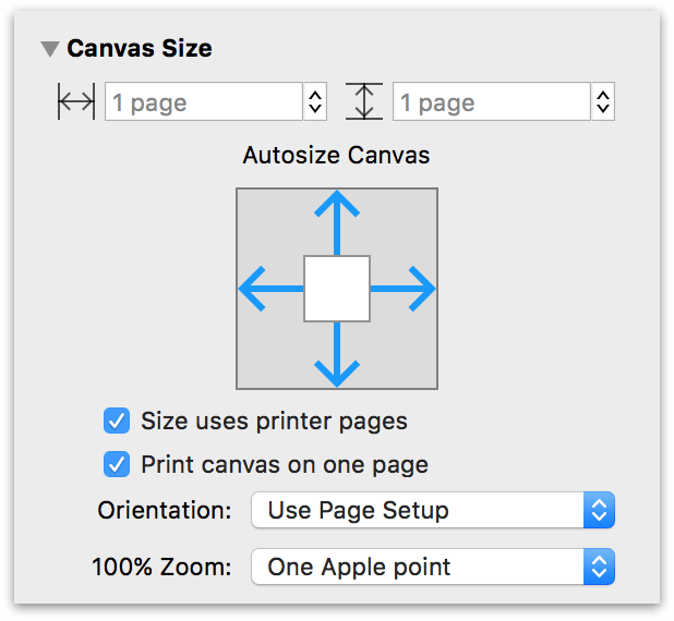
- The Canvas Size fields control the width and height of the canvas. You can use any of the units available in the Ruler, or enter a number of pages.
-
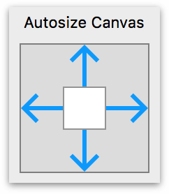
Use the Autosize Canvas control to specify in which directions the canvas will grow or shrink to fit the objects you create. For an Infinite Canvas, select the arrows in each direction:
-
If your design has a specific width, you can set the Canvas Width, and then choose which direction the canvas autosizes vertically (Up, Down, or both).
-
Similarly, if your design has a specific height, you can set the Canvas Height, and then choose which direction the canvas autosizes horizontally (left, right, or both).
-
And if your design has a fixed size, you can disable all of the arrows for Autosize Canvas, and then set a specific Canvas Width and Canvas Height.
- With Size uses printer pages selected, the Canvas Size is determined by the Paper Size you have selected in the Print Setup screen (File ▸ Print Setup, or Shift-Command-P).
- With Print canvas on one page selected, the canvas gets scaled up or down when printed to fit on a single piece of paper, regardless of its size on the screen.
- The Orientation of pages can be Portrait (vertical), Landscape (horizontal), or can be taken from the settings in Page Setup, which is the default setting.
-
-
If you have OmniGraffle Pro, you can also specify how things look onscreen when viewing your document at 100% Zoom:
-
One screen pixel matches the pixel density of your display. For example, at 100% zoom, objects viewed at One screen pixel only appear smaller onscreen; however, they retain their actual size (which you can verify by looking at the object’s dimensions in the Geometry inspector).
-
One Apple point (the default) relates to resolution-independent distance on the display. For example, on a standard-resolution display, 1 point equals 1 pixel; on a Retina display, 1 point equals 2 pixels. At 100% zoom, objects viewed at One Apple point only appear smaller onscreen; however, they retain their actual size (which you can verify by looking at the object’s dimensions in the Geometry inspector).
-
One PostScript point displays the contents of your document at real-world size. At 100% zoom, you can hold a ruler up to your display and the size of the object you are measuring onscreen will match the dimensions you see in the Geometry inspector.
The 100% Zoom options make it possible for you to work on large-scale projects (such as a poster for an event, or even a highway billboard) at a smaller scale onscreen, and provide you with the flexibility to view your work in real-world dimensions when needed.
-
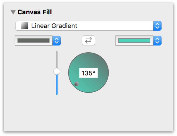
Specify a Background Fill or Pattern in the Canvas Fill Inspector
Select a canvas by clicking its preview in the sidebar to edit its background fill properties. As with the Fill inspector (see Coloring Shapes with the Fill Inspector, earlier in this chapter), you can choose from nine fill styles and edit various parameters of each.
Use an Image as a Backdrop in the Background Image Inspector
You can also add an image to a canvas. Just click the canvas in the sidebar and then use the Background Image inspector to place an image similarly to the Image inspector (see Placing Graphics Inside a Shape with the Image Inspector, earlier in this chapter).
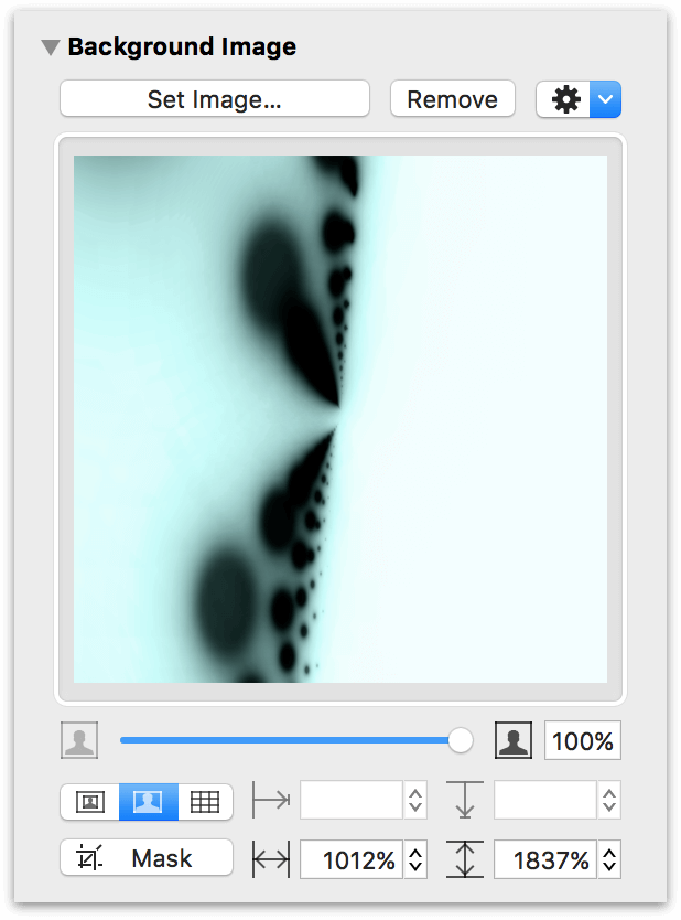
Use the controls above the Mask button to Manually Size, Stretch, or Tile the image you’ve placed. Use the grid of four fields to the right to position the image from left, from top, sized horizontally, or sized vertically. Use the slider beneath the image well to change the image’s opacity.
Defining the Units of Measurement in the Units Inspector
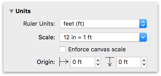
Use the Units inspector to determine the unit of measure to use for the canvas and its rulers, as well as to set the scale and ruler origin points.
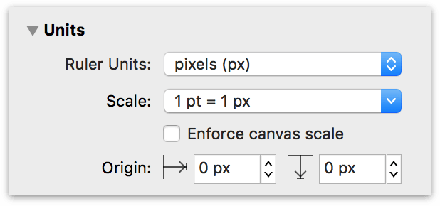
Ruler Units
The Ruler Units pop-up menu is where you set the type of measurement units you’d like to use for the current canvas.
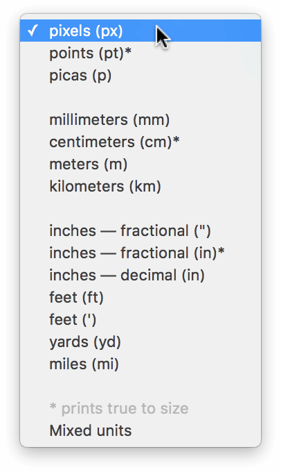
You can also change the Ruler Units by Control- or Right-clicking on the Canvas or one of the rulers. For more information, see Changing Ruler Units to Suit Your Design Needs earlier in this guide.
The actual size of your diagram does not change when you change the Ruler Units; it is merely measured differently. The ruler and the inspectors display measurements in whichever unit you select.
As you may have noticed, Points (pt), Centimeters (cm), and Inches, fractional (in) each have an asterisk (*) next to them in the Ruler Units pop-up menu. With one of these Ruler Units selected, objects on the canvas will print to size as long as the Scale is 1:1 (i.e., 1 pt = 1 pt, 1 cm = 1 cm, or 1 in = 1 in). For example, if you have a 5 cm square on the canvas and you print that canvas (by choosing File ▸ Print), you could measure that square with a ruler to reveal it is the exact size and scale as noted in the Units inspector.
Scale
The Scale pop-up menu can be used to interpret simple expressions of scale. This allows you, for example, to use OmniGraffle for things like creating to-scale drawings of your house and garden area, or for scaling icons and graphics needed for an app or website.
By default, the scale is based on what you have selected in the Ruler Units pop-up. For example, if you set the Ruler Units to feet (ft), the Scale pop-up reads 12 in = 1 ft.
If you choose Custom from the Scale pop-up, you can change the scale to suit the project you’re currently working on. For example, if you enter 1 cm = 1 m, 1 cm on the ruler now becomes 1 meter, objects on the canvas that were 2 cm wide are now 2 meters wide, and so on. The Units setting changes to match the second value in the equation.
You can also enter a ratio, such as 1:2 or 100:93000000, as a Custom scaling option. The Scale ratio you set respects the Ruler Units selected in the pop-up menu above. For example, if the Ruler Units are set to pixels (px), and the scale uses a ratio of 1:2, objects on the Canvas are, effectively, twice as big.
Enforce Canvas Scale
If you need to draw something to a different scale (for example, if you are doing landscape planning), clearly you don’t want to print an exact-scale replica of your garden. However, if you first select Enforce canvas scale in the Units inspector, you can change the scale to something more sane; such as 1 in = 12 in, where 1 inch on the canvas is the equivalent of 12 inches (1 foot) in the real world. You’ll notice that the objects and rulers change their scale, but the object retains its dimensions in the Geometry inspector.
Optionally, you can turn on Enforce canvas scale in the Units inspector. With Enforce canvas scale enabled, nothing happens to the objects on the Canvas when the Scale is at a 1:1 ratio (e.g., 1 pt = 1 px or 1 in = 1 in). If you change the Scale ratio to 1:3, for example, the objects appear to be smaller as the canvas scales to the new setting. However, if you select an object and examine its properties in the Geometry inspector, you’ll notice that the object is still the same size—it just looks smaller because the Canvas Scale’s is no longer 1:1.
The one caveat to enabling Enforce canvas scale is when you are adding Stencils to your canvas. Stencils, such as the Basic ▸ Shapes objects, already have a predetermined size:
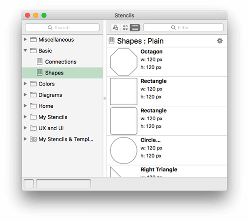
With a 1:1 Scale—regardless of whether Enforce canvas scale is enabled—Stencils you place on the canvas are sized normally. If you turn on Enforce canvas scale and then change the ratio to something like 1:4, the Stencil appears to be smaller, but it is sized to fit the Canvas Scale. However, if you have the same 1:4 canvas scale ratio but turn off Enforce canvas scale, the stencil not only appears to be four times as big, it is four times as big when you examine its properties in the Geometry inspector.
Canvas Origin Points
By default, the very upper-left corner of a canvas is its origin (that is, the point where the rulers’ measurements start from, where the coordinates are 0,0). To change the origin, enter values in the two Origin fields. (You can also drag the origin from the corner where the rulers meet.) The coordinates in the Geometry inspector are based on this origin point.
In the case of an Infinite Canvas, a base point on the canvas is used as the origin (0,0). The numbers on the rulers can extend in all directions, from negative to positive. See What Happens to the Canvas Origin with an Infinite Canvas, earlier in this guide.
Setting Up a Grid with the Grid Inspector
Use this inspector to set up a grid on the canvas, so you can keep objects lined up nicely.
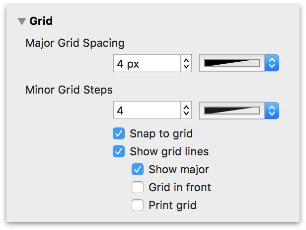
The two fields at the top of the inspector are where you can set the values for the Major and Minor Grid spacing, respectively:
- The Major Grid Spacing field determines how large each square of the main grid should be. Click the color well next to it to choose a color for the major grid.
- The Minor Grid Steps field determines how many minor grid squares should fit across one major grid square. For example, if your major grid squares are 100 pixels across, and you have 10 minor grid steps, your minor grid squares are 10 pixels across. Click the color well next to it to choose a color for the minor grid.
The checkboxes beneath the Major and Minor Grid spacing fields provide additional control over how the grid is used and its appearance:
- While the Snap to grid checkbox is selected, all objects fit themselves to the grid as you create or move them. (If you want to snap objects already on the canvas, use the Align To Grid button below.)
- Select Show grid lines to show the Minor Grid lines on the canvas.
- Select Show major to make the heavier Major Grid lines visible as well.
- Select Grid in front to make the grid visible in front of objects on the canvas.
- Select Print grid to include the grid when printing.
Choose Arrange ▸ Grid ▸ Align Objects to Grid (Option-Command-[) to make all of the selected objects line up to the grid right away.
Nudging Objects on the Canvas
While working in OmniGraffle, there are times when you just need to give an object a little "nudge" to get it into position. To nudge an object, select it first and then press one of the arrow keys on the keyboard to move it up, down, left, or right.
The nudge distance is determined by the distance set in the Grid inspector’s Minor Grid Steps field, and whether Snap to grid is on or off:
- When Snap to Grid is Off, pressing an arrow key nudges the selected object 1 pt in the direction of the arrow key pressed, regardless of the units you are using.
- When Snap to Grid is On, pressing an arrow key nudges the selected object by one Minor Grid Step in the direction of the arrow key pressed.
Holding Shift while nudging inverts the nudge behavior. For example, if Snap to grid is off and you hold Shift while nudging an object, the object is nudged by one Minor Grid Step.
Similarly, if Snap to grid is on and you hold the Shift key while nudging an object, the object is nudged by 1 pt in the direction of the arrow key pressed.
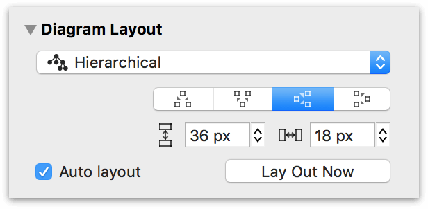
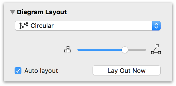
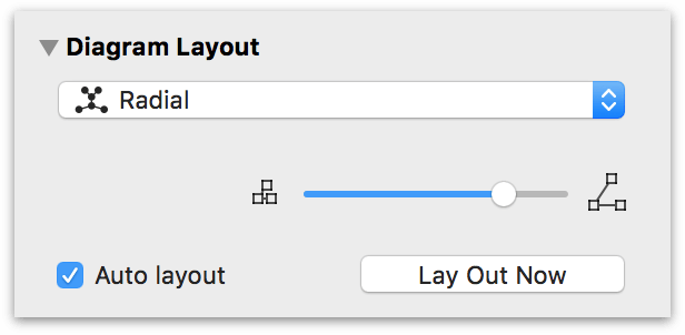
Automatically Arranging Objects with the Diagram Layout Inspector
Use this inspector to automatically lay out shapes based on the logical relationships established by the connection lines between them.
Use the Layout Type pop-up menu to select from one of four layout types: Hierarchical (the default), Force-directed, Circular, and Radial. The various controls within the Diagram Layout inspector change depending on which layout type you choose.
- Hierarchical
-
The hierarchical layout creates layers of equally-ranked objects, extending in one direction.
- Force-directed
-
The force-directed layout grows in semi-random directions from the center, rather than in one particular direction from the edge.
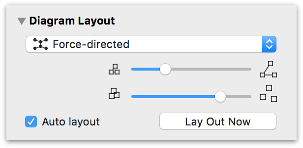
The top slider determines the length of the connecting lines between objects, and the bottom slider determines how far apart the objects appear in the diagram.
- Circular
-
The circular layout tries to arrange sibling shapes in a circle around their parent.
- Radial
-
The radial layout tries to arrange sibling shapes in arcs around their parent.
When you use a hierarchical layout:
- The Direction buttons change where the top level objects start, and which way to layer the lower level objects from there.
- The Rank Separation field controls how far away each level of objects should be from the next.
- The Object Separation field controls how far away each object should be from other objects on the same level.
When you use other layout methods:
- Connection lines can stretch and compress, but you can adjust their average length by dragging the Line Length slider.
- The Shape Repulsion slider determines how strongly the shapes try to avoid coming near one another. If the line length and shape repulsion are small enough, shapes can be made to overlap.
Finally, you can turn on Auto layout to make OmniGraffle distribute the objects on the canvas whenever the connections between them change.
Defining Your Canvases in the Canvas Data Inspector (PRO)
You can also edit the note and other metadata of a canvas itself. Select the canvas in the Sidebar and then use the Canvas Data inspector to add metadata for the canvas.
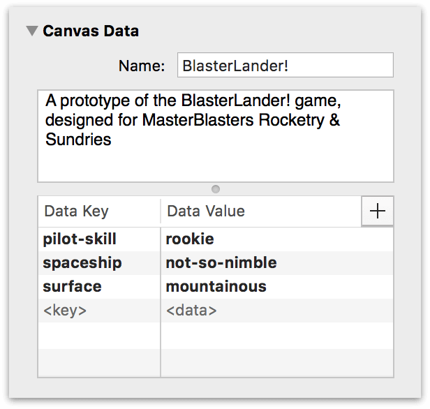
As with the data added using the Note inspector, this information is used primarily for indexing and doesn’t affect the appearance of your OmniGraffle document in any way.
The Document Inspectors
Use the Document inspectors to manage the properties of your OmniGraffle document.
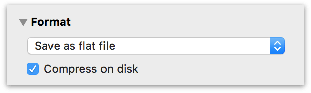
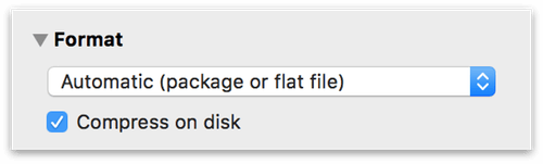
The Format Inspector
The pop-up menu determines whether to save your document as a flat file or a file package:
The options for saving your OmniGraffle files include are covered in the following sections.
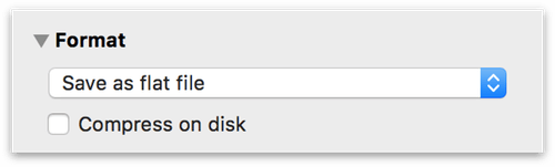
Save as flat file
A flat file is a single file on disk, with all of the attached images and resources embedded within.
Choose Save as flat file when saving your files to cloud services, such as Dropbox or some networked storage systems.
Save as file package
OmniGraffle’s file package format is highly structured, allowing it to perform better than a flat file when the document contains more than basic XML data.
If you are saving and syncing files to the cloud, please know that the file package format works with both OmniPresence and iCloud Drive, but there is a fairly strong risk that OmniGraffle package files could become corrupt on other systems, such as Dropbox.
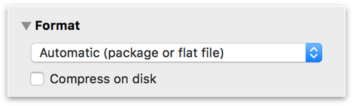
Automatic (package or flat file)
Due to its performance gains, we encourage you to choose the Automatic (package or flat file) option whenever possible, particularly if you are saving files to your Mac’s hard drive.
When selected, OmniGraffle saves your file in the most efficient format as possible (either flat or as a package file). The file version—flat or packaged—isn’t determined on what produces the smaller file size; it is based on what works best for the contents of the file.
Choose Automatic (package or flat file) when saving files to:
- your Mac’s hard drive;
- a version control system, such as SVN, GIT, or CVS; or,
- OmniPresence or iCloud Drive for syncing files between devices.
Do not use Automatic (package or flat file) when storing and syncing files with other cloud services, such as Dropbox, or to some networked storage systems.
Compress on disk
When you turn on Compress on disk, your OmniGraffle files are saved in a binary format that takes up less hard drive space. As such, the contents of a compressed file cannot be read by scripts or text editors.
If you aren’t scripting your projects, or if you don’t need to open them in a text editor, we recommend that you consider enabling the Compress on disk option. This won’t hurt anything; it just makes the file size a bit smaller.
That said, we recommend that you do not use the Compress on disk option when storing files in a version control system.
Guidance for How to Save Your OmniGraffle Files
With all of the terms laid out for your edification, how you save your OmniGraffle files depends greatly on where you save your files. Please use the following guidance to ensure the best possible experience when using and storing OmniGraffle files:
-
Local File Storage — If you are storing files locally on your Mac’s hard drive, we recommend the following choices:
- Automatic (package or flat file)
- Turn on Compress on disk

-
Storing Files in the Cloud — How you configure the file format depends on where you are storing and syncing files:
-
Storing and Syncing with OmniPresence or to iCloud Drive:
- Automatic (package or flat file)
- Turn on Compress on disk
-
Storing and syncing files to other cloud services (such as Dropbox), or to some networked storage systems:
- Save as flat file
- Compress on disk can be on or off, depending on your preference.
-
-
Storing Files in Version Control — When checking your OmniGraffle files into version control system, such as SVN, GIT, or CVS, use the following settings:
- Automatic (package or flat file)
- Do not turn on Compress on disk
If you choose to save files without compression, bare in mind that those files will likely be larger in size. Which means, depending on the speed of your Internet connection, file syncing can take longer.
The Margins Inspector
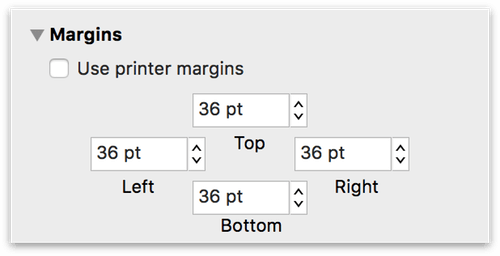
Here you can specify your own page margins, or choose Use printer margins to default to the margins defined by your printer driver (or by any custom settings you’ve made in File ▸ Page Setup).
Storing Information in the Document Data Inspector
The Document Data inspector has fields for lots of information about your document, in case you care to keep track of such things. The available fields are Subject, Copyright, Version, Description, and Comments. The pop-up menu includes options for adding information about the document’s Authors, Organizations, Languages, Keywords, and Projects.
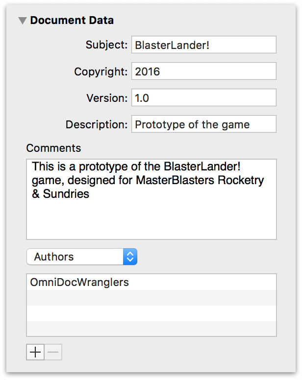
All of this data is made available to macOS’s Spotlight searching feature, to help you find the diagram you’re looking for.