Navigating the Outline
The Outline lies at the heart of everything you do in OmniOutliner. It’s where you compose and arrange content, it reflects the styles you choose with the Sidebar and Inspectors, and it is built on a hierarchy of rows that gives exactly the structure you want for your data.
The Anatomy of a Row
When working in the outline, the building blocks of your content are referred to as rows.
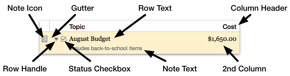
Rows can appear as simple as a line of text, but many outline styles also display other common components to the row such as handles, notes, and status checkboxes. Rows can also span multiple columns (if your document has more than one).
You can choose to hide or show all of these components independently of one another (other than the text of the row itself—which can be collapsed if the row is hierarchically nested beneath another).
Click the space to the left of the row handle, known as the gutter, to select a row.
Shift-click to select multiple contiguous rows, or Command-click to select multiple discontiguous rows in the outline.
Use Text Folding (View ▸ Show Full Row Text ▸ When Editing) to truncate the contents of a row to a single line when not editing the row.
Row Handles
Row Handles are used to get a grip on the contents of a row and any of its children in the hierarchy. Click and drag a row handle to move the row (and any beneath it) elsewhere in the outline.
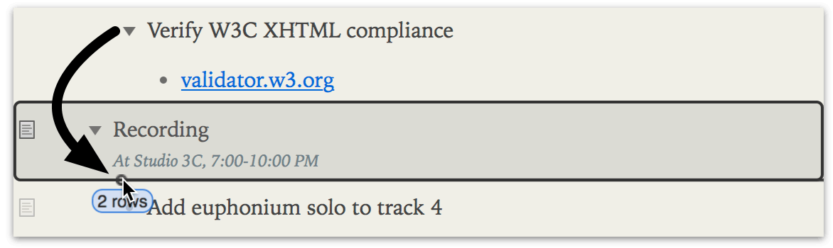
Row handles come in two styles: bullets, which indicate the row has no children, and disclosure triangles, which mean the row has child rows indented underneath. Click a row’s disclosure triangle to show or hide its children. (You can also do this when row handles are hidden; just use the Expand and Collapse options in the View menu.)
Option-click a disclosure triangle to open or close all of the rows within.
To hide row handles throughout your document, use the Row Inspector’s Handle controls. Row handles can be shown at all times, only on mouseover, or hidden completely.
Status Checkboxes
If your outline contains items with a binary status that would be useful to have indicated on a row (a list of tasks to be completed, for example), you can choose to show or hide interactive checkboxes adjacent to each row. Choose View ▸ Show/Hide Status Checkboxes to change their visibility.
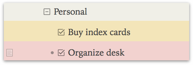
The state of a status checkbox is saved along with the document, so a checked item will retain its state regardless of whether checkboxes are currently being shown.
Notes
OmniOutliner supports adding notes to individual rows in the outline. These notes are attached to the rows they annotate, living at the same position as the row in your outline’s hierarchy.
On the left side of the outline is a hidden Note column. This narrow column may appear empty, but hover the mouse cursor over it and a note icon  appears next to the adjacent row.
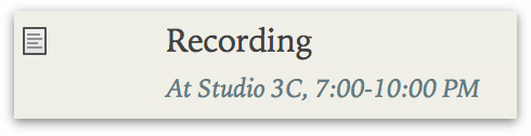
Click this icon to add note text to the row. A row with note text gains a permanent version of the note icon  , which is used to collapse or expand visibility of the note for that row.
By default notes are displayed individually beneath the rows they are attached to. If you prefer, you can opt to have them appear in a pane along the bottom of the Outline area instead. To view your Notes in a pane, choose View ▸ Notes ▸ Display in Pane.
To hide the column where the Notes icons appear, choose View ▸ Columns ▸ Note.
Columns
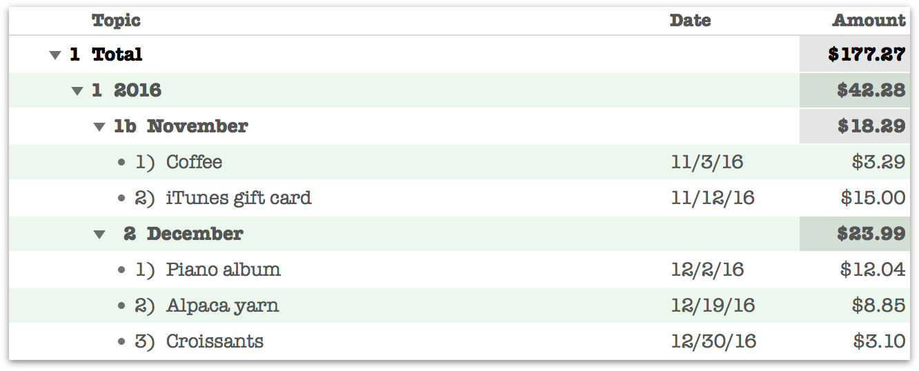
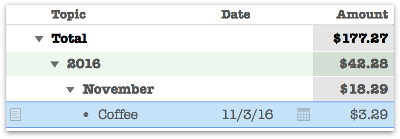
Just as rows describe how your content is oriented horizontally in the outline, Columns describe how it is grouped vertically.
All OmniOutliner documents must have at least one column. The default column created for a new document is the Topic column, which contains content in rich text format by default. The Topic column has some special properties:
-
The Topic column is the only column in the outline that can organize its rows hierarchically; when organization in the Topic column changes, content in additional columns comes along for the ride.
-
The Topic column can have a fixed width, or can adjust automatically to fit the width of the window or other columns. Choose Autosize from the Topic header contextual menu, Auto from the Column Type inspector, or View > Columns > Autosize Topic to switch between modes.
Outlines with a single column do not display the column header (since there’s no need to distinguish between multiple columns). Once a second column is added, the headers are shown above each column. This is the Automatic behavior, which can be changed by choosing from the View ▸ Column Headers submenu.
Add columns to your document with the Add Column button in the Toolbar, or the Organize ▸ Add Column menu item. Delete columns by selecting them (click the column header) and pressing Delete, or editing a cell in the column and choosing Organize ▸ Remove Column. Double-click on a column’s header to change the column title.
As shown in the illustration above, columns can have specialized types other than rich text. Choose an alternate type for your column data with the Column Type Inspector.