The Selection Inspectors
OmniOutliner's Inspector, revealed by tapping  , contains controls for customizing the appearance, layout, styling, and technical properties of your document. The inspector controls are split into two groups: the Selection inspectors, which govern properties of selections in the outline, and the Document inspectors, which contain document-wide settings, column controls, and style editing tools.
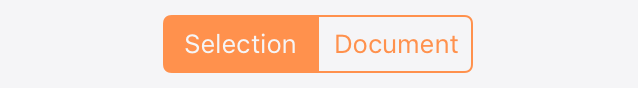
Tap the segmented control at the top of the inspector pane to switch between the Selection and Document inspectors.
This chapter describes the features of the Selection inspectors, including controls for changing the selection's Font, Paragraph layout, Row numbering, and applying or editing Style presets saved along with the outline.
The Selection inspectors govern the style properties of content currently selected in the outline.
If nothing is selected, changes made apply to the Whole Document structural style, as described in Structural Styles and Style Layers.
Font
The Font inspector controls the font family, color, styles, and size of the current selection.
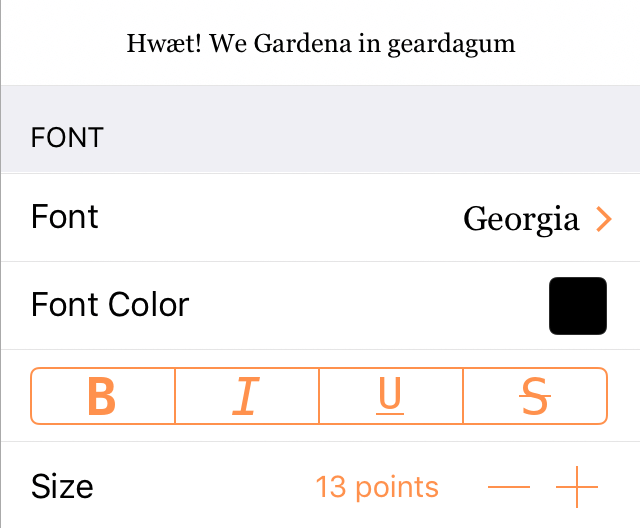
Font Family
Choose from Recommended Fonts or All Fonts; tap  for additional style attributes.
Font Color
Tap to select a color. See Choosing Colors for more detail on setting colors in OmniOutliner.
Bold, Italic, Underline, Strikethrough
Tap B to embolden the text; tap I to italicize the text; tap U to underline the text; or tap S to apply a strikethrough.
Size
Tap the minus button  or the plus button
  to make the text smaller or larger, respectively. Optionally, double-tap the point size to enter a specific value.
Paragraph
The Paragraph inspector controls the text alignment and background color of the current selection.
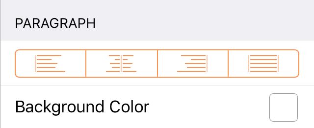
Alignment
Choose how text aligns horizontally; align to the Left, Center, Right, or Justified, respectively. With a row or rows selected, the alignment applies to text in each cell in the row. With text selected, the alignment applies to all text in the cell containing the selection.
Background Color
Choose a background color for the selected text or rows. With a row or rows selected, the background color applies to the entire row. With text selected, the background color applies to the selected text only, unless all of the text in a note or cell is selected, in which case the background color applies to the entire note or cell.
Row
The Row inspector controls the row numbering and numbering style of the current selection.
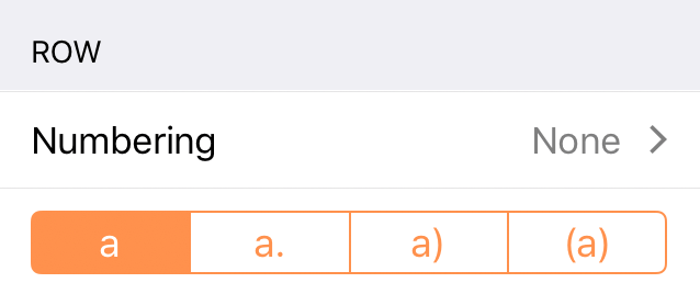
Numbering
With a row or rows selected, choosing a numbering scheme from this sub-inspector applies numbers (or letters) to each of the selected rows corresponding to their position in the outline.
Since numbering applies to entire rows, this control works the same when editing text in a cell as it does when the row itself is selected.
Adornments
With a row or rows selected, choosing an adornment style from the segmented control applies it to the front of the row adjacent to the row number. (if no row number is present, the adornment appears alone.)
Column
The Column inspector appears when editing text in a cell, and corresponds to the column containing that cell (in a single column document, this is always the default Topic column).
Use the controls in the Column inspector to rename the column, change the column's data type, determine whether (and how) the column displays summaries of its data and whether the column autosizes to fit the document, and set the custom style properties of the column.
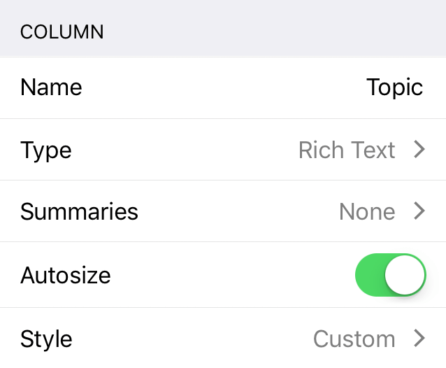
Column Name
Tap here to change the existing column name to something else.
Column Type
The Topic column and any additional columns always start out with the Rich Text type by default. However, you can change this to one of the following to suit the needs of your outline.
If you add custom content specific to a chosen column type, switching the column type to one that doesn’t support that specialized content will cause it to be lost.
If you unintentionally switch column types, tap Undo to switch back to the previous type and revert any data loss.
- Rich Text
- Choose Rich Text for regular text; this is the default column type for new columns.
- Number
- Choose Number as as the column type when you have a numbered value that you’d like to record.
- Tap the Info button to choose from a variety of available formats for numbers in this column.
- 9,999.99—Numbers with a two-digit decimal at the end. Large numbers will use a comma to separate thousands.
- 9999.99—Numbers with a two-digit decimal.
- 10000—Whole numbers; decimal numbers are rounded up or down to the nearest whole number. For example, 2.67 is rounded up to 3, while 3.14 is rounded down to 3.
- 10000%—A whole number percentage; a decimal number that gets entered is rounded up or down to the nearest whole number. For example, 2.67% is rounded up to 3%, while 3.14% is rounded down to 3%.
- 99.99%—Percentages with a two-digit decimal value, if needed. For example, 99% appears as that and not 99.00%, while 3.14159% is rounded to 3.14%.
- $9,999.99—Use this option for representing currency values based on the settings you choose in iOS Settings > General > Language & Region. For example, if your region is set to Japan, the currency value would show up with the Yen symbol (¥).
- Date
- Tap the Info button to choose a date and optional time format to use in the column.
- When entering dates into columns, OmniOutliner uses date parsing logic that accurately interprets things like now, yesterday, 2d, September, thu, or –5w and renders the date in the relevant format.
- Duration
- Use a Duration column for estimating or tracking the amount of time a task or project takes.
- Tap the Info button to choose from Work Time (the default; 8 hours per day) and Calendar Time (24 hours per day). OmniOutliner formats the duration time based on the setting you’ve chosen; for example, 12h in Calendar Time is equivalent to 1d 4h in Work Time (assuming an 8 hour workday).
- Pop-up List
- Choose the Pop-up List column type when you have a set of repeating options that you want to choose from.
- Tap the Info button to set up the list of values (pop-up options) for the column. Tap the + button at the bottom of the inspector to add new values, and tap Edit to rearrange or delete them. Tap the values in the list to edit their text.
- After creating the list, tap a cell in the Pop-up List column to choose from a menu of the preset values. Alternatively, use the field at the top of the menu to search for a value to apply. If the value doesn't exist, tap Add "x" to add it to the list.
- Checkbox
- Tap the checkbox in a checkbox column cell to toggle between a checked and unchecked binary state. (The checkbox is the only content in a column of this type.)
Column Summaries
The second control in the Column inspector provides options for converting the column into a summary.
The most important thing to know about summary columns is that they only appear on the parent row for a group. In that parent row, the summary appears in the column calculated based on the values of its children, but with a gray background to the cell. The gray background is a transparent layer of black, which slightly darkens any background color you’ve assigned to the row style.
The options in the Summary popup menu change depending on the column type.
Rich Text column type summary options include:
-
None—There is no summary.
-
Hidden—The summary cell is empty.
Number column type summary options include:
-
None—There is no summary.
-
Total—The summary cell displays the total of all cells in the column.
-
Minimum—The summary cell displays the lowest number in the column.
-
Maximum—The summary cell displays the highest number in the column.
-
Average Leaves—The summary cell displays the weighted average of numerical values among children of branches of the parent row (also known as leaves). If one branch has two leaves and another has one, for example, the first branch is weighted at 2/3 of the average displayed in the parent cell, while the second is weighted at 1/3.
-
Hidden—The summary cell is empty.
Date column type summary options include:
-
None—There is no summary.
-
Minimum—The summary cell displays the earliest date (or time) in the column from among the child rows.
-
Maximum—The summary cell displays the latest date (or time) in the column from among the child rows.
-
Hidden—The summary cell is empty.
Duration column type summary options include:
-
None—There is no summary.
-
Total—The summary cell displays the total of all cells in the column.
-
Minimum—The summary cell displays the lowest duration in the column.
-
Maximum—The summary cell displays the highest duration in the column.
-
Average Leaves—The summary cell displays the weighted average of durations among children of branches of the parent row (also known as leaves). If one branch has two leaves and another has one, for example, the first branch is weighted at 2/3 of the average displayed in the parent cell, while the second is weighted at 1/3.
-
Hidden—The summary cell is empty.
Pop-up List column type summary options include:
-
Minimum—The summary cell displays the earliest entry in the Column Type inspector from among those in the children it summarizes.
-
Maximum—The summary cell displays the latest entry in the Column Type inspector from among those in the children it summarizes.
-
Hidden—The summary cell is empty.
Checkbox column type summary options include:
-
None—There is no summary; the summary cell displays a checkbox that acts completely independent of its children.
-
State—Displays an empty checkbox if no items have been checked off, a checkbox with a dash inside if some items have been checked, or a filled checkbox if all of the items have been checked.
-
Hidden—The summary cell is empty, regardless of the state of the other checkboxes in the column.
Autosize Column
When the Topic column is selected, use the Autosize switch to have it resize automatically based on the changing widths of the device view or the other columns in the outline. (This control only appears when editing the Topic column and is not available for other columns.)
Column Style
Tap to apply a custom style to the column. The top level of the Column Style editor has controls for commonly used styles like bold, italic, and underline, as well as the list of named styles saved with the document.
Tap Customize style for the full set of additional style controls, identical to those in the Selection inspector (described throughout this chapter).
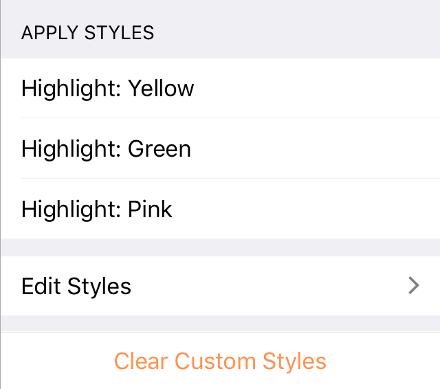
Apply Styles
The Apply Styles inspector provides controls for applying named styles to the current selection, editing existing styles, and removing custom styles from the selection.
To apply a style to a selected row, rows, or text, tap the style's name in the inspector. A check mark appears next to the style to indicate that it is applied to the selection. (Tap the style's name again to remove it.)
Edit Styles and Add Named Styles
Tap Edit Styles to view a list of all style presets currently saved with the document. These include structural styles, which apply to universal components of the outline, and named styles, which are saved sets of style attributes that can be applied to individual selections.
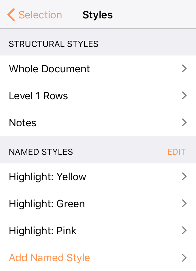
Tap a style's name in the list to open it for editing. An inspector pane appears with controls similar to the Selection inspectors described in this chapter, except that the values set for each parameter apply to the chosen style rather than a selection in the outline. (When a named style is applied to a selection, it brings its entire set of style attributes along for the ride.)
To reorder or delete named styles saved with the document, tap Edit next to the Named Styles inspector header. Use the reordering handle on the right of a style's row to change its position in the list, and tap the Delete button on the left to reveal a delete control that removes the style from the document entirely.
To create a new named style, tap Add Named Style at the bottom of the list of named styles. This presents the style editor, where you can add a name for the style and define its attributes just as if you were setting style attributes on a selection in the outline.
Clear Custom Styles
If any custom styles have been applied to the selection, tap Clear Custom Styles to remove them all and return the selection style to that inherited from the document's underlying structural styles.
Structural Styles and Style Layers
Structural styles, as the name implies, are style presets that apply to sections of the document based on its structure.
Since a document's structure depends on how you organize it, elements of structure are made available for styling based on changes you make to the outline (rather than adding to the list of styles in the style editor, as is the case with named styles).
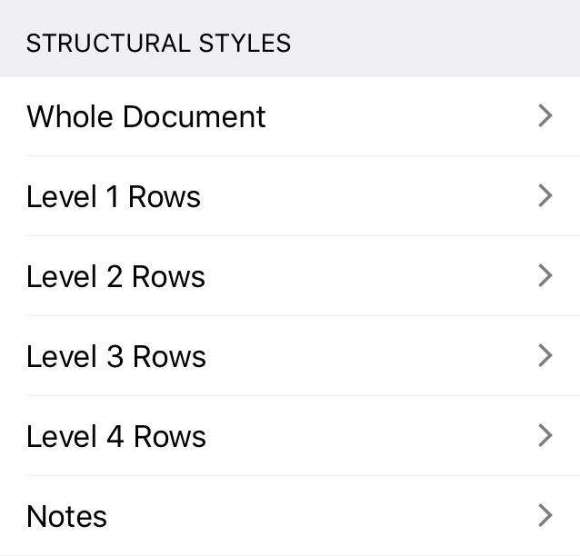
The list of available structural styles includes Whole Document (properties applying to every row in the document), Notes (properties that apply to all notes), and individual styles for every row level in the document hierarchy (Level 1 Rows, Level 2 Rows, etc.).
Additional structural styles are added automatically whenever you add a new, deeper level of hierarchy to the outline.
As the list of structural styles indicates, multiple styles may apply simultaneously to the same row, text, or section of the document. When this is the case, styles are layered from the general (bottommost layer) to the specific (topmost layer), with styles on top receiving priority for display when they conflict with styles beneath.
From lowest to highest, the order of style priority is as follows:
- The Whole Document structural style (the base on which other styles are layered)
- The Alternate Row Color, if one is set
- The column style
- Structural styles for individual row levels and structural styles for notes
- Named styles applied to a selection
- Ad hoc styles applied using the selection inspectors
Note that multiple named styles can be applied to the same selection. When this is the case, the styles take precedence in the order they appear in the named styles list, with the lowest on the list appearing on top of the others.
Including Styles Within Other Styles
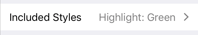
A control unique to the style editor is Included Styles, which can modify the properties of a style by including other named styles within it. To include other styles within a style that you are editing, tap Included Styles to show a list of the document's named styles, then tap one or more to select them for inclusion.
When a named style is included with another style, its properties are linked to that style on a level below the style's existing properties. For example, including a style that contains a font inside another style that already has a font selected will result in the container style's font coming out on top, and the style's font won't visibly change.
The properties of an included style are linked, rather than copied, so any subsequent changes made to the included style are reflected in the style that contains it.
Choosing Colors
Throughout the inspectors, you will find color swatches which you can tap to change the default colors.
Tapping a color swatch— —takes you to a pane of preset color palettes, from which you can choose another color.
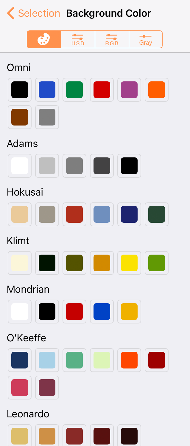
Tap to select another color, or tap the HSB, RGB, or Gray tabs to mix your own colors by adjusting the sliders in those tabs.