Using the Inspectors
OmniOutliner’s Inspectors are tool palettes grouped by theme that control the stylistic aspects of everything in your document: from individually applied text styles and row appearance traits, to column styles, to whole document styles that apply universally.
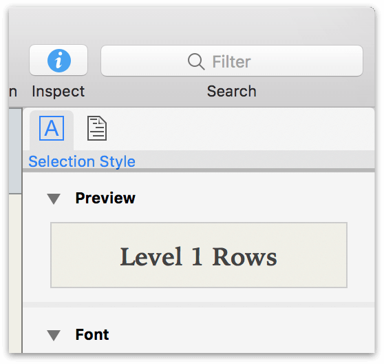
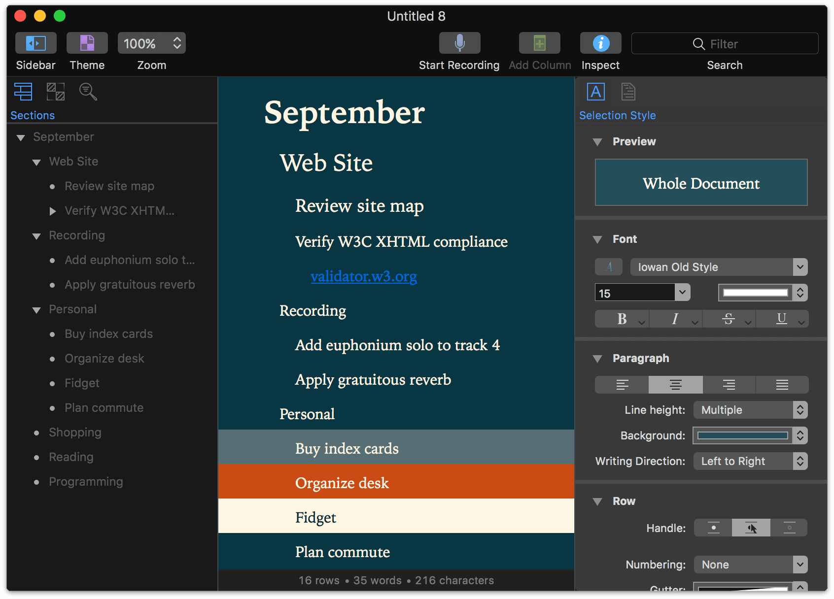
The Inspectors reside in a sidebar on the right side of the outline which you can open by clicking the Inspect button  in the Toolbar. Other ways you can open the Inspector are by choosing View ▸ Show/Hide Inspectors, or by using the Shift-Command-I keyboard shortcut.
The Inspectors are divided into two groups based on how their tools apply to the document: the Selection Style Inspectors, used to modify the style of a selection in the outline or Sidebar, and the Document Inspectors, used to modify the global traits of the document.
The Inspectors are pretty good at switching to what’s relevant based on your current selection. You can always switch between the Selection Style and Document Inspectors by clicking one of the buttons in the Inspector’s Toolbar along the top, or choosing from the View ▸ Inspectors submenu.
Selection Style Inspectors
Use the Selection Style Inspectors when you want to change the appearance of rows, columns, text selections or styles in your document.
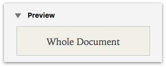
Preview
This Inspector provides a preview of the style applied to your current selection, as well as an indication of what that selection is (with nothing selected, for example, Whole Document is displayed).
Font
This Inspector provides a variety of controls for changing the appearance of the text in your document.
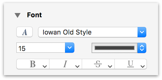
- Typeface, Size, and Color
- Choose the font, size, and color for the selected text or row.
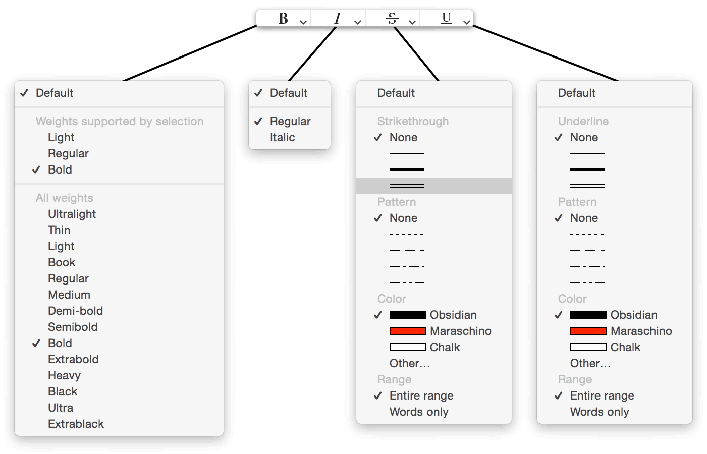
- Bold, Italic, Strikethrough, and Underline
- Click to apply the default Bold, Italic, Strikethrough, or Underline styles to the selected text or row. At the lower right of these buttons you’ll see an arrow pointing downward. This lets you know that there are additional options from which you can select. You can either click on the arrows, or click and hold to reveal the optional attributes menus.
Using the Colors Palette
Whenever you click on a color picker to choose a color for an element in an Inspector (such as the font color mentioned above), the Colors Palette appears—a special window for selecting, manipulating, and saving colors perfect for use throughout OmniOutliner.
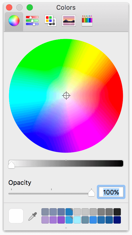
The big disc of color is known as the Color Wheel. To select a color, click within the color wheel and drag the handle to find the value you want. Beneath the color wheel you’ll see a slider for Opacity (or see-through-ness) of the color, where 0% is totally transparent and 100% is opaque.
You can switch from the color wheel to other color-choosing options by clicking the icons along the top of the colors palette, including the Color Sliders, Color Palettes, Image Palettes, and Pencils.
The lower left of the colors palette holds an eyedropper (click it to sample a color anywhere on your screen), and a rounded square that contains the color you’ve selected. This is the Color Inspector. Click and drag a color from the Inspector to one of the empty color swatches along the bottom of the window to save it.
If you run out of space in the color swatches area, click and drag the little dot handle at the bottom of the window to reveal more empty rows for saving your custom color selections.
Paragraph
Use the Paragraph Inspector to choose the layout and background attributes for the current selection.
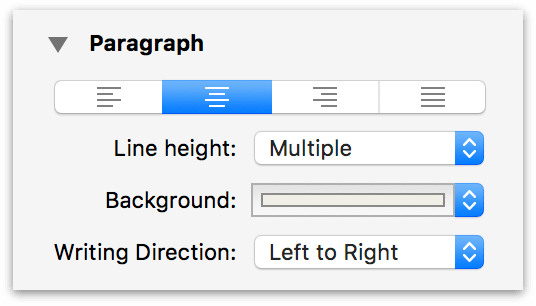
- Text Alignment
- This row of buttons are used to left-, center-, right-align, or justify text in the selection.
- Line Height
- Choose from a range of single to double spacing for your document. Line height adds spacing above the text within a row, where Padding adds spacing between rows.
- Background
- Set the background color for the selected row or style. Click the arrows on the right edge to choose from one of the presets we’ve offered, or click the color bar to open the Colors palette where you can choose a custom color.
- Writing Direction
- Set the writing direction to Natural (based on the system language), Left to Right, or Right to Left.
Enabling Dark Mode
The background color picker in the Paragraph Inspector has one other very special function: enabling Dark Mode throughout OmniOutliner. Dark mode changes the appearance of OmniOutliner’s window, making it more friendly on the eyes in low-light conditions (and making it more closely match the appearance of darker template themes, such as Solarized Dark). It looks something like this:
There are two ways to enable dark mode in your document.
-
Select a theme with a dark document background color.
-
Use the Paragraph Inspector to set a dark document background color.
To do this, first select the Whole Document style in the Styles Sidebar tab. Then click the background color picker in the Paragraph Inspector, and drag the color value slider to the right. At a certain point (as determined by the darkness of the color value), the OmniOutliner window will switch from light to dark.
This point will be slightly different depending on the darkness of the original background color. Experiment to find a color scheme you like! (And if you do, you can save it as a template for future use.)
Row
Use these controls to set row features on the current selection.
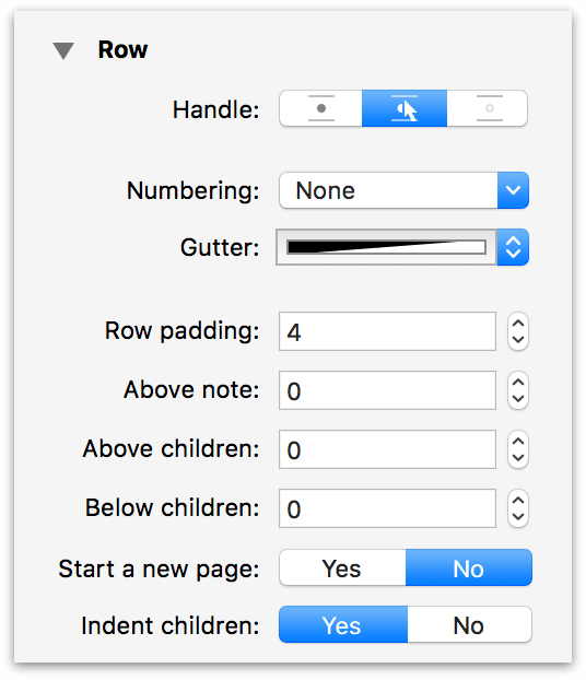
- Handle
- Determines whether the row handle is always visible, only visible when you hover over the row, or never visible.
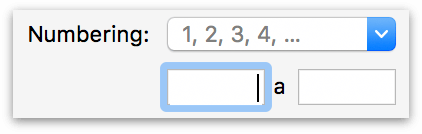
- Numbering
- Choose a numbering style to use for the rows in your document. The dropdown menu offers a variety of prefix and suffix choices that mirror those in the Format ▸ Row Numbering submenu.
-
It also offers the Other numbering option, which reveals two fields that define custom prefix and suffix characters for the row number. Values entered here statically flank any existing row numbering scheme.
- Gutter
- Set a color to use for the gutter (the area where the row handle and status checkbox appear). Click the arrows on the right edge to choose from one of the presets we’ve offered, or choose Other to open the Colors palette.
- Row Padding
- Set the amount of space (in pixels) above and below the text within the row.
- Above Note
- Set the amount of space above an inline note.
- Above Children
- Set the amount of space between a parent row and its children.
- Below Children
- Set the amount of space below the last child row.
- Start a New Page
- Determines whether the currently selected row forces the start of a new page. When you select this option, a red dashed line appears above the row, as if you were going to cut the document with a pair of scissors. This is specifically for the purposes of printing or exporting to PDF.
- Indent Children
- Choose whether to indent a row’s children. If you choose to not indent children, it might be hard to determine which is the parent and which is the child row. As such, you might want to style child rows differently, perhaps giving them a different background color or shade, reducing the font size, and so on.
Style Attributes
The Style Attributes Inspector shows a detailed list of all of the styles currently applied to the selection, organized by source. It also provides controls for removing styles on the selection, or bringing them (via drag and drop) to other items or styles in the outline.
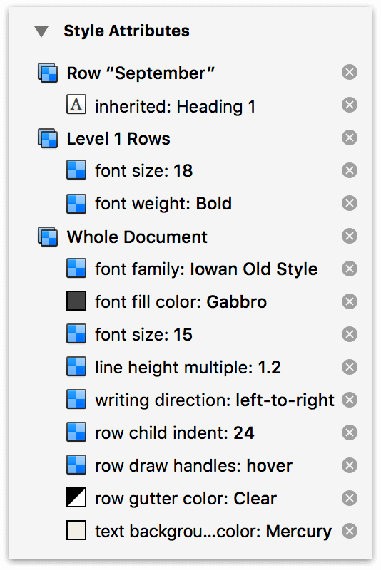
The order of styles shown matches the priority with which they are applied to the selection, providing insight on how the item’s style is calculated (where styles conflict, the topmost style overwrites those beneath it).
Click the  button at the right of each style to remove unwanted styles from the selection.
Column Type
The Column Type Inspector has two popup menus for setting column attributes (Type and Summary), and controls for determining column width. Some column types require additional formatting specific to them; additional menus appear to govern that formatting as required.
This Inspector appears while editing text in a column’s row, or when a column is selected (by clicking its header). If column headers are hidden, use View ▸ Column Headers ▸ Show to expose them for selection.
New columns always start out with the Rich Text type. However, you can change this to one of the following to suit the needs of your outline:
If you add custom content specific to a chosen column type, switching the column type to one that doesn’t support that specialized content will cause it to be lost.
If you unintentionally switch column types, Edit ▸ Undo (Command-Z) will switch back to the previous type and revert any data loss.
- Checkbox
-
Checkbox columns can be used for anything from giving you another checkbox to tick off, to monitoring the state of something, and even for ratings. You can add as many Checkbox columns as you’d like, and you can show or hide them as needed with the options in View ▸ Columns.
When used in combination with OmniOutliner’s sorting features (Organize ▸ Keep Sorted or Organize ▸ Sort Outline), checkboxes can be used to denote a Yes or No (binary) state for almost anything.
- Date
-
Choose a date and optional time format to use in the column.
When entering dates into columns, OmniOutliner uses date parsing logic that lets you type things like now, yesterday, 2d, september, thu, or –5w in a date column and have it know what you mean.
With the Date column type chosen, use the Locale dropdown menu to switch between regions used to calculate the time. Use the Format dropdown menu to choose how dates and times are displayed in the column.
If you choose Custom Format from the Format menu, the Date Format Editor appears.
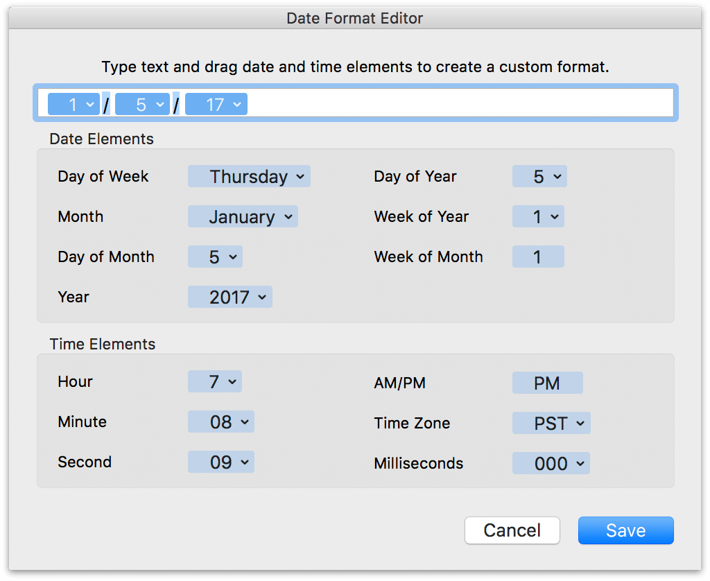
To use the Date Format Editor, drag the items you’d like as part of the date/time string up to the field at the top of the dialog window. Items, such as Day of the Week or Month, have additional formats which you can choose by clicking the downward-pointing arrow. By default, the custom format uses slashes ( / ) for the delimiter, but you can enter another character (or different characters) or remove them entirely, if you’d like.
- Duration
-
Use a Duration column for estimating or tracking the amount of time a task or project takes.
Use the Settings popup menu to select from Work Time, Calendar Time, or to use a Custom time of your choosing. OmniOutliner formats the duration time based on the Setting you’ve chosen; for example, 12h in Calendar Time is equivalent to 1d 4h in Work Time (assuming an 8 hour workday). If you turn on Long format, OmniOutliner spells out the time durations; for example, 1d 4h gets expanded to 1 day 4 hours.
Use the hours per day, hours per week, and hours per month fields to adjust or fine-tune the Duration settings to suit your needs.
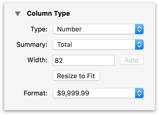
- Number
- Choose Number as as the column Type when you have a numbered value that you’d like to monitor. When you choose this column type, an additional Format popup menu appears in the Column Type Inspector with options for number formatting:
- 9,999.99—Numbers with a two-digit decimal at the end. Large numbers will use a comma to separate thousands.
- 9999.99—Numbers with a two-digit decimal.
- 10000—Whole numbers; decimal numbers are rounded up or down to the nearest whole number. For example, 2.67 is rounded up to 3, while 3.14 is rounded down to 3.
- 10000%—A whole number percentage; a decimal number that gets entered is rounded up or down to the nearest whole number. For example, 2.67% is rounded up to 3%, while 3.14% is rounded down to 3%.
- 99.99%—Percentages with a two-digit decimal value, if needed. For example, 99% appears as that and not 99.00%, while 3.14159% is rounded to 3.14%.
- $9,999.99—Use this option for representing currency values based on the localized values you’ve set in System Preferences ▸ Language & Region ▸ Region. For example, if your Region is set to Asia ▸ Japan, the currency value would show up with the Yen symbol (¥).
- Pop-up List
-
Choose the Pop-up List column type when you have a set of repeating options that you need to choose from.
A table in the Column Type Inspector contains the list of values (pop-up options) that you can customize using the + and - buttons below it.
After creating the list, start entering one of the terms in a pop-up list column cell and you’ll have the option automatically enter it from the selection that appears.
If you enter a term in a pop-up list column cell that isn’t already part of the list, you can press Command-Return to add it to the list.
- Rich Text
- Choose Rich Text for regular text; this is the default column type for new columns.
The second popup menu in the Column Type Inspector provides options for converting the column into a Summary.
The most important thing to know about Summary columns is that they only appear on the parent row for a group. In that parent row, the summary appears in the column calculated based on the values of its children, but with a gray background to the cell. The gray background is a transparent layer of black, which slightly darkens any background color you’ve assigned to the row style.
The options in the Summary popup menu change depending on what you’ve selected in the Type popup menu:
Checkbox Summary options include:
-
None—There is no summary; the summary cell displays a checkbox that acts completely independent of its children.
-
State—Displays an empty checkbox if no items have been checked off, a checkbox with a dash inside if some items have been checked, or a filled checkbox if all of the items have been checked.
-
Hidden—The summary cell is empty, regardless of the state of the other checkboxes in the column.
Date Summary options include:
-
None—There is no summary.
-
Minimum—The summary cell displays the earliest date (or time) in the column from among the child rows.
-
Maximum—The summary cell displays the latest date (or time) in the column from among the child rows.
-
Hidden—The summary cell is empty.
Duration Summary options include:
-
None—There is no summary.
-
Total—The summary cell displays the total of all cells in the column.
-
Minimum—The summary cell displays the lowest duration in the column.
-
Maximum—The summary cell displays the highest duration in the column.
-
Average Leaves—The summary cell displays the weighted average of durations among children of branches of the parent row (also known as leaves). If one branch has two leaves and another has one, for example, the first branch is weighted at 2/3 of the average displayed in the parent cell, while the second is weighted at 1/3.
-
Hidden—The summary cell is empty.
Number Summary options include:
-
None—There is no summary.
-
Total—The summary cell displays the total of all cells in the column.
-
Minimum—The summary cell displays the lowest number in the column.
-
Maximum—The summary cell displays the highest number in the column.
-
Average Leaves—The summary cell displays the weighted average of numerical values among children of branches of the parent row (also known as leaves). If one branch has two leaves and another has one, for example, the first branch is weighted at 2/3 of the average displayed in the parent cell, while the second is weighted at 1/3.
-
Hidden—The summary cell is empty.
Pop-up List Summary options include:
-
Minimum—If the Pop-up List contains numbers, the summary cell displays the lowest number used in that column. If the Pop-up List contains text, the summary cell displays uses the first entry in the Column Type Inspector.
-
Maximum—If the Pop-up List contains numbers, the summary cell displays the highest number used in that column. If the Pop-up List contains text, the summary cell displays the last entry in the Column Type Inspector.
-
Hidden—The summary cell is empty.
Rich Text Summary options include:
-
None—There is no summary.
-
Hidden—The summary cell is empty.
- Column Width
-
Enter a value in the Width field to set the width of the selected column. If the Topic column is selected, the Auto button can be used to have the Topic column resize automatically based on the changing widths of the window or the other columns in the outline.
Click the Resize to Fit button to have the column width automatically adjust to fit the longest single line of text. (This is a one-time operation. Subsequent changes to the text do not cause the column to resize again.)
Document Inspectors
Use the Document Inspectors to adjust the styles or attributes of the outline as a whole, rather than styles that can be applied to a certain part of the outline.
Document
The Document Inspector controls the appearance of how elements (rows, columns, margins, and more) are laid out within the outline.
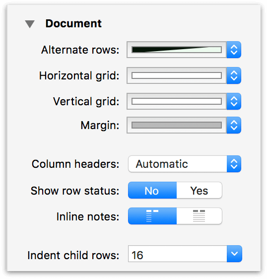
- Alternate rows
- Use the Alternate rows option to set a background color to alternating rows in your document. You can choose from one of the preset color options, or click the color bar to choose a custom color or background pattern from the Colors palette.
- Horizontal grid
- Use the Horizontal grid option to add a thin line of color between the rows in your document. You can choose from one of the preset color options, or click the color bar to choose a custom color from the Colors palette.
- Vertical grid
- Use the Vertical grid option to add a thin line of color between the columns in your document. You can choose from one of the preset color options, or click the color bar to choose a custom color from the Colors palette.
- Margin
- Choose a color for the document margin—the space outside the bounds of the outline’s canvas. This appears when in full screen mode, or when the width of all visible columns is less than the width of the outline in the window. You can choose from one of the preset color options, or click the color bar to choose a custom color from the Colors palette.
- Column headers
- Choose whether to Show or Hide column headers. The Automatic option shows any text you’ve entered for a header, but hides the generic Topic header if you have only one column in your document. You can also do this by choosing View ▸ Column Headers ▸ Show/Automatic/Hide.
- Show row status
- Choose this option if you want to display the status checkboxes along the left side of every row. These are different from the checkbox option you can set on a column, in that status checkboxes are always located on the left edge of and follow the indentation level of your rows.
- Inline notes
- Choose whether inline notes will wrap based on the first column of the document, or if they’ll span the width of all columns. (Inline notes, which are styled using the Notes style, appear beneath the text you’ve entered in a row.)
- Indent child rows
- This pop-up menu lets you choose how far child rows will be indented. You can choose from one of the options we’ve provided, or enter a value of your liking and press Return.
Format and Metadata
Use the Format and Metadata Inspector to provide additional information (metadata) about the document you’re working on. The information you provide here stays with the document and makes it easier to find on your Mac using Spotlight.
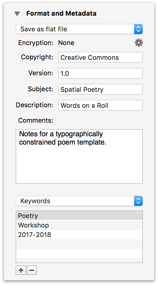
- Save File As
-
The first option in the Document Inspector is a popup menu with options for how your Outliner document is saved: either as a flat file or as a file package. (This option is document-specific.)
If you choose to save as a flat file (the default), OmniOutliner compresses your files down to the smallest practical size. Compressed files don’t just take up less space on your hard drive; they’re also easier to share, and to sync between devices.
Choosing to save as a file package means your files won’t be compressed. This generally isn’t recommended, but can be useful if you are saving your OmniOutliner files in a version control or document management system, or if you run scripts (Python, Ruby, and so on) on the XML inside your document.
- Encryption
- Click the Gear button to add or modify Encryption on your document (detailed at the end of this chapter).
The rest of this Inspector is composed of metadata fields for contextually enriching your document, and have no direct effect on the contents of your outline. The metadata fields in the Format and Metadata Inspector include:
- Copyright
- Copyright statements typically declare who owns the legal rights to something. (Usually you, your company, or some other entity.)
- Version
- Version numbers are used to indicate a certain “state” of a project. For example, 0.1 might be a beta release while 1.0 might be an initial release.
- Subject
- Something similar to what you would enter as the subject line for an email; for example, Staff project assignments for OmniOutliner 5, or Fried Chicken Recipe.
- Description
- A description of the contents of your OmniOutliner file. For example, A list of bike parts, or Actors who’ve portrayed Batman.
- Comments
- Use the Comments field to enter more information about the file you’re working on. For example, you could provide additional detail about a project this file is associated with, or notes to yourself about other things that you’d like to add to the file.
Beneath the Comments field is a popup menu that’s set to Authors. This menu works in conjunction with the combo box below it for creating metadata attribute and value pairs.
To create a metadata attribute and value pair using the popup menu and the combo box:
- Select one of the options in the popup menu (Authors, Organizations, Languages, Keywords, or Projects).
- Click the Add button (the + sign) at the bottom of the Document Inspector. When you click Add, the focus changes to the box in the middle so you can enter information about the item you’ve selected in the popup menu.
- When you’ve finished entering some text, either press Tab or Return to save the metadata information to the file.
If you decide later that you want to remove an item, select it with the mouse and then click Remove (the − button, next to the Add button). To edit an existing item, double-click to highlight the text, and then enter your changes and press Tab or Return to save the changes.
Options in the popup menu include (all of these options can have multiple entries):
- Authors
- The name(s) of the person or people who created the document.
- Organizations
- The name of your company or the organization the document has been created for.
- Languages
- Enter the language, such as English or Japanese, or use one of the ISO 639 language codes, such as en or jp.
- Keywords
- Keywords increase the find-ability of your files more than anything else. Add as many keywords as you like; they help make each document unique when it comes to finding files with Spotlight.
- Projects
- If you’ve created an Outliner file for a specific project, enter the project name here.
If you are using other Omni apps, such as OmniGraffle or OmniPlan, you can enter similar metadata in the Document Inspectors for those apps. macOS Spotlight indexes these attributes, making it particularly easy to find files that share metadata in common.
Encryption
Use the gear button in the Format and Metadata Inspector (or the File ▸ Encrypt Document command) to add password protection to outlines containing private or sensitive material.
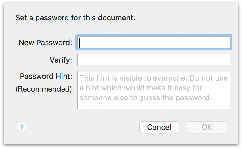
You are prompted to enter and confirm a password. With the New Password and Verify fields matching (and an optional password hint added), click OK to finish the encryption process. The next time you open the document, you’ll see the following prompt:
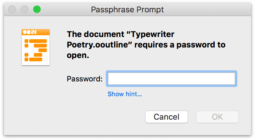
Your document is now encrypted and cannot be opened—or have its contents otherwise read—without entering the password. This is true both of the original document and any copies of it that are subsequently created, so if you send a copy to a coworker they’ll need the password to open it.
To remove encryption from a password-protected document (and remove the requirement for a password), choose File ▸ Encrypt Document, enter the existing password, and click Remove Password.