Inspectors
Use the Object, Style, and Properties inspectors for working with objects on the canvas, and use the Canvas inspectors for configuring the canvas and setting document-specific metadata.
Inspector Basics
To access the inspectors, tap  in the toolbar. Depending on the orientation and available screen space (for example, when multitasking on iPad), the Inspectors Bar either slides in from the right or bottom edges of the screen. When there is enough room on the right side of the screen, the Inspectors Bar appears there; otherwise, the bar slides up from the bottom of the screen.
The inspectors reside within four tabs in the Inspectors pane: Object, Style, Properties, and Canvas/Document inspectors. Tap a tab to switch inspector sets.
Wherever you see  paired with
  in an inspector, these are used as “steppers” to decrease or increase a number value, respectively. For example, while using the Stroke inspector, tapping makes the stroke thinner, while tapping makes the stroke thicker.
Many of the inspectors include a Show/Hide [Inspector] Options button. For example, tapping Show Stroke Options unveils a list of available stroke Patterns you can choose from.
Inspector Tabs
The inspectors are gathered in four tabs, and categorized by their purpose. To switch between tabs, tap the applicable tab at the top of the Inspectors Bar.
Object Inspectors 
Inspectors for defining the style properties of objects, shapes, and text. Object inspectors include:
Style Inspector 
Displays the styles of the selected item on the canvas, as well as the style properties of everything else on the canvas. Tap a different style in the On This Canvas section to apply that style to the current selection.
Properties Inspectors 
Inspectors for further defining the properties of an object. Properties inspectors include:
Canvas Inspectors 
Inspectors for defining the properties of the canvas and the OmniGraffle document itself. Canvas inspectors include:
Fill Types for Objects and Canvases
The Fill Type pop-up menu, found in the Fill and Canvas Background inspectors allow you to set a fill for a shape or apply a background color or pattern for the entire canvas.
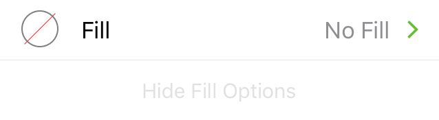
The one difference between Object and Canvas Fill is that Object Fill also has a None option, whereas the Canvas must always have a fill.
None 
An object without any fill properties. This option is not available in the Canvas Fill inspector.
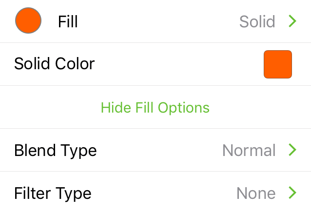
Solid 
Fills the object/canvas with a solid color. Tap the Color Swatch to select or mix a color.
Linear Gradient 
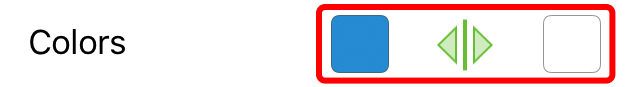
Fills the object/canvas with a linear gradient. Use the Color Swatches to change colors for the start and end phase of the gradient.
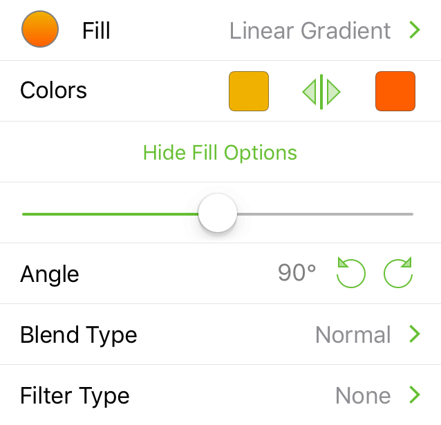
- Colors: Choose start and end colors. Tap
 to swap color positions.
 - Slider: Adjust where the midpoint of the gradient appears.
- Angle: Tap
 or
or  buttons to rotate in 15° increments. Optionally, double-tap and then enter a specific number for the angle of the gradient.
Radial Gradient 
Fills the object/canvas with a radial (i.e., circular) gradient. Use the Color Swatches to change colors for the inner and outer phase of the gradient.
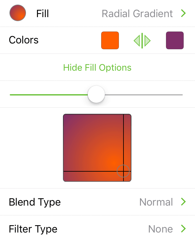
- Colors: Choose start and end colors; center and outside, respectively. Tap to swap color positions.
- Slider: Adjust where the midpoint of the gradient appears.
- Light Source Positioning: Touch and hold, and then drag the circle to reposition where the light source for the gradient is positioned.
Double Linear Gradient 
Fills the object/canvas with a three-colored linear gradient. Use the Color Swatches to change colors for the start, mid-, and end phase of the gradient.
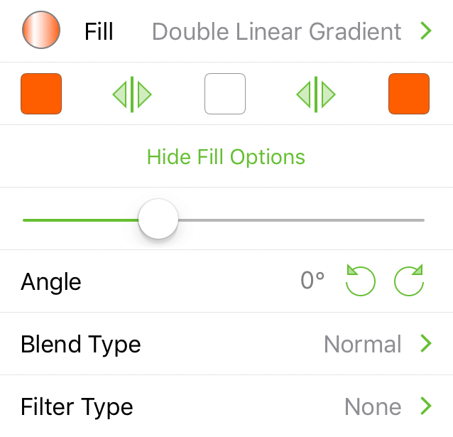
- Colors: Choose colors for the start, mid-, and end phase of the gradient. Tap to swap right/center or center/left colors.
- Slider: Adjust which is the dominant color in the gradient; drag to the right for the left-most color, or to the left for the right-most color, or leave centered for the middle color.
Double Radial Gradient 
Fills the object/canvas with a three-colored radial gradient. Use the Color Swatches to change colors for the inner, mid-, and outer phase of the gradient.
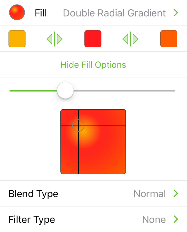
- Colors: Choose colors for the inner, mid-, and outer colors of the gradient. Tap to swap the inner/middle or middle/outer colors.
- Slider: Adjust which is the dominant color in the gradient; drag to the right for the left-most color, or to the left for the right-most color, or leave centered for the middle color.
- Light Source Positioning: Tap in the box to reposition where the inner color appears. Optionally, you can touch and hold within the square.
Stipple 
Fills the object/canvas with a black background and with white “stipple” dots around the outer edge. Use the Color Swatches to change the background and stipple colors.
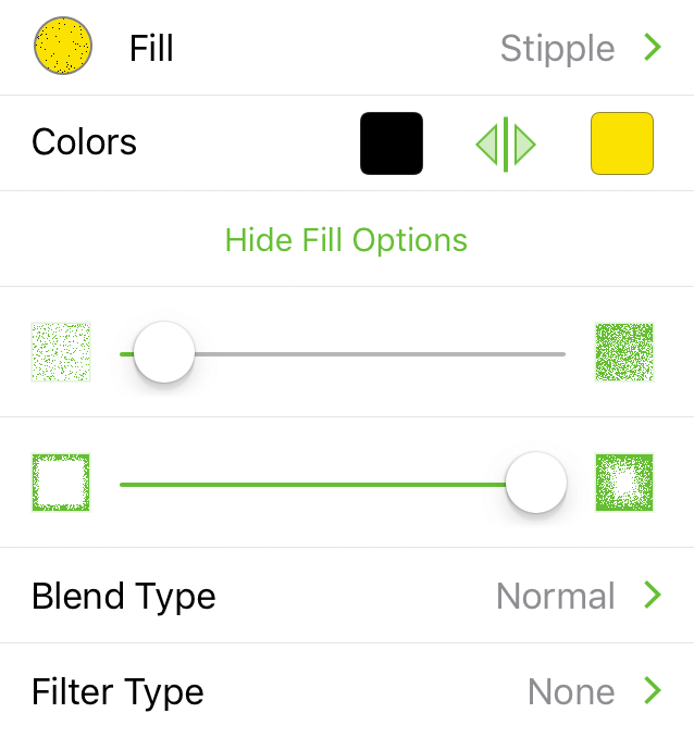
- Colors: Choose the color for the stipple dots (right) and the background (left). Tap to swap the stipple and background colors.
- Stipple Frequency Slider: Drag left for fewer stipple dots or to the right for more.
- Stipple Depth Slider: Drag to the left to keep the stipple dots closer to the edge of the object/canvas, or to the right to fill in more of the object/canvas area.
Squiggle 
Fills the object/canvas with a black background with a thick curvy line on top. Use the Color Swatches to change the background and squiggle colors.
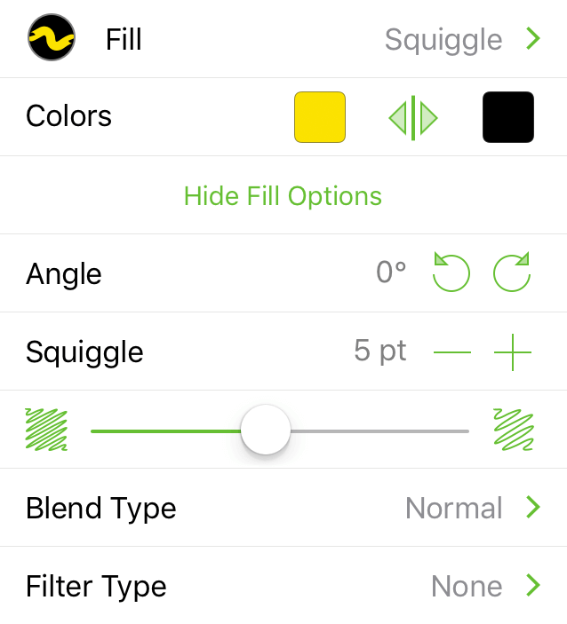
- Colors: Choose the color for the squiggle line (right) and the background (left). Tap to swap the squiggle and background colors.
- Angle: Tap or to rotate the squiggle line in 15° increments; optionally, double-tap the angle number to enter a specific value.
- Squiggle Size: Tap or to decrease or increase the width of the squiggle line, respectively.
- Squiggle Gap Slider: Drag to the left to have the squiggle lines appear closer together, or drag to the right to add more space between the lines (revealing more of the background color in the process).
Plastic 
Fills the object/canvas with a shiny, plastic-like fill that is slightly beveled. Use the Color Swatches to change the highlight and bevel colors.
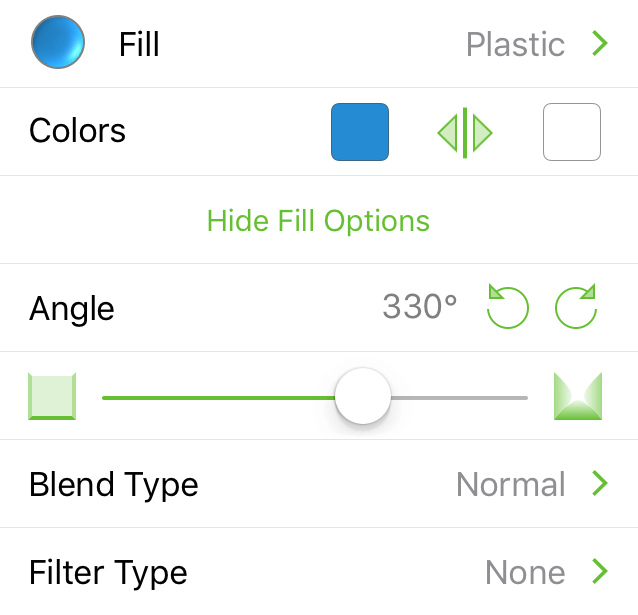
- Colors: Tap the left color swatch to set the background color; tap the right color swatch to set the highlight color. Tap to swap the selected colors.
- Angle: Tap or to rotate the position of the highlight color (the right color swatch); optionally, double-tap the angle number to enter a specific value.
- Bevel Height: Drag the slider to the left for a flatter beveled edge on the object/canvas; drag to the right for higher beveled edge.
Marker 
Fills the object/canvas with a black background and a set of thick lines on top. Use the Color Swatches to change the background and marker colors.
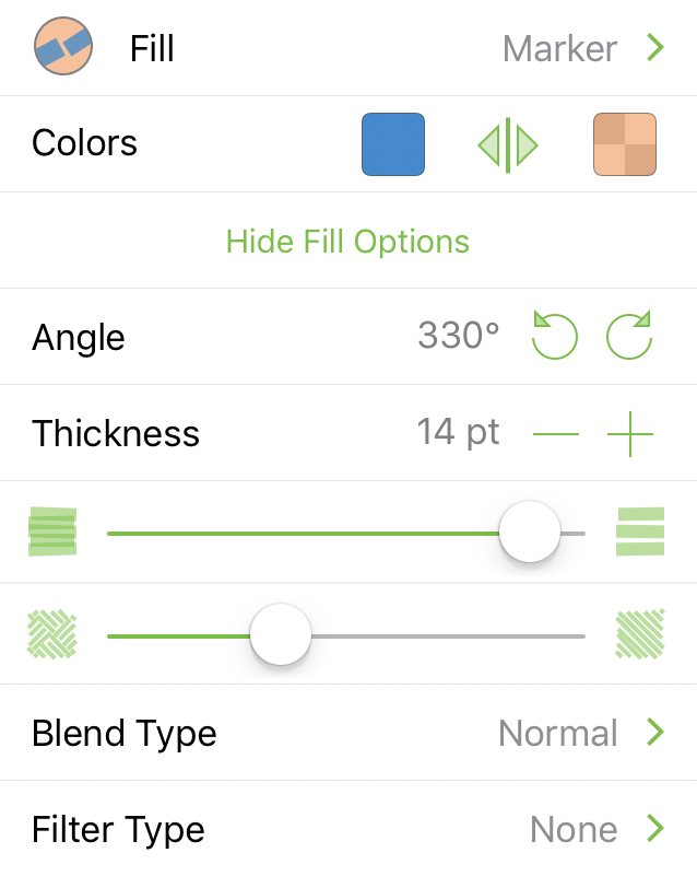
- Colors: Choose the color for the marker lines (right) and the background (left). Tap to swap the marker and background colors.
- Angle: Tap or to rotate the marker line in 15° increments; optionally, double-tap the angle number to enter a specific value.
- Thickness: Tap or to decrease or increase the width of the marker line, respectively.
- Marker Gap Slider: Drag to the left to decrease the gap between the marker lines; drag to the right to increase the gap between the marker lines.
- Marker Pattern Slider: Drag left to fill the object/canvas with increasingly smaller squares of marker lines, creating a herringbone pattern. Drag right to fill the object/canvas with increasingly larger squares of marker lines. When all the way to the right, the marker lines fill the entire object/canvas.
Choosing Colors
Throughout the inspectors, you will find Color Swatches which you can tap to change the default colors. Some inspectors, such as the Line inspector, only have one Color Swatch, while others, such as the Linear Gradient or Double Radial Gradient fill type in the Fill inspector, have two or three, respectively.
Tapping a Color Swatch— —takes you to a pane of preset Color Palettes, from which you can choose another color.
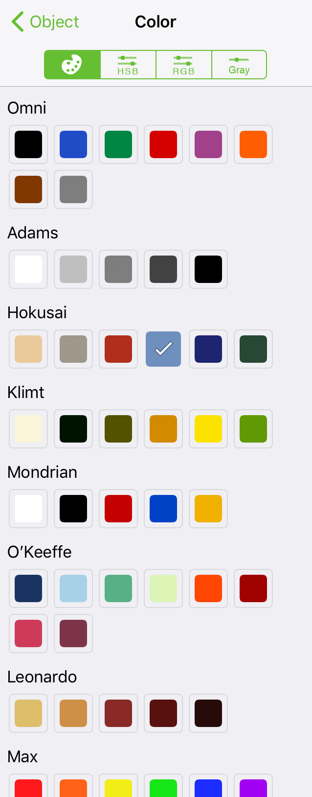
Tap to select another color, or tap the HSB, RGB, or Gray tabs to mix your own colors by adjusting the sliders in those tabs.
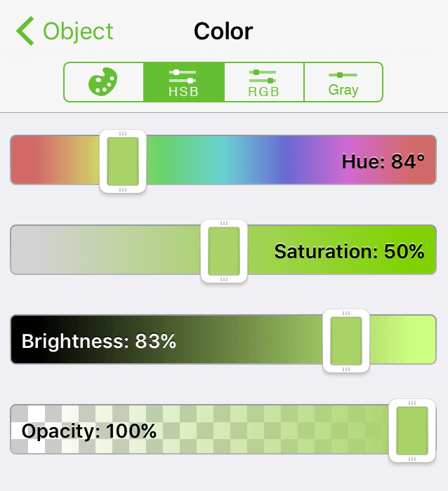
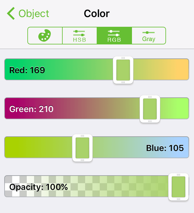
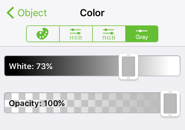
The HSB, RGB, and Gray tabs each feature an Opacity slider for setting a fill color’s opaqueness.